
The right neutral colors can make a home feel calm and lived-in. With farmhouse touches, they also look warm, not plain.
You can mix creamy whites, sandy beiges, and soft grays into spaces that feel welcoming every day.
1. Creamy Off-White Walls With Warm Undertones
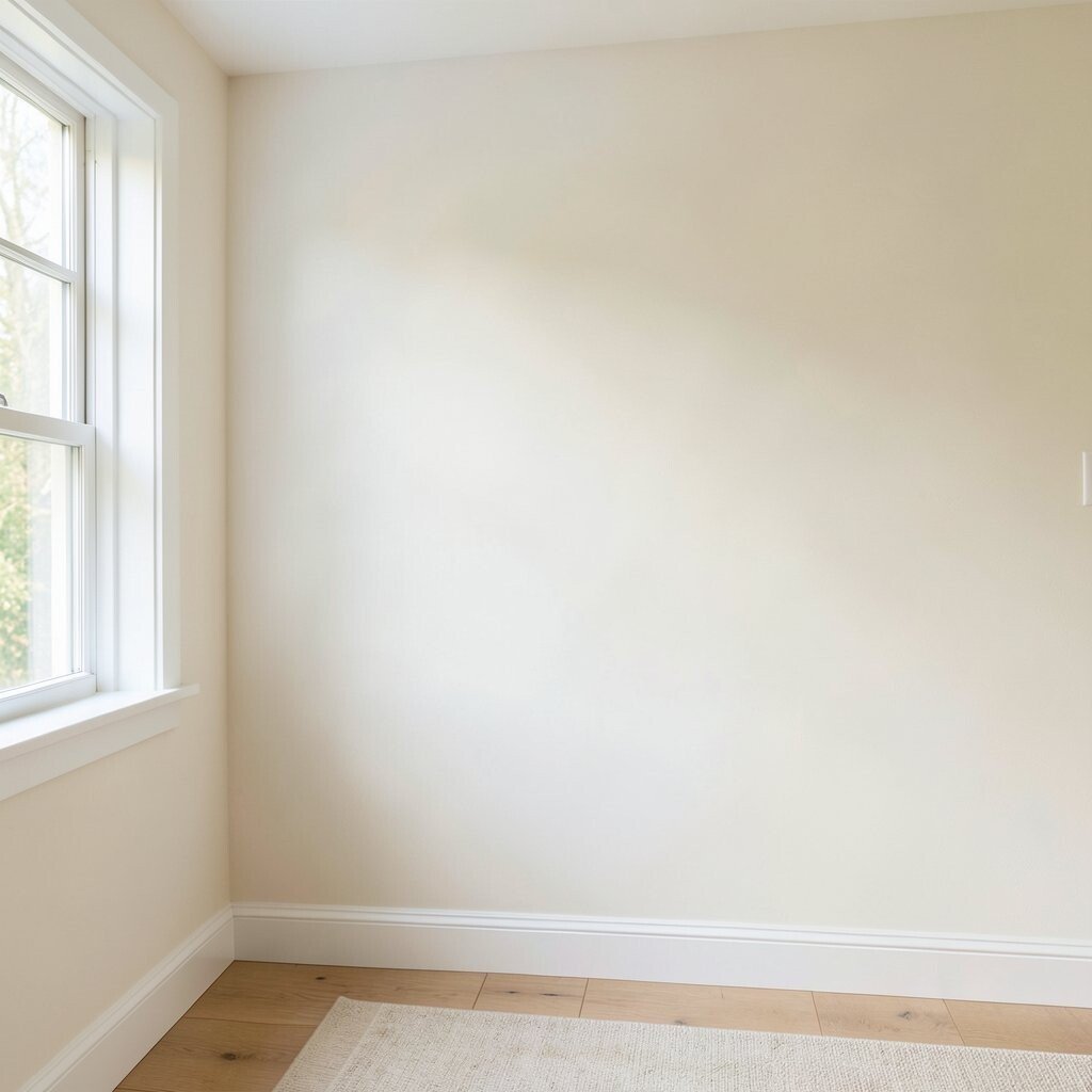
Start with creamy off-white walls that lean slightly warm, like buttered toast or fresh linen. When daylight hits, the room looks bright but still cozy, and it never feels sterile.
Choose a paint finish that hides tiny imperfections, such as an eggshell, so walls look smooth without looking shiny. Pair the color with light oak trim and simple black or bronze hardware for a farmhouse look. If you worry about the shade reading too yellow, test swatches on multiple wall areas because kitchens and north-facing rooms can shift fast.
2. Sand Beige Accents That Feel Like Sunlight
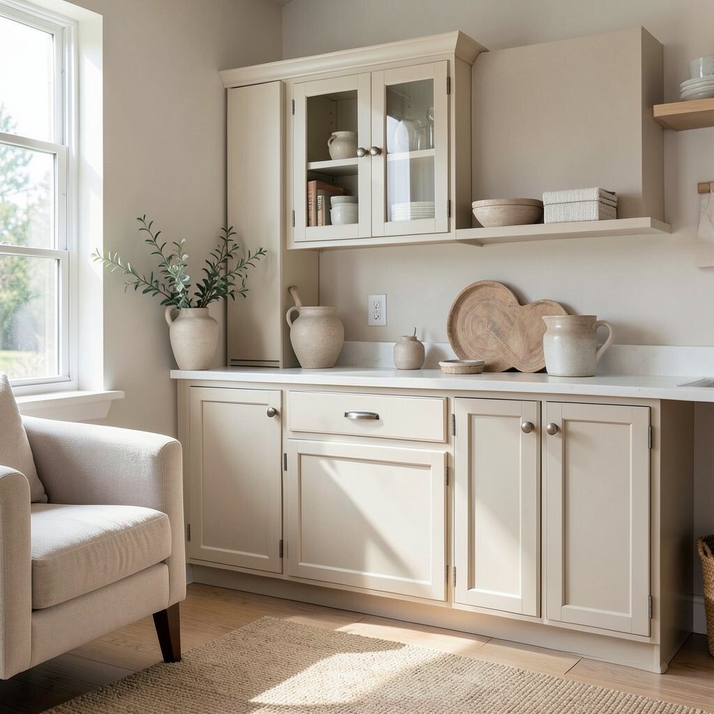
Use sand beige for accent walls, built-ins, or curtains to create a soft glow. The color visually “holds” warm light, which is great in rooms that don’t get much sun.
To keep it balanced, combine sand beige with crisp whites and light gray textiles. Add one darker grounding color, like weathered oak or muted charcoal, so the palette doesn’t float.
For a practical upgrade, match your baseboard color to your wall paint to reduce harsh contrast. You can also use removable wallpaper panels or stenciled patterns in a sand-beige tone around shelves for texture without a full repaint.
3. Greige Foundations For Easy Mixing

Greige is a favorite farmhouse-neutral because it blends gray coolness with beige warmth. Think of it as a flexible backdrop that lets wood grain and textiles stand out.
Try greige on larger surfaces like walls, cabinetry, or furniture bases to create a calm, modern farmhouse vibe. It also hides small scuffs better than very bright white, which matters in busy homes.
Personalize it by choosing greige with the right undertone for your floors. If your floors are honey-toned, select greige that feels more beige; if your floors read cooler, pick a greige that leans more gray.
When shopping, bring a cloth sample of your curtains or rug and compare undertones in daylight. A quick home test can save you from a color that looks perfect in the store but shifts on your walls.
4. Soft Taupe Living Room Color That Renews
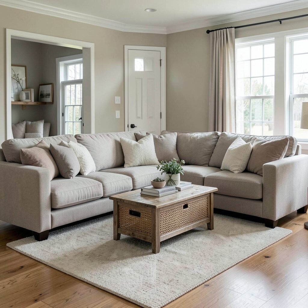
Soft taupe on walls creates a gentle, earthy backdrop that feels grounded. It makes the space look collected, like each item belongs together.
Use taupe in living rooms where you want comfort and calm. It works beautifully with woven baskets, thick knit throws, and rustic wood coffee tables.
5. Dove Gray Trim For Crisp Farmhouse Contrast
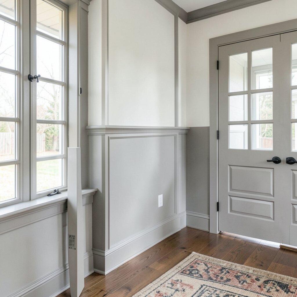
Dove gray trim is a subtle way to add contrast without going too dark. It frames windows and doors so your farmhouse style looks intentional and tidy.
Pair dove gray with cream walls and matte black light fixtures for a clean, cozy look. If you have white cabinets, the gray trim helps them feel less “stark” and more layered.
For practicality, choose durable trim paint with good adhesion because trim takes more daily bumps. A satin finish on trim can resist cleaning while still looking soft.
6. Charcoal-Soft Accents For Depth Without Harshness

Bring in charcoal-soft accents through picture frames, shelving brackets, and slim table legs. The darker tones add depth so neutrals don’t feel flat.
Keep the charcoal softened by using it in small doses and pairing with creamy textiles. You can also pick charcoal that reads brownish to match weathered wood and avoid a “cold” look.
To make it practical, use washable paint for any painted furniture and sealed finishes for wood. If you’re updating quickly, swap hardware and frames first, then add larger pieces once you know your favorite combos.
7. Weathered Oak Tones As The Main Character
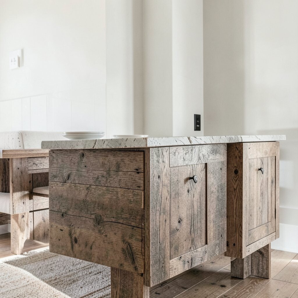
Farmhouse palettes shine when the wood feels warm and lived-in. Weathered oak tones bring a natural look that works with almost every neutral.
Use oak for floors, shelves, tables, or even cabinets if you’re renovating. The texture matters as much as the color, because knots and grain add visual interest without extra pattern.
For cost control, consider refinishing only one hero piece like a dresser, coffee table, or open shelving. New stain plus a protective topcoat can create a big change without the expense of replacing everything.
You can also add warmth with darker wood accents such as candle holders or a vintage tray to keep the palette cohesive.
8. Warm White Kitchen Cabinets With Simple Hardware
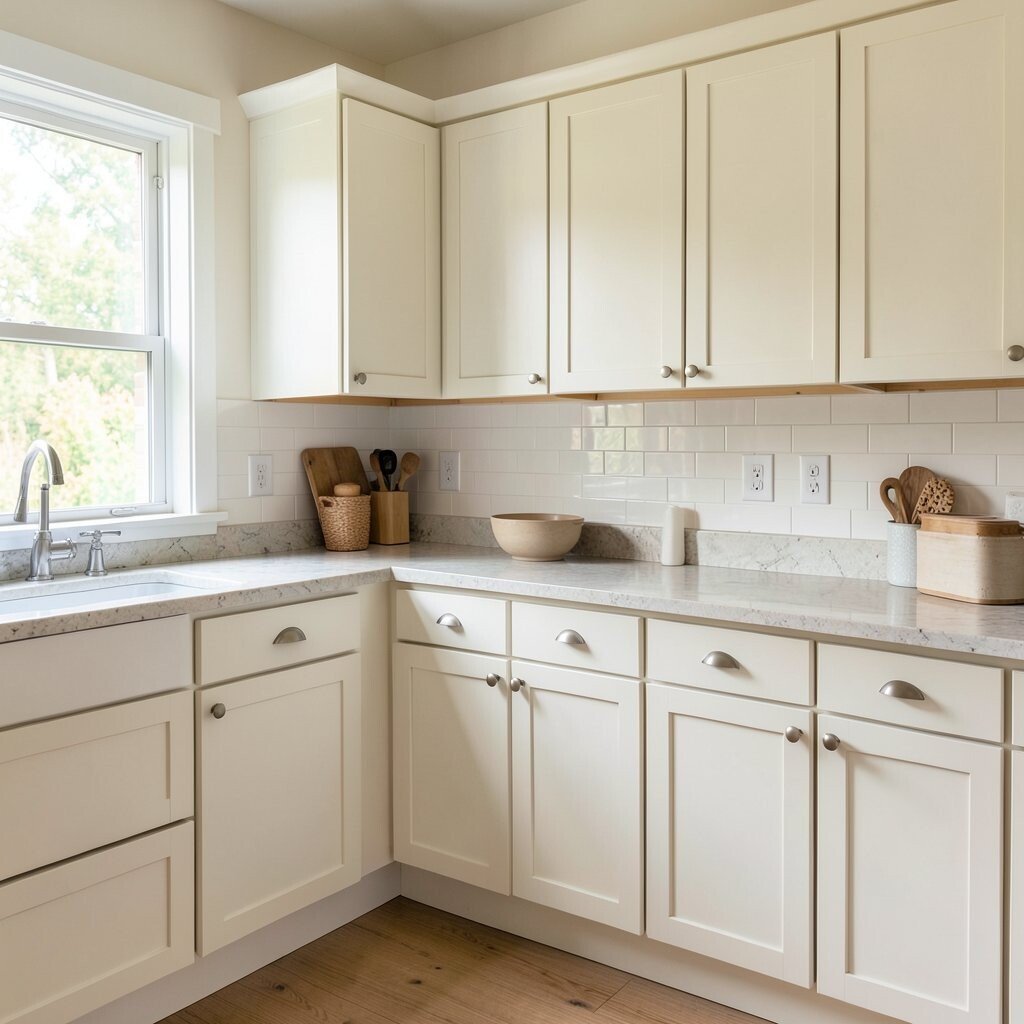
Warm white cabinets help a kitchen feel clean and inviting without losing farmhouse charm. The goal is a soft white that doesn’t fight your lighting or countertops.
Choose hardware with a gentle finish, like brushed bronze, satin nickel, or blackened steel. These details help the room look finished and current.
9. Linen Texture Neutrals For Instant Cozy Layering
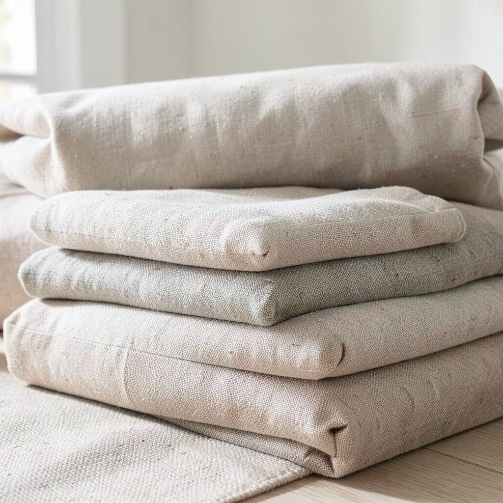
Even if you keep walls neutral, the room changes fast when textiles feel right. Linen-texture neutrals in curtains, slipcovers, and bedding create that cozy, touchable look farmhouse spaces love.
Look for fabrics in oatmeal, cream, and light tan that feel slightly textured rather than perfectly smooth. The visual texture adds warmth without needing patterns or loud colors.
To keep maintenance easy, choose machine-washable covers or slipcovers for high-use seating. You can also rotate throws seasonally, which keeps your palette looking fresh without buying brand-new furniture.
10. Oatmeal Rug With Subtle Patterning
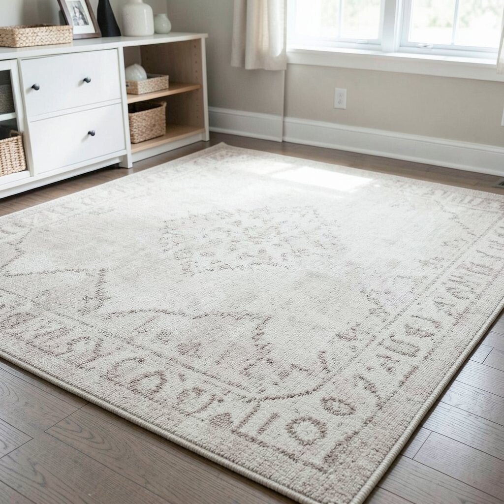
An oatmeal rug anchors the room and ties neutrals together. Choose one with a soft pattern like raised weave lines or faint shapes so it feels farmhouse, not formal.
Layer a natural fiber rug like jute or sisal underneath if you want extra warmth underfoot. Then add a cream or beige area rug on top for a cozy landing.
11. Pale Greenish-Gray For A Soft Country Mood
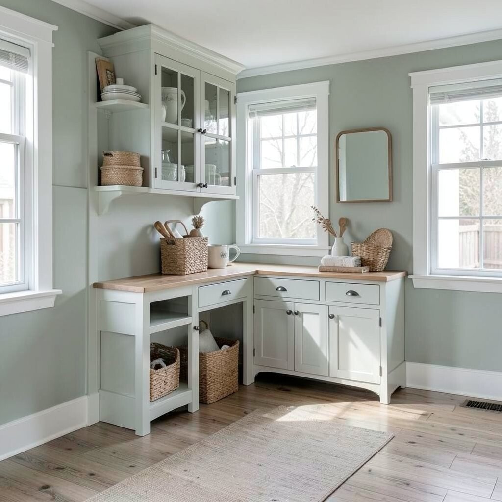
Pale greenish-gray gives you a hint of nature while staying neutral. It’s perfect for rooms where you want calm, like bedrooms and home offices.
This color pairs beautifully with warm woods, creamy whites, and aged metal. You’ll often see it trending in modern farmhouse interiors because it feels fresh but never loud.
For practical results, test the shade in the room at different times of day. Greenish tones can shift based on sunlight, so swatches help you avoid surprises.
If you love the idea but fear commitment, paint a single built-in cabinet back panel or a bathroom vanity instead of all walls.
12. Muted Mushroom Beige For Dining Areas

Muted mushroom beige is like a cozy sweater for your dining space. It creates a warm, flattering background for tableware, candles, and seasonal centerpieces.
Use it on dining room walls or on the inside of open shelving. The earthy tone makes wood serving trays and ceramic bowls look especially rich.
To keep the room from looking heavy, balance with bright textiles like a cream table runner and light chair cushions. You can also add reflective surfaces such as a lightly distressed mirror or glass candle holders.
13. Soft Gray-Blue For A Calm Entryway
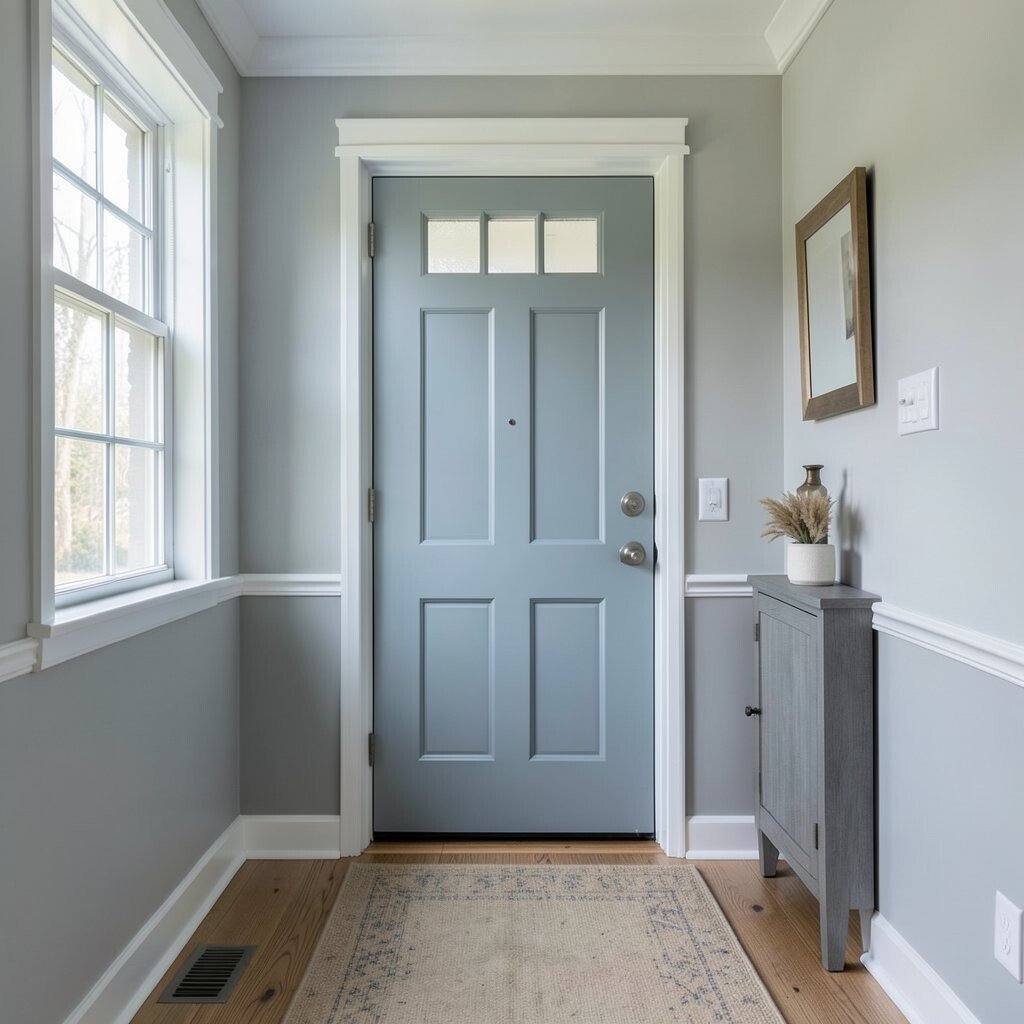
Soft gray-blue works like a gentle greeting when you step into the home. It adds color without turning the space into a “paint project” that feels too bold.
Put this tone in an entryway wall, mudroom bench, or cabinet nook. The slight blue helps neutrals feel airy, especially with warm lighting.
14. Putty Walls With Clean Lines And Vintage Finds

Putty walls fall right between beige and gray, creating an easy, farmhouse-friendly foundation. The color looks warm with wood and also plays well with metal finishes.
Pair putty with vintage-inspired decor, like an antique-style clock, a rustic mirror, or a simple gallery wall. The neutral wall makes older pieces look purposeful rather than mismatched.
For a practical tip, keep your paint sheen consistent across walls to avoid visible patches. If you’re matching an existing color, take a sample of your current paint to the store so the undertone stays steady.
15. Milky White Ceiling For Extra Brightness
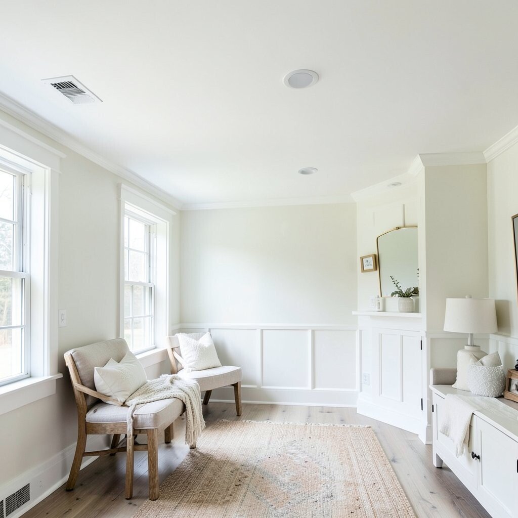
A milky white ceiling can brighten a room without changing the walls. It gives your farmhouse palette a gentle lift and makes spaces feel taller and more open.
Choose milky white with a soft finish so it looks clean but not glaring. This is especially helpful in kitchens, hallways, and rooms with fewer windows.
16. Oat-Gold Accents Through Lighting And Hardware
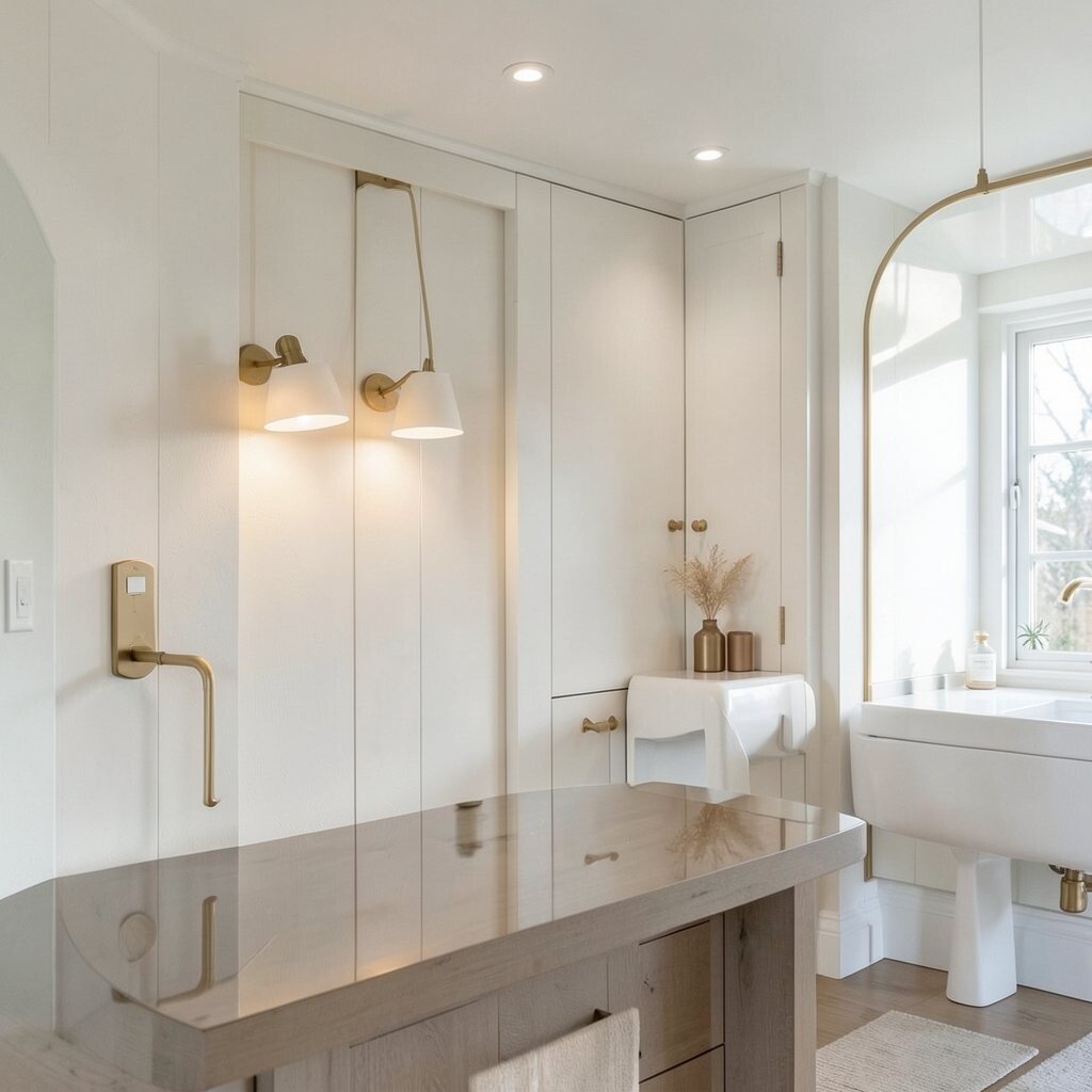
Oat-gold accents add warmth like candlelight, even during the day. Try it on pendant lighting, faucet finishes, towel bars, or picture light fixtures.
Gold can feel tricky, but in a muted farmhouse palette it works best when it’s toned down and brushed. Pair it with cream, beige, and weathered oak so the warmth stays natural.
If you’re planning a quick refresh, swapping lighting and hardware is usually one of the most cost-friendly upgrades. You’ll also get an instant style upgrade because these items sit right in your line of sight.
17. Mushroom-Tan Cabinets With Black Farmhouse Details

Mushroom-tan cabinetry looks cozy and a little vintage, especially with black farmhouse details. It feels softer than pure gray, and warmer than cool beige.
Choose matte black for handles, pulls, and faucet parts to create a crisp contrast. This pairing is a current farmhouse trend because it balances modern simplicity with rustic charm.
For personalization, add open shelving above or beside cabinets to show dishes in cream and stoneware tones. If budgets are tight, paint only the cabinet fronts and reuse existing boxes when possible.
When selecting paint, consider a durable cabinet finish so it withstands cleaning in kitchens. A good topcoat helps your color stay rich and prevents scuffs from everyday use.
18. Warm Gray With Lots Of Natural Light

Warm gray can feel inviting when it’s paired with light and warm materials. In a room with good daylight, it reads soft and helps neutrals layer beautifully.
Use warm gray on walls or large furniture pieces like sideboards and media consoles. Pair it with off-white textiles and light wood for a calm, cohesive look.
19. Putty And Cream Combination For Built-Ins

Built-ins look amazing with a putty-and-cream combo because it adds depth without clutter. You can make the shelves feel custom by painting backs and trim in matching neutral shades.
Try cream for the outer trim and putty for the interior shelves, or switch it for a more dramatic look. Either way, the difference helps your farmhouse decor stand out.
For practical styling, keep shelf items in a tight color range: cream, natural wood, and muted tan. Then add one small darker piece like a charcoal vase or frame to keep the eye grounded.
If you want to spend less, paint the built-in structures and keep decor minimal, using baskets and a few taller objects to balance the space.
20. Natural Linen Curtains In Ecru And Oatmeal
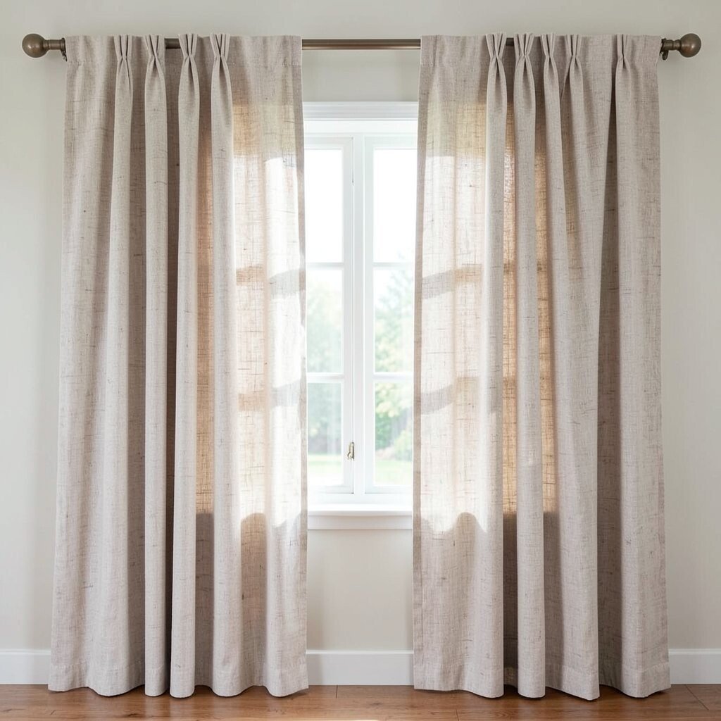
Natural linen curtains in ecru and oatmeal soften the whole room. The fabric moves gently and adds texture, which makes neutrals feel warmer and more welcoming.
Choose a curtain length that pools just slightly or reaches the floor, depending on the vibe you want. Farmhouse spaces often look best with relaxed draping rather than overly stiff panels.
For easy upkeep, consider lined curtains if your windows get strong sun. You’ll protect furniture and rugs from fading while keeping your palette stable.
21. Soft Stone Countertops And Matching Wall Paint

Soft stone countertops bring a natural, neutral look that feels timeless. When you match your wall paint to the countertop undertone, the kitchen or bathroom looks instantly cohesive.
Look for wall colors that echo the stone, such as creamy white, putty, or warm beige. This approach makes the space feel designed, even when you’re using simple farmhouse accessories.
For personalization, bring in stone-like textures through ceramics, trays, and woven placemats. If budget is a concern, you can update color perception with paint, textiles, and hardware instead of replacing countertops.
To keep everything grounded, add one darker element, like black faucets or dark wood stools, so the neutral palette has a gentle anchor.