
Nature has a quiet way of making a space feel calm and alive at the same time. Soft browns, misty grays, warm creams, and stone-like tones can spark fresh ideas fast.
1. Sand Dune Beige

Sand dune beige brings the look of sunlit hills and soft desert paths into a room. It feels warm without being loud, and that makes it easy to live with every day.
This shade works well on walls, linen curtains, and simple ceramic decor, especially when you want a calm space that still feels welcoming. It is a smart choice for small rooms because it can open up the view, and it often costs less than stronger colors since many paint lines already carry it as a standard neutral.
2. River Stone Gray
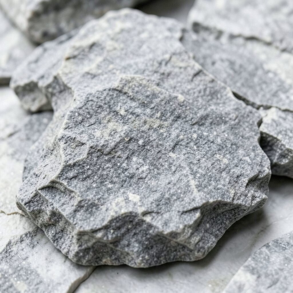
River stone gray has the cool, smooth look of pebbles resting in clear water. It gives a room a steady feel that can make busy days seem a little softer.
You can pair it with wood, white, or black accents for a look that feels current and clean. Many people like it for kitchens and work areas because it hides small marks well, and it is easy to personalize with colorful art, woven baskets, or plants that break up the quiet tone.
Since this shade stays popular in modern homes, you can find it in many price ranges, from budget paint to high-end finishes. Try it with matte surfaces if you want a more natural feel, or use a slightly glossy version if you want the light to bounce around a bit more.
3. Driftwood Taupe
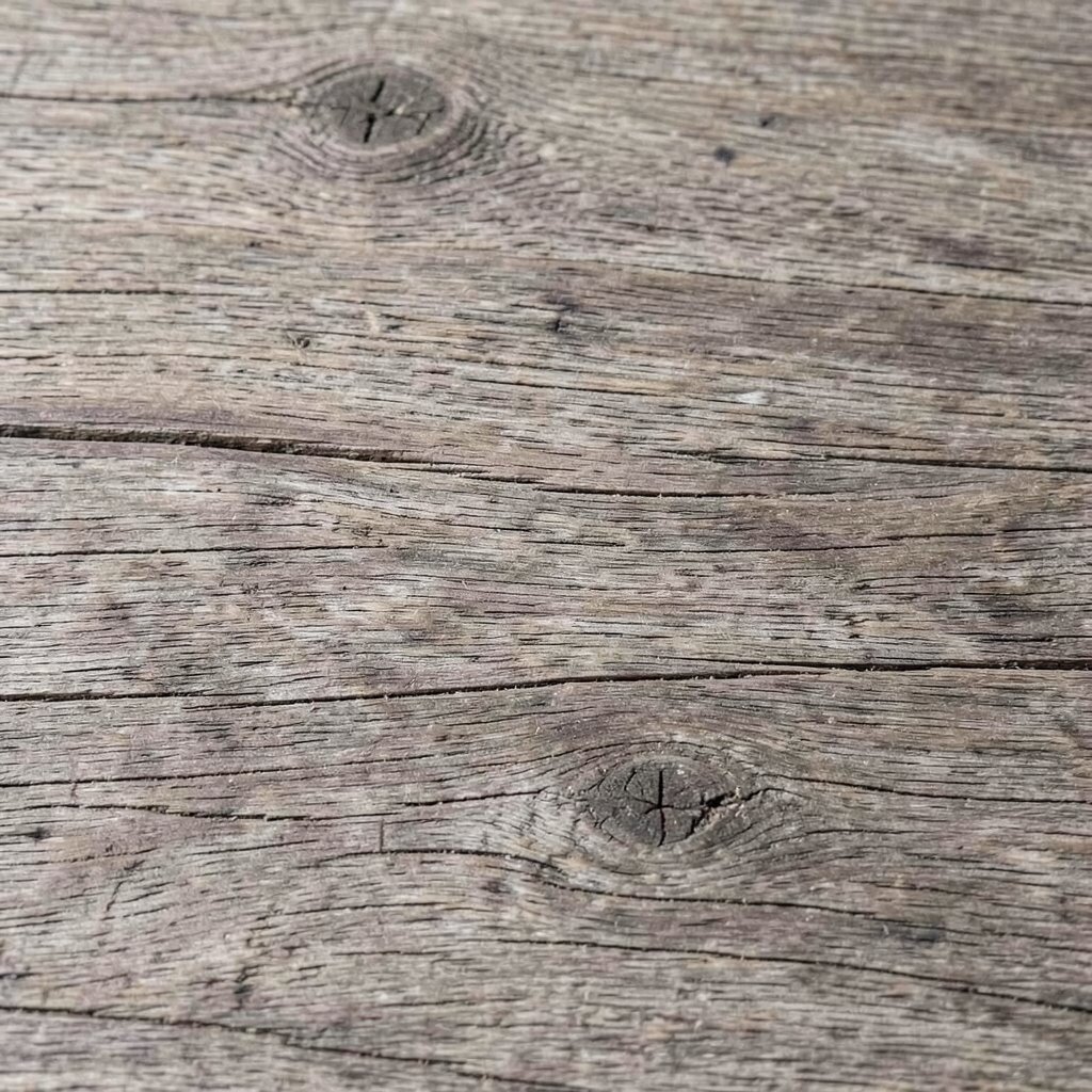
Driftwood taupe carries the weathered look of wood that has spent years near the sea. It feels gentle and lived-in, with just enough brown and gray to make it interesting.
This tone can make a bedroom or living room feel grounded, and it works well with soft textiles like wool throws and cotton pillows. For a personal touch, mix it with family photos, handmade pieces, or soft green plants, and keep costs low by using it on one main wall instead of painting everything.
The shade is especially useful if you like a rustic style that still feels neat and modern. It also fits well with current natural design trends, where people want rooms that look calm, warm, and easy to care for.
4. Shell White

Shell white looks like the inside of a smooth seashell, with a creamy glow that is softer than bright white. It adds light to a space without making it feel cold or sharp.
This color is a favorite for trim, bedding, and simple furniture because it plays nicely with nearly every other neutral. It can save money too, since you can use it in many rooms and keep the same paint or fabric feel across your home, then add your own style with textured lampshades, woven rugs, or pale wood pieces.
5. Mossy Olive
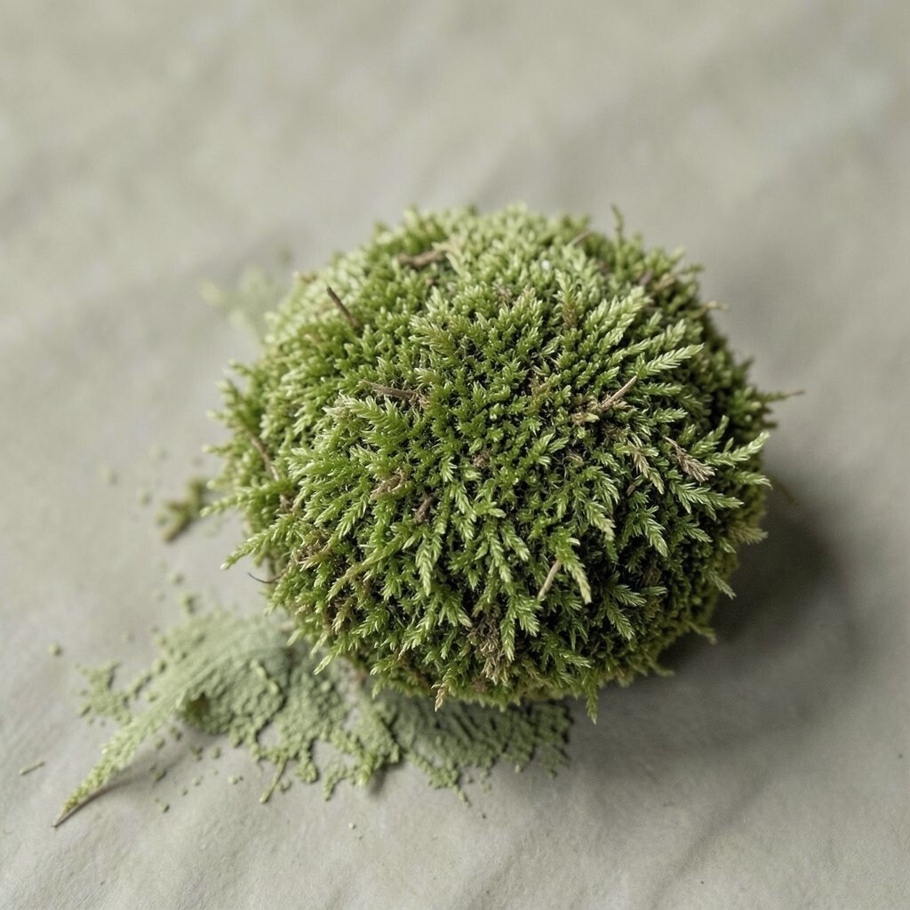
Mossy olive brings the deep, restful look of forest ground and shaded leaves. It feels earthy and rich, but still calm enough to work as a neutral in the right setting.
You may like it on cabinets, accent chairs, or a single wall where you want a cozy mood. It pairs well with brass, stone, and cream details, and it gives a room a unique edge without shouting for attention, which is one reason many people are using softer greens in current home design.
For a personal twist, add leather, rattan, or black frames to keep the color from feeling too heavy. The paint and decor can range from affordable to premium, so it helps to test a small sample first and see how the shade changes in morning and evening light.
6. Pebble Beige

Pebble beige has the smooth look of tiny stones warmed by the sun. It feels clean and easy, and it can make almost any room look more relaxed.
This is a helpful color when you want a backdrop that does not fight with your furniture or art. It is practical for busy homes because it hides dust better than crisp white, and it lets you change your style later without repainting right away, which can save time and money.
Many decorators use it with curved furniture and soft edges to match the gentle feel of natural stone. To make it your own, bring in one stronger accent like navy, rust, or forest green, and the whole room will feel more complete.
7. Misty Clay

Misty clay has the soft warmth of dried earth after rain. It gives off a cozy mood that feels human and real, not too perfect or stiff.
This tone works well in dining rooms, reading corners, and entryways where you want a welcoming first impression. It is also a good choice for people who want something a little different from common beige, and that small twist can make a room feel more special without raising the design cost too much.
Pair it with pale wood, creamy textiles, and simple black details for a look that feels balanced and fresh. If you want a softer result, use it with low contrast pieces, but if you want a more stylish edge, mix in woven decor and rounded shapes that are very on trend right now.
8. Cedar Bark Brown
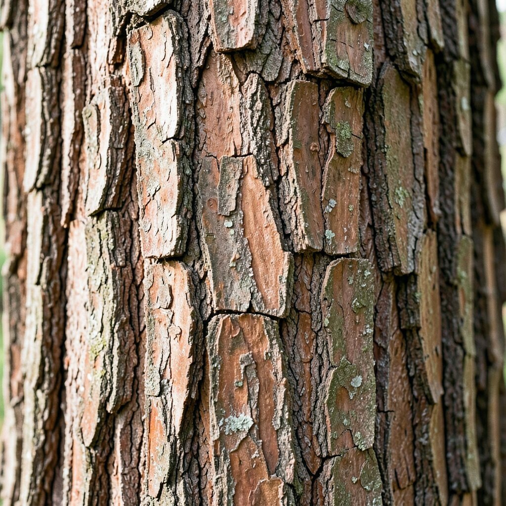
Cedar bark brown carries the look of tree trunks and dry outer bark, with a deep natural warmth. It can make a space feel safe, stable, and full of character.
This color is strong enough to stand out, yet it still works as a neutral when paired with light walls or cream fabrics. It can be a smart choice for furniture, doors, and shelves, especially if you want something that feels durable and can be refreshed with simple accents instead of a full room makeover.
Use it with soft beige textiles or pale stone colors to keep the room from feeling too dark. A personal detail like a woven basket, an old wooden bowl, or a framed nature print can make the shade feel even more inviting.
9. Foggy Slate
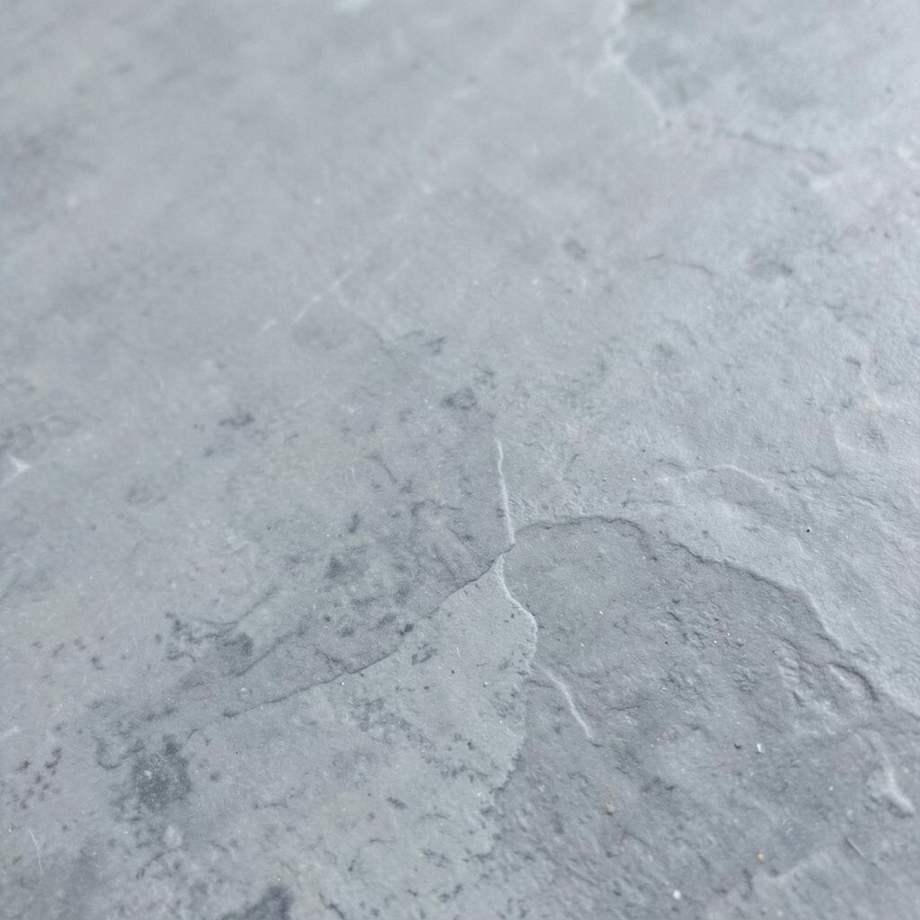
Foggy slate has the cool quiet of a cloudy morning over rocks and water. It feels modern and calm, with a smooth look that can make a room seem tidy and polished.
People often use this shade in bathrooms, offices, and kitchen spaces because it works well with metal, glass, and white surfaces. It can also be a nice money-saving choice since it matches so many styles, from simple farmhouse decor to cleaner city apartments, and that means you can reuse accessories instead of buying all new ones.
If you want it to feel less formal, soften it with fabric shades, pale wood, or a rug with a gentle pattern. This color is especially good for anyone who likes a current style that still feels timeless and easy to keep up.
10. Wheat Field Cream

Wheat field cream has the warm, open look of tall grain under soft sunlight. It feels brighter than beige but still gentle, which makes it a lovely middle ground for many rooms.
This shade can help a room feel fresh and airy, and it is especially useful in places that need more light without using stark white. You can personalize it with warm metals, simple art, or natural fiber rugs, and the overall cost stays friendly because cream colors are common in paint, fabric, and home goods.
It works well with both rustic and clean modern looks, so you do not have to lock yourself into one style. If you like a calm home that still feels awake, this color can do a lot of quiet work for you.
11. Charcoal Pebble

Charcoal pebble has the look of dark stones found near a mountain trail. It brings depth and contrast, but in a softer way than pure black.
This color can make art, plants, and light furniture stand out in a beautiful way. It is useful for accent walls, frames, and cabinets, and it often feels more practical than lighter shades in high-use areas because it can hide wear, which helps with long-term value and cost control.
To keep it from feeling too heavy, balance it with creamy textures and warm lighting. Many people use this darker neutral in current layered interiors because it gives a room a rich feel while still leaving room for personal style.
12. Limestone Ivory
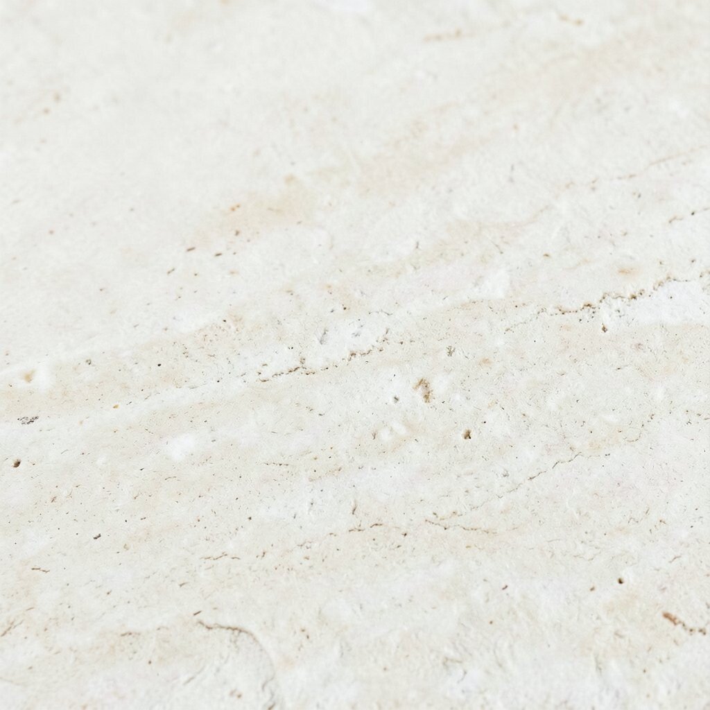
Limestone ivory feels like smooth stone touched by sunlight. It is soft, clean, and just warm enough to keep a room from feeling plain.
This tone works well for walls, bedding, and large furniture because it creates a quiet base for the rest of the room. It can be a practical pick if you like to change decor often, since it matches almost everything and helps you avoid extra spending on full replacements.
Add texture through linen, boucle, or woven pieces so the space feels rich instead of flat. A few natural objects, like branches in a vase or a basket beside the sofa, can make the color feel more personal and alive.
13. Bark and Birch Mix

Bark and birch mix brings together the dark strength of tree bark and the light softness of birch wood. That contrast gives a room depth while still keeping the palette natural and easy to use.
You can bring this look into a space through layered wood tones, neutral textiles, and a few darker accents, and it works beautifully in homes that want more warmth than a plain gray scheme. It is also flexible for different budgets because you can start with simple pieces, then add richer textures or a statement chair later as your style grows.
This mix is especially nice for people who want a home that feels collected instead of copied. Use it with soft lighting, handmade decor, and a few smooth surfaces to keep the look fresh, current, and ready for everyday life.