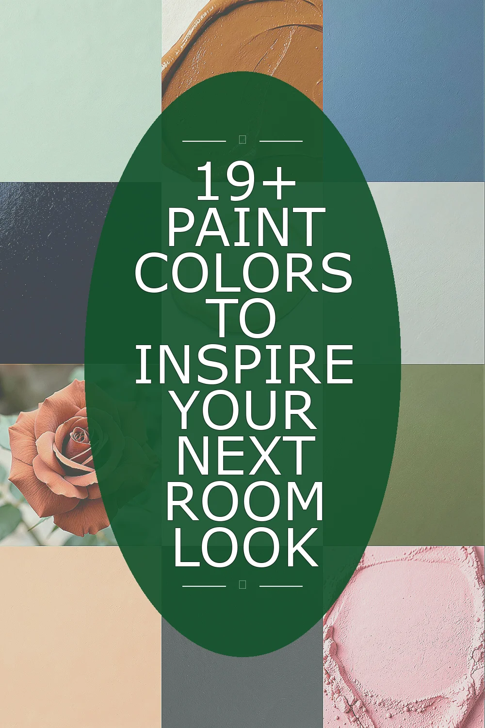
Fresh paint can change the whole mood of a room. The right shade can make a space feel calm, bright, rich, or cozy.
1. Soft Sage Green

Soft sage green brings a gentle, leafy feel that makes a room seem calm right away. It looks beautiful with light wood, cream fabric, and simple black accents, so it fits many styles without feeling plain. This shade works well in bedrooms, kitchens, and reading corners because it gives rest to the eyes and adds a quiet bit of color.
People like sage because it feels current without being loud, and that makes it a smart choice if you want a look that can last. It can also help older furniture feel fresh, which is a nice way to save money while updating a space. If you want more personality, try soft sage on one wall and keep the rest of the room warm white for a balanced finish.
2. Warm Clay

Warm clay feels earthy, sun-baked, and inviting, almost like a favorite ceramic bowl. It pairs well with woven rugs, linen curtains, and plants, which helps a room feel grounded and lived in. The color adds depth without making the space feel dark, so it is a good pick for dining rooms and cozy living rooms.
This shade has a handmade look that feels unique, especially now that natural and rustic styles are so popular. It often works well with mid-range paint brands, so you can get the look without spending a lot. For a personal touch, mix it with brass lamps or pale tan pillows to keep the room warm and friendly.
If your room gets strong light, warm clay may look softer in the day and richer at night, which adds charm. Try a sample first on more than one wall because the color can shift a little with the light. That small step can help you avoid repainting later and keep the cost under control.
3. Dusty Blue

Dusty blue has a calm, misty look that feels peaceful the moment you see it. It works especially well with white trim, pale gray sofas, and simple art, giving a room a clean and airy feel. The color is lovely in bedrooms and bathrooms because it makes those spaces feel quiet and cool.
One reason dusty blue stands out is that it can feel both classic and modern at the same time. It is a great way to add color without going too bold, and that helps if you are painting a large room on a budget. For a more personal style, add patterned pillows or a dark wood table to give the soft walls more contrast.
4. Deep Navy

Deep navy gives a room a rich, tailored look that feels a little dramatic in the best way. It can make white trim pop, and it looks sharp with gold, walnut, or leather details. Many people use it in offices, dining rooms, or powder rooms because it brings strong style in a small space.
This color feels upscale and timeless, which makes it a favorite in current home design. Dark paint can sometimes take extra coats, so it is smart to plan for a bit more product when counting the cost. If you want a softer effect, balance navy with warm lamps, cream curtains, or a bright rug so the room does not feel too heavy.
Deep navy also works well when you want a room to feel focused and polished. In rooms with lots of sunlight, it can look almost jewel-like, which adds a special touch. Try it on built-ins or a single accent wall if you want drama without painting every surface.
5. Butter Yellow
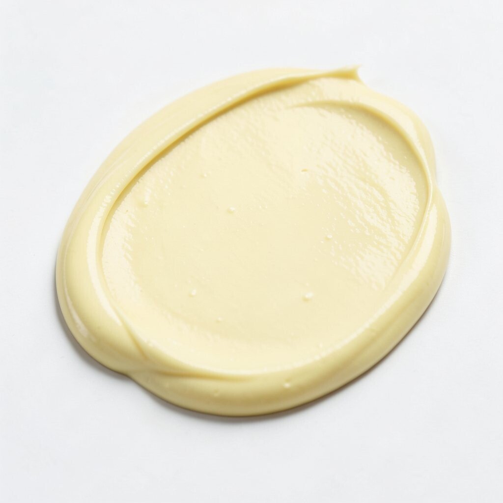
Butter yellow brings a cheerful glow that feels sunny but gentle. It can make a room look warmer right away, especially in spaces that do not get much natural light. This shade is charming in kitchens, breakfast nooks, and kids’ rooms because it feels happy without being too bright.
The color has a sweet, old-fashioned feel that is coming back in fresh ways. It can make plain rooms feel more welcoming, and it often works with simple decor you may already own, which helps keep spending low. If you want a more personal look, pair it with white shelves, green plants, or a checkered fabric for a playful finish.
6. Soft Greige

Soft greige blends gray and beige into one smooth, easy color that works almost anywhere. It gives walls a soft backdrop that lets furniture, art, and textiles stand out without fighting for attention. This makes it a strong choice for open rooms, hallways, and homes with changing decor.
Greige is popular because it feels clean and calm while still having warmth, which many plain grays do not. It is often a safe pick for resale value, and that can matter if you want a style upgrade without risking too much. To make it feel less flat, add layers like textured throws, matte pottery, or a bold frame color.
The shade can shift a little in different light, sometimes looking more beige in the morning and more gray by evening. That changing look can give the room a soft, lived-in feel. A sample board near the window and another in the corner can help you choose the best version for your space.
7. Terracotta Rose
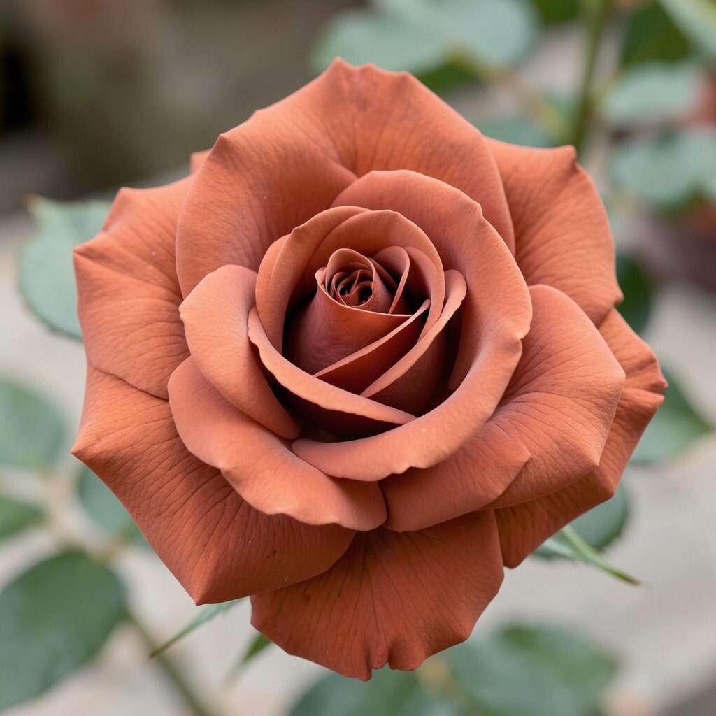
Terracotta rose has a warm pink-brown tone that feels rich, soft, and welcoming. It brings a gentle glow to walls and works nicely with cream, rust, and natural wood. This color is a good fit for bedrooms, sitting rooms, and even creative spaces where you want comfort with a bit of flair.
Its charm comes from the mix of earthy and romantic notes, which makes it feel fresh instead of overly sweet. Since it has depth, it can make a room feel finished even with simple furniture, and that can help you spend less on decor. For a personal touch, pair it with woven baskets or soft green accents to bring out its natural side.
8. Crisp White

Crisp white gives a room a clean, bright look that makes walls feel open and fresh. It reflects light very well, which is helpful in small rooms or spaces with dark floors. White also makes artwork, wood furniture, and colorful pillows stand out clearly.
This shade stays popular because it is easy to live with and works in nearly every style. It can also be one of the most affordable ways to refresh a room, especially if you want a simple backdrop instead of a full color story. To keep it from feeling cold, add warm textures like knit blankets, linen curtains, and a soft rug.
When you choose white, pay attention to the undertone so the room does not feel too blue or too yellow. A warmer white can feel cozy, while a cooler one can feel sharp and modern. That small choice can make a big difference in how the room looks with your furniture.
9. Olive Green

Olive green gives a room a deep, natural feel that looks calm and confident. It works especially well with leather chairs, aged brass, and wood grain because the mix feels rich and steady. Many people like it for studies, dining rooms, and bedrooms since it feels restful without being plain.
The color has a strong personality, which makes it a nice pick if you want something more memorable than basic neutral paint. It often pairs with current earthy decor trends, so it can make a room feel up to date. If you want to keep the cost low, paint just one wall or try it on cabinets before committing to every wall.
Olive can look different depending on the light, sometimes leaning more green and sometimes more brown. That shifting look gives it a lived-in charm that feels unique. Add pale cream bedding or a sandy rug to soften the room and make the color feel balanced.
10. Peach Blush
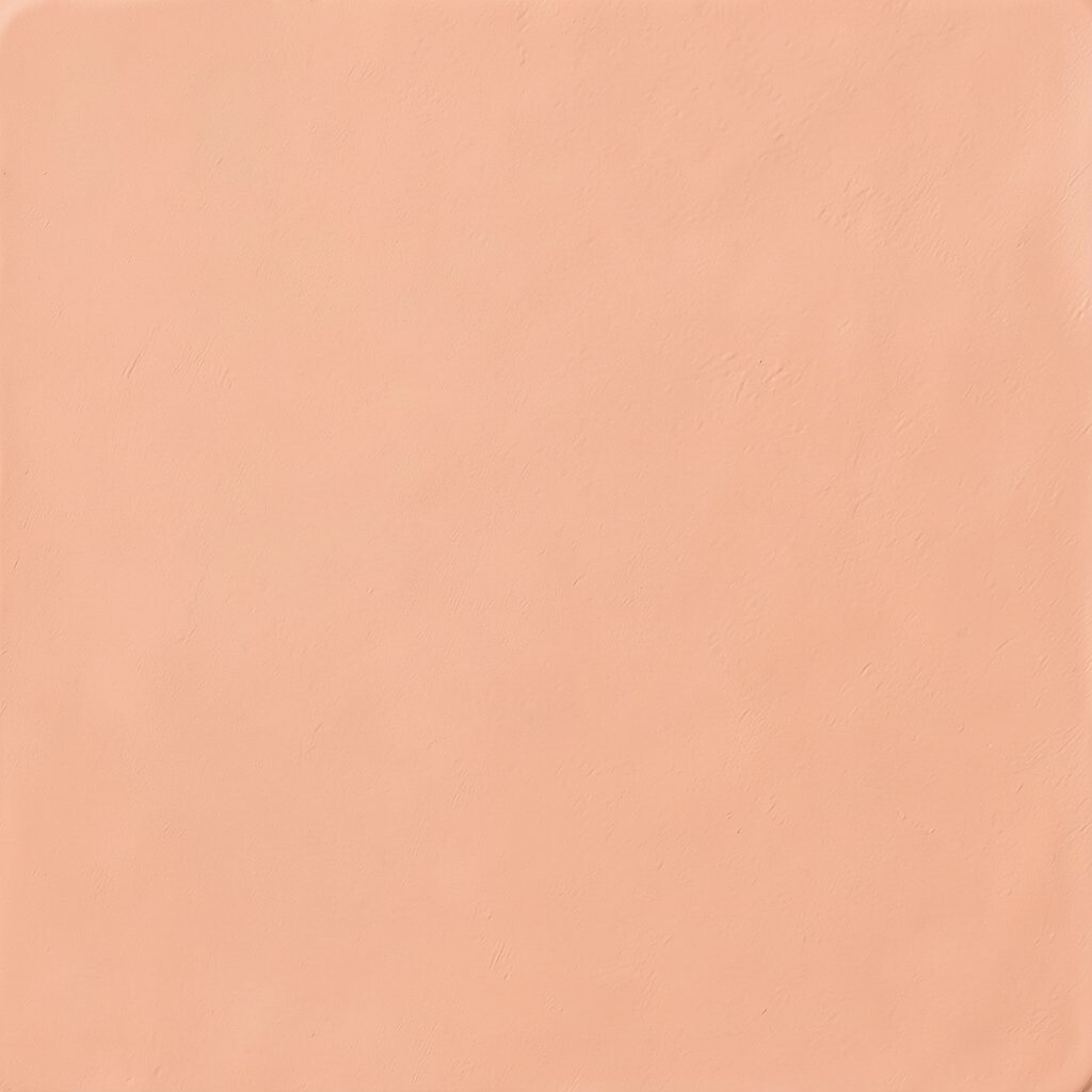
Peach blush adds a soft, happy glow that feels warm and friendly. It can make a room seem sunny even on cloudy days, and it pairs nicely with white trim, light oak, and simple floral touches. This shade is lovely in nurseries, guest rooms, and cozy corners where you want a gentle mood.
It feels fresh because it sits between pink and orange, which gives it a little surprise without being too bold. Peach tones are showing up more in modern homes, especially when people want color that still feels soft. If you are watching your budget, use it with lighter bedding and simple art so the room feels complete without needing many extras.
11. Charcoal Gray

Charcoal gray brings a sleek, strong look that can make a room feel grounded and stylish. It gives depth to walls and looks especially good with white, natural wood, and soft metallic accents. Many people use it in media rooms, bedrooms, and offices because it creates a focused, cozy mood.
This color has a modern edge, yet it still feels easy to live with when balanced well. Dark tones like charcoal can hide small marks better than lighter paint, which may save time and cleaning effort over the long run. To keep the room from feeling too heavy, add light curtains, mirrors, or a pale rug that opens up the space.
Charcoal also works well as an accent on trim, doors, or shelves if you want a sharper look without painting everything dark. It is a good choice when you want the room to feel more polished and less casual. A soft lamp glow can make the color feel rich instead of harsh.
12. Powder Pink
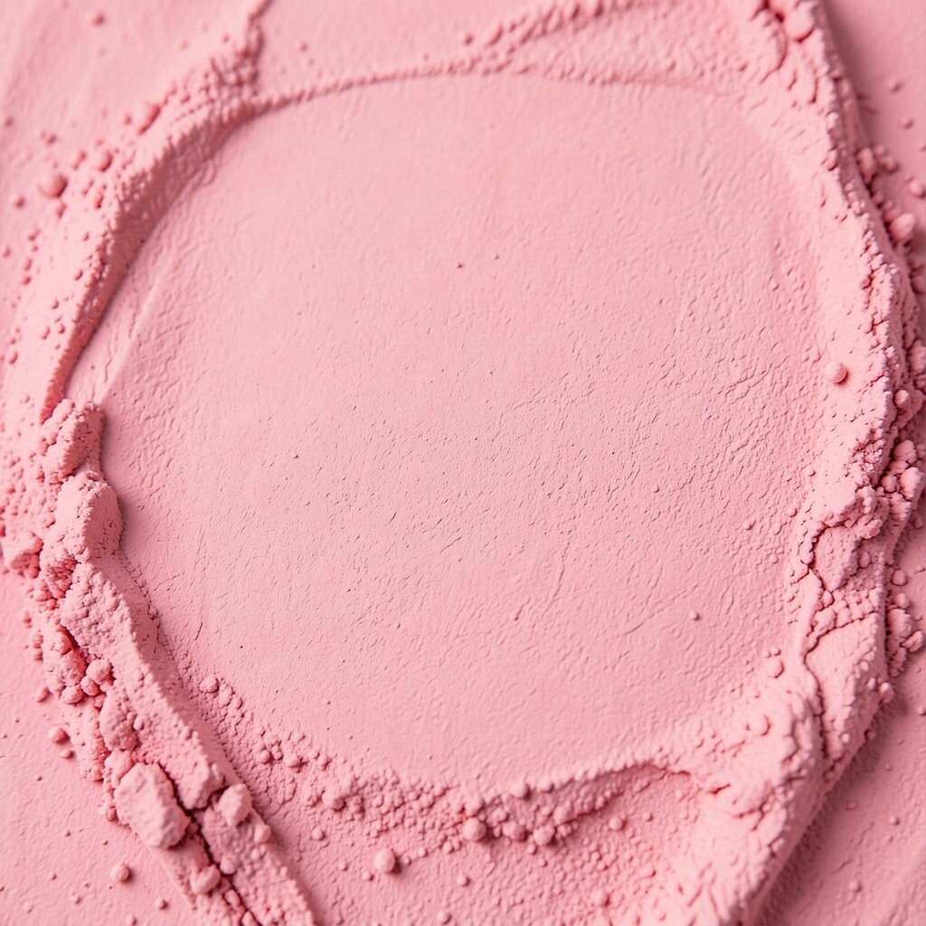
Powder pink gives walls a soft, airy charm that feels sweet but not childish. It works well with white furniture, pale gold details, and light gray fabrics, creating a calm and dreamy setting. This color is a lovely choice for bedrooms, craft rooms, or sitting areas where you want a gentle mood.
It stands out because it can feel both classic and modern, depending on what you place beside it. Powder pink is easy to style with thrifted decor, which can help keep the room makeover affordable. For a more personal feel, add framed photos, a velvet pillow, or a patterned lamp shade.
13. Forest Green

Forest green brings a deep, lush feeling that can make a room seem elegant and snug at the same time. It looks striking with cream, walnut, and brass, and it can give plain rooms a strong point of view. Many people choose it for libraries, dining rooms, and bedrooms because it feels steady and rich.
The color has a bold uniqueness that still feels natural, which is why it keeps showing up in stylish homes. Since it can make a big impression, you may only need a few changes to complete the look, which can help with cost. If you want a lighter touch, use forest green on lower walls, a bookshelf, or built-in cabinets instead of every wall.
It also works well in spaces with plants, since the shades blend in a pleasing way without looking too matchy. Warm lighting can make forest green feel cozy and inviting after sunset. That makes it a strong choice for rooms used in the evening.
14. Warm Taupe

Warm taupe offers a soft, polished look that feels easy and elegant. It sits nicely between brown and gray, so it works with many kinds of furniture and decor. This color is useful in living rooms, hallways, and bedrooms because it creates a calm base that does not shout for attention.
One of its best traits is flexibility, since you can dress it up with black frames or keep it relaxed with natural textures. Warm taupe is a smart paint choice when you want lasting style without paying for lots of new decor. To make the room feel personal, bring in family art, woven baskets, or a favorite colorful throw.
15. Sky Blue

Sky blue gives a room a fresh, open feeling that can make walls seem farther away. It is a great fit for bathrooms, laundry rooms, and small bedrooms because it brings lightness and air. This shade looks especially nice with white tile, silver fixtures, and pale wood pieces.
People often love sky blue because it feels happy and restful at the same time. It is also a good match for simple, budget-friendly decor, since the color itself does much of the style work. For a more current look, mix it with soft clay, woven baskets, or clean-lined furniture.
Sky blue can feel playful in a child’s room and calm in a grown-up space, which makes it very versatile. If you want a little more depth, choose a version with a hint of gray. That small twist can give the color a more tailored, modern finish.
16. Rich Plum

Rich plum brings a deep, cozy feeling with a hint of drama. It looks beautiful with cream, gold, and dark wood, giving a room a jewel-box look that feels special. This shade works well in dining rooms, bedrooms, and powder rooms where you want color that feels bold but still polished.
Its uniqueness makes it stand out from more common wall colors, and that can give a room a memorable style. Plum is often best used with simple decor, which can help keep the total cost lower while still making the room feel finished. If you want the color to feel softer, use light bedding or pale curtains to keep the room balanced.
At night, plum can feel rich and velvety, which makes the room look extra inviting. In daylight, it may show more of its purple side, giving the space a lively change. That shifting look can be a fun part of the design.
17. Sand Beige

Sand beige gives a room a warm, breezy feel that reminds many people of quiet beaches and soft light. It works with almost any style, from simple farmhouse to clean modern rooms, and it never feels too busy. Because it is so easy on the eyes, it is a nice choice for large spaces and rooms with lots of furniture.
This shade is still a favorite because it is easy to decorate around and easy to keep looking good over time. It can be a cost-friendly option if you want to reuse the items you already own, since so many colors work with it. To make it feel less plain, mix in texture through baskets, woven shades, or a chunky throw blanket.
18. Aqua Mist
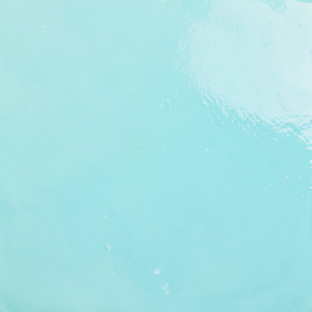
Aqua mist has a cool, watery look that feels fresh and light. It can make bathrooms, laundry rooms, and sunrooms feel more cheerful without becoming too bright. The shade pairs well with white tile, chrome details, and pale wood for a clean finish.
It feels unique because it brings both blue and green notes into the room, which gives it a soft, easy charm. Aqua shades are getting more attention in current design because they feel refreshing and modern. If you want to keep spending low, use it in a smaller space where a little paint goes a long way.
Try adding coral art or sandy beige towels if you want the color to pop a little more. Those small touches can make the room feel personal without needing a big makeover. The result is light, easy, and full of character.
19. Mocha Brown
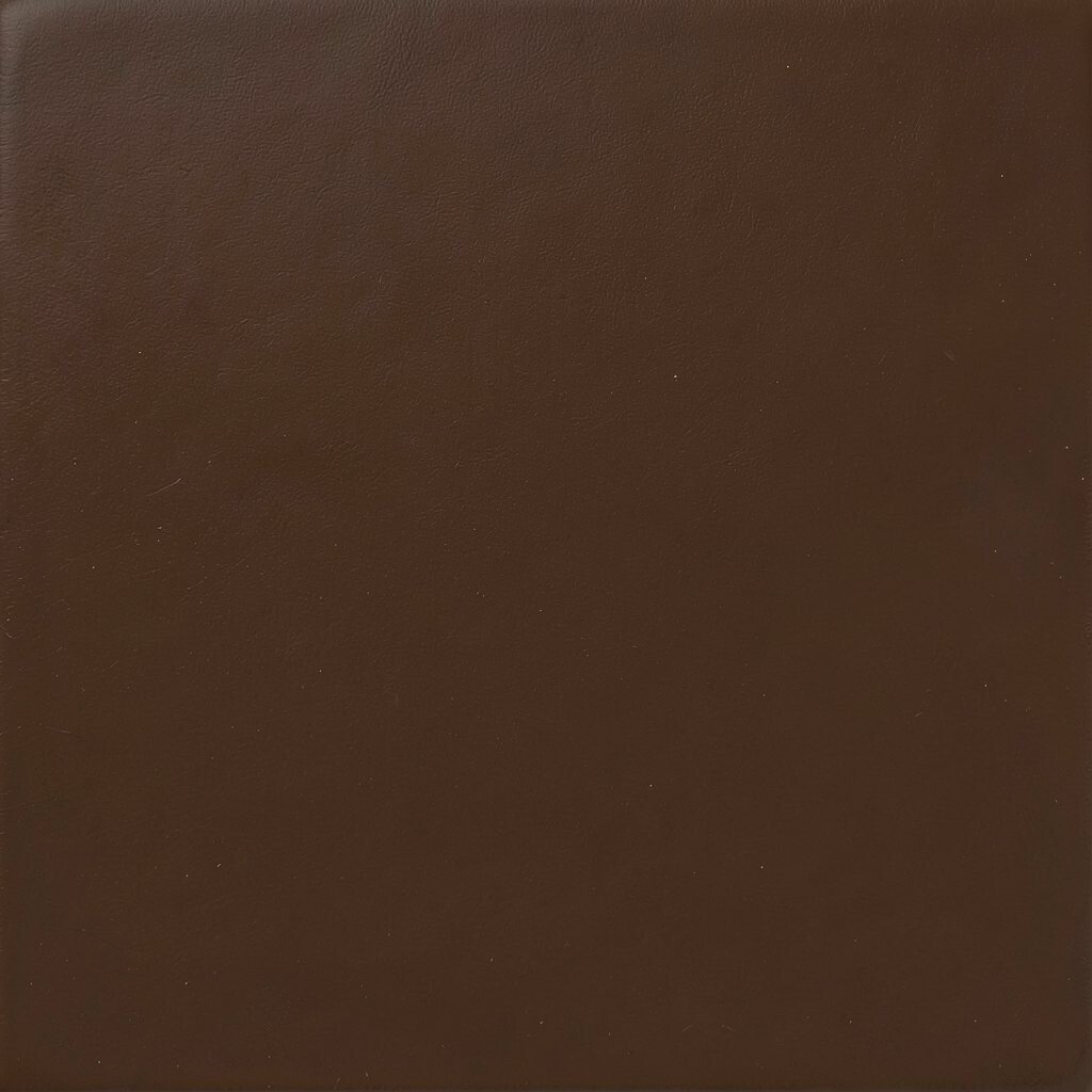
Mocha brown gives a room a warm, cozy, and slightly luxurious feel. It looks rich with cream, olive, or gold details and can make a space feel settled and inviting. This shade works well in dens, bedrooms, and living rooms where comfort matters most.
Mocha has a strong sense of style, yet it still feels easy to live with because it connects so well with nature-inspired decor. It can also hide scuffs better than lighter colors, which may help lower upkeep over time. If you want a more personal look, add family photos, textured pillows, or a vintage lamp to bring out its warm side.
In larger rooms, mocha can create a grounded mood that feels elegant instead of heavy. In smaller rooms, it may feel best when paired with light trim and bright accents. That balance helps the color feel cozy while still leaving the space open.
20. Soft Lavender

Soft lavender adds a gentle, dreamy feeling that can make a room feel calm and a little magical. It looks lovely with white, silver, and pale wood, and it brings a sweet glow without feeling too bright. This color is a good fit for bedrooms, reading spaces, and creative corners where you want a relaxed mood.
Its charm comes from being unusual enough to feel special while still staying soft and easy to use. Lavender can be a smart way to bring in color without needing many extra decor pieces, which can help with cost. For a style that feels current, pair it with clean lines, simple art, and a few natural textures.
Soft lavender can change with the light, sometimes looking cooler and sometimes warmer, which makes it feel full of life. If you want it to feel more grown-up, add deeper purple accents or a charcoal chair. If you want it softer, keep everything else pale and airy so the wall color stays in the spotlight.