
The right soft colors can make a home feel like a warm hug. Small changes can turn everyday routines into something quietly magical.
1. Blush Walls With Sunny Undertones
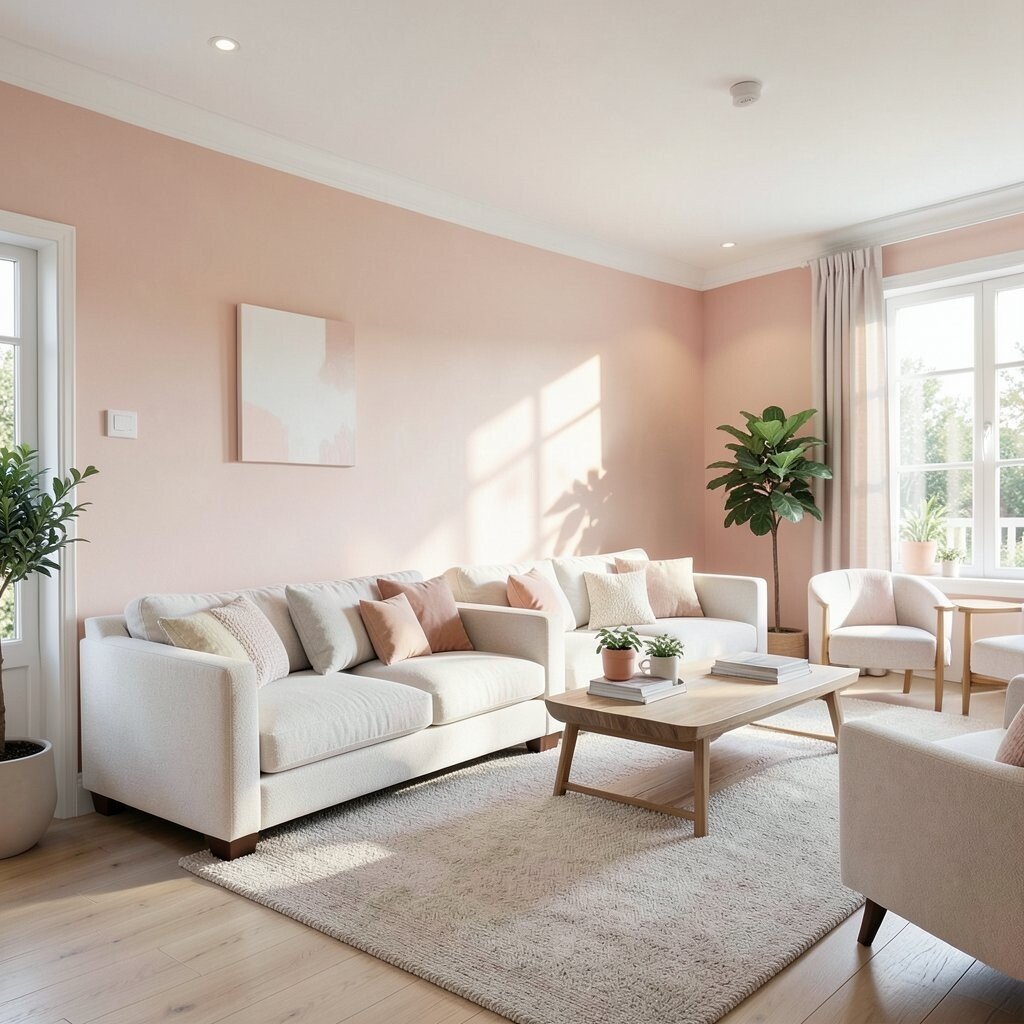
Picture a living room where walls look like a gentle peachy cloud. When daylight hits, the space feels brighter without feeling harsh. Choosing blush with warm undertones keeps the room cozy, and it also makes furniture colors look richer. You get an inviting vibe that works for both calm evenings and busy mornings.
Start by testing samples on two walls at different times of day, since the light changes everything. Pair blush walls with creamy whites on trim and shelves so the look stays clean. Add pastel art in frames you love, and use one deeper accent like terracotta pillows to keep it grounded.
2. Powder-Blue Reading Nooks
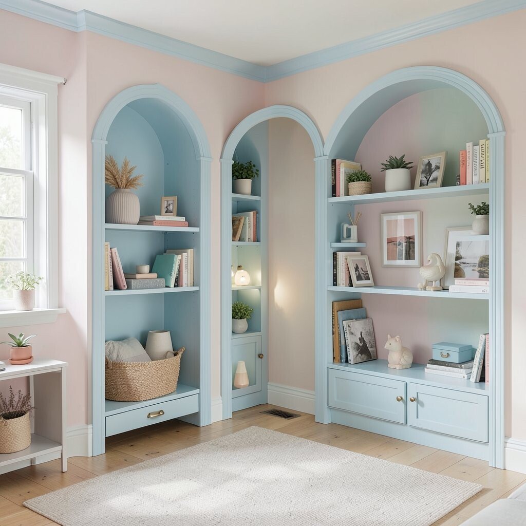
Imagine slipping into a corner that feels made for slow mornings, with powder-blue tones and soft textures. A built-in bench or a snug chair can turn plain space into a favorite retreat.
Pick a pastel fabric that resists stains if you can, because reading nooks get daily use. Warm lighting is key, so choose a lamp with a dimmer for late-day comfort and fewer glare spots. Add a small bookshelf nearby so your go-to books stay within reach. Finish with a tiny throw blanket in a complementary pastel so the nook feels personal.
To keep costs friendly, search for a secondhand chair and repaint it in a matching blue shade. Budget for a cushion refresh first, since it changes the comfort fast. If built-ins are too pricey, use a freestanding bookcase and a decorative wall mirror to mimic the same cozy feeling.
3. Minty Green Kitchen Details
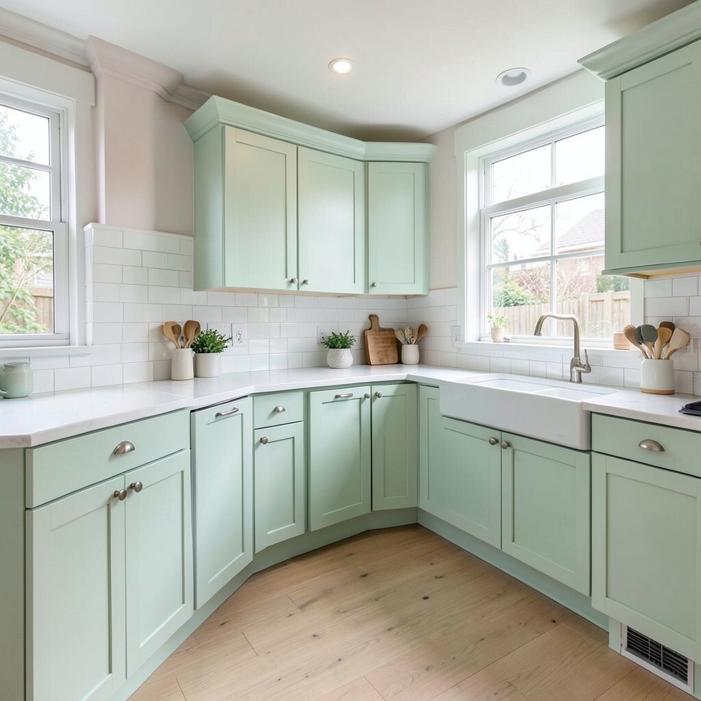
Your kitchen can feel fresh and calm when mint shows up in the right places. Think of mint cabinet fronts, drawer pulls, or even just a backsplash that looks like cool spearmint. Soft green tones can make the whole area feel cleaner and more cheerful. They also pair well with wood and neutral countertops.
Consider painting only the lower cabinets in mint while keeping upper cabinets creamy white. If painting feels like a big job, swap hardware for polished or matte pastel-friendly finishes. Add a mint dish towel set and a matching canister on the counter for small but steady color hits. Keep the rest simple so the mint remains the star.
For personalization, choose a mint shade that matches your favorite sweater or the pastel color in your kitchen art. Current trend makers love mixing soft greens with warm brass and natural wood, so you’ll look right on time. If you’re on a tighter budget, start with peel-and-stick backsplash panels in mint tones, and upgrade later if you want real tile.
4. Lavender Linen Textiles
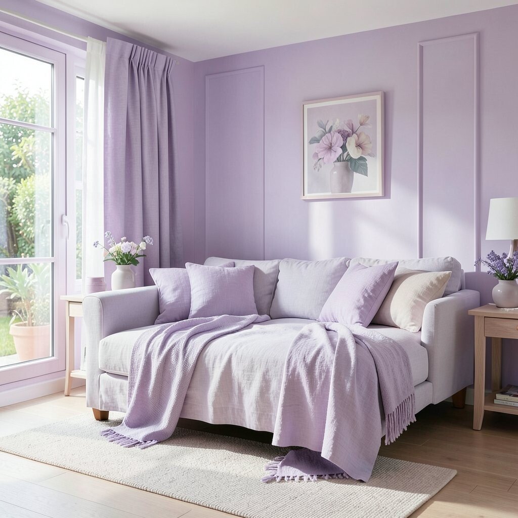
Close your eyes for a second and picture sheets that feel like a soft morning sky. Lavender linen can bring a relaxed, dreamy mood to bedrooms and even guest spaces. This color also works beautifully with white walls and warm wood furniture.
Choose a breathable fabric like cotton or linen-blend so the room stays comfortable year-round. Layer pillowcases in lavender with a cream duvet cover for a gentle, not-too-loud look. Add one matching accent like a lavender bedside lamp shade to tie the story together. If you prefer low effort, shop for pillow covers first, since they’re easy to swap when your tastes change.
5. Coral Accent Walls in Small Spots
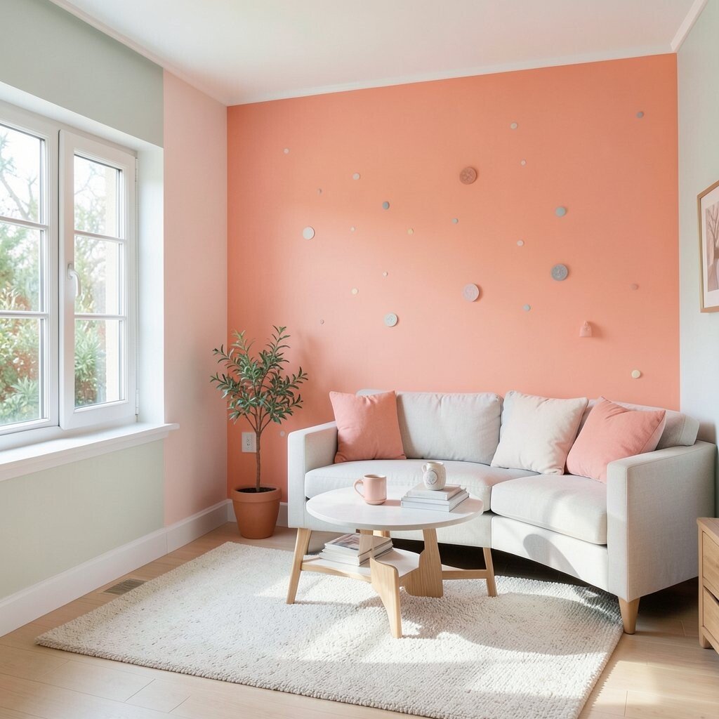
Coral doesn’t have to be bold to feel fun, especially when it’s used like a highlight. A small accent wall behind a dining chair or a hallway console can add personality fast. When coral meets soft neutrals, it creates a friendly glow that feels welcoming.
Try painting one wall section, like half-height wainscoting, and leave the rest in warm white. Balance the coral with pastel pink or peach decor so nothing feels random. Add a few natural textures such as a woven basket or a light wood frame to soften the look.
If you want to control cost, use removable wallpaper in coral tones as a low-risk first step. For personalization, pick a coral shade that leans more peachy or more rosy based on the mood you want. Pair it with simple brass hardware so the whole space looks polished without heavy spending.
6. Peach-Tinted Light Fixtures

The quickest way to change the mood of a room is often the light itself. Peach-tinted shades can make evenings feel softer and more flattering. When you add warm, indirect glow, pastel colors look richer and skin tones look natural.
Choose a pendant or table lamp with a fabric shade that diffuses light, instead of a harsh bare bulb. Match the fixture finish to other metals in the room, like brushed nickel or warm brass. Place one in a reading corner or near a sofa so you get cozy pockets of light throughout the day. If you rent, consider a clamp lamp with an easy-to-install shade instead of changing wiring.
7. Pastel Gallery Walls With Color Stories
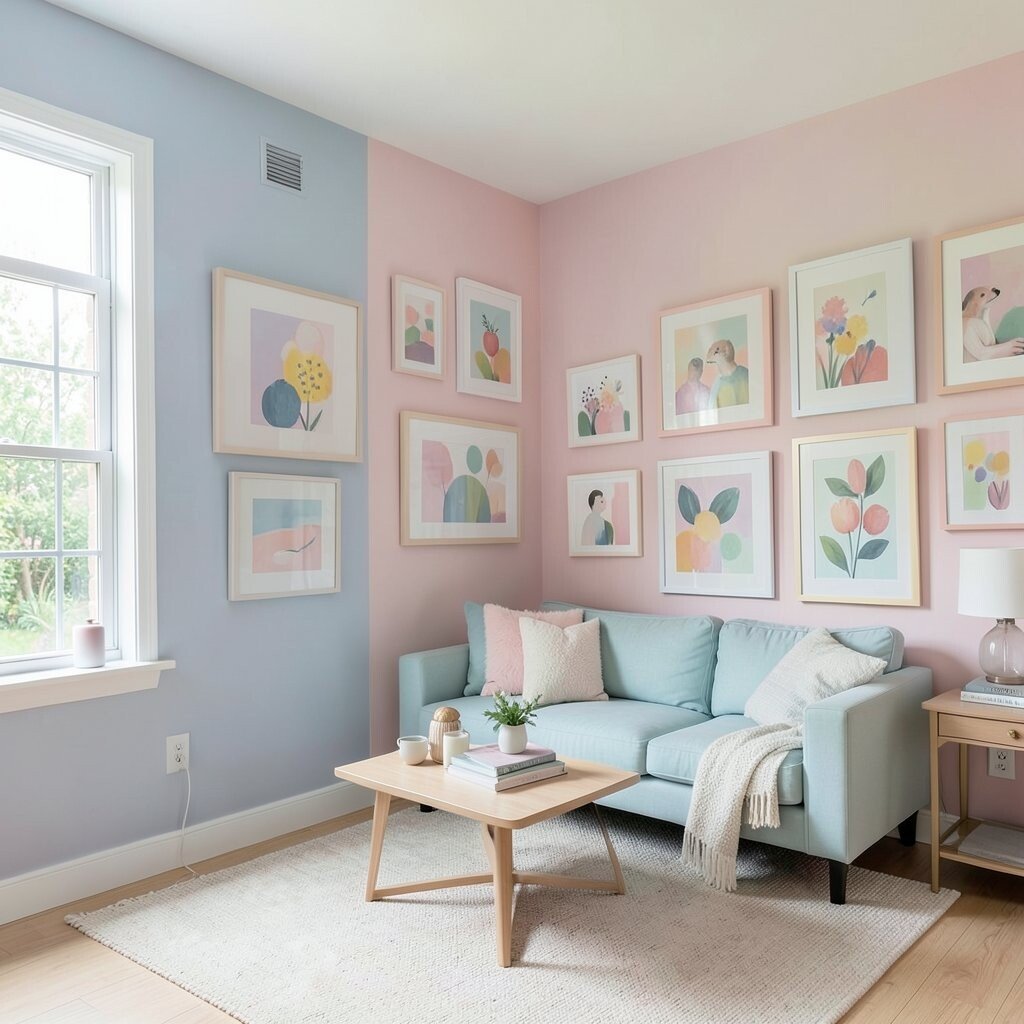
A pastel gallery wall can turn blank space into a conversation starter. Imagine frames in pale blue, dusty rose, and mint, all arranged in a way that feels calm. This is a great option because it lets you mix styles while keeping one soft color theme. The best part is that you can build it over time, piece by piece.
Pick a main color you love and repeat it in several frames so the wall feels unified. Use a mix of sizes, but keep mat colors mostly white or cream for a clean look. Add one larger art piece as an anchor, then surround it with smaller prints. If you have family photos, choose frames that match the pastel palette for a sweet personal touch.
For budget-friendly setup, print your own art using pastel color settings and inexpensive frames from home stores. Current trends favor simple borders and gentle color grading, so your wall will feel modern. If you want extra uniqueness, include a small hand-drawn piece or a postcard from a place that matters to you. Keep the wall at eye level and use painter’s tape to plan the layout before you hang anything.
8. Soft-Tone Bathroom Tiles and Towels
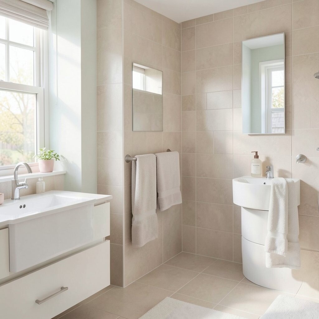
Your bathroom can feel like a mini spa when the palette is soft and airy. Think pale blush tiles in a shower niche or calming sky-blue towels stacked like clouds. Pastel bathrooms look fresh, and they also help the space feel cleaner between deep cleans.
Instead of redoing the whole bathroom, consider adding a pastel tile-look backsplash on one wall panel. Swap towels first, since new texture and color changes the room right away. Add a matching bath mat and a soap dispenser in a similar tone to make everything feel coordinated.
For practical tips, choose mildew-resistant fabrics and wipe surfaces regularly so pastel tones stay bright. If you’re renovating, look at matte finishes because they hide water spots better than shiny ones. For personalization, pick a pastel that makes you feel calm, like lavender before bedtime or mint in the morning. Keep the rest neutral with warm white grout or light stone so the bathroom stays timeless.
9. Cozy Blended Flooring With Warm Neutrals

Flooring sets the base mood of your home, so pastel style shines most on warm neutral foundations. Visualize light wood floors with soft gray-beige rugs in pale pink or dusty blue patterns. When the floor feels cozy, your furniture and wall colors can breathe without feeling crowded. This balance makes rooms feel both gentle and practical.
Choose a rug that has pastel accents rather than full-on color floods. That way, you get the dreamy look while hiding everyday messes better. For rentals or smaller budgets, focus on runner rugs and layered mats in a soft palette. Vacuum and rotate rugs to keep the fibers looking even and fresh.
To personalize, match your rug tones to your favorite pillows or your kitchen accessories. A current trend is layering rugs with slightly different pastels, like pale blue on top of cream, for a soft, artistic feel. If you’re investing in new flooring, ask about durability and stain resistance so the pastel vibe lasts longer. Even minor updates like adding underlay for comfort can make the whole home feel better underfoot.
10. Pastel Closet Organization That Hides Clutter

A peaceful home looks calm because clutter is under control, not because everything is perfect. Pastel closet organization can feel pretty and still be super practical. Imagine bins in soft colors, matching hangers, and drawers labeled by memory rather than mess.
Start by sorting clothes into groups you actually wear, then choose storage that fits your routine. Use a mix of clear and opaque bins so you can see essentials without staring at everything. Add a pastel liner in one drawer or a subtle pastel sticker on the back panel to bring in the dream-home look.
For cost considerations, buy storage items gradually and prioritize what you use most. If you want uniqueness, paint or wrap one shelf panel in your favorite pastel shade, then keep the rest neutral. Many people now like “soft color systems,” where containers match a palette instead of a random assortment. It makes the closet feel designed, and it reduces decision fatigue when getting dressed.
11. Dreamy Window Treatments in Soft Hues
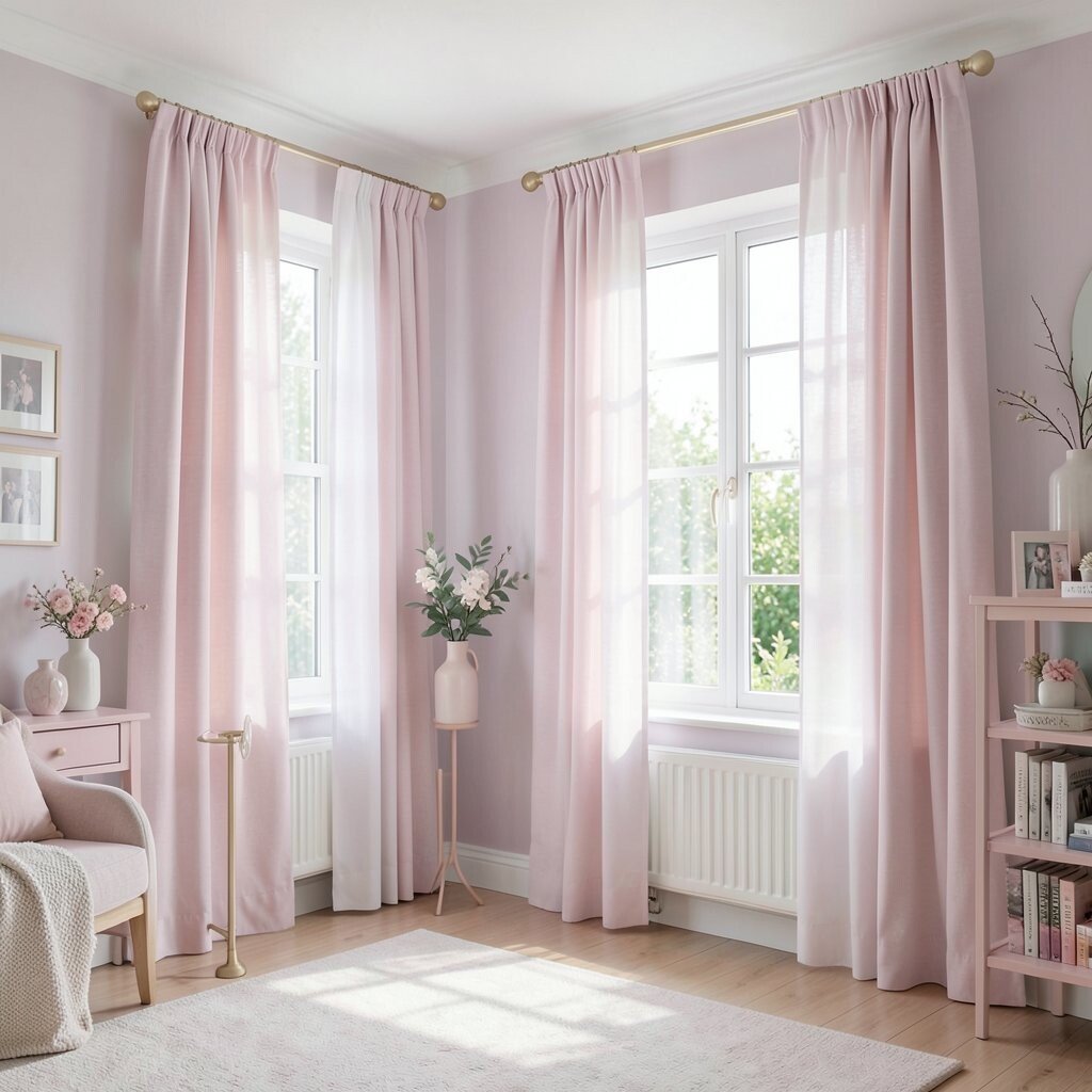
Windows are like picture frames for your rooms, and pastel drapes can change the whole scene. Imagine sheers in pale peach floating in daylight, with thicker curtains that look like warm clouds at night. Soft window treatments also help rooms feel calmer because they reduce glare and soften shadows. You’ll notice the difference in comfort quickly.
Choose light-filtering fabrics for daytime softness and full coverage curtains for evening privacy. Keep hardware simple and finish it to match your room metals for a polished look. If you like a breezy feel, go for layered sheers and add a pastel roller shade underneath for flexibility. Measure carefully and hang a bit higher than the window frame to make the room feel taller.
For personalization, match the curtain tone to the dominant color in your living room art or bedding. Current trends favor airy, slightly textured fabrics instead of shiny ones, so your windows will feel modern. To keep spending reasonable, search for one great pair of curtains and add inexpensive matching sheers. You can also use fabric panels as a curtain alternative if they’re the same width and hang nicely.
12. Pastel Outdoor Spaces With Lounge-Friendly Comfort
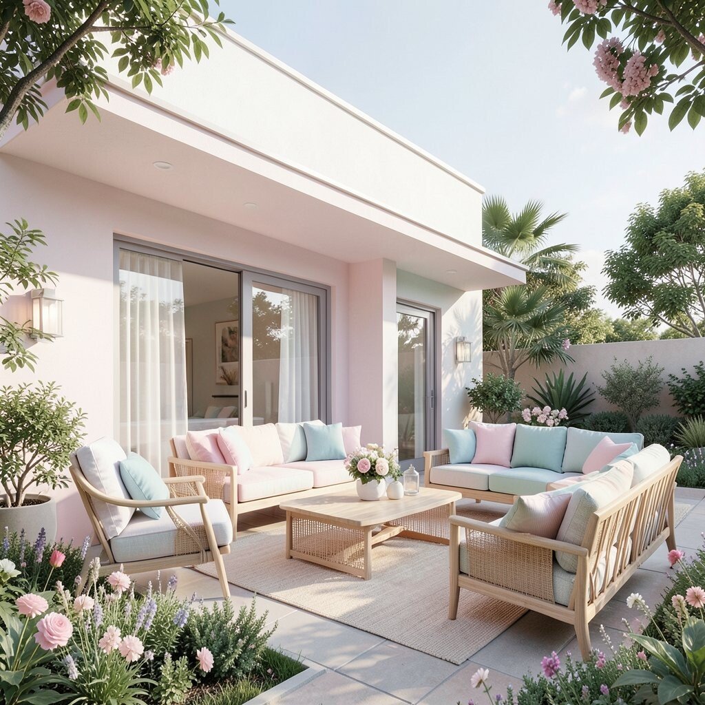
Your dream home isn’t only inside, and pastel colors look stunning outdoors. Picture a patio set with blush cushions, mint planters, and a pale lavender throw draped for lounging. Pastels make outdoor areas feel lighter, and they create a relaxing mood for slow dinners or weekend coffee. Even small balconies can feel like a getaway with the right details.
Choose weather-friendly fabrics and materials so the color stays pretty through sun and rain. Use outdoor planters in pastel shades or paint terracotta pots with a sealed finish. Add string lights with warm bulbs to make the evenings feel soft and inviting. For practical tips, group items by color so the space looks intentional instead of scattered.
If you want uniqueness, mix pastel textures like woven wicker, smooth painted wood, and a gently patterned outdoor rug. Current trends often blend pastel accents with natural greenery, so add easy-care plants like herbs or hardy succulents. For cost, start with one or two big upgrades like cushions and planters, then grow the setup over time. If you’re limited on space, use vertical plant holders and wall-mounted hooks to keep the lounge area open and comfy.