There is something electric about a wall that feels alive with color. Good graffiti ideas start small, then grow into a whole mood.
When you plan your marks the right way, the wall looks bold instead of messy. You can make it personal, keep it fun, and still make it look clean from far away.
1. Pick a Wall That Wants to Be Art
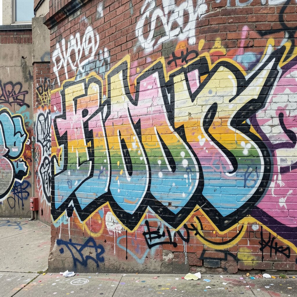
Choose a surface with a strong texture and enough space for your main piece. A smooth wall can look sharp, but a lightly rough wall can hold spray patterns in a nicer way.
Stand back and look at how light hits the area during the day. If the spot is bright and visible, your colors will pop more, and people will notice your work from farther away.
Check for damage like cracks, peeling paint, or stains that could bleed through. Cleaning and patching first saves time later, and it keeps your design looking crisp from start to finish.
2. Set a Clear Theme Before You Spray
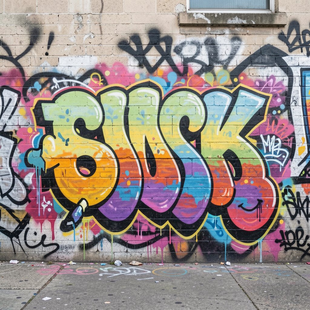
Pick one theme so every tag, character, or symbol feels like it belongs. It can be street culture, nature shapes, a favorite game style, or a dreamlike night city.
When you stay on theme, your wall looks planned instead of random. That planning helps the viewer understand your mood right away.
Try matching your colors to the theme, like warm sunset oranges for city energy or cool greens for nature energy. This also helps you choose fewer colors, which cuts cost and makes mixing easier.
3. Create a Simple Sketch With Room to Move
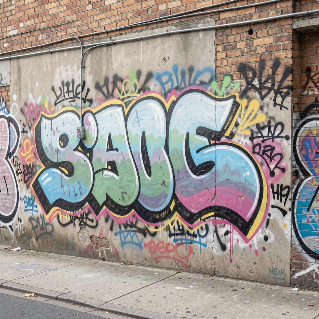
Make a quick sketch using shapes instead of perfection. Big letters, rounded characters, and flowing lines are easier to place, and they look lively even when you change details on the wall.
Use a few guiding lines to map where your biggest element will go. Then add smaller accents around it so the empty space feels intentional, not blank.
Keep your sketch flexible because graffiti evolves while you work. Changing a curve or enlarging a character often makes the piece feel more unique.
For practical results, take a photo of your sketch and keep it beside you while painting. It helps you remember your plan when you step back and check the balance.
4. Choose a Color Set That Looks Good Together
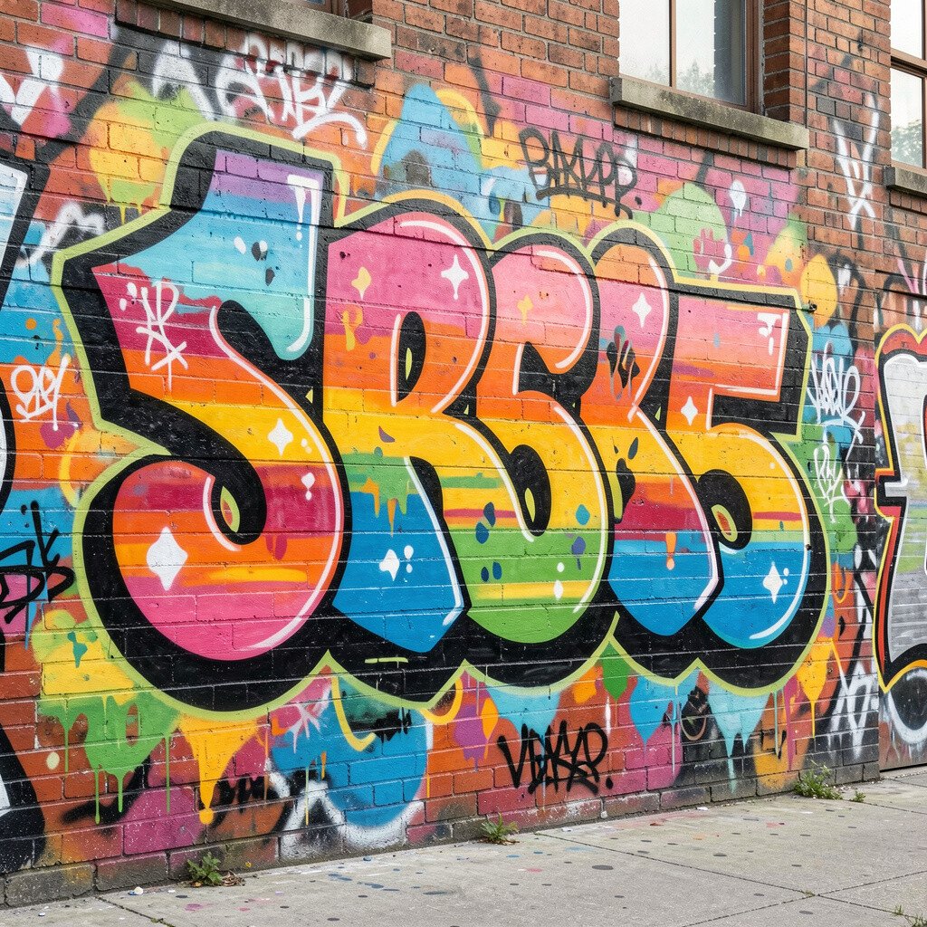
Start with a simple palette of a few main colors and one or two special accents. Bright colors can look amazing together, but too many shades can make the wall feel chaotic.
Try pairing one bold color with a contrasting one, then use a neutral like white or black to connect everything. Using a neutral helps your outlines look clean and keeps your highlights popping.
Current street style often leans into high-contrast outlines and smooth gradients. If you like that look, pick colors that blend well, such as blues into purples or reds into pinks.
Before you commit, test colors on a scrap surface. You will learn quickly what the spray does, and you will avoid surprises on the final wall.
5. Use Strong Outlines for Instant Readability
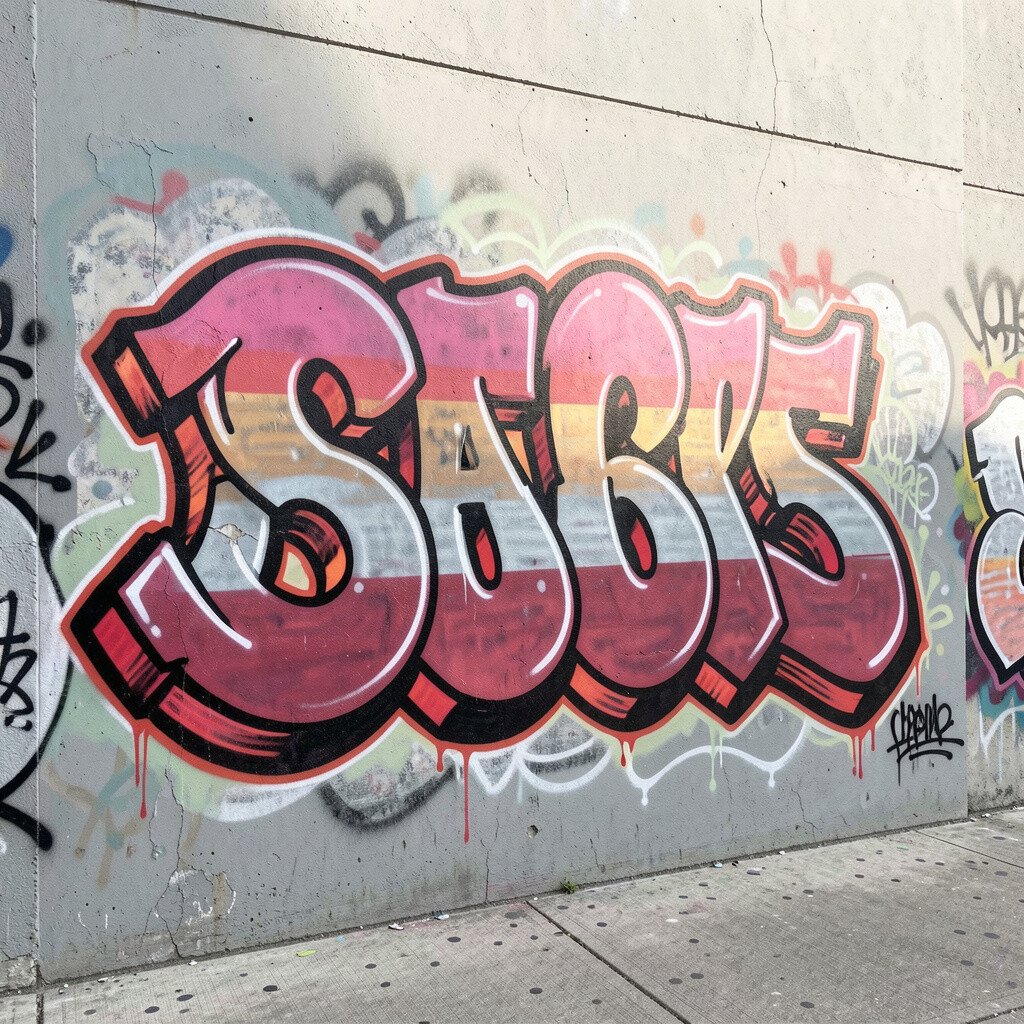
Outlines make your graffiti easy to read from far away, even if the fill details are simple. A thick outline can give your letters weight, while a thin outline can make them feel sharp and fast.
Pick one outline color that matches your theme, like black for bold contrast or a darker shade of your fill color for a smooth look. Consistent outlining also makes your whole wall feel unified.
If you want a modern vibe, try layered outlines where a lighter color sits just inside the darker one. That trick makes the letters look more dimensional.
6. Practice Your Lettering With Bold, Friendly Shapes
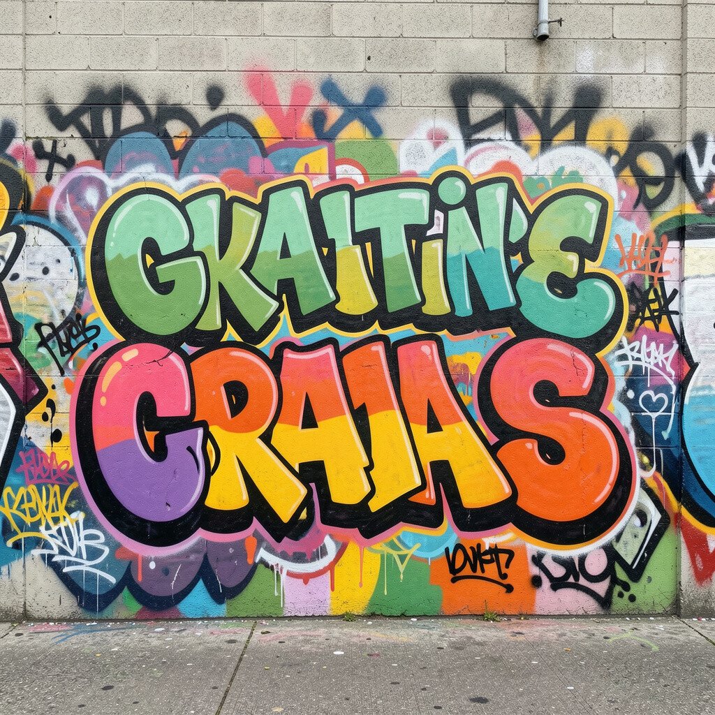
Make letters you feel confident drawing, then build from there. Bubble letters can look playful and welcoming, while block letters feel sturdy and strong.
Practice on paper first and focus on spacing. When your letters keep even gaps, your graffiti looks more professional and easier to follow.
If you are new, keep your lines smooth and avoid tiny details right away. Big clean shapes are more forgiving, and they still look awesome on a wall.
7. Plan the Flow so the Wall Feels Like Motion
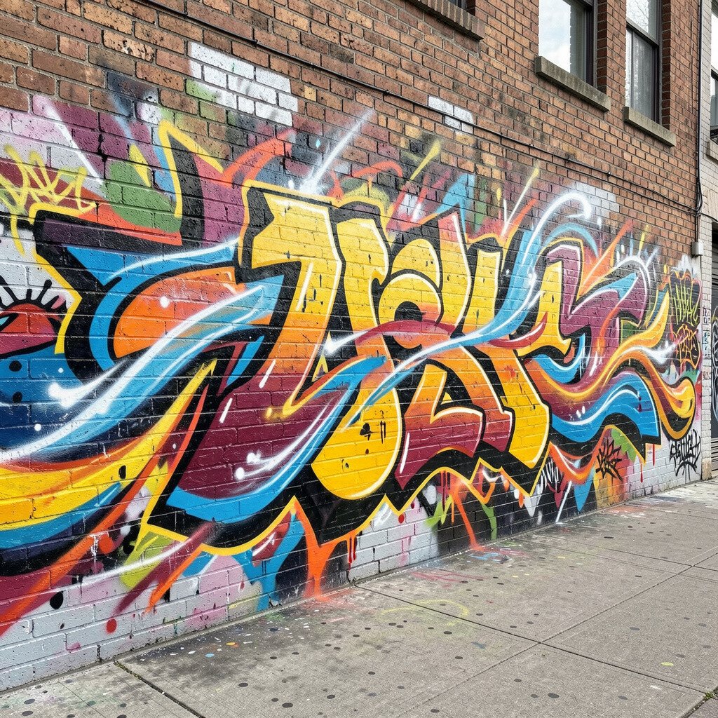
Look at the wall like it is a path, not a blank sheet. Think about how your lines can guide the eye from the biggest part to the smaller parts.
Use curves, arrows, or swooshes to show movement across the space. When the flow feels natural, your design looks alive instead of stuck in one spot.
Balance matters, so place heavy colors and big shapes on one side, then match them with smaller accents on the other. That simple trick helps the wall feel stable and visually pleasing.
As you paint, step back often and check if your eye keeps traveling. If it stops, adjust the next element so it pulls attention forward again.
8. Add Characters or Symbols for a Personal Signature
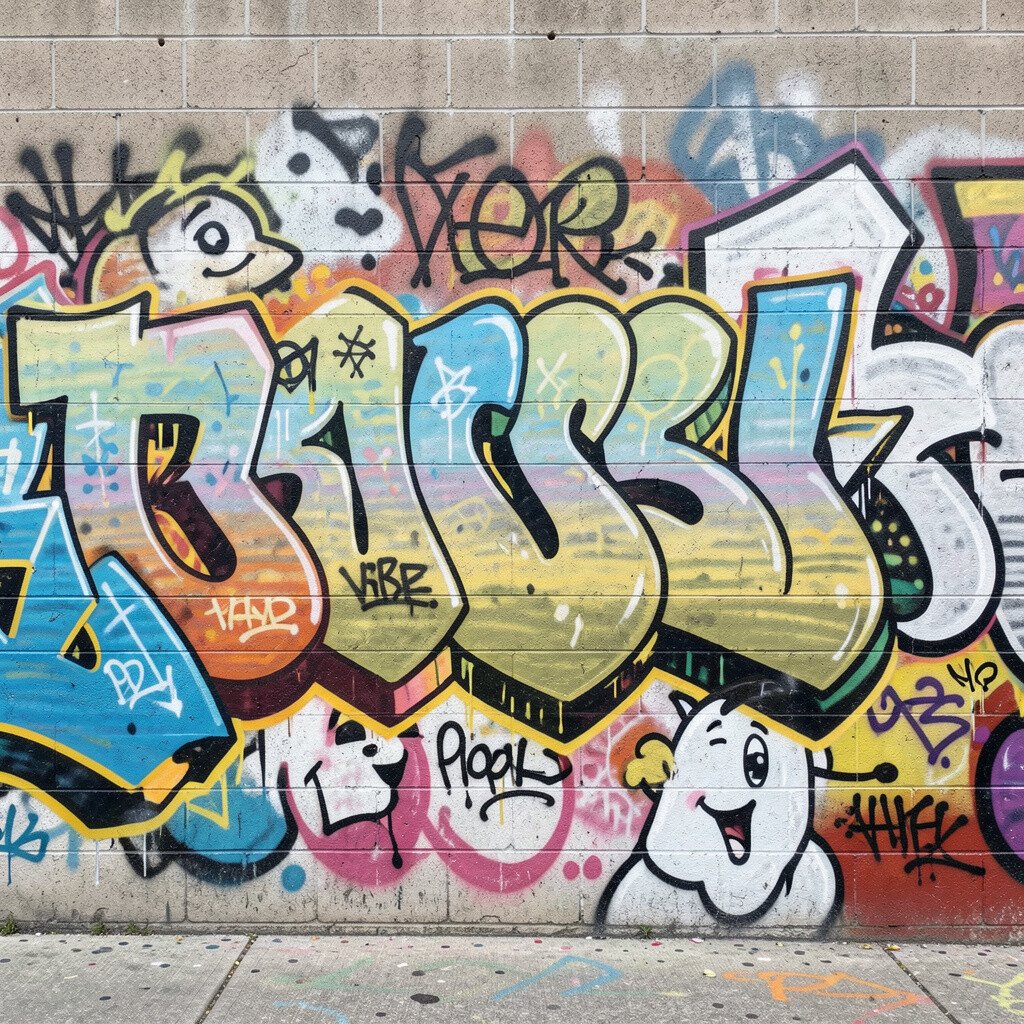
A character face, a mascot, a small animal, or even a simple symbol can make your graffiti feel like yours. Those pieces act like signatures that people remember.
Keep the character style consistent with your lettering, like matching rounded shapes or matching sharp angles. That consistency helps the whole wall look like one artwork, not separate doodles.
Consider adding a subtle inside detail that only you understand, like a tiny star, a heart pattern, or a hidden letter. Personal touches create uniqueness without making the design too busy.
9. Try Layering With Highlights and Shadows
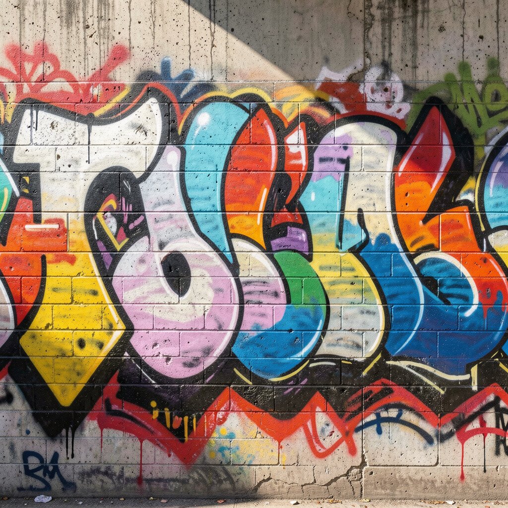
Layering turns flat colors into something that feels deeper and more vivid. Use a lighter shade for highlights and a darker shade for shadow areas so your piece looks three-dimensional.
Start with the base fill, then add shadows where you imagine light coming from one direction. It is easier than trying to shade every edge equally, and your wall will still look skilled.
For the easiest highlight effect, use white or a pale version of your fill color on the top edges. Small highlights go a long way and make curves look smooth.
10. Stay Safe, Work Clean, and Protect the Wall
Wear gloves and consider eye protection because spray can drift and surprise you. A mask also helps your lungs, especially in still air.
Cover nearby plants, furniture, or floors so overspray does not ruin anything. Cleaning up small spills quickly keeps the wall area ready for future sessions.
If you are painting on a legal or shared space, ask about rules for priming and finishing. Using the right primer and a clear sealant can help your work last longer and look brighter.
Ventilation matters, so work when air moves and avoid spraying in heavy wind. When you feel comfortable, your lines get steadier and the whole piece looks better.
11. Keep Costs Low by Using Smart Materials
You can make a great graffiti wall without buying every color imaginable. Choose a few reliable spray cans and add one or two specialty colors for accents.
Caps and nozzles affect style, so pick ones that match the look you want. A fine cap can help with details, while a wider cap can fill large areas faster.
Test your cans before the main wall, since some colors spray thicker or thinner. That saves you from wasted passes, and it helps you control the look.
If you share tools with friends, pooling paint and swapping caps can cut costs while building a fun teamwork vibe. It is also a great way to try new ideas without spending too much.
12. Personalize With Texture, Effects, and Community Energy
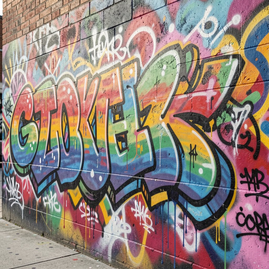
Texture makes graffiti feel more real, like you can almost touch the paint. You can create texture with stencil edges, drip effects, or quick scratch-like lines in the background.
Try a gradient behind your main piece so it frames everything without fighting for attention. Soft blends look clean and match current trends toward smoother, more polished murals.
Invite a friend to add a tag, a small character, or a color stripe that matches the theme. Collaboration adds uniqueness and turns your wall into something people feel part of.
When you personalize, include a small pattern you can repeat, like dots, chevrons, or tiny stars. Repeated details make the wall look intentional, and they help your artwork feel finished.
Take photos in different lighting so you can see how the piece changes during the day. It also gives you inspiration for your next wall because you will notice what worked and what you want to do better.