The room feels calmer when the walls look like soft weather. Sage green subway tiles can make even small spaces feel quietly dramatic.
From muted ceramics to slightly smoky finishes, these tiles add depth without shouting. Keep your palette cozy, your grout intentional, and your layout grounded.
1. Misty Sage With Soft Marbling
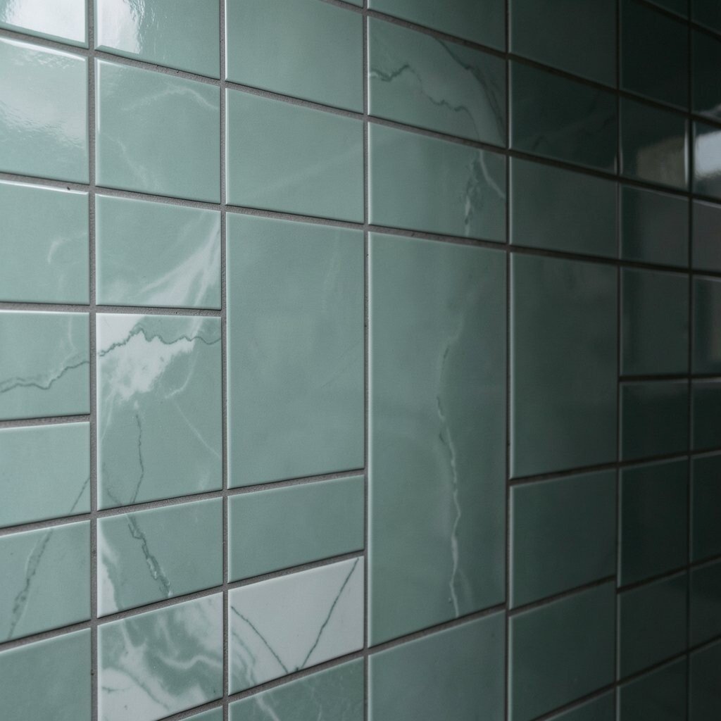
Imagine sliding your hand along a wall where the glaze looks like gentle fog. The surface catches light in small swirls, like marble that decided to be subtle.
These tiles bring a moody calm because the pattern is never too busy. They also work well in bathrooms, kitchens, and hallway nooks where you want warmth but not clutter.
To make the vibe feel intentional, choose a warm white or light gray grout that won’t erase the movement. Pair them with matte black fixtures or brushed brass to keep the look grounded.
2. Evergreen-Gray Sage With a Cool Sheen
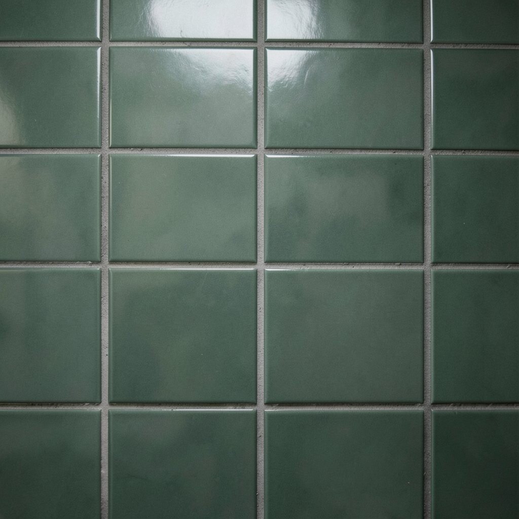
The color sits between pine and weathered stone, so it feels timeless and grown-up. You’ll notice a cool sheen that makes the wall look freshly lit.
Because the finish is smooth and slightly reflective, the tiles help bounce light around. That’s a practical win for kitchens with fewer windows or powder rooms that need a little lift.
Use slightly narrower grout lines for a cleaner, modern rhythm. Finish the counter area with darker wood or slate-colored surfaces so the sage feels richer, not washed out.
3. Smoked Sage With a Fluted Edge Texture
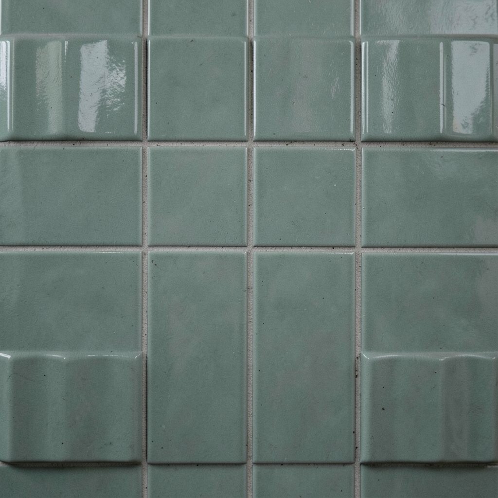
These tiles look like they have tiny folds, catching shadows instead of shine. Up close, the texture feels dimensional, even before the light hits it.
The benefit is that texture adds depth without changing the color. You get a moody look that still feels cozy because the wall isn’t flat and plain.
For a practical layout, keep the tile running at standard subway height and center it with a level line. If you’re doing backsplashes, consider matching the texture to hardware finishes so everything feels like one story.
To personalize, add a thin strip of coordinating mosaic in the same sage family along the top edge. It can give the backsplash a framed, gallery-style feel without making the room busy.
4. Deep Sage With a Hand-Painted Look
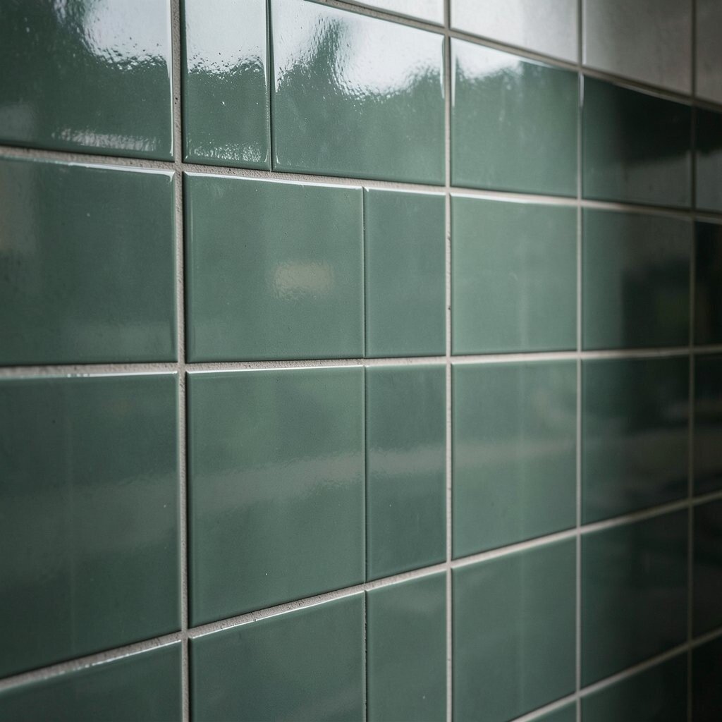
This style has visible brushwork that makes each tile feel one of a kind. The colors shift slightly, so the wall looks alive throughout the day.
Hand-painted details create uniqueness because the pattern won’t repeat perfectly. That makes the room feel special, even if you keep your design simple.
Choose a grout that is close to the tile’s mid-tone so the brush marks stay in view. If you’re installing above a stove, seal the tiles after setting to protect them from splashes and daily mess.
For cost planning, remember that hand-painted glazes often cost more per square foot. If you want a budget-friendly approach, use these tiles on a single feature wall or behind open shelving.
5. Vintage Sage With Speckled Glaze
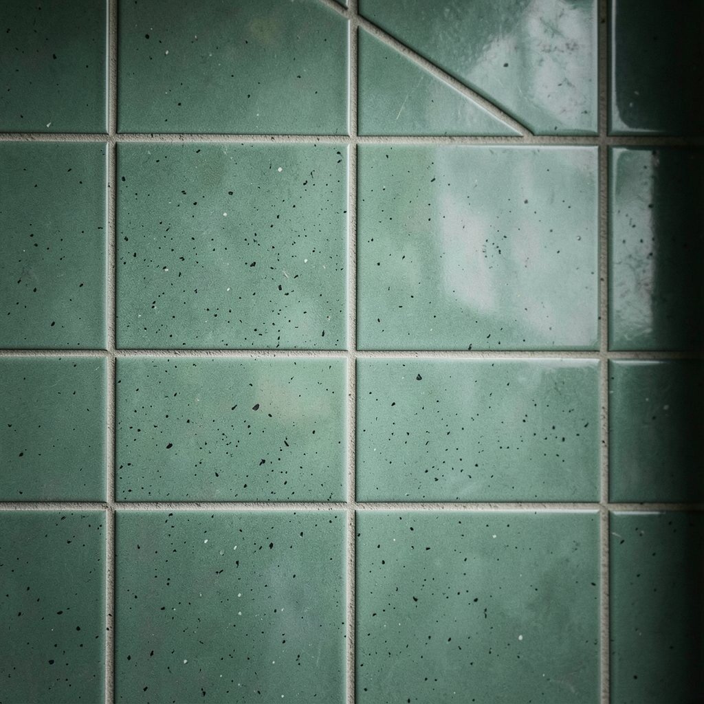
Picture a subway tile that looks sun-warmed and a little weathered. The tiny specks feel like old pottery, giving the wall a lived-in charm.
This kind of glaze adds visual texture without needing extra patterns. It also hides small chips or marks better than ultra-smooth finishes.
Keep the surrounding decor simple so the speckle can do its job. Matte cabinet hardware, natural wood cutting boards, and soft linen towels make the sage look even more inviting.
6. Sage Green With a Satin-Frost Finish
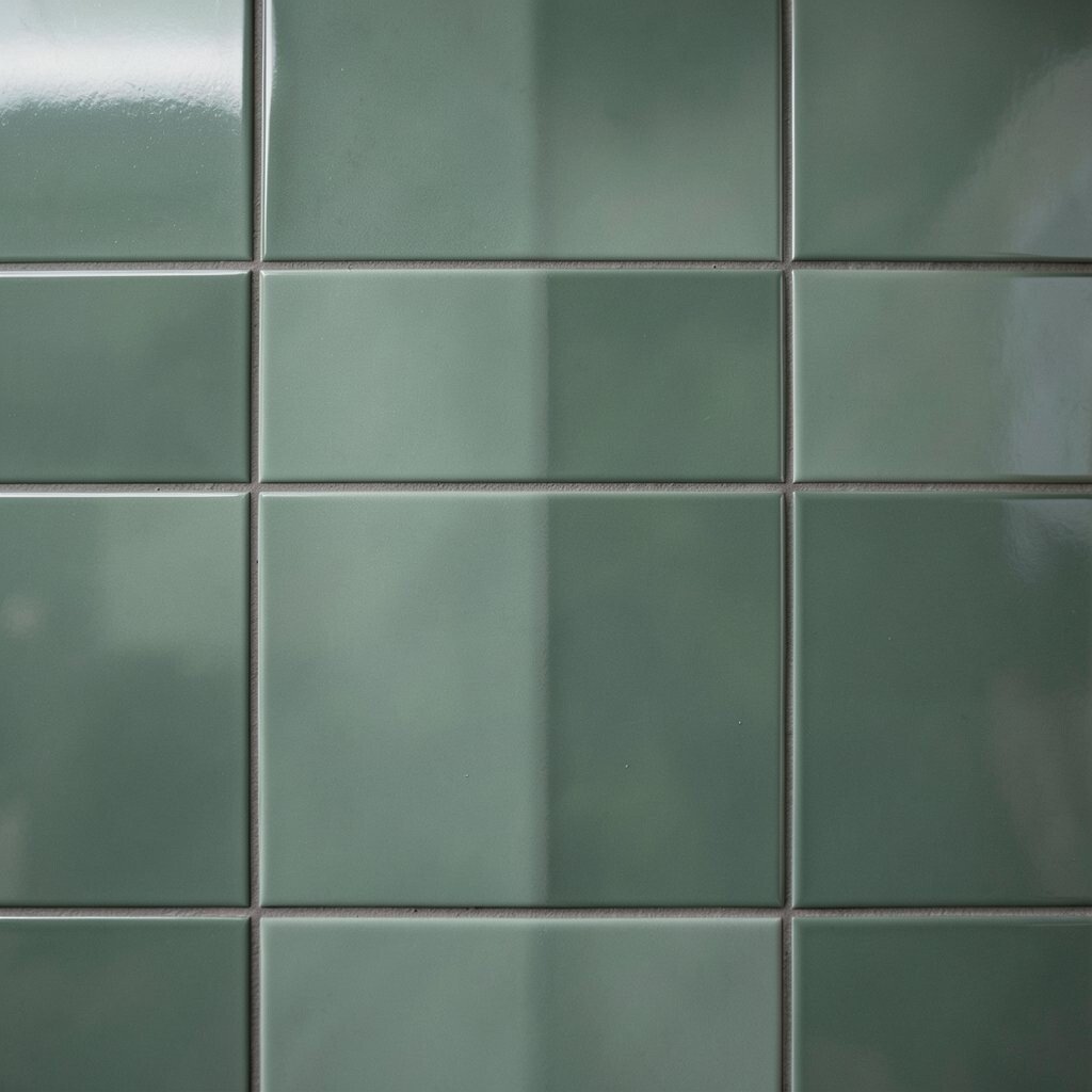
Instead of glossy shine, this tile wears a gentle satin layer that softens everything. The wall looks slightly blurred in the best way, like a favorite sweater.
That frost-like finish helps create a moody vibe because highlights are muted. It’s also practical since smudges and fingerprints show less than on high-gloss surfaces.
Pair it with creamy counters and deep charcoal accents for a contrast that feels modern. If you want extra warmth, choose a grout that leans beige instead of stark white.
7. Olive Sage With Warm Undertones
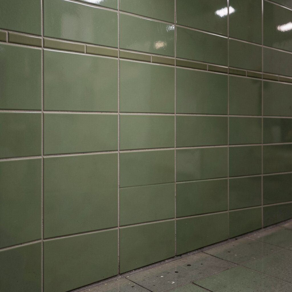
This shade leans toward olive, so it feels grounded and cozy. The wall looks like greenery after rain, rich but calm.
Warm undertones make sage feel welcoming, especially in kitchens with wood cabinets. They can also complement terracotta accessories without clashing.
Try a darker grout to deepen the shadows and make the subway layout look crisp. For a personalization touch, add a matching olive-toned tile inside a small niche or around a mirror.
Cost-wise, earthy tones are popular in many tile lines, so pricing can vary widely. If you’re comparing options, focus on thickness and finish quality first, then adjust shade to fit your budget.
8. Smoke-Tone Sage With Darker Edges
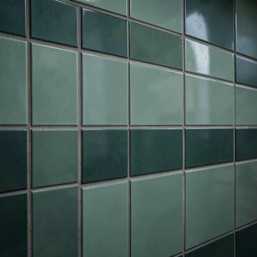
Some tiles have faint edge shading that creates a subtle frame around each brick. When the rows line up, the whole wall looks layered like stacked stone.
This edge effect creates uniqueness because it makes the subway pattern feel architectural. The slight variation also helps the wall stay interesting even when you’re not looking closely.
To keep it practical, maintain consistent installation alignment so the edge shadows line up nicely. Choose a grout color that won’t fight the darker edging, usually a medium gray works well.
9. Sage Green With Color-Body Consistency
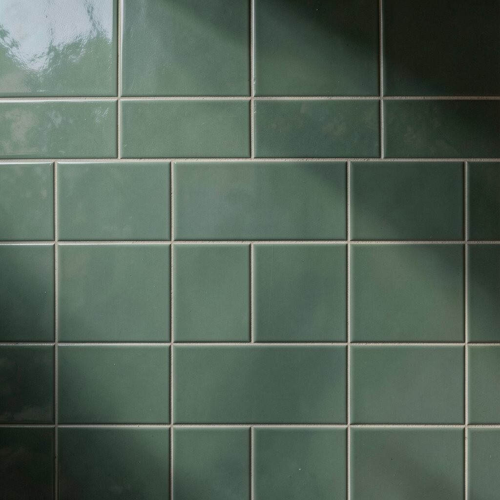
Here the color runs through the tile body, not just on the surface. Even if a chip happens, the shade still looks cohesive.
That’s a major benefit for real life, especially in high-use kitchens. It can also help your maintenance routine because scratches are less noticeable.
If you want a moody vibe without extra visual clutter, go with a clean, straight-laid subway pattern. Add soft lighting above the counter so the sage reads deep and even.
For personalization, consider mixing two lengths of subway tiles while keeping the same color family. It gives you a custom look while staying easy to plan and install.
10. Sage Green Matte Ceramic With Fine Ripples
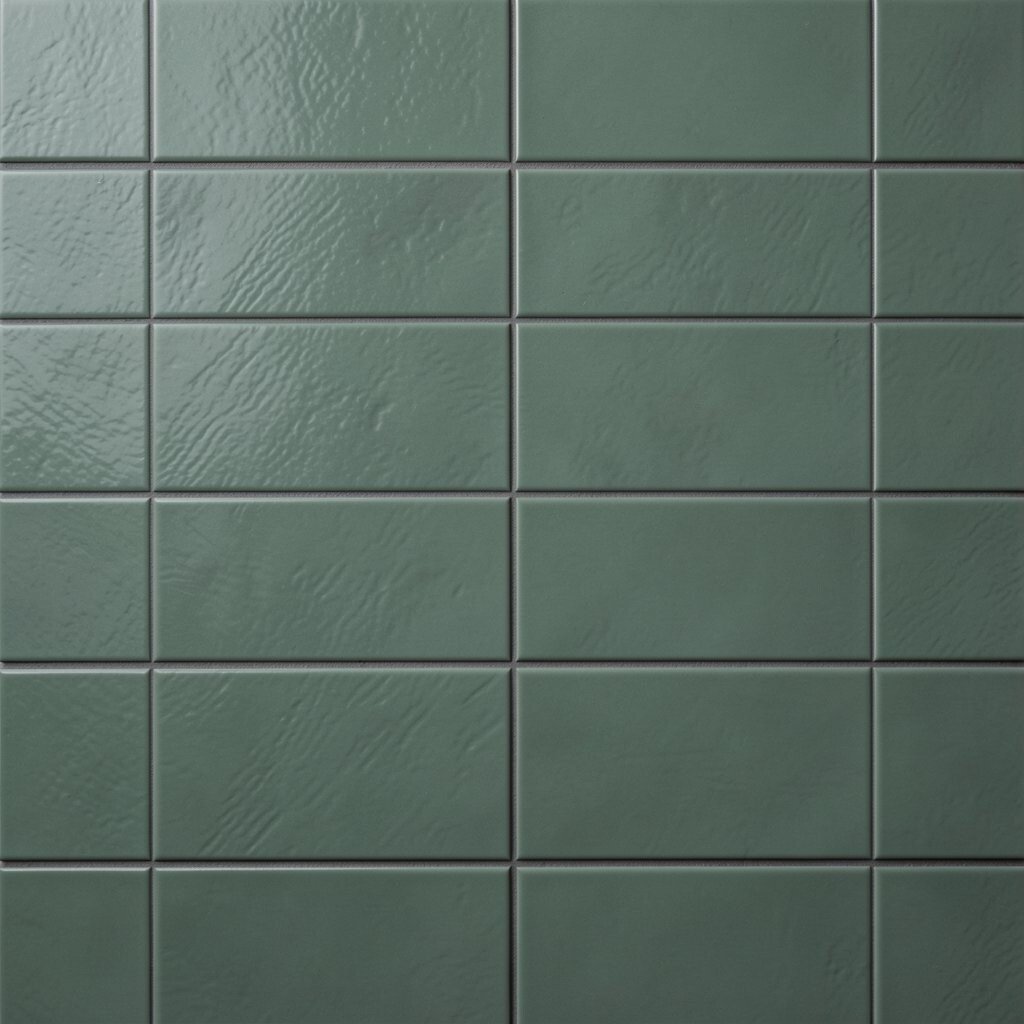
These tiles have tiny ripples that catch light in soft waves. From a distance, the wall looks smooth; up close, it feels crafted.
The benefit is that matte finishes create a calm mood and reduce glare. Fine ripples also add uniqueness without adding bold patterning that can date quickly.
When choosing grout, pick a neutral shade that blends with the ripple depth. A slightly warm gray can make the tiles feel richer and help them pair nicely with natural stone countertops.
To keep the project smooth, plan your cuts before you install. Ripples can make edges look different, so measure carefully around outlets and corners.
11. Sage Green Subway Tiles in Mixed Batch Tones
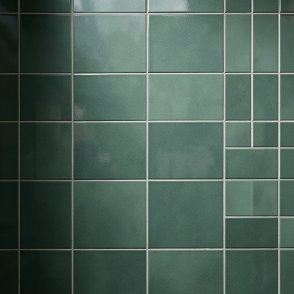
Some collections include subtle batch variation, so every box isn’t exactly the same. That small difference can make the wall look like it was always meant to be there.
This style supports a moody vibe because the wall feels lived in, not manufactured. It also offers uniqueness that you can’t fake with paint.
For practical installation, dry lay tiles first and mix them from multiple boxes. That way, you avoid noticeable bands of darker or lighter tiles in one area.
To personalize on a budget, use the best batch variation on the main viewing areas and keep the rest balanced. It keeps the look elevated where people notice it most.
12. Smoked Sage With a Classic Glossy Profile
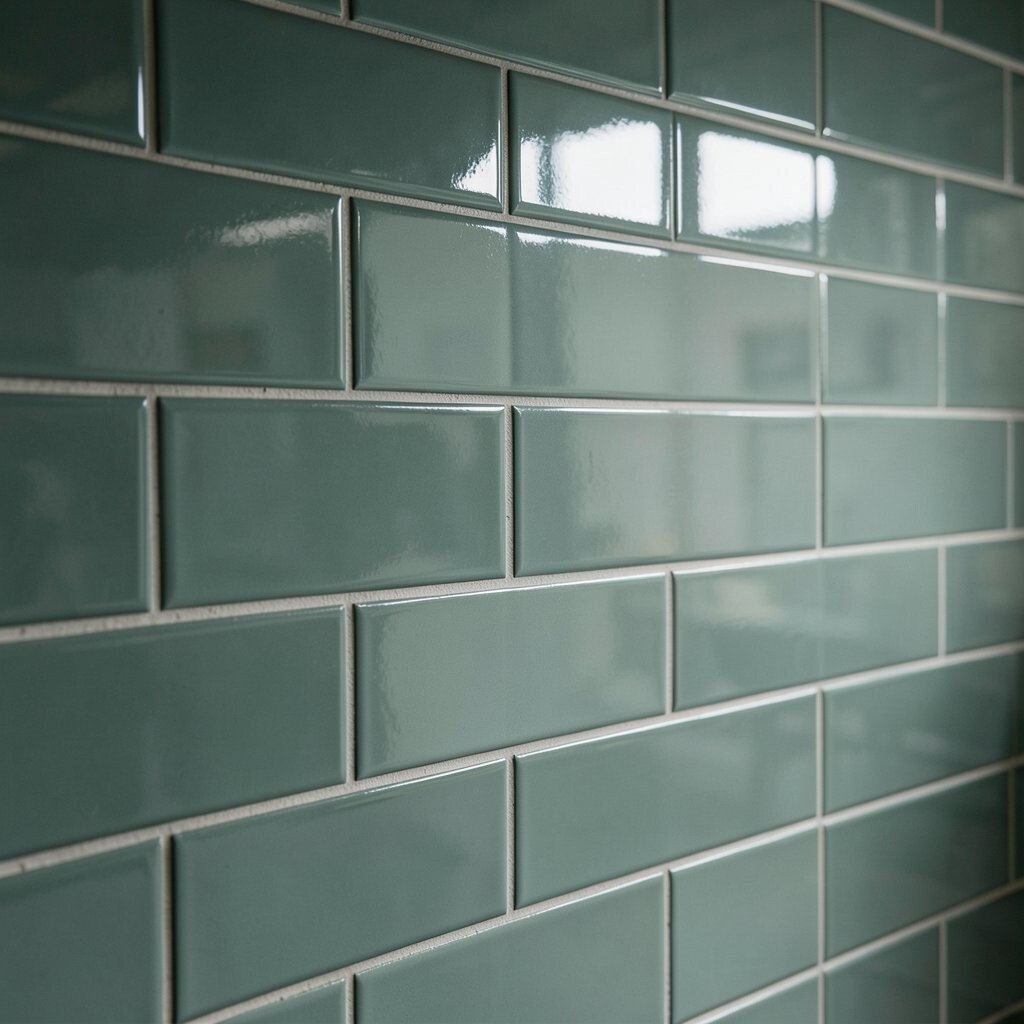
Glossy sage subway tiles look like a quiet night window when the light hits them. The color still stays soft, but the shine adds crispness.
One benefit of a glossy finish is that it’s easy to wipe clean. That matters in kitchens where splashes and splatter happen no matter how careful you are.
Pair the shine with matte cabinetry or textured wall paint so the room doesn’t feel too shiny. If you love a moody vibe, choose deeper greens elsewhere in the space like in a vase, artwork, or a rug.
Cost considerations can be helpful here because glossy tiles are often widely available. If you’re trying to manage spending, look for sales on reputable brands and compare thickness and glaze quality.
13. Sage Green With a Dark Gray-Grouted Look
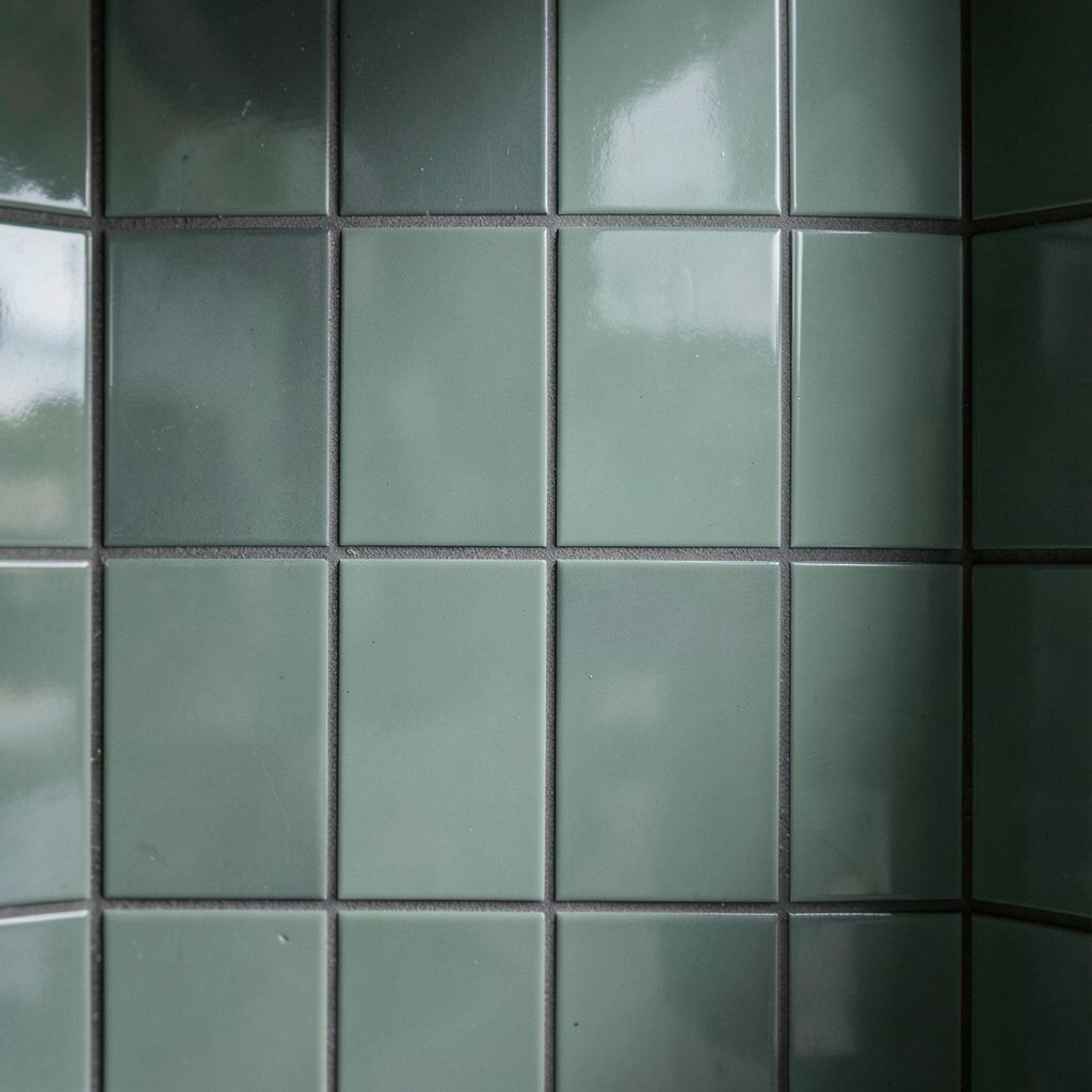
This approach uses a sage tile paired with darker gray grout for extra contrast. The result feels bold but still calm, like ink on aged paper.
The moody vibe comes from the way grout lines frame each tile and make the grid feel sharper. It also highlights the subway layout, which can make small rooms look more structured.
For personalization, experiment with a slightly green-gray grout so the tone stays in the same family. That small choice can make the whole wall look cohesive instead of accidental.
To keep maintenance simple, seal the grout after installation and stick to gentle cleaners. If you want a long-lasting finish, maintain your seal schedule and avoid abrasive scrubbing tools.