
Stairs are often the loudest quiet spot in a home. With the right color, they can feel fresh, safe, and full of personality.
Because you see them every day, a thoughtful paint or stain choice pays off fast. Even small updates can change the mood of your whole hallway.
1. Sunny White With Soft Butter Trim
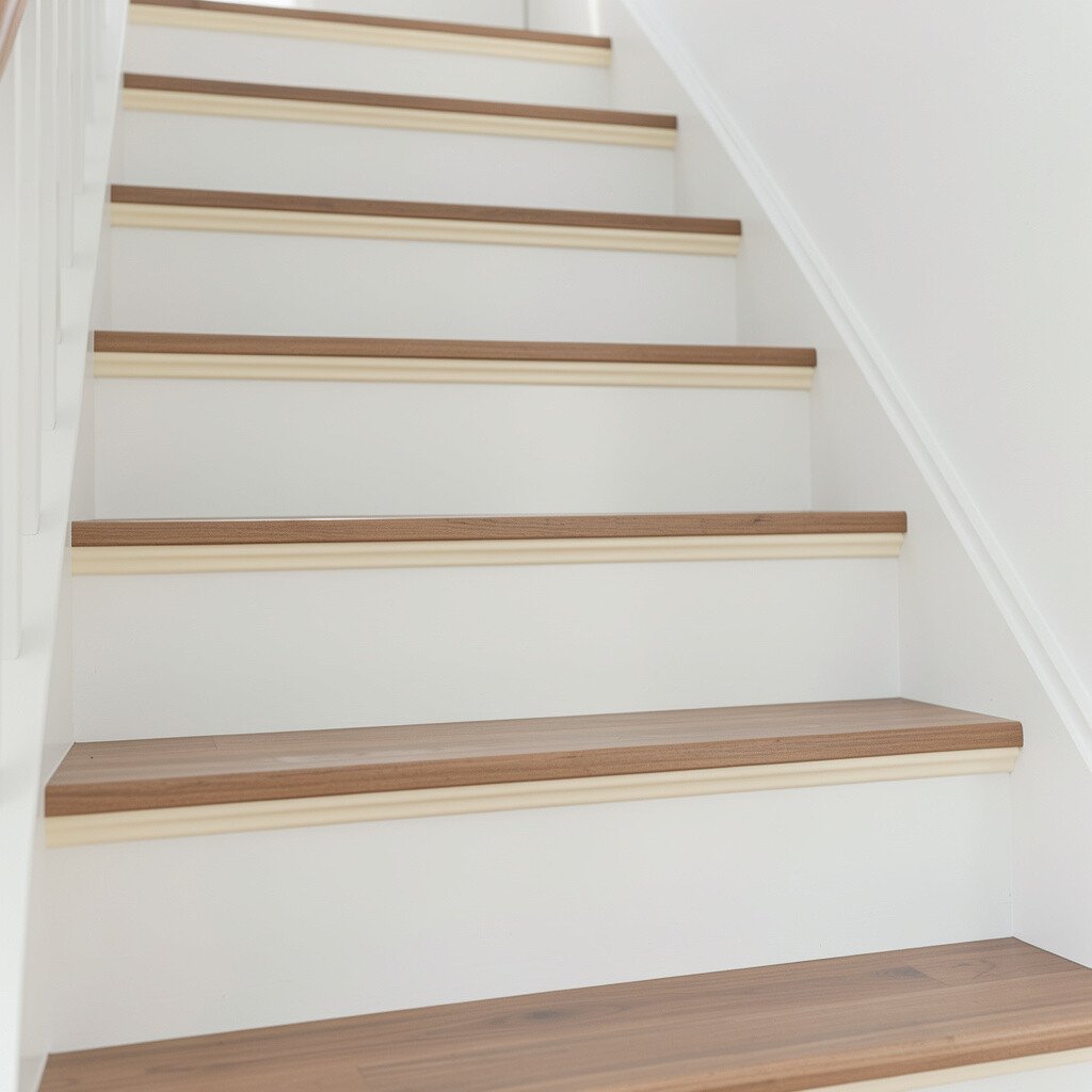
A clean white stair face makes your space look brighter right away. Add a soft butter-colored trim along the edges to catch the light every time you step.
This combination feels calm but still joyful. It also hides scuffs better than many darker shades, which is great for busy households.
Try painting the treads and risers in clean white, then use butter trim on the side rails or stair nosing. For a practical finish, pick a semi-gloss or satin paint that wipes clean without looking shiny. To personalize, match the butter tone to your kitchen hardware or a nearby wall color so the whole home feels connected.
2. Terracotta Warmth With Modern Line Details
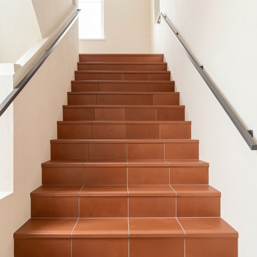
Terracotta brings cozy warmth to your entryway and stair landing. Picture dusty orange tones that glow softly in morning light and feel rich at night.
Pairing terracotta with clean, simple line accents can look modern without feeling cold. You can also reduce visual clutter by keeping the railings a neutral color like matte black or warm wood.
For practical planning, choose a durable floor-grade paint for the treads and a complementary wall paint for risers. Consider a thin two-tone stripe where the riser meets the tread to make steps feel crisp. If you want uniqueness, experiment with a slightly deeper terracotta on the first few steps since they’re the first thing guests notice.
3. Sage Green That Feels Like Fresh Air
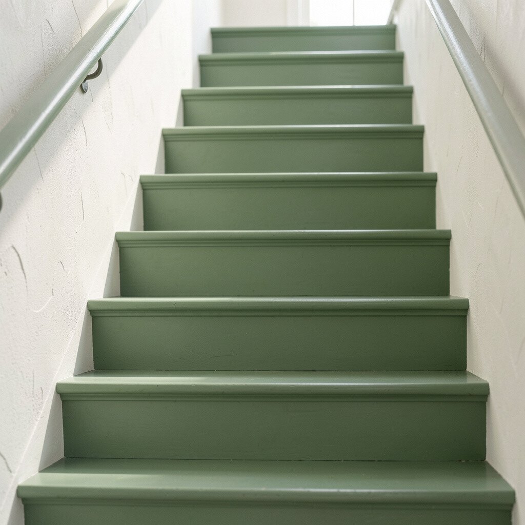
Sage green makes stairs feel softer and more inviting. It looks like calm greenery, especially when you have natural light in the hall.
The benefit is a color that works with many styles, from farmhouse to modern. It also pairs beautifully with warm wood, brushed nickel, and neutral wall colors.
Try sage on the risers and a warm neutral on the treads to keep traction-focused contrast. A satin finish on vertical surfaces helps it stay easy to clean. To personalize, add a subtle stencil pattern on one stair flight or around the landing to echo plant motifs elsewhere in your home.
If you’re watching cost, sage is often affordable and easy to find in mid-range paint lines. You can keep materials simple by painting only risers and the stringer while leaving treads protected with a clear, scuff-resistant coating.
4. Navy Blue With Crisp White Risers
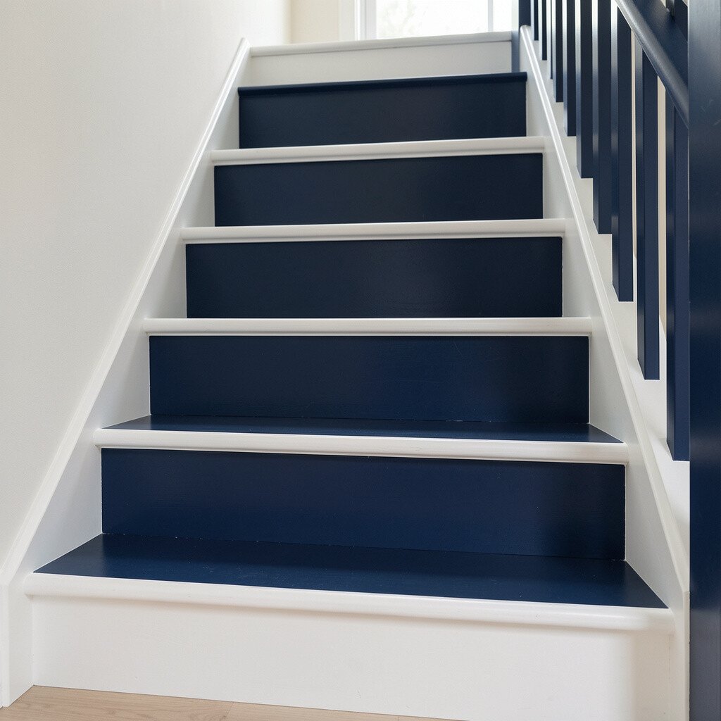
Navy blue gives your stairs a strong, confident look. When paired with crisp white risers, the steps feel balanced and bright instead of heavy.
This contrast helps guide the eye as you climb, which can feel safer. Navy also hides wear better than many light colors, so it stays sharp longer.
Use navy on the vertical stringer or side panels, then keep risers white for a clean visual rhythm. For personalization, add a thin gold or brass accent line near the rail for a subtle glow. Cost-wise, consider staining wood treads and painting only the parts that need a color change, which can save money on refinishing.
5. Moody Charcoal With a Pop of Color on the Edge
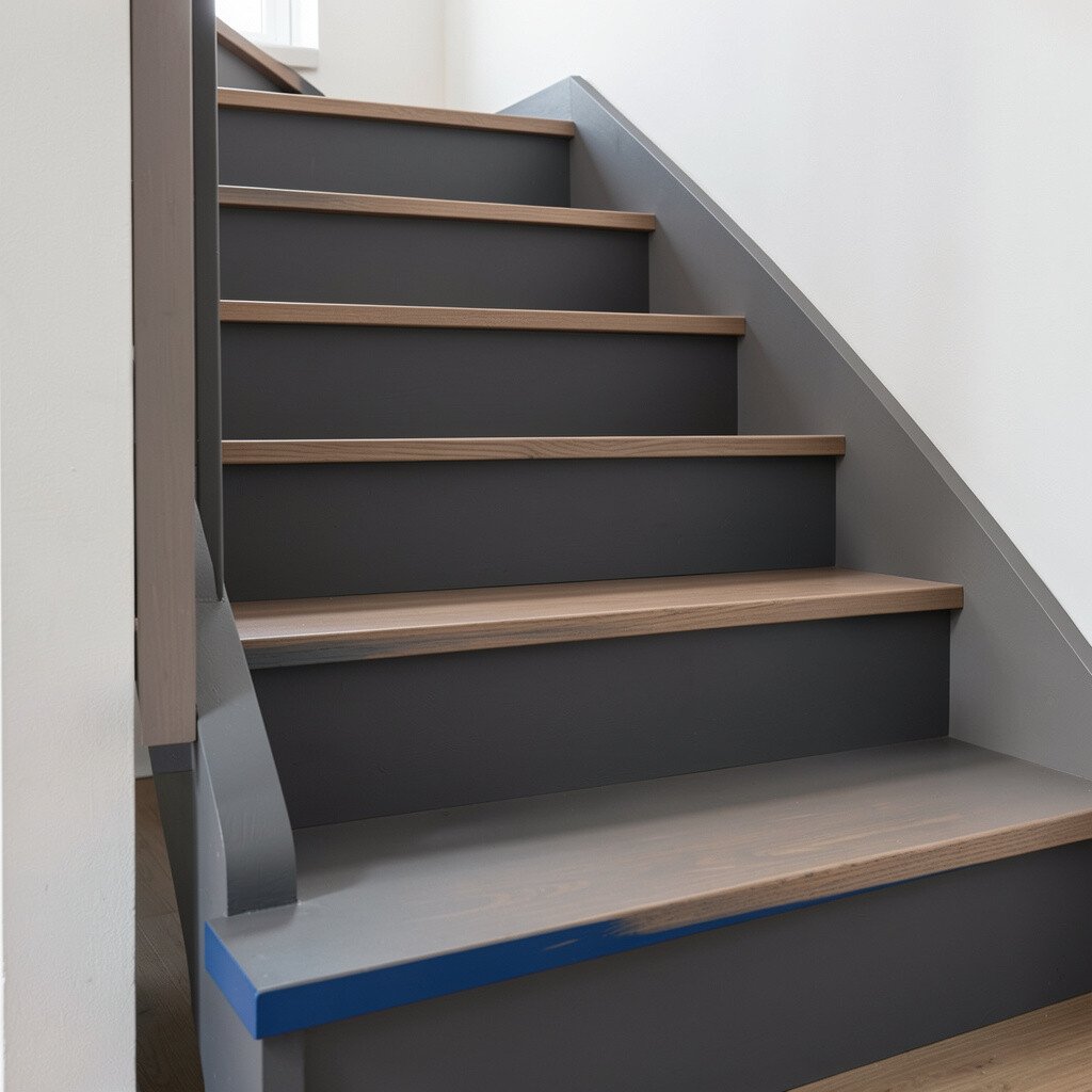
Charcoal stairs look sleek and grounded. When you add a bright edge accent, the whole staircase feels playful instead of serious.
Choose a charcoal base for treads or side panels, then paint the stair nosing edge in a pop color like coral, teal, or sunny yellow. That small stripe can become your signature style without overwhelming the hall.
This approach is practical because you can keep the main color deeper for better scuff hiding. It also helps each step stand out, which is handy for nighttime use. For uniqueness, match the edge color to a throw blanket, artwork, or a painted door nearby so it feels intentional.
6. Light Wood Stain With Painted Riser Caps
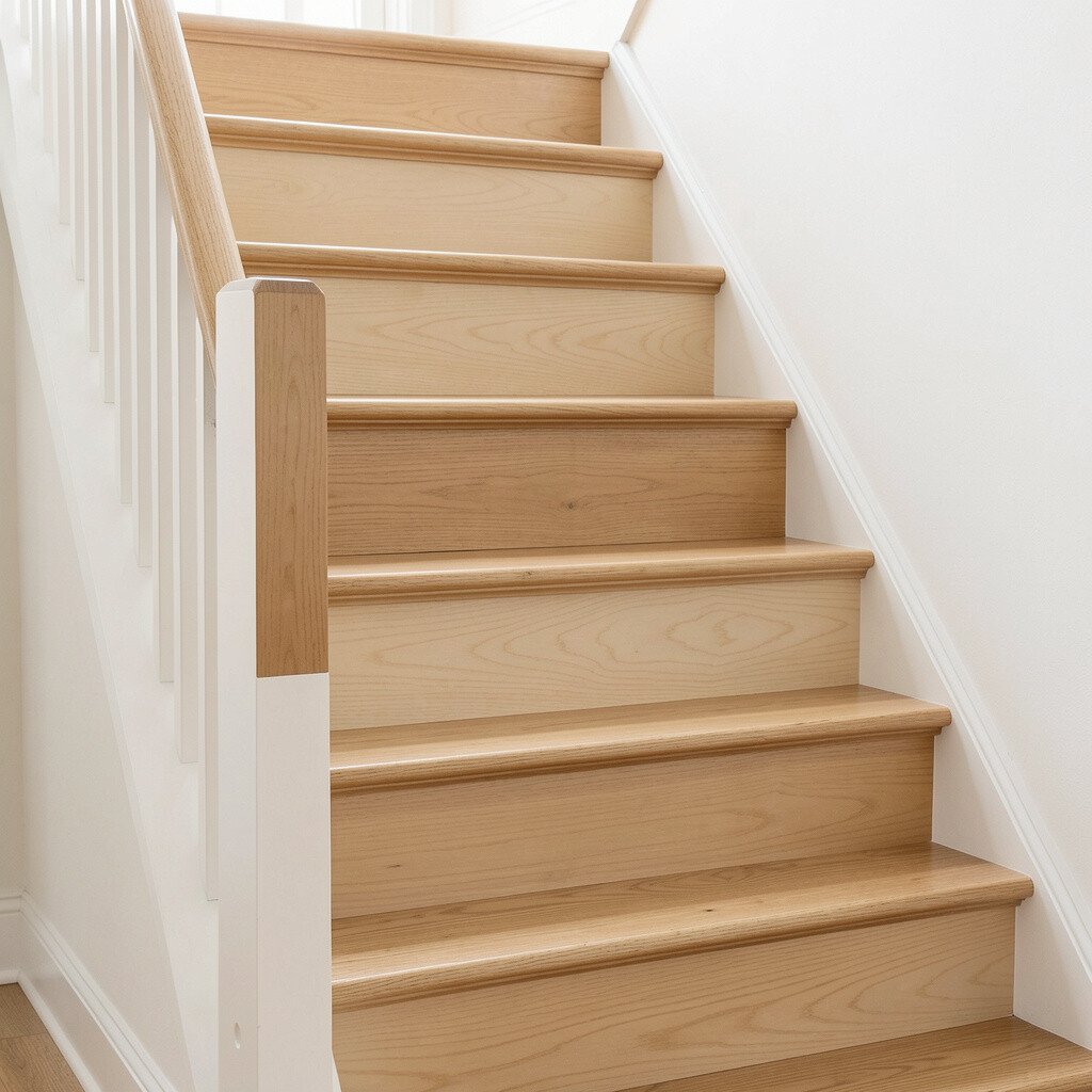
If you love natural texture, try light wood stain as your base. Then paint the top portion of each riser like a neat little cap for a modern twist.
This combo brings warmth while keeping your space bright and airy. The benefit is that stain highlights grain patterns, while the painted caps create a clean, updated look.
Pick a durable clear finish to protect the steps from daily traffic. Keep the cap color in a soft tone like ivory, pale blue, or warm gray so it looks calm, not loud. To personalize, choose a color that matches a favorite rug or curtains and keep the cap placement consistent for a crisp finish.
7. Pastel Lavender for a Dreamy Hallway Vibe
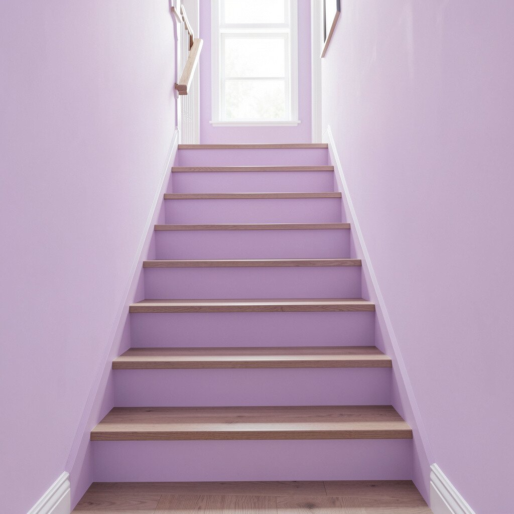
Lavender on stairs can feel soft, creative, and full of charm. The trick is using a pastel shade that stays airy rather than overly bold.
Because pastel colors reflect light gently, your stair area often looks larger. Lavender can also make everyday routines feel calmer, especially in homes that need a little more peaceful energy.
Paint risers a light lavender and keep treads neutral with a protective coat. For practical tips, use painter’s tape carefully along stair edges to avoid fuzzy lines. To personalize, add a small floral or geometric motif on the landing where it’s easiest to see.
If you’re worried about cost, pastel paints may require fewer coats than darker colors. You can also use a semi-gloss finish on the risers to keep cleaning simple when shoes and backpacks bring in dust.
8. Classic Black With Steel Gray Treads
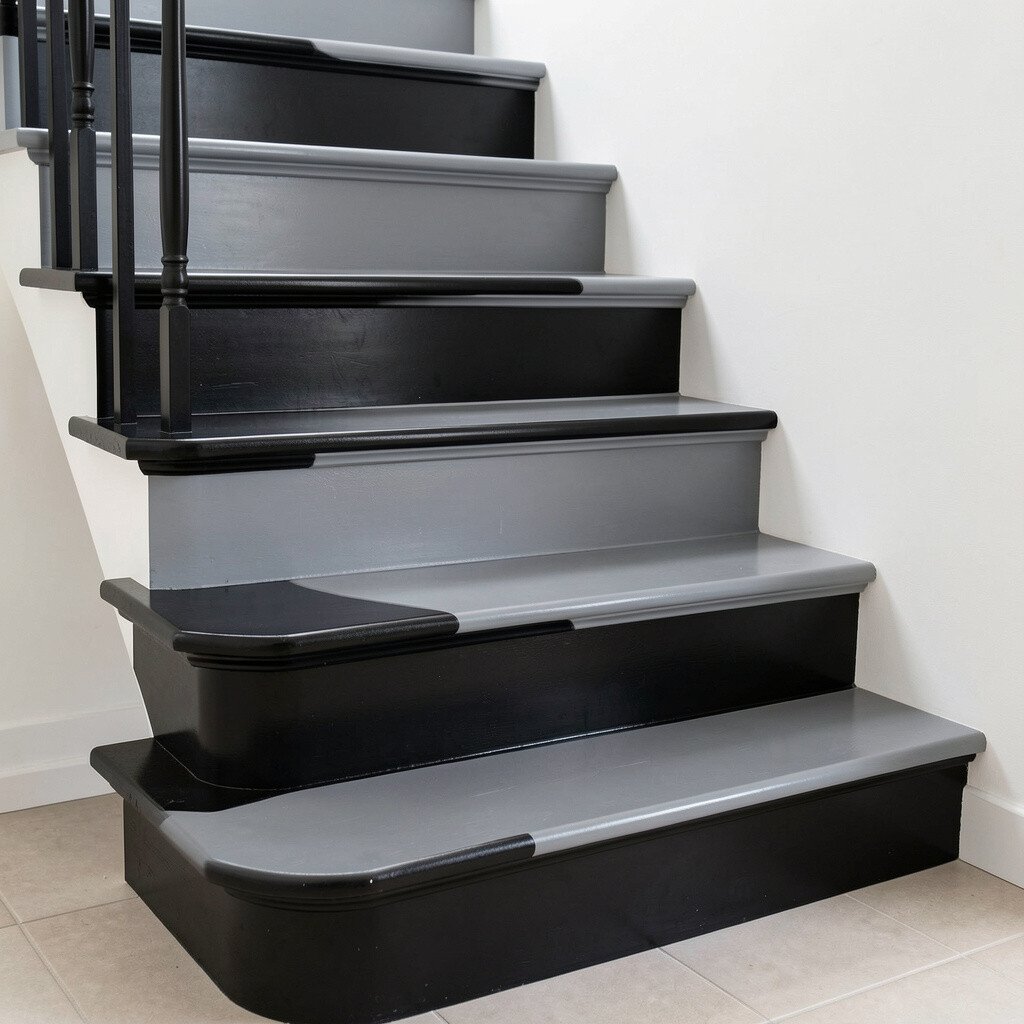
Black stairs create a bold, high-end look. When you use steel gray for the tread surface, you get contrast that looks clean and modern.
This style benefits from being visually strong and easy to coordinate with lots of design choices. Black also helps hide scuffs compared to bright whites, especially on stair side panels and rails.
Consider painting risers matte black and using steel gray for treads with a tougher topcoat. Keep the rail hardware in brushed steel or black metal to make the whole staircase feel cohesive. For personalization, add a thin line in a lighter gray to outline each tread edge for a subtle “floating step” effect.
If you want to control spending, keep the darker colors limited to the areas that take the most attention, like risers and stringers. You can protect treads with a quality clear finish instead of replacing anything.
9. Bright Coral That Welcomes You In
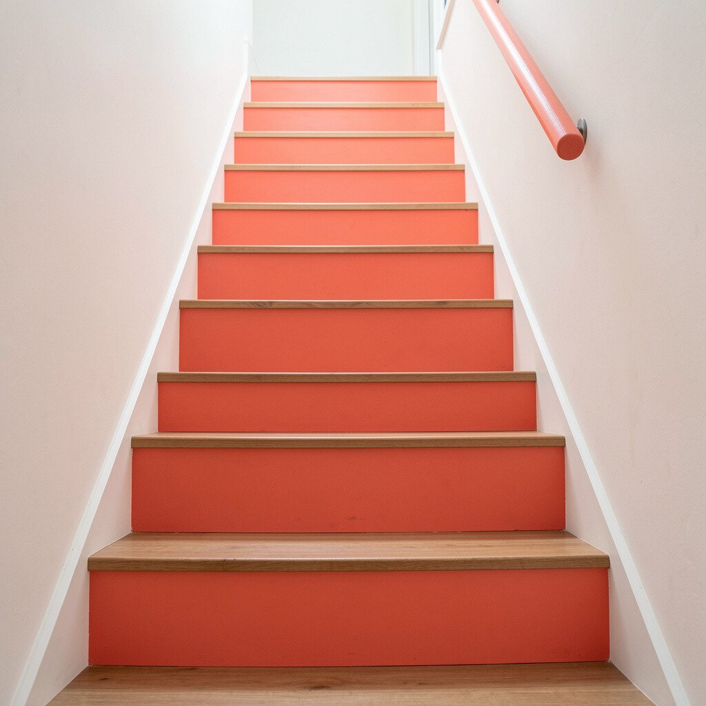
Coral instantly adds warmth and friendly energy to a staircase. Think of it as a cheerful accent that turns an ordinary hall into a welcoming entry.
This color can benefit your home by boosting visual warmth, especially if the hallway gets little sunlight. Coral also looks great with white walls, natural wood, and gold or brass hardware.
Paint risers coral and use white or light oak tones for the treads. For practical results, choose a washable paint and let each coat cure long enough before heavy foot traffic. To personalize, try a coral-and-cream diagonal pattern on just the first few steps so the entry feels special without repainting everything.
Cost-wise, coral shades can be a bit pricier in some brands, but a careful primer layer helps you use fewer coats. You can also blend coral inspiration by using a coral stain on wood treads if you prefer a softer look.
10. Creamy Off-White With a Gentle Greige Baseboard

An off-white stair scheme can feel timeless while still looking fresh. Add a greige baseboard tone near the sides or trim to create a soft, layered look.
This choice benefits homeowners who want bright stairs but don’t want them to look stark. Off-white also plays nicely with many paint colors in the rest of your home.
Paint risers off-white, then use greige for the side stringer and any trim panels. For practical tips, make sure your surface is smooth before painting so the finish looks even. To personalize, match the greige to your living room or hallway floors so transitions feel natural.
11. Forest Green With Warm Brass Accents
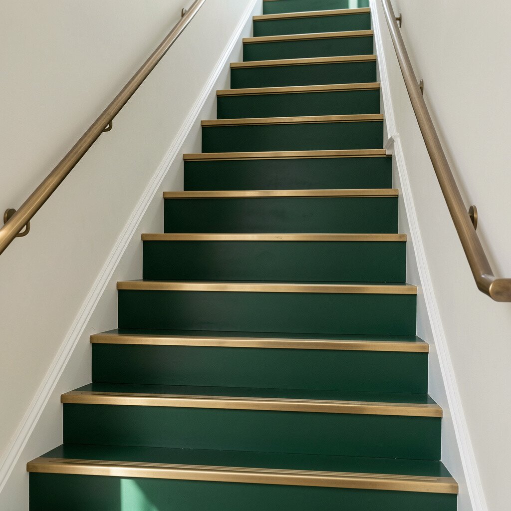
Forest green feels rich and grounded without being gloomy. When you pair it with warm brass accents, it can look elegant and a little luxurious.
The benefit is that green tones hide wear well and give your home a calm, nature-inspired mood. Brass details catch light and make the staircase feel lively even on gray days.
Paint risers forest green and keep treads in a warm neutral like honey wood or light brown stained finish. Use brass hardware on handrails or add a thin brass-toned line on the stair edge. For personalization, choose a deeper green on the lower steps where people linger, and keep the upper steps slightly lighter for a gentle gradient effect.
If you’re thinking about cost, consider using contact-friendly brass paint on accents rather than replacing rail hardware. That small upgrade can deliver a high-impact look at a lower price.
12. Coastal Blue With Whitewashed Wood Texture
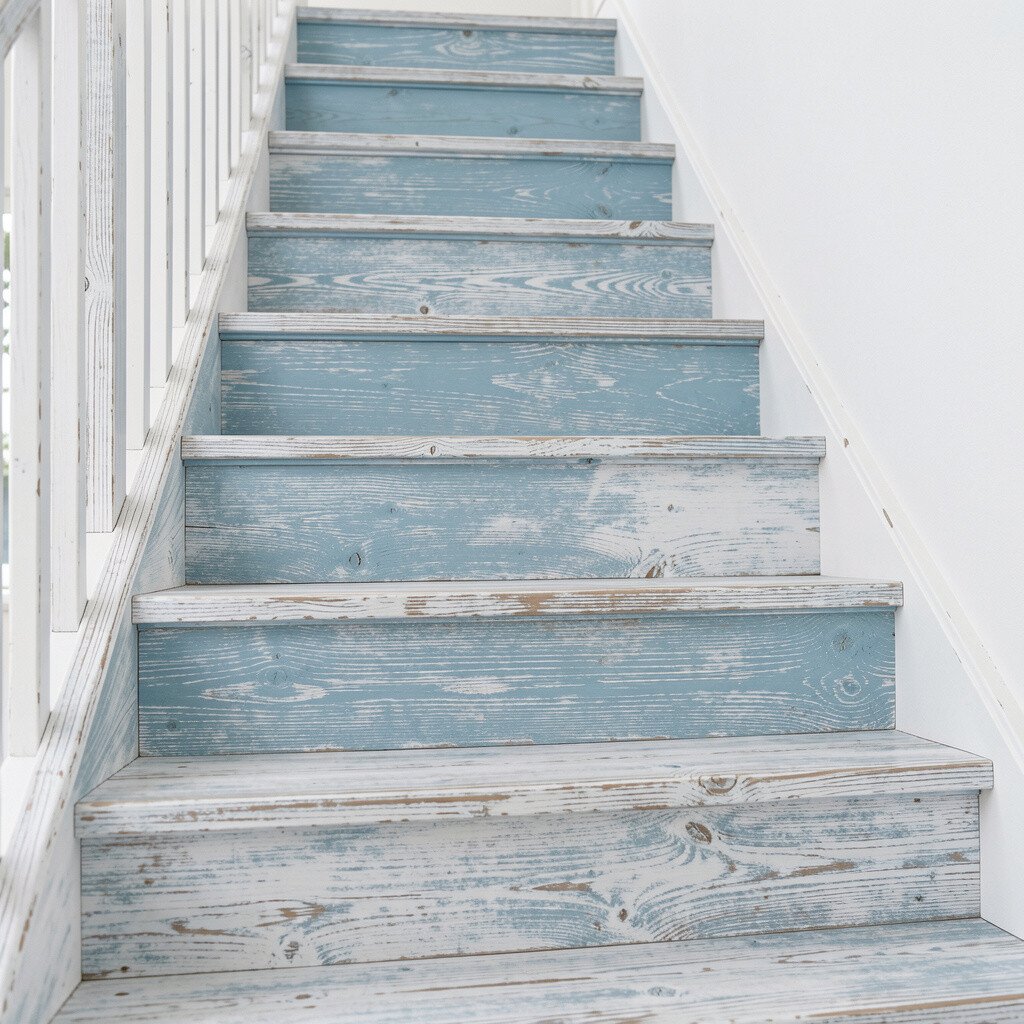
Coastal blue makes stairs feel like a breezy getaway. Use a soft coastal tone and blend it with a whitewashed wood texture for an easy, relaxed look.
This stair color benefits homes that want airy style without feeling empty. It also complements beachy decor, light curtains, and casual furniture.
For practical steps, whitewash wood treads with a clear or tinted product, then paint risers coastal blue. Keep the finish in satin so it cleans up easily. To personalize, add subtle wave-like marks on the landing using a stencil, but keep it light so it doesn’t feel busy.
13. Soft Pink Blush With Neutral Treads
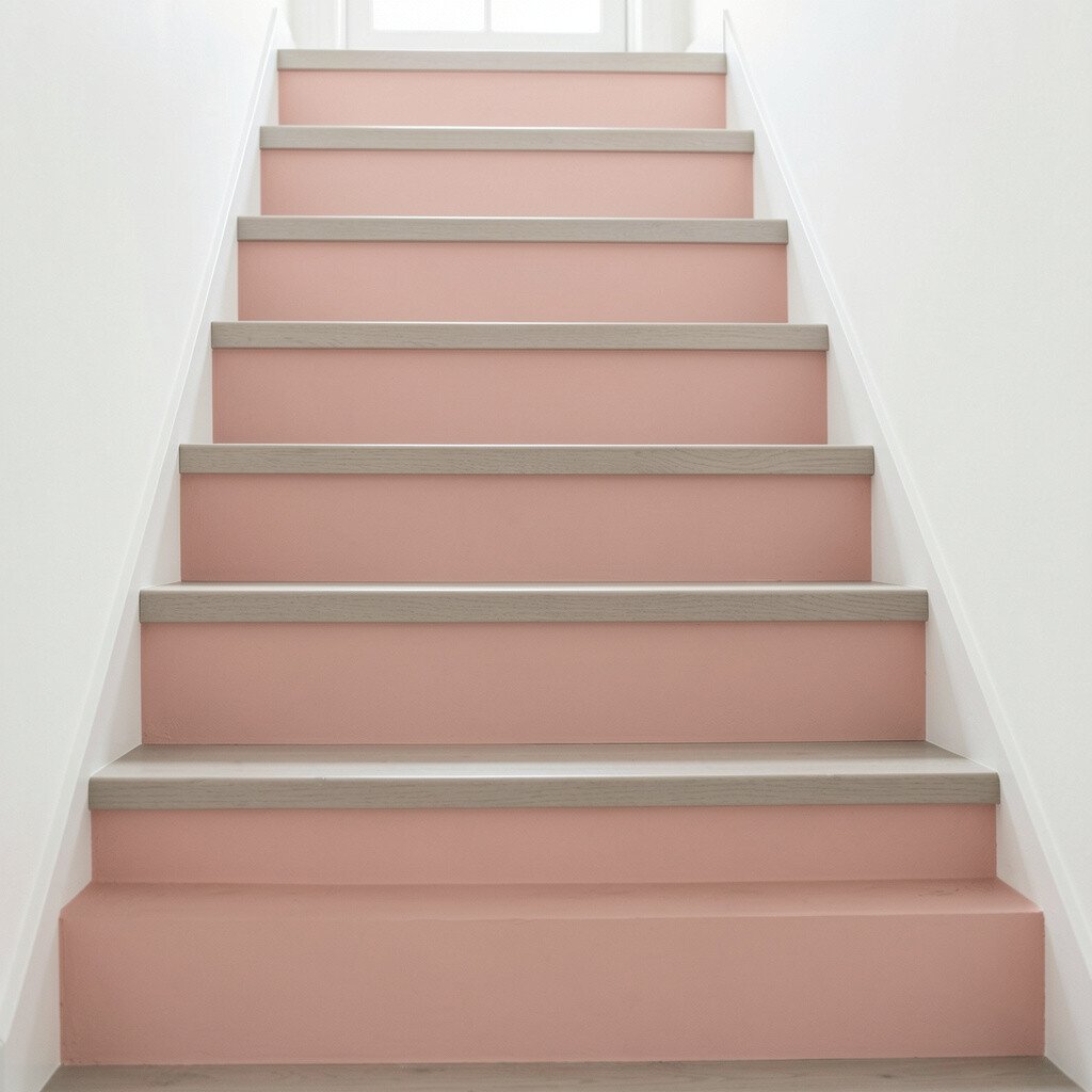
Soft pink blush can turn a staircase into something sweet and welcoming. It’s gentle enough for everyday life but still feels like a statement.
The benefit is that blush tones brighten a room without the sharp contrast of stronger colors. Pink also pairs well with many neutrals, so you can keep walls and furniture calm.
Paint risers blush and keep treads neutral, like light gray, whitewashed wood, or warm beige stain. For practical tips, use a primer that helps block stains so the finish stays even across older wood. To personalize, coordinate the blush with artwork colors or a nearby accent wall so it feels intentional, not random.
If you’re managing cost, blush can be a smart choice because you may only need to paint risers for a big visual shift. Adding a protective topcoat on the treads helps you avoid redo work later.
14. Monochrome Light Gray With Slightly Darker Steps

A monochrome gray staircase looks modern and tidy. If you vary the shades by just a bit, the steps show depth without needing bright colors.
This benefits busy homes because gray hides dust and minor scuffs better than pure white. It also works well with contemporary trends like minimal decor and sleek hardware.
Choose a light gray for risers and a slightly darker gray for tread surfaces or stair edges. For personalization, keep railings in a matching gray for a seamless, built-in feel, or go with warm wood to balance the cool tone. If you want to stay practical, apply scuff-resistant coatings on treads and use satin paint on risers for easy cleaning.
15. Two-Tone Gradient From Warm to Cool
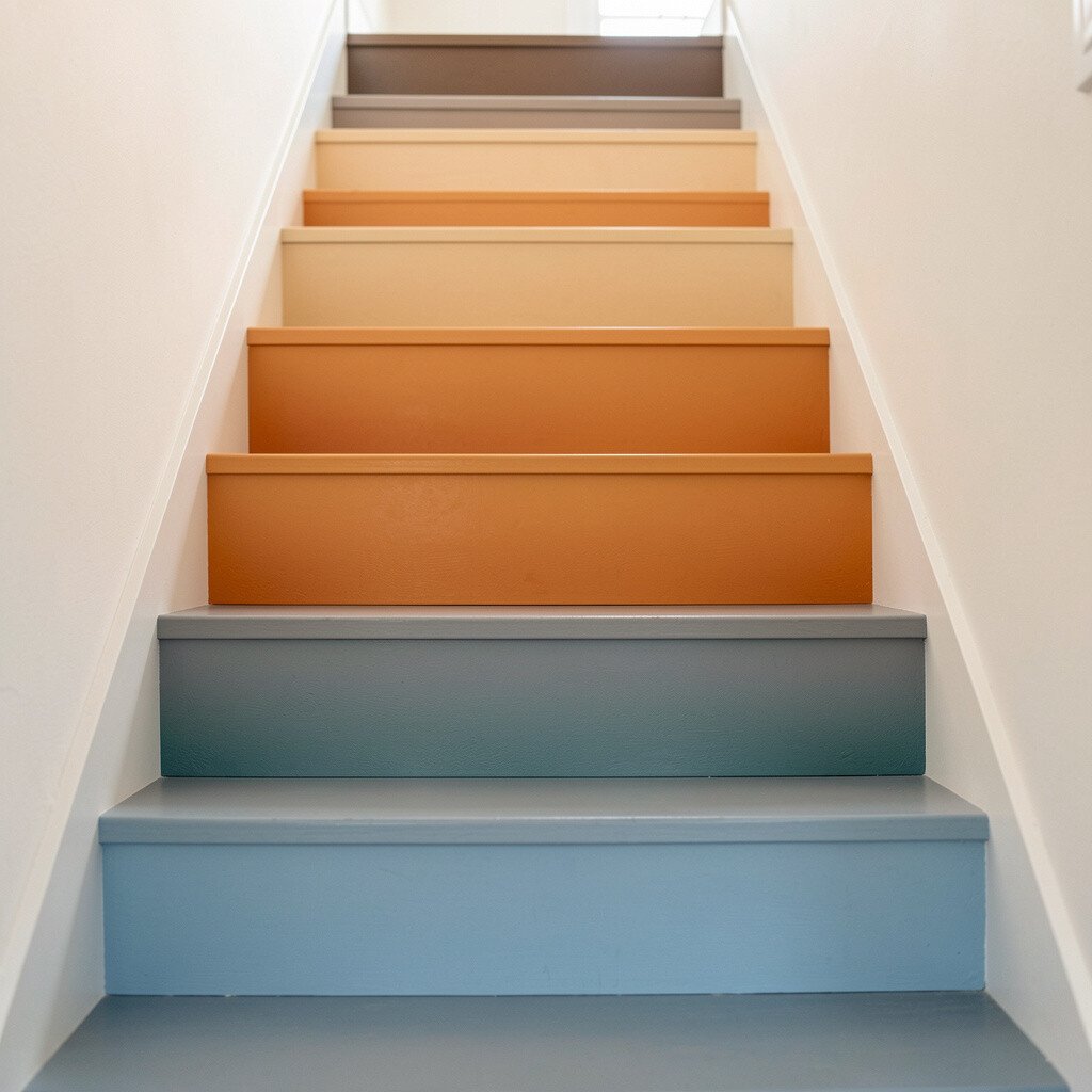
A two-tone gradient can make stairs feel artistic and dramatic. Start with warm tones at the bottom and move into cooler tones as you go up.
This idea benefits the whole hallway because it creates visual flow rather than stopping at the staircase. Gradients also feel unique, and they can match current design trends that favor custom color stories.
Plan your color sequence carefully, using two related paint samples and blending between them across steps. A simple approach is to paint every other riser in each tone, then smooth the transitions with a gentle glaze. For personalization, choose warm-to-cool pairs that match your decor, like creamy beige to soft taupe, or warm gray to cooler slate.
Cost is manageable because you’re using the same paint family and can limit the number of coats with good prep. If you want a safer route, test your gradient on a few spare risers or a small board first so you’re confident before committing.