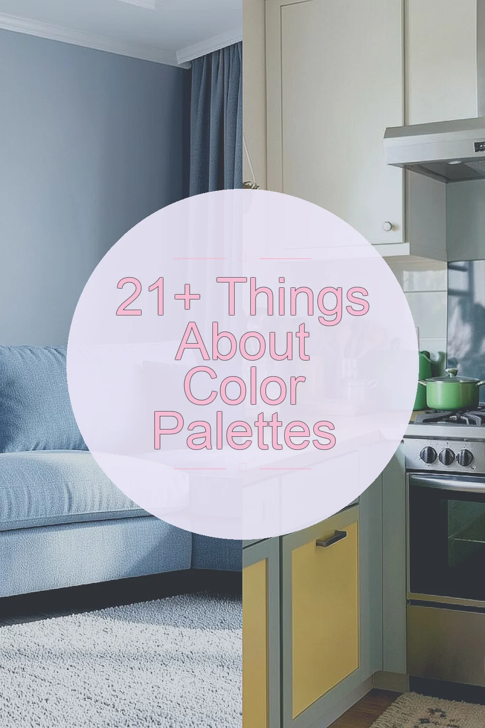
Colors can change the mood of a room or even your outfit. The magic of color palettes lies in their ability to inspire and transform in unexpected ways.
1. The Power of Monochrome
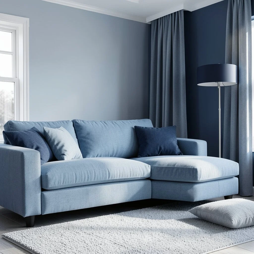
Monochrome palettes focus on one color in various shades. They create a soothing and cohesive look.
Imagine a room with different shades of blue, from soft sky to deep navy. It feels calm and inviting.
Monochrome is cost-effective because you only need one base color. Try it in your living room for a serene escape.
2. Complementary Colors
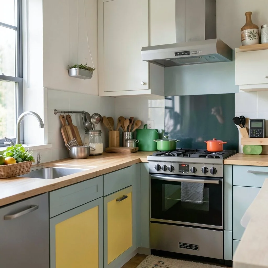
Complementary colors sit opposite each other on the color wheel. Think red and green or blue and orange.
This duo creates a vibrant, energetic look. It’s like a visual party that makes everything pop!
Perfect for bold fashion statements or lively kitchen decor.
3. Analogous Adventures
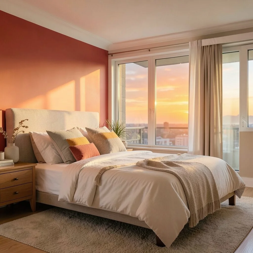
Analogous palettes use colors next to each other on the wheel. They blend seamlessly, like red, orange, and yellow.
These palettes feel natural and harmonious, like walking through a sunset.
Great for bedrooms where relaxation is key. Personalize it by choosing your favorite color trio.
4. Triadic Treasures
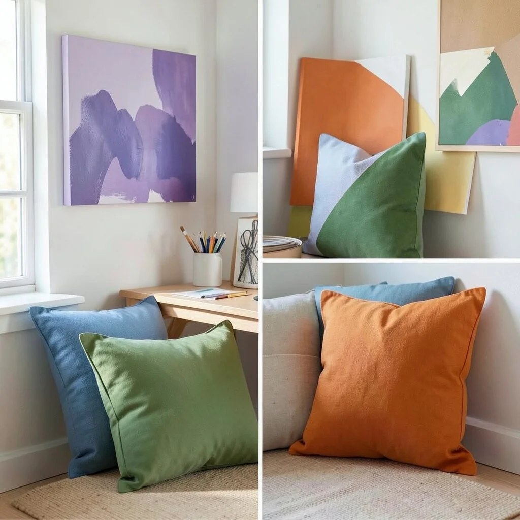
Triadic palettes use three evenly spaced colors on the wheel. They balance contrast and harmony beautifully.
Imagine a palette of purple, green, and orange. It’s playful and fresh, perfect for a creative workspace.
Keep costs down by using accent pieces, like cushions or artwork, to introduce triadic colors.
5. Tetradic Triumphs
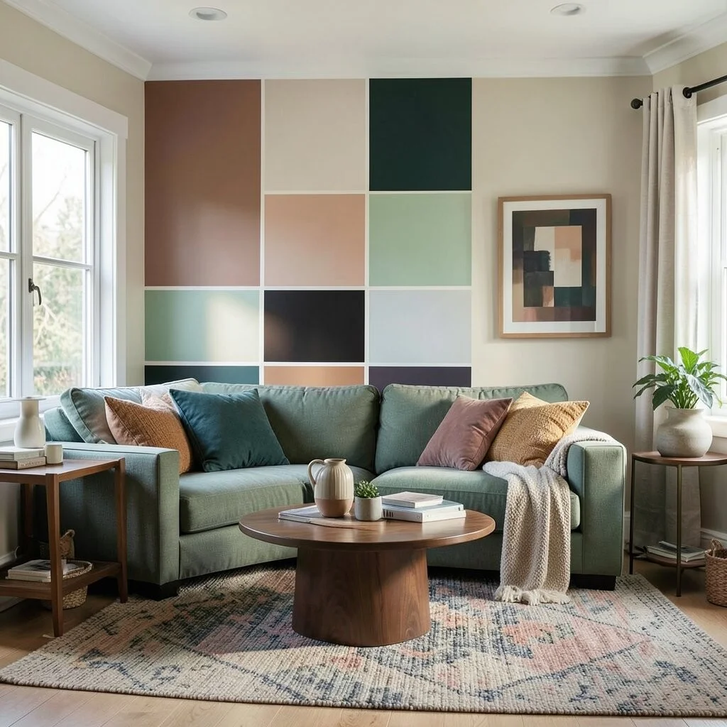
Tetradic palettes use four colors, forming a rectangle on the color wheel. It’s complex yet striking.
This palette is ideal for those who love variety. You get a rich, layered look without overwhelming the space.
Perfect for eclectic living spaces. Use one color as the dominant shade to tie the look together.
6. Pastel Perfection
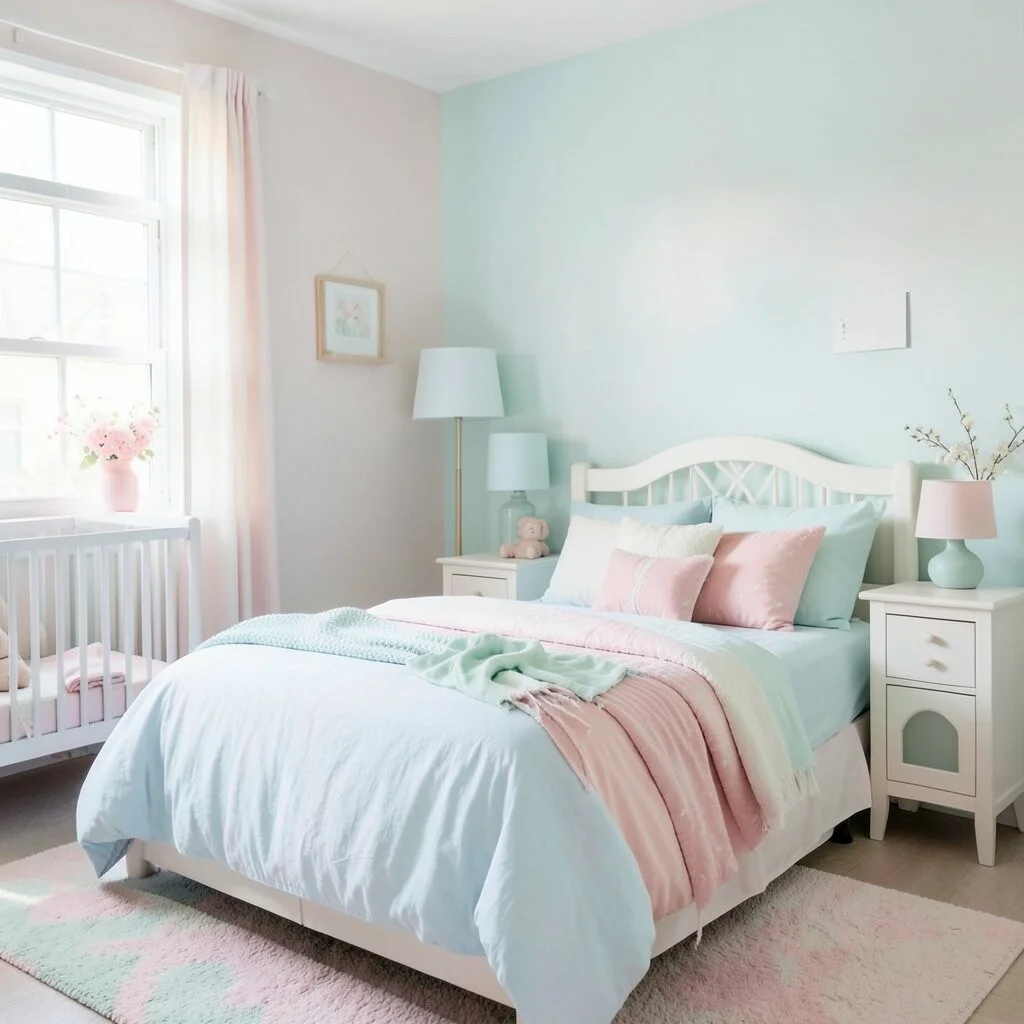
Pastels are light, soft colors. They’re gentle and sweet, like a whisper of spring.
These colors add a touch of whimsy to any room or outfit. Think of baby blues, soft pinks, and mint greens.
Pastels are great for nurseries or romantic bedrooms. They’re budget-friendly and easy to find.
7. Earthy Essentials
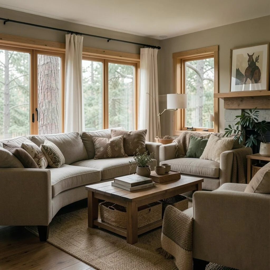
Earth tones include colors like brown, green, and tan. They bring the outdoors inside.
This palette feels grounded and warm, like a cozy cabin in the woods.
Perfect for those who love nature. Use them in living rooms or kitchens for a natural vibe.
8. Neon Nuances
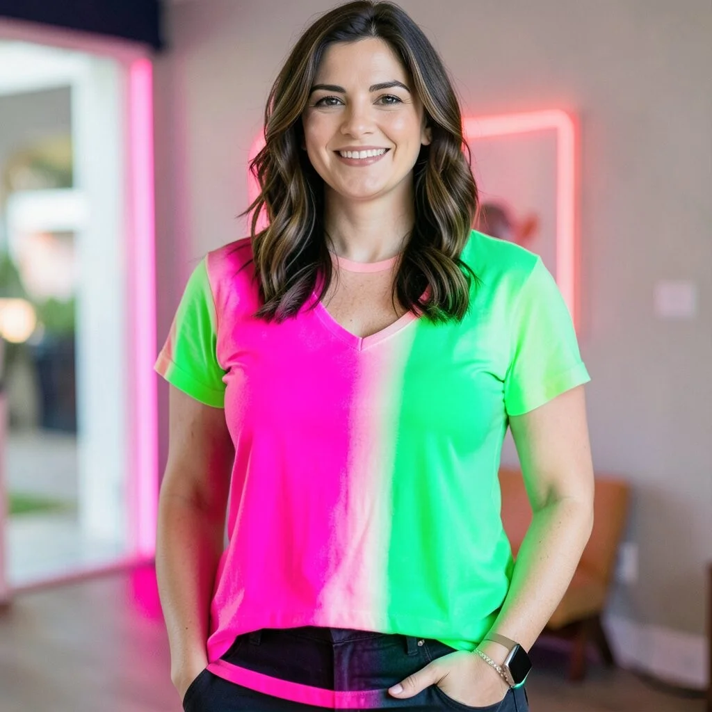
Neon colors are bright and bold. They scream excitement and fun!
Imagine a splash of neon pink or green in your wardrobe. It’s like a burst of energy.
Neons are perfect for parties or statement pieces. Use them sparingly to keep things chic.
9. Jewel Tones
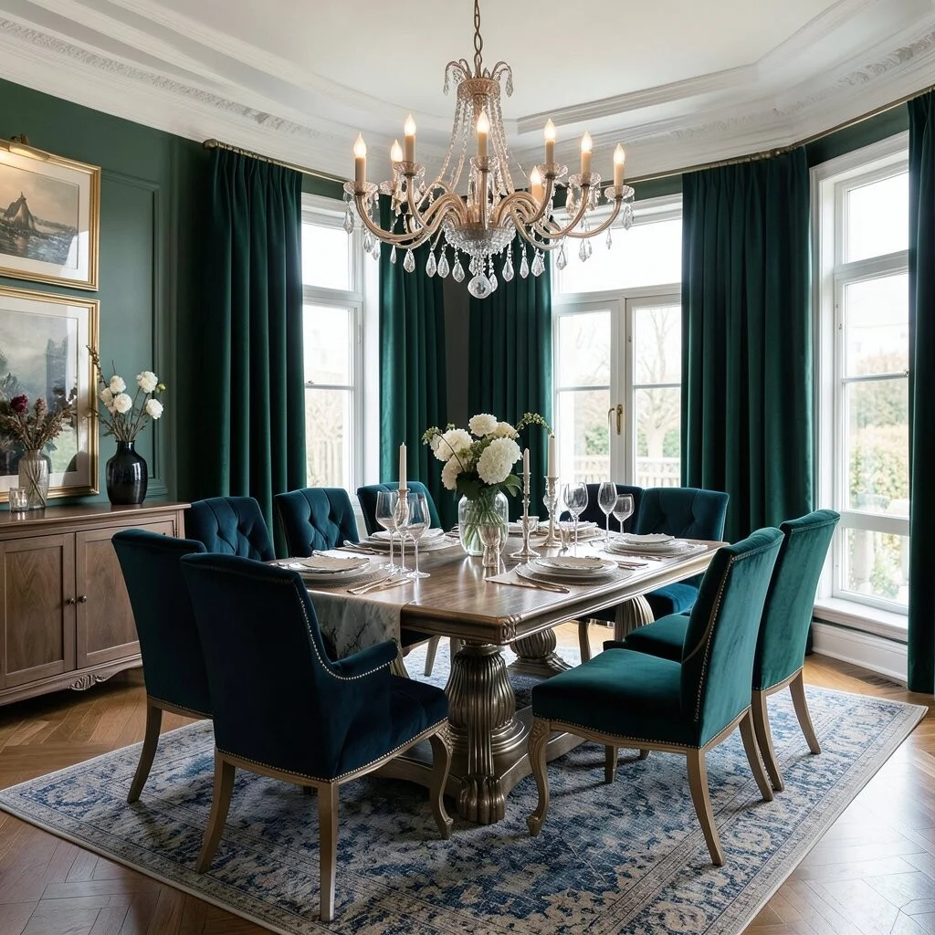
Jewel tones are rich and luxurious, like emerald, sapphire, and ruby.
These colors add depth and elegance to any space. They’re like wearing a crown!
Ideal for dining rooms or formal living rooms. Pair them with metallics for a posh look.
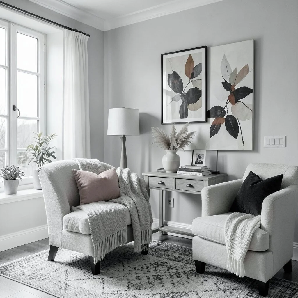
10. Neutral Nirvana
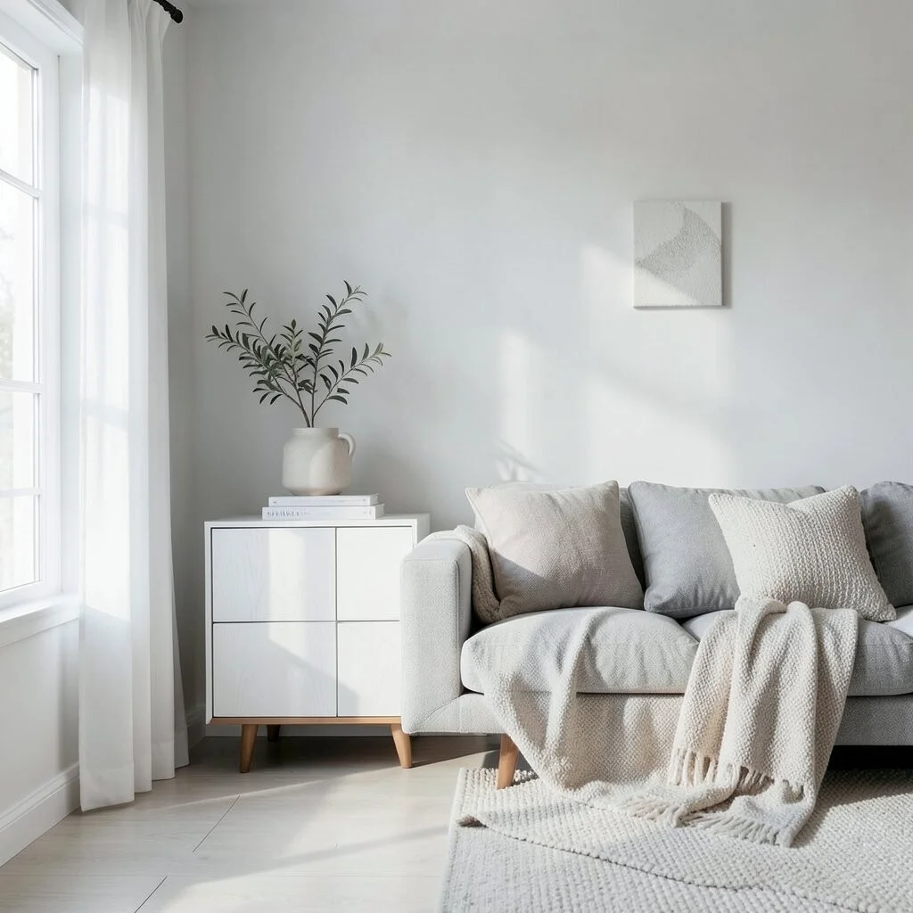
Neutrals include white, gray, and beige. They’re timeless and versatile.
This palette creates a clean, minimalist look that’s easy to update with accents.
Great for any room or style. Add personal flair with textures and patterns.
11. Vintage Vibes
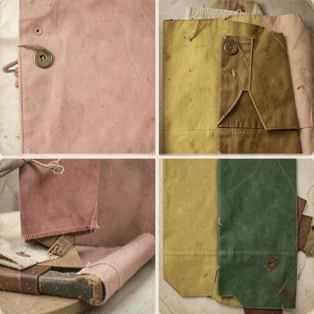
Vintage palettes draw from the past with muted, nostalgic tones.
Think of dusty rose, mustard yellow, and olive green. They tell a story.
Perfect for retro lovers. Incorporate vintage finds for an authentic touch.
12. Ocean Hues
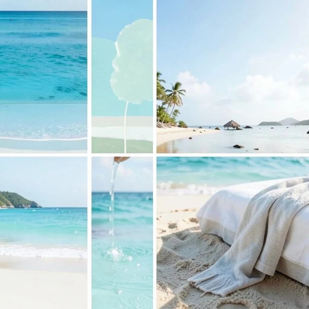
Ocean hues capture the essence of the sea with blues, aquas, and teals.
They’re refreshing and calming, like a sea breeze on a hot day.
Use them in bathrooms or bedrooms for a coastal escape. Affordable and easy to find.
13. Sunset Shades
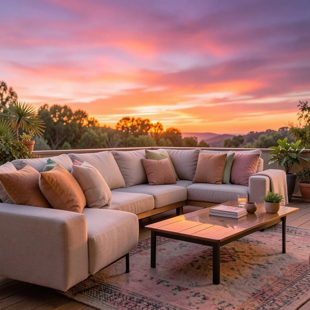
Sunset palettes feature warm colors like oranges, pinks, and purples.
These hues are vibrant and comforting, like a hug from the sun.
Brighten up a living space or outdoor patio. Mix and match for a fiery effect.
14. Forest Finds
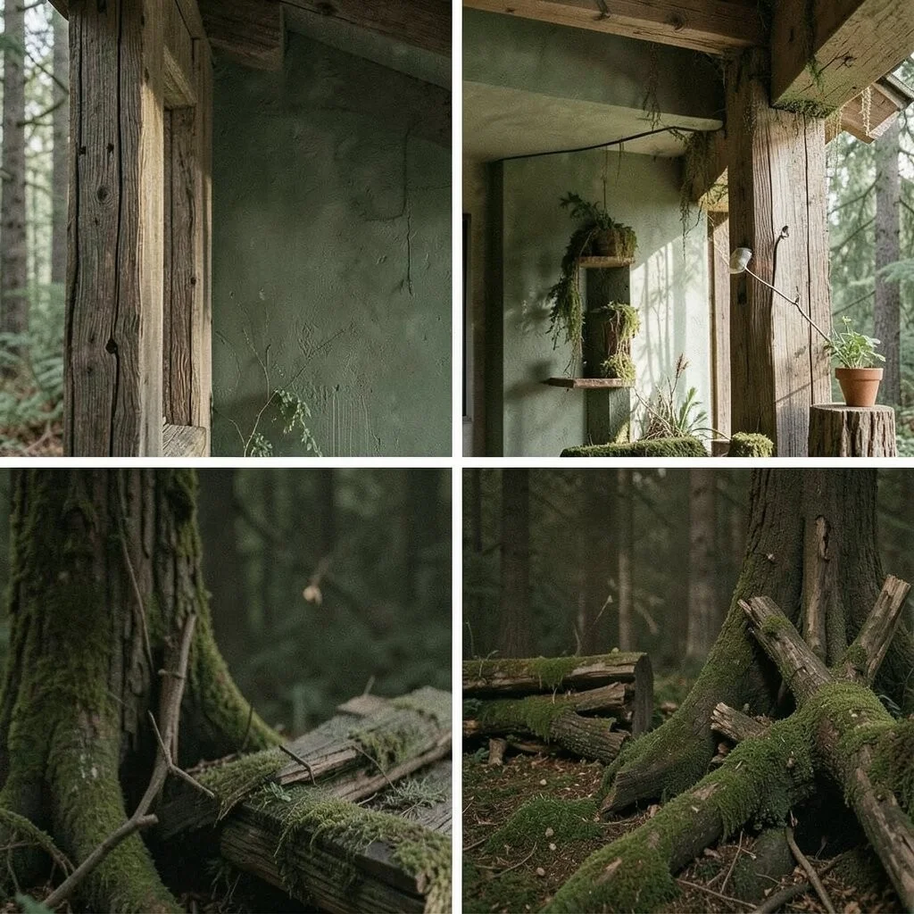
Forest palettes include deep greens, browns, and mossy tones.
This palette is serene and earthy, like a walk through the woods.
Perfect for nature-inspired interiors. Add wooden elements for a rustic feel.
15. Candy Colors
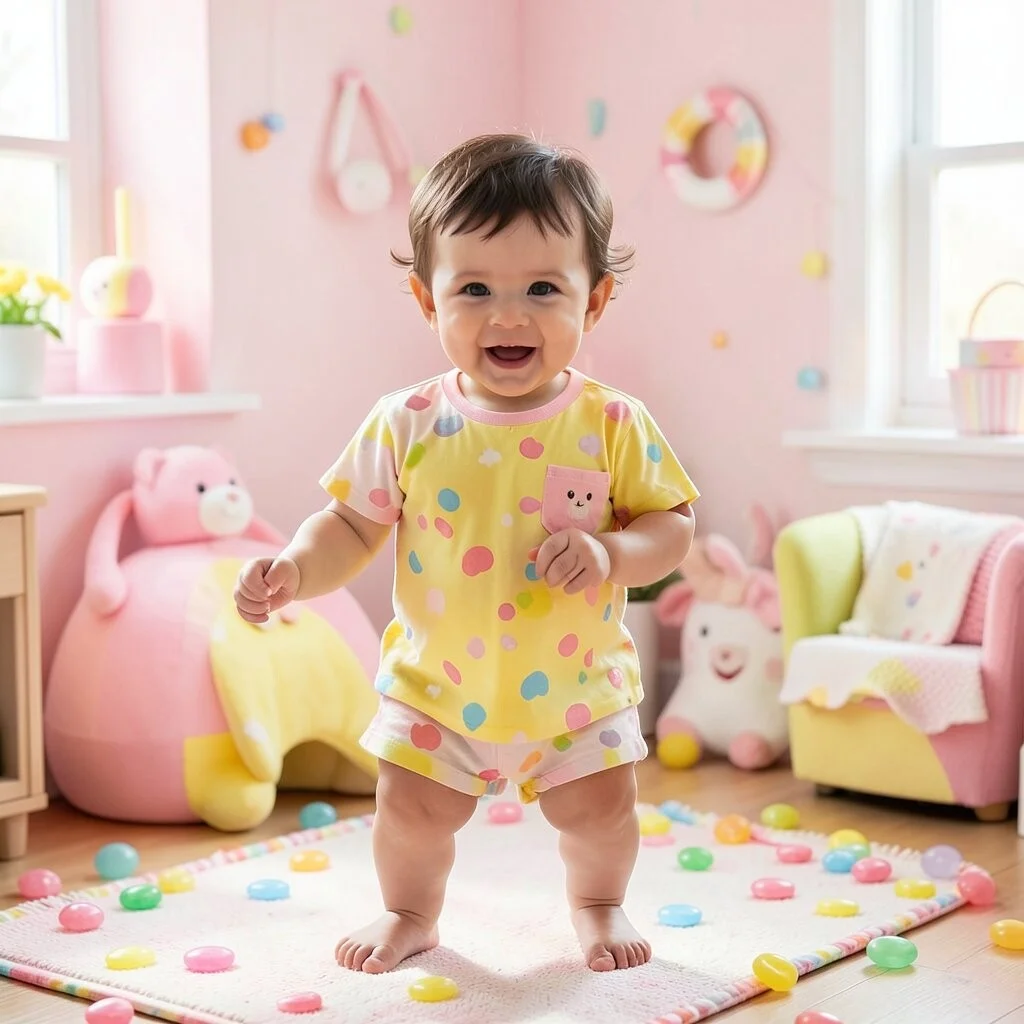
Candy colors are playful and sweet, like bubblegum pink and lemon yellow.
These colors add fun and whimsy to any space or outfit.
Great for kids’ rooms or playful accents. Affordable and cheerful!
16. Industrial Influence
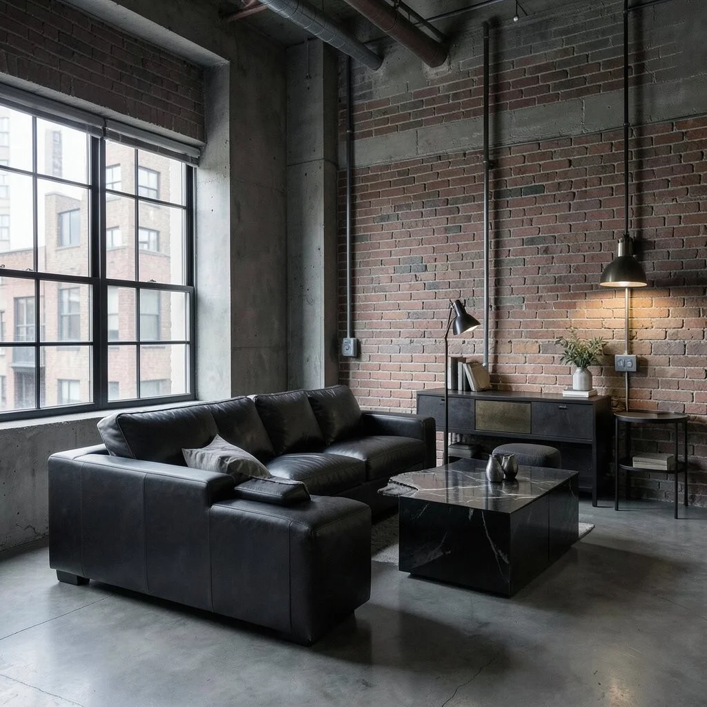
Industrial palettes use grays, blacks, and metallics for a sleek look.
This style feels modern and edgy, like a cool city loft.
Ideal for urban spaces. Use textures like brick and metal for authenticity.
17. Romantic Reds
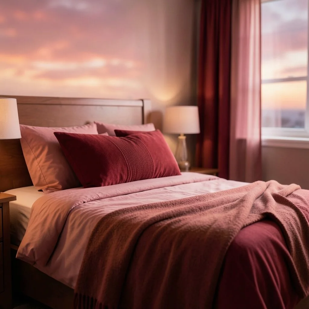
Romantic palettes focus on reds and pinks. They’re passionate and warm.
These colors create a cozy, loving atmosphere. Think of a rosy sunset.
Perfect for bedrooms or intimate spaces. Pair with soft lighting for extra romance.
18. Black and White Classics
Black and white is timeless and chic. It’s the ultimate in sophistication.
This palette is versatile and easy to personalize with pops of color.
Great for any room or style. Add personal flair with art or colorful accents.
19. Citrus Splash
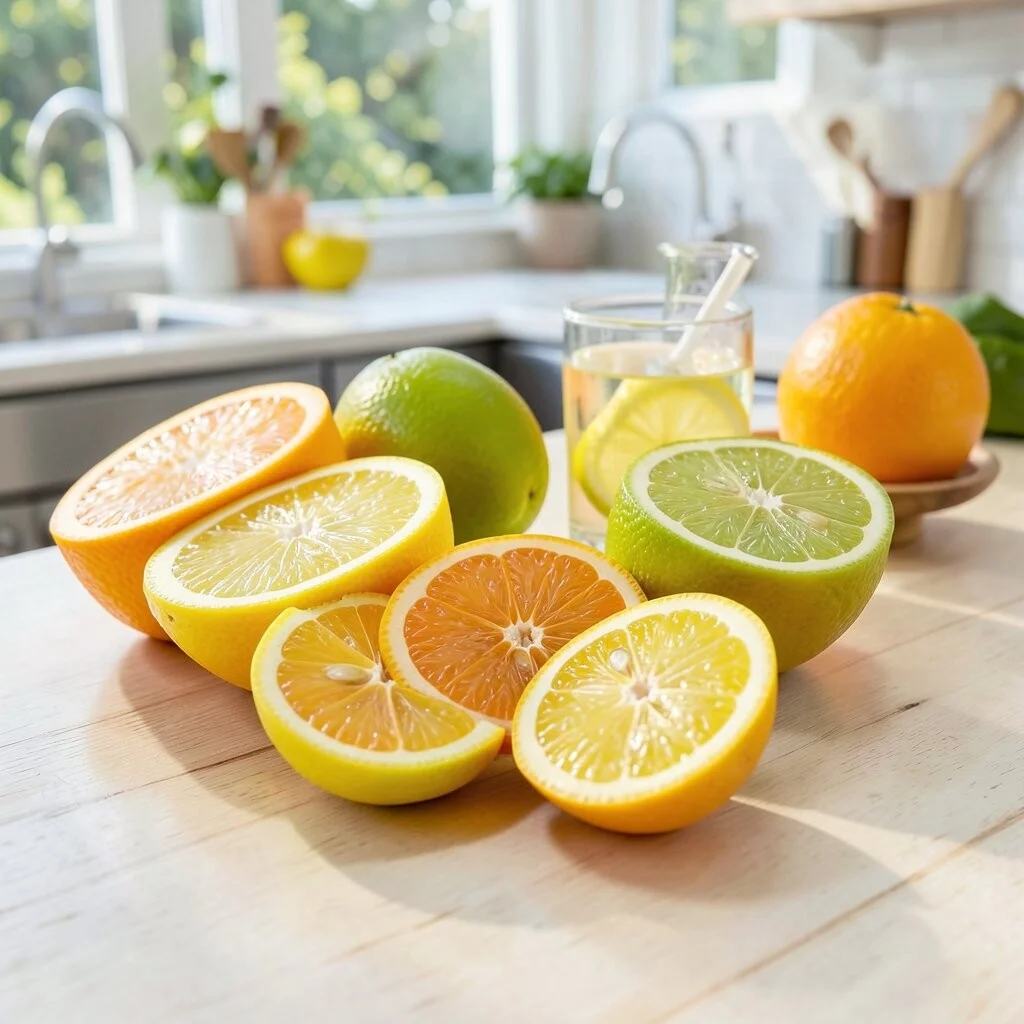
Citrus palettes include bright yellows, oranges, and greens.
They’re zesty and fun, like a sip of lemonade on a summer day.
Use in kitchens or outdoor spaces for a refreshing vibe. They’re cost-effective too!
20. Midnight Mysteries
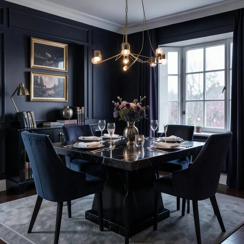
Midnight palettes use dark blues, purples, and blacks for a dramatic effect.
This palette feels mysterious and elegant, like a starry night.
Perfect for a sophisticated dining room or study. Pair with metallics for a luxe touch.
21. Floral Fantasy
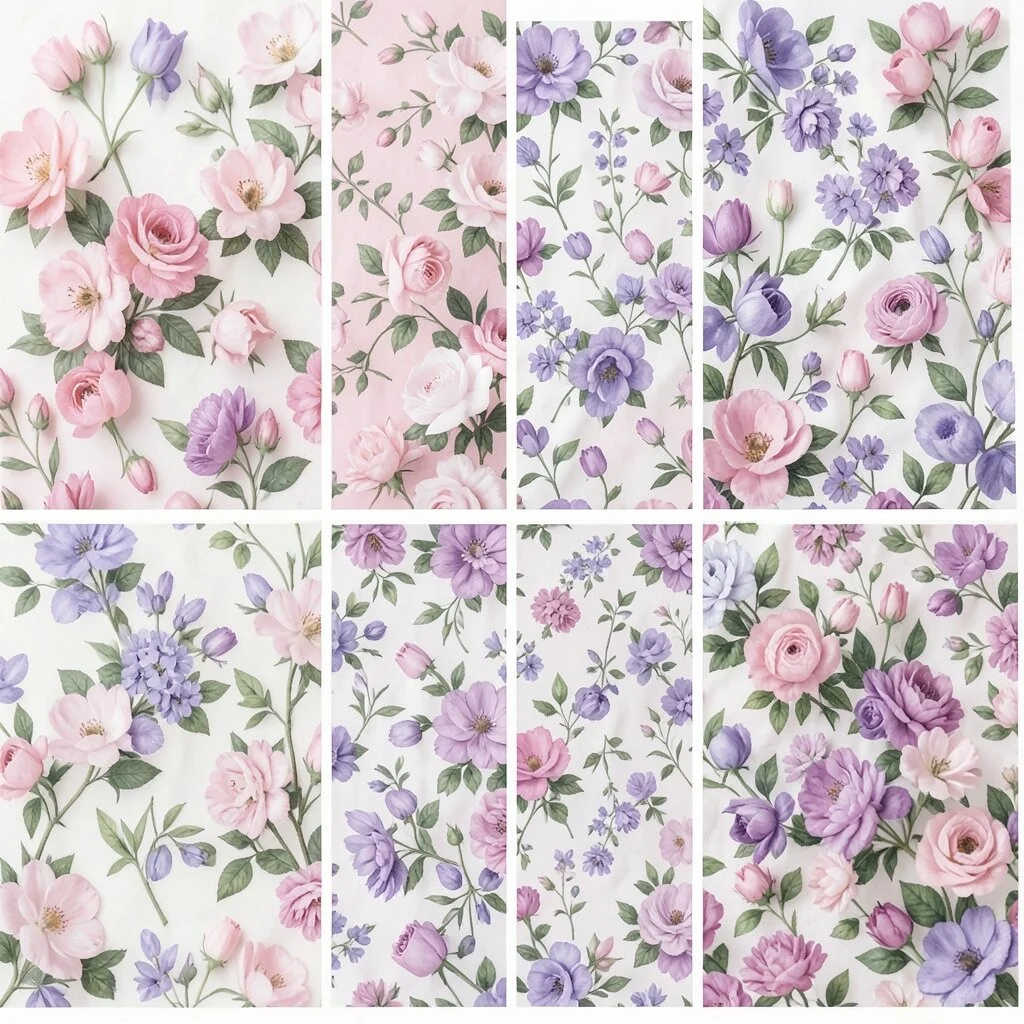
Floral palettes include soft pinks, purples, and greens. They’re romantic and fresh.
These colors feel like a blooming garden in springtime.
Use in bedrooms or bathrooms for a refreshing feel. Mix with floral patterns for extra charm.
22. Metallic Marvels

Metallic colors like gold, silver, and copper add a touch of glamour.
They’re shiny and luxurious, perfect for a little sparkle.
Use in accessories or small accents to keep costs down. They’re timeless and chic!