A color scheme can set the mood before you even think about it. Pick the right palette and your space, brand, or artwork starts to feel like it belongs to you.
When you understand how colors behave together, inspiration becomes easier and choices feel less stressful. Use these ideas to make your next palette feel fresh, useful, and unmistakably yours.
1. Start With a Feeling, Not a Favorite Color
Before you choose swatches, decide what you want people to feel. Soft greens and warm creams can feel calm, while deep blues and charcoal can feel focused.
Notice how color shows up in everyday life, like sunset light turning rooms golden. When you match a feeling to a palette, you’ll make better choices faster and waste less money on samples that don’t fit.
2. Learn the Basics of Hue, Value, and Saturation

Hue is the name of the color, like red or teal, while value is how light or dark it is. Saturation describes how strong or muted the color looks, such as a vivid orange versus a dusty terracotta.
Play with value first by pairing a light shade with a darker one for instant readability. A simple rule helps: if everything is the same brightness, the palette can look flat and expensive things can still feel unfinished.
In design tools, you can adjust these settings one at a time, which makes your palette easier to control. That control is a practical benefit when you want a consistent look across walls, clothes, or web graphics.
3. Use a Color Wheel to Build Smart Combos
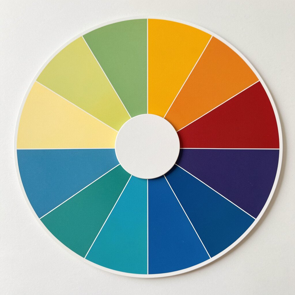
A color wheel is like a map for mixing moods, even when you’re not an artist. Complementary colors sit opposite each other, so they pop with energy, like coral with ocean blue.
Analogous colors sit next to each other, which can feel smooth and natural, like sage, olive, and warm beige. These groupings create uniqueness because they look intentional instead of random.
Try a small experiment by picking one anchor hue, then choosing neighbors or opposites for contrast. You’ll get practical inspiration quickly and you can stop once the vibe feels right.
Many current trends also favor gentle blends rather than harsh contrasts, especially in lifestyle branding. Keeping contrast in the accents helps your design stay modern and friendly.
4. Choose One Dominant, One Secondary, and One Accent
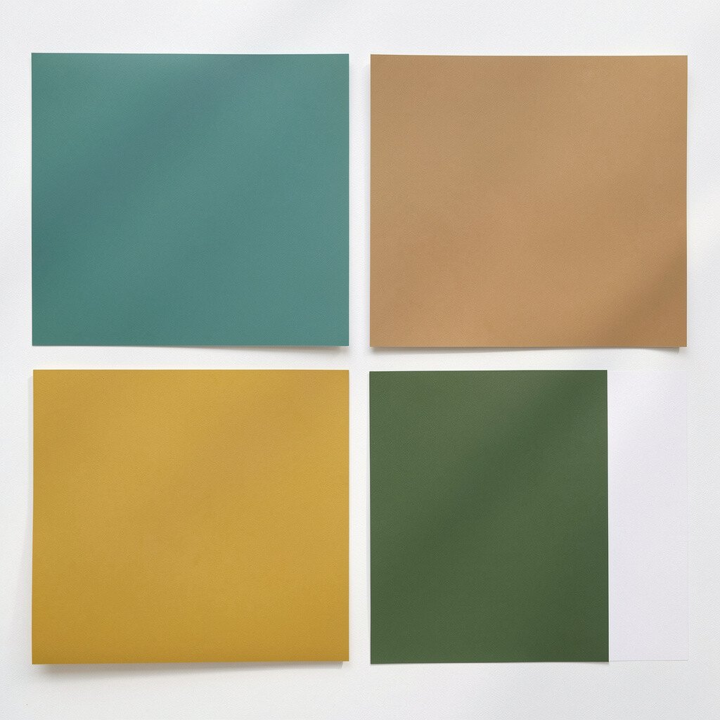
Visual balance gets easier when one color leads the scene. A dominant color like warm white or slate gray can set a clean foundation, while a secondary shade supports the background.
Then use an accent color sparingly for emotion, like a small burst of mustard on shelves or a teal button on a website. This structure helps your work feel polished and reduces the cost of trial and error because you buy fewer items.
Think about where the eye should land, such as on artwork, a product, or a key message. When you plan the highlight, your palette feels purposeful, not chaotic.
5. Let Neutrals Do Real Work for You

Neutrals are not boring when you treat them as tools. A creamy off-white, a warm gray, or a cool taupe can change the whole mood of a space or layout.
Choose neutrals that match the undertone of your main color so everything harmonizes. This practical step keeps your palette from looking mismatched, especially in rooms with mixed lighting.
You can also save money by using neutrals for big surfaces and investing in one or two bold accents. That way, your biggest areas stay flexible if your tastes shift later.
6. Match Your Palette to Real Lighting
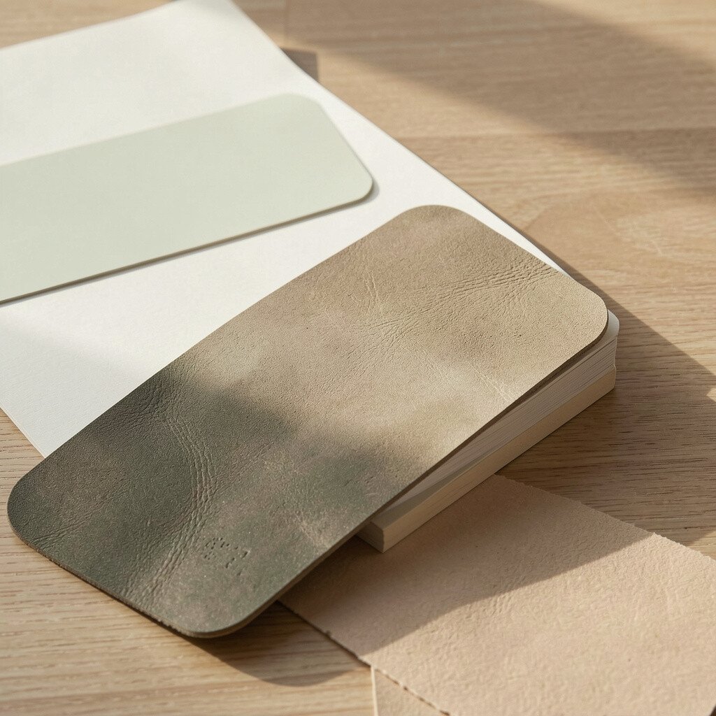
Lighting can make the same paint or digital color look very different. North-facing rooms often feel cooler, while south-facing light can bring warmth and soften contrast.
Try testing colors at different times of day, not just under one lamp. This helps you avoid the common problem of buying shades that look perfect in a swatch but too strong on a wall.
In graphic design, remember that screens vary too, so choose colors that still look good in dark mode. When your palette stays steady across conditions, it feels high quality and earns trust.
7. Consider Cultural Meaning and Audience Comfort
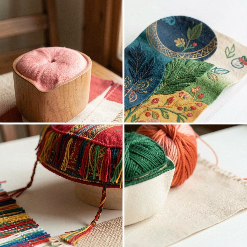
Colors carry meanings that people learn through culture, media, and personal experience. Bright reds can feel urgent and bold, while softer blues may feel steady and safe.
If you’re designing for a team or community, think about comfort as well as style. A palette that feels welcoming can boost usability, because people are more likely to read and stay focused.
Unique choices can still be friendly when you balance strong colors with calming neutrals. Personalization matters here too, since a palette that reflects the audience’s values often feels more “right.”
For brands, keeping meaning in mind is a practical way to avoid mixed signals. It also helps your colors feel consistent across campaigns and products.
8. Use Texture and Pattern to Add Depth
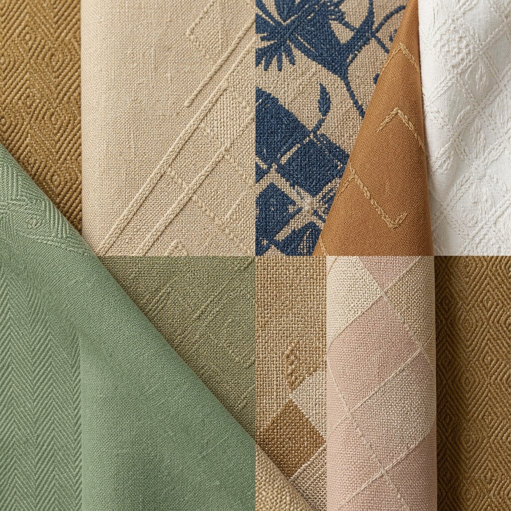
A palette becomes richer when colors meet texture. Think about how linen fabric changes the look of a beige, or how matte walls make deep colors feel smoother.
In design, add depth using patterns that share the same color family. A subtle stripe, a woven background, or even a faint grain effect can make simple palettes feel special.
This is a cost-smart move because you can reuse the same colors while still changing the mood through surface. Uniqueness shows up fast when texture does some of the heavy lifting.
9. Build Contrast Through Temperature, Not Just Brightness
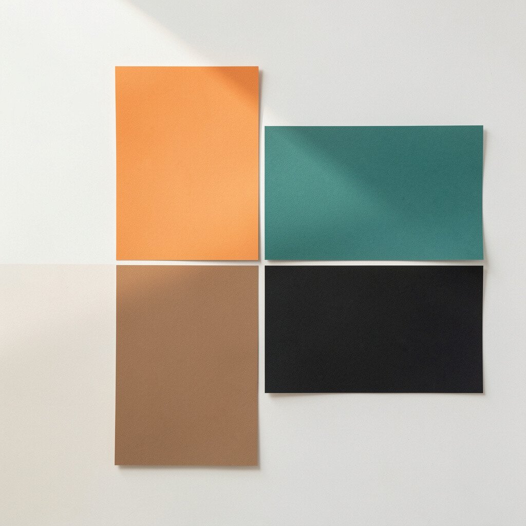
Warm colors like orange and warm yellow feel energetic, while cool colors like blue and teal feel calm. Using temperature contrast can make your design feel lively without using loud saturation.
Try pairing a warm cream with a cool deep teal for a natural “pop” that doesn’t look harsh. This approach keeps readability strong and reduces eye strain.
You can also use temperature shifts for hierarchy, like warm accents on key information. When your attention naturally flows, your palette feels easier to use and easier to enjoy.
10. Plan Your Palette for Different Sizes and Spaces
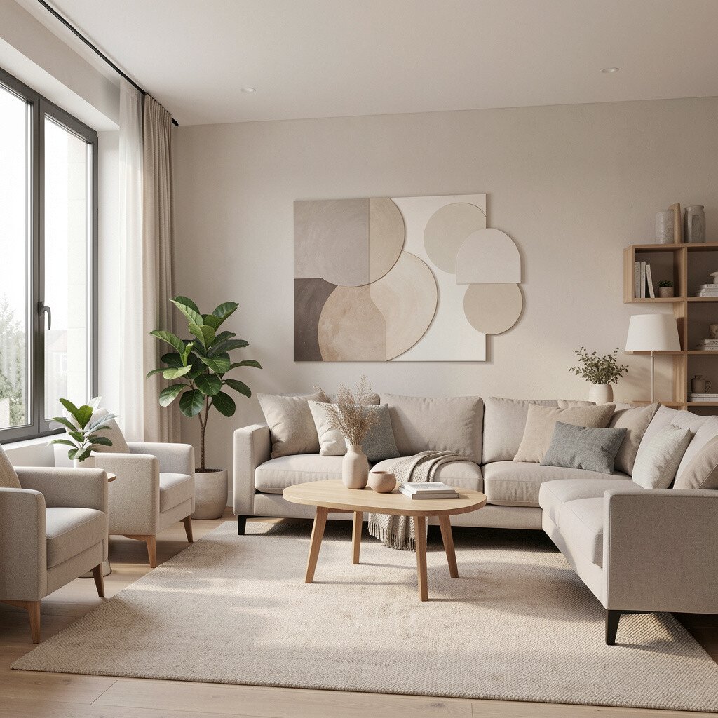
A color that looks bold on a small swatch may overwhelm a whole wall. The same idea applies to logos, posters, and product packaging, where scale changes perception.
Use your dominant color for large areas and save the strongest shades for smaller parts. This practical planning keeps your design from feeling too intense and helps your budget stretch further.
If you want a dark palette, try balancing it with light highlights and reflective materials. Many current design trends lean into dark accents, but they still keep spaces breathable.
11. Don’t Forget Typography Color and UI States

Text colors and interface colors shape how people read, tap, and understand. Dark text on light backgrounds is usually easier to scan, while white text on dark backgrounds can feel sleek and modern.
Make sure links, buttons, and hover states have clear contrast. When your palette supports these states, usability improves and frustration goes down.
In branding, match typography to the same mood as your palette so everything feels like one system. Personalization shows up when you pick type colors that match your personality, like playful bright accents or calm muted tones.
Also think about accessibility, since good contrast often benefits everyone. Investing a little time here is a practical benefit that saves headaches later.
12. Create a Reusable Palette You Can Keep Improving

When you find a palette you love, save it as a “starter set” for future projects. A reusable palette means you don’t start from scratch every time you need inspiration.
Keep a library of your favorite neutrals, one main color, and two accent shades. This structure helps you stay consistent across seasons while still adding new touches.
Over time, you’ll learn what works for your style, which is a big part of uniqueness. You’ll also likely spend less because you’ll order fewer random materials.
13. Use Reference Boards from Real Life
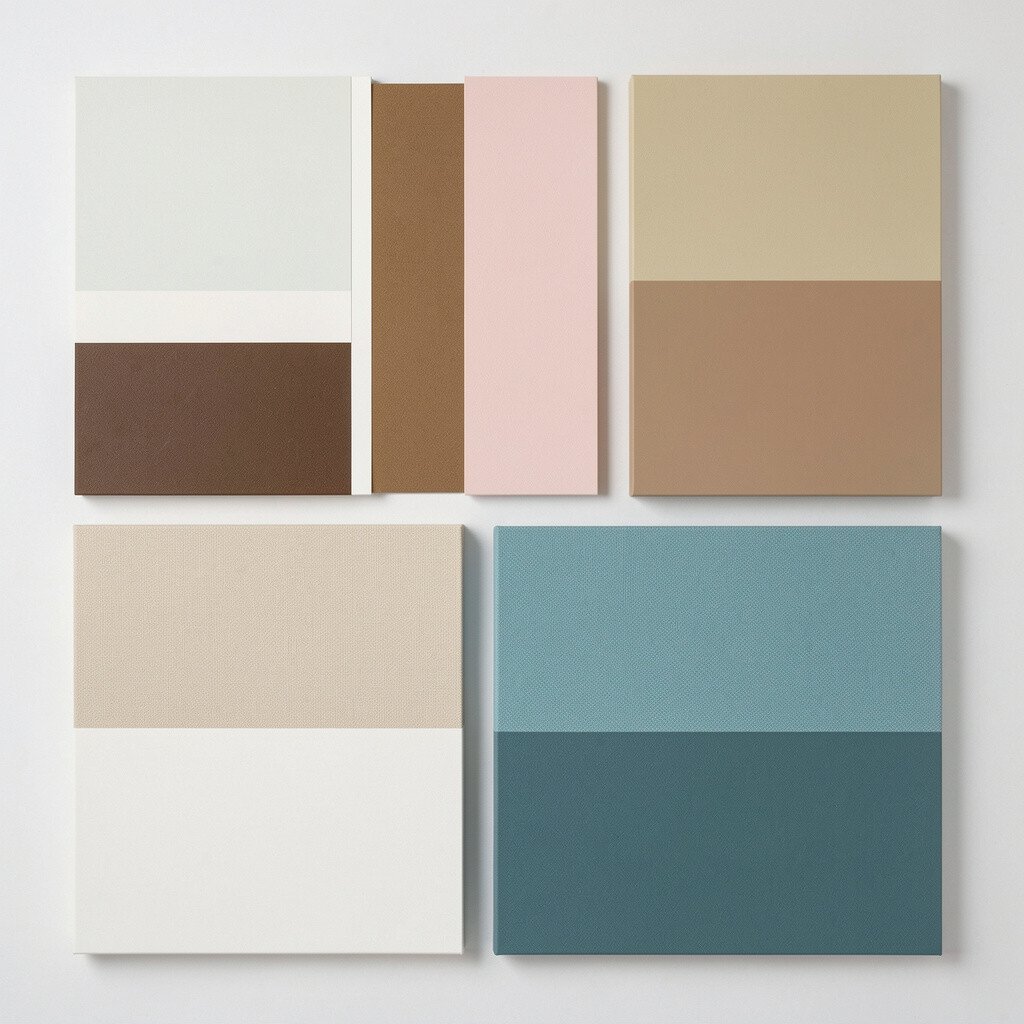
Inspiration often comes from what you already see, like clothing racks, street signs, or food plating. A bag of oranges, a patterned tile, or a sunset photo can be a full palette in disguise.
Collect images that share similar light and saturation, not just the same “pretty” colors. This helps your palette feel cohesive even if the sources look different at first.
Try saving references for different moods too, like “cozy evenings” or “clean mornings.” Personalization becomes easier when your inspiration library reflects how you actually want to feel.
This approach also supports current trends, because many designers now look to everyday textures and natural palettes. It feels grounded, not overly manufactured.
14. Try a “Limited” Palette for Stronger Style
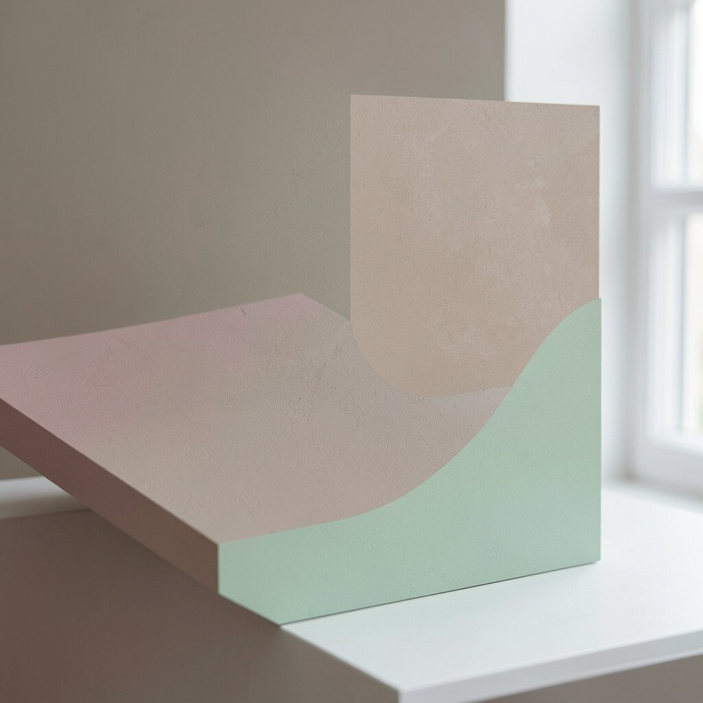
Some of the most striking palettes use just a few colors well. When you limit your choices, each shade has a job and your design stops sounding confusing.
For example, try one dominant neutral, one deep color for structure, and one bright accent for energy. That simplicity makes the result feel confident and helps the work look curated.
You can keep it interesting by shifting value, like pairing dark ink tones with soft mist tones. This technique gives you uniqueness without needing many different hues.
15. Balance Boldness With Calm Support Colors
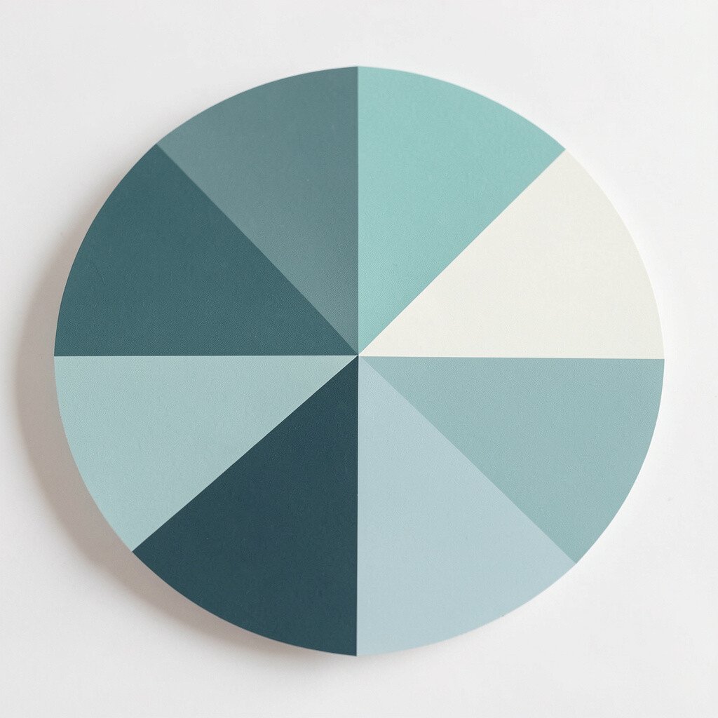
If you love bold colors, give them breathing room. A bright teal or fiery red can look amazing when surrounded by calm grays, warm creams, or muted greens.
This balance helps your palette feel more wearable, even for people who usually avoid loud shades. It also supports practical usability, since strong colors often need clear spacing to look good.
Try placing bold shades only where you want attention, like a front door, a hero section header, or a featured product. Personalization gets easier because you can adjust the intensity based on how bold you want your message to feel.
16. Plan for Seasonal Shifts Without Starting Over
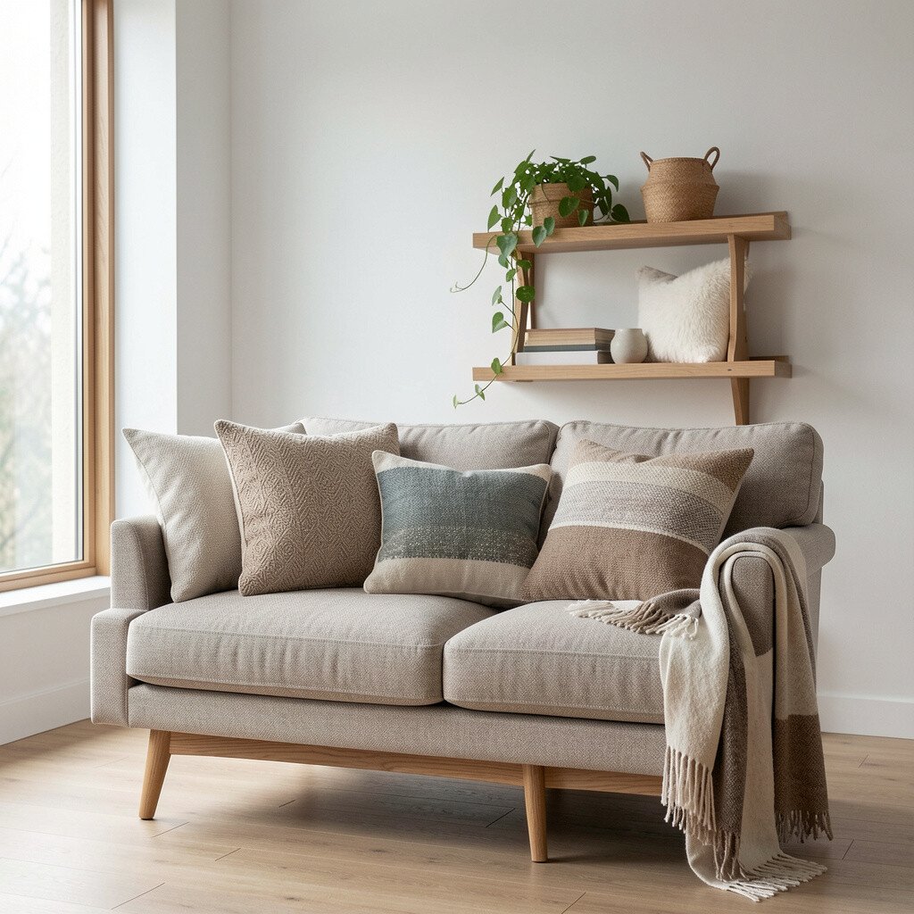
Seasonal color changes can keep your space or brand feeling fresh. Instead of rebuilding everything, swap small accents like pillows, packaging stickers, or website banners.
In fall, warm palettes with earthy browns and burnt oranges can feel inviting. In spring, lighter greens and bright blues can feel airy and upbeat.
Keeping the base neutral makes these changes cheaper and easier. This practical approach also supports uniqueness, since your “core” stays yours while the seasonal layer adds variety.
Current trends often blend timeless neutrals with seasonal color pops, which helps your design feel current without chasing every fad.
17. Test Palettes in Context Before You Commit
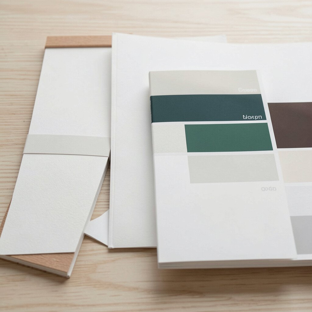
Seeing a palette in context is the difference between “looks nice” and “looks right.” If you’re painting, place samples near your lighting and furniture so the undertones can mingle.
If you’re designing digitally, preview colors on the actual screens and backgrounds you’ll use. This practical test prevents surprises like low contrast or weird color casts.
You can also simulate materials by adding digital textures, which helps you predict how matte, glossy, or fabric surfaces will affect the palette. That prediction can save money by reducing wasted purchases.
18. Make It Yours With Small Personal Adjustments
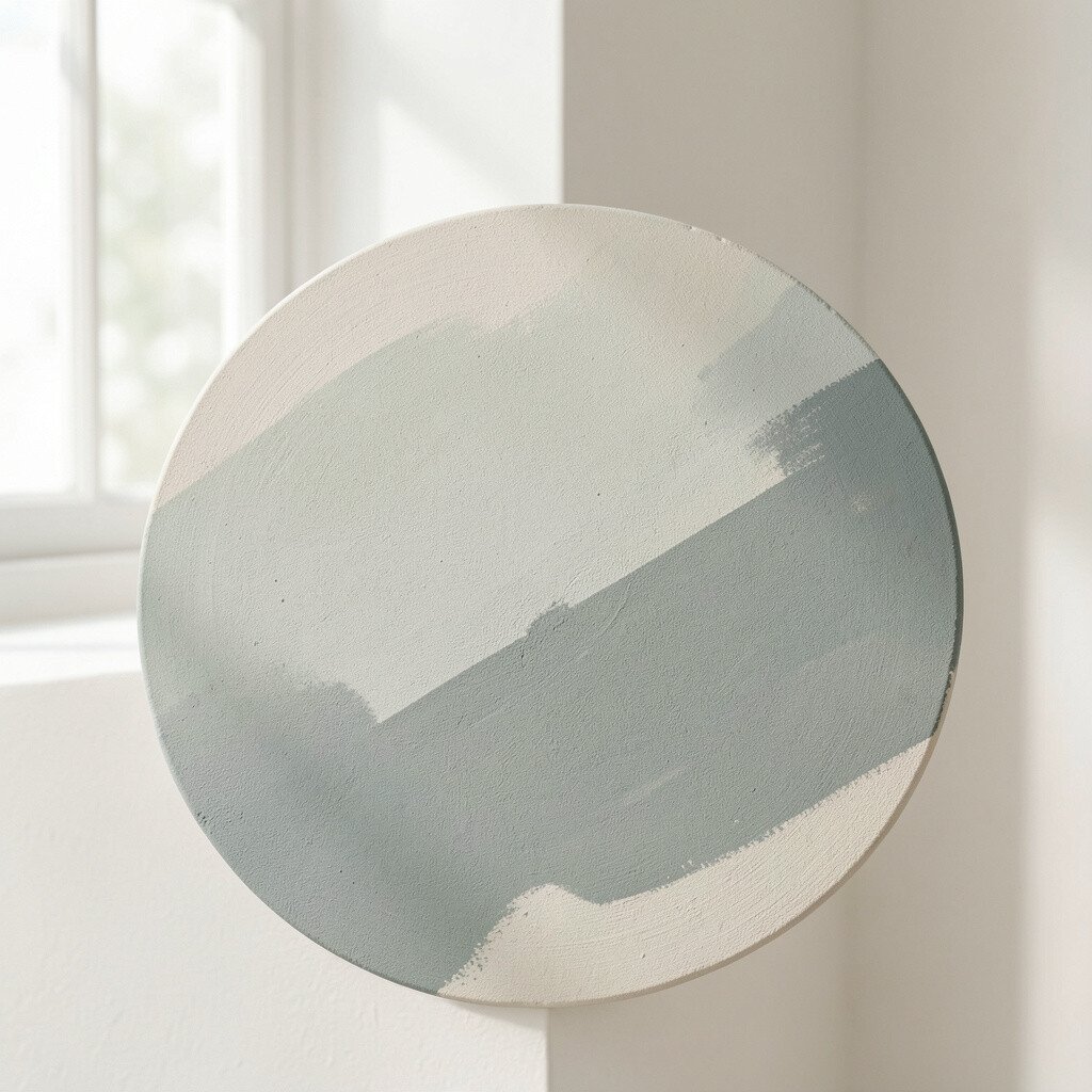
The best color scheme is the one that fits your life, not just a trend report. Add a personal twist by choosing accent colors tied to a memory, a favorite outfit, or a meaningful place.
Maybe you love ocean blues because of travel, so you bring that tone into art frames or your home office. Or you prefer gentle blush tones because they feel comforting when you’re tired.
To keep your palette cohesive, adjust through value and saturation rather than replacing every shade. This cost-smart method helps you upgrade your look without buying all new items.
When your palette includes personal cues, it feels unique and inviting. You’ll also feel more confident using it every day, because it reflects you in a real way.