
Old colors can make a room feel rich and warm. A few thoughtful shades can bring back charm in a very simple way.
1. Mustard Yellow

Mustard yellow brings a sunny glow that feels cozy instead of loud. It works well in rooms that need warmth and a little old-school cheer.
This shade looks lovely on an accent chair, a painted side table, or a kitchen wall. It pairs nicely with wood, cream, and deep green, and it can fit a tight budget if you start with small items like pillows or lampshades. If you want a modern twist, mix it with clean lines and matte finishes.
2. Olive Green

Olive green has a calm, earthy look that feels steady and timeless. It can make a space feel restful without looking plain.
Use it on cabinets, curtains, or a reading nook for a soft vintage mood. The shade works well with brass, tan leather, and white trim, and it is a smart choice if you want a color that hides wear better than lighter tones. For a personal touch, add woven baskets or framed plant prints.
This color is popular in cozy homes right now because it feels natural and lived-in. It also works in small rooms when paired with bright light and pale accents. If you want to save money, try olive in fabric or decor before painting the whole room.
3. Dusty Rose
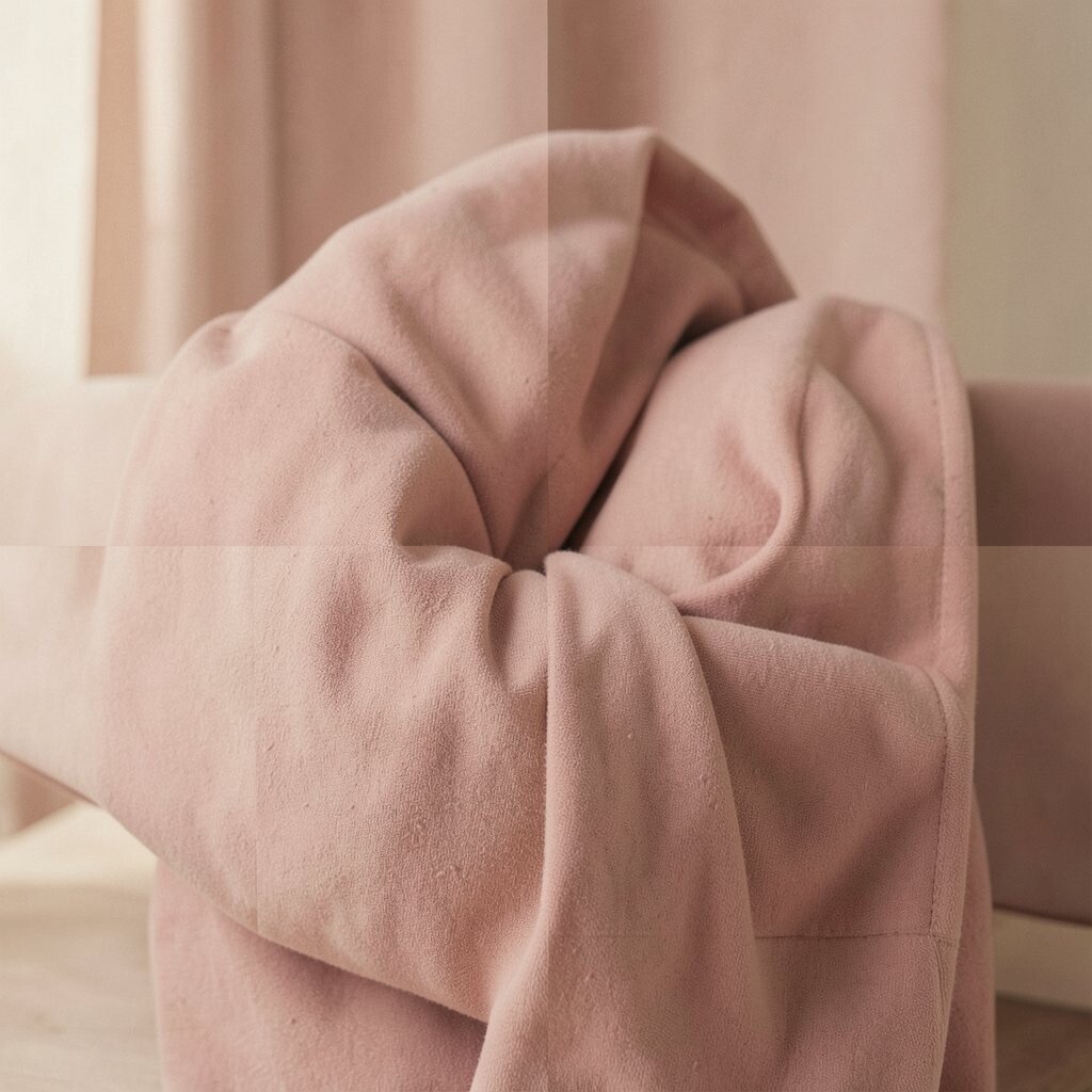
Dusty rose gives a room a soft blush that feels sweet and grown-up. It has a vintage charm that works well in bedrooms, sitting rooms, and even bathrooms.
Try it on bedding, wall art, or a painted dresser for a gentle pop. It looks pretty with gray, cream, and faded gold, and it can make a room feel warm without being too bold. If you like a softer style, keep the rest of the room simple so the color can shine.
This shade is easy to personalize with lace, velvet, or old brass frames. It can also be a low-cost way to refresh a room if you use it in pillows or throws. Many people like it now because it feels romantic but still easy to live with.
4. Teal Blue

Teal blue brings a deep, rich look that feels both classic and fresh. It can make plain furniture or walls stand out in a strong but friendly way.
Use teal on a front door, a bookcase, or a feature wall to add drama. It pairs well with walnut wood, white tile, and warm metal details, and it can make a room feel more polished without needing many extra pieces. For a custom feel, add artwork with sea glass tones or old maps.
5. Avocado Green

Avocado green has a bold retro feel that can make a room feel playful and full of character. It brings back the spirit of old kitchens and mid-century spaces.
Try it on a breakfast nook, an accent wall, or a set of dining chairs. It looks good with burnt orange, cream, and dark brown, and it can be a fun way to use a color that feels different from today’s usual neutrals. If you want to keep costs down, use it in smaller pieces instead of repainting everything.
This color works well in homes that need a bit of personality. It can also feel current when paired with simple shapes and light wood. Add plants or woven textures to keep it from feeling too heavy.
6. Powder Blue

Powder blue feels light, airy, and a little dreamy. It can make a room seem calmer right away.
Use it on bedroom walls, a nursery, or a painted cabinet for a soft vintage touch. The shade looks lovely with white, silver, and pale wood, and it is a good option if you want color without a strong visual push. For a more personal style, add striped fabric or old glass jars.
Powder blue is easy on the eyes, which makes it great for restful spaces. It also works well in sunny rooms because it keeps the light feeling fresh. If you are on a budget, a few blue accessories can give the same mood as a full paint job.
7. Burnt Orange

Burnt orange adds warmth and energy with a vintage edge. It feels rich, cozy, and full of life.
This color shines on pillows, rugs, and ceramic pieces, but it can also look bold on an accent wall. It pairs well with brown leather, cream, and olive green, and it works nicely in fall-inspired rooms all year long. For a custom look, mix it with handmade items or textured fabrics.
Burnt orange is a strong choice for people who want a room with personality. It can make a space feel welcoming without needing a lot of decor. If you want to keep spending low, choose one or two standout pieces instead of many small ones.
8. Sage Green

Sage green has a soft, misty look that feels peaceful and easy to live with. It brings a gentle vintage mood without taking over the room.
Paint it on walls, shelves, or built-in storage for a calm, stylish feel. It works well with cream, stone, and light wood, and it is a favorite in current home design because it feels natural and fresh. If you want something more personal, add dried flowers or old botanical prints.
9. Burgundy

Burgundy gives a room a deep, rich feeling that can seem fancy and warm at once. It has a strong vintage look that feels full of history.
Use it in velvet pillows, a dining room wall, or a statement chair to create depth. The color pairs well with gold, dark wood, and soft beige, and it can make even simple furniture feel more special. If you want a lower-cost option, try burgundy in art, candles, or a throw blanket first.
This shade works well in rooms where you want a cozy, elegant mood. It also fits with current trends that favor richer, moodier colors. Add a few lighter pieces so the room stays balanced and bright enough.
10. Peach
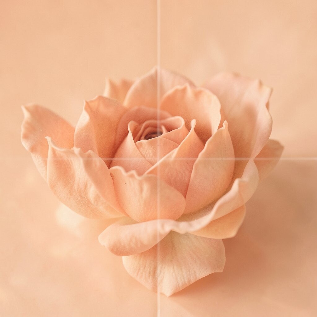
Peach brings a soft glow that feels friendly and cheerful. It has a sweet retro charm that can make a room feel welcoming right away.
Try it on bathroom walls, curtains, or a small accent chair for a warm touch. Peach looks lovely with white, tan, and soft green, and it can brighten a room without feeling harsh. For a personal style, mix it with curved furniture or vintage glass accents.
This color is a nice choice if you want something gentler than coral but warmer than beige. It can also be a smart budget pick because small peach items can change the mood of a space fast. Many people like it now for its soft, sunny look.
11. Chocolate Brown

Chocolate brown feels deep, steady, and comforting. It gives a room a classic vintage base that can make other colors stand out.
Use it on leather, wood furniture, or trim to add richness. It pairs well with cream, rust, and gold, and it can make a space feel grounded and calm. If you want to keep costs low, focus on brown decor pieces instead of large changes.
This shade is great for rooms that need more warmth and structure. It also works well with today’s cozy, layered style. Add soft textiles and warm lighting to keep it from feeling too dark.
12. Aqua

Aqua has a bright, playful feel that brings a fresh vintage vibe. It can make a room feel lively without becoming too intense.
Use aqua on stools, picture frames, or a bathroom vanity for a cheerful look. It pairs nicely with white, sand, and coral, and it can give a room a beachy retro mood. For a personal touch, add old postcards or glass decor in matching tones.
Aqua works well in smaller spaces because it feels open and light. It is also a fun way to bring color into a room without going too dark or heavy. If you are watching your budget, try one painted piece before committing to a full wall.
13. Creamy Beige
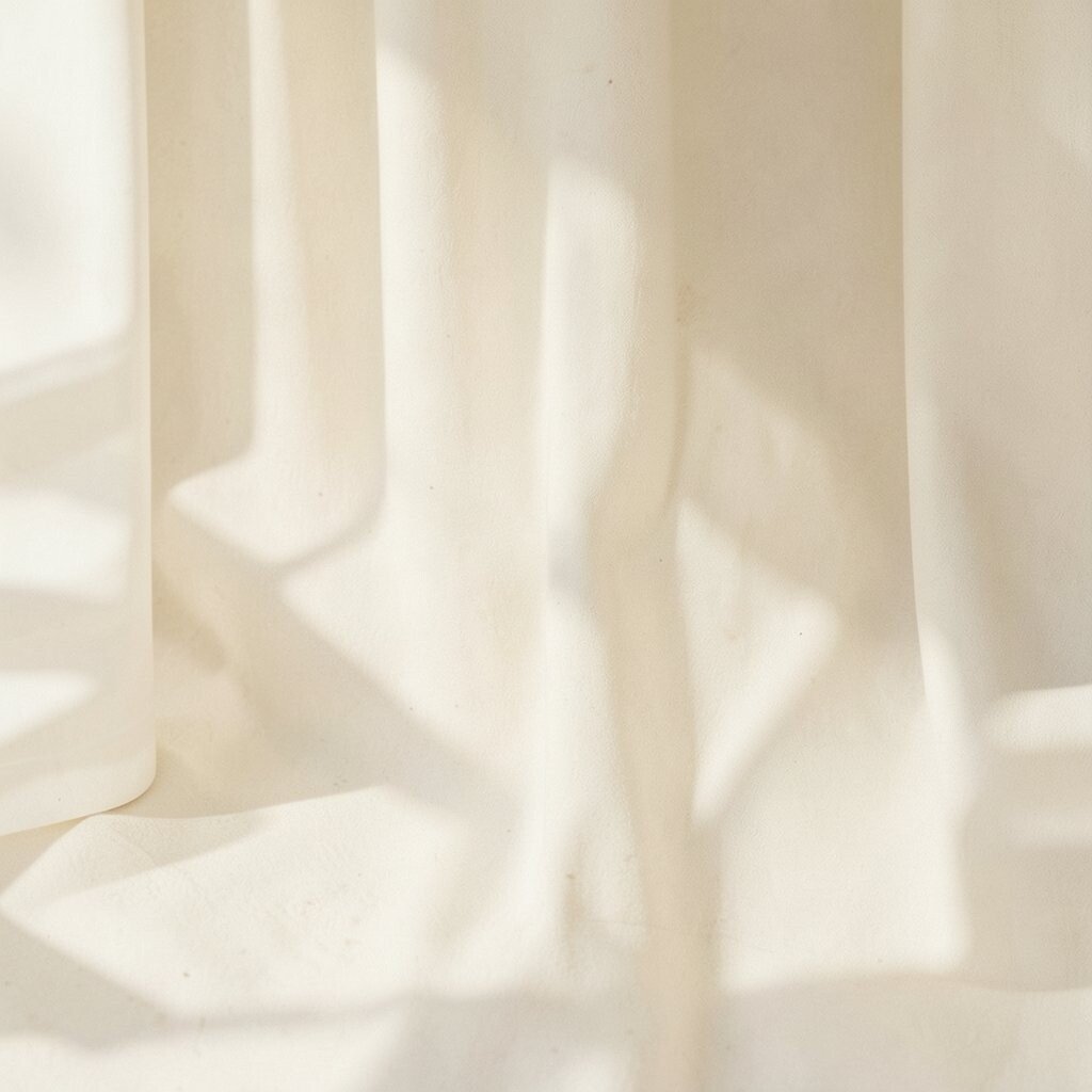
Creamy beige may seem simple, but it has a soft vintage beauty that feels warm and safe. It can make a room look calm, neat, and timeless.
Use it as a wall color, on curtains, or in large rugs to create a gentle base. It works with almost everything, including brown, blue, and green, and it helps brighter vintage colors stand out more clearly. For a custom feel, layer in lace, rattan, or old books.
This color is a smart choice if you want a room that feels light but not cold. It also suits current trends that favor soft, natural shades. A creamy beige palette can be budget-friendly because it is easy to build around with pieces you already own.
14. Terracotta

Terracotta brings a warm clay look that feels earthy and full of character. It has a handmade vintage feel that can make a room seem inviting.
Try it in planters, wall paint, or a tiled backsplash for strong charm. Terracotta looks beautiful with cream, sage, and black, and it can make a space feel grounded and cozy. If you want to personalize it, add pottery, woven rugs, or travel finds.
This color is popular in home design because it feels natural and stylish at the same time. It works especially well in rooms with lots of light. For lower cost, use terracotta in small decor pieces before painting the whole room.
15. Pale Lavender
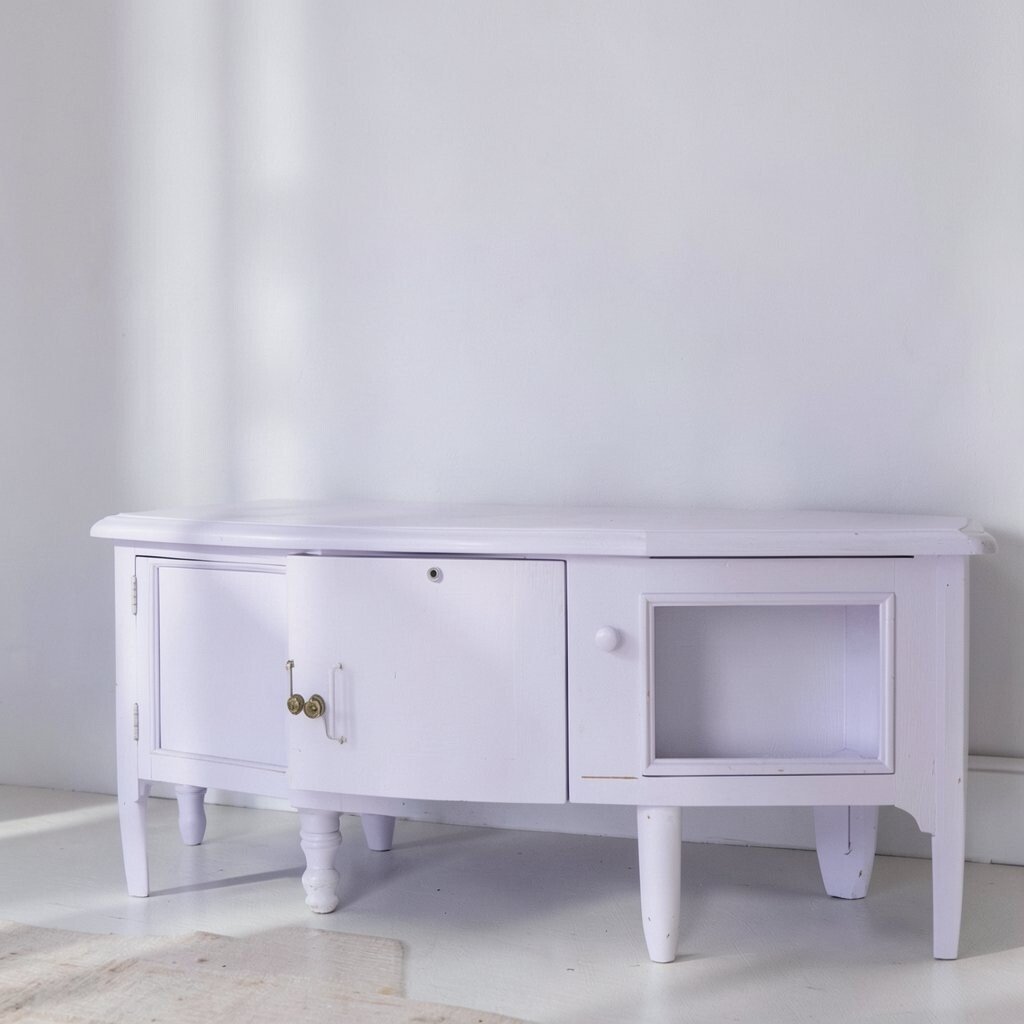
Pale lavender has a soft, dreamy quality that feels gentle and a little magical. It can make a room seem calm and sweet without looking childish.
Use it on bedroom walls, a vanity stool, or framed art for a light vintage touch. It pairs well with white, silver, and soft gray, and it can add color while still feeling easy and restful. For a personal style, mix in floral patterns or old perfume bottles.
This shade works well in spaces meant for relaxing or getting ready. It also fits current trends that favor soft color with a romantic feel. If you want to keep costs down, a few lavender accessories can give the same mood as paint.
16. Navy Blue

Navy blue brings a strong, classic look that feels smart and timeless. It can make a room feel deeper and more polished right away.
Use it on a sofa, a feature wall, or cabinets for a bold vintage effect. Navy works well with brass, white, and wood tones, and it is a great choice if you want something that looks rich but still easy to match. For a personal touch, add striped pillows or framed sailboat art.
This color is a favorite because it works in both old and new homes. It can hide marks better than lighter shades, which is helpful in busy spaces. If you are watching your budget, navy decor can give a lot of style without a full redesign.
17. Coral

Coral feels bright, warm, and full of energy. It has a cheerful vintage look that can wake up a room fast.
Try it on throw pillows, a painted mirror, or a small wall section for a happy pop of color. Coral pairs well with teal, cream, and soft brown, and it can make a space feel fun without being too sharp. For a unique touch, use it with retro shapes or shiny brass details.
This shade is a good pick if you want a room that feels lively and friendly. It also works well in social spaces like dining rooms or family rooms. To save money, start with one coral piece and build from there.
18. Moss Green

Moss green has a deep, wooded feel that brings the outdoors in. It gives a room a quiet vintage mood with lots of character.
Use it on walls, cabinets, or upholstered furniture for a rich look. It pairs beautifully with tan, cream, and dark wood, and it can make a room feel calm and tucked away. If you want to make it your own, add fern prints or old brass lamps.
This color is a strong choice for cozy rooms and reading spots. It also fits current trends that lean toward nature-inspired colors. If you need a lower-cost update, try moss green in a rug or blanket first.
19. Soft Gray

Soft gray gives a room a quiet, balanced look that feels easy and neat. It can act like a gentle backdrop for more colorful vintage pieces.
Use it on walls, sofas, or shelving to create a calm base. Soft gray works well with pink, navy, and wood tones, and it helps old-style decor stand out without making the room feel busy. For a personal touch, add framed family photos or textured pillows.
This shade is useful in almost any room because it stays flexible. It also fits current homes that mix old and new styles. If you want to keep costs low, gray paint is a safe starting point that can work with many future changes.
20. Rust

Rust has a warm, weathered look that feels bold and earthy. It brings strong vintage energy without feeling too shiny or new.
Try it on a rug, curtains, or a painted accent wall to add depth. Rust pairs well with cream, olive, and dark blue, and it can make a room feel cozy and collected. For a custom look, use it with handmade pottery or old wood frames.
This color is great for spaces that need more warmth and personality. It also feels current because rich earthy shades are very popular now. If you want to spend less, choose rust in soft goods instead of large furniture.
21. Mint Green

Mint green brings a fresh, breezy feeling that can make a room seem light and cheerful. It has a sweet vintage style that feels clean and happy.
Use it on bathroom cabinets, kitchen chairs, or a small dresser for a playful touch. Mint looks lovely with white, pale wood, and chrome, and it can brighten a room without making it feel crowded. For a personal style, add glassware or retro patterns.
This shade works well in smaller rooms because it feels open and airy. It is also a fun pick for people who want color but not too much weight. If you are on a budget, mint accessories can give a big style boost fast.
22. Plum

Plum gives a room a rich, moody look that feels elegant and a little dramatic. It has a vintage feel that can make simple spaces seem more special.
Use it on a velvet chair, drapes, or a feature wall for strong impact. Plum pairs well with gold, blush, and dark wood, and it can add a sense of comfort and depth. For a personal touch, mix in art with floral or jewel tones.
This color is a smart choice if you want something that feels fancy but still cozy. It also works with current trends that favor deeper, more expressive colors. If you want to keep costs down, use plum in one statement item and keep the rest simple.
23. Butter Yellow

Butter yellow has a soft, sunny glow that feels kind and welcoming. It brings a gentle vintage warmth that can brighten a room without shouting.
Try it on kitchen walls, a hallway, or fabric accents for a light happy mood. It pairs well with white, blue, and pale wood, and it can make a room feel cheerful even on cloudy days. For a unique touch, use it with enamelware or old floral prints.
This color is nice for people who want a warm room that still feels soft. It also fits current tastes for gentle, upbeat shades. If you are watching your budget, small butter yellow pieces can change the mood with very little cost.
24. Emerald Green
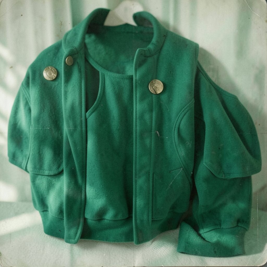
Emerald green feels rich, bold, and full of life. It brings a jewel-like vintage style that can make a room look special right away.
Use it on a statement wall, a shelf, or a plush chair for a strong look. Emerald pairs beautifully with brass, black, and cream, and it can make a room feel polished and deep. For a personal touch, add velvet, glass, or framed nature art.
This color works well in rooms that need a bit of drama. It also fits current trends that lean toward luxurious, saturated shades. If you want to save money, use emerald in decor pieces before choosing paint.
25. Salmon

Salmon has a warm pink-orange feel that looks soft and inviting. It gives a room a vintage glow that feels friendly and easy to enjoy.
Try it on cushions, a painted stool, or wall art for a gentle pop. Salmon pairs well with cream, teal, and light wood, and it can make a space feel warm without becoming too bright. For a personal style, mix it with curved mirrors or retro lighting.
This shade is a nice middle ground if you want color but not too much intensity. It can also work well in rooms that need a happy, relaxed mood. If cost matters, use salmon in small decor pieces and build your palette slowly.
26. Chocolate Cherry

Chocolate cherry blends deep red and brown into a rich, moody color. It feels old-fashioned in a good way and can make a room seem cozy and full of depth.
Use it on a painted desk, a heavy curtain, or a statement armchair. It looks great with cream, gold, and dark wood, and it can add a touch of luxury without needing a lot of extras. For a personal touch, pair it with antique books or framed portraits.
This color works well in rooms meant for slowing down and resting. It is also a strong choice for current styles that like darker, warmer shades. To keep costs lower, use it in one bold piece instead of many.
27. Seafoam

Seafoam has a light, watery look that feels fresh and soft. It brings a breezy vintage mood that can help a room feel open.
Try it on bathroom walls, a bedside table, or kitchen chairs for a clean, pretty effect. Seafoam pairs well with white, silver, and sandy beige, and it can make a room feel calm and bright at the same time. For a unique look, add shell shapes or glass decor.
This shade is especially nice in rooms that need a little lift. It also fits current home trends that favor soft coastal colors. If you want to spend less, seafoam decor can be enough to set the tone.
28. Faded Red

Faded red has the worn, time-softened look of old signs and vintage fabric. It feels bold, but the softer finish keeps it from looking too strong.
Use it on a rug, a painted shelf, or a small accent wall to add instant character. It pairs well with cream, brown, and muted blue, and it can make a room feel warm, lived-in, and full of story. For a personal touch, mix it with old posters or handmade ceramics.
This color is a good pick if you want vintage style with a little edge. It also works well with today’s love for imperfect, nostalgic spaces. If you are keeping a close eye on cost, start with faded red accessories and add more only if the look feels right.