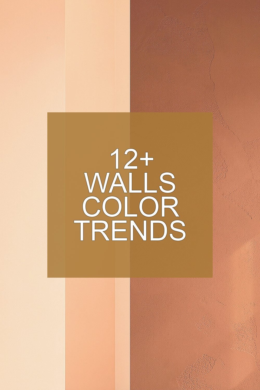
Your walls set the mood before you notice a single thing. The right color can make everyday life feel softer, brighter, and more you.
1. Warm Off-White With a Peachy Glow
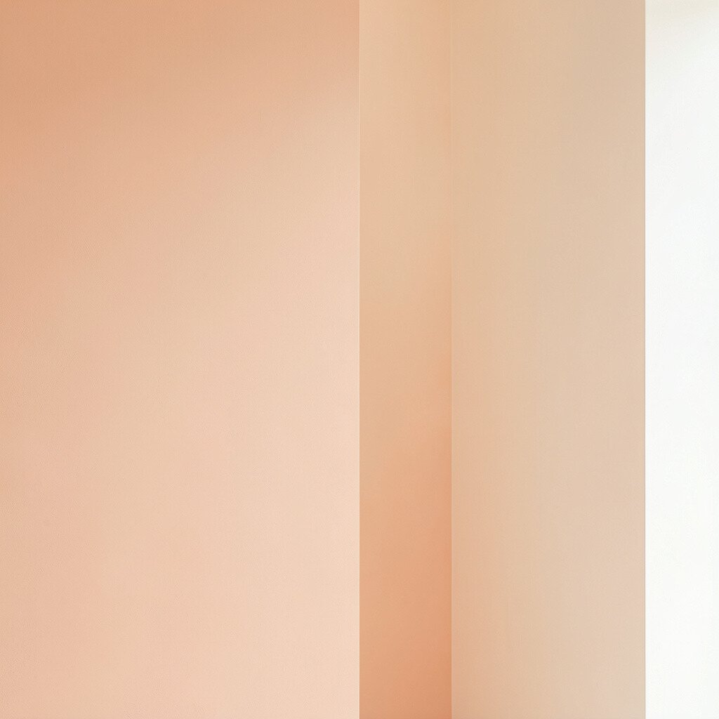
Warm off-white can look clean yet cozy, like sunlight caught in plaster. Choose a peachy-leaning undertone and watch how the room feels more welcoming at breakfast and more relaxed at night.
Pair this color with light wood, cream textiles, and brushed gold accents for an easy, current look. It helps hide small scuffs and uneven patches, which means fewer worries with daily living. If you want a simple upgrade, paint the main wall first and compare it in the evening with your existing lamps.
2. Deep Terracotta for Grounded Energy

Terracotta adds warmth that feels natural, like clay, brick, and sun-baked earth. A deep shade can bring a grounded calm to living rooms, hallways, and dining spaces.
It also gives color depth without needing dark furniture to carry the whole look. For a modern feel, keep the rest of the palette neutral, then add patterned pillows or artwork with muted greens or soft browns. Use matte paint to reduce glare and make the color look even richer.
To keep costs under control, focus on a single feature wall and use touch-up paint for edges where doors and trim meet. Test samples on two different walls, since light changes how warm terracotta looks. If you love the vibe, then bring the color into an accent trim or cabinet interior for a cohesive feel.
3. Soft Sage Green That Feels Like a Fresh Breath
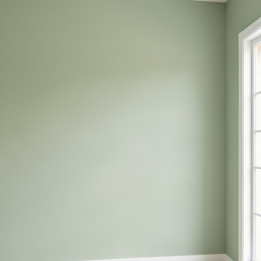
Sage green is calm and friendly, like a garden path after a gentle rain. It works especially well in rooms where you want comfort, such as bedrooms and reading corners.
Its gray undertone prevents it from getting too loud, so it still feels balanced. Match it with crisp whites, natural stone, and linen fabrics for a clean, current look. You can also add a slightly warmer beige rug to make the green feel even more inviting.
Go practical by painting in a semi-matte finish, which wipes clean without looking shiny. If you have kids or pets, this kind of soft color can hide everyday marks better than pure white. For personalization, pick artwork with botanical lines or ceramic vases in off-white and muted clay tones.
4. Milky Blue for a Bright, Airy Mood
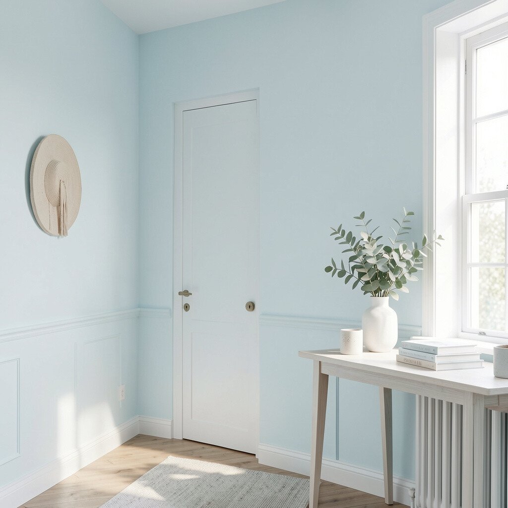
Milky blue is gentle, not icy, and it can make rooms feel open and light. Think of clouded sky colors that look soft in daylight and soothing under warm bulbs.
It pairs beautifully with warm grays, creamy whites, and natural oak, creating a smooth, lived-in look. If you want instant freshness, paint a hallway or the ceiling line for a subtle lift. A satin finish can help the paint last longer in high-traffic areas.
5. Charcoal Gray With a Smooth, Modern Edge
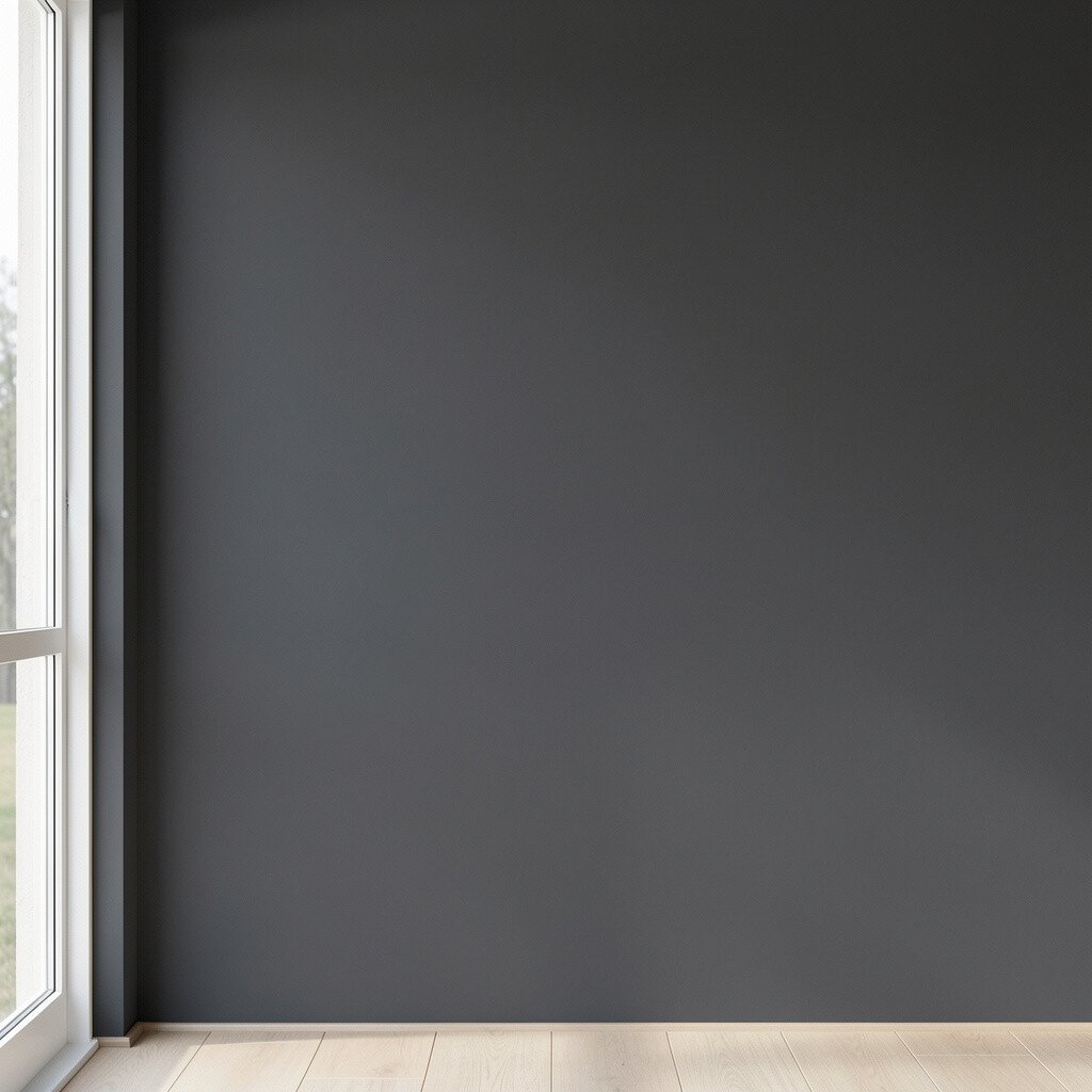
Charcoal gray brings a bold, grown-up vibe that makes furniture and art stand out. It can feel dramatic in a good way, especially when the walls are crisp and well lit.
To avoid heaviness, use it in a medium-sized room with plenty of natural light or pair it with pale curtains. Add warm lighting and light-toned textiles so the space still feels cozy. This trend also looks great with modern shelving, simple molding, and bold black-framed photos.
Consider cost and coverage by using a high-quality primer if your current walls are darker. Test a few swatches near the floor and near eye level, since gray can shift with shadows. For personalization, paint built-ins or an accent wall in charcoal while keeping trim bright white for a sharp frame effect.
6. Butter Yellow That Feels Sunny, Not Squeaky
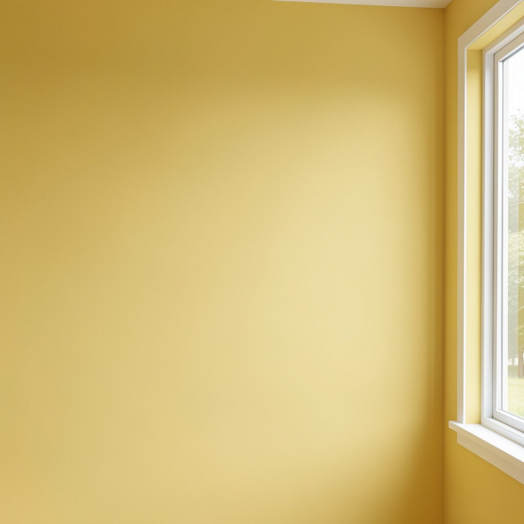
Butter yellow adds joy without feeling childish, especially when it has a soft, creamy base. It brightens kitchens, breakfast nooks, and home offices in a way that feels warm and human.
Choose a shade that leans slightly buttery and not neon, so it stays flattering. Pair it with white cabinets, light stone counters, and woven textures for a modern farmhouse blend. Want to make it feel more adult? Add charcoal accents in frames, hardware, or a single chair.
If you’re worried about upkeep, use an eggshell or washable interior finish that stands up to splashes and fingerprints. To manage cost, paint one area that matters most, like the wall behind a table or the side of a peninsula. For personalization, bring in patterned curtains with subtle stripes or small botanical prints that echo the color’s warmth.
7. Rich Forest Green for a Cozy Statement
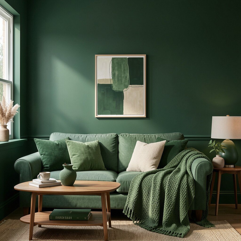
Forest green can make a room feel like a calm retreat, full of depth and comfort. It’s a great choice for offices, bedrooms, and spaces where you want people to slow down and relax.
Because it’s bold, it works best with lighter flooring and warm neutrals to balance the contrast. Pair it with brass, dark wood, or cream-colored textiles to keep the look layered. When you add artwork, choose frames in black or warm metal so everything feels intentional.
Practical planning matters, so measure the wall space and account for multiple coats, especially if you’re covering a lighter color. If you want a softer shift, try a deeper green with a touch of gray rather than an ultra-saturated shade. For personalization, paint the inside of shelves or a closet door in forest green for a surprise pop when you open it.
8. Clay Pink for a Gentle, Modern Comfort
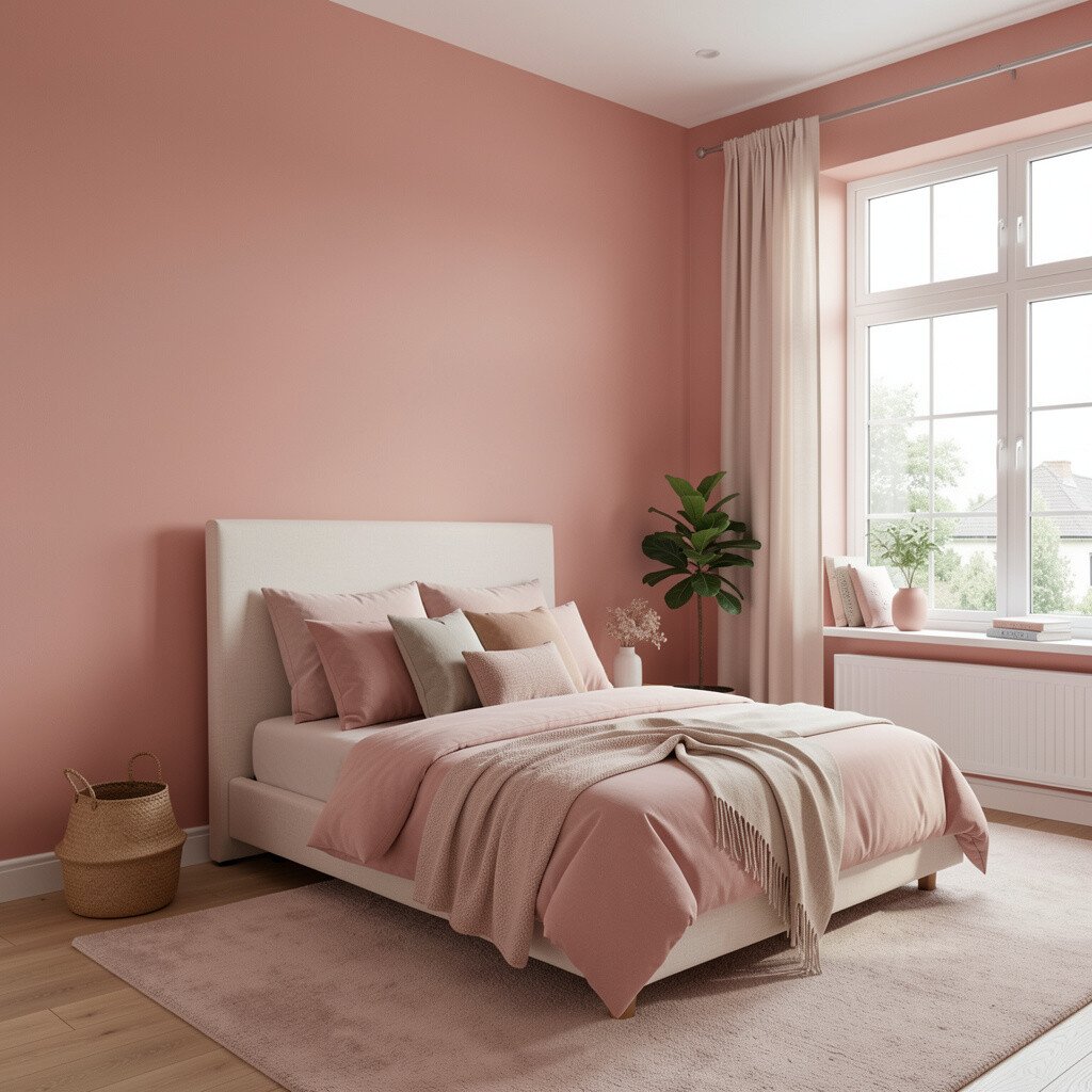
Clay pink is cozy, earthy, and surprisingly versatile. It can make living rooms feel tender and welcoming without the sharpness some pinks bring.
It looks beautiful with warm whites, light oak, and natural textures like rattan. You can also pair it with muted blues or olive green for a trendy color story that feels fresh. Choose a matte or soft eggshell finish so the walls look smooth and calm.
9. Classic Cream With Cool Highlights
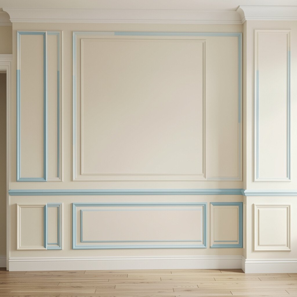
Cream walls can feel timeless, but the trend is in choosing the right undertone. A cream with cool highlights keeps the room feeling crisp while still staying soft.
This color can make trim and molding look extra sharp, which is perfect if you like clean lines. Pair it with gray or taupe accents, stainless fixtures, and simple geometric art for a modern update. If you have a lot of natural light, this choice can feel airy and elegant.
To keep it practical, use a paint that’s made to be washable, especially if you have busy hallways. Sampling helps a lot, so test swatches next to your flooring and your existing curtains. For personalization, paint the top half of a wall in cream and leave the lower trim in a brighter white for a tailored look.
10. Soft Black Ink for a Clean, Editorial Look
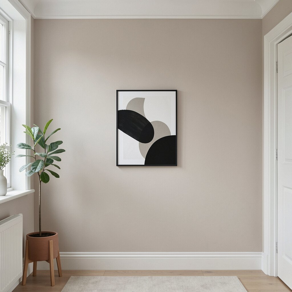
Soft black ink is not harsh like old-school black paint, and that makes it feel more wearable. It can give your home a magazine-like feel, especially when balanced with light furniture and bright accents.
It works well on feature walls, behind beds, or in entryways where you want a strong first impression. Pair it with warm woods, textured fabrics, and cream art for a stylish contrast. Use a low-sheen finish to reduce glare and keep the surface looking smooth.
If you love bold colors but want control, start with one wall and see how the room looks through different times of day. When you paint near outlets and trim, take time with clean edges so the final look feels polished. For personalization, add a lighter color band at chair height or frame it with thin trim for a refined effect.
11. Light Taupe for a Quiet, Easy Base
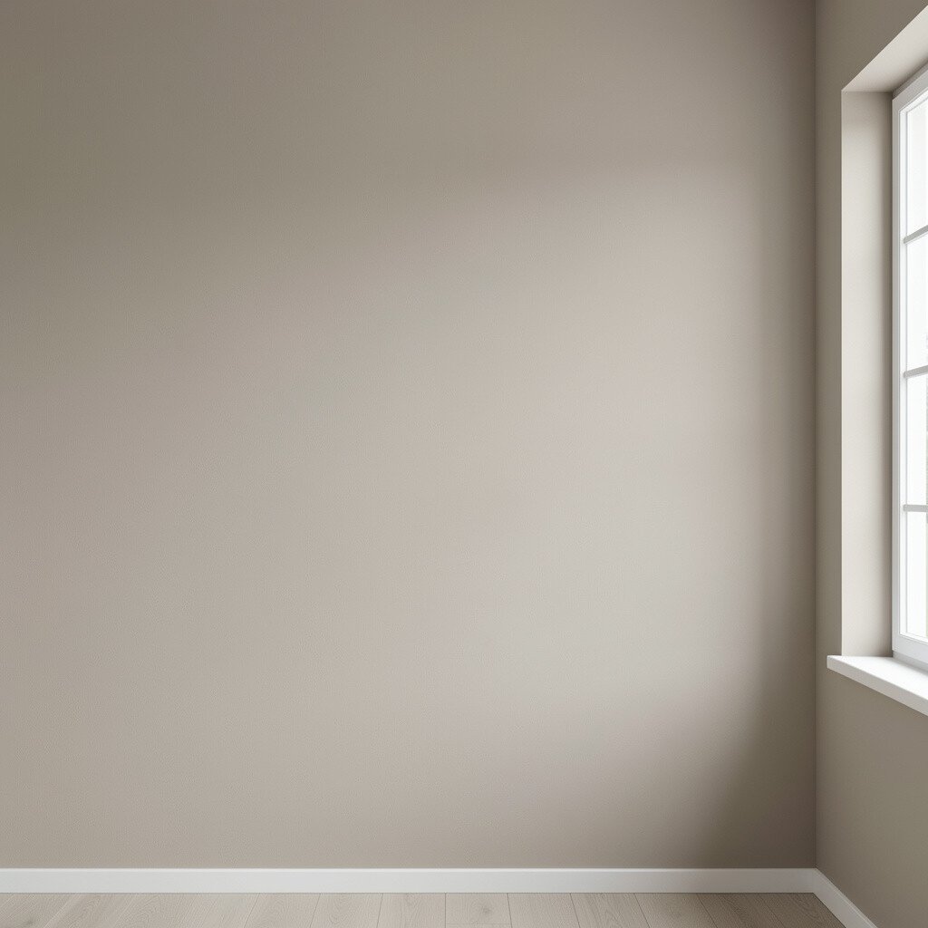
Light taupe is a friendly neutral that fits almost every style, from cozy to sleek. It hides small imperfections better than many whites and keeps the room from feeling too stark.
This color also makes it easy to switch accents later, like changing pillows, rugs, or artwork without repainting. Pair taupe with camel, soft black, and off-white for a balanced palette that feels current. It’s also a smart choice if you’re updating one room at a time and want your whole home to connect smoothly.
12. Pale Lavender That Adds Calm Personality
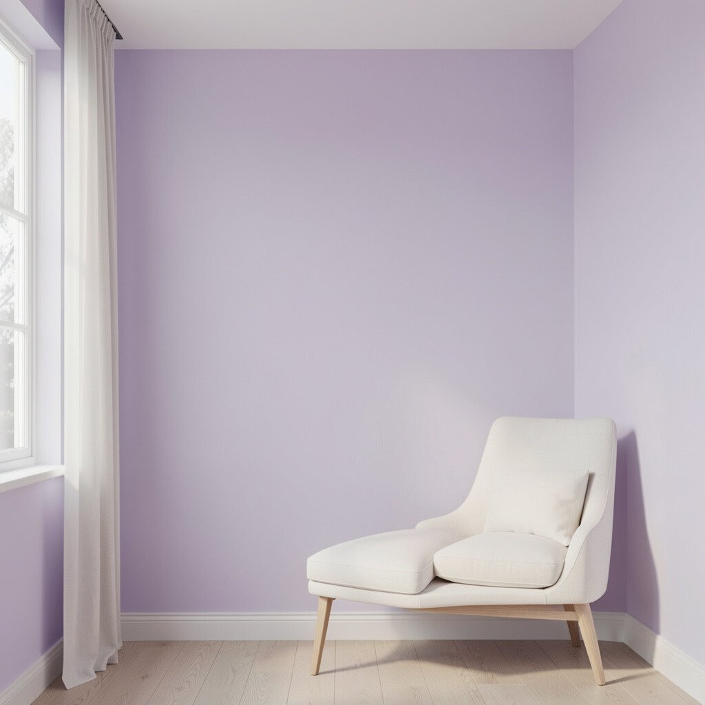
Pale lavender can be soothing while still giving your home a little personality. It’s one of those colors that feels dreamy without taking over the entire room.
To keep it modern, pair it with warm whites, light gray, and natural textures like linen and rattan. Add accents in silver or soft gray-blue to keep the lavender looking light and fresh. For personalization, choose art with gentle purples or floral shapes so the color feels intentional.
Cost-wise, consider painting only the walls you see most, such as the main wall and the wall behind a bed or sofa. Use a paint with good coverage so you don’t need too many coats, especially over darker colors. If you’re unsure, choose a slightly more grayish lavender for a subtler shift that still feels trendy.
13. Bright White With a Hint of Warmth
Bright white is crisp, but the current trend is to choose one with a hint of warmth. That small change can help walls look inviting rather than sterile.
This is a practical pick for almost any room, especially kitchens, bathrooms, and spaces that need clean brightness. Pair it with colorful accessories and natural materials so the white becomes the stage, not the star. If you’re changing fixtures or updating hardware, warm white helps many finishes look more flattering.
For cost considerations, you can often cover well with fewer coats when you’re staying in the white family. Test in both morning and evening lighting, since warm whites can glow differently under bulbs. For personalization, paint doors and trim the same warm white for a smooth, cohesive look, then add one bold color accent through a rug, curtains, or a single piece of furniture.