Brick tones have a way of making rooms feel lived-in and light at the same time. When you pick the right warmth, even a plain corner can start to glow.
This list is packed with practical color ideas that look great in real homes. You’ll find shades that feel cozy, fresh, and totally doable with your budget.
1. Clay Rose Blush

Clay rose blush is like warm daylight caught in terracotta. It softens hard lines and makes walls feel friendlier without turning the room dim.
Paint it on lower walls or as a living-room accent to add gentle contrast. Pair it with creamy whites, light oak shelves, and brushed brass. If your space gets less sun, this tone can still look bright because it leans into rosy warmth.
2. Burnt Sienna Wallpaper

Burnt sienna wallpaper adds instant mood with a velvety, earthy look. It feels bold, but it can also make furniture and textiles look more vibrant.
Use it behind a sofa, in a dining nook, or on a single hallway wall. Choose a subtle pattern so the color stays calm and not loud. This is a great choice if you want something unique without replacing everything.
Try balancing it with matte off-whites, linen curtains, and a few darker accents like espresso wood. For cost control, pick peel-and-stick panels for a smaller wall first. Many homeowners are leaning into warm, patterned backdrops lately, especially in rentals and smaller spaces.
3. Ginger Terracotta Trim
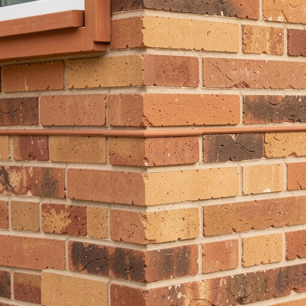
Ginger terracotta trim looks like a warm spice that brightens the edges of a room. It makes doors, window frames, and built-ins feel crisp and intentional.
Paint trim before you move big furniture in so you can see how it catches light. Pair it with soft gray-beige walls and warm white trim to keep everything balanced. The color also works beautifully with woven baskets and natural stone textures.
If you’re cautious about cost, limit it to trim only. A fresh coat can be cheaper than changing flooring, and the payoff feels high. This tone is popular with modern farmhouse styles and also works with contemporary, clean-lined interiors.
Personalize it by matching the trim color to a rug fringe or a throw pillow you already love.
4. Honeyed Brick Half-Wall
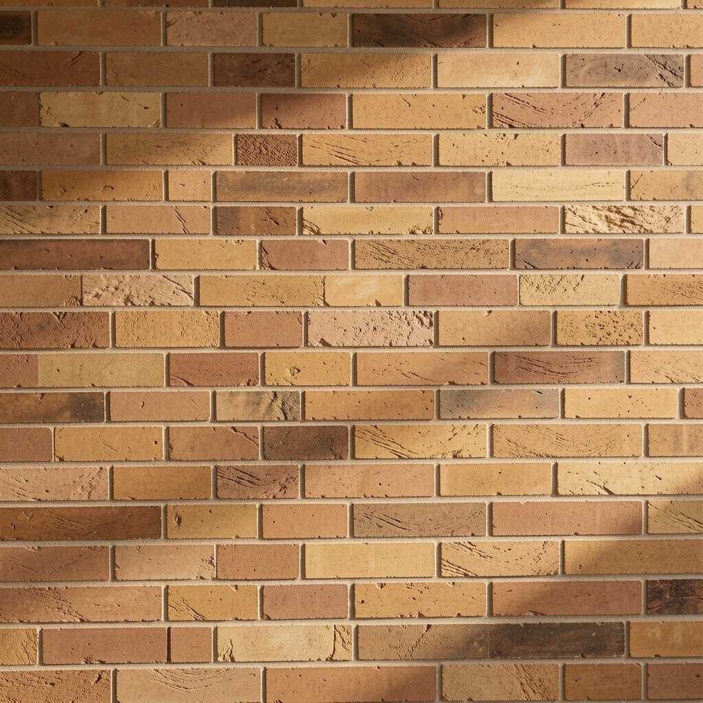
Honeyed brick tones on a half-wall create a bright, sunny rhythm. The height break helps rooms feel taller while the color keeps things cozy.
Go for a semi-matte finish if you want light to reflect softly. Combine it with a light top color like warm ivory so the brick shade doesn’t overwhelm. This approach is especially helpful in dining rooms where you want warmth without heavy darkness.
5. Toasted Clay Ceiling
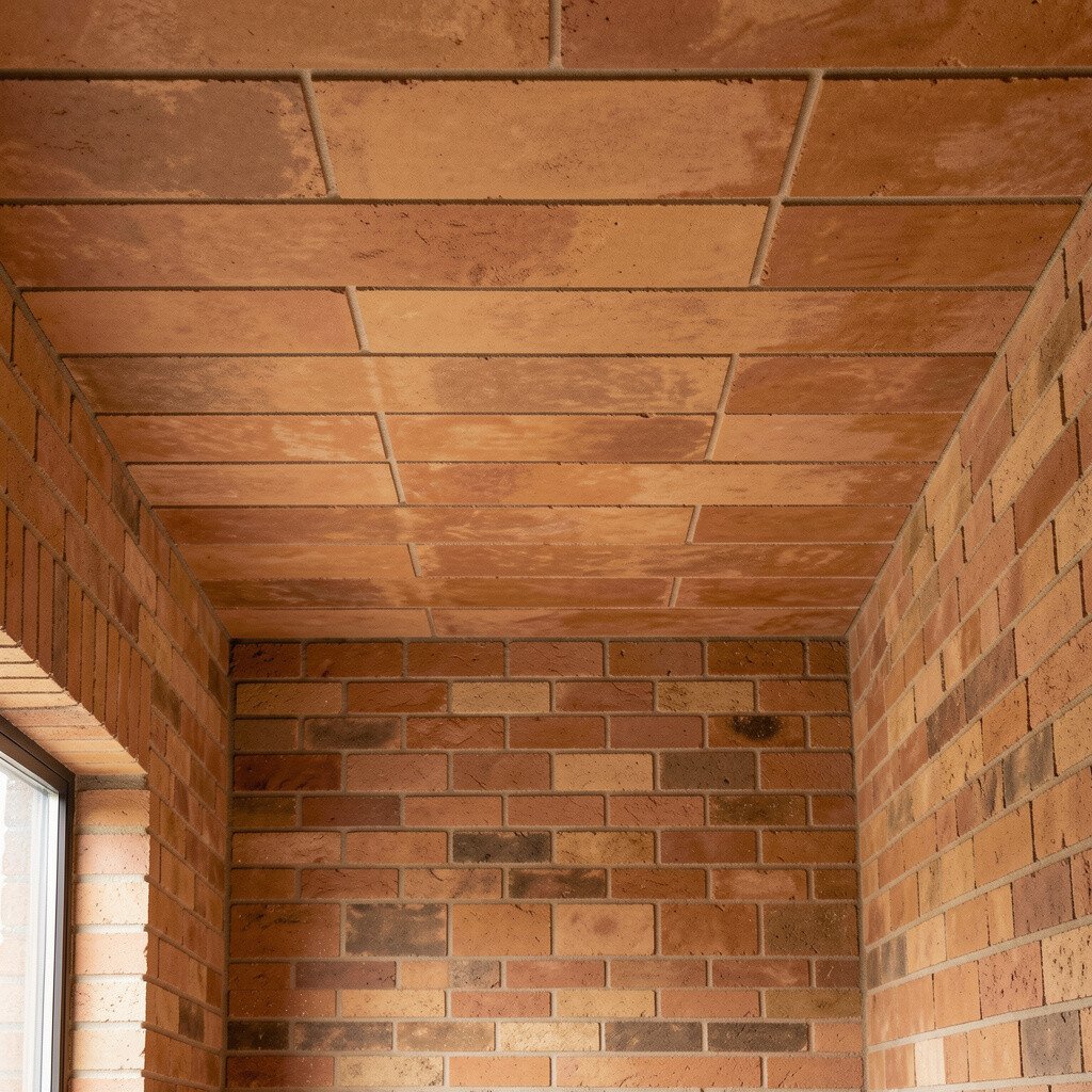
A toasted clay ceiling surprises people in the best way. It adds glow from above, like the room is gently warmed by sunlight.
Keep walls a lighter neutral so your eyes move around easily. If you have low ceilings, choose a tone that is closer to pale terracotta than deep brick. This trend is getting more attention because it’s a simple way to add personality without taking up wall space.
For budget-friendly results, use the same color on the ceiling only, then add brick-toned decor like art frames and cushions. You can also tie the palette together with a warm wood cabinet or a honey leather chair. Personalize it by picking one repeated hue, then using it in two or three spots.
6. Rosewood Brick Counter Color
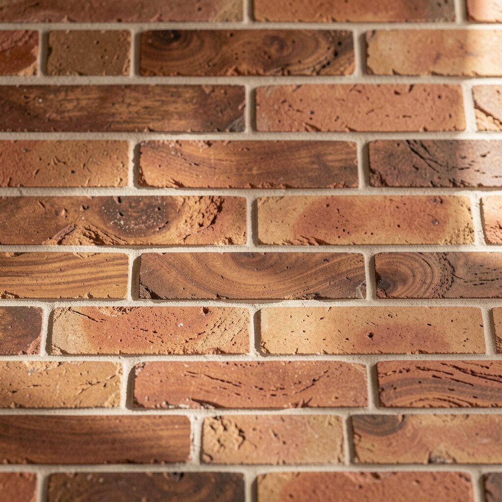
Rosewood brick on counters or a built-in shelf can feel rich without being heavy. It looks elegant next to warm whites and helps small kitchens feel more gathered.
If you’re painting rather than replacing, use a durable cabinet or countertop coating. Match it with simple hardware in brushed nickel or antique brass for a timeless mix. The visual benefit is that brick warmth makes everyday items, like coffee mugs and spice jars, look more styled.
Cost-wise, refinishing can be far cheaper than swapping cabinetry. To keep it bright, add under-cabinet lighting and choose light backsplash tiles with a soft sheen. This is also a smart move for open-plan homes where you want the kitchen to feel inviting.
7. Brick Oatmeal Walls
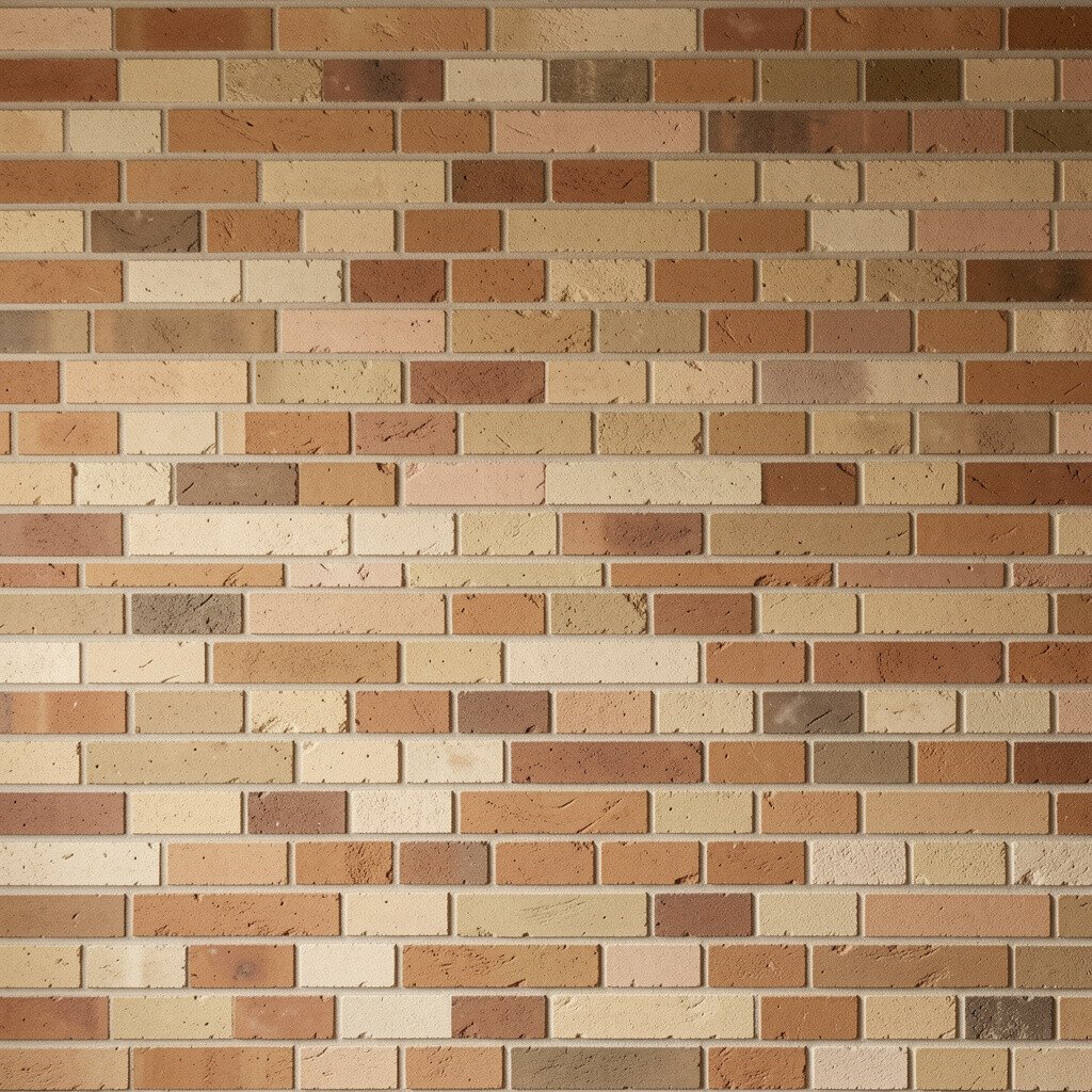
Brick oatmeal is a soft, creamy brick tone that feels calm and welcoming. It brings warmth without the intensity of deep reds.
This shade is great for bedrooms, offices, and entryways where you want a friendly mood. Pair it with white trim, caramel leather, and textured fabrics like boucle or linen. The uniqueness comes from how it reads as both neutral and warm at the same time.
To keep it airy, use eggshell or satin paint and add mirrors opposite windows. If you’re working with limited funds, one coat of well-prepped paint can do most of the work. Many people are choosing warmer “greige” looks now, and brick oatmeal fits right in.
8. Terracotta Sage Accent Wall
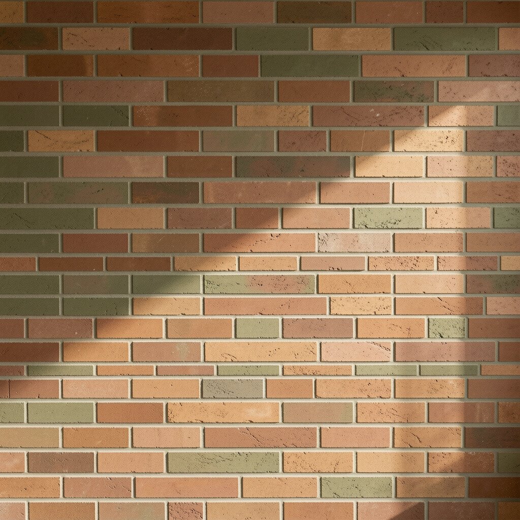
Terracotta sage blends earthy warmth with a muted green undertone. It feels fresh like garden air, yet still cozy like a brick patio.
Use it as an accent wall behind a reading chair or bed. Add sage-toned textiles, white ceramics, and warm wood to make the colors feel connected. This pairing looks especially good with plants, because the color echoes leaves without looking matchy.
9. Spiced Brick Media Console
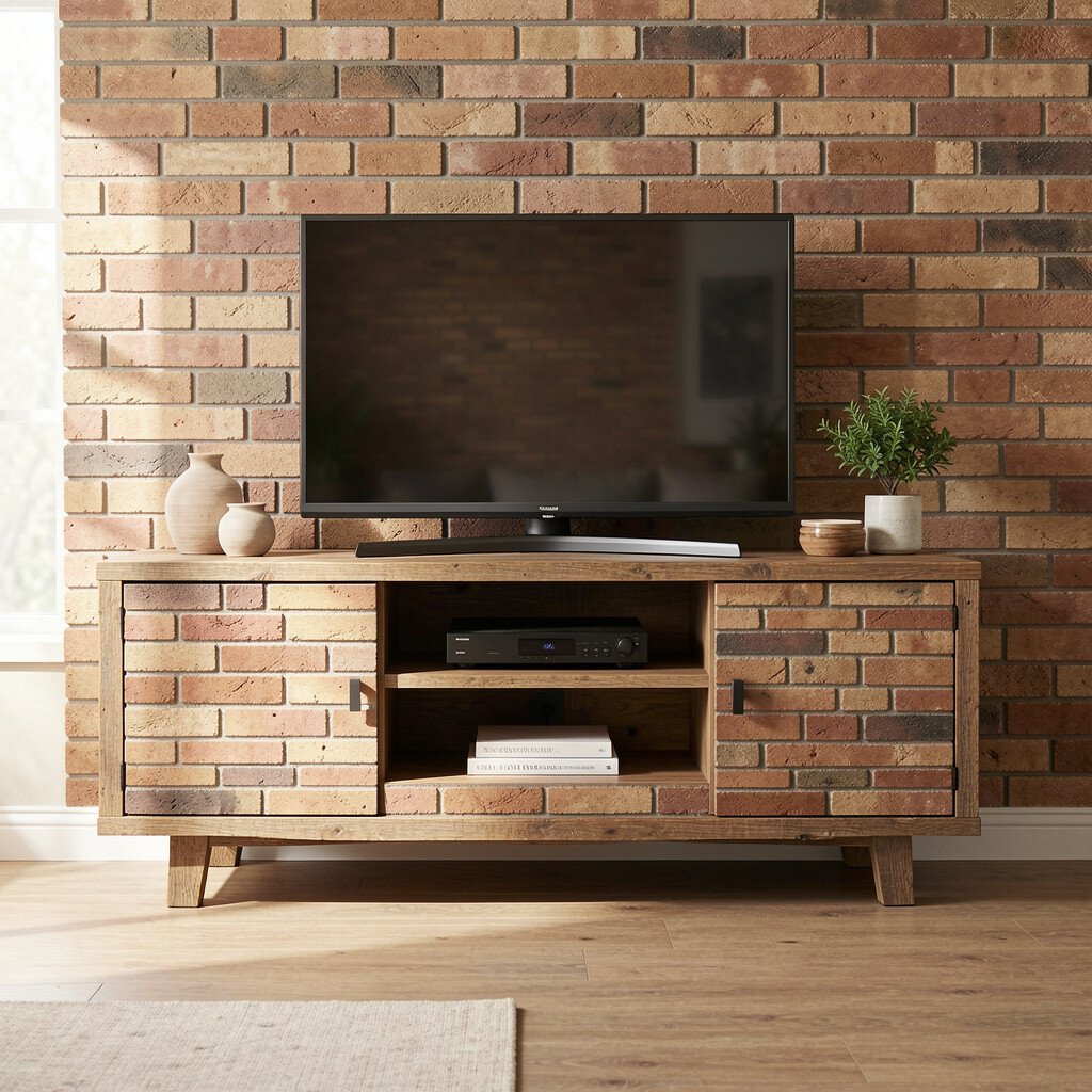
A spiced brick media console makes the whole living room feel more organized. When the storage piece matches the warmth in your room, the space feels calmer and brighter.
Choose a finish that shows a little depth, like a satin stain or a chalky paint blend. The benefit is that it grounds the room and gives your decor a clear stage. Style it with light-colored books, a framed print, and one darker ceramic to create contrast.
If you want a practical approach, use the console as the color anchor and keep walls neutral. For cost, consider repainting an existing piece rather than buying new. Personalize it with new knobs in a warm metal so the tone feels intentional.
This look is popular because it adds warmth without closing in the room visually.
10. Sunset Clay Window Seats
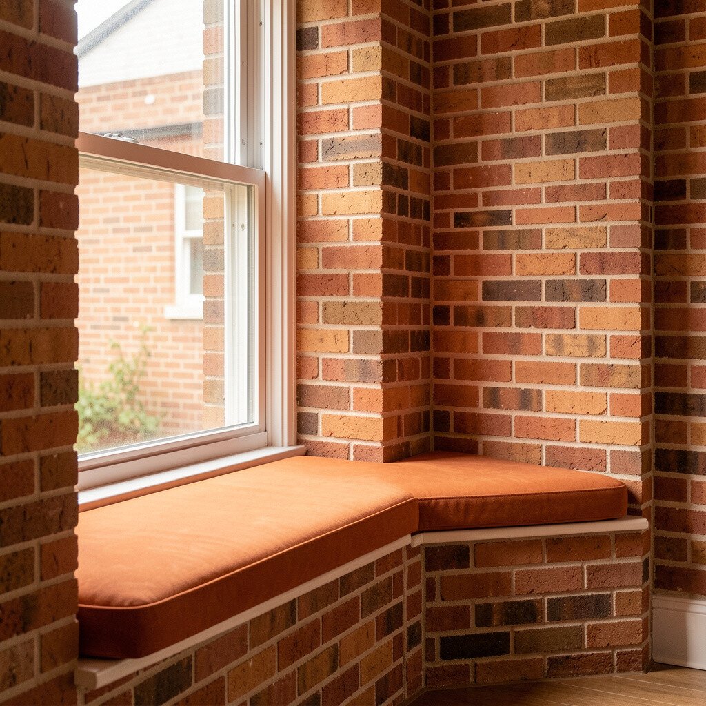
Sunset clay window seats feel like a built-in daydream. The warm tone makes the seating area inviting, even when the room is cool or cloudy.
Keep cushions in cream or light tan to brighten the seat. Add a throw with subtle brick flecks so the color looks layered, not flat. This is a great way to add uniqueness because window seats are a focal point people love to notice.
For a budget-friendly upgrade, you can reupholster only the cushions. A washable fabric in a warm clay shade can also help with messes. Pair the seat with a simple curtain in a light fabric for a soft, airy frame.
11. Brick and Linen Living Room Scheme
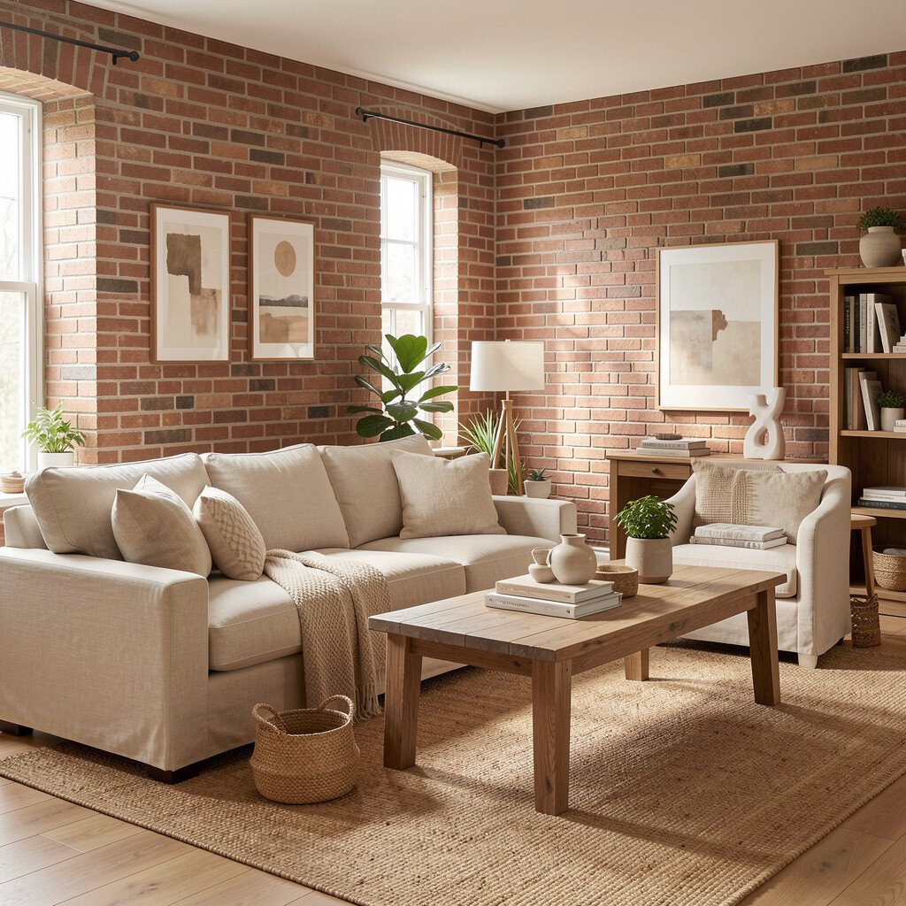
Brick and linen create a warm balance that feels both soft and styled. The brick tones bring energy, while linen textures keep everything relaxed and bright.
Start with a brick-toned throw or rug, then build outward using neutral upholstery. Choose off-white curtains and light wood coffee tables to keep the room feeling open. The benefit is that you can test the palette without committing to major painting.
To personalize, look for patterns that blend brick and cream in the same weave. If you prefer a quicker refresh, swap pillow covers and add one framed artwork in a matching hue. Cost stays manageable because textiles are usually easier to change than large surfaces.
12. Terracotta Plaster Look Walls
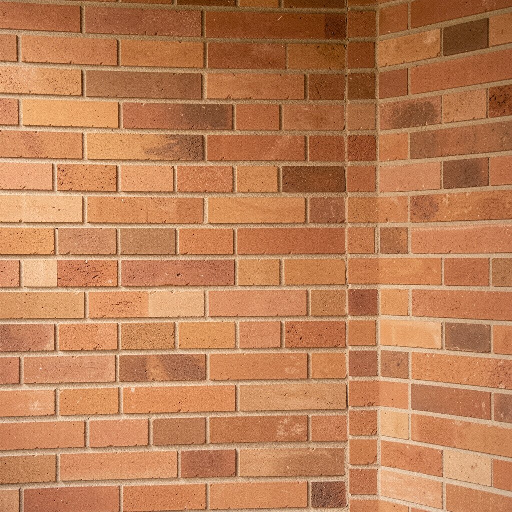
Terracotta plaster look walls add texture, which makes color look warmer and more dimensional. Even a simple room can feel richer when the finish has subtle movement.
Choose a plaster effect product or a paint finish technique for a similar vibe. Pair it with matte white trim and natural stone accessories. The uniqueness is in the way light scatters across texture, which helps the room feel bright instead of flat.
13. Cinder Brick Accent Doors
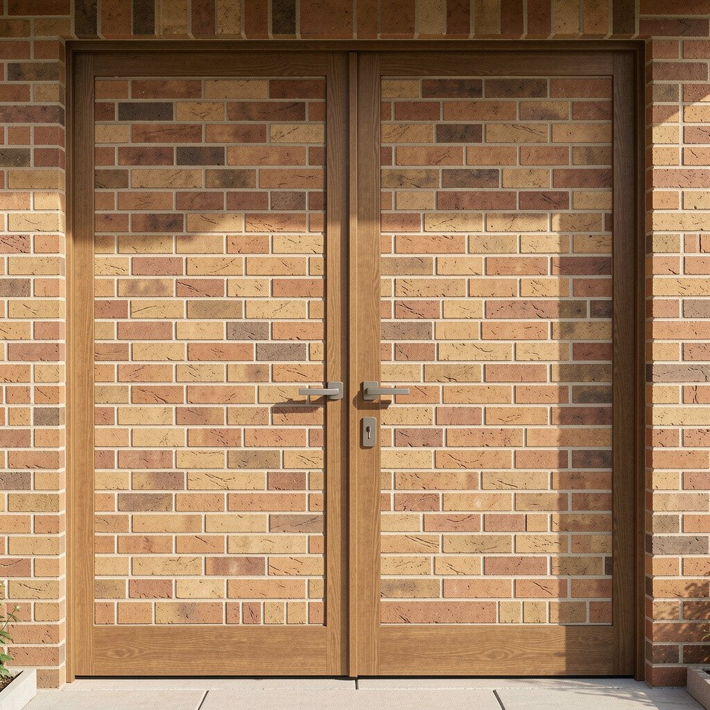
Cinder brick accent doors add a dramatic, modern twist while staying warm. The darker brick shade frames the space and makes neighboring colors pop.
This works well for pantry doors, office doors, or interior doors in open homes. Use lighter wall paint so the door color feels like a purposeful highlight, not a shadow. If you want a practical win, paint the door and keep the hardware simple for a clean finish.
For cost considerations, door painting is usually far cheaper than replacing doors. Add a soft runner rug or warm-toned art nearby to balance the deeper hue. This kind of accent is trending because it offers style with minimal disruption.
14. Paprika Terracotta Ceramic Mix

Paprika terracotta ceramic pieces bring warmth without committing to big paint jobs. Think vases, planters, and bowls that catch light and make surfaces feel friendly.
Use one larger statement piece and a few smaller items to create balance. Choose creams, warm beige, and muted green accents to keep the palette bright. The benefit is that you can shift the look seasonally, adding lighter pieces in spring and deeper tones in autumn.
To keep costs under control, hunt for handmade ceramics at local markets or use thrift stores for single items. Personalize by grouping items by color family, then adding one personal favorite like a travel souvenir bowl. This style is loved right now because it feels personal and collected.
When arranged near windows or lamps, the brick warmth makes the whole room feel warmer in an instant.
15. Brick Warmth Living Room Rug
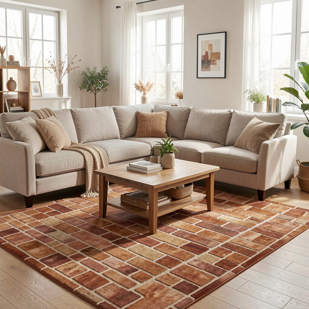
A brick warmth rug can brighten a room by adding color to the floor plane. It anchors furniture while bringing cozy warmth underfoot.
Choose a rug with lighter cream or tan areas if your space needs extra brightness. Pair it with solid-colored cushions and a simple coffee table to avoid visual clutter. The uniqueness is in how a well-chosen rug can make everything else look more intentional.
For practical tips, check the rug size before you shop and aim to keep the front legs of furniture on the rug. This helps rooms feel larger and more connected. Budget-wise, a rug can be one of the biggest visual changes you can make without remodeling.
16. Warm Brick Gallery Wall Colors
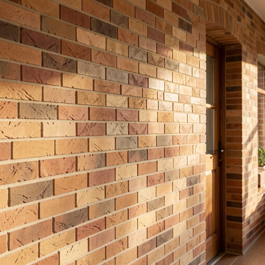
A warm brick gallery wall turns art into a color story. Frames in brick-adjacent tones, like terracotta or clay rose, make the display feel unified and bright.
Pick art pieces that include cream backgrounds, warm earth tones, or subtle brick accents. Use a consistent frame finish to keep the look neat even if the artworks vary in style. The benefit is that you can personalize easily, because gallery walls let you change things over time.
If you’re watching costs, print your own art or choose affordable poster sets, then frame them in matching tones. Trend-wise, mix-and-match galleries are popular again, and warm brick frames help the wall look cohesive. For a final touch, add one small mirror or a ceramic wall sconce holder to bounce light around.
This is a wonderful way to bring brick warmth into a rental without painting anything permanent.