
Stairs set the mood for the entire home the moment you step onto the first step. With the right colours, they can feel softer, warmer, and more inviting every day.
Below are warm, practical colour ideas that balance style with comfort, so your staircase feels like part of your home’s personality.
1. Honey Oak Tones With Soft White Risers
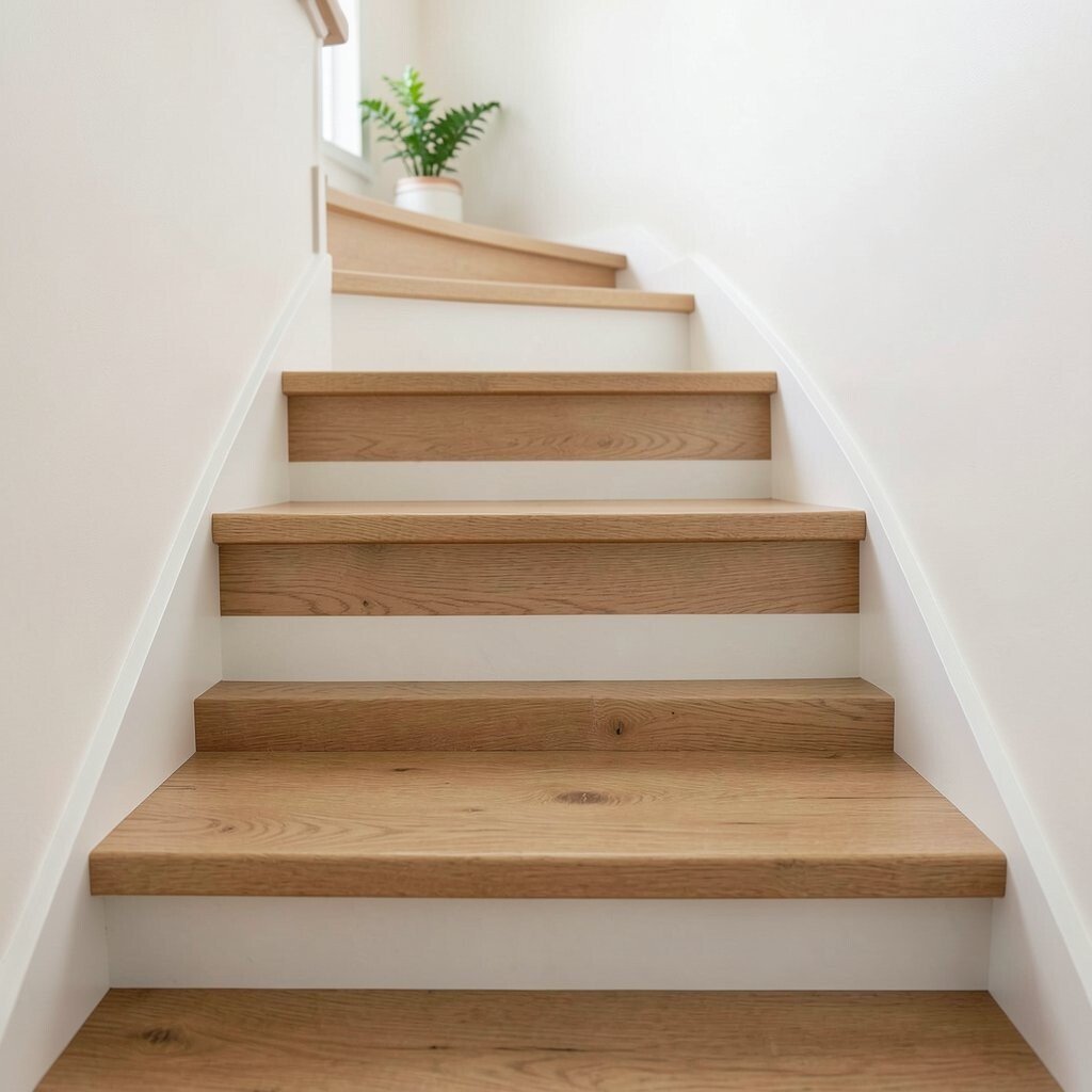
Honey oak tones catch the light and make each step feel welcoming. Pair them with soft white risers to keep the look airy and calm.
The result feels classic but still cozy, like warm bread fresh from the kitchen. If your stairs are already close to oak, this is an easy upgrade using stain or a matching wood finish.
For a practical finish, use a durable satin topcoat that can handle daily foot traffic. Choose a paint for risers that dries hard and wipes clean, especially near handrails and entryways.
2. Terracotta Steps With Creamy Off-White Accents

Terracotta adds a friendly, earthy glow that looks great in natural light. When paired with creamy off-white accents, it feels warm without looking heavy.
Terracotta can hide scuffs better than many pale shades, which is helpful for busy homes. The colour also creates a gentle contrast that guides the eye upward, making stairs feel easier to navigate.
Try painting only the treads in terracotta and keeping the rest a lighter neutral if you want a slower, subtle change. For cost control, use primer and a quality roller for large areas, then switch to a brush for edges and corners.
3. Warm Greige With Matte Satin Sheen
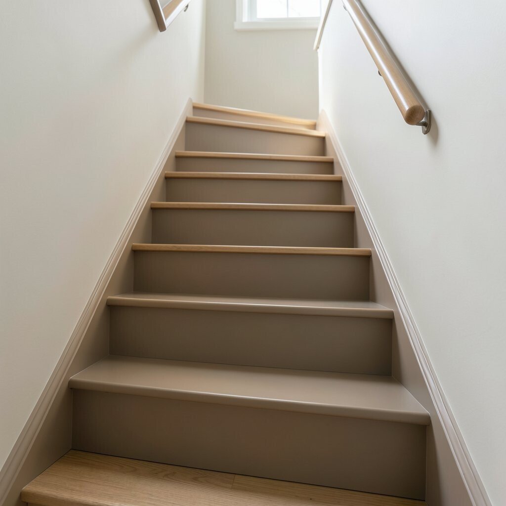
Warm greige sits in the sweet spot between beige and grey, so it feels modern and cozy. A matte satin sheen keeps it soft to the eye and less reflective at night.
This colour works especially well if your home has both wood furniture and cool-toned textiles. You get a steady backdrop that makes rugs, artwork, and plants feel richer.
For practical results, sand lightly and clean thoroughly before painting or staining. A consistent thin coat prevents blotchiness and gives you a smoother, more professional finish.
If you want personalization, add a slightly darker greige stripe down the center tread line for a neat, tailored look. It’s a small detail that makes the staircase feel designed, not just painted.
4. Deep Walnut Brown With Brushed Gold Details

Deep walnut brown brings a grounded, cozy feel, especially in homes with warm lighting. Add brushed gold details through trim or a handrail element to make the colours look richer.
This combination feels unique because walnut can look both elegant and lived-in. The gold adds a gentle shine that makes the staircase feel more special without being flashy.
If you plan to update hardware, consider using matching brackets and rail accessories. Doing that at the same time can save effort and reduce the chance you will repaint around mismatched parts later.
5. Soft Sage Green With Light Oak Steps
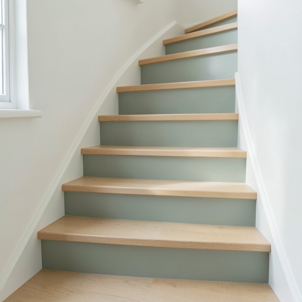
Soft sage green has a calm, cozy vibe that feels like fresh air indoors. It looks even better with light oak steps or wood tones that lean warm.
This pairing feels fresh yet comforting, so it suits modern, farmhouse, and cottage styles. It can also look great when your home includes linen curtains, pale rugs, or lots of plants.
For a practical approach, use semi-gloss or satin paint on risers if they get scuffed. Pick a sage that leans slightly grey to avoid looking too bold in lower light.
6. Butterscotch Beige With a Subtle Chocolate Edge
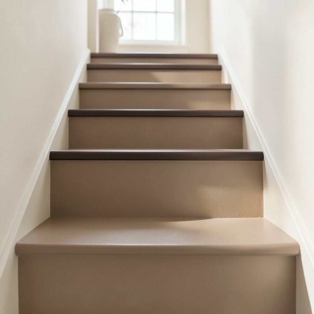
Butterscotch beige makes stairs feel like warm sunlight. A subtle chocolate edge adds depth while still keeping the overall look gentle.
This colour idea is great if you want cozy without too much contrast. It also helps define each step, which can make movement feel more confident.
To keep it clean and professional, use painter’s tape to create a crisp chocolate border along tread edges. If cost matters, focus your darker shade on only the line where shoes and shadows fall the most.
7. Rose Clay With Warm White Risers
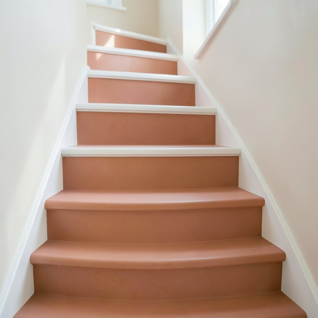
Rose clay brings a soft, rosy warmth that feels inviting and not overly pink. With warm white risers, it balances well and keeps the staircase looking bright.
The beauty of rose clay is that it feels unique, like a colour found in sunbaked pottery. It can also make neutral rooms feel more alive without turning loud.
Choose a durable paint finish so scuffs wipe away easily. Consider testing a small patch on a tread and viewing it in the morning and evening light before committing.
8. Toasted Coconut White With Textured Wood Grain Accent
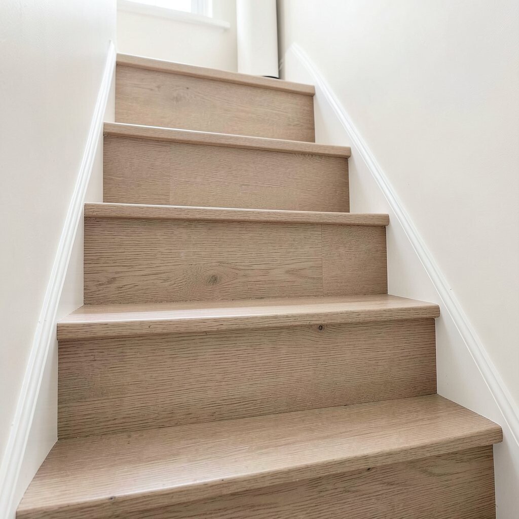
Toasted coconut white feels creamy and cozy, like a warm sweater for your entryway. It brightens stairs and makes hallways feel bigger.
Add a textured wood grain accent to keep things from looking plain. This could be a narrow strip on each tread or a panel-style pattern on the landing for extra character.
The benefit is that white stairs can still feel warm if you choose a creamy undertone. If you have a lot of natural light, it will look especially soft and welcoming.
For practical upkeep, use a paint that is made for trim or high-traffic surfaces. You can also seal wood grain accents for easy cleaning.
9. Caramel Latte With a Soft Espresso Handrail
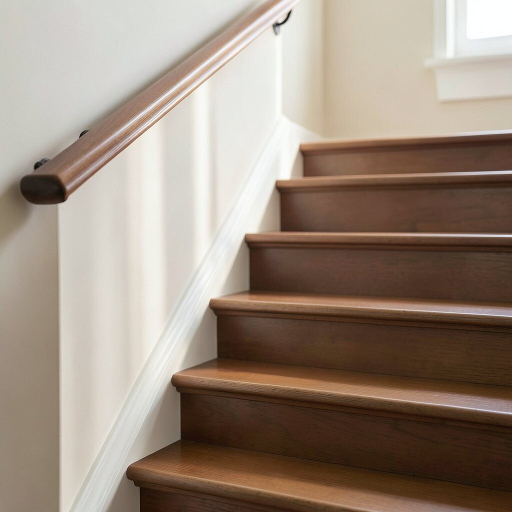
Caramel latte colours feel comforting and cozy, like a warm drink after a long day. Pair them with a soft espresso handrail for an inviting, layered look.
This idea looks rich without feeling dark, so it works in many home sizes. The warm undertones also blend nicely with many flooring types, from oak to engineered wood.
To personalize it, choose a caramel shade that matches your living room textiles. If you already have a rug with caramel threads, pulling that exact warmth into the stairs ties the whole space together.
For cost considerations, buy one main paint in your primary tone and mix small batches for touch-ups. Label the leftover paint and store it properly so future repairs stay consistent.
10. Terracotta Rosewood Blend With Light Grey Paint

A terracotta rosewood blend adds warmth and character, while light grey keeps it balanced. Together, they create a cozy contrast that feels modern and welcoming.
This colour pairing can look especially good in homes with modern fixtures and clean lines. The grey helps prevent terracotta from feeling too fiery in darker corners.
Use a brush for detail work around edges, then roll the main surfaces for even coverage. If your stairs are worn, fill cracks and sand first so colour looks smooth and intentional.
11. Warm Charcoal With Creamy Over-Edges
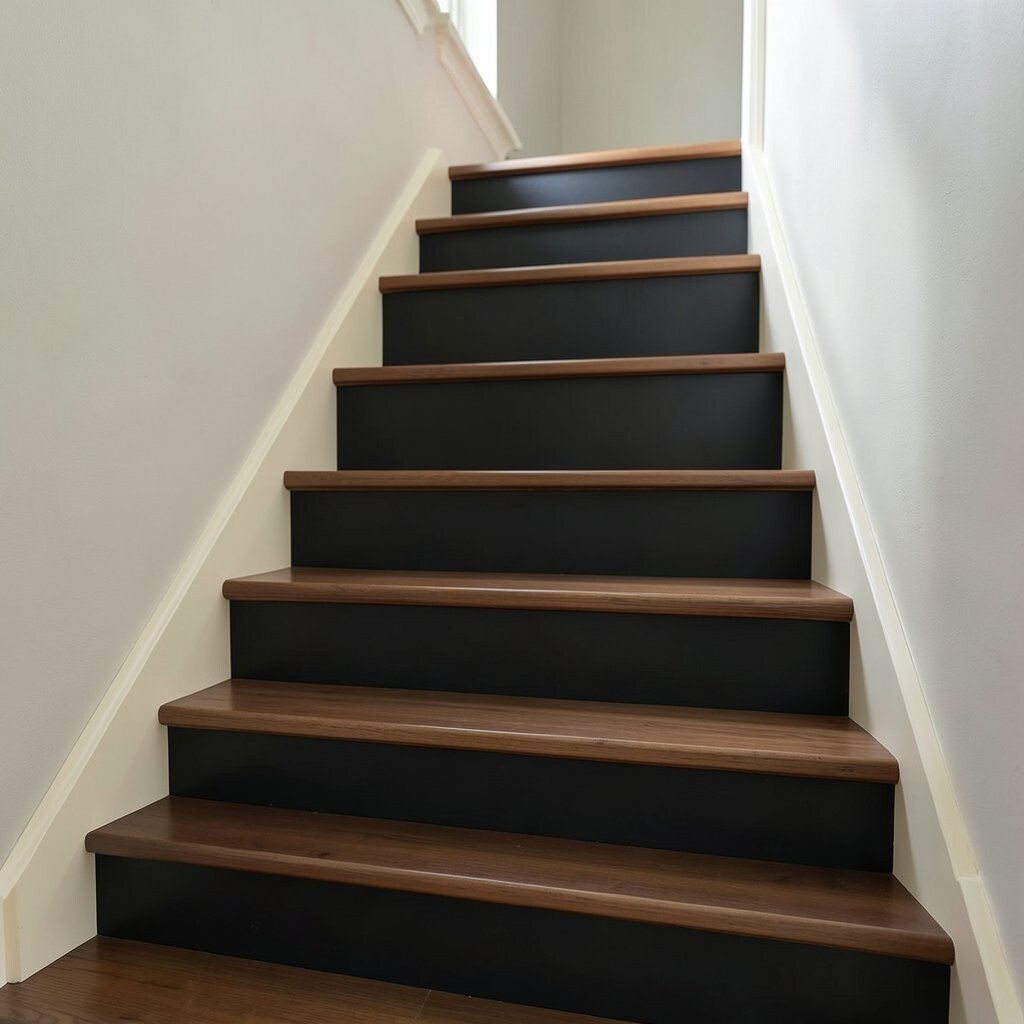
Warm charcoal stairs feel stylish and cozy when paired with creamy over-edges. The lighter edge highlights each step, making the staircase look crisp and easy to follow.
This combo is unique because it brings drama without going cold. It also works well if your home has black accents, like matte fixtures or dark frames.
For practical tips, choose a paint that resists scuffs and consider a protective topcoat. If you’re worried about cost, start with risers or rail areas first and do the treads later when budget allows.
12. Golden Oat With Light Maple Highlights
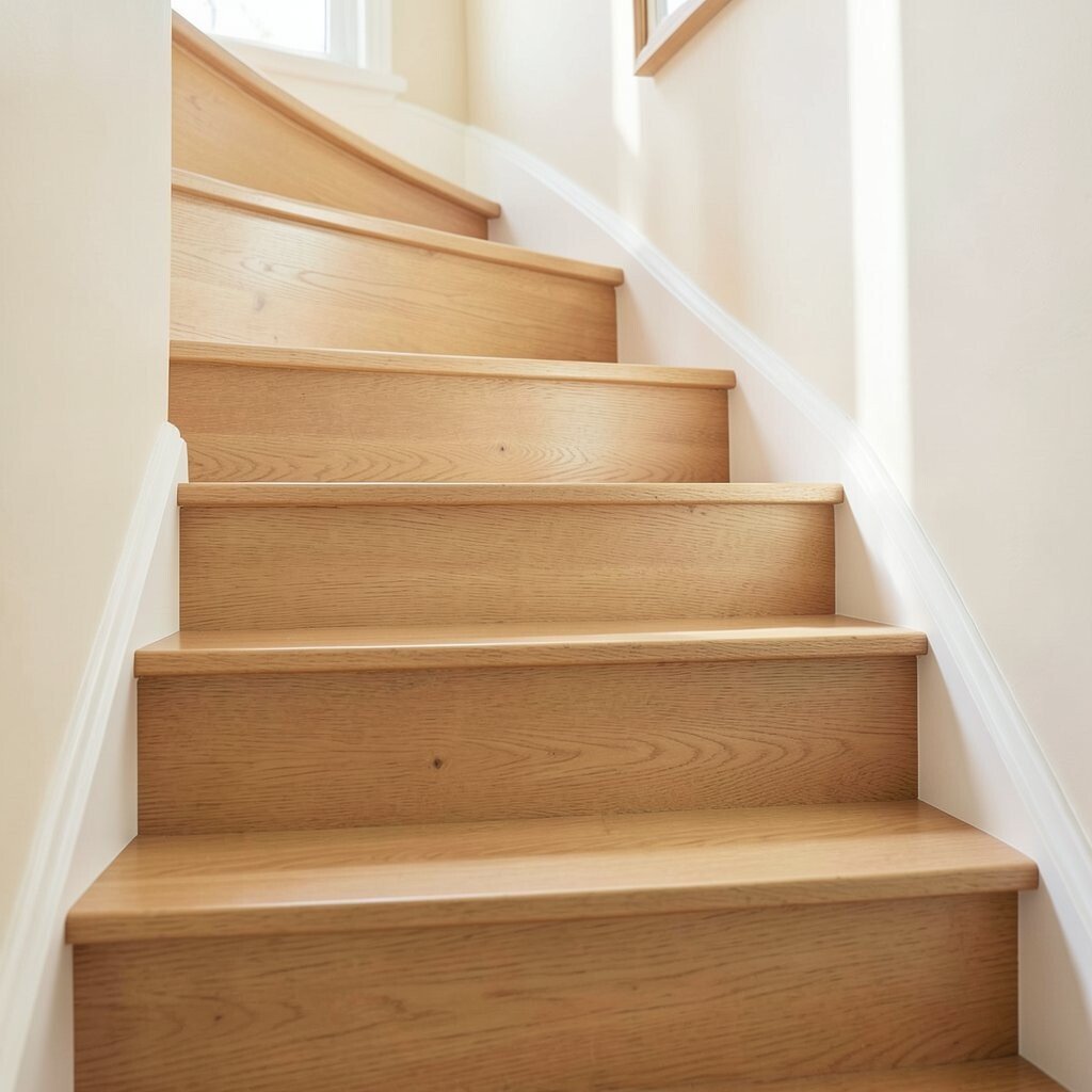
Golden oat colours feel soft and comforting, like a warm blanket. Add light maple highlights so the staircase has movement and a natural glow.
This idea suits homes with light woods, cream walls, and warm lighting. It can also make stairways feel less busy, which is great in small hallways.
Try a gentle glaze over base paint to mimic the look of lightly stained wood. For personalization, match the maple highlights to your baseboards or door trim for a connected, finished feel.
13. Soft Plum Tones With Brighter White Treads
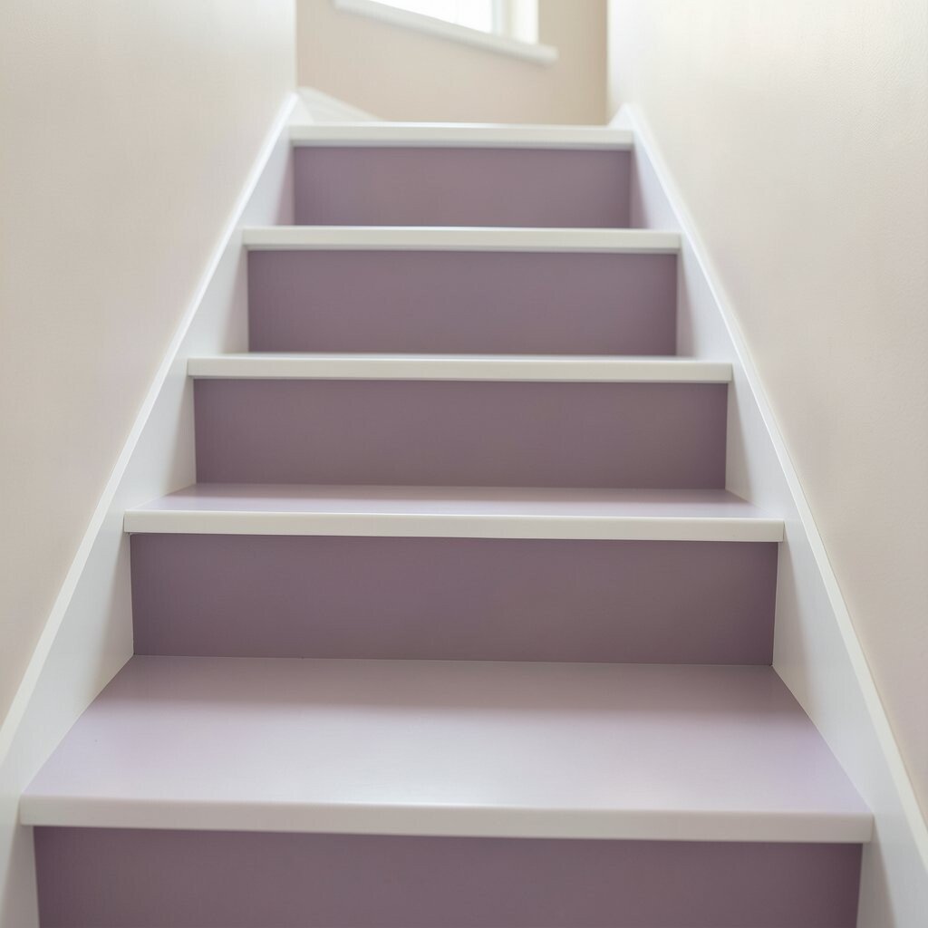
Soft plum tones bring a cozy richness that feels both inviting and stylish. Keep the treads brighter with white or near-white so the staircase stays light.
This approach is great for homeowners who want a more unique colour story. Plum can also complement brass, wood, and warm fabrics, making the whole entry feel more curated.
To avoid a too-dark feel, use plum mostly on risers and vertical faces rather than on the main tread surface. That way, the steps guide your feet while the colour adds depth in the right spots.
14. Vintage Yellow Ochre With Neutral Linings
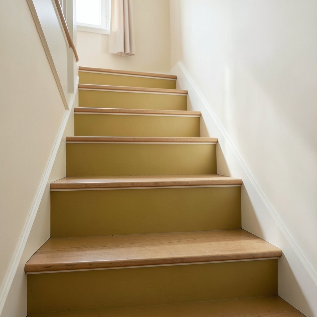
Vintage yellow ochre looks warm and sunny without screaming bright. Pair it with neutral linings like cream, greige, or warm taupe for a cozy, balanced look.
This colour is uniquely cheerful and works well in entryways that feel a bit dull. It also pairs nicely with natural textures like jute, wicker, and linen.
For practical upkeep, use washable paint on risers and consider a non-slip finish on treads if needed. If you’re concerned about cost, test a few small shade samples first to reduce wasted paint.
15. Warm Beige With a Hand-Painted Stair Runner Stripe
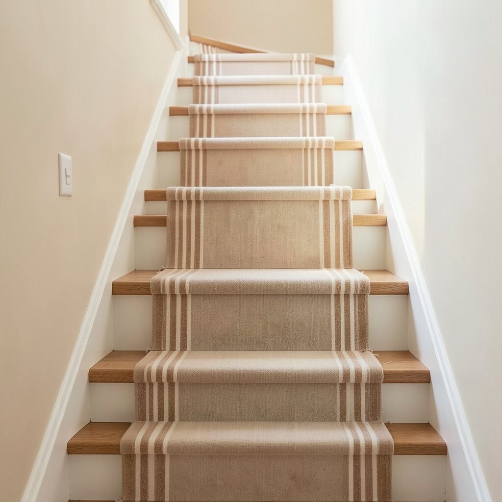
A warm beige base keeps stairs calm, and a hand-painted runner stripe adds character. The stripe can mimic the look of a fabric runner without the hassle of constant cleaning.
This is a personalization-friendly idea because you can pick a stripe colour that matches your rug or curtains. It also gives you a custom look even if your home builder’s paint is basic.
For practical steps, measure tread edges carefully and paint the stripe with a steady hand using tape or a thin guide. Seal the stripe with a topcoat so it survives daily scuffs.
16. Cognac Brown With Natural-Finish Step Nosing
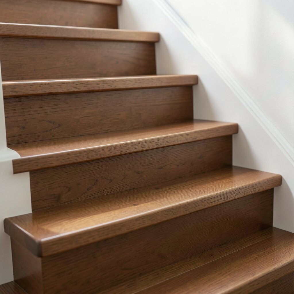
Cognac brown feels warm and refined, like leather and wood tones combined. Keep the step nosing in a natural finish to add contrast and highlight the tread edges.
The benefit is that you get a rich, cozy colour story without making the stairs too dark. The natural nosing also helps create a clear visual boundary, which can feel safer and more comfortable.
If you want a more affordable route, paint the risers first and save staining for the nosing later. That staggered approach lets you spread costs while still achieving a high-impact look.
17. Soft Apricot With Warm White Trim
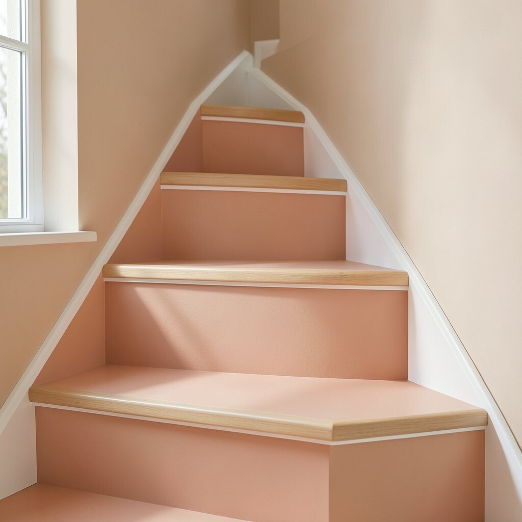
Soft apricot brings a gentle warmth that feels friendly and welcoming. With warm white trim, it looks balanced and cozy instead of too bold.
This colour idea stands out because apricot often feels more comforting than typical peach shades. It can also work beautifully with gold light fixtures and warm-toned flooring.
Try using apricot on risers and keeping the trim crisp for a neat contrast. For practical tips, choose an enamel-based paint for smoother coverage and easier wipe-downs.
18. Cinnamon Spice With Muted Teal Side Panels
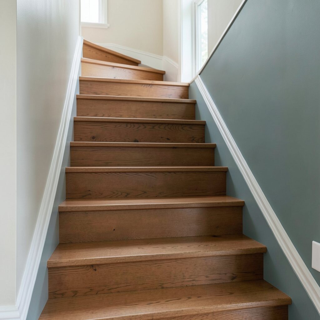
Cinnamon spice colours create a warm, inviting staircase that feels full of comfort. Add muted teal side panels for a subtle pop that still feels cozy and grounded.
This combination is unique because it blends warm and cool in a way that feels intentional. It also pairs well with natural wood, patterned rugs, and art that includes both warm and cool tones.
To personalize, pull the teal shade from nearby décor, like a cushion or framed artwork. For cost considerations, paint panels only on the most visible sides and keep the rest a simpler warm base to save supplies.
Finish with a protective topcoat and consider improving grip if stairs are prone to slipping. When you balance warmth with just enough contrast, your stairs feel stylish, comfortable, and truly yours.