
Color can make a room feel alive in seconds. A gallery wall turns everyday walls into a personal story.
If you’ve been craving a fresh look, these colorful ideas will give you clear paths to follow. You can keep it playful, bold, or balanced, depending on your style.
1. Rainbow-Row Frame Collage

Imagine a neat lineup of frames that shifts through every shade of the rainbow. Bright reds, oranges, and yellows catch the light while deeper blues and greens add calm.
Choose a consistent frame style so the colors do the talking, not the hardware. Use sturdy spacing tape to keep gaps even, then hang the frames on a simple grid for a clean look.
2. Color-Matched Themed Prints

Pick one theme, like seaside shells or city street signs, and then choose prints that share a color mood. When the colors match, the wall looks intentional even if the art styles differ.
Try grouping artwork by color blocks so each section feels like its own mini-world. Use matte finishes for a soft look, and consider a few glossy pieces if you want sparkle.
To personalize it, include one or two pieces made by family or friends so the theme feels lived-in. You can also shop affordable print sets online or at local markets and swap later as your tastes change.
3. Bold Wallpaper Backdrop With Art

Start with a small patch of bright wallpaper behind the gallery. The pattern becomes the quiet background that makes your frames pop.
Choose wallpaper colors that relate to your artwork so everything feels connected. For practical hanging, mount the frames onto a solid support board first if your wall is uneven, then attach the board at the end.
Use this idea to create a strong focal point in a hallway or dining area. It’s a great fit for trend-forward homes because textured walls and layered styling are showing up everywhere right now.
If you’re watching your budget, use removable wallpaper and keep the print count small to avoid overspending. You can also pick one accent color from the wallpaper and build your frame selection around it.
4. Mini Frames In A Big Statement Grid
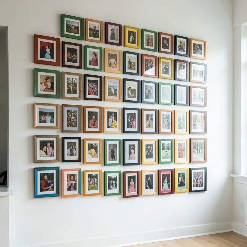
Think of your wall like a colorful mosaic made from small frames. Even when each piece is tiny, the overall shape looks bold from across the room.
Arrange the frames in straight rows for a modern feel, then vary colors inside each row. Use a level and measure twice so the grid stays crisp.
For a unique touch, swap a few standard frames for rounded or arched styles. That small change can add charm without ruining the organized look.
If you want cost control, look for mixed packs of frames at craft stores and repaint the ones that don’t match. Keeping the artwork sizes similar helps you avoid extra framing expenses.
5. Sunset Gradient Picture Run

Build a gradient wall that moves from warm sunrise tones to deep night shades. The effect looks smooth even when each frame holds different art.
Use artwork that follows the same palette, like coral skies, golden landscapes, and navy abstracts. Hang the lightest pieces near natural light sources, so the gradient feels brighter during the day.
To personalize the gradient, include a favorite quote print or a photo strip that matches the warm hues. This is an easy way to make color feel meaningful instead of random.
6. Painted Frames With Gallery-Ready Color

Instead of buying matching frames, repaint what you already own. A few coats of vibrant craft paint can turn mismatched frames into a cohesive set.
Try alternating frame colors, like teal next to mustard, to create rhythm across the wall. For durability, use a paint meant for wood or metal and seal it with a clear topcoat.
This method is unique because it lets you bring your exact favorite colors into the room. It’s also budget-friendly when you use secondhand frames from thrift shops.
7. Maximal Color With a Single Styling Rule
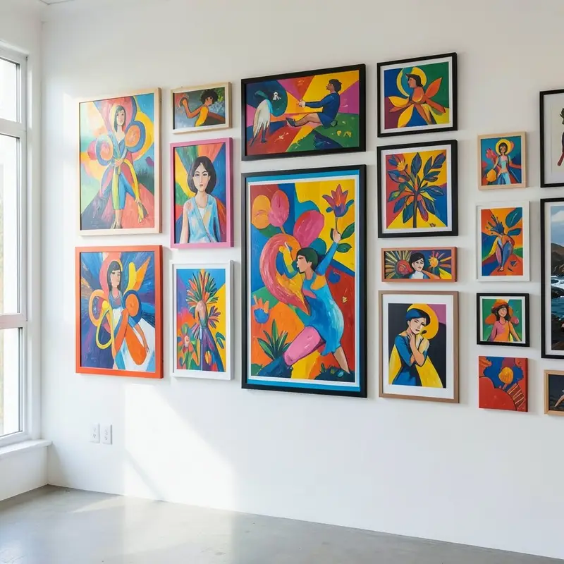
If you love bold color, use one simple rule to keep the wall from feeling chaotic. For example, choose art all featuring circles, or stick to one brand of paper texture.
When everything shares that one detail, the wall can be loud and still look balanced. Use consistent mat colors so the frames feel related even when the artwork varies.
Personalize it by adding a few holiday cards or ticket stubs turned into prints. That small touch gives the wall a story without costing much.
8. Pastel Patchwork With Negative Space

Pastels feel soft and friendly, especially when you leave breathing room between frames. That negative space makes your wall feel airy instead of crowded.
Choose a mix of pastel prints like blush, mint, and pale sky blue, then use white mats for a clean finish. Keep frame sizes mostly similar so the arrangement looks calm.
For practical results, plan your spacing on the floor first. When the wall looks good in a flat layout, hanging becomes much easier.
This approach is trendy because airy styling and light color palettes keep showing up in modern interiors. It’s also a great choice if you want color but still like a soothing vibe.
9. Tropical Color Meets Botanical Prints

Bring a fresh, sunny feeling with tropical artwork featuring leaves, flowers, and bright plant colors. Think lime greens, bright pinks, and warm sunset oranges.
Mix botanical prints with a few photos of real plants for extra realism. If you use framed photographs, a simple black frame can help them stand out against the colors.
To personalize, include one drawing from a child or a handmade pressed-leaf print. That handmade element makes the wall feel truly yours.
Budget-wise, you can print your favorites at a local print shop and use inexpensive frames. To stay current, look for artwork with bold botanical shapes and clean line styles that are popular now.
10. Vintage Posters With Modern Pops

Vintage posters add character, and modern color accents keep them from looking outdated. A few bright frame colors or a colorful mat can help vintage pieces blend with today’s decor.
Choose posters that share a common color theme, like teal and red, so the mix feels smooth. Place larger posters in the center and balance them with smaller framed prints around the edges.
This setup is unique because it mixes eras while still feeling curated. It also benefits your space by adding warmth and personality without needing a full room makeover.
11. Monochrome Frames With Colorful Art Inside
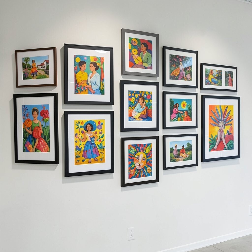
Use black, white, or natural wood frames, then let the artwork colors be the star. This keeps the structure steady while still giving you a vibrant visual punch.
If your room already has strong colors, this is a practical way to add more without overwhelming the space. Try limiting the art palette to two or three main colors for an easy, polished look.
Personalization becomes simple when you can rotate prints over time. You can use removable frames or swap art seasons, like summer florals in warm months and cozy colors in winter.
For cost, focus money on a few standout pieces and fill the rest with affordable prints. That balance keeps the wall from becoming too expensive while still looking high-end.
12. Letter Art and Color Blocks

Spice up your gallery wall with letter art and color-block designs. A few bold letters can turn a wall into a message you can see every day.
Choose a font style that matches your room, then pair it with geometric art in matching tones. Use consistent frame widths so the letters feel orderly, even when the colors are bright.
To personalize, use initials, a favorite word, or a family name in the center spot. This idea feels unique because it turns wall decor into something you’ll actually enjoy reading.
13. Oversized Center Piece With Smaller Surrounds

Start with one large, colorful piece as the anchor, then surround it with smaller frames. The center becomes the visual magnet, and everything else supports it.
Pick a dominant palette from that large piece and choose smaller prints that echo those colors. This method is practical because it reduces guesswork when you’re choosing art.
For a uniqueness boost, include one unexpected shape, like a tall frame or a vertical poster. When you vary orientation, your wall feels more dynamic.
If you’re planning around budget, buy one slightly pricier art print for the center and then use affordable prints for the rest. This gives you a gallery feel without paying for all premium pieces.
14. Fabric Art and Textiles In Frames

Don’t limit yourself to paper prints. Fabric art, colorful scarves, and small textile pieces can look amazing when framed properly.
Choose fabrics with strong color contrast, like bright stripes or woven patterns, then mount them behind glass or under a clear sheet. The layered texture adds depth you can’t get from flat prints.
To make it easy, use removable frame backs and keep a few extra fabric swatches ready for changes. This is a fun personalization option because you can swap seasons or moods without starting over.
15. Colorful Photo Strips With Equal Spacing

Turn cherished photos into a colorful story using a row or grid layout. Colorful editing styles, like warm filters or vivid saturation, make the photos feel like art.
Print photos in similar sizes, then frame them with matching mats to keep the look clean. Equal spacing makes the wall feel calm, even when the photos are full of life.
For practical hanging, test the layout on the wall with painter’s tape before you commit. That way you can adjust alignment quickly.
This idea supports current trends because people are leaning more toward personal, lived-in galleries rather than only traditional artwork. It’s also budget-friendly if you print from your own photos at a local shop.
16. Metallic Accents With Colorful Artwork

Add a little sparkle by pairing colorful art with metallic frame accents. Gold, rose gold, or brushed silver can make bright colors feel more luxe.
Use metallic frames sparingly so they don’t compete with your art. A good approach is to alternate a metallic frame with a matte frame for a balanced rhythm.
To personalize, include one piece that already has metallic elements, like a foil-style illustration or a photo with warm highlights. That connection makes the whole arrangement feel intentional.
If you want to control cost, repaint inexpensive frames with metallic spray paint. That’s often cheaper than buying new frames that already match.
17. Geography-Inspired Map Art With Bright Coordinates
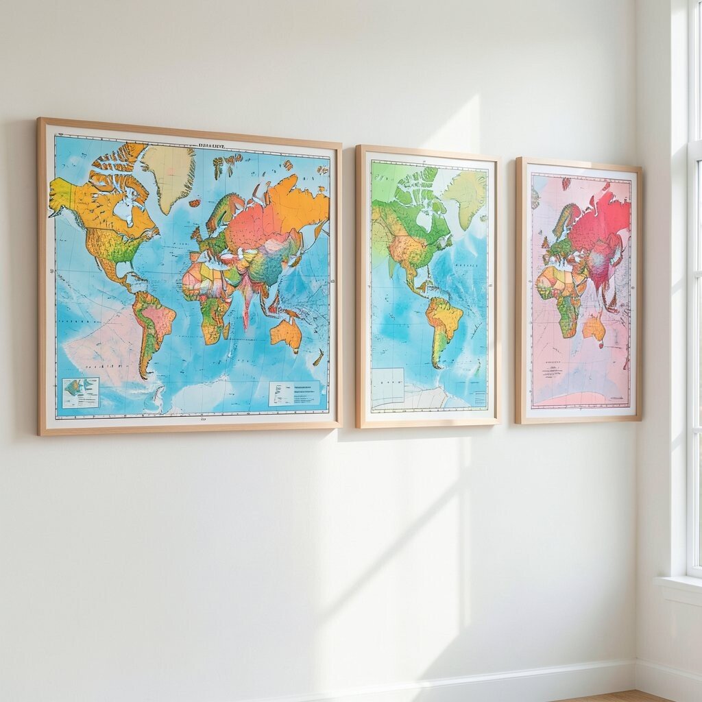
Make your wall feel like a travel scrapbook with colorful map prints. Choose maps that highlight routes with bright lines or playful coordinate markers.
Frame a few different regions and use a shared color palette across them for unity. This benefits your space by adding meaning and a sense of direction.
Personalize it by marking places that matter, like where you met or where you want to go next. Even a simple coordinate label can turn the wall into a daily reminder.
For practicality, keep the map prints similar in style so they work together. You can often find affordable map downloads that look great once printed.
18. Everyday Objects Framed In Colorful Mats
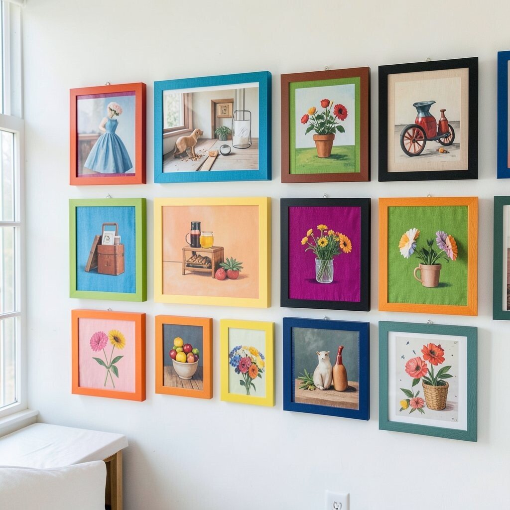
Think beyond paintings and hang art that uses everyday objects. Bright letters, colored ticket stubs, postcards, and even small fabric samples can be arranged in a frame.
Use colorful mats to add the pop you want while keeping the items readable. This approach is uniquely personal because it turns memories into something you can display.
For a neat finish, keep the layout tidy and avoid cramming too many items into one frame. It’s easier to maintain visual balance when each frame has a clear focus.
Cost is usually low because you’re using what you already have, and you can reprint favorites if needed. This is also a current trend since people love quirky, personal galleries over polished and generic decor.
19. Colorful Symmetry With Same-Shape Frames
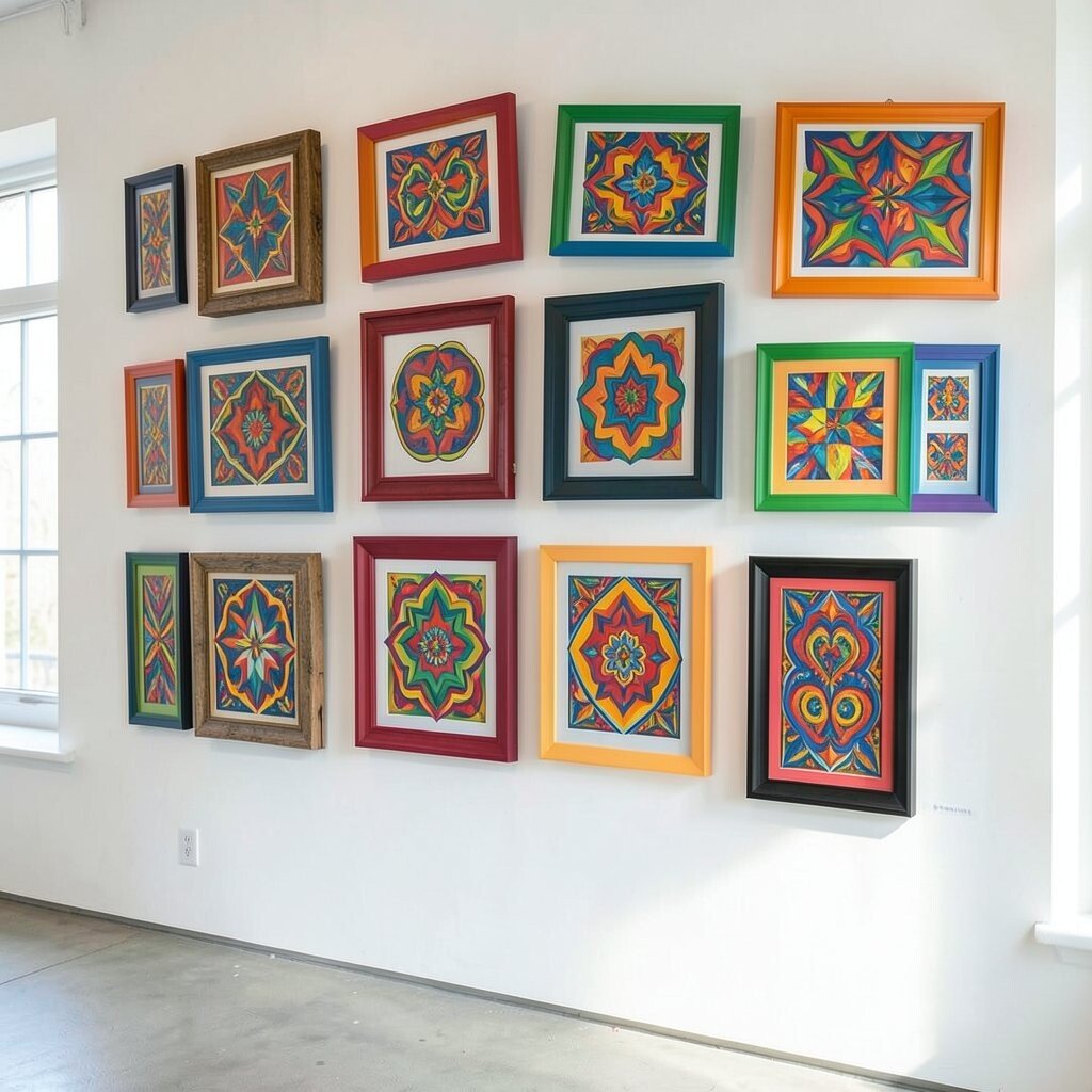
Create a structured look using symmetry and repeat frame shapes. The wall feels confident, while the colors add warmth and personality.
Choose two or three art colors and mirror them across the center line so each side looks like a matching duet. Use same-size frames or same mat sizes to keep the symmetry strong.
To personalize, swap one mirror piece for something special, like a family photo or a favorite print. That little difference makes the wall feel human rather than perfectly manufactured.
For practical tips, measure the center point of your wall and build outward. When the symmetry is right, you’ll spend less time adjusting after hanging.
20. Color-Themed Corner Gallery So It Feels Built-In

Use the corner of a room for a gallery wall that feels like it was always part of the design. Corner placement can add depth and make the area more inviting.
Choose frames that work well from multiple angles, like artworks with bold color even when viewed slightly sideways. Place larger pieces on the most visible wall and smaller ones on the adjacent wall.
This idea benefits your space because it makes an awkward corner feel purposeful. It also supports a design trend toward creating focal moments without adding new furniture.
If you’re keeping costs down, use a mix of frame sizes and repaint them so they match. Corner galleries are also forgiving because you can adjust after you see how the wall looks in real life.
21. Hand-Drawn Highlights With Store-Bought Surrounds

Pair store-bought art with a few hand-drawn pieces to make your gallery feel truly one-of-a-kind. A quick sketch or colorful doodle can add personality right away.
Choose simple sketch styles like leaves, sun shapes, or abstract forms, and frame them with matching mats. This makes your handmade work look polished without needing fancy tools.
To personalize further, use colors that already appear in your room textiles, like couch pillows or rug accents. That color link helps everything feel cohesive.
Budget considerations are great here because handmade art is free once you have supplies. You can invest in quality frames for the pieces you love most and save on prints for the rest.
22. Seasonal Color Swaps With Magnetic Backings

Design your gallery wall so it can change with the seasons. When frames use magnetic backings or clip systems, swapping art becomes quick and fun.
Keep a starter set of colorful art you rotate often, like spring florals, summer beach scenes, and fall warm tones. You’ll always have something fresh without needing a brand-new wall every time.
This idea is unique because it turns decor into a hobby. It also benefits your space since color changes can brighten rooms during darker months.
For practical cost control, print a small batch of seasonal artwork and reuse the same frames. This keeps expenses low while still giving you that “new room” feeling again and again.