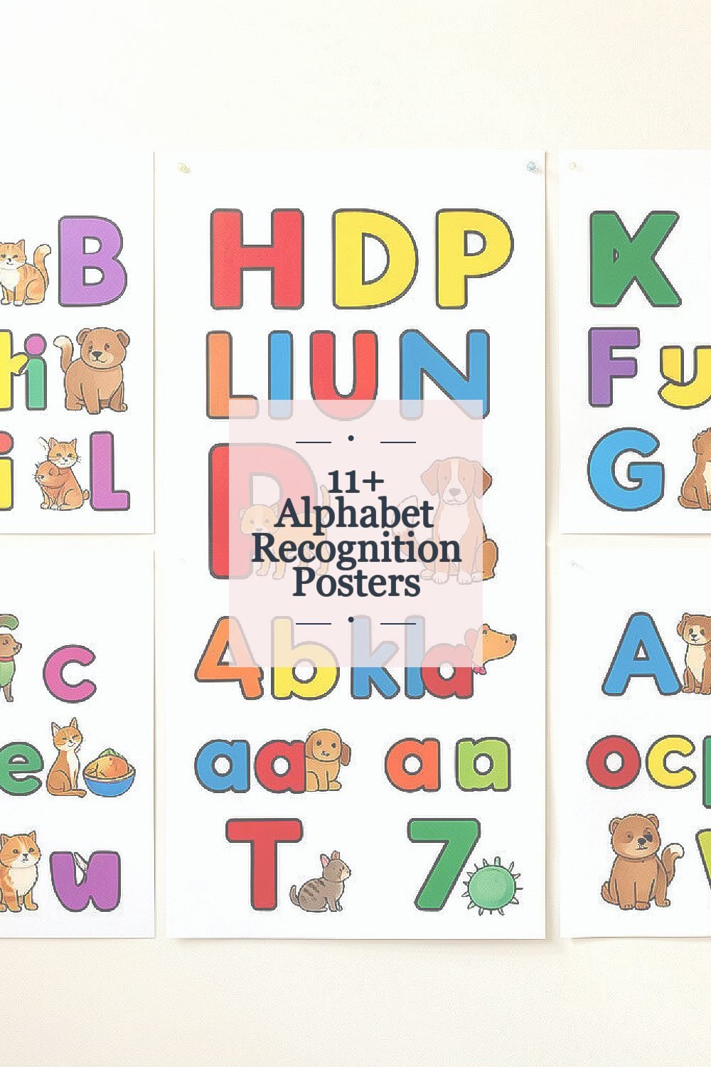
Alphabet recognition can feel simple, but kids need strong visual signals. Good posters make letters stick in a playful way.
When classrooms and homes use the right designs, practice turns into everyday motivation. You’ll see what to look for, how to use each poster, and how to tailor it to your child’s style.
1. Bold Letter Shapes With Picture Matches
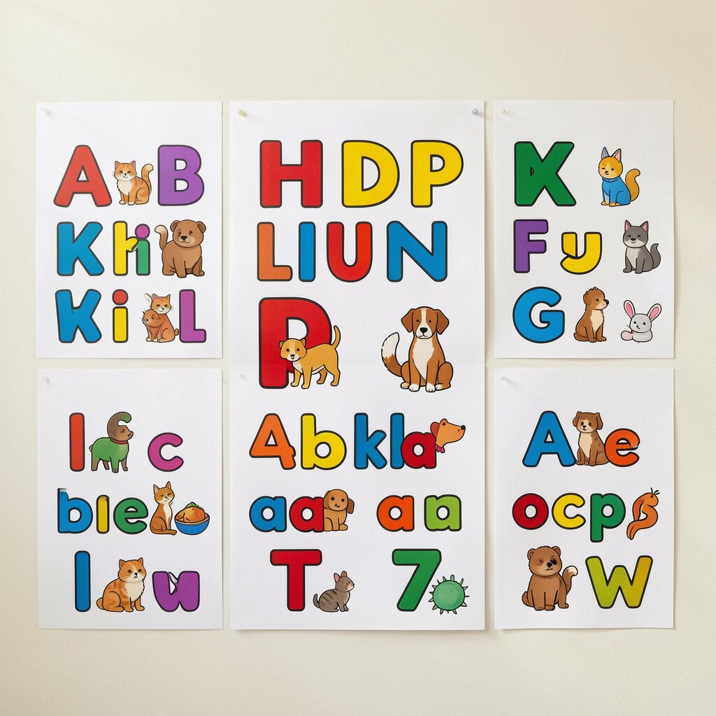
The first poster idea is all about strong letter shapes paired with clear picture matches. You’ll see a big uppercase and lowercase letter next to an image that starts with the same sound.
For example, the letter “A” sits near an apple, and “B” sits near a ball, with plenty of space between them. Kids can glance, connect the picture, and say the sound right away. This setup supports faster recognition because the eye learns the form and the ear confirms the sound.
If you want it to feel extra useful, use the poster during short, daily moments rather than long practice. Point to one letter, ask your child to name it, then let them point to the matching picture. To personalize, choose pictures your family already talks about, like animals your child loves or foods they actually eat.
2. Alphabet Posters With Color-Coded Sounds

A second great option uses color to help separate sounds. You might notice that vowels share one color, consonants share another, and letter blends get a third highlight.
This visual organization reduces guesswork and helps kids focus on patterns. When children can “see” sound groups, they often remember longer. It also makes review easier because you can ask, “What color does this sound belong to?”
For practical use, keep a mini routine near the poster so you don’t have to hunt for materials. Say the letter sound, then trace the letter in the air while matching the color cue. You can personalize by writing your child’s name or favorite character under the poster so the wall feels like theirs.
Color-coded designs also fit current trends toward multisensory learning, where sight, sound, and movement work together. If you’re thinking about cost, compare bundle options because many sellers provide both lowercase and uppercase versions together. Buying a set can be cheaper than adding individual posters later.
3. Uppercase and Lowercase Posters Side by Side
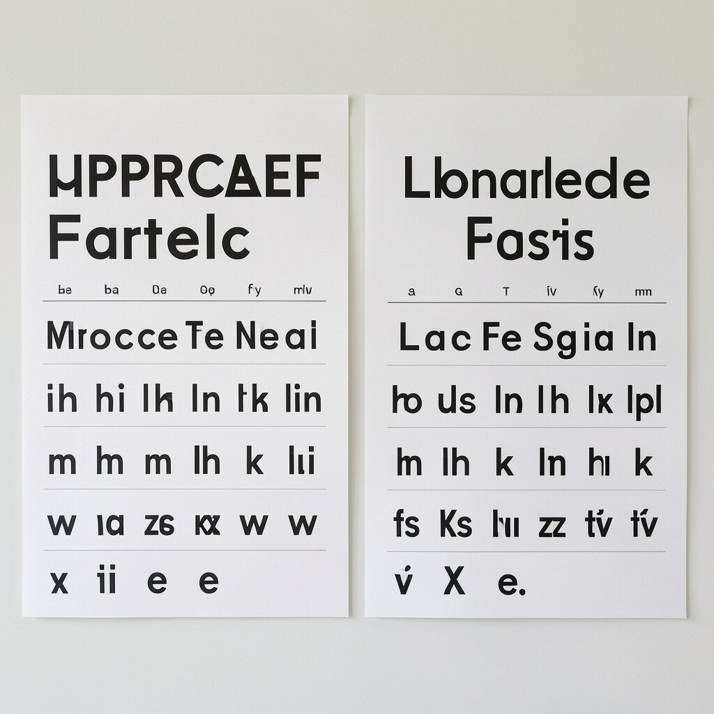
A third poster style shows uppercase and lowercase letters in one tidy layout. You’ll see the pair aligned so children can compare shapes without flipping pages.
This pairing makes it easier to spot differences, like “A” versus “a” or “B” versus “b.” Kids learn that letters are not just separate characters, but matched siblings with related sounds. The benefit is faster accuracy during letter naming and early reading.
To use it well, point out one mismatch at a time, such as which one has a round top or a tail. Ask your child to choose which one matches what they hear, then celebrate even small wins. For personalization, use a dry-erase marker to circle letters your child is practicing this week.
These posters are especially helpful for homes with mixed routines, because you can keep everything visible all day. Many modern designs also include handwriting guides or dotted trails for extra support. If you’re watching cost, consider printing your own version once you find a layout you love.
4. Handwriting Practice Posters With Tracing Paths
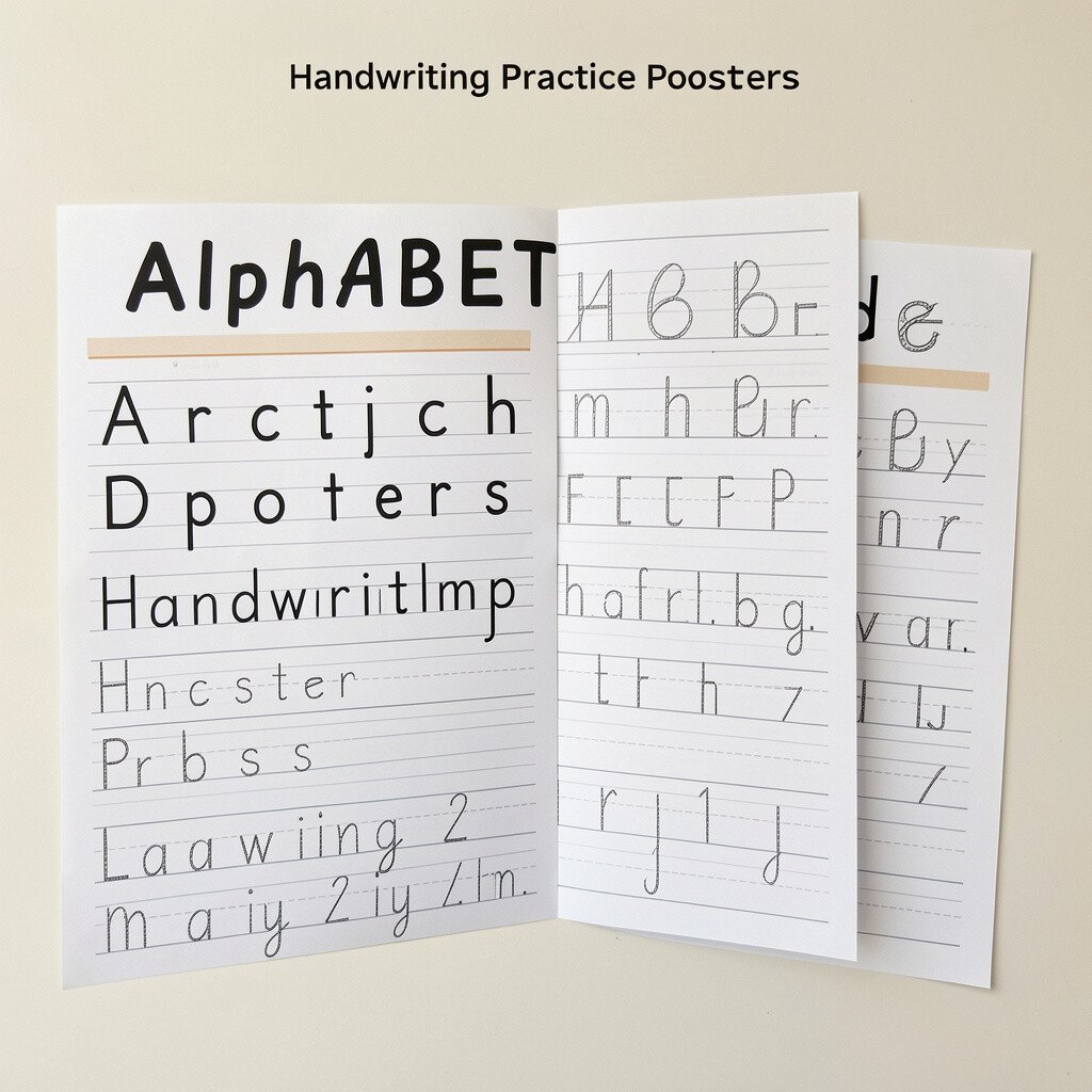
Some alphabet posters look like they were made for writing hands. Letters appear with dotted lines and arrows showing direction, plus a smooth example of the finished letter form.
When kids trace along those paths, they build muscle memory and improve both recognition and formation. This approach supports early writing, not just reading, which makes it a strong whole-skill option. You can turn it into fun by tracing with a finger, then tracing with a chunky crayon for grip.
For a practical tip, place the poster at a height that matches your child’s comfortable reach. Keep a small tray of crayons or washable markers nearby so practice happens without delays. To personalize, use their name or favorite number to mark the letters they master, creating a friendly sense of progress.
5. Minimalist Alphabet Posters for Focused Attention
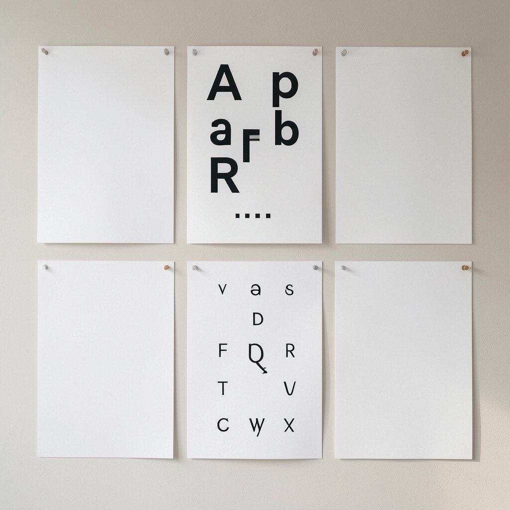
If you want something calm and uncluttered, choose a minimalist poster. Large black or dark letters on a light background help kids see the shape clearly.
Less visual noise can be a real benefit for kids who get overwhelmed by busy images. They can concentrate on one thing at a time and build confidence. This style also works well during quick check-ins, like “Show me the letter you hear.”
To personalize, pair the minimalist poster with a simple chant you already use at bedtime. You can add a few stickers to highlight letters your child is learning right now. When it comes to cost, minimalist posters often come as affordable printables, making them a budget-friendly choice.
6. Alphabet Posters With Phonics in Simple Chunks
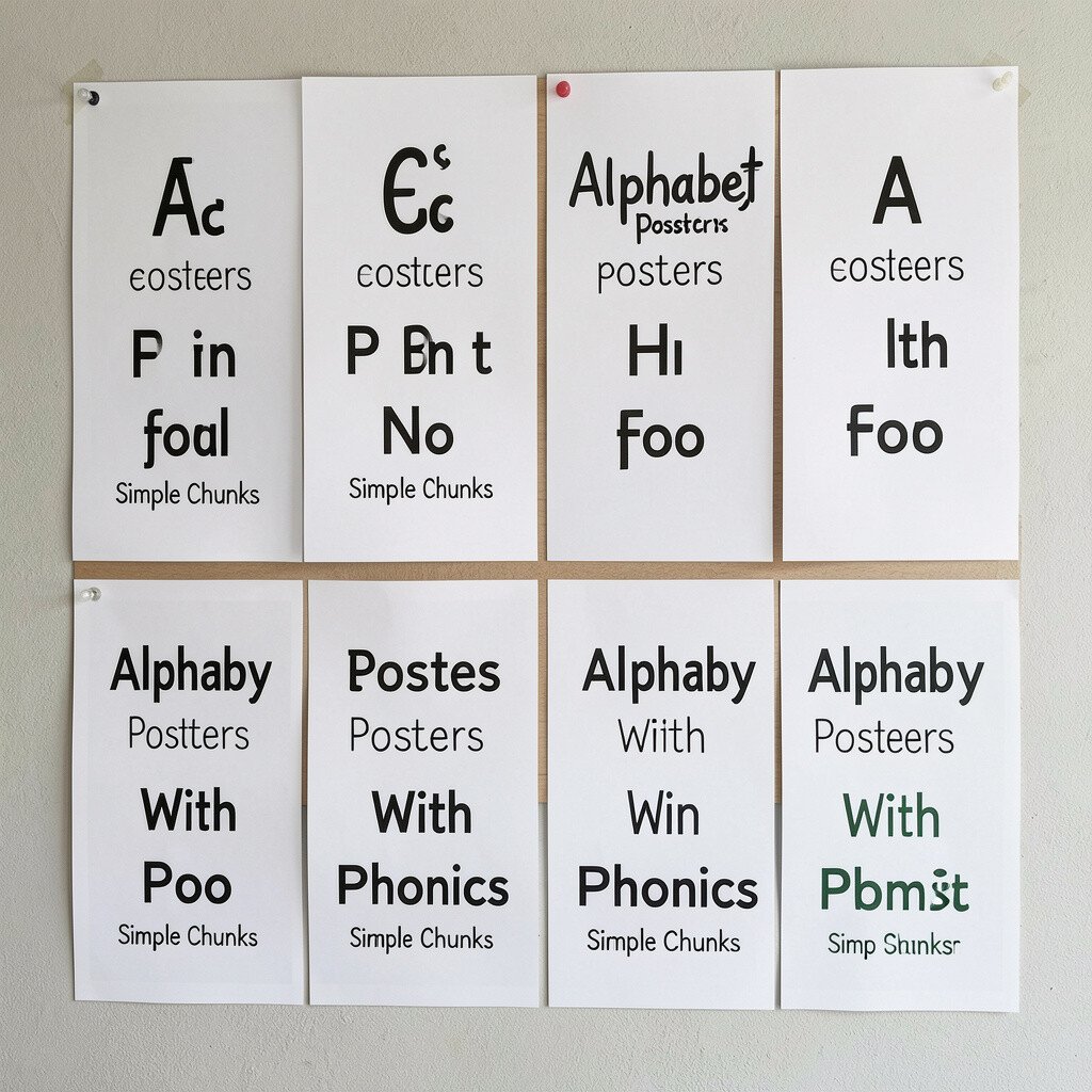
This poster style combines letter recognition with basic phonics patterns. You might see letters grouped by sound families, such as short vowels or common consonant blends.
The value is that children don’t just memorize shapes; they practice sound chunks that appear in many words. That helps them feel more ready for reading tasks later. It also gives parents and teachers an easy way to keep practice connected to real language.
For practical tips, ask your child to find the letter, say the sound, then name a word from their world that starts with that sound. Keep it playful by using toys, pictures, or snack names. To personalize, include a small pocket chart or cards where you can swap in the letter that your child is learning today.
Current learning trends often highlight “short lessons” with repeated practice, and these posters fit that routine perfectly. If you want to watch cost, look for designs that include multiple sound families on one page. One poster can cover a wide set of skills, so you don’t need many extras.
7. Theme-Based Alphabet Posters From Animals to Transportation

Theme posters can make letters feel like part of a story. You might see an alphabet journey through animals, vehicles, space, or ocean life, with each letter paired to a themed picture.
This poster type is unique because the images do more than decorate; they create curiosity. When a child loves the theme, motivation grows, and learning feels less like work. The benefit is that attention stays longer, especially for active kids.
To use it well, connect letters to theme talk during daily routines. On a walk, point at things that match the poster, like buses for “B” or birds for “B” depending on your design. Personalize it by letting your child choose the next theme, then rotate posters as interests change.
For cost considerations, theme posters vary widely, so compare what’s included. Some bundles include matching flashcards, while others focus on one poster only. If you’re on a budget, a single strong theme poster can still do the job when paired with simple word play.
8. Alphabet Posters With Everyday Objects and Labels
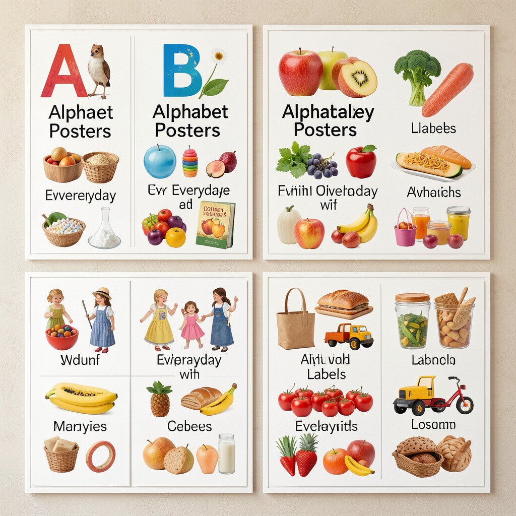
Another helpful option uses everyday objects instead of big, fancy illustrations. Think a bright cup for “C,” a comb for “K,” or a mitten for “M,” with simple, clear drawings.
This style feels practical because it connects learning to the home or classroom. Kids often recognize the object immediately, which makes letter-to-sound mapping feel real. The benefit is smoother practice because the vocabulary already lives in their daily life.
For a simple routine, put the poster near where you read or where your child gets dressed. Ask them to find the letter that matches an object you hold, like “Find the letter that starts with sock.” Personalize the poster by writing family objects on blank areas with a marker if the design allows it.
9. Alphabet Posters With Motion-Friendly Design Elements
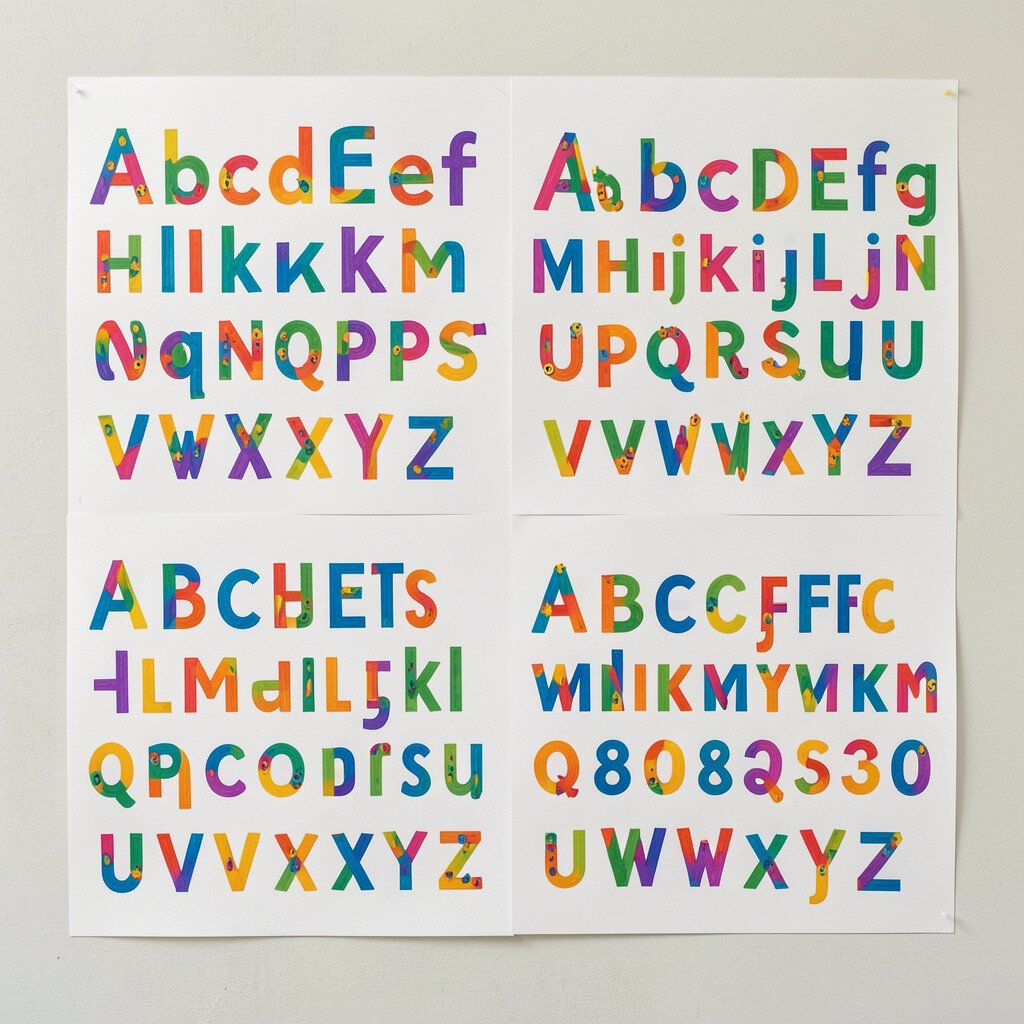
Some posters are designed to encourage movement, not just looking. Letters might include arrows, paths, or “follow me” lines that guide the eye from one letter to the next.
This motion cue helps kids practice sequencing, which supports recognition and recall. Instead of only naming letters, children can track how the alphabet flows. That makes the learning feel energetic, especially in a busy household.
To make it more actionable, try a “letter race” that stays gentle and safe. Point to where the arrow starts, say the sound, and have your child hop to the next letter on the poster. Personalize the pace by using slower steps when the letters feel new and faster steps when they feel familiar.
These posters also match current trends toward active learning, where kids learn through body movement. For cost, look for posters that include both uppercase and lowercase or multiple activities in one design. A single versatile poster can replace several separate practice materials.
10. Alphabet Posters for Sight Words and Letter Names Together
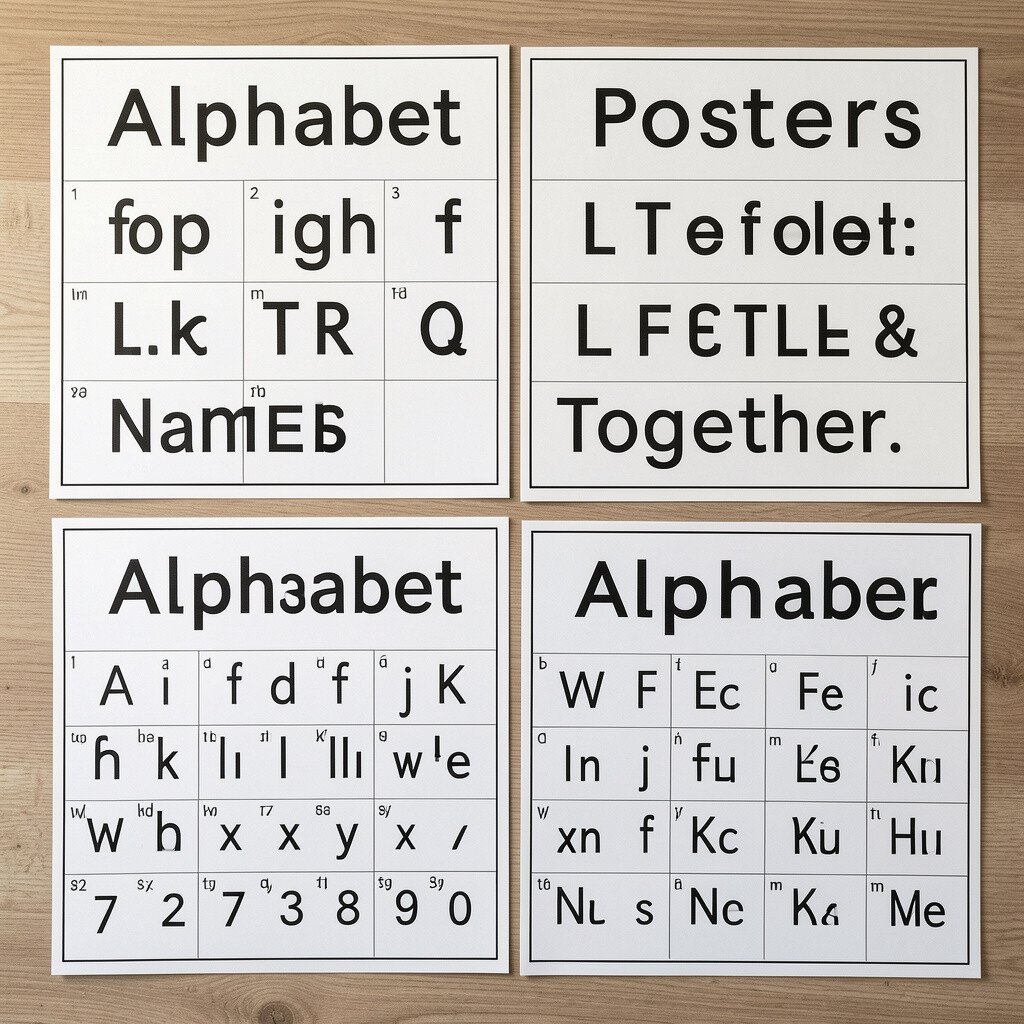
A smart hybrid option includes letter names plus early word cues. You may see a letter alongside a short, common word that begins with that letter, like “A for apple,” and “S for sun,” in a tidy format.
The benefit is that kids see the letter sound and the letter name at the same time. That can reduce confusion when children start noticing words in books and signs. It also gives you extra chances to practice during reading, not only during letter drills.
For practical use, keep a few matching picture cards nearby so you can point back and forth between the poster and real items in the room. Ask your child to choose a letter, then find the matching word example on the poster. To personalize, swap in the words that matter most, like “Mom,” “cat,” or “milk,” by adding small labels if the design is writable.
Cost-wise, hybrid posters can be slightly pricier, but they often replace multiple sets of flashcards. If you’re budget-conscious, check whether the publisher offers printable companion pages. That way you get more practice without buying more physical items.
11. Alphabet Posters With Short Stories Under Each Letter
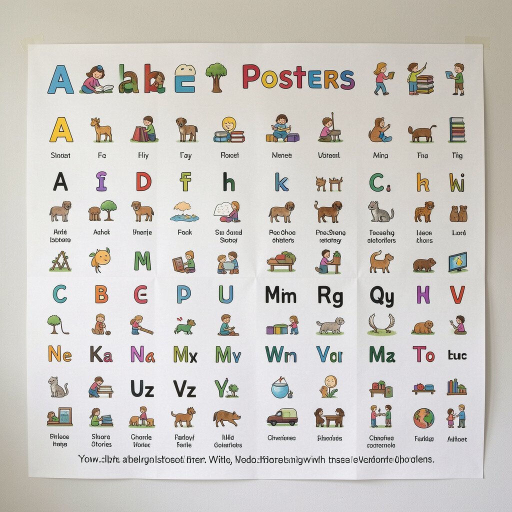
Story-driven posters can make each letter feel memorable. Under every letter, you’ll find a tiny scene or mini phrase that hints at a sound and a situation.
This uniqueness helps kids remember letters through meaning, not only shapes. When children can picture a little moment, the letter becomes easier to recall. The benefit is strong engagement, because kids love hearing and repeating small lines.
To make it actionable, read the mini story once, then ask your child to act it out with a toy or hand gestures. After that, point to the letter and ask them to name it from memory. Personalize it by changing the story tone to match your child’s favorite style, like silly, calm, or superhero energy.
If you’re thinking about cost, story posters can be a good long-term pick because they can be reread many times. A durable print with good ink often lasts through daily use. When you shop, look for designs that are easy to read from a distance, since kids will be looking from different spots in the room.
12. Alphabet Posters With Interactive DIY Upgrades
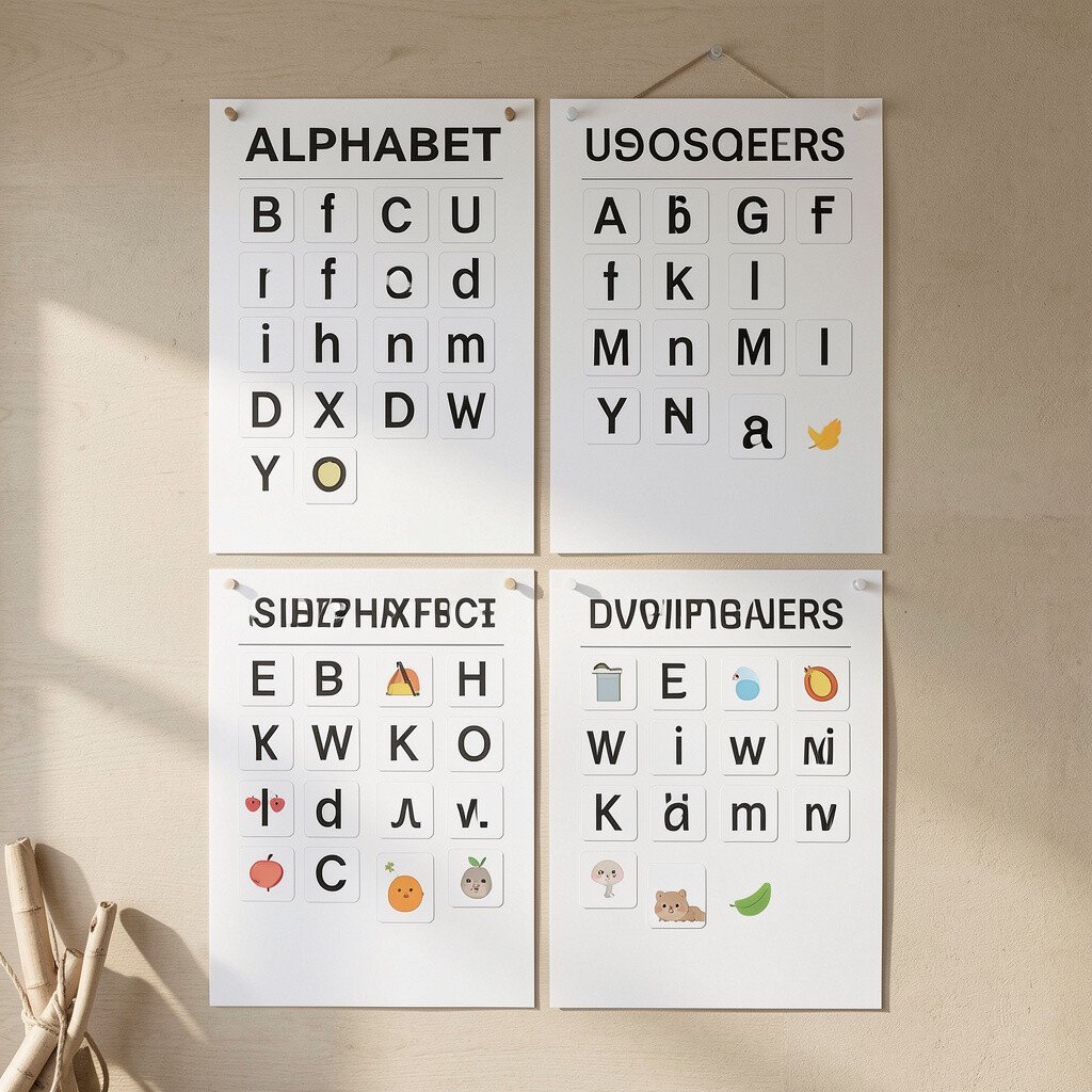
If you love customizing, choose a poster that invites upgrades. Some designs include blank spaces, removable pockets, or sections where you can add stickers and cards over time.
This is unique because the poster becomes a living tool, not a one-and-done chart. As your child’s skills grow, you can adjust what’s shown so the learning stays “just right.” The benefit is steady progress without needing a whole new poster every few weeks.
For practical tips, add a set of removable letter tiles or sticky tabs so your child can match sounds and rearrange them. Use a magnet board or Velcro strips for quick swaps, then keep a simple storage box nearby. Personalize by setting a weekly goal, like mastering three new letters, and tagging those spots with your child’s favorite sticker style.
Current trends often focus on personalization and parent-friendly materials, and DIY upgrades match that perfectly. Cost considerations are also flexible because you can start with the poster and add upgrades slowly. Even a small set of letter cards can make the poster feel brand new.