Bathrooms can feel too predictable when the floor and walls use the same familiar rhythm. A fresh tile pattern can make the whole room feel brighter, calmer, and more “you.”
Below are design ideas that use tile patterns in smart ways, so you get real style without turning the room into a loud experiment.
1. Herringbone That Feels Warm and Tailored
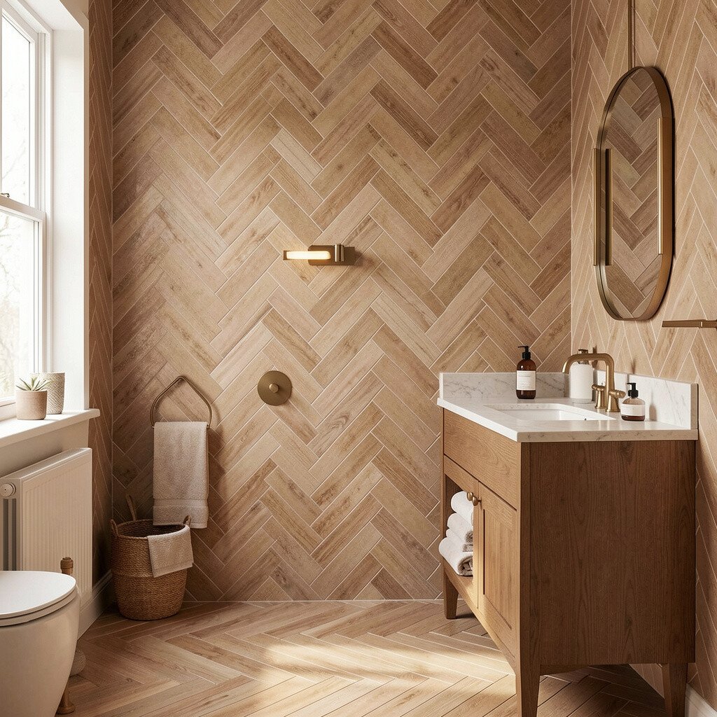
Picture small rectangular tiles laid in a neat zigzag, like a tailored jacket for your floor. The pattern pulls the eye along the room and makes even a compact bathroom feel longer.
Herringbone looks clean and classic, but it still feels lively because the lines catch the light. For practical comfort, choose slip-resistant finishes on the walking zones so the style stays safe. If your bathroom is busy, keep the wall tiles simple and let the floor do the talking.
2. Chevron Lines for a Confident, Modern Mood
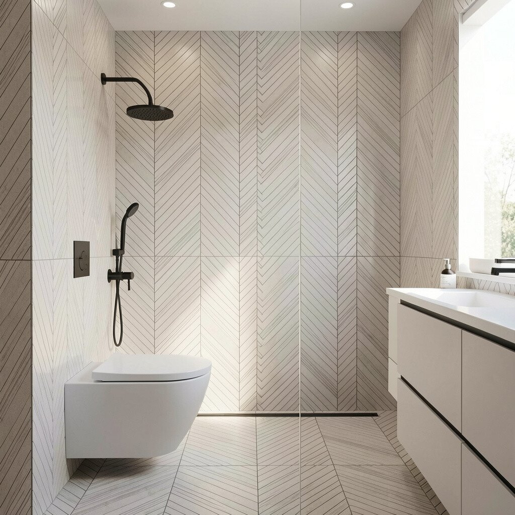
Chevron is like herringbone’s bolder cousin, with sharper angles that create a strong visual direction. When you install it so the point lines face toward the vanity, the space feels more anchored and intentional.
Use a matte tile to reduce glare, especially in bathrooms with bright overhead lighting. Pair the floor with solid-color walls and warm fixtures so the pattern stays fresh instead of overwhelming.
To personalize, pick a grout color that blends for a calm look or contrasts for a high-fashion edge. When budgeting, compare the cost of pattern alignment work, since straight layout planning can reduce wasted cuts.
3. Subway Tile in a Staggered Offset for Easy Balance
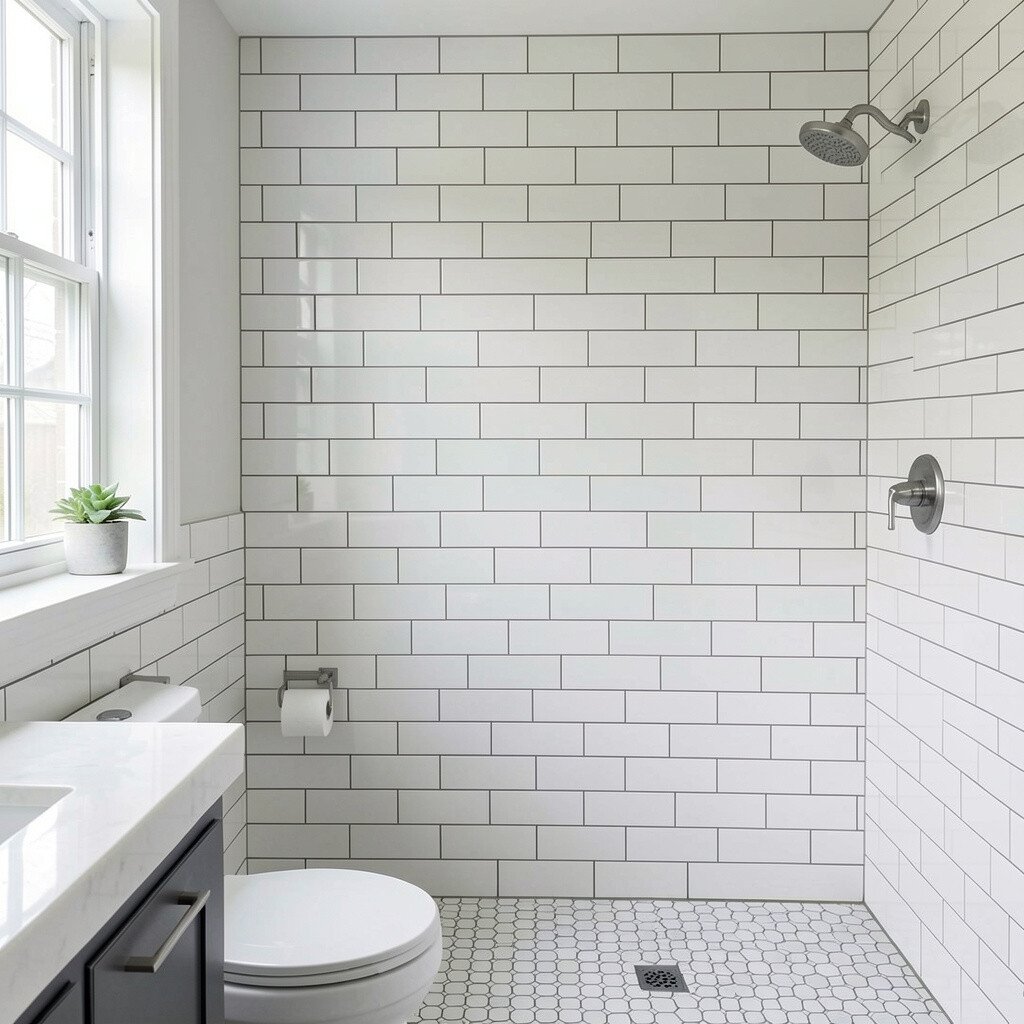
Subway tiles look familiar, yet offset patterns add a gentle rhythm without feeling busy. You can create a tidy backdrop behind the mirror and still keep the room airy.
This layout is great because it’s forgiving when walls aren’t perfectly even. Use a consistent grout width to keep the stagger looking crisp, and aim for a finish that wipes clean around the sink.
For personalization, try micro-mosaic accents only around niche shelves or the shower edge. It often costs less than intricate floor patterns because the tile shape repeats smoothly.
4. Large-Format Tiles with Subtle Linear Motion
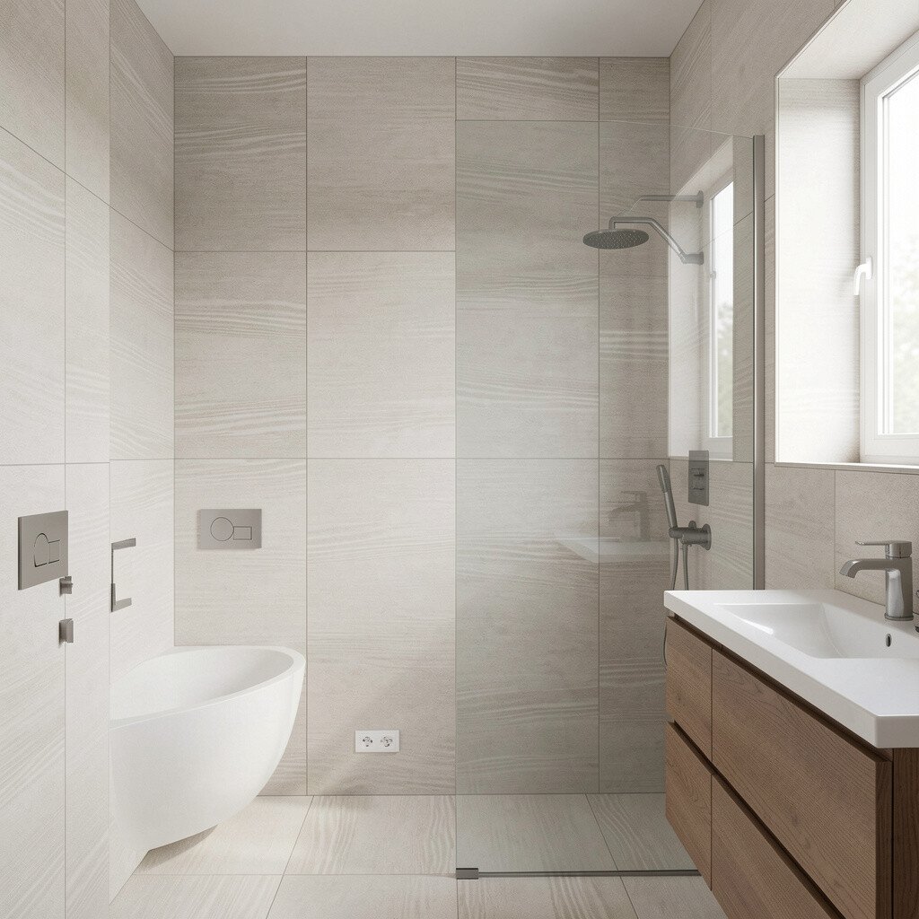
Big tiles can make your bathroom feel more open, especially when the pattern is a mild movement like wood grain or stone veining. The fewer grout lines create a calm surface that still looks interesting up close.
Choose long, straight veining that runs horizontally to visually widen the room. If your vanity is narrow, this style helps the walls feel less crowded while you keep storage functional.
5. Moroccan-Inspired Geometric for a Storybook Look
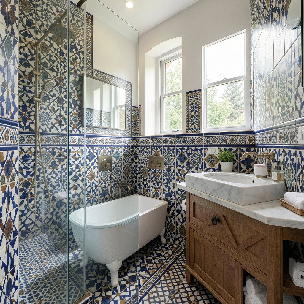
Think of patterned tiles as artwork you can walk on, with star and lattice shapes that bring personality fast. A Moroccan-inspired floor can make a simple vanity feel like part of a curated design.
Use geometric tiles in the main traffic zone and keep the shower surround more neutral so cleaning stays manageable. If you love the look but don’t want the whole room patterned, frame a small section like the entry of the shower or the border around the mirror.
For cost control, choose a smaller amount of premium pattern tiles and surround them with budget-friendly solid tiles. Pick grout in a warm tone to avoid strong contrast that can feel harsh over time.
6. Watercolor-Style Ombre Tiles for Soft Color Gradients
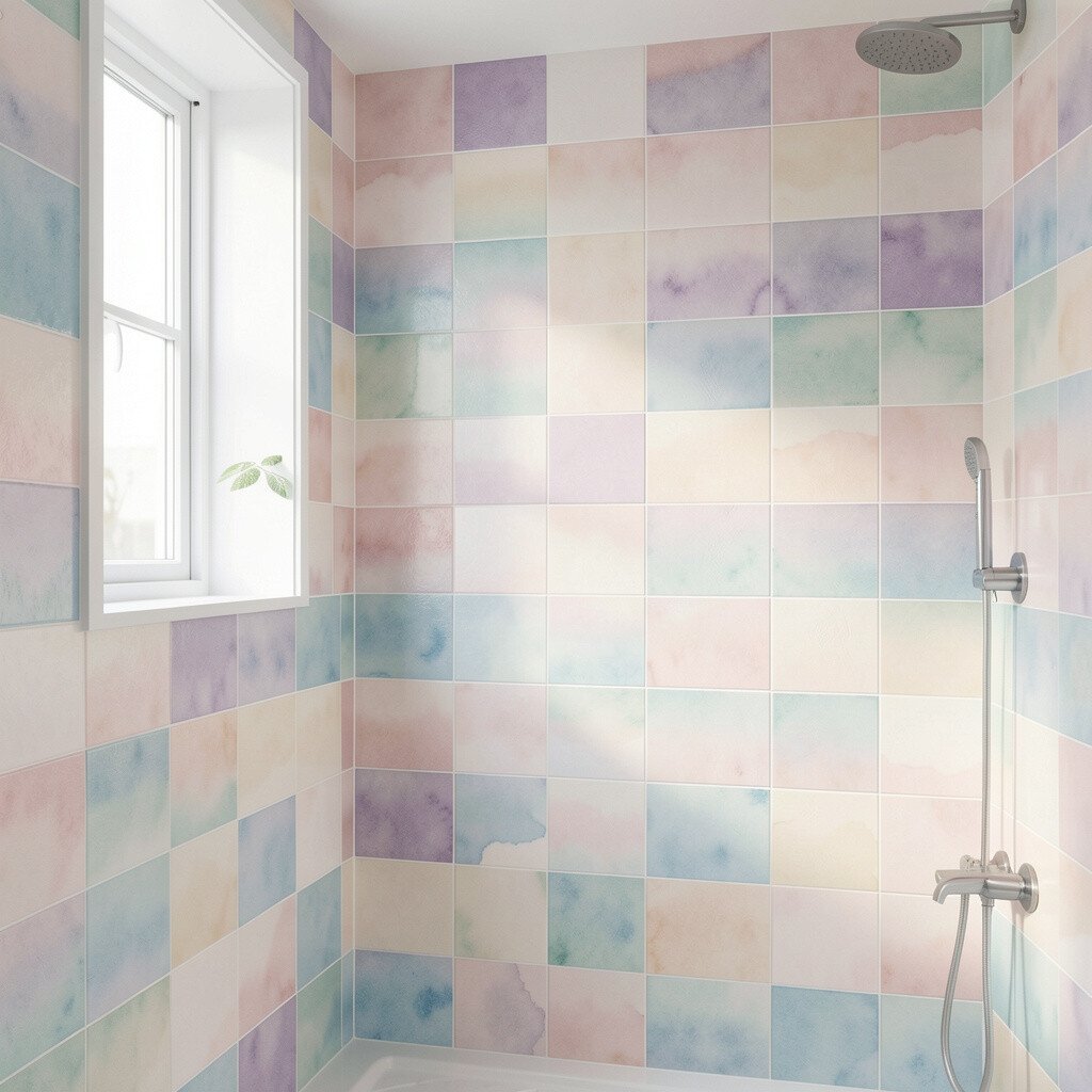
Ombre tiles shift from one tone to another like a quiet sunrise across the wall. The gradient creates depth and makes the bathroom feel spa-like without needing expensive décor.
Keep the darkest shade near the floor and let the light move upward, especially in low-light bathrooms. This trick makes the space feel taller, and it flatters skin tones in mirror lighting.
For personalization, pair the gradient with a simple terrazzo or smooth stone countertop so the colors feel intentional. Budget-wise, you can use ombre as a feature strip instead of covering every wall to keep spending under control.
7. Penny Tiles for a Playful, Reflective Texture
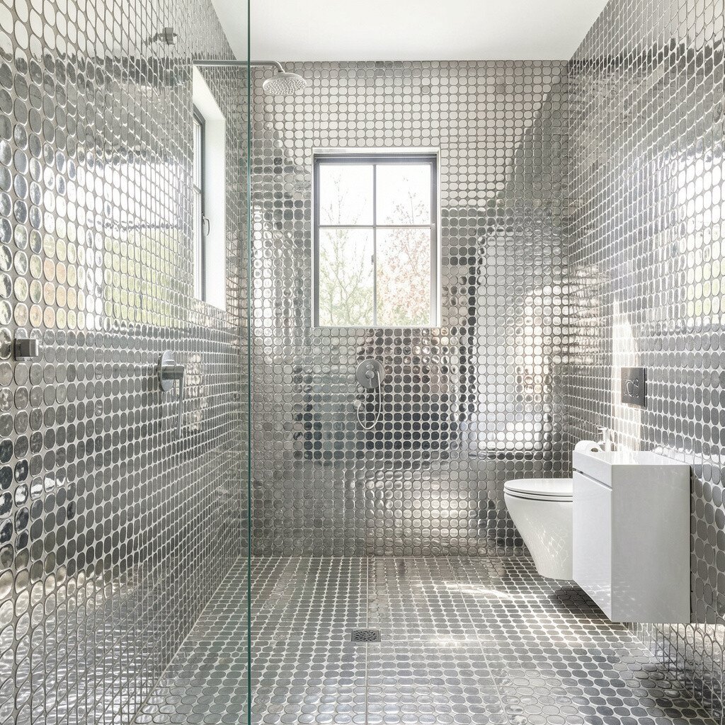
Penny tiles pack lots of charm into a small area, with round edges that catch light and create a gentle sparkle. The texture feels fun underfoot and adds visual interest even when everything else is minimal.
Use them strategically, like as a shower floor or a small “wet zone” mat effect, so grout lines don’t dominate the entire bathroom. Choose a finish that suits your cleaning routine, because smooth, sealed surfaces are easier to maintain.
To personalize, match the tile color to your hardware, like warm brass or cool chrome. When planning cost, remember that smaller tiles require more labor, so you may save by limiting the pattern to key spots.
8. Patterned Floor Medallions That Look Custom
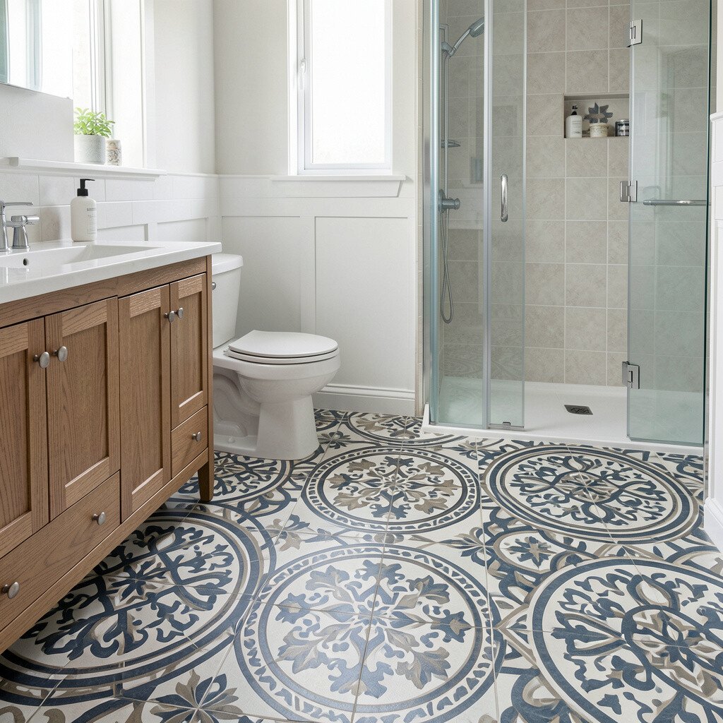
A centered medallion tile pattern can make your bathroom feel like a boutique suite. The visual focal point helps your layout work better, especially when the vanity sits off-center.
To keep it balanced, surround the medallion with simple tiles in a solid color that ties into your hardware or paint. This approach keeps the design unique without making the room feel cluttered.
9. Botanical Leaf Motifs for a Fresh, Natural Energy
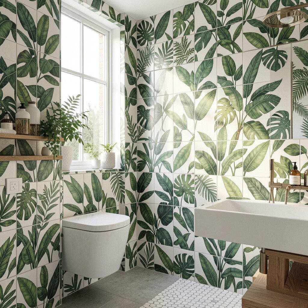
Leaf-pattern tiles bring a calm, outdoorsy feel that pairs beautifully with warm wood and soft linen textures. The best part is how naturally it works with greenery, even if you keep plants to just one or two.
Place the motif where the eye naturally lands, like along a niche shelf or half-height wall border. Keep surrounding tiles plain so the leaf details feel crisp rather than chaotic.
For personalization, choose tile colors that echo your window view, such as muted greens or earthy clay tones. Costs can vary, so consider ordering the botanical tiles as a targeted accent line rather than building the full floor from pattern stock.
10. Fan-Shaped Layout for Movement Around the Room
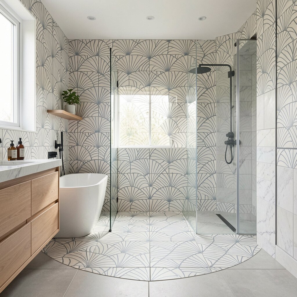
Fan-shaped tile patterns can make a bathroom feel like it’s gently moving, even when everything stays still. The curved layout works especially well for shower floors and entry areas.
Use the fan motif near the shower threshold and keep the rest of the floor simple to maintain clear walking paths. This is also a practical way to manage grout cleaning since the pattern is limited.
11. Brick-Style Running Bond for a Clean, Modern Flow
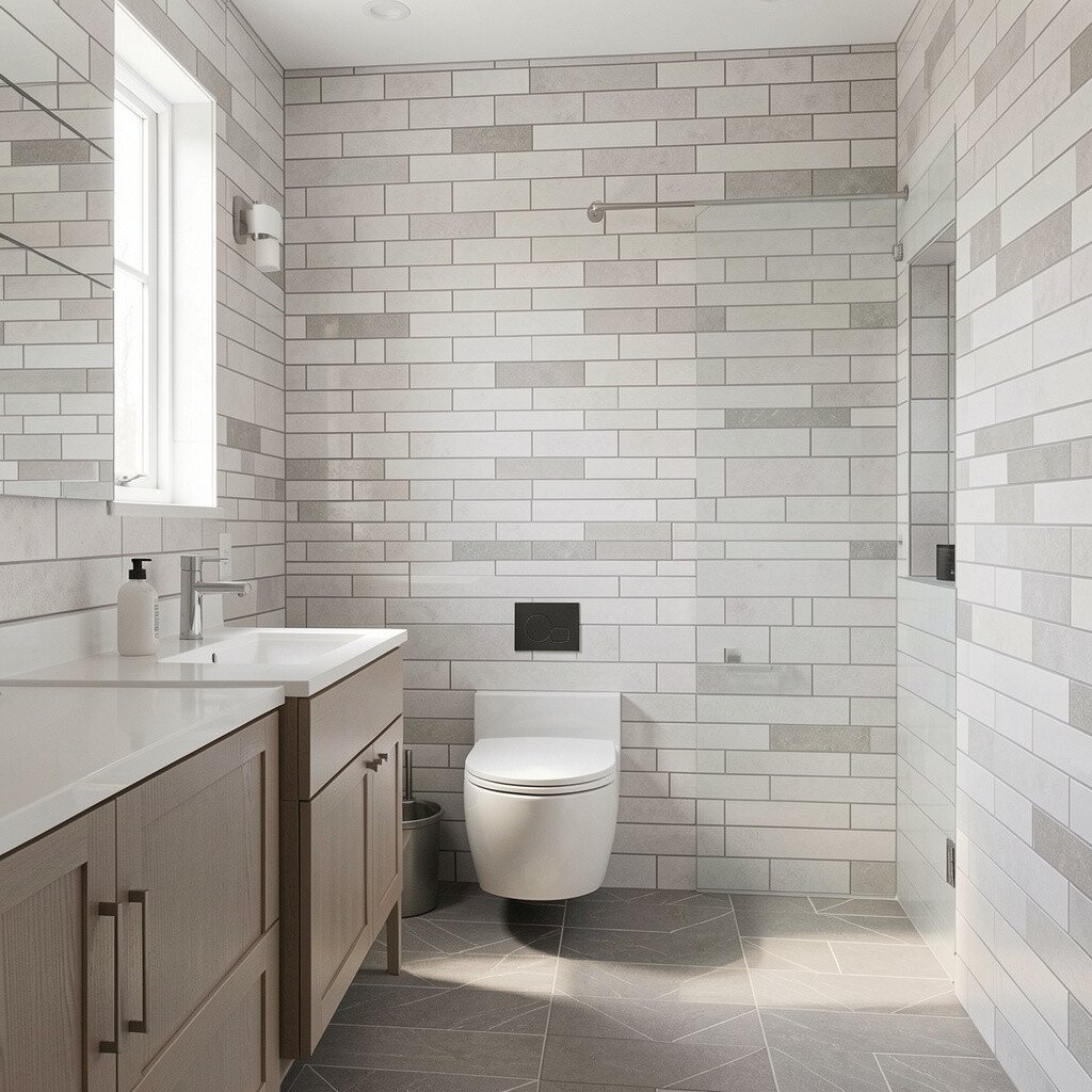
Running bond, like brick walls, creates a steady rhythm that feels tidy and modern. It works well on both floors and shower walls because the lines look organized rather than decorative-chaotic.
Choose tile lengths that match the scale of your bathroom, especially if your space is narrow. With good installation, the running pattern helps reduce visual “noise,” which is a big win for small rooms.
For personalization, vary the tile color just one shade darker for subtle contrast near the wet zone. It can be a cost-friendly option because the layout is repeatable and reduces complicated cutting.
12. Turkish-Style Marbling with Veins That Feel Like Water
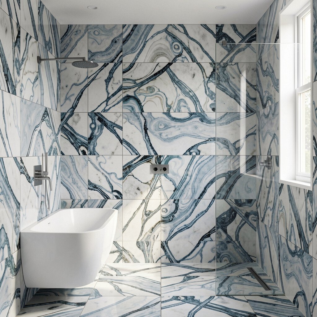
Marble-look tiles often look luxurious, but a Turkish-style design adds swirling motion that feels rich and artistic. The veining can imitate stone while still giving a controlled, bathroom-friendly finish.
This pattern is a great choice if you want elegance without heavy maintenance from real stone. Pick a grout color that softens the veining, like light gray or warm sand, so the room looks seamless.
To personalize, echo the marble direction with your vanity countertop veining or a matching paint tone. Cost can be higher for premium porcelain that resists water, so consider using the strongest pattern tiles in the main visual zone around the vanity.
13. Split-Color Checker for a Playful, Balanced Contrast
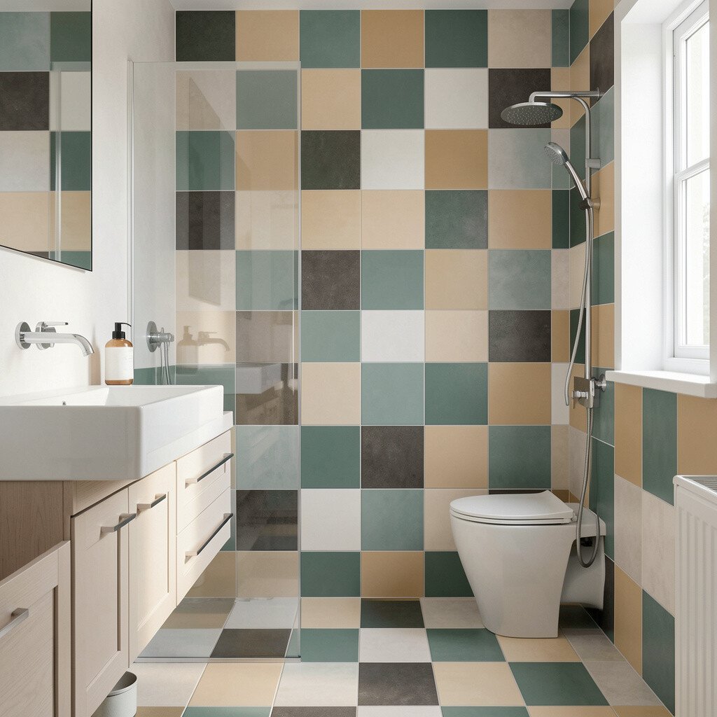
A checker pattern with two tones can feel playful while still staying organized. When you use larger squares, the pattern looks modern instead of retro, and the room feels more graphic.
Keep one tile color warm and the other cool so the bathroom feels balanced rather than flat. This style also helps define zones, like separating the sink area from the shower area.
14. Mosaic Borders for a Luxurious Edge Without Full Coverage
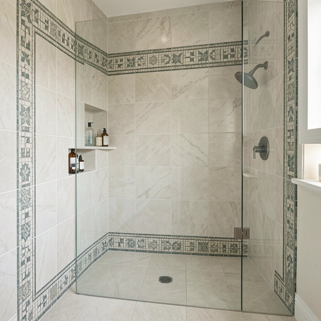
Mosaic borders are a smart way to add pattern without covering every inch. Think of them as a stylish frame that makes plain tiles feel designed.
Try a thin mosaic strip along the top of the shower wall or as a subtle band around the vanity backsplash. It adds shine and detail where you notice it most, which keeps the look feeling intentional.
For personalization, choose mosaic colors that match towels or wall paint, then keep the main tiles neutral. This approach can help with cost because you’re buying patterned tile only where it counts.
15. Striped Tile Layout for Taller Walls and Cleaner Lines
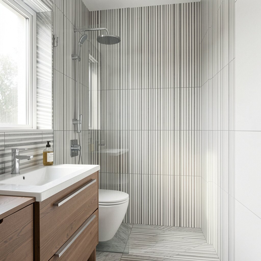
Vertical stripes can visually stretch a bathroom, which is helpful when ceiling height feels tight. The pattern also adds a crisp edge that works well with modern fixtures.
Use slim tiles for the stripes so the effect stays elegant rather than chunky. If you want a practical finish, pick a durable porcelain with a smooth surface that wipes clean in daily use.
To personalize, you can repeat a stripe theme only on one wall, like the one behind the mirror. Budget-wise, focusing stripes on key areas can keep material and installation costs more manageable than full-room pattern coverage.
16. Mixed-Pattern Zoning for a Designer Look in One Room
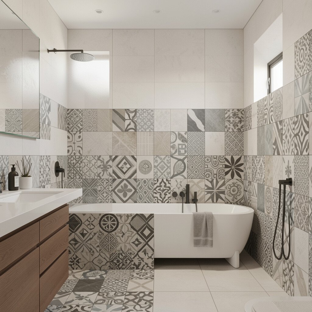
Mixed-pattern zoning lets you create different moods in the same bathroom, like using geometry near the sink and calming stone-look tiles in the shower. When done well, it feels custom, not chaotic.
Choose two patterns that share a color family, such as warm grays with soft beige, so everything blends naturally. Keep grout colors consistent across patterns to avoid visual breaks that can make the room feel busier than intended.
For personalization, match the pattern intensity to your daily routines, placing the boldest tiles where you stand longest. Cost considerations matter here, so plan a clear boundary between zones to prevent over-ordering expensive patterned tile.