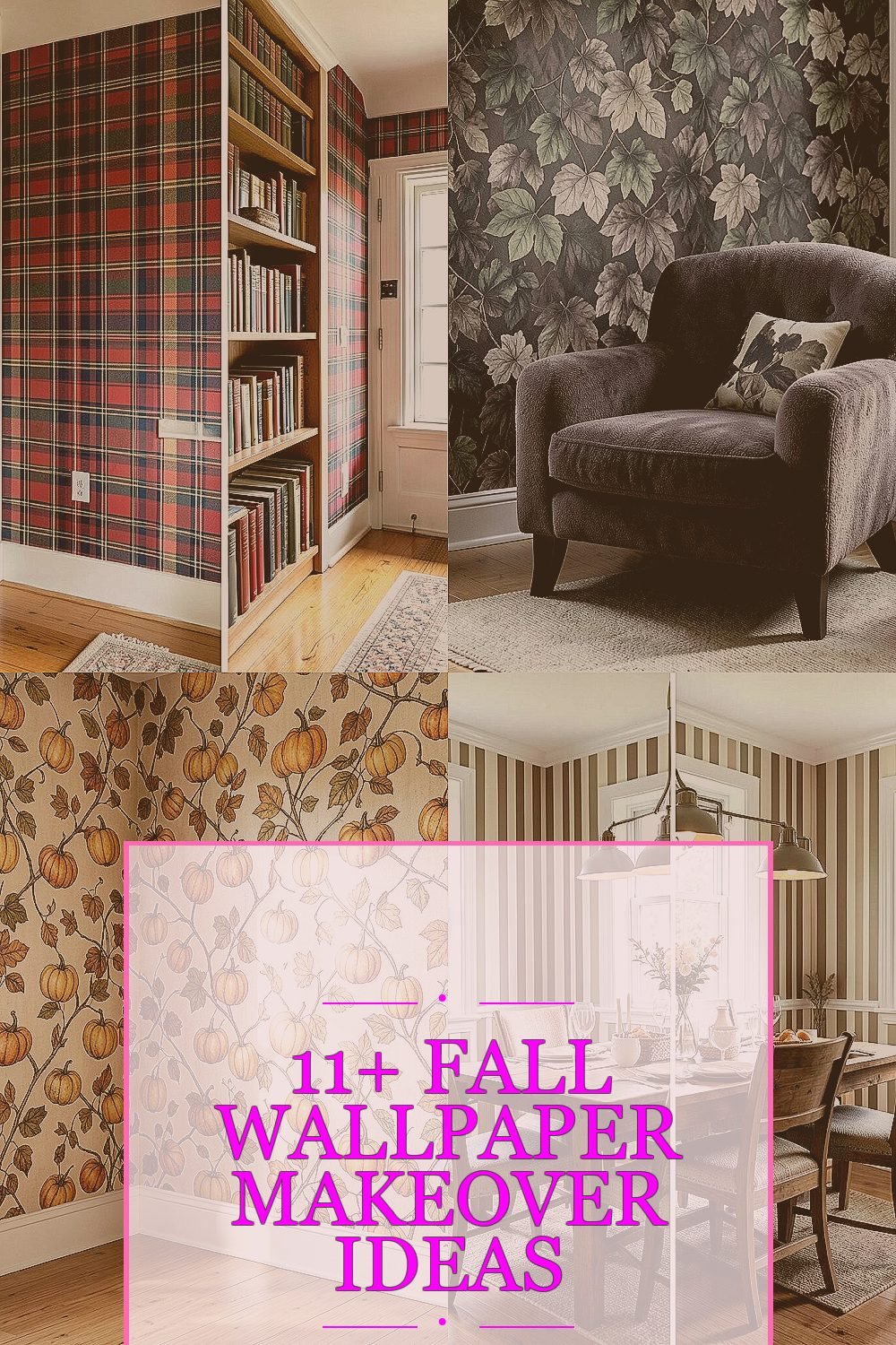
The right fall wallpaper can make a room feel like a warm hug. Small changes can turn an ordinary wall into something you actually look forward to seeing.
Here are makeover ideas with clear before-and-after energy, plus practical ways to make each look work for your space.
1. Library-Style Plaid Entry Wall
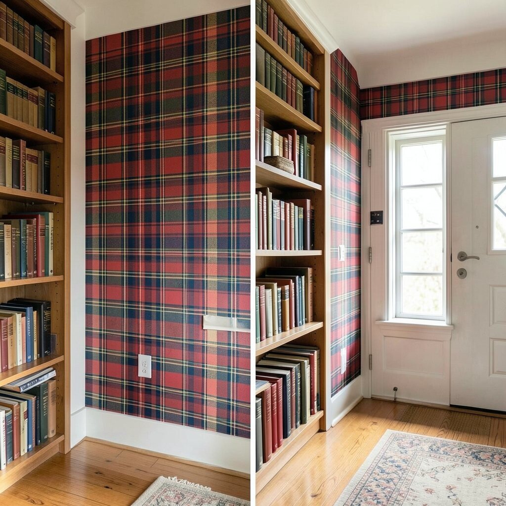
Picture your entry wall looking plain and a little forgotten, with paint that feels flat. Now imagine crisp plaid in warm browns, honey gold, and soft cream, setting the tone the moment you step inside.
This makeover works because plaid adds structure and cozy rhythm, even in tight spaces. To get the best results, measure the wall width and plan where the pattern will line up so the design looks intentional. Pair it with a simple console and textured fall decor like a knit runner to keep the vibe grounded.
2. Moody Ombre Leaves Behind a Reading Chair
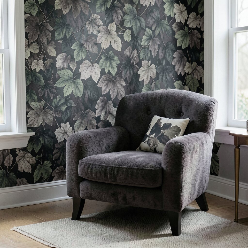
Before, the wall behind your chair might feel too bright or too busy with leftover patterns from past seasons. After, a leaf-inspired ombre wallpaper fades from deep forest green into muted amber, making the whole corner feel calmer.
Ombre gives your room depth without requiring heavy furniture to carry the look. Try using a non-gloss adhesive and smooth the first sheet slowly so the fade stays even across seams. Keep a throw blanket in a single warm color so the leaves feel like art, not clutter.
If you want a more budget-friendly approach, buy one accent roll and focus it on the wall section behind the chair. You can also rotate the look each year by swapping pillows while keeping the base wallpaper in place.
3. Vintage Pumpkin Vines on a Half Wall
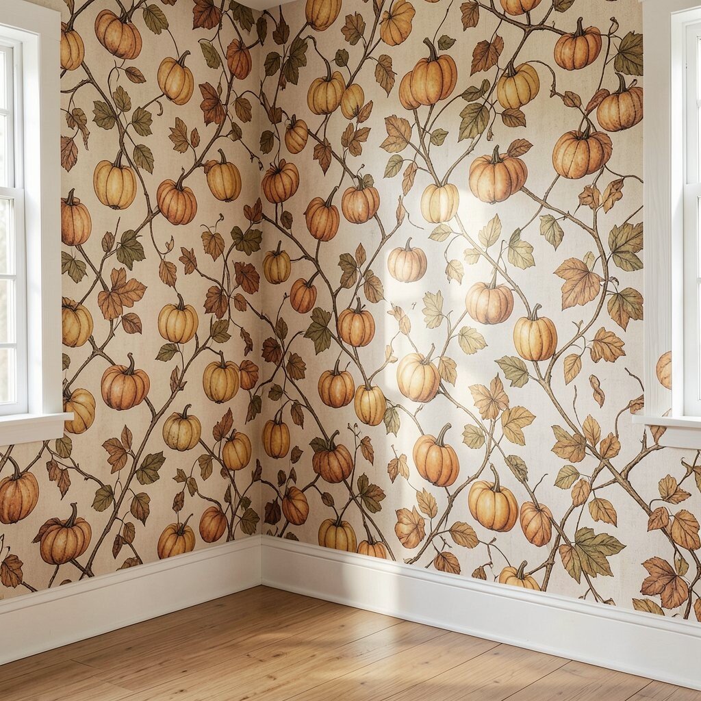
Maybe your half wall or wainscoting area used to be solid and kind of forgettable. Imagine it after, covered in vintage pumpkin vines with hand-drawn curves that look charming and slightly old-fashioned.
Wallpaper like this brings personality without making the space feel too busy, especially when it stays contained to a smaller portion of the room. For a clean finish, mark a level line where the top edge should land and use a trim kit to cover the cut edges. Choose warm neutrals for your furniture so the vines look like they belong rather than stuck on.
To personalize, match the vine tones to your existing autumn tableware or framed prints. This is also a smart cost consideration since a half wall usually uses less paper than full walls.
4. Earth-Tone Stripes in the Dining Nook
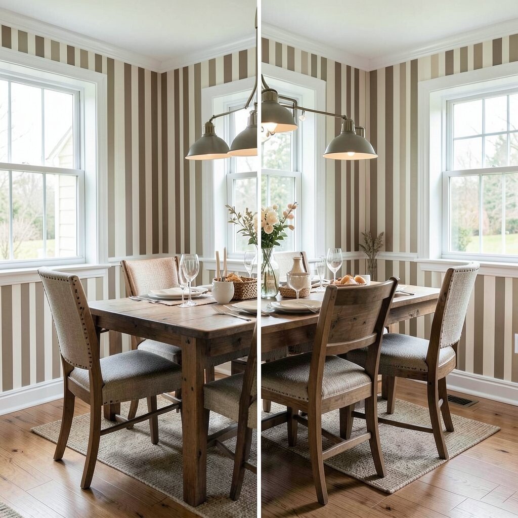
If your dining nook feels narrow, you might notice your eyes slide around instead of settling. Stripes fix that by adding direction and visual comfort, especially when you choose fall-ready colors like burnt umber and clay.
After the makeover, the stripes make the nook feel taller and more inviting, like the table is centered in a cozy spotlight. Go for matte or low-sheen wallpaper so your lighting from overhead fixtures looks soft. Keep the rest of the room simple, with solid curtains and one patterned centerpiece so the stripes stay in charge.
5. Faux Woven Basket Texture on a Feature Wall
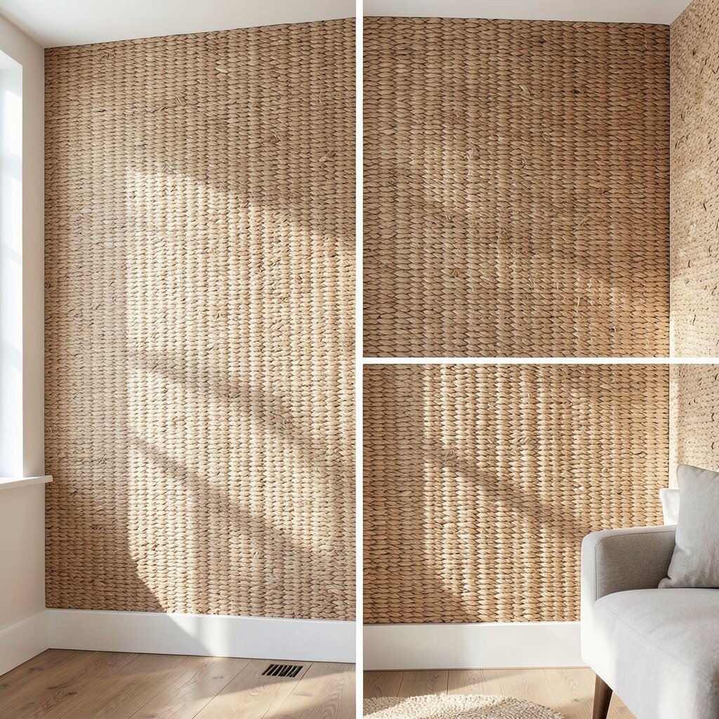
Before, a feature wall can look underwhelming if it’s just paint, even when you add decor. After, imagine textured woven-basket wallpaper that mimics natural fibers in warm caramel tones.
This kind of wallpaper is popular because it gives the look of high-end materials without the mess of real weaving. Run your hand over the surface to see why it feels cozy, and add natural lighting so shadows bring out the texture. Pair it with wood frames, linen curtains, and fall greenery for a cohesive look that feels seasonal but not temporary.
For a practical tip, use a microfiber roller when smoothing the seams so the texture remains crisp. If you’re watching the budget, look for removable wallpaper versions that still mimic texture well.
6. Modern Geometric Fall Spots in the Kitchen
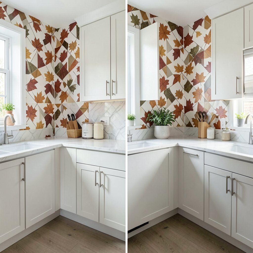
Your kitchen walls may have felt too plain for the energy happening in the room every day. Then picture modern geometric wallpaper in pumpkin orange, cocoa brown, and cream with gentle circular motifs that feel playful.
Geometric designs add energy and help busy spaces look styled instead of scattered. Keep the pattern scale medium so it looks balanced with cabinets and countertops. If you worry about clashing, stick to mostly neutrals in your decor and let the wallpaper handle the color.
To personalize, coordinate dish towels and a runner with one of the wallpaper tones. This keeps your makeover from feeling like “random fall” and instead feels like a plan, which is a big part of current fall trends in home design.
7. Antique Lettering and Calendars in a Mudroom
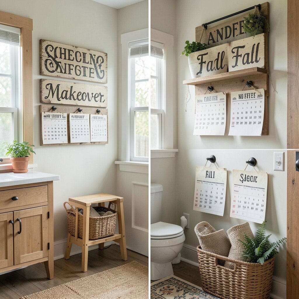
Before, the mudroom wall might hold a few hooks and a mirror, but it can still feel cold. After, imagine muted vintage lettering and calendar-style shapes that look like they belong to a cozy farmhouse notice board.
This idea is unique because it turns everyday organization into something you enjoy walking past. Choose a palette that matches your entry hardware so the lettering feels cohesive, not pasted over. Use a level to install the mirror carefully so it sits like it was meant to share the wall.
8. Deep Teal Botanical Branches in the Hallway
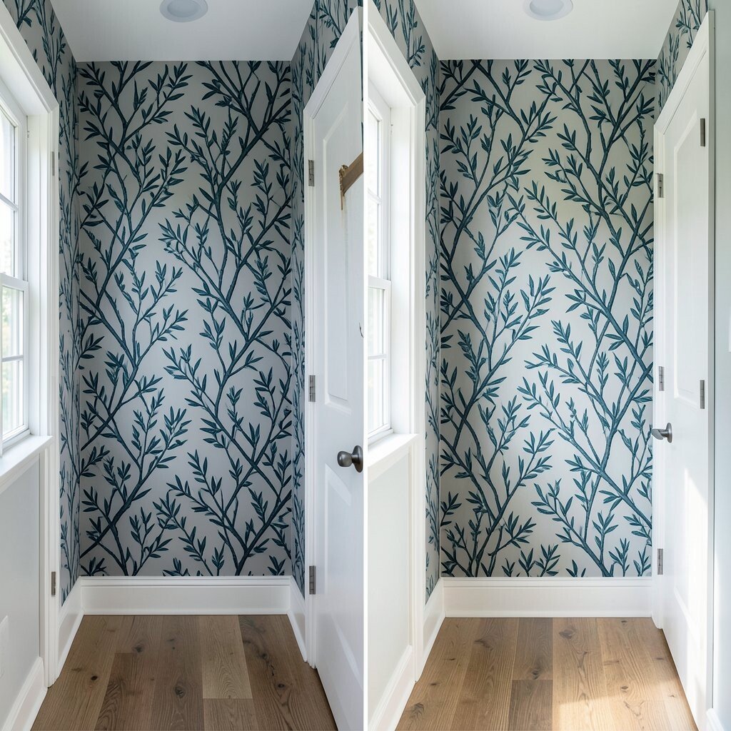
A hallway often suffers from boring lighting and not enough visual interest. Consider deep teal botanical wallpaper with branches and soft fall leaves that guide your eyes down the corridor like a living mural.
Botanical walls make narrow spaces feel more layered and welcoming, especially when the lighting is warm. For practical results, install an extra strip of primer on the wall if you have patchy spots so the wallpaper pattern stays true. Add a runner rug and a couple of framed photos in simple frames so the look feels finished.
9. Warm Neutral Check in a Bedroom Accent Wall
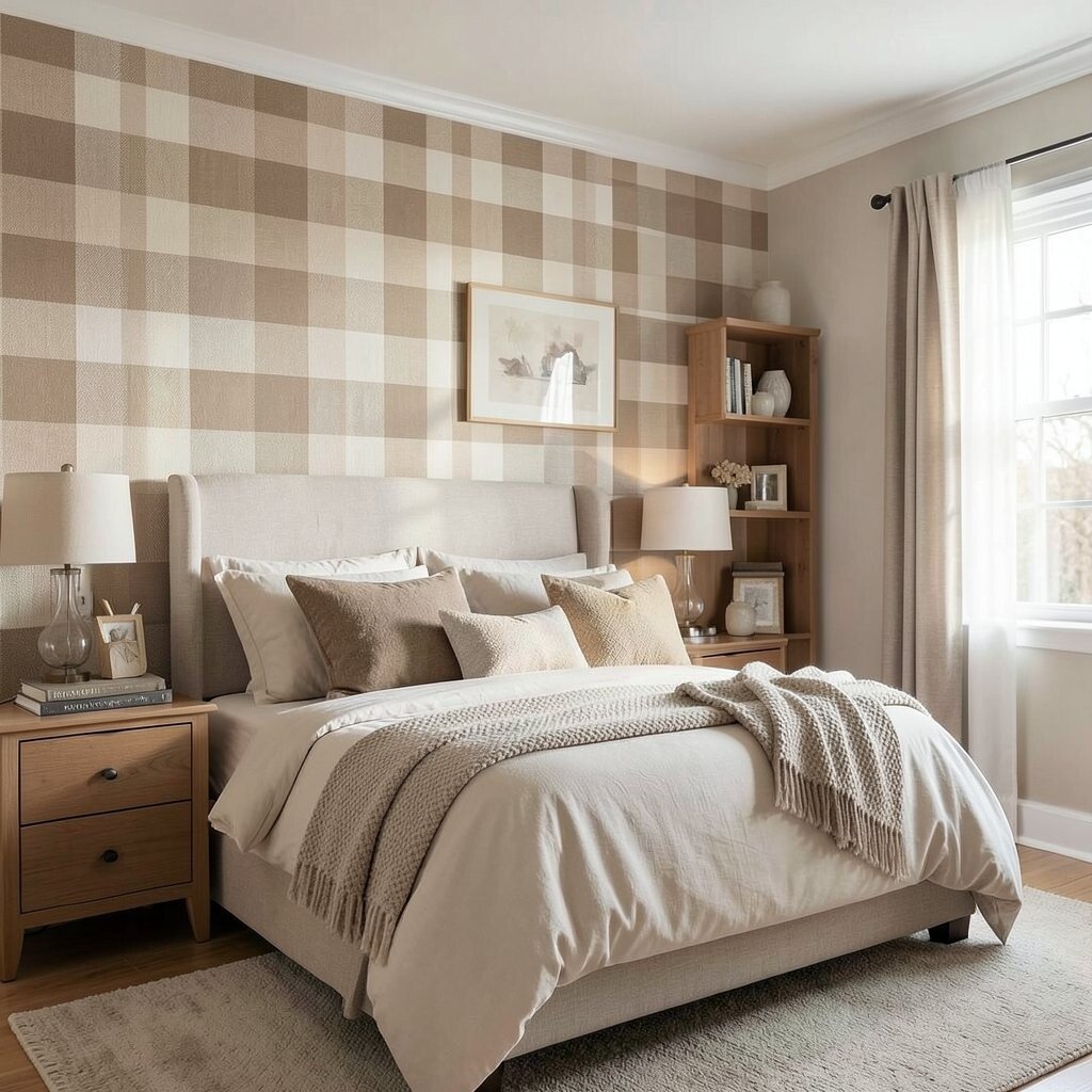
Before, your bedroom accent wall may have felt too bold or too sleepy, depending on the paint color. After, imagine a warm neutral check pattern that combines soft taupe and oat tones with tiny touches of fall warmth.
A check pattern works well because it reads cozy and classic without overwhelming the room. It also pairs beautifully with layered bedding, since the design doesn’t fight your blankets and throws. When applying, line up the edges carefully and take your time around corners so the grid stays crisp.
If you want personalization, mix in one color from the check, like a rust pillow or a cinnamon knit throw, for a gentle seasonal pull. For cost, focus wallpaper on the wall behind the bed while keeping the other walls painted for a balanced spend.
10. Watercolor Maple Blasts on a Kids’ Play Corner
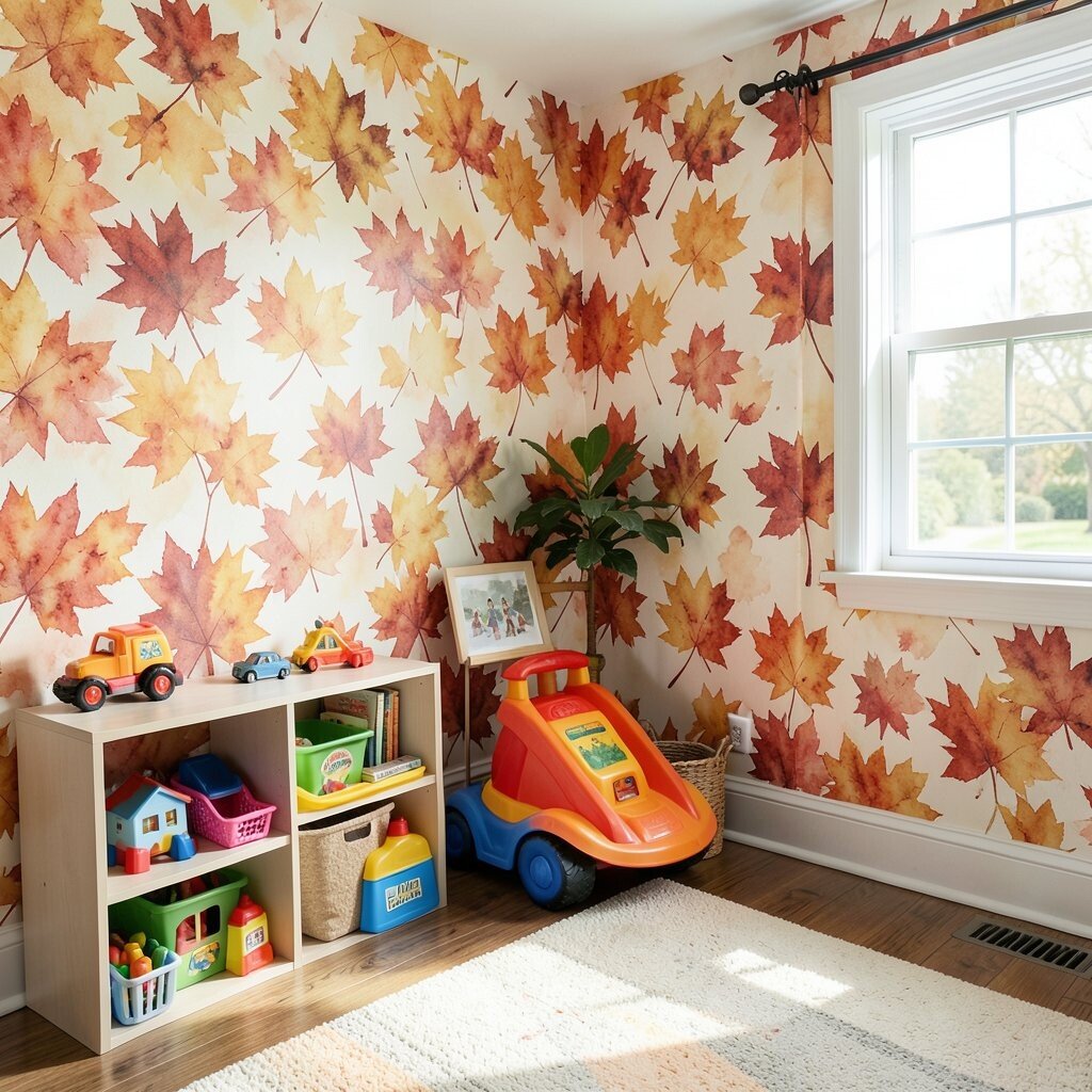
Before, a play corner might feel like it’s constantly changing, with art supplies and toys taking over the wall. After, watercolor maple leaf wallpaper creates a soft background that looks cheerful even when the space is messy.
Watercolor designs are popular right now because they feel artistic and forgiving, hiding small scuffs or bumps in the room’s daily life. Choose a pattern with bigger shapes so the leaves remain visible even from a distance. Add removable wall shelves and keep bins in plain colors so the wallpaper stays the main visual anchor.
To keep it practical, consider a washable finish or a removable wallpaper option for easy changes later. Personalize by matching the leaf color to a theme your child loves, like bringing in a bright leaf tone through crayons, books, or posters.
11. Classic Damask in Burnt Orange and Cream
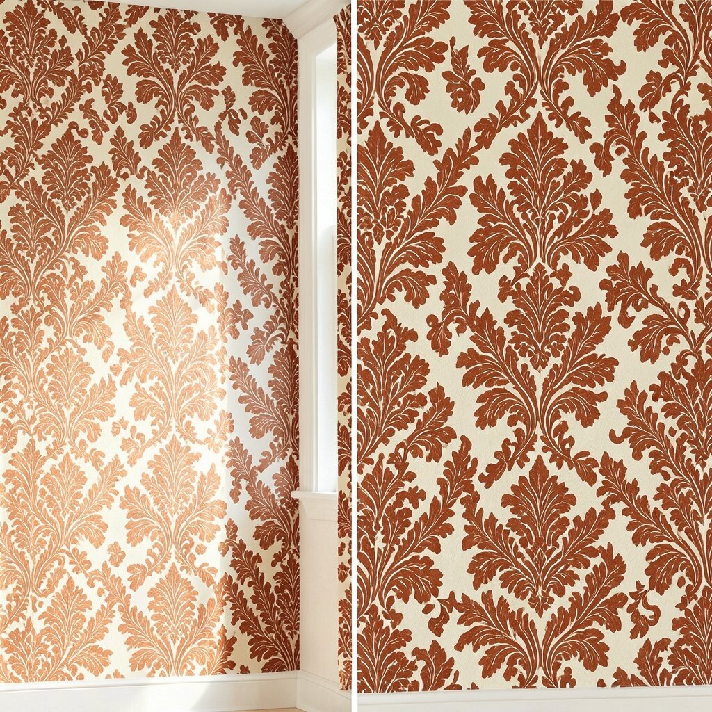
Before, your wall might rely on plain paint, making the room feel less “dressed” during fall evenings. After, damask wallpaper in burnt orange and cream adds a classic, fancy look that feels warm without turning the space dark.
This makeover feels unique because damask brings elegance, yet the fall palette keeps it cozy and approachable. Use a strong adhesive and smooth each panel carefully, since damask patterns look best when aligned cleanly. Keep furniture and curtains in neutral fabrics so the pattern stands out like a well-chosen outfit.
12. Repeating Scarecrow Silhouettes on a Storage Wall
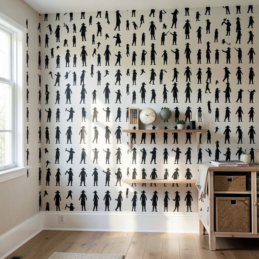
Before, the wall behind storage bins or shelving could look purely functional. After, repeating scarecrow silhouettes bring a playful fall theme that feels whimsical while still staying organized and practical.
Silhouettes are a great choice because they create charm without needing lots of bright color, so they blend easily with your existing items. For best results, measure the height of the shelving and decide whether you want the design to sit above the units or run behind them. If the wall has any dents or patch marks, prep well so the paper adheres smoothly and the silhouettes stay sharp.
For cost, cover only the visible wall section where the theme can be seen from the doorway, instead of wrapping the entire room. Personalize the vibe by adding small touches like a woven basket, a scarecrow figurine, or a fall wreath that matches one silhouette tone.