Bright kitchens feel like sunlight you can cook in. Small color choices can make everyday meals feel more fun.
From bold cabinets to playful backsplashes, color brings personality and warmth. If you crave a kitchen that looks happy and works hard, these ideas will fit right in.
1. Coral Cabinets With Soft White Countertops
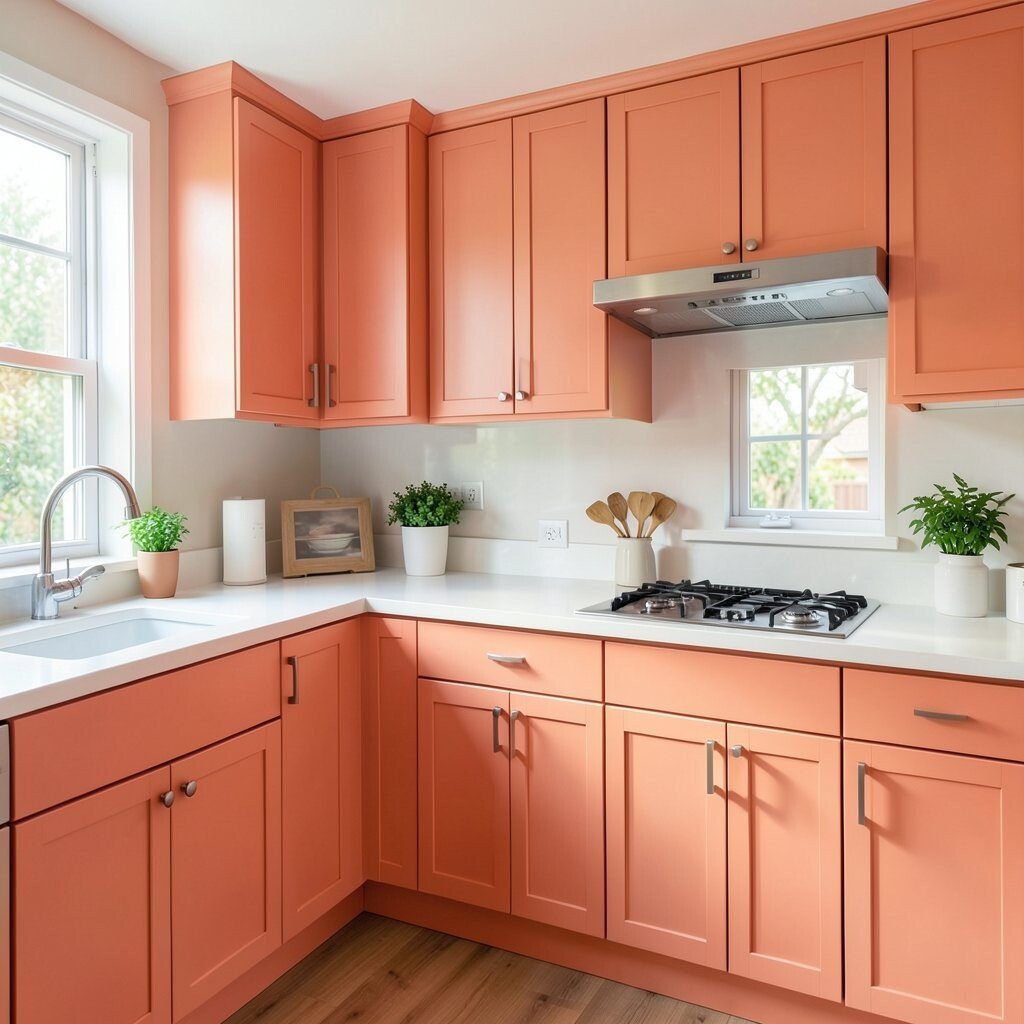
Coral cabinets add instant cheer the moment you walk in. Pair them with soft white countertops so the whole room feels balanced.
Choose a matte finish for a modern look and easier cleaning. A fresh coral shade also helps hide everyday scuffs and fingerprints better than very pale finishes. Keep hardware simple in brushed nickel or warm brass for a polished glow.
2. Turquoise Tiles That Turn the Backsplash Into Art
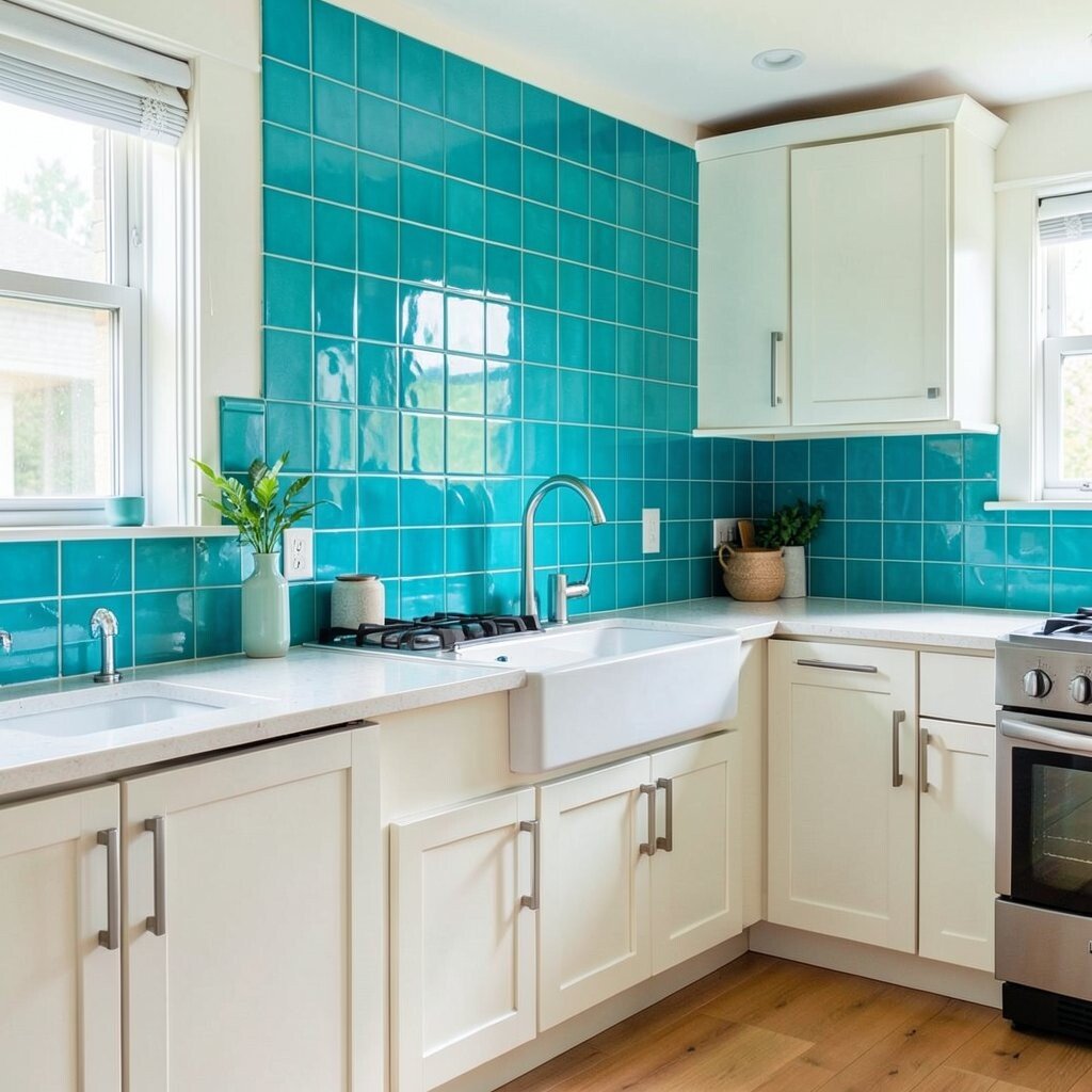
Turquoise backsplash tiles look like a mini vacation every time you prep food. The color pops beautifully behind a stove or sink.
Use smaller subway tiles for gentle movement and easier grout touch-ups. Go for a light grout so the turquoise stays bright instead of looking heavy. This style is unique because it feels playful yet still tidy when you pick the right shade.
For personalization, mix two close turquoise tones to create subtle depth without clutter. If you want a budget win, use tile only behind the range and sink, then keep the rest neutral. New grout and a good caulk line can make older tiles look newly installed too.
3. Mustard-Yellow Accent Wall for Instant Warmth
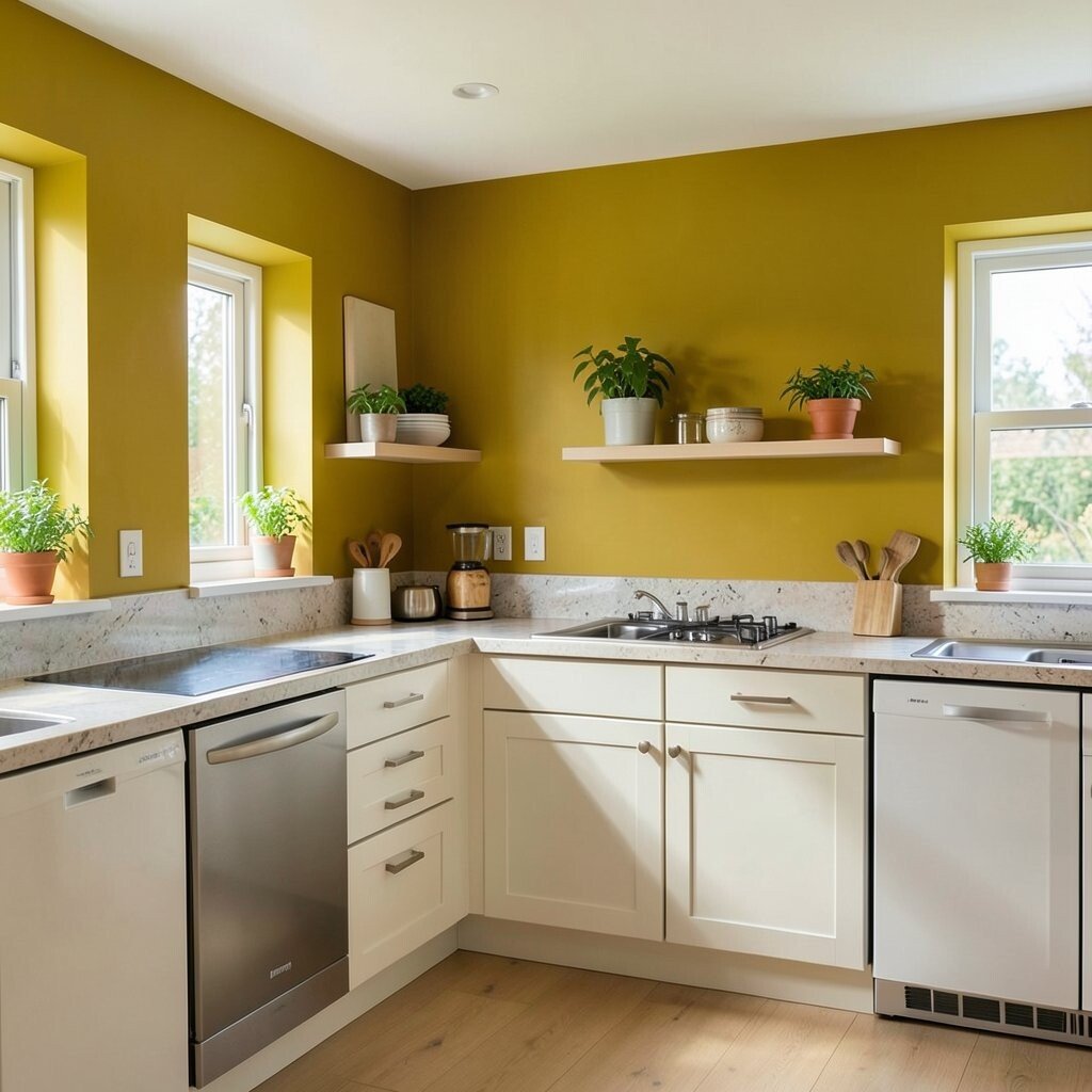
A mustard-yellow accent wall makes the kitchen feel warmer and more welcoming. It also works with both wood floors and cool-toned appliances.
Try a satin paint so light reflects nicely and stains wipe away. Keep the main cabinets white or pale wood so the yellow stays the star. You can also carry the color into small decor like a runner, canisters, or a bright utensil crock.
For practical placement, paint only the wall around the dining nook or the area opposite the window. If you rent, use peel-and-stick wall tiles or removable wallpaper in a similar golden tone. This idea feels current because warm yellows are showing up in modern, lived-in kitchens.
4. Red Statement Range Hood With Sleek Lines
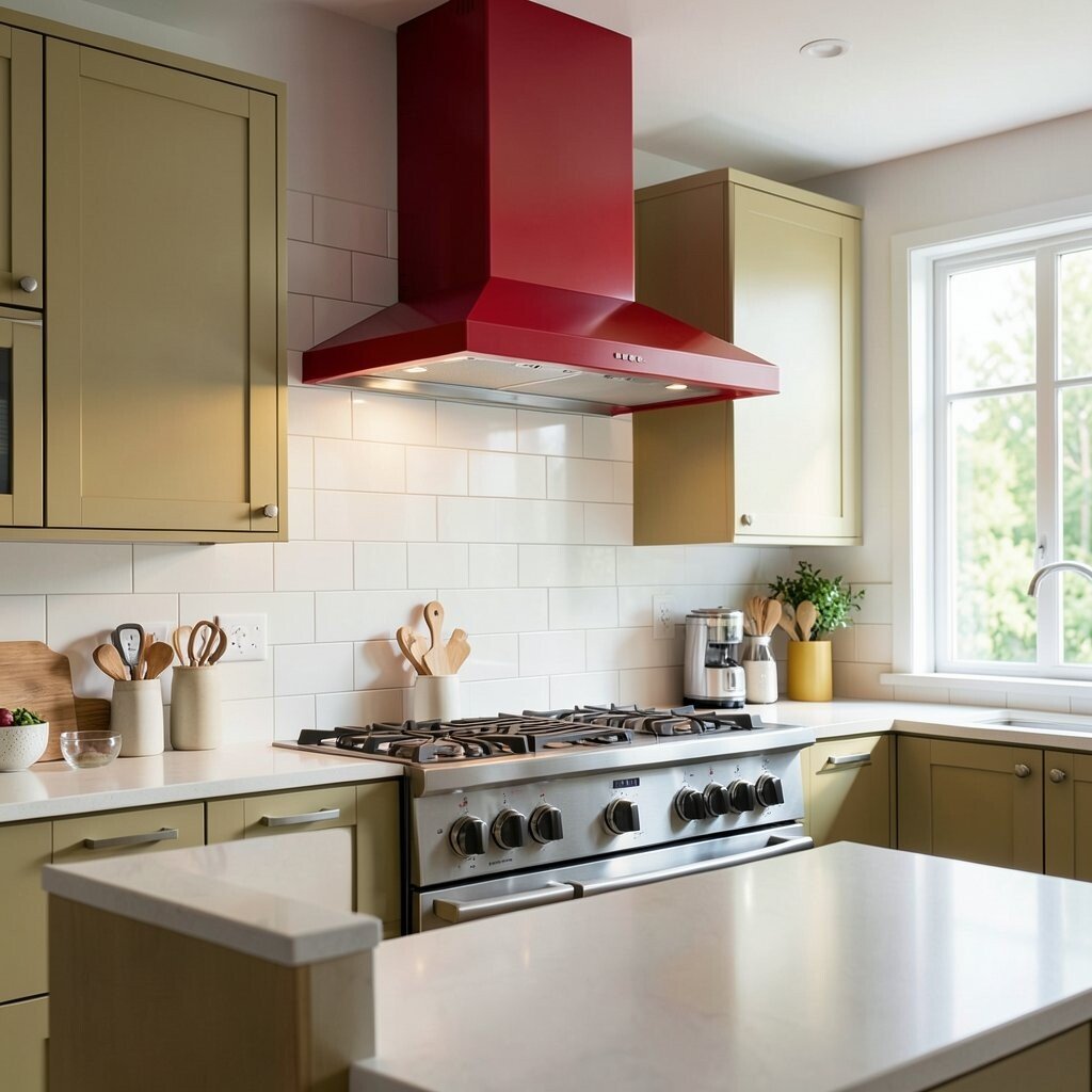
A red range hood becomes a focal point that makes cooking feel dramatic. Choose a shade that leans toward cherry or brick for richness.
Keep the rest of the kitchen calmer with white walls and light countertops. This gives you the benefits of bold style without overwhelming the room. Match the red with warm metals, like brass faucets or copper lighting, to tie it all together.
5. Green Glass Pendant Lights Over a Breakfast Spot
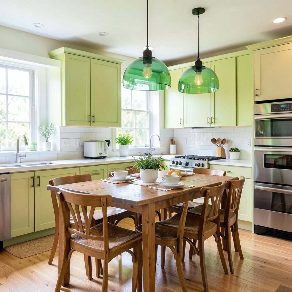
Green pendant lights add sparkle and a gentle pop of color above the table or island. When the light hits glass, it creates soft reflections that feel cozy.
Go for shades in sage, bottle green, or deep emerald depending on your wall color. This is a great way to add uniqueness without painting everything. You can also change bulbs to warmer tones for a more inviting look.
If you want it to feel personal, choose pendants with different glass textures for visual interest. For cost considerations, look for secondhand fixtures from local resale shops and give them a quick clean. A new cord and a fresh shade can upgrade the look for much less than buying brand-new.
6. Rainbow Dishware Storage for a Colorful Daily Ritual
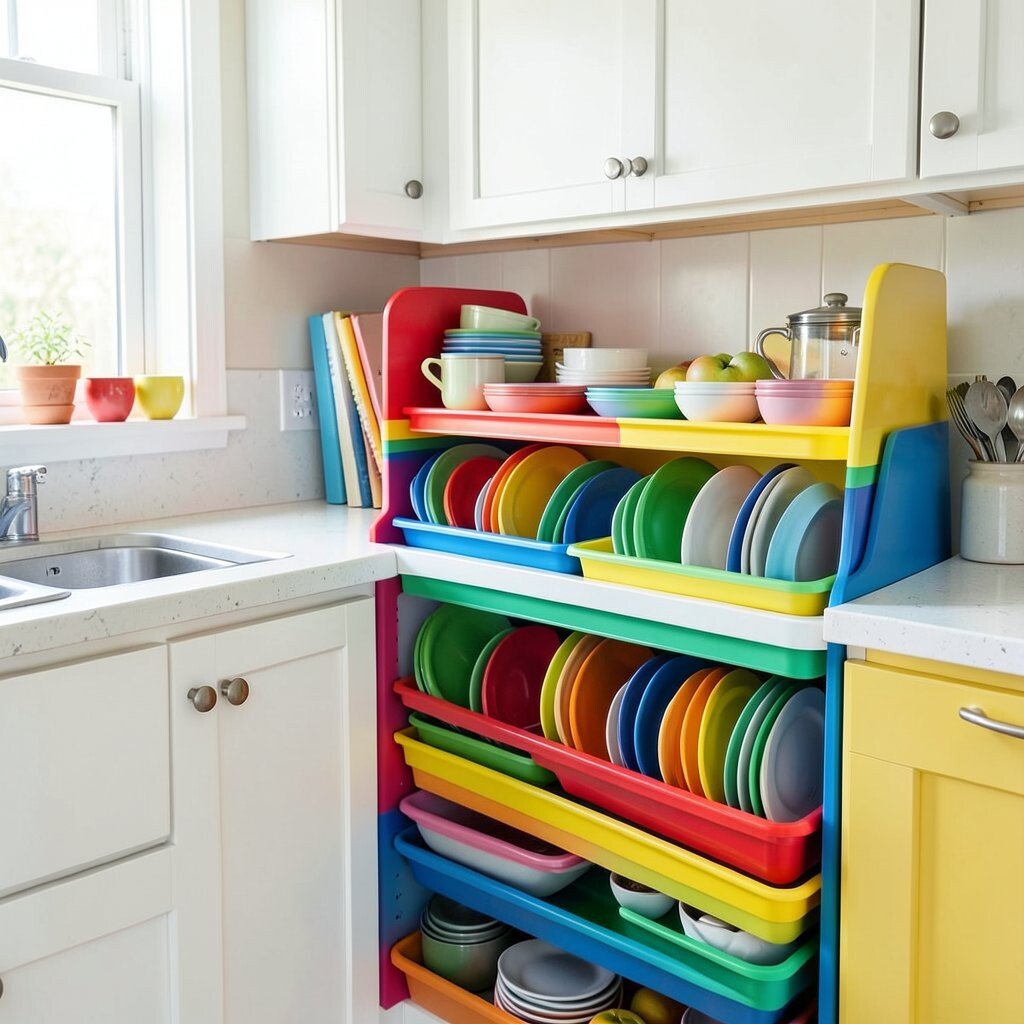
Color doesn’t always need to be permanent to look amazing. Clear canisters and open shelving filled with rainbow dishware make your kitchen feel lively.
Use matching jars for flour, sugar, and pasta so the colors look intentional instead of messy. This also helps you see what you need at a glance. When you keep everyday items visible, cooking becomes smoother and more fun.
7. Color-Blocked Counter Seating With Bright Cushions

If you have bar seating, bright cushions can do a lot with little work. A sunny orange or cheerful teal makes the space feel instantly more upbeat.
Pick outdoor-friendly fabric if you deal with spills, and choose removable covers if possible. This gives you practical benefits like easier washing and longer-lasting color. For personalization, add a matching throw pillow or a small patterned placemat set.
To keep the look from feeling too busy, stick to one main cushion color and use neutral frames. This approach feels trendy because it brings color through textiles instead of permanent changes. If you want a cost-friendly upgrade, search for discount fabric or seasonal cushion covers.
8. Bold Front-Facing Pantry Doors in a Happy Color
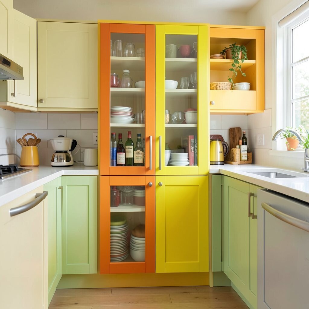
A pantry door in a bright color hides clutter while adding personality. Choose a shade that complements your backsplash or appliances for a cohesive feel.
For a modern look, consider flat-panel doors with simple knobs and a fresh coat of paint. The benefit is twofold: your kitchen stays organized, and the color makes it more visually interesting. You can also add a magnetic strip or hooks inside the pantry for quick access.
9. Patterned Floor Tiles That Anchor the Color Palette
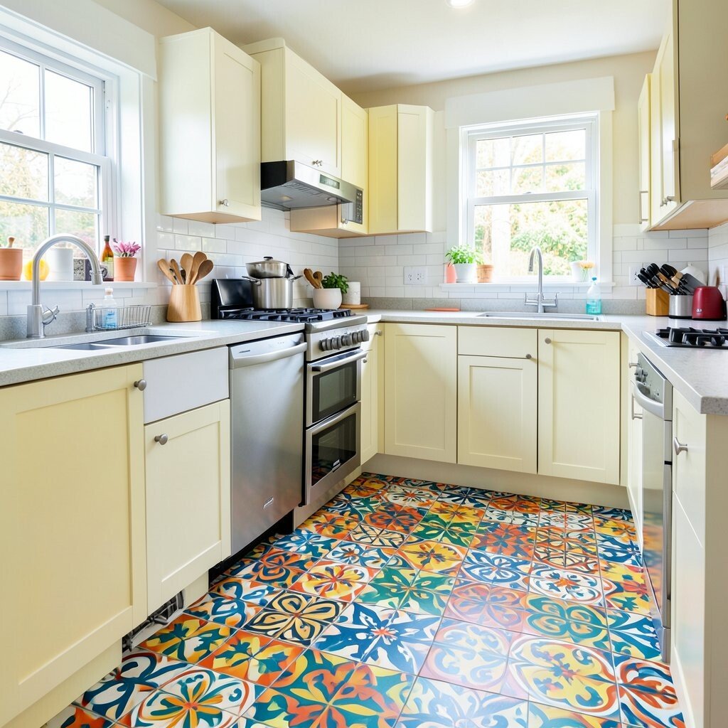
A patterned floor can hold the whole room together like a colorful anchor. Think of geometric shapes, lively mosaics, or playful medallions underfoot.
Choose a pattern that includes your main colors so the kitchen feels connected. This makes your design feel intentional even if you mix different shades elsewhere. For practicality, pick tiles rated for high-traffic use and use a sealer that helps with stains.
If you’re worried about cost, consider vinyl tile sheets that mimic real tile. They’re easier to install and can be replaced when you’re ready for a new look. This idea stays popular because bold floors are a favorite way to add drama without touching your cabinetry.
10. Colorful Cabinet Hardware in Mix-and-Match Finishes
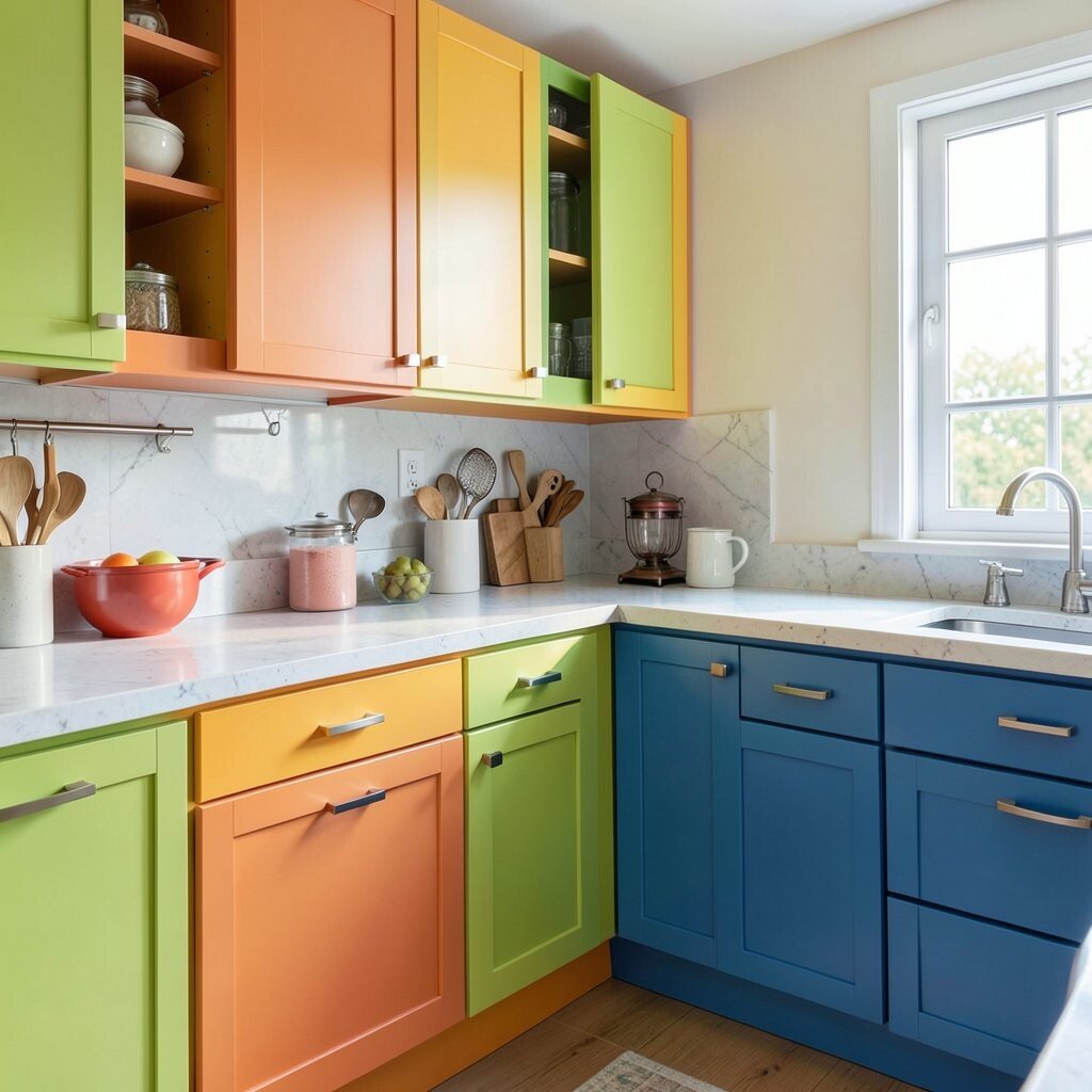
Switching cabinet pulls and knobs is one of the easiest ways to add bright style. A mix of finishes can look fun when you choose colors with a common warmth.
Try enamel or painted knobs in cheerful hues, then keep everything consistent across the same cabinet line. The benefit is that your hands feel the upgrade every day, and it refreshes the kitchen quickly. For personalization, pick a color that repeats in your art, towels, or a small plant pot.
To manage costs, buy hardware for high-visibility cabinets first, like the ones near the sink. Over time, you can swap the rest to keep it budget-friendly. Just make sure screw sizes match so the install is smooth.
11. Lemon-Lime Counter Stool Details and Matching Rugs
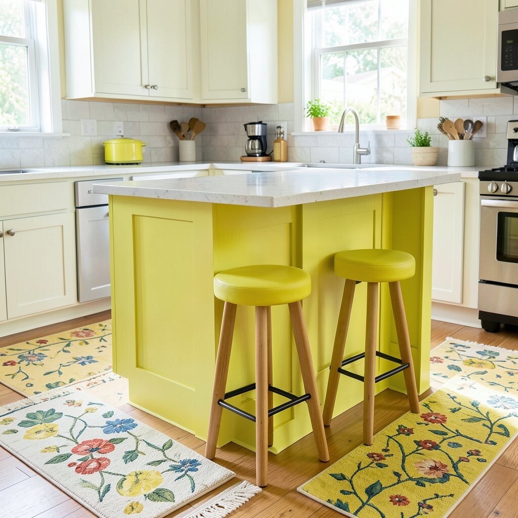
Small lime accents can brighten the kitchen without taking over the room. A lemon-lime rug near the sink or a few matching placemats can make a big difference.
This kind of color placement is great if you like to change things seasonally. You can rotate textiles when you want a fresh vibe. Choose non-slip backing for safety and pick wipeable fabric to handle splashes.
For practical personalization, tie the rug color to your dishware or jar labels. Keep the rest of your kitchen mostly neutral so the lime pops and feels clean. This approach feels current because people are leaning toward bright accents over full-room color.
12. Bright Paint Around the Window With Framed Color Trim
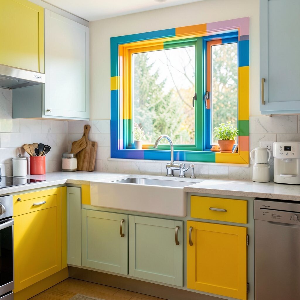
Painting window trim in a bold color is a smart way to add character. It frames the view and makes daylight feel more vibrant.
Use a semi-gloss paint so it wipes clean and looks crisp. This detail also helps the kitchen feel finished, not random. For uniqueness, choose a trim color that matches your backsplash or your favorite small appliance color.
13. Sunny Orange Bar Carts for Flexible Color Everywhere
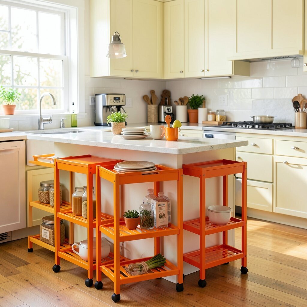
A bright orange bar cart brings color into the kitchen without a long project. Roll it out for snacks, coffee, or dinner prep, then tuck it away when you’re done.
This idea feels useful because it also improves your workflow. Keep a tray with mugs, a canister for tea, and a small bowl for fruit so everything stays handy. For personalization, swap shelves with baskets in matching colors for a softer look.
If you want cost savings, use a basic cart and paint it in a durable enamel. Let it cure fully before adding items, and seal it for extra protection. The benefit is big impact with a manageable budget and a fun “wow” moment.
14. Deep Navy Upper Cabinets With Bright Lower Contrast
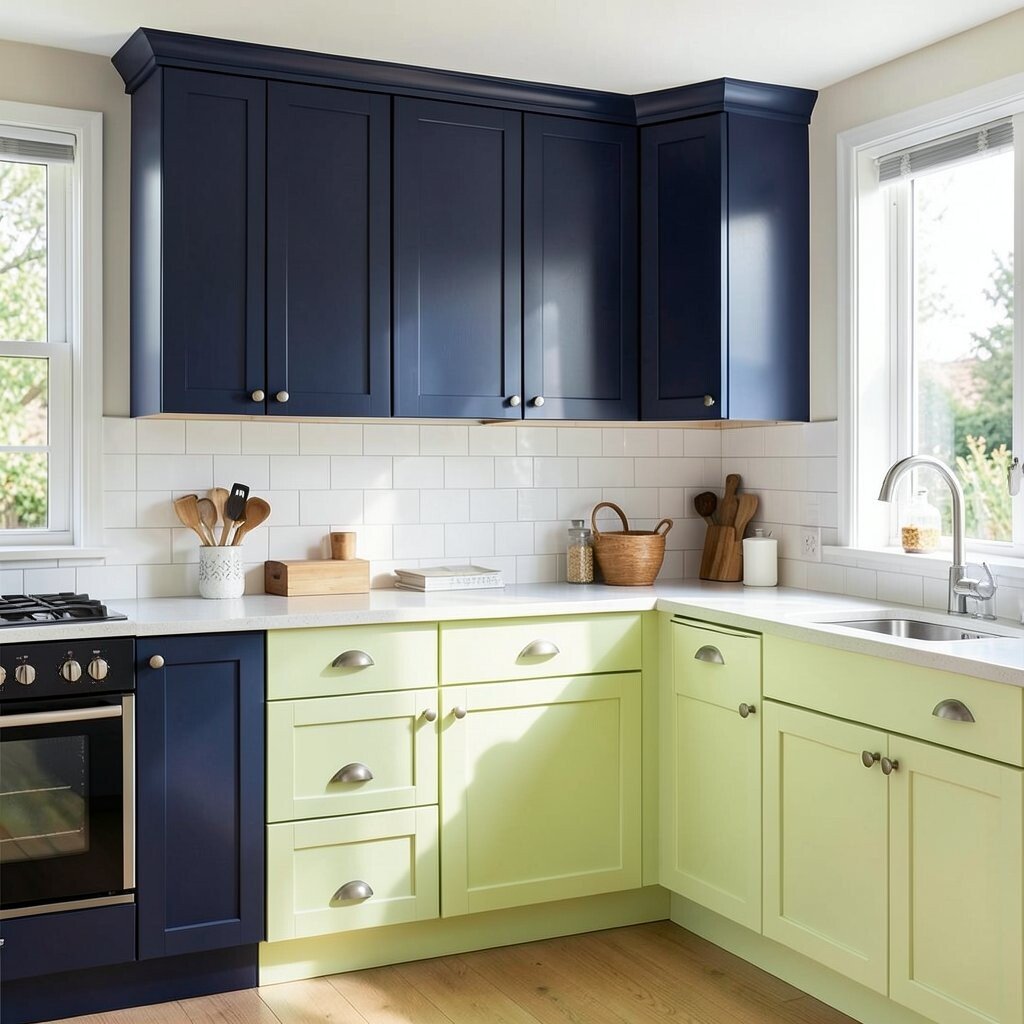
Deep navy upper cabinets feel stylish and grounding. When paired with bright lower cabinets, the whole space becomes lively and balanced.
Keep the bright lower color in a cheerful white, sunshine yellow, or light coral for energy. This color contrast helps the room look taller and more layered. Add warm lighting under cabinets to make the colors glow at night.
15. Colorful Countertop Accessories That Look Like Decor
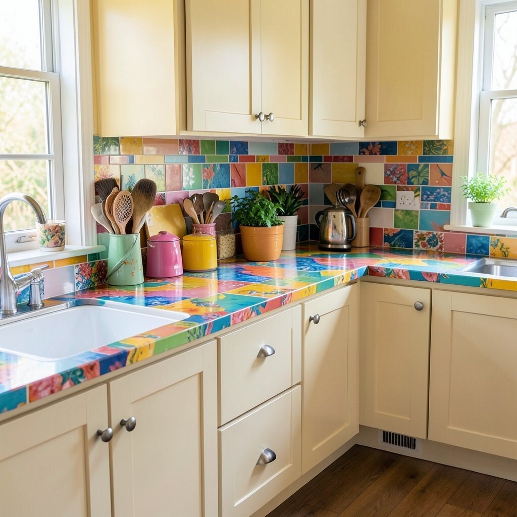
Bright color can live on your counters through everyday items. Think of a turquoise kettle, a pink soap dispenser, or a set of matching canisters.
This approach gives you the benefits of personalization without committing to a major renovation. It also makes your kitchen feel welcoming because it shows how you live. Pick items from the same color family so they look curated instead of scattered.
For practical tips, choose heat-safe holders for hot pans and keep cords tidy with a short cable cover. Replace older, mismatched containers with bright ones one at a time. The trend right now favors “pretty but useful” kitchen styling, and these choices fit right in.
16. Bright Wallpaper in a Small Kitchen Nook
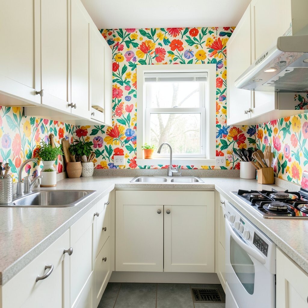
Wallpaper is a quick way to add color, especially in a small kitchen nook. A bold pattern behind a coffee station or near a window instantly makes the area feel special.
Choose a peel-and-stick option if you want easier removal and fewer worries. The benefit is that you get uniqueness without long downtime or complicated paint work. Pick a pattern with colors you already use, like coral, teal, and cream, to keep it coordinated.
To stay practical, apply wallpaper to a dry area away from direct steam when possible. Use wipeable coverings in near-sink zones. This idea fits current style because more kitchens are using statement wallpaper in small doses for big impact.
17. Multi-Colored Pantry Labels and Storage Bins
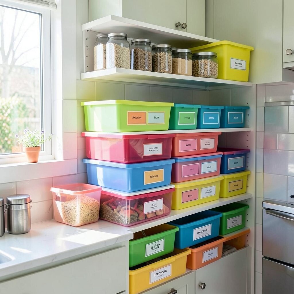
Labels may sound small, but they can make a kitchen feel bright and organized. When the label colors match your palette, the pantry becomes a cheerful design feature.
Use colored bins for snacks, baking supplies, and breakfast items so you can spot what’s low. This benefits daily cooking by reducing rummaging. For personalization, pick fonts that match your vibe, like playful script for a fun look or clean print for a calmer feel.
If you’re cost-conscious, repurpose jars and bins you already own and just add fresh labels. Print them at home or use simple sticker labels for a low-cost refresh. It’s a modern trend because kitchens are shifting toward organized visual systems that also look pretty.
18. Bright Sconces With Colorful Shades Along the Walls
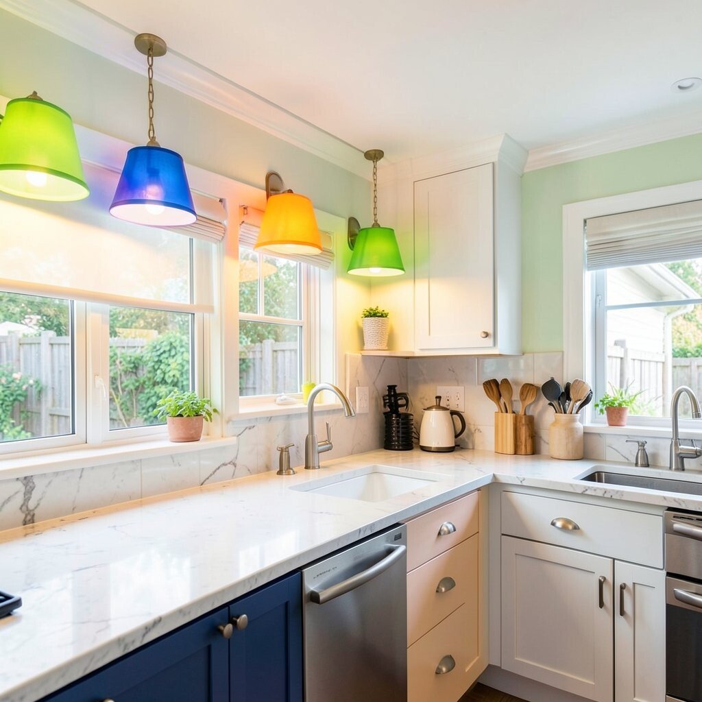
Wall sconces with bright shades add both color and warmth to evening cooking. Choose shades in amber, coral, or lime to make the light feel lively.
This is a great way to boost the mood without changing your cabinets. The practical benefit is improved task lighting near prep zones, plus a softer glow around the room. If you want a unique twist, pick shades with texture so they cast interesting light patterns.
19. Pastel Cabinet Paint With Clear Glass Upper Sections
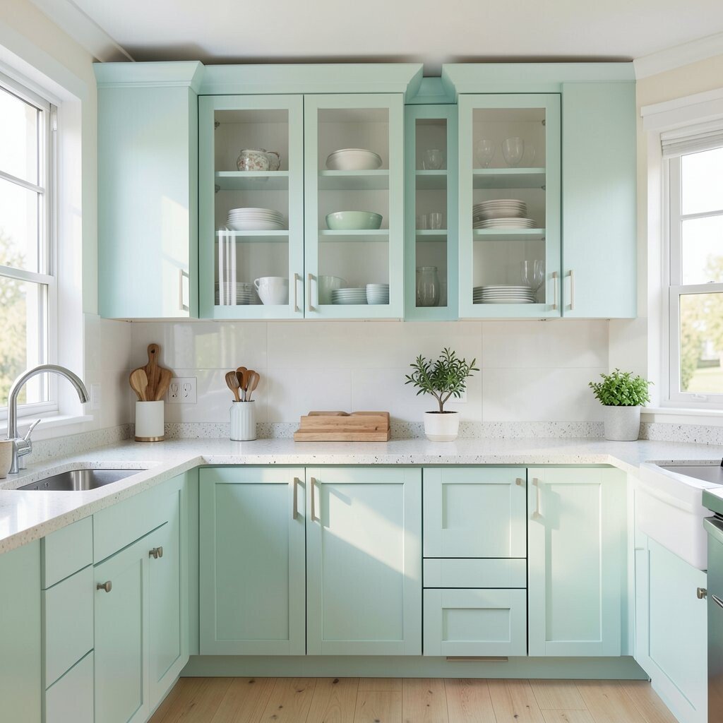
Pastel cabinets feel airy and charming, especially when paired with clear glass upper sections. The soft colors make your kitchen feel lighter and friendlier.
Try pale mint, gentle peach, or light lavender for a soothing look. Keep interiors styled with coordinated plates or colorful mugs so the glass doors show off your personality. This idea is unique because it blends color with transparency in a way that looks custom.
For practical tips, choose durable cabinet paint and use a protective topcoat for easy wiping. If clear glass feels too exposed, add a subtle tint or use matching shelf liners. Cost-wise, you can achieve the look by painting just the visible sections first and upgrading doors later when you’re ready.