
Mid century style has a way of making ordinary rooms feel thoughtfully designed. With the right wall art, your space can look polished without costing a fortune.
Today you’ll see affordable pieces that feel classic, warm, and a little bit special. Each idea includes practical ways to hang, style, and personalize for a high-end look.
1. Geometric Prints in Warm Neutrals

Look for geometric wall art with clean lines and soft color choices like sand, muted mustard, clay, and espresso. When the shapes sit in a balanced layout, the room instantly feels calmer and more intentional.
Choose prints that use thick-looking strokes and limited color palettes, because that gives a “designed by a pro” feeling. If your wall is small, hang one bold piece centered at eye level so it reads clearly from the doorway. For an upscale touch, use a simple mat and a thin wood or black frame to add structure. Keep the paper finish lightly textured if you can, since it makes the print feel less flat.
2. Vintage-Inspired Abstract Posters With Off-Center Composition
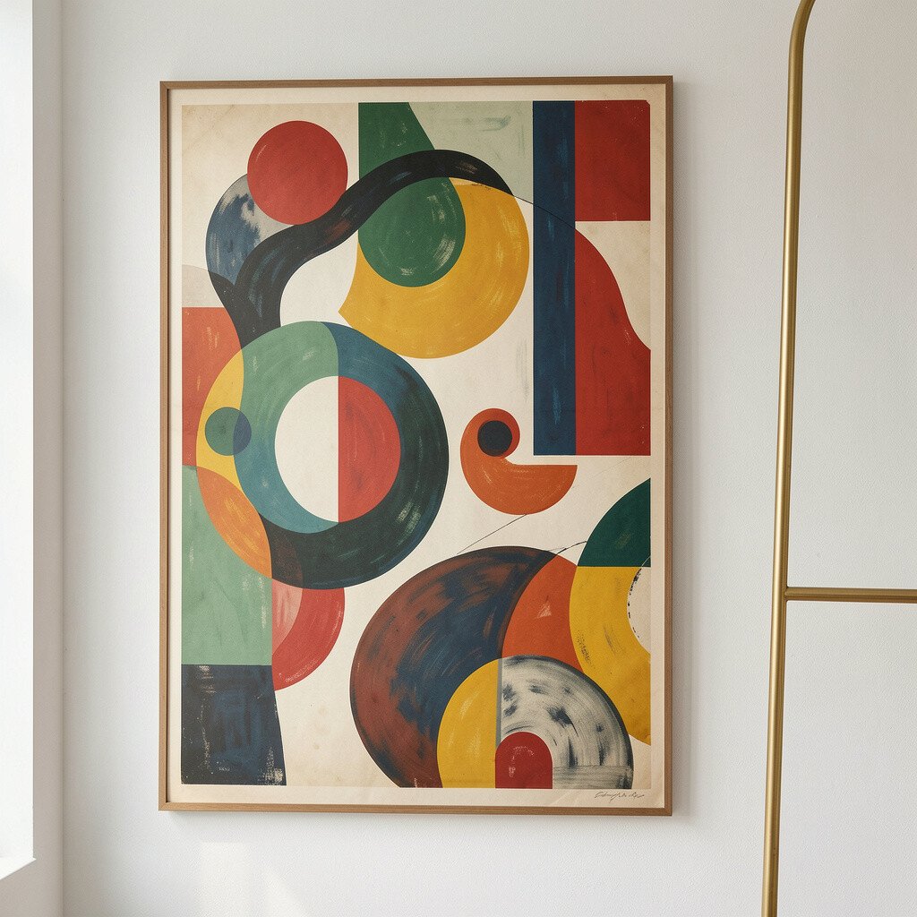
Search for abstract posters that use sweeping curves, layered forms, and off-center balance. The best ones look like mid century artwork even when they come from modern print shops.
Hang the poster with generous spacing around it so the negative space feels intentional. Pair it with a plain curtain or a solid sofa so the colors don’t fight for attention.
If you want it to look more expensive, match the poster colors to two items in the room, like a pillow and a lamp shade. Use a frame in the same finish as your hardware, such as brass, walnut, or matte black. Consider a slightly larger frame than you think you need, because the extra border makes the image feel curated.
3. Atomic Starburst Wall Art in Brushed Brass Tones
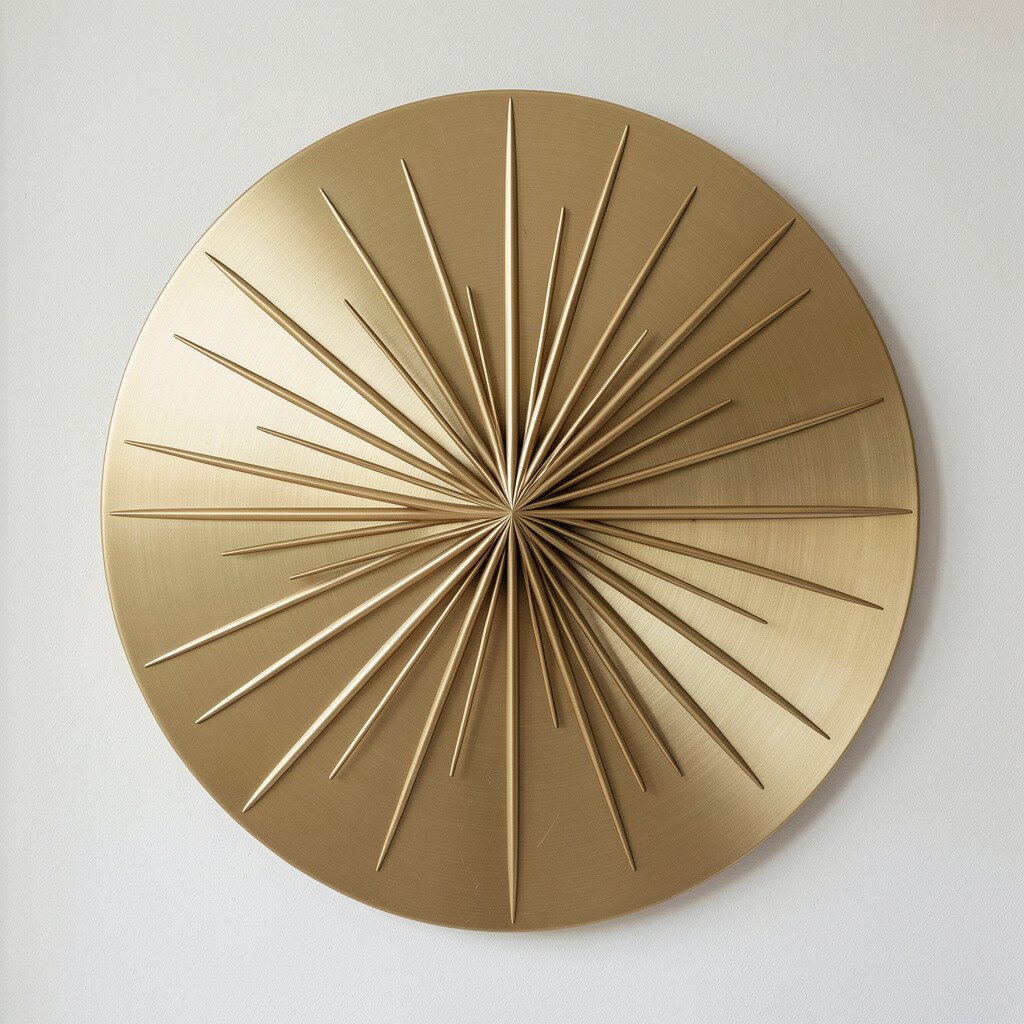
Atomic starburst art brings instant mid century drama with a lively center point and radiating lines. Even a small piece can look bold when the finish has a metallic glow.
Pick designs in brushed brass, antique gold, or warm copper so they blend with wood furniture and amber lighting. For the cleanest look, mount it so the starburst sits straight and not tilted, since symmetry reads more “gallery.”
To personalize, place it near a lamp or shelf where its rays can catch light. If your room is busy, choose a starburst with fewer rays and calmer colors so it stays elegant. If you want a premium feel, frame a similar pattern print with a metallic mat instead of relying only on the metal piece.
Keep cost in mind by shopping for smaller sizes or secondhand accents, then upgrade the presentation with a sturdy wall mount. A simple installation level helps the piece look like it was installed by someone with time and patience.
4. Mid Century Landscape Prints in Muted Sky Colors

Soft landscapes with distant horizons, warm skies, and gentle shapes are a fast way to add calm to your walls. The right print can make your space feel bigger and brighter without using loud colors.
Go for muted blues, sage greens, and sandy browns that echo mid century palettes. Mount the print in a simple frame and add a mat for depth, which helps the artwork look crisp and intentional.
If you love personalization, choose prints with a landscape element you already have in your home, like a plantlike shape or a curved horizon. For best results, hang it next to wood shelving so the tones feel connected. A light-reflecting glass or acrylic cover can also make the print look cleaner under everyday lighting.
To keep it budget friendly, look for reproductions from lesser-known artists or modern sellers that offer good paper weight. When you match the frame finish to your floor or furniture, the piece reads as part of the whole design instead of a separate purchase.
5. Teak-Style Frame Gallery Sets of Botanical Cuts
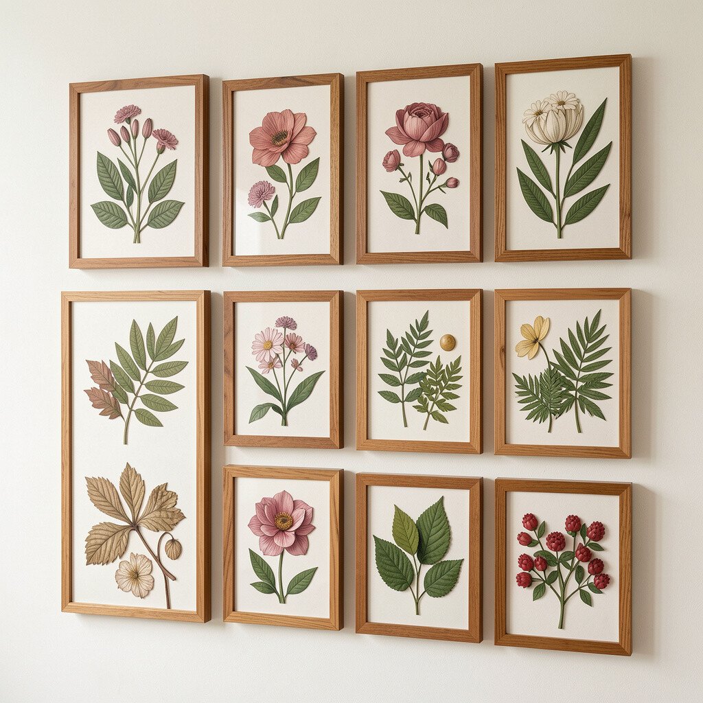
Botanical wall art can look mid century when it uses bold shapes and simplified leaves instead of tiny detailed realism. Think bold stems, clean silhouettes, and color that leans warm and earthy.
Choose a set of small prints that share the same theme, like stylized botanicals in one color family. The matching frames create a cohesive look that feels more expensive than random singles.
Arrange the prints in a tidy grid or a gentle stagger and keep the spacing even so it looks professionally planned. If you prefer one focal point, place the largest botanical at the center and let smaller prints flank it. For personalization, swap one print for something meaningful, like a leaf shape from a vacation photo you love.
Wood-toned frames are an affordable way to mimic teak mid century style. You can also buy plain frames and paint or stain them to match your room’s warm finishes, which saves money and boosts uniqueness.
6. Textured Canvas Art With Abstract Linework
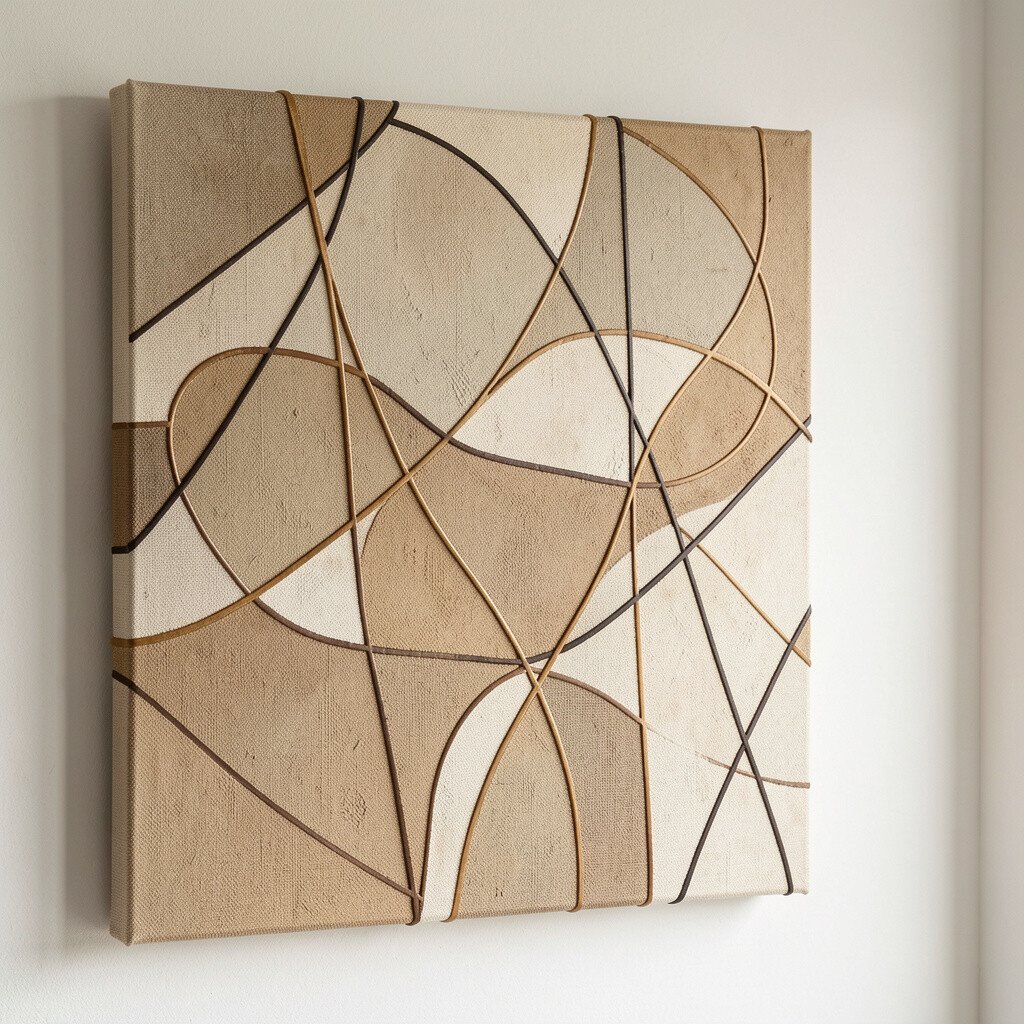
Abstract linework on canvas can give you that mid century “art gallery” mood. The texture matters, so look for pieces that use visible brush marks or subtle fabric grain.
Pick a design that uses few colors and strong lines, like black, cream, and muted terracotta. A textured background helps the art feel layered, which is one of the easiest ways to make affordable art look high-end.
Hang it so there’s room around it, because negative space makes textured art feel more intentional. Use a strong nail or wall anchor to keep it flat, since sagging corners can make even nice pieces look cheap.
To personalize, choose linework that matches your home’s shape language, such as curved furniture or rounded lamp bases. Cost wise, you can find canvas prints at a lower price than framed originals, especially when you buy from seasonal sales. If the art seems too plain, add a pair of matching small works or even two matching prints flanking a mirror.
7. Vintage Colorblock Prints With Mid Century Palettes
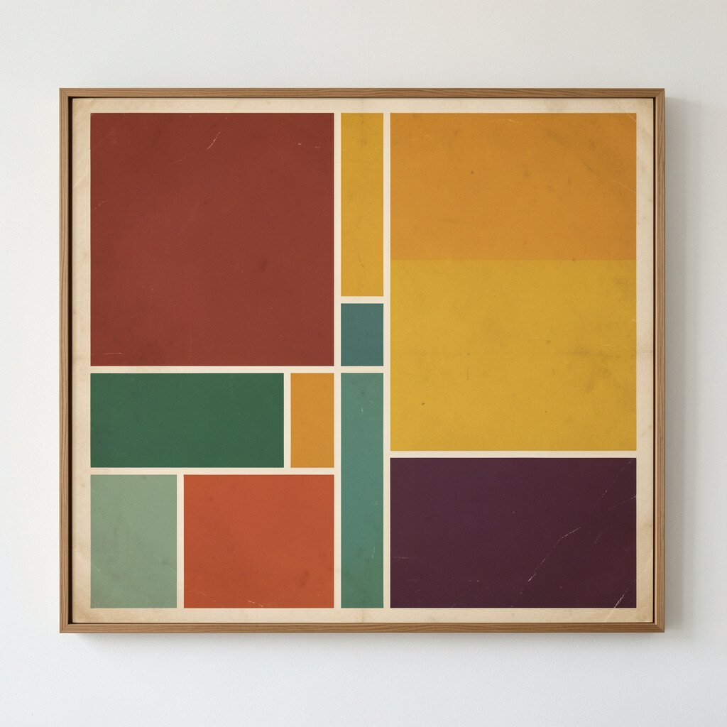
Colorblock wall art feels confident because it uses simple shapes and clear boundaries. When the palette is mid century friendly, the whole room instantly looks styled.
Choose colors like mustard, burnt orange, olive, and oatmeal, then keep the background light. Frame the print with a clean matte and a simple frame so the colors pop without looking overly modern.
For practical hanging, keep the top of the frame roughly at eye level if you’re placing it above a sofa. If you’re working with a narrow wall, use a slightly vertical orientation so the space feels taller.
Uniqueness comes from customizing the palette, not just the picture. You can pair two prints that share one color, like mustard, and let the other colors rotate across both pieces.
To stay in budget, look for colorblock prints on durable paper rather than thick gallery canvases, and invest in better framing. A high-quality frame can be the difference between “cheap” and “expensive-looking” in seconds.
8. Mid Century Typography-Like Prints Without Loud Slogans
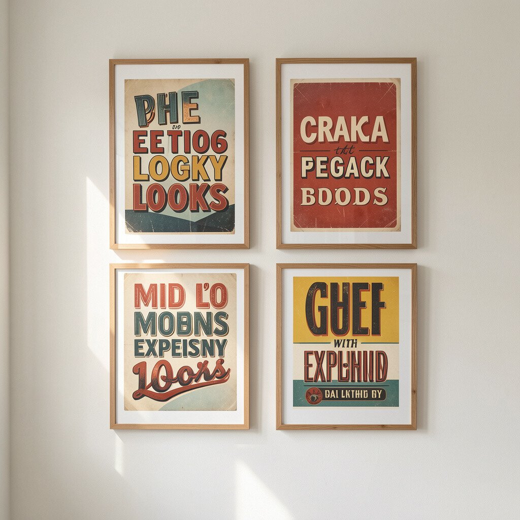
Some wall art features lettering patterns and typographic shapes that feel mid century without being full-on quotes. Soft letterforms, grid styles, and vintage-style numbering can look classy and playful.
Pick artwork that uses light textural backgrounds and minimal ink tones, like black and muted gray. Avoid harsh neon text, since that usually pulls the look away from mid century warmth.
Hang it in a spot where you want quiet interest, like a hallway or near a reading chair. Use a mat that matches your room’s lightest neutral, because that makes the text feel crisp and finished.
Personalization is easy here by choosing a print theme that fits your life, such as music-inspired patterns, maps, or calendar-like designs. If you want a more custom feel, buy a typography-style print and add a thin accent frame in the same finish as your decor. Keep cost lower by choosing print-only art with strong typography rather than oversized statement pieces.
9. Large Oversized Oversimplified Figures in Flat Color
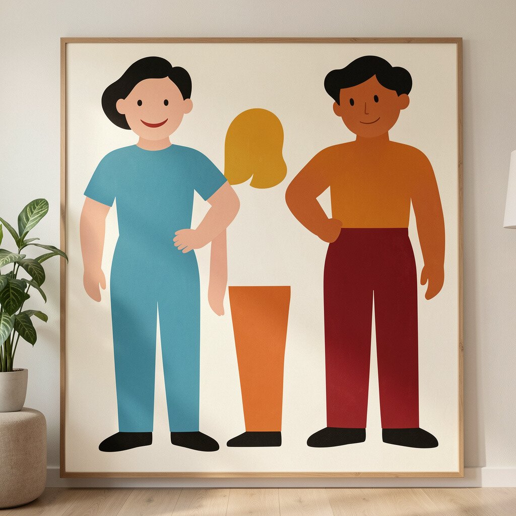
Oversimplified figure art can look surprisingly luxurious when it uses flat color and clean silhouettes. It often gives off the same vibe as vintage mid century magazines and posters.
Look for designs where the shapes are bold and the edges are neat, with one or two main colors. A larger size helps it look like a curated statement rather than a casual purchase.
For a more polished look, match the artwork colors to your existing textiles, like a throw blanket or rug. If your room has wood tones, choose art with warm undertones and avoid icy cool colors that clash.
Uniqueness can come from placing the figure art near a lamp or a plant so it feels like part of your daily scene. To keep installation simple, measure your wall first and use a center mark to hang straight. Budget wise, oversized prints and poster-style frames often cost less than original paintings while still giving that “wow” moment.
10. Sunburst Trays or Mirror-Like Accent Art on the Wall

Wall-mounted sunburst accents can look like decorative collectibles, especially when they reflect light. Even if it’s an affordable decor piece, you can style it to feel intentional.
Choose pieces with a warm metallic finish and a sculptural design, like a layered starburst or a radial medallion. Mount it carefully so the pattern points line up, since straight alignment makes it look premium.
Benefits show up fast because reflective art bounces light across the room, making corners feel brighter. Position it across from a window or near a light source so the rays catch and move throughout the day.
For personalization, pair it with a small framed print that repeats one color from the sunburst. Cost considerations are easier when you choose a smaller wall version and spend a bit more on a secure mount. If you’re handy, you can also repaint the base color to match your room’s hardware for a custom look.
11. Checkerboard and Grid-Inspired Prints With Mid Century Rhythm
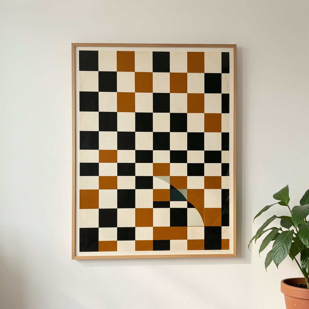
Grid art and checkerboard patterns can feel very mid century when they’re softened with warm tones and balanced spacing. The repeating rhythm creates structure, which makes your wall look designed.
Pick grids in muted colors like cocoa, cream, rust, or olive so it feels cozy instead of modern-minimal. Frame the art with a thin black or walnut frame to keep it grounded.
To make it feel expensive, use proper spacing and hang it level, because grid patterns highlight uneven placement. If you’re styling a wall, combine one grid print with one organic artwork, such as a botanical silhouette, to keep the room from feeling too strict.
Uniqueness can come from changing the scale by choosing one large grid piece instead of several small ones. If you find a smaller print you love, you can still make it feel bigger by using a larger frame and mat border. For cost, poster prints are often the most budget friendly, and the right frame is what elevates the final look.
12. Split-Room Diptych Prints With Shared Backgrounds
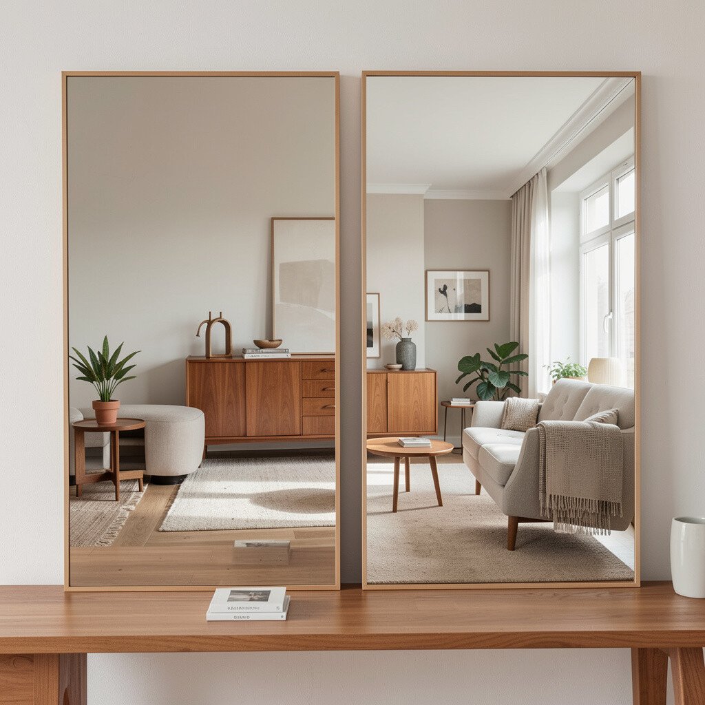
Diptych prints, where two pieces connect visually, can look extra polished because they feel like a set. When they share the same background color, the wall looks cohesive instead of busy.
Choose diptychs with mid century subject matter like abstract waves, bold shapes, or simplified landscapes. Make sure the two prints have matching edges or consistent color tones so the seam looks smooth.
Hang the pair with a small gap so the artwork looks intentional rather than like two random frames. For practical guidance, measure the full width including the gap and center it above your sofa or console.
Personalization ideas include swapping one image for a print that holds personal meaning, such as a color scheme from your favorite fabric or an abstract you love from a trip. To keep costs down, look for diptych print sets that come with matching frames, then upgrade only if the frames are flimsy. If you want a high-end effect, add a mat and choose a frame finish that repeats your room’s biggest wood tone.