Abstract art can make a room feel calm and alive at the same time. A symmetrical wall brings order to that energy in a way that feels easy to love.
1. Soft Neutrals In A Clean Grid
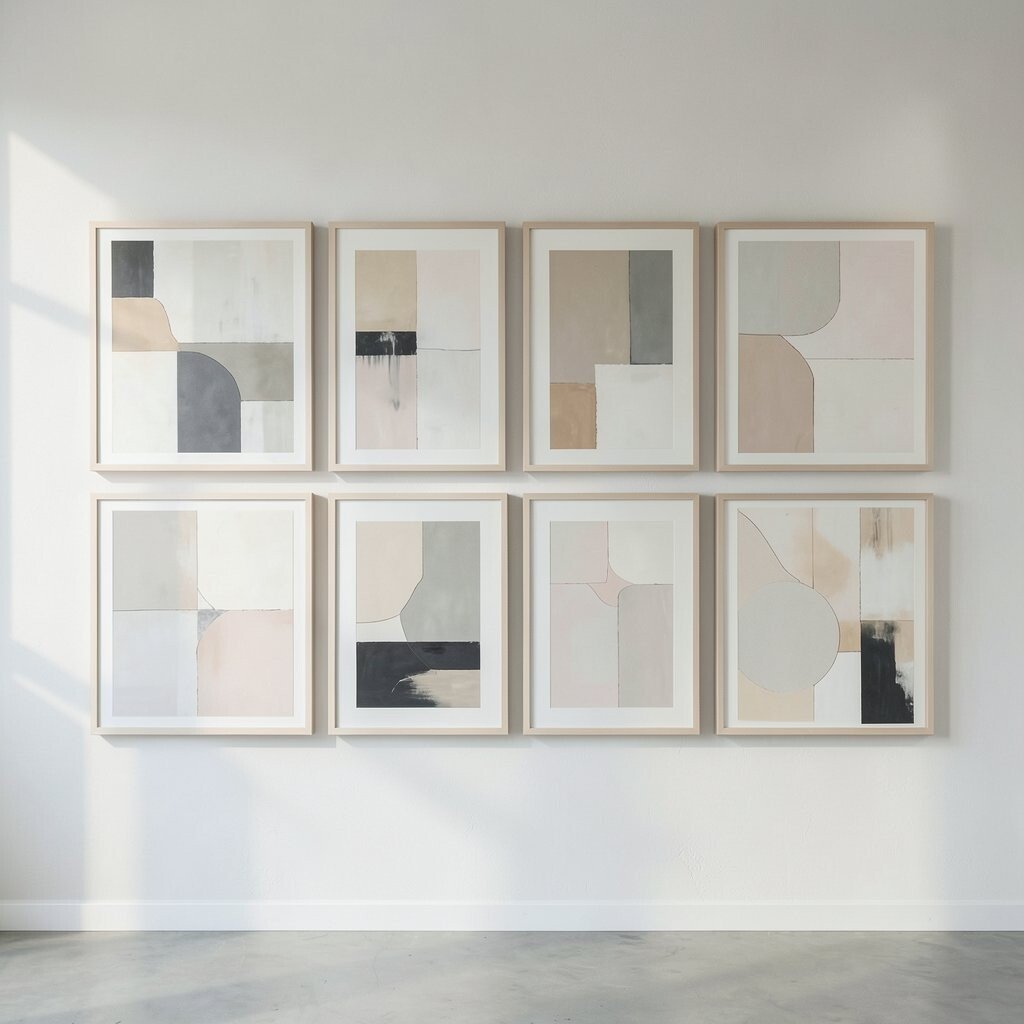
A clean grid of abstract prints in soft beige, ivory, and gray creates a quiet wall with a polished look. The even spacing makes each piece feel special, while the full set gives the room a strong sense of balance.
This style works well in living rooms, hallways, and bedrooms because it looks neat without feeling stiff. It is also budget-friendly since you can mix framed prints with simple mats, and you can make it personal by choosing art with gentle brush marks, cloudy shapes, or faint texture.
2. Bold Black And White Squares
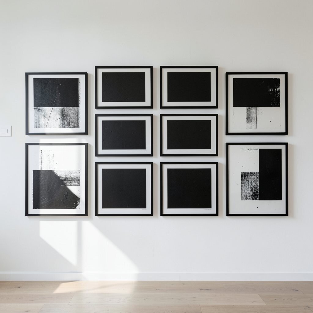
Black and white abstract art can look sharp and modern when arranged in a square shape with even lines. The contrast gives the wall a strong visual pull, and the symmetry keeps it from feeling too busy.
For a fresh look, use frames that match in black or thin metal so the art stays the focus. This kind of wall is easy to build over time, which helps with cost, and it fits current trends that favor simple shapes and strong contrast.
You can make the layout feel like your own by mixing line work, soft ink washes, and blocky forms that share the same color story. A wall like this is great for adding energy to a home office or entryway without using bright color.
3. Warm Earth Tones In Two Matching Rows

Two straight rows of abstract pieces in rust, clay, sand, and olive can make a room feel warm and grounded. The matching rows give the eye a steady path, and the earthy palette adds comfort right away.
This layout is a smart choice for homes that want a cozy look with a modern edge. It can also save money because prints in these tones are often easy to find, and you can personalize the mix with art that has arches, waves, or soft blocks of color.
To keep the wall balanced, use frames of the same size and hang them with the same gap between each piece. That small detail makes the whole display feel planned, which is one reason this style keeps showing up in current decor trends.
4. Large Center Piece With Smaller Matches Around It
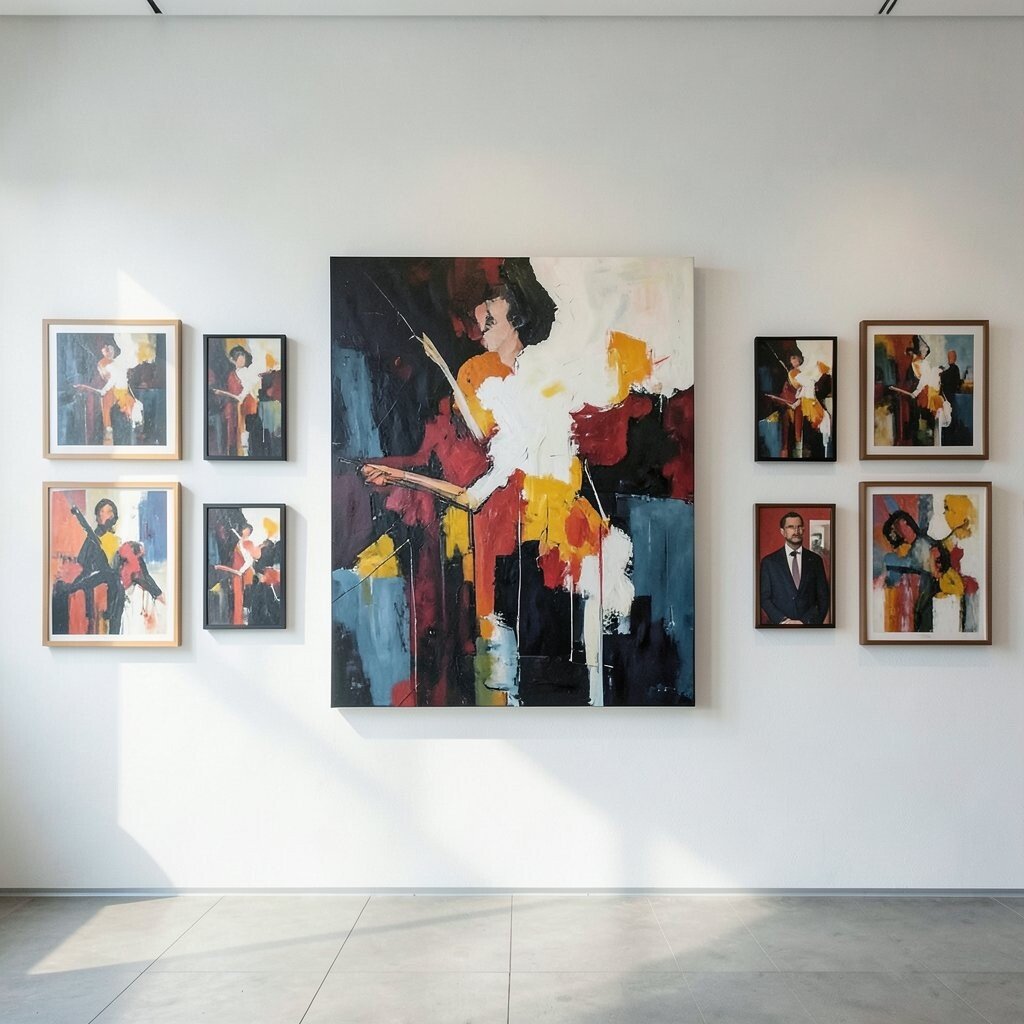
A strong abstract canvas in the center can anchor the wall and make the smaller pieces feel orderly. When the outer frames mirror each other, the result looks calm, elegant, and easy to enjoy every day.
This setup works well if you want one special artwork to lead the whole display. It can be cost-friendly too, since the smaller pieces can be prints while the center piece can be the one splurge item, and you can shape the mood with colors that repeat from frame to frame.
Choose art with a shared theme like motion, mist, or layered paint so the gallery wall feels connected. The layout looks best when the middle artwork has a little more visual weight, because that helps the symmetrical design feel complete.
5. Monochrome Texture With Thin Frames
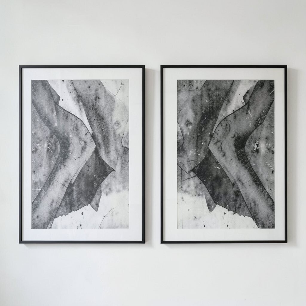
Abstract art in one color family, such as white-on-white, gray-on-gray, or tan-on-tan, can feel rich even without bright color. The thin frames keep the wall light and neat, while the textures give it depth and interest.
This kind of gallery wall is a good fit for modern homes that want a soft, quiet look. It is also easy to personalize with papers, canvas prints, or framed fabric art, and the matching tones can help a small room feel more open.
Because the design depends on texture more than color, you can choose pieces from different price ranges and still get a unified result. The style feels current, especially in spaces where people want a calm backdrop for furniture, plants, or books.
6. Color Block Sets With Mirror Placement
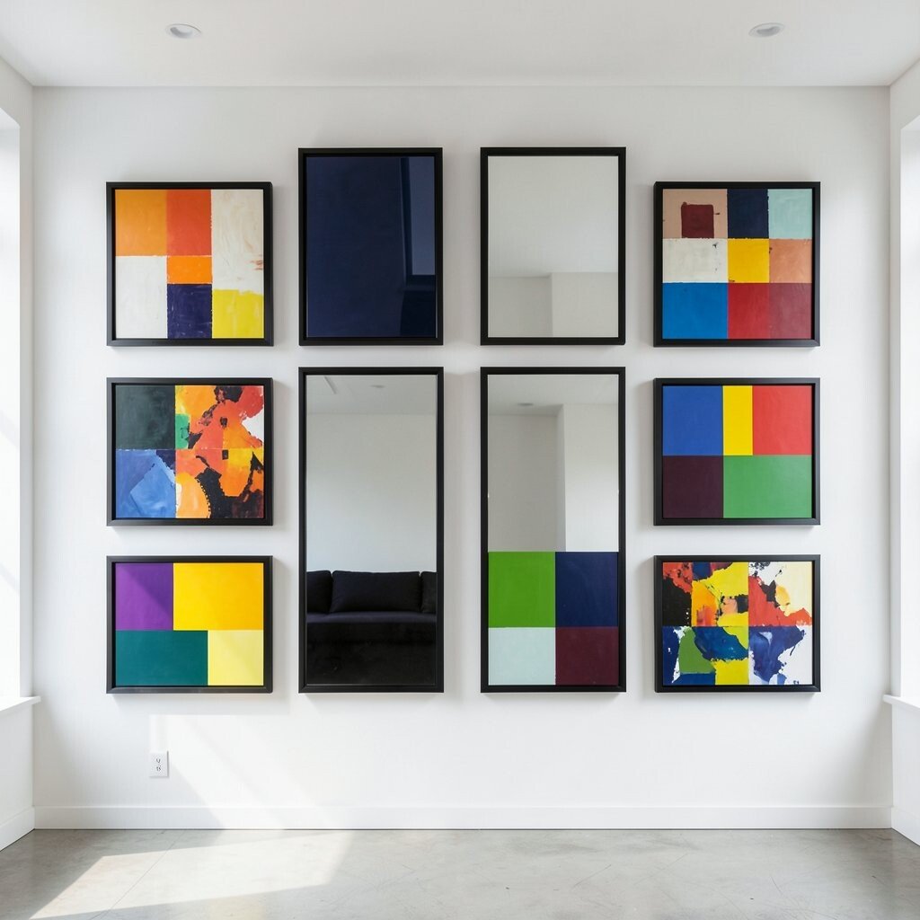
Pairs of abstract art with bright color blocks can create a lively wall that still feels tidy. When each side mirrors the other, the whole arrangement looks balanced and playful at the same time.
This idea is great for family rooms, play spaces, or creative corners where a little extra energy is welcome. It can stay affordable if you print your own art or buy digital downloads, and you can make it feel personal by repeating favorite colors from pillows, rugs, or dishes.
Try keeping the frame style the same so the color can do the talking. The crisp symmetry gives bold art a place to shine, and that mix of order and fun is part of what makes the look so appealing right now.
7. Gold Accents With Soft Abstract Washes
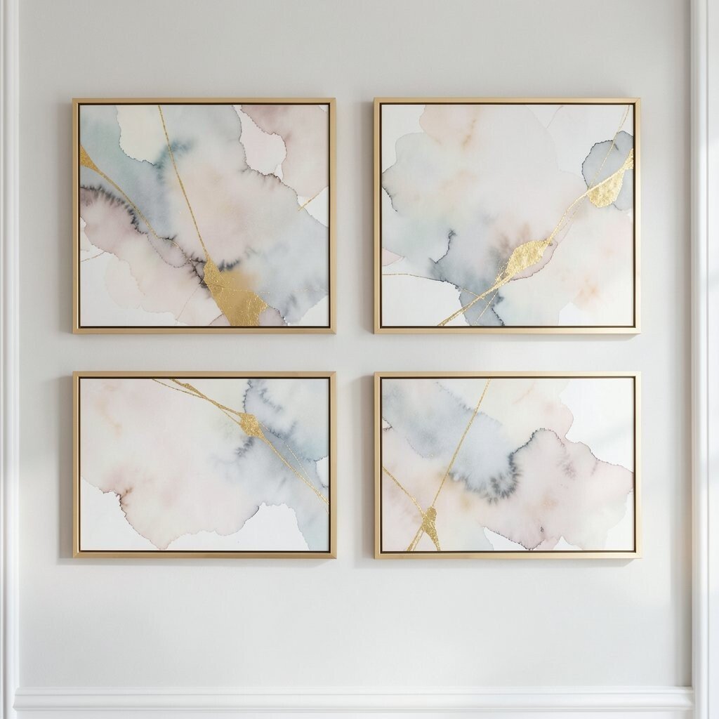
Abstract art with gentle washes of color and small touches of gold can bring a touch of glow to a room. Arranged in a symmetrical pattern, the wall feels graceful and warm without becoming too formal.
This style works well above a sofa, along a dining room wall, or in a bedroom that needs a little shine. It can be a smart spend if you use one or two metallic pieces and fill the rest with simple prints, and the look can be made more personal through warm blush, cream, or slate tones.
Use frames with a slim gold edge or a soft champagne finish to echo the art without taking over. The result feels current because subtle metallic details are still popular, and they catch light in a way that makes the whole wall feel alive.
8. Blue Tones In A Wide Symmetrical Rectangle

A wide rectangle made from abstract art in blue tones can feel peaceful and fresh. The shape gives the wall a clear frame, while the matching colors make the room feel steady and calm.
This idea suits bedrooms, bathrooms, and quiet sitting areas where a soft mood matters. It is also practical because blue art comes in many price points, and you can personalize the display with ocean shapes, sky-like gradients, or inky brush strokes that remind you of a favorite place.
To keep the wall feeling polished, repeat the same frame finish across every piece. The look stays neat and timeless, yet it still feels current when you mix pale blue, deep navy, and a little gray for depth.
9. Mixed Sizes In A Symmetrical Frame Set
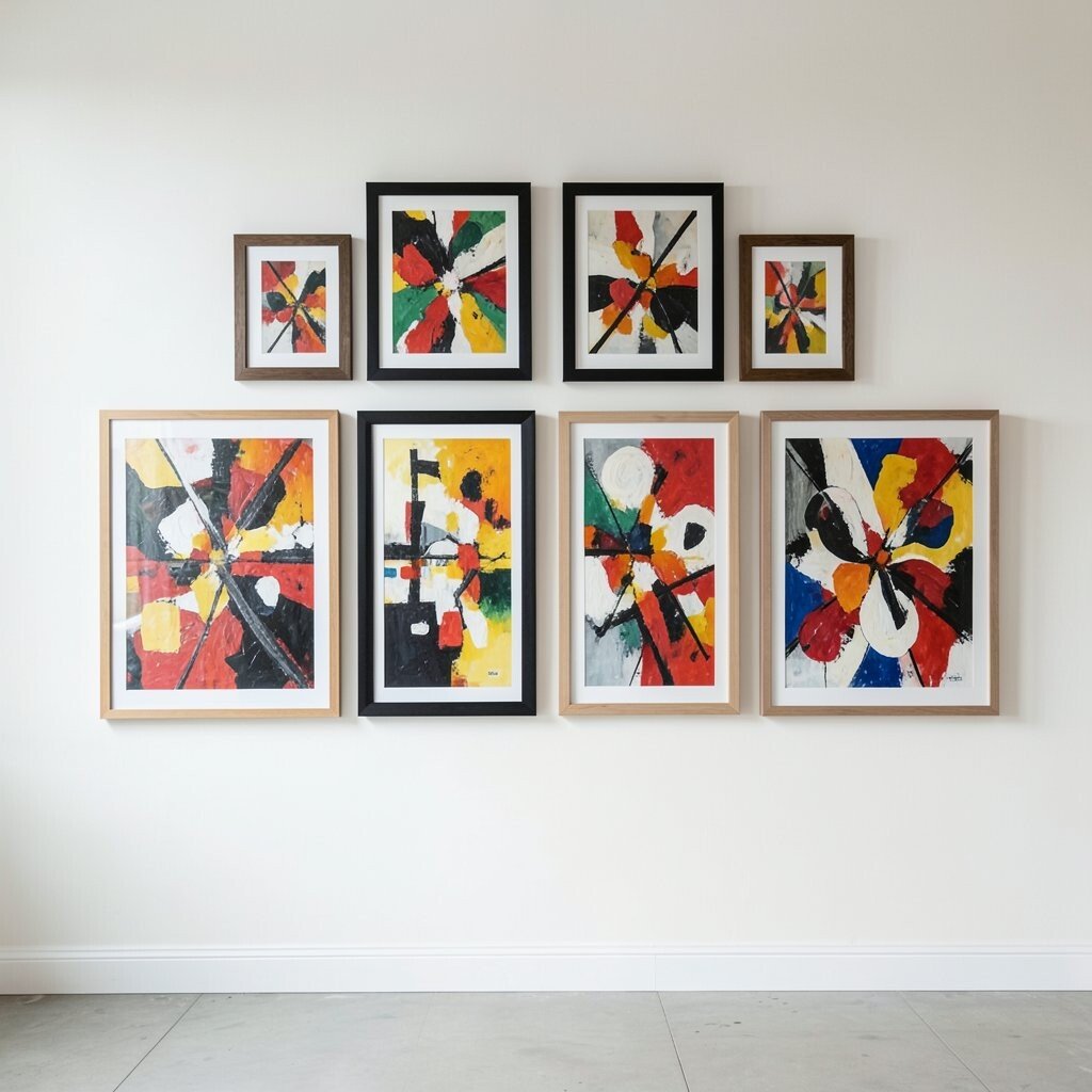
A symmetrical gallery wall does not have to use only one size, and that is what makes this setup so interesting. When larger and smaller abstract pieces are placed in a careful mirrored pattern, the wall feels full of motion but still tidy.
This style gives you room to use art you already own, which can help with cost and make the display feel more personal. It also works well for people who like a collected look, since you can mix prints, painted paper, and simple canvases while keeping the spacing even.
Keep the color range narrow so the different sizes do not fight each other. The mix of scale adds uniqueness, and the balanced shape makes the wall feel planned even when the artwork itself is playful.
10. Soft Pastels With Matching Mats
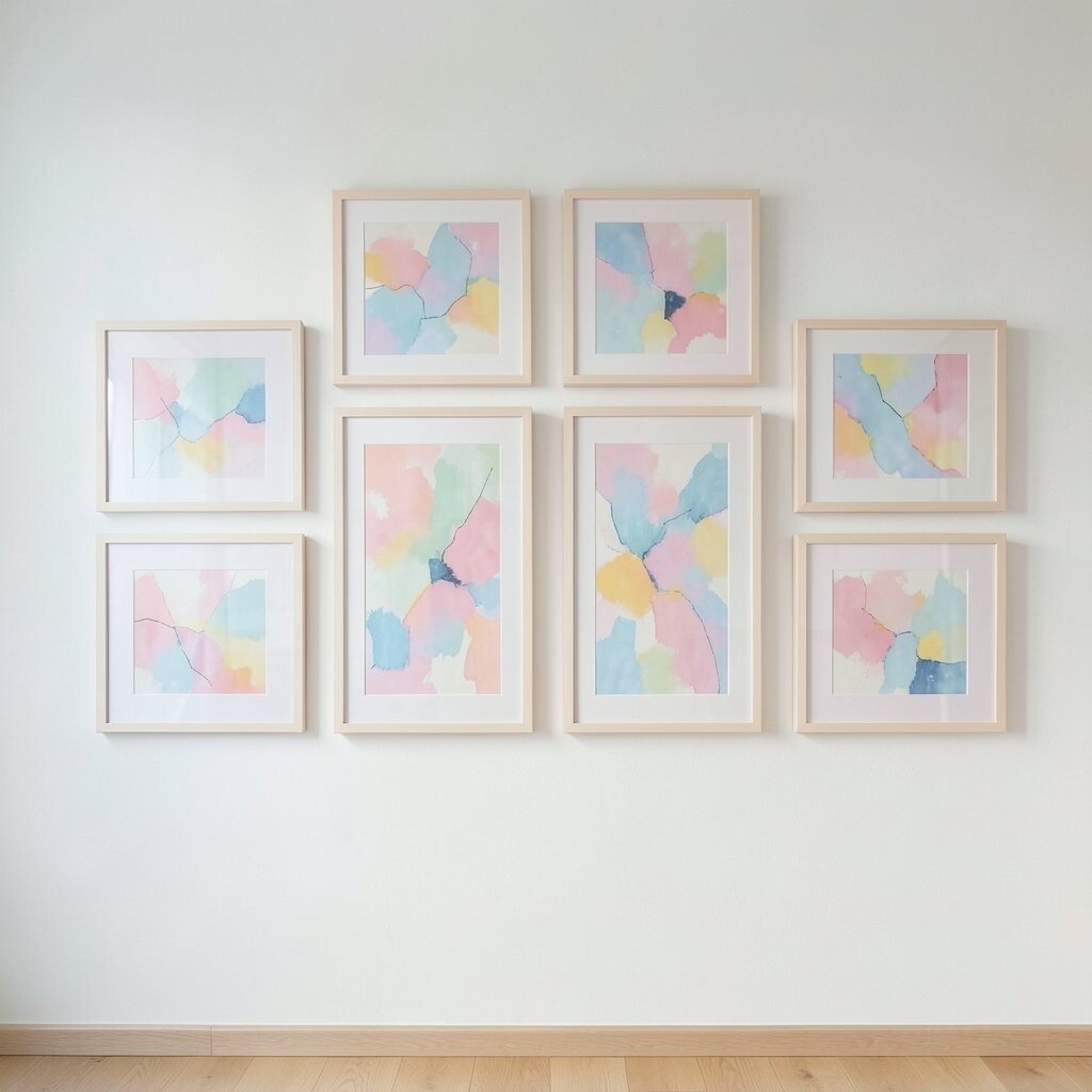
Pastel abstract art can make a wall feel sweet, airy, and light without looking childish. Matting each piece the same way helps the symmetry stand out, and the soft colors give the room a gentle glow.
This is a nice choice for nurseries, bedrooms, and reading spaces where a calm mood matters. It can also be cost-friendly because many pastel prints are easy to find, and you can make the wall more personal with shapes that feel dreamy, like circles, haze, or floating color fields.
Matching mats help every frame look connected, which is useful if your prints come from different artists or shops. The style fits current home trends that favor light, open rooms, and it pairs well with pale wood and simple decor.
11. Earthy Abstracts With Repeating Shapes
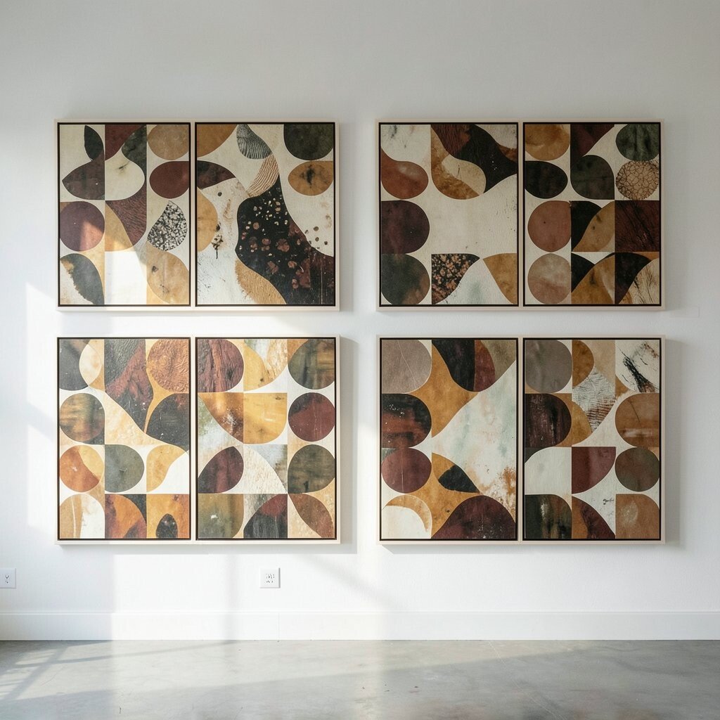
Repeating shapes like arches, curves, and stacked blocks can give abstract art a friendly rhythm. In a symmetrical layout, those shapes create a wall that feels organized, warm, and full of quiet charm.
This idea is useful if you want art that feels modern but not cold. It can be done at many price levels, and it becomes more personal when you choose shapes that echo the room, such as rounded mirrors, curved chairs, or a soft rug pattern.
Use frames in one material, like wood or matte black, so the repeated shapes feel even stronger. The result stands out because it looks simple at first glance, yet it has enough detail to keep people looking.
12. Bright Abstract Art In A Balanced Cross Pattern
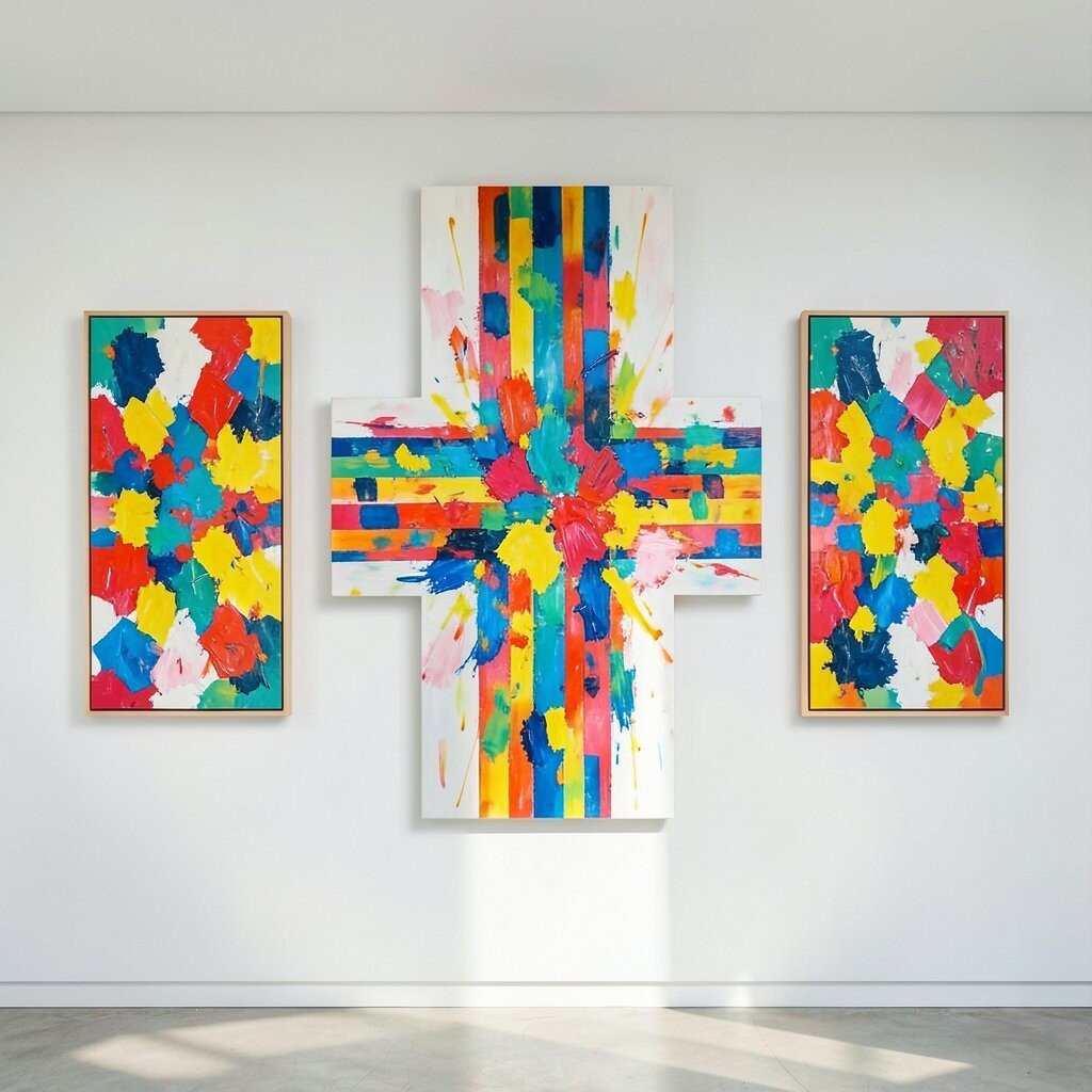
A cross-like layout with bright abstract pieces can make a wall feel lively and full of cheer. When the pieces are placed with equal spacing from the center, the arrangement feels playful but still orderly.
This look is a great match for homes that want color without clutter. It can stay affordable if you use small prints in cheerful shades, and you can personalize the wall by choosing colors that match your favorite dishes, art supplies, or throw blankets.
Because the layout already has a clear shape, the art can be more expressive without making the room feel messy. The style feels fresh in today’s homes, especially in spaces that need a happy focal point.
13. Calm Abstract Landscapes In Perfect Rows
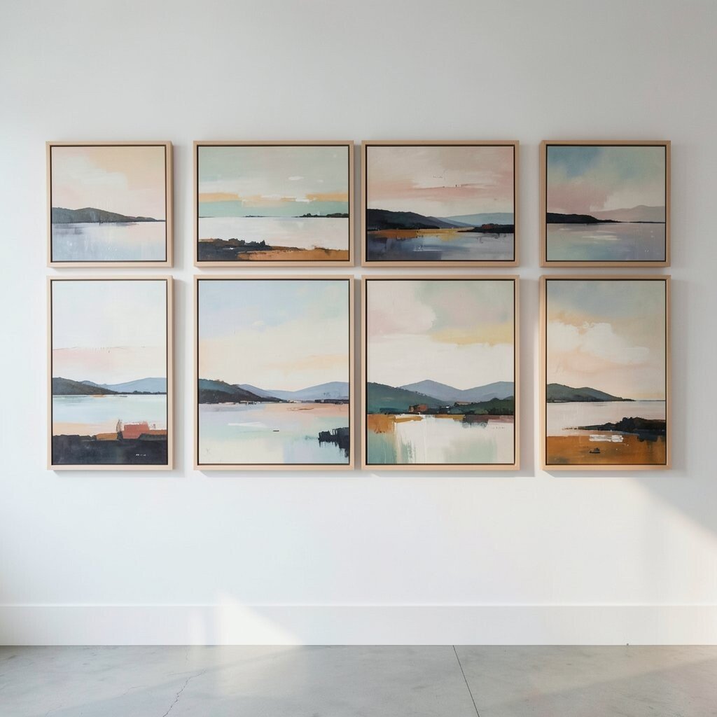
Abstract pieces that hint at hills, skies, or water can bring a soft landscape feel to a room. Set in perfect rows, they create a soothing view that feels balanced, calm, and easy to live with.
This final idea works beautifully in bedrooms, halls, and dining rooms because it offers peace without losing style. It can also be a wise choice for cost control, since simple landscape-inspired prints are often easier to find, and you can make the set your own by picking scenes that remind you of travel, seasons, or a special place.
Try using the same frame color and the same mat width so the rows feel smooth from edge to edge. The symmetry gives the abstract landscapes a gallery-like look, while the soft images keep the wall warm and welcoming.