Wall art can make a room feel finished without feeling too perfect. When you mix styles the right way, your home starts to look like it has a story.
Even small changes in color, spacing, and frame choices can create a look that feels confident and personal.
1. Start With One Style Anchor
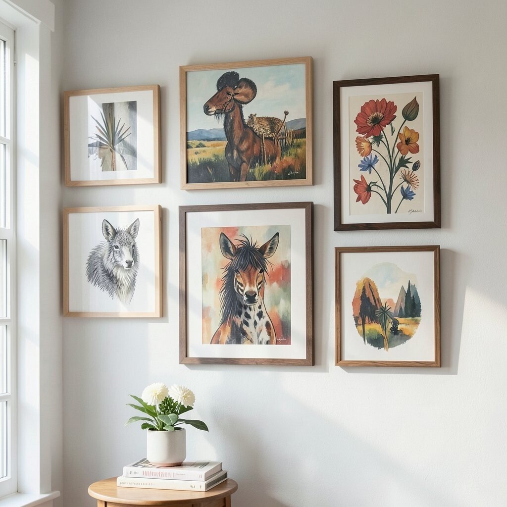
Pick a main theme that you love, like warm neutrals, modern lines, or gallery-style photos. Then make that style the “anchor” so everything else has something to agree with. Look for a repeating visual clue, such as flat color blocks, black frames, or soft landscapes. When you see the room from a few steps away, that anchor should be the first thing your eyes catch.
Use the anchor to guide how you mix sizes, too. If your anchor is modern, choose one or two pieces with crisp edges and use softer art for the rest. This creates a calm rhythm rather than a chaotic collage. You also save money because you buy fewer “random” items that fight each other. Keep personalization easy by using your anchor style for sentimental pieces, like a family photo in a matching frame.
2. Build a Color Story Before You Buy
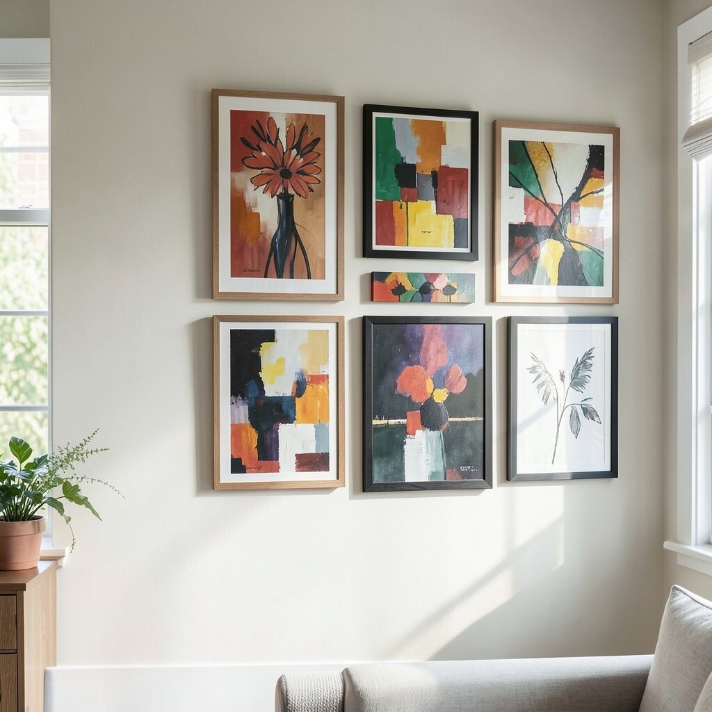
Choose a small color story, such as earthy browns plus cream, or deep blues plus gold accents. When you shop, check that each artwork includes at least one color from your story. You can see this in the way a floral print echoes the same shade as a landscape, even if the subject is different.
Mixing becomes simpler when the colors keep meeting across the set. Try pulling colors from your sofa, rug, or curtains so the wall art looks like it belongs. This also helps the room feel more put together, even in spaces where paint or furniture will not change soon.
For cost considerations, aim to buy one larger piece that sets the colors, then add smaller pieces that repeat those tones. You can even find affordable prints that share the same palette and swap frames later. Personalize the look by adding one artwork that holds a special memory, like a trip photo converted into a print that matches your palette.
3. Use Frame Color to Make Everything Agree
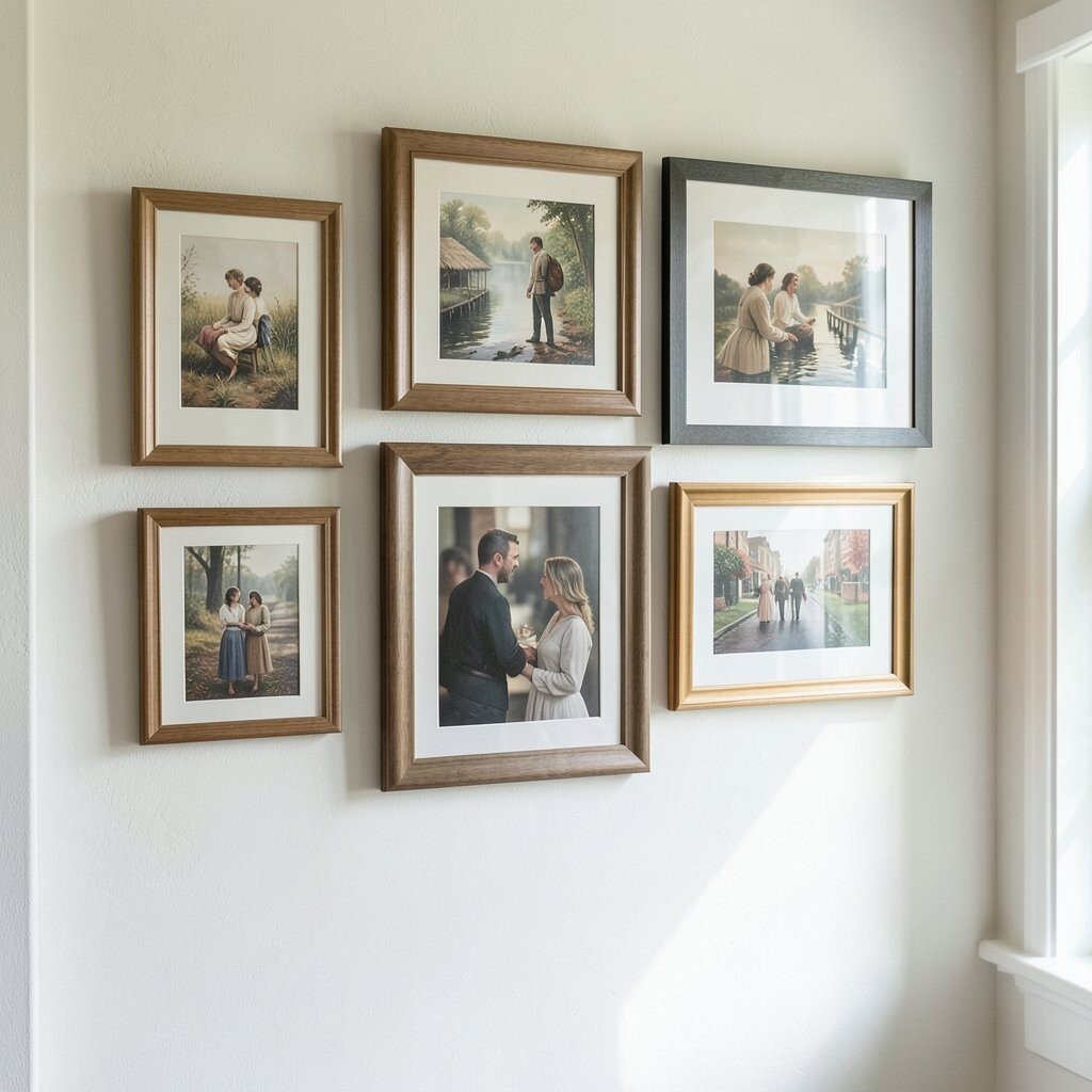
When you mix art styles, frames can do the heavy lifting. Choose a frame color family, such as matte black, whitewashed wood, or natural oak, and keep most frames within that family. Even if the artwork is totally different, similar frames help it feel intentional.
Look closely at your room lighting, too, because shiny frames can reflect light in a way you may not expect. Matte finishes often feel calmer and look great in bright living rooms. If your pieces are all different sizes, consistent frames also make the group look balanced. You get a stylish effect without needing expensive matching sets.
To personalize, mix frame widths slightly, like pairing a thin frame for photos with a thicker frame for a bold print. For practical tips, leave enough wall space between framed items so the frames do not visually crowd each other. For cost, buy frames for your existing prints first, then upgrade artwork over time when you find pieces you truly love.
Current trends lean toward clean frame lines, warm wood, and black accents that feel modern but not cold. A set of mixed art inside matching frame families is an easy way to follow that trend without overhauling your whole home.
4. Mix Sizes With a Clear Layout Plan
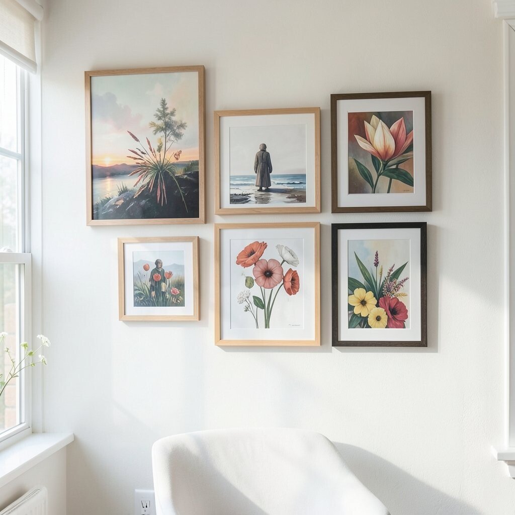
Start by placing the biggest piece first, then build around it like you are making a center point. A large artwork can anchor the visual weight, while smaller pieces add detail. You will instantly feel more confident when the arrangement has a plan, even if you use different art styles.
If you like a gallery wall look, consider a mix of tall, medium, and wide pieces. Keep the center of the arrangement at eye level, usually around where you look when you stand. This helps the wall art feel welcoming instead of too high or too low.
5. Try a Grid Look for Easy Balance

A grid layout makes mixing feel tidy, even when the art is varied. You can space frames evenly so the whole wall has a neat structure that still allows creativity. Choose prints or photos with similar visual weight, then vary the subject matter.
For a practical approach, measure the wall space and mark a simple guide before you hang anything. Keep the gaps between pieces fairly consistent so your eye moves smoothly across the wall. This is also a great way to make smaller artworks look more expensive.
To personalize, select a theme across the grid, like coastal scenes, botanical prints, or black-and-white portraits. Cost can stay friendly by using a mix of DIY prints and store-bought art as long as the grid spacing stays consistent. The uniqueness comes from your selection, not from buying a full set.
6. Create a “Theme Thread” Across Styles
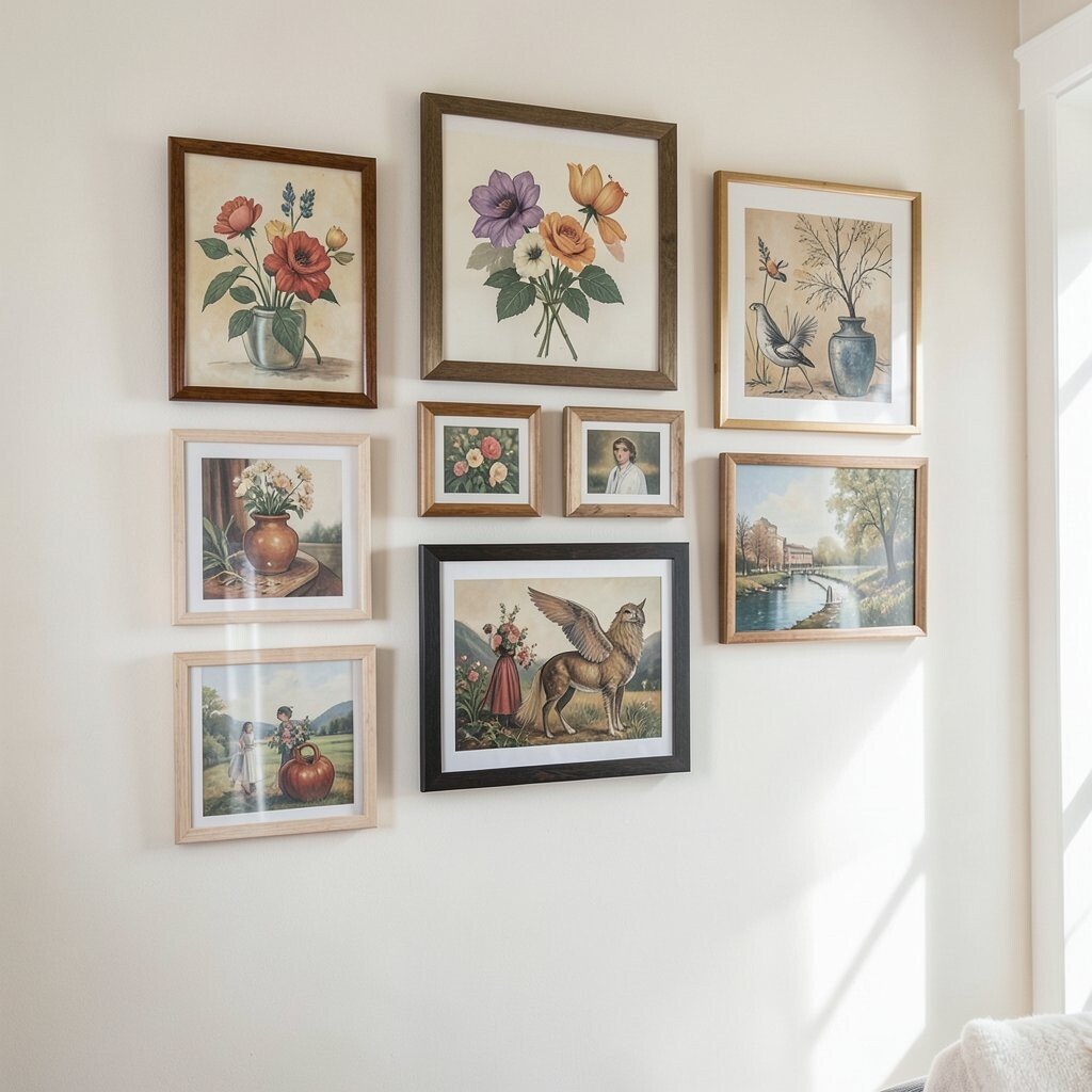
Even if you mix different art styles, you can make them feel connected with a single theme thread. Think about shared subjects like nature, music, architecture, or cities at night. When you choose pieces that share a story, they blend naturally even when the colors or techniques differ.
Try using texture as your theme thread, too. A woven wall hanging next to a printed illustration can share a vibe through earthy tones and soft shapes. The benefit is that your wall feels curated instead of random. You also get uniqueness because the theme reflects what you care about.
For personalization, include one “voice” piece, like a painting that looks slightly bold compared to the rest. Then repeat that boldness through a smaller accent, such as a print with a similar color. This keeps your wall art looking intentional and lively without needing extra purchases.
7. Use Negative Space Like It’s Part of the Design

Empty wall space helps art breathe, especially in smaller rooms. If you pack too many pieces together, the wall can feel busy and heavier than you want. Leave room around each frame so your eye can rest between visuals.
Negative space is also a trick for cost control, because you can use fewer items and still get a stylish look. Choose one or two statement pieces, then let the rest of the wall stay simple. This makes your favorite artwork feel more special. It also keeps your budget focused on quality rather than quantity.
8. Match Art to the Room’s Purpose
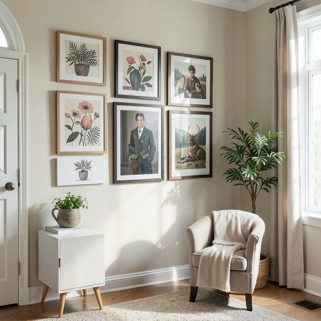
Your wall art should suit how the room is used, not just how it looks. In a calm bedroom, soft colors and gentle themes often feel more soothing. In a busy kitchen or entryway, you can handle brighter tones and playful subjects more easily.
Think about movement, too. A hallway wall can handle more directional artwork, like lines or patterns that guide the eye forward. This benefit is real because your home starts to feel smoother as you move through it.
For personalization, consider your daily life. If you love cooking, include an illustration with herbs, utensils, or warm food photography. For practical tips, avoid art that clashes with how you already decorate, like using very loud colors near furniture in the same space. Current trends often favor art that feels lived-in and meaningful, not just decorative.
Cost can stay manageable when you shop for art sets that share a theme across rooms. Even if styles differ, repeating a color story from room to room ties your home together without spending more than you planned.
9. Mix Canvas, Prints, and Photos With Intention
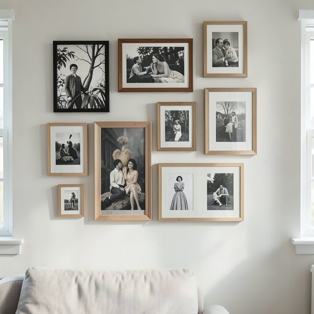
Different mediums can look amazing when you keep a consistent style thread. Canvas art often feels bold and modern, while paper prints feel light and flexible. Photos add emotion and personality, especially when they are framed in a style that fits the rest of your decor.
You do not need everything to look the same to make it feel cohesive. Try using a similar finish across mediums, such as matte frames for photos and prints, then one canvas with a deeper texture. This gives contrast without visual conflict.
10. Choose One Common Shape or Motif

Shape can be a secret tool for making mixed art look coordinated. If most of your pieces include rectangles, then square frames or odd shapes can feel jarring. Instead, pick a shape family, like rectangular works, then vary the artwork inside that shape.
You can also use a motif to connect pieces, like repeating circles, waves, or leaf shapes. The eye notices those patterns and feels the wall art is meant to be together. This makes the mix look unique and designed rather than accidental.
For practical tips, keep small details consistent, such as using similar line thickness in prints. That keeps the overall wall from feeling too busy. For cost, you can buy affordable prints with the right motifs and upgrade one or two bigger pieces later.
11. Go Monochrome for a Bold Modern Look
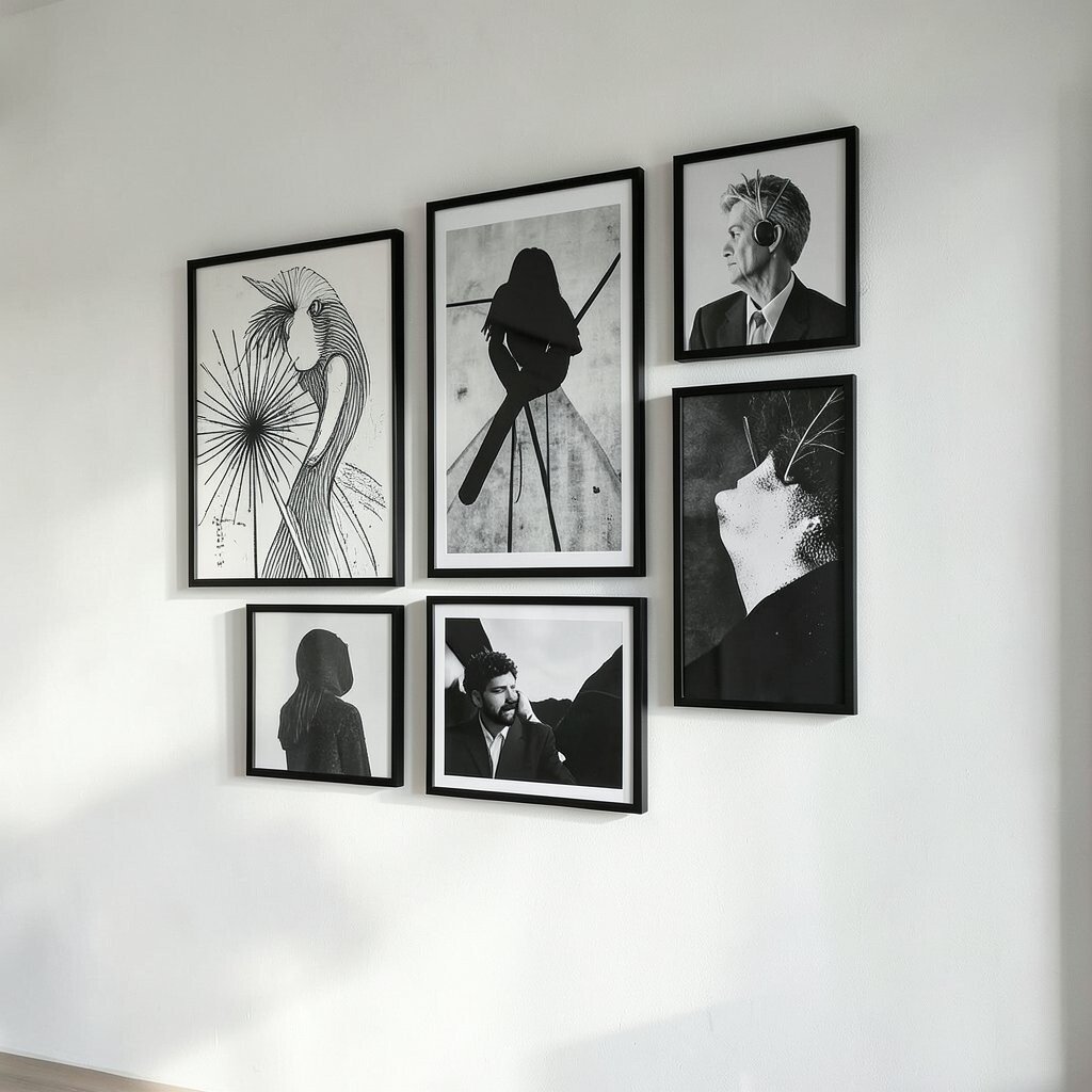
Monochrome wall art can make mixing easy because all the pieces share the same color direction. Black-and-white photos, ink drawings, and grayscale prints can feel chic and clean. This is a great choice if you want your wall art to stand out without adding extra color noise.
If your furniture has strong colors, monochrome art balances the room. You can also add one metallic accent, like a thin gold frame, to keep it from feeling too plain. The benefit is that you can mix many different styles and still achieve a cohesive look.
For personalization, use family photos in black-and-white so your wall tells a story. For practical tips, vary the texture, like pairing a photo print with a line-art drawing and a high-contrast poster. This keeps the wall from looking flat while still staying within one palette.
12. Combine Scales by Grouping Like With Like
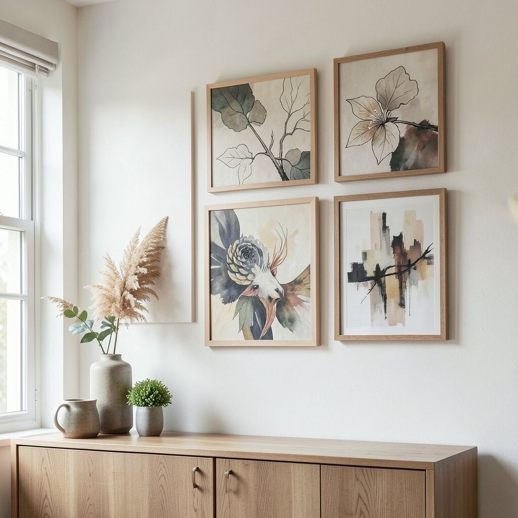
Think about scale as you plan your mix. Pair one large statement piece with several medium pieces, then add small accents only when they feel needed. This helps you avoid a common problem where tiny art gets swallowed by a wall, or big pieces overpower the rest.
You can group by scale even if the subjects differ, like a cluster of medium landscapes next to a bold portrait. The benefit is that your wall art feels organized even when it is creatively mixed.
Practical tips include using consistent spacing between items in each scale group. Cost considerations are easier when you buy one higher-impact piece first, then fill in with smaller frames you find at sales or thrift stores. Personalization comes from what you choose for the center piece, because it sets the mood.
13. Layer Art Horizontally for a Lived-In Feel
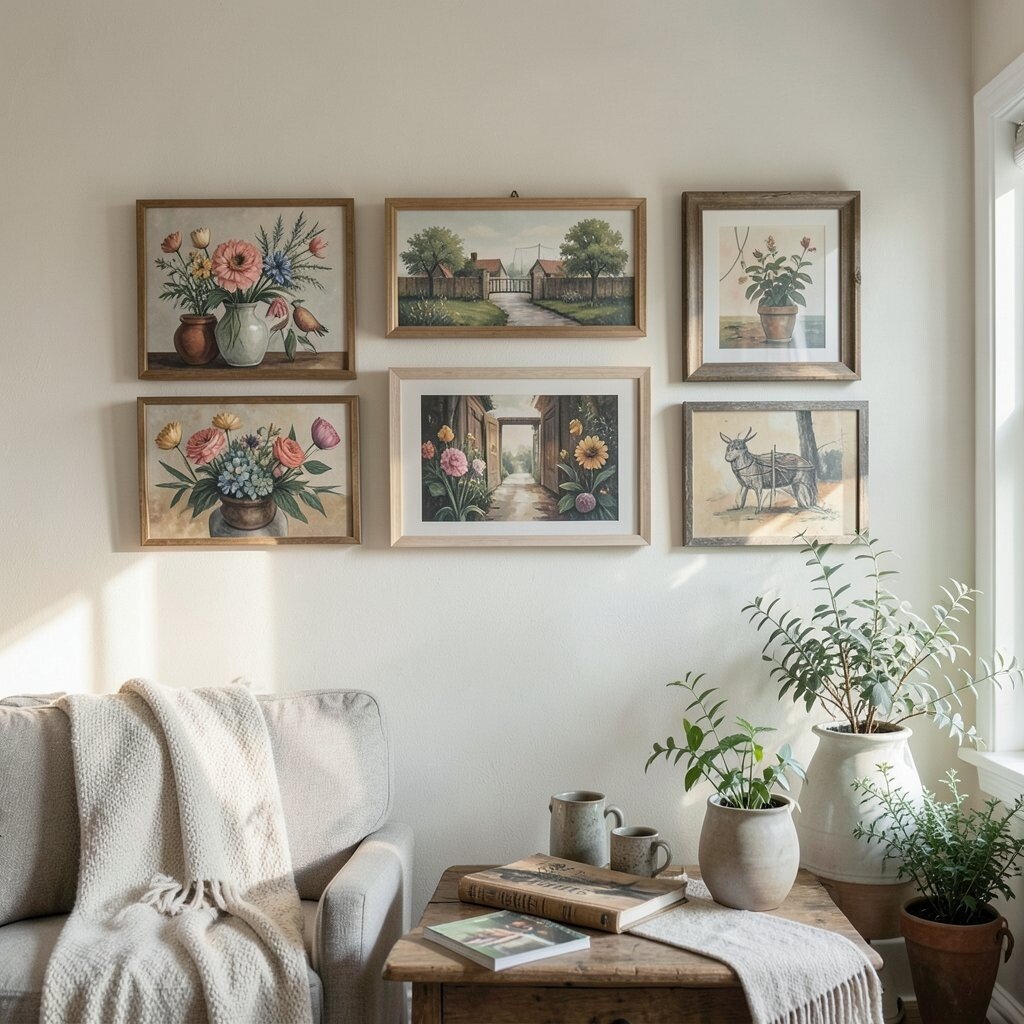
Instead of lining everything up in a perfect grid, you can arrange pieces in a gentle horizontal flow. Place one or two larger artworks across the middle, then add smaller pieces that “float” around them. This style looks relaxed and lived-in, which fits many current home trends.
For a practical setup, start with the middle row of art and build outward. Keep the top edges roughly aligned if you want a calmer look. The benefit is that the wall feels intentional without requiring strict measurements for every frame.
To personalize, use a mix of your favorite moments, like printed ticket stubs framed with photos from the same trip. For cost, this approach works well because you can combine inexpensive prints with a single upgraded frame or poster.
14. Create Contrast With Texture and Color Temperature
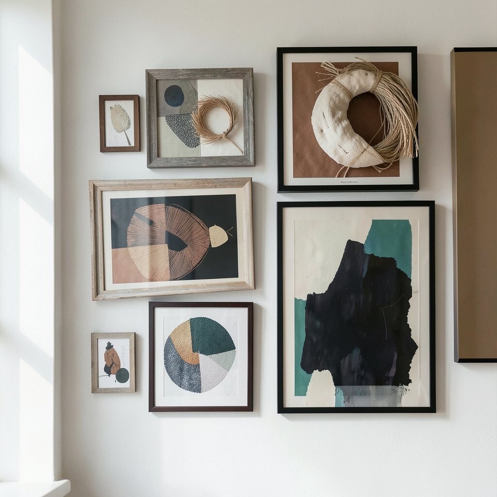
Mixing wall art gets exciting when you play with texture and warmth. Pair smooth printed images with a textured wall hanging, like woven or fabric art, to add depth. Use warm tones, like creams and rust, alongside cooler tones, like teal or slate, in small doses.
This creates visual contrast, and contrast makes a room feel more dynamic. The benefit is that your wall art becomes a focal point that still feels balanced. Uniqueness grows when you choose textures that match your personal style, like using a modern print next to something handmade.
Practical tips include keeping one element consistent, like frame color, so contrast stays stylish instead of messy. For cost considerations, hunt for affordable texture sources like prints with thick paper stock or simple woven pieces you can hang easily. Personalize by selecting textures that echo your home materials, such as linen curtains or a wooden coffee table.
15. Use Odd-Number Clusters for Visual Confidence
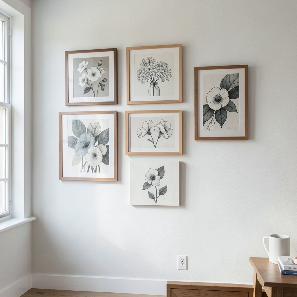
Cluster arrangements often feel natural, especially when you group three or five pieces with a clear central focus. A middle piece draws attention while the surrounding pieces add movement. This works great for mixing styles because the cluster structure does the organizing for you.
You can keep the cluster simple by choosing one main color story and repeating it across all frames. The benefit is that the grouping looks complete even if your art includes different subjects. Uniqueness comes from how you choose the art inside the cluster.
For practical tips, keep cluster height consistent so it sits comfortably on the wall. If you hang above a sofa, allow the bottom edge to align with the furniture back or cushion height. For cost, this approach helps because you can spend more on one or two key pieces and fill in with budget-friendly options around them.
16. Let Your Art Echo Your Rug or Upholstery

Your rug and upholstery can guide your wall art choices more than you might expect. If your rug has a pattern with curved shapes, find art that also uses curves or similar lines. If your sofa features a certain color, pick artwork that includes that color as a supporting tone.
This matching strategy makes the whole room feel connected, which is a big benefit for busy homes. Your eyes stop trying to “solve” the room because the colors and shapes align. Personalization is easy, too, because you can choose artwork that repeats elements you already love.
For practical tips, take a close look at the rug’s dominant tones and select frames that match those tones or complement them. Cost can be managed by using your existing decor as a palette guide, so you avoid buying pieces that do not truly fit. Trends right now often emphasize cohesive layering, and this is one of the most natural ways to do it.
17. Mix Personal Collections Into a Curated Gallery
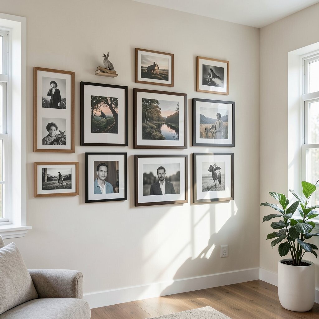
Collecting something over time, like postcards, vintage maps, or concert posters, can become a stunning gallery wall when you group it with care. Start by spreading your collection out and sorting by theme, color, and frame style. You will notice patterns you did not see at first.
This is where uniqueness really shines, because the wall becomes your personal archive. The benefit is emotional as well as visual, since every piece can remind you of a memory. Practical tips include using consistent matting so the collection feels polished, even when the items are different.
For cost considerations, scan for sales on frames or use a mix of frame sizes you already have. You can also use affordable prints to “fill gaps” between rare pieces. Personalization is built in, because your collection is already one of a kind.
Current trends favor nostalgia with clean styling, so keeping the frames simple while the content stays personal hits a popular look without trying too hard.
18. Balance Bold Pieces With Subtle Ones

Bold art can be thrilling, but it needs softer partners to feel comfortable. If you have a large colorful painting, balance it with calmer prints or quiet photos around it. The contrast keeps the statement piece from feeling overwhelming.
For practical tips, assign roles to each artwork, like “main character” for one piece and “supporting cast” for the rest. You can see this in how a bright abstract print might sit next to black-and-white photography. The benefit is that the wall becomes stylish rather than loud.
Cost is easier to manage when you buy one bold piece you love and then choose affordable supporting prints that match the palette. Personalization comes from choosing what you want to highlight, like a favorite travel moment in a bold frame. Uniqueness happens when you combine your boldness with restraint instead of repeating the same intensity in every piece.
19. Finish With Spacing, Leveling, and Protective Care
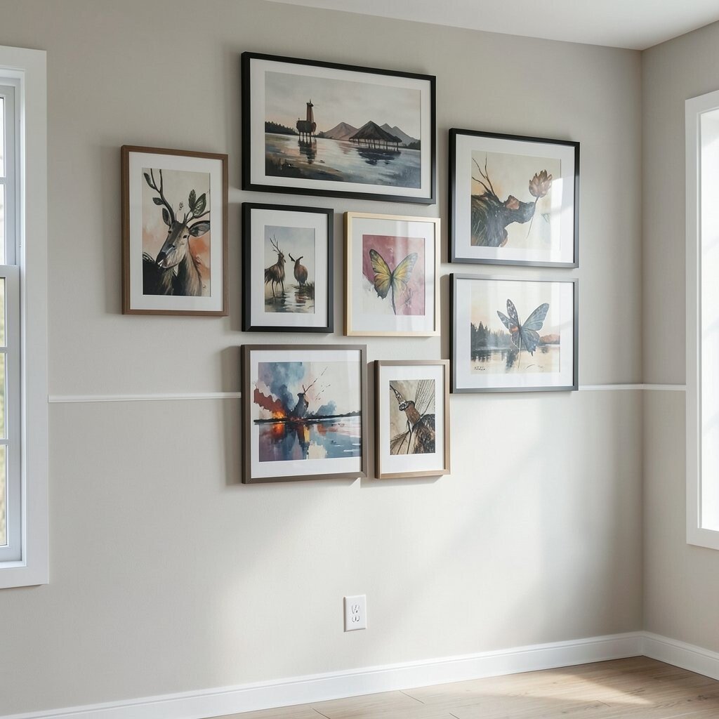
The final step is often what makes the look feel truly high-end. Use a level, measure your spacing, and double-check that the center points line up at eye level. Small adjustments can turn a wall that feels almost right into one that looks effortless.
Once everything is hung, step back and view the wall from different angles. If one piece feels too far from the group, bring it closer or change the spacing slightly. This is also a practical tip for long-term enjoyment, because you will be less likely to redecorate the space soon.
Protect your art as you finish. Keep framed pieces away from direct sun when possible, and use hanging hardware that can safely hold weight. The benefit is that your wall art stays crisp and beautiful longer, which is a smart cost consideration.
Personalization can be the last touch by adding a signature frame detail, like consistent mat colors or a repeated accent color in the hardware. Current trends emphasize clean, polished styling, and careful spacing is the simplest way to get that refined look without buying new furniture.