
Some colors feel like they have a story stitched into every thread. The right vintage shade can make a party look instantly refined.
1. Deep Porcelain Blue

This color sits between slate and classic china, like an heirloom teacup under warm light. It looks crisp in photos and feels calm in the room.
Try it on table linens, chair sashes, or the base of a floral arrangement so everything else feels grounded. Pair porcelain blue with ivory candles and brass accents for an upscale glow that still feels cozy. For personalization, match it to a signature cocktail garnish using blue cornflowers or blue hydrangea tones, and keep your palette to a few materials to avoid visual clutter.
2. Antique Saffron Gold

Antique saffron gold reads like candlelight captured on paper. It adds warmth without screaming, which is perfect for evening events.
Use it on place cards, menu holders, or subtle napkin embroidery so guests notice the details. It also flatters skin tones, making portraits and candid shots look richer. To keep costs friendly, consider mixing one gold feature element, like lanterns or a garland, with mostly neutral linens. If you want a current feel, blend saffron with muted sage or dusty clay instead of bright yellow, since softer vintage pairings are trending in upscale styling.
For uniqueness, choose gold accents with a slightly matte finish, such as brushed gold frames, rather than mirror shine. This small shift makes the whole look feel curated and vintage-minded.
3. Old Rose Blush
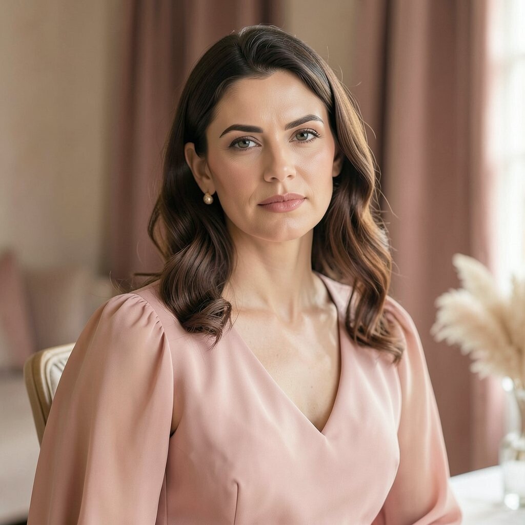
Old rose blush has that romantic, faded quality that looks like it was once part of a wedding quilt. It feels gentle, elegant, and easy to style across many event themes.
Try old rose in bridesmaid-style florals, satin ribbon on chair backs, or the wash of a painted tabletop runner. It works especially well with cream, warm gray, and soft gold so the final look stays polished. For practical setup, keep the shade consistent across textiles but vary the textures, like velvet, chiffon, or linen, to add depth.
Make it personal by echoing the tone in small signage, such as wax seals on envelopes or blush-toned ink on place cards. If you want to elevate the look further, add a few deep berry flowers for contrast, which keeps the blush from looking too pale on camera.
4. Burnished Walnut Brown

Burnished walnut brown looks like polished wood and toasted spices. It brings instant sophistication and gives vintage styling a strong foundation.
Use it for table runners, escort card holders, or a wood-toned backdrop that frames the main moment. This shade also helps dark florals, candles, and metal accents look more dramatic. Keep it practical by limiting brown to key surfaces and balancing with lighter elements like champagne, cream, or pearl-toned glassware.
If you’re watching budget, choose affordable brown craft items and upgrade them with paint or stain, since walnut tones forgive small imperfections. For personalization, carve or stencil your event initials into simple wood frames, then finish with a satin seal for a classy look.
5. Weathered Olive Green

Weathered olive green feels timeless and natural, like vintage military tailoring or aged olive oil bottles. It brings a refined calm to spaces that otherwise might feel too plain.
It shines in mixed greens, linen napkins, and subtle accents such as glass vases wrapped with olive ribbon. Pair olive with warm neutrals like oatmeal, cream, and caramel so the overall mood stays upscale. To keep styling easy, repeat the olive shade in at least three places, such as florals, tabletop elements, and a single backdrop fabric.
For personalization, swap generic greenery for seasonal branches and herbs so the color feels lived-in. If you want a trend-forward vibe, combine olive with terracotta and soft ivory for a modern vintage palette that still looks elegant.
6. Oxblood Wine Red

Oxblood wine red is deep, dramatic, and surprisingly wearable in event decor. It reads like luxury leather and makes even simple arrangements look high-end.
Use it in bold table accents, like napkin folds, floral ribbon, or a statement backdrop panel behind the head table. It also pairs beautifully with warm gold and dark green, which creates a rich, layered look. For practical planning, choose one hero area in oxblood and keep the rest neutral so the room feels balanced.
To personalize, match the tone to your dessert plating, such as berry sauces or burgundy-toned cake accents, so the color story feels intentional. If you’re mindful of cost, use oxblood through paper goods and fabric add-ons first, since large structural decor can get expensive.
On camera, oxblood can look especially stunning under warm lighting, so aim for golden bulbs or candle-style fixtures when possible.
7. Dusty Amethyst Purple

Dusty amethyst purple looks like velvet that has softened over time. It gives a classy, creative mood without turning the room into a themed circus.
Try it on floral varieties like lavender-toned blooms, satin chair ties, or layered table overlays. This color also makes silver and antique brass look more interesting, so it’s a great match if your event uses mixed metals. For practical tips, keep purple concentrated in accents and use creamy whites to prevent the palette from feeling heavy.
If you want uniqueness, use different purple textures, such as matte paper menus and slightly shiny ribbon, so the color has dimension. You can also personalize by echoing purple in a signature drink garnished with edible flowers, which looks elevated and feels fun.
8. Mariner’s Navy Ink

Mariner’s navy ink is crisp, vintage, and sharp enough to feel like formalwear. It gives upscale structure to a color palette and works year-round.
Style it on tablecloths, folded napkins, or a dark banner that frames the event entry. Navy also helps lighter colors pop, so ivory, pale blue, or blush flowers look even more romantic. For cost considerations, look for navy in areas that are easy to replace, like runner fabric and printed signage, rather than repainting large items.
Personalize it using monogrammed stamps on textured paper, or match navy to the color of your invitations for a cohesive guest experience. If you want to follow current trends, pair navy with muted metals and soft sand tones, since understated combinations are popular in modern vintage styling.
To keep the navy from feeling too severe, add warm candlelight and a few dusty rose accents to soften the overall mood.
9. Antique Celadon Mist

Antique celadon mist feels airy and refined, like old porcelain with a hint of spring. It brings a gentle glow that works especially well for daytime receptions.
Use it in ceramic vases, tinted glassware, or as a watercolor-like backdrop wash behind a dessert table. Celadon also pairs well with white roses, pale gold, and light wood, which keeps everything feeling elevated. For practical setup, choose one celadon-heavy moment, like the main floral installation, then keep the rest lighter so the room stays breathable.
To personalize, match the shade in small details such as ribbon on favors or a pastel-colored place card font. Cost-wise, you can often find affordable celadon-toned dishes or vases online, then reuse them across multiple events for strong value.
10. Soft Terracotta Clay

Soft terracotta clay is warm, welcoming, and full of vintage character. It feels like sun-baked pottery and makes outdoor events look extra charming.
Style it through clay-toned linens, terracotta pots for floral groupings, or printed patterns on paper menus. This color looks amazing with olive, cream, and deep brown, which creates a sophisticated earthy palette. For a practical tip, vary terracotta in small doses, like mixing matte terracotta napkin rings with a few glazed ceramic accents so it doesn’t look flat.
For personalization, include handcrafted elements such as custom stamped place cards or small pot favors filled with local treats. If you’re watching costs, rent larger structural decor when possible, but buy low-cost tabletop pieces that you can keep, like ribbon and signage. Current styling trends favor earthy tones with warm neutrals, and terracotta is a perfect match when you want vintage without looking old-fashioned.
11. Pale Linen Sage

Pale linen sage is subtle, grown-up, and quietly luxurious. It gives your setup a soft botanical vibe that feels polished rather than casual.
Try sage in table runners, napkins, or a delicate floral palette featuring eucalyptus and cream blooms. This color also helps your space look tidy, since it hides minor wrinkles and blends beautifully with natural textures. To keep it practical, stick to sage for the background elements, then add bolder vintage accents like antique gold or dusty rose in the focal points.
For uniqueness, use sage in unexpected places like the color of folded menu cards or the tint of your candle holders. Personalize by matching the shade to wedding colors or a brand palette, then keep your typography style simple so everything feels upscale.
12. Antique Teak Orange-Brown

Antique teak orange-brown has a vintage warmth that feels both elegant and inviting. It’s a great choice when you want color that reads rich without being too bright.
Use it in leather-like textures, such as brown paper lanterns, caramel napkins, or subtle terracotta-copper accents. This shade looks especially stunning with deep green foliage and cream tableware because the contrast feels intentional. For practical planning, choose two main neutrals and one warm hero tone like teak, since multiple warm browns can blur together.
To personalize, incorporate your event theme through small craft details, like a stamped wax seal in a coppery-brown ink. If you want cost control, skip custom furniture wraps and instead upgrade affordable items with paint, felt overlays, or heat-transfer decals that mimic vintage grain patterns.
For current trends, consider pairing teak tones with softened navy or muted plum, giving the palette depth that looks modern in photos.
13. Vintage Opal Pearl

Vintage opal pearl is soft, luminous, and elegant without being flashy. It adds a bridal-like glow that suits upscale dinner parties and celebrations.
Style pearl tones with glass beads, pearlized candles, or iridescent napkin accents that catch light gently. Pair it with charcoal, warm gray, or antique gold so it looks intentional and not washed out. For practical tips, use pearl as the “light layer” across your tables, then anchor the design with darker elements to create visual balance.
Personalize by matching opal pearl to your stationery, such as using pearlescent paper stock or subtle shimmer ink. Cost-wise, you can get big impact using small upgrades like a few shimmering tablecloth sections or one statement centerpiece rather than covering everything in metallics.
14. Smoky Charcoal Graphite

Smoky charcoal graphite brings a modern-vintage edge that feels sleek and sophisticated. It makes bright florals and warm metals look like they belong in a high-end magazine.
Use charcoal on place cards, table runners, and linens in place of stark black for a softer, more vintage feel. It also looks fantastic with blush, cream, and antique brass, which keeps the palette refined instead of harsh. For practical planning, keep your charcoal portions mostly in paper goods and background fabrics, then add lighter elements to keep the room welcoming.
To personalize, use a charcoal color scheme for typography, monograms, and signage, and match it to your venue’s lighting so the design looks seamless. If you want to follow current trends, combine charcoal with warm metallics and natural textures like linen, rattan, or wood to create a stylish contrast that feels current and timeless.
15. Antique Linen Cream

Antique linen cream feels classic, warm, and quietly luxurious. It creates an elegant base that makes every other color look more expensive.
Choose this shade for tablecloths, chair covers, and backdrop fabrics so your event feels calm and elevated. It also works with almost every vintage color, which makes planning simpler when you’re coordinating flowers, candles, and centerpieces. For practical tips, test the cream under your venue lighting, since some creams skew yellow while others lean pink.
For uniqueness, layer different cream textures, like raw linen napkins, textured paper menus, and matte ceramic vases. Personalize by adding a subtle pattern to one element, such as an understated border on place cards or a gentle weave in the centerpiece wrap.
Cost-wise, cream is often easier to manage because it hides stains and wrinkles better than bright white, so it can reduce stress and last-minute fixes.
16. Cobalt Heritage Electric Blue

Cobalt heritage electric blue is bold, vintage, and full of energy. It feels upscale when used like jewelry, with a few strong accents rather than overwhelming the whole room.
Style cobalt in statement florals, bold ribbon, or a striking drink station backdrop that becomes a memorable photo spot. This color also pairs beautifully with warm gold and creamy neutrals, so the overall look stays elegant instead of juvenile. For practical planning, pick one cobalt hero surface, then repeat tiny details across place cards and menus to tie the design together.
To personalize, incorporate your event colors through blue glassware, sapphire-toned edible flowers, or custom monograms that match the cobalt tone. Budget consideration is straightforward here: you can use inexpensive paper products and fabric ribbons to achieve the color punch without needing expensive lighting rigs. Current trends show more saturated jewel tones in vintage settings, and cobalt fits that vibe perfectly.
17. Powdered Vintage Green Teal

Powdered vintage green teal feels like aged glass and deep coastal air. It gives a sophisticated twist to classic greens, especially when paired with warm neutrals.
Try teal in centerpiece vases, velvet ribbon, or layered floral palettes featuring dark foliage and light cream blooms. This color also looks stunning with antique gold and warm wood, which creates a layered, upscale atmosphere. For practical tips, keep your teal shade consistent and avoid too many close cousins, since similar greens can make the palette look muddy.
For personalization, use teal in your guest experience, like matching it to the color of your invitation envelopes or using teal wax seals for envelopes and gift tags. Cost-wise, you can find teal-toned candles and jars that create a high-end look with relatively small purchases. If you want a modern-vintage trend, blend powdered teal with sand and muted rose for a gentle contrast that feels fresh.
To make the color glow, place it near warm light sources so it looks rich and inviting instead of flat.
18. Antique Blush Champagne Rose

Antique blush champagne rose is soft, sparkling, and tailored for celebration. It gives a refined shimmer that feels special without being too bright.
Style it in metallic rose gold accents, blush-toned linens, or floral petals with a champagne undertone. It pairs nicely with cream, taupe, and deep plum, which helps the palette stay sophisticated and photo-ready. For practical planning, use champagne rose as a bridge color between lighter and darker shades, so everything looks cohesive.
To personalize, coordinate it with your dessert presentation, like rose-tinted macarons, a gradient cake, or edible gold touches that echo the shimmer in your decor. Cost considerations are favorable here because small sparkle moments, such as candle wraps, table card foils, or a single rose-glazed centerpiece, can create a big impact. Current trends often favor subtle metallics over loud chrome finishes, and champagne rose gives that upscale softness.
Finish the look with warm lighting and a few textured elements, like linen and velvet, so the rose champagne color feels rich and intentional.