
Home should feel like a warm exhale the moment you walk in. Color is one of the easiest ways to make that feeling happen.
When you choose shades with personality, every room starts to work harder for your mood. Even small changes can create a big spark.
1. Sunbeam Yellow
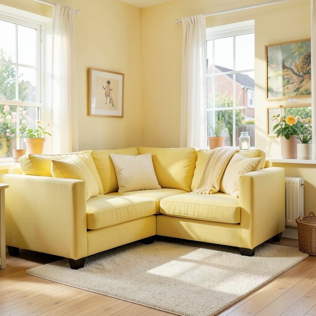
Sunbeam yellow looks like late-morning light caught inside your walls. It feels cheerful, friendly, and instantly awake.
Try it in a kitchen, breakfast nook, or hallway where people pass through often. Keep the walls fairly soft in tone so it stays sunny without becoming loud. Pair it with white trim and warm wood for a cozy balance. Add a yellow throw pillow or a ceramic vase to test the vibe before painting.
2. Peachy Apricot
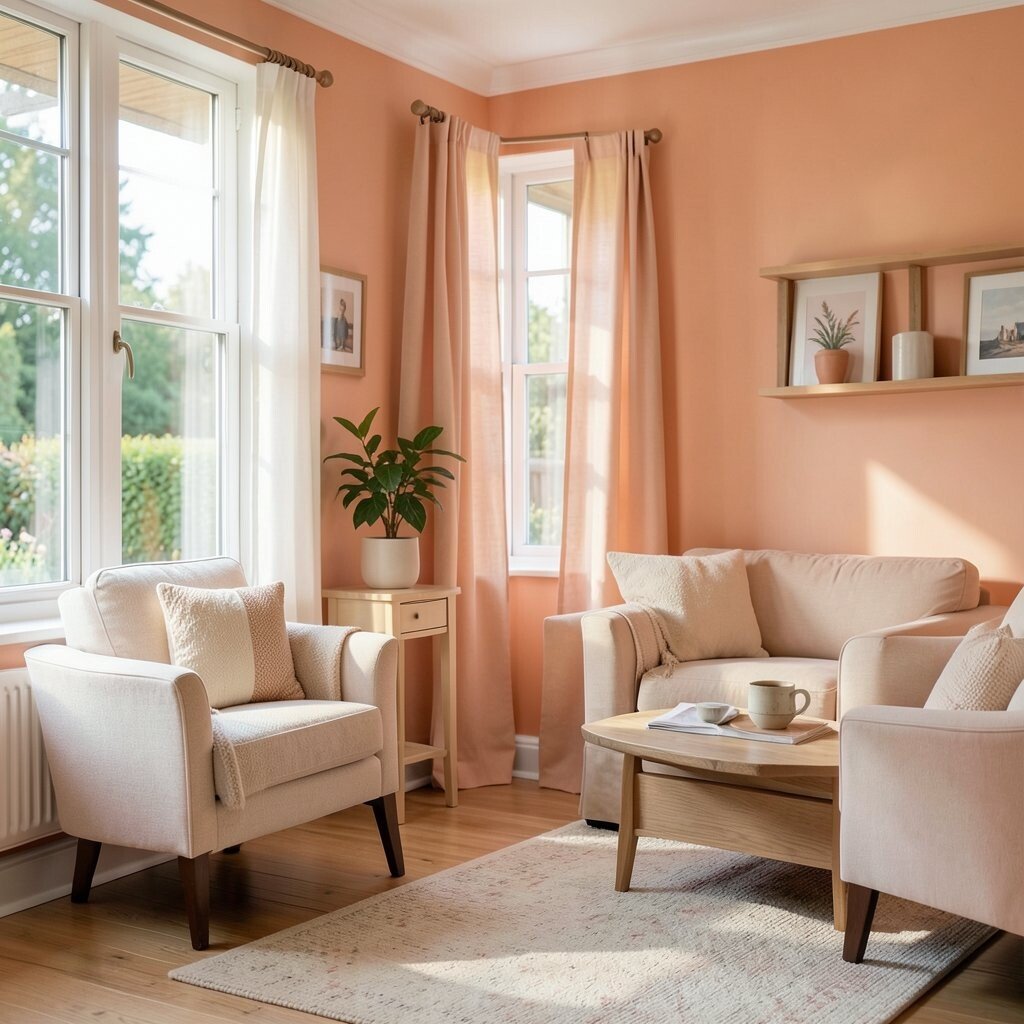
Peachy apricot brings gentle warmth that flatters skin tones and makes spaces feel welcoming. It sits between pink and orange, so it feels playful without being too energetic.
Use it in a living room to make conversations feel easy. Accent with cream, light gray, or natural rattan to keep the palette calm. This shade is also a great match for current soft-terra trends and vintage-inspired decor.
For practicality, consider painting just one wall or using it on cabinetry doors. Matte paint hides small wall flaws, which helps on older surfaces. If you want lower cost, swap in peach artwork, curtains, or a lamp shade instead of full repainting.
3. Cornflower Blue
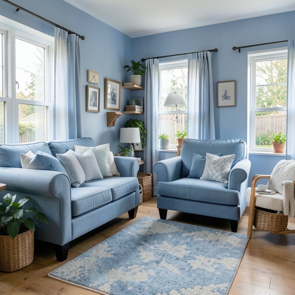
Cornflower blue has a crisp, sky-like clarity that makes rooms feel brighter. It adds a calm mood while still feeling lively and fresh.
Paint a bedroom wall cornflower blue to create a soothing place to unwind. Pair it with crisp white bedding and light oak furniture for a clean look. To make it more personal, add small touches of navy in frames or a patterned rug.
If you want an easy start, choose blue-blue-toned accessories first. Blue also photographs beautifully, so it can lift your whole room’s visual feel. Consider a washable paint if the room gets daily use or kids hang around there.
4. Sage Green
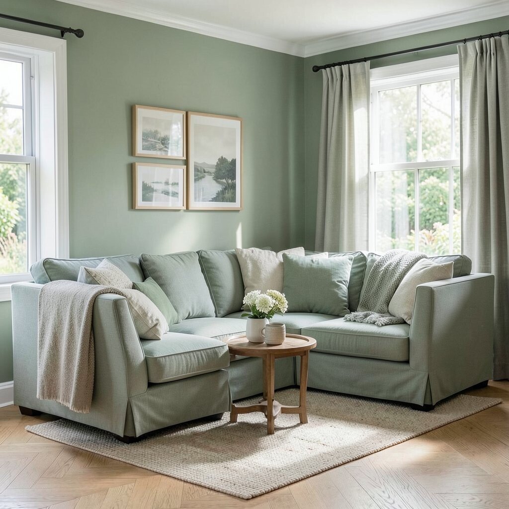
Sage green feels like fresh air through a window. It softens bold furniture and makes even plain rooms look cared for.
It works especially well in kitchens, bathrooms, and home offices. The current trend toward organic, nature-minded palettes makes sage feel very “now.” For a practical approach, try sage on lower cabinets or on a single accent wall.
5. Rose Blush
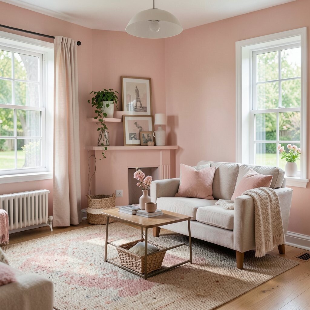
Rose blush gives your home a gentle glow and a touch of romance. It feels sweet and modern when used in the right amount.
Try blush in a bedroom, reading corner, or dressing area where you want a soothing mood. Pair it with warm whites and brushed gold to keep it elegant. For a unique look, mix blush with deeper tones like muted plum in small decor pieces.
If you worry about the color feeling too pink, choose a dusty or muted blush. Paint can be more budget-friendly than you think when you do one room or focus on trim. You can also use removable wallpaper behind a desk for a low-commitment boost.
6. Classic Sea Glass
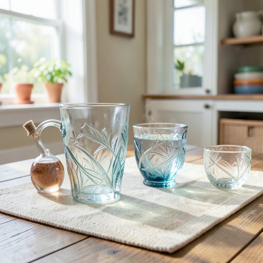
Sea glass color looks cool and refreshing, like waves meeting light. It brings a clean, breezy feeling that makes spaces seem bigger.
Use sea glass in a bathroom or laundry room to create a spa-like mood. Pair it with white tile accents and pale wood for a bright, airy result. It also blends well with minimalist decor and soft coastal vibes.
For personalization, add artwork with shells, abstract lines, or ocean gradients. If you’re keeping costs down, try painting only cabinets or adding a sea glass backsplash in a small area. A washable eggshell finish helps surfaces look neat even with splashes.
7. Terracotta Clay
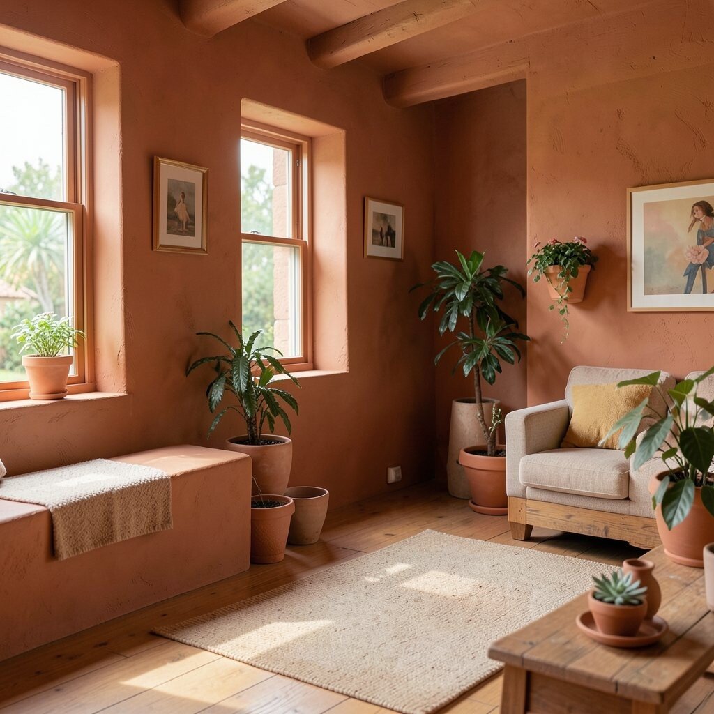
Terracotta clay is warm, earthy, and full of character. It makes walls feel grounded and stylish at the same time.
This color is perfect for living rooms, entryways, and dining spaces where you want warmth. Pair it with cream, olive, or dark bronze hardware for a rich look. Right now, earthy tones are trending because they feel natural and comforting.
To personalize, match terracotta with patterns like woven baskets, Moroccan-style tiles, or artisanal ceramics. Keep it practical by using it as a feature wall, since full coverage can be a bold step. If you want a lighter cost option, choose terracotta paint for shelves or picture frames instead.
8. Deep Teal
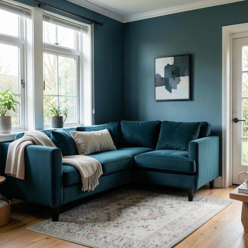
Deep teal feels confident and cozy, like a candlelit corner with good conversation. It can make neutral furniture look more expensive.
Use deep teal in a study, dining room, or hallway to add depth. Pair it with soft beige, brass, and dark wood for a rich contrast. For an easy win, paint built-ins or a media console, then keep the rest of the walls in warm white.
9. Bright Coral
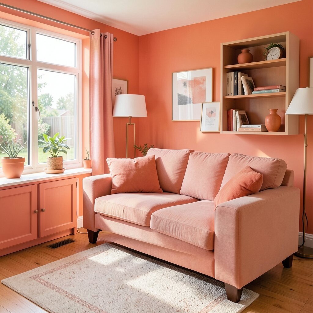
Bright coral adds energy without turning into neon. It’s playful, warm, and great for creating a happy first impression.
Try coral in a kids’ room, playroom, or sunny breakfast space. Pair it with white and light gray so it stays fresh and easy on the eyes. A coral accent rug or curtain can give you the color pop without major work.
For cost considerations, consider painting just a small wall or adding coral on cabinet interiors. If you choose coral paint, a satin finish can make small scuffs easier to wipe. Personalize by mixing in patterns like stripes, polka dots, or modern geometric prints.
10. Warm Butterscotch
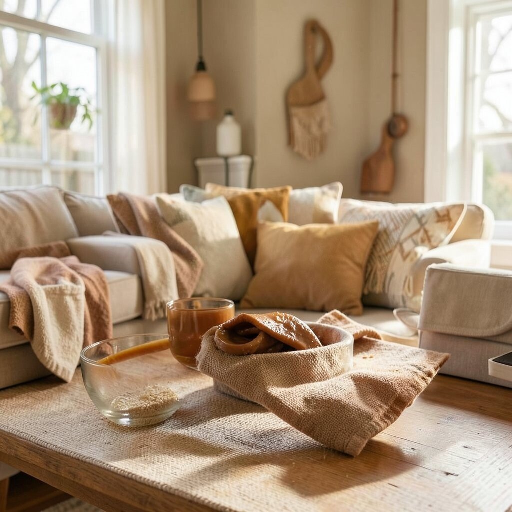
Warm butterscotch feels like a cozy evening even during the day. It’s slightly darker than yellow, so it looks richer and more grown-up.
It works beautifully in kitchens, dining rooms, and mudrooms where you want a welcoming vibe. Pair it with chocolate brown accents, cream textiles, and black metal fixtures for a stylish contrast. If you want a trend that fits right in, this shade pairs nicely with vintage-inspired lighting and natural materials.
11. Soft Lavender
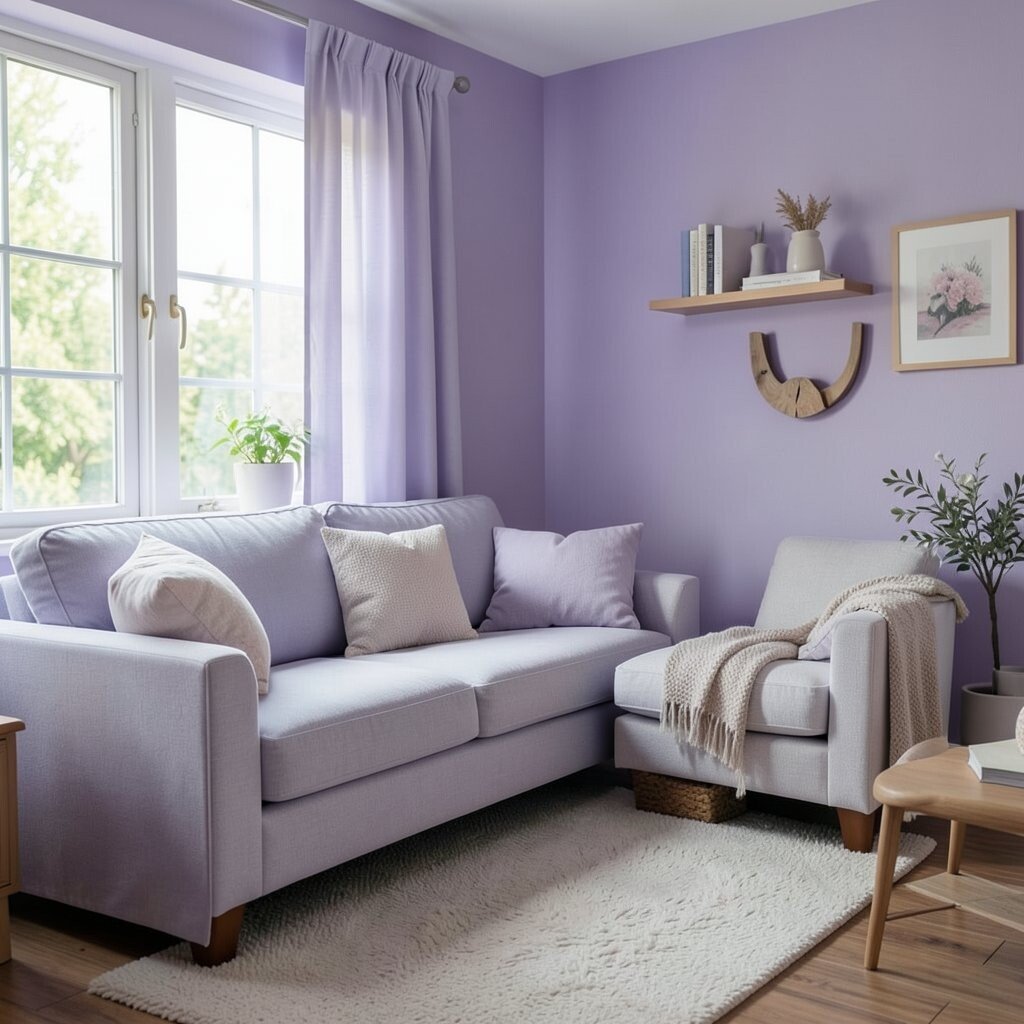
Soft lavender feels calm, creative, and gently whimsical. It can make a room feel like a peaceful studio.
Use it in a guest room, creative space, or bathroom where you want a restful tone. Pair it with white, light gray, and natural wood so it doesn’t overpower the room. For uniqueness, try lavender with small hints of sage or dusty blue in decor.
If you want practical results, choose a light lavender that stays airy. Washability matters in bathrooms, so pick a durable paint finish. You can also add lavender through bedding, art prints, and simple vases for a lower-cost update.
12. Butter Cream White

Butter cream white is not plain white, and that’s the magic. It has a subtle warmth that makes rooms feel cozy instead of sterile.
Choose butter cream for ceilings, walls, or trim when you want a fresh look without strong color. It pairs with almost everything, especially warm woods, beige fabrics, and soft greens. This shade also helps colorful accents look more balanced.
13. Charcoal Smoke
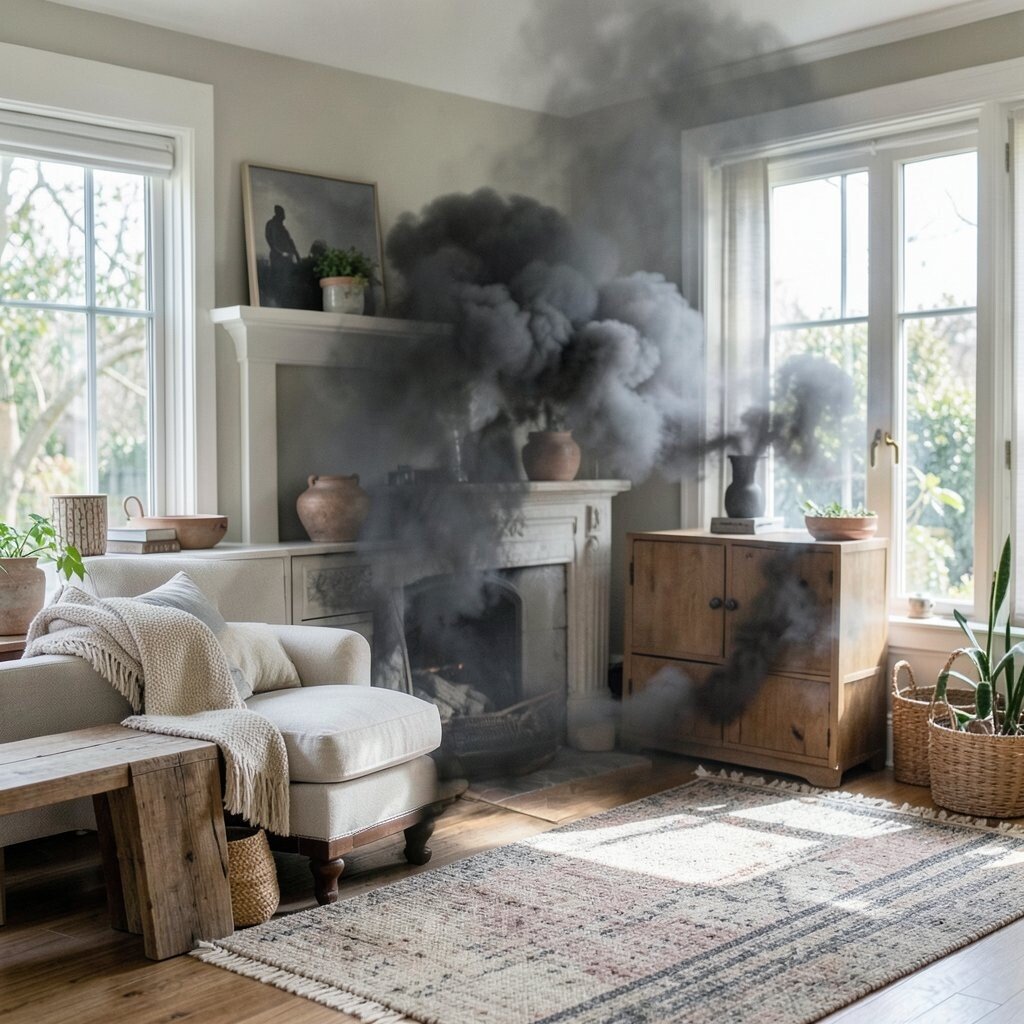
Charcoal smoke might sound dark, but it can brighten a room in a surprising way. It adds contrast that makes lighter colors stand out.
Use charcoal on an accent wall, fireplace surround, or front door for dramatic curb appeal. Pair it with crisp white, bright art, and warm metallics for a modern vibe. This is a great current trend move when you want bold style without colorful chaos.
For cost, painting just one feature can be budget-friendly and still make a big impact. If you’re nervous about darkness, start with charcoal on cabinets or shelving. Personalize with colorful accessories like bright books, colorful ceramics, or a patterned cushion.
14. Golden Honey
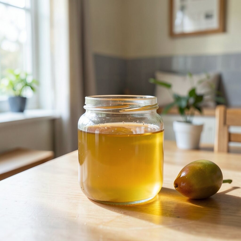
Golden honey feels like warm sunlight on the floor. It gives a room optimism and makes everyday items look more cheerful.
Try honey tones in kitchens, dining areas, or entryways where people gather. Pair it with soft white, tan, and dark walnut for a rich, inviting look. You can keep it unique by adding honey accents through lighting, hardware, and artwork.
If you want practical control, use honey as a backsplash color, on a single wall, or on trim. A semi-gloss finish can handle splashes in kitchens better. For lower cost, swap in honey-colored curtains, a rug, or a set of mugs.
15. Berry Jam Purple
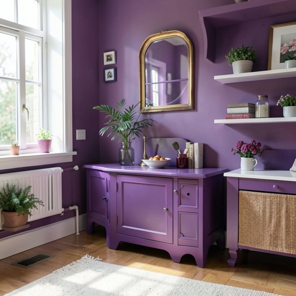
Berry jam purple is bold, joyful, and full of personality. It can make a room feel creative and slightly magical.
Use berry purple in a dining room, reading nook, or behind a desk. Pair it with neutral furniture like cream and light wood so the color feels intentional, not overwhelming. A touch of black and gold can make it look especially trendy.
For personalization, add patterns like botanical prints or abstract art with similar tones. Practical tip: consider painting only one wall or using it on bookshelves. Cost can stay manageable when you choose removable peel-and-stick decor for the first try.
16. Leafy Olive

Leafy olive brings calm confidence and natural charm. It feels grounded, but still soft enough for everyday life.
It’s great for living rooms, bedrooms, and even a home office. Pair olive with warm creams, cognac leather, and light gray accents to keep the palette balanced. Current trends favor these nature-inspired greens because they feel timeless and soothing.
For practical steps, try olive on lower walls, cabinets, or a cozy window seat. If you want a unique touch, add olive with subtle pink or mustard accents to create friendly contrast. Keep costs in check by using paint in one main area and repeating the shade through smaller decor items.
17. Ocean Blue Gray

Ocean blue gray is like the color of a cloudy seascape. It feels cool and calming, yet still bright enough to energize your day.
Use it in bedrooms, hallways, and family rooms where you want a gentle backdrop. Pair it with white trim, pale wood, and simple linen textures for an airy look. Personalize it by adding accents in coral, yellow, or deep teal.
To stay practical, choose a durable paint finish that handles frequent cleaning. This shade also works well with current modern farmhouse styling, especially when paired with warm light fixtures. If you want lower cost, paint just the doors or use blue-gray on a media console.
18. Bright White with Soft Gray Undertone
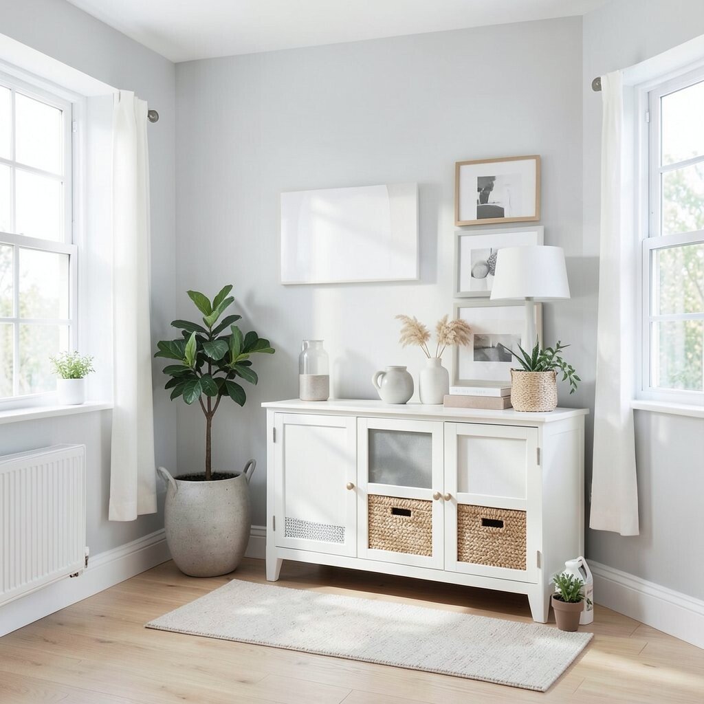
This kind of bright white keeps everything feeling light and open. The soft gray undertone helps it blend smoothly with metals and modern lighting.
Use it when you want color, but not immediately on the whole room. It’s perfect for walls while you add joyful color through rugs, pillows, and art. This approach keeps the look flexible, especially if you like changing seasonal decor.
19. Electric Lime Pop
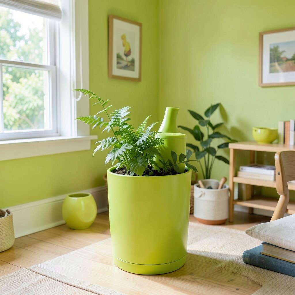
Electric lime is a little daring, and that’s what makes it fun. It adds a burst of excitement that makes neutral rooms feel alive.
Use it sparingly in a home office, kids’ room, or craft area. Pair lime with white, black, and gray for a graphic look that feels current. For uniqueness, try it in one lamp shade, a chair accent, or a bold vase.
Because it’s strong, practical tip is to balance it with calm colors and plenty of light. Lime also looks amazing with natural textures like rattan and light wood. For cost considerations, removable wall decals or a small painted frame can deliver the punch without a big budget.
20. Chocolate Walnut Brown
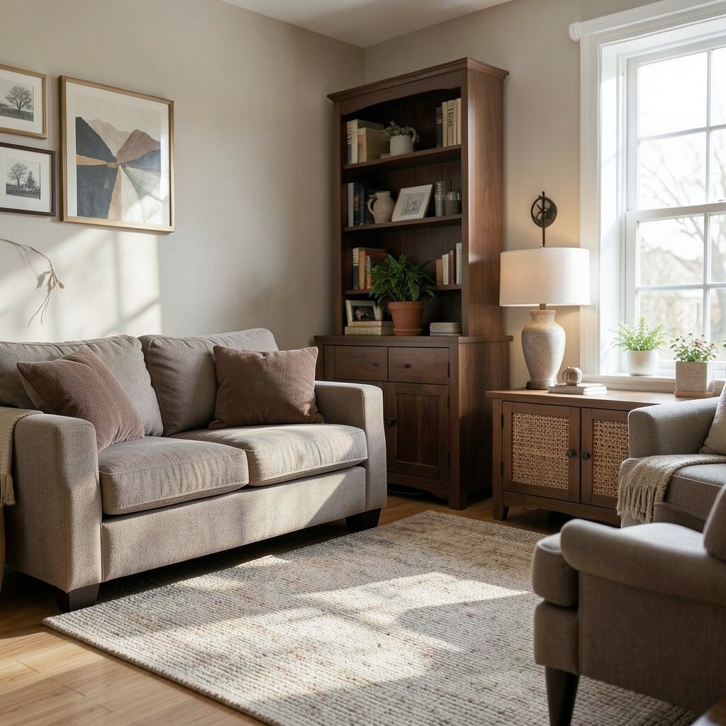
Chocolate walnut brown brings cozy depth that feels like a warm blanket. It can make a space feel steady, calm, and welcoming.
Try it on built-ins, accent cabinets, or trim for a rich, layered look. Pair it with cream, caramel, and soft blues to create joyful contrast. This shade is unique because it works as both a neutral and a style statement.
If you’re thinking practical, choose satin or semi-gloss for surfaces that get handled often. It hides fingerprints better than bright colors, which is great for busy homes. For lower cost, update knobs, switch plates, and picture frames in a walnut finish rather than repainting everything.
21. Fresh Mint Twist
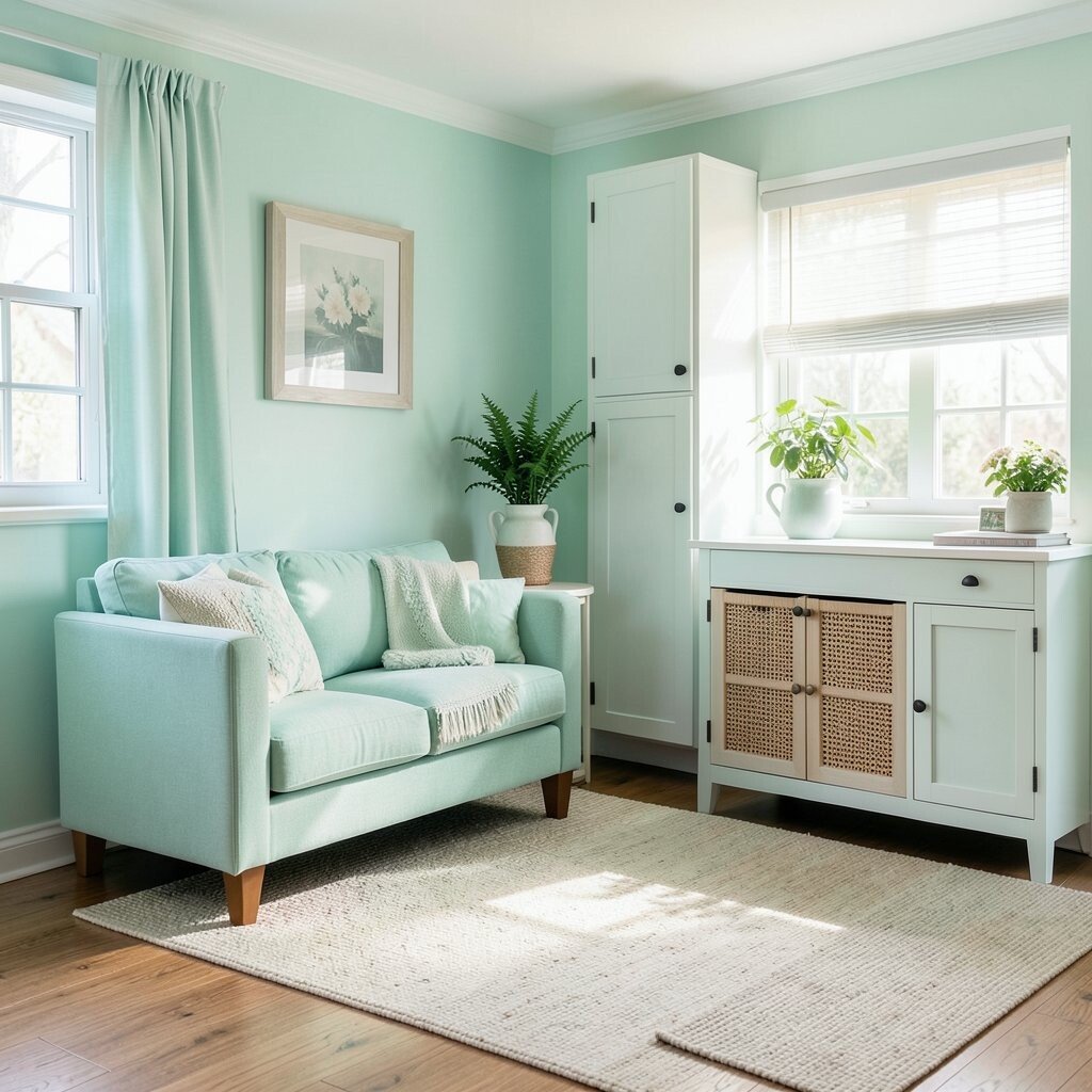
Fresh mint twist feels light, playful, and easygoing. It gives your room a clean, friendly energy that feels great in everyday life.
Use mint in bathrooms, kitchens, or a bright laundry corner where you want a little lift. Pair it with white tile, light wood, and soft gold hardware for a crisp finish. For personalization, blend mint with navy patterns or coral accents to keep the look joyful and modern.
To keep it practical, consider mint on cabinets, doors, or a narrow accent wall. A washable paint finish helps in spaces that see frequent cleaning. If you want a budget-friendly path, try mint through curtains, a rug, or small art pieces first.