
Plain walls can feel heavy, even in a sunny room. A fresh coat can make your home feel lighter and more you.
1. Sunny Citrus Accent Wall
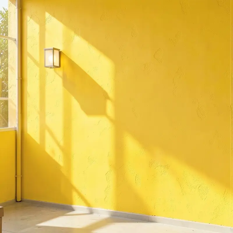
Pick a bright citrus shade that reminds you of fresh fruit and warm afternoons. Paint just one wall so the room still feels open while that color brings instant energy.
For a clean look, use painter’s tape and roll on two even coats, then add a thin brush line for crisp edges. Pair the wall with soft white curtains, light wood furniture, and gold or brass frames to keep the vibe cheerful instead of loud.
2. Soft Blush With Tonal Layers
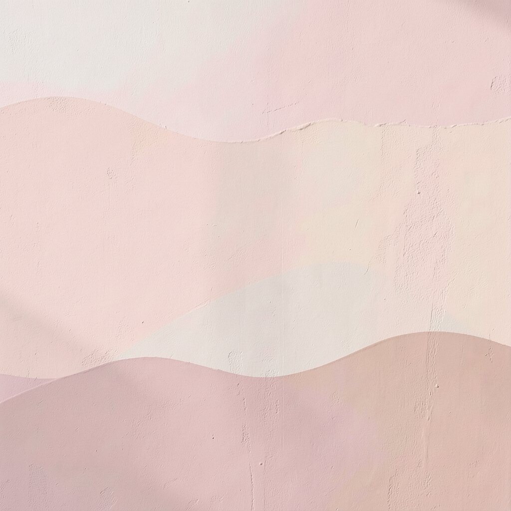
Choose a blush pink that feels gentle, not candy-sweet. It flatters skin tones and works beautifully in bedrooms, reading nooks, and calm living rooms.
To make it feel custom, paint the main wall blush, then add a lighter or deeper blush around trim, shelves, or the area behind a headboard. Use satin or eggshell paint so the color glows without looking shiny, and keep décor airy with linen textures.
Small upgrades like a blush throw pillow, a ceramic lamp, or botanical art can make the wall feel finished. If you want budget control, focus your darker-toned paint on only one section so the rest stays simple and easy to maintain.
3. Coastal Waves in Gentle Blue
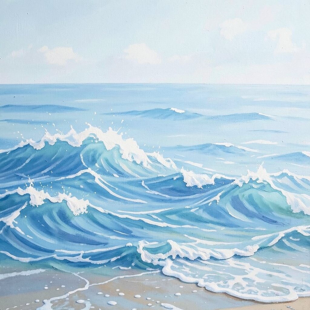
Let your walls feel like a breezy shoreline by using pale blues and muted seafoam tones. Swirling wave patterns bring movement to a room without needing expensive décor.
Try a sponge technique or a simple stencil for repeating wave lines across one or two walls. Keep the pattern airy with lots of breathing space between shapes so the room doesn’t feel crowded.
Waves can also help a space feel bigger because your eye keeps traveling across the design. Combine this look with white bedding, natural fiber rugs, and dark navy accents for balance.
4. Gallery-Ready Neutral With Paintable Backdrops
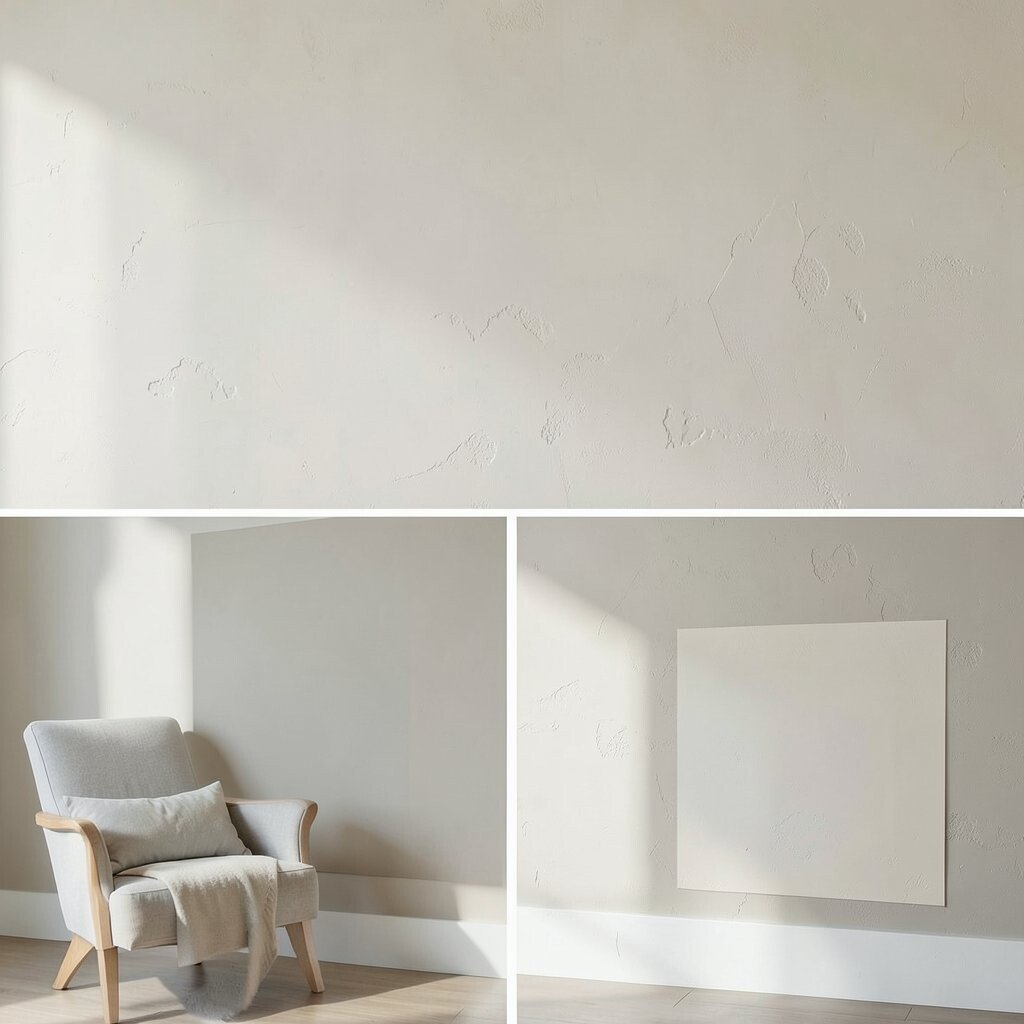
If you love art and photos, give them a calm stage. A warm greige or creamy beige makes colors pop while still feeling cozy.
Paint the wall behind your largest pieces slightly more muted than the surrounding walls. That tiny shift helps the art stand out and makes hanging frames easier because the background stays steady.
5. Deep Emerald for Instant Drama
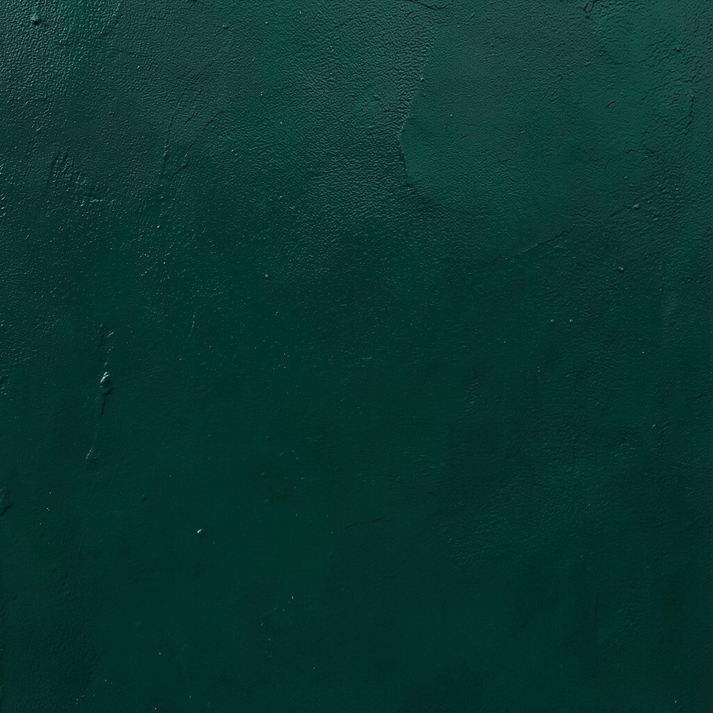
Emerald green feels bold, rich, and surprisingly welcoming when used thoughtfully. It turns an ordinary room into something that feels styled on purpose.
Go for deep emerald on a single wall or the wall behind a desk to add focus. Keep the rest of the space light with off-white paint, warm metals, and light-colored curtains.
For a practical approach, use painter’s plastic to protect floors and paint in sections so you can keep a consistent finish. Consider semi-gloss on trim or doors to reflect light and make the emerald look even deeper.
6. Bright Checkerboard for a Playful Corner

A checkerboard wall can make a hallway or kid-friendly space feel lively right away. Use two colors that both feel sunny, like warm white and soft mustard, for a modern twist.
Map your grid carefully with a level and tape, then paint squares in a steady rhythm. If you want it to look polished, allow each color to dry fully before removing tape.
This design is unique because you’re not just adding color, you’re adding rhythm. Balance it with solid-colored furniture and simple patterned-free textiles so the wall stays the main event.
7. Vertical Stripe Illusion for Taller Walls

Vertical stripes can make ceilings feel higher, especially in compact rooms. Choose thin lines for a classy look or thicker stripes for a more graphic feel.
Paint two or three shades that relate to each other, like warm white and pale sand, rather than high-contrast colors. The result looks tailored and helps your layout feel more spacious.
8. Sunset Gradient From Warm to Cool

A gradient wall brings a dreamy, sunset-like glow that changes how a room feels. Start with warmer tones near the bottom and fade into cooler tones near the top.
Use a sponge, rag technique, or a soft-brush blend to fade between colors without harsh lines. Keep the transitions smooth by working in small sections and maintaining the same brush direction.
This effect feels special because the wall looks different throughout the day as lighting shifts. Pair it with warm lighting, like amber bulbs, for extra cozy vibes.
9. Statement Murals With Peel-and-Stick Options

If you want a mural look without permanent commitment, consider peel-and-stick wall art panels. Many styles mimic hand-painted scenes like arches, botanical prints, or faux tiles.
Pick one focal area, such as above a console or behind a reading chair, so the design feels intentional. The practical win is that you can swap it later if your taste changes.
Choose colors that match your existing furniture to keep the room from feeling mismatched. This route can be cost-friendly compared with full mural painting, and it’s also great for renters.
10. Limewash Look for Soft Texture

Limewash-style paint adds a chalky, naturally mottled finish that looks classy and lived-in. It’s perfect for making walls feel airy while keeping them interesting up close.
To get the best texture, apply with a brush in loose strokes and lightly vary pressure. Some limewash products are designed for easy layering, so you can deepen the color gradually.
11. Vintage Stencil Pattern on a White Base
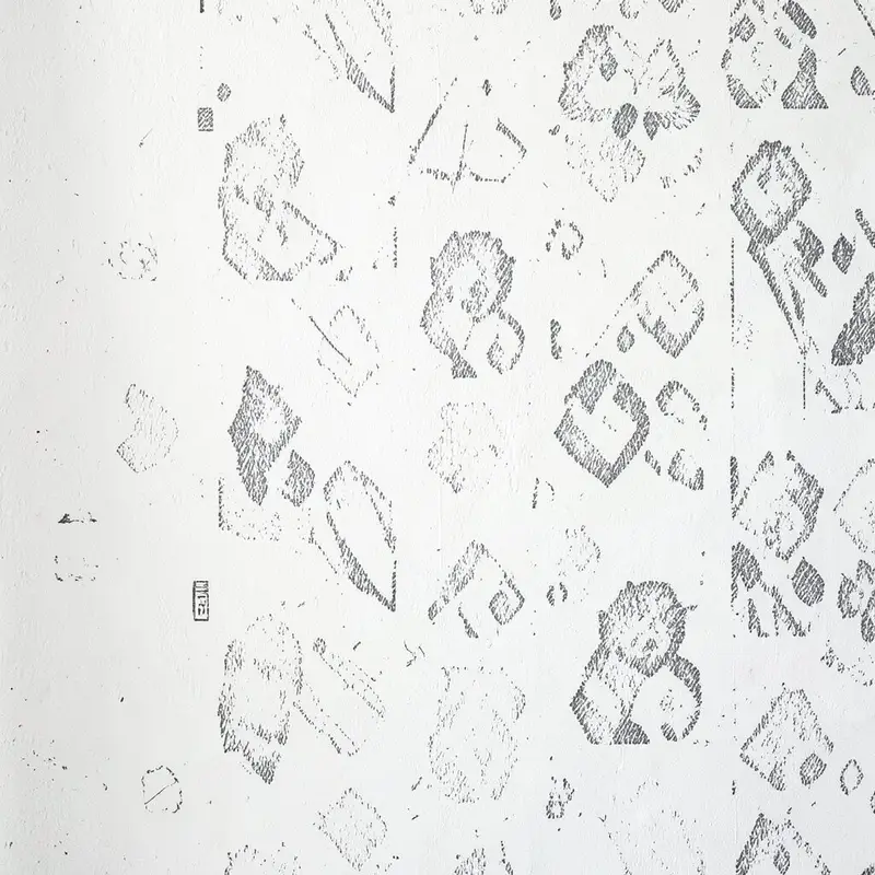
Stenciling over a crisp white wall can give your space the charm of older homes. Choose patterns like subtle medallions, small florals, or geometric repeats for a clean look.
Use a guide sheet or painter’s tape marks to keep the stencil aligned. Build up color slowly so you avoid messy overspray or uneven coverage.
This idea feels unique because the wall becomes decorative without needing large art pieces. It also works with many styles, from farmhouse to modern, as long as your stencil scale fits the room size.
12. Monochrome Charcoal With Bright Trim
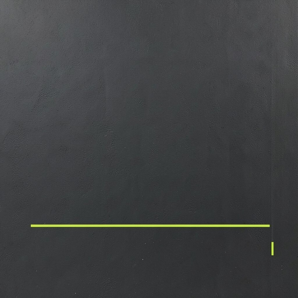
Paint one wall in charcoal and keep doors, baseboards, and shelves bright for contrast. The deep color creates drama, while the trim keeps everything looking sharp and tidy.
When you use charcoal, lighting matters, so add warm lamps or a bright ceiling fixture. You can also paint your interior shelves or built-ins the same charcoal for a cohesive look that feels expensive.
13. Pastel Ombre Behind a Bed or Sofa

Pastel ombre looks soft and calming, especially in bedrooms and cozy living rooms. Choose two or three gentle shades and make them blend gradually, like cotton candy fading into cream.
Mask off the area behind your bed or sofa so the design stays focused and doesn’t overpower the whole room. Blend with a damp sponge for smoother transitions and to avoid visible brush marks.
This approach feels personal because you can tailor the exact colors to your bedding and rug palette. Keep the cost manageable by painting a smaller section rather than entire walls.
14. Faux Tile Lines With Paint and Tape
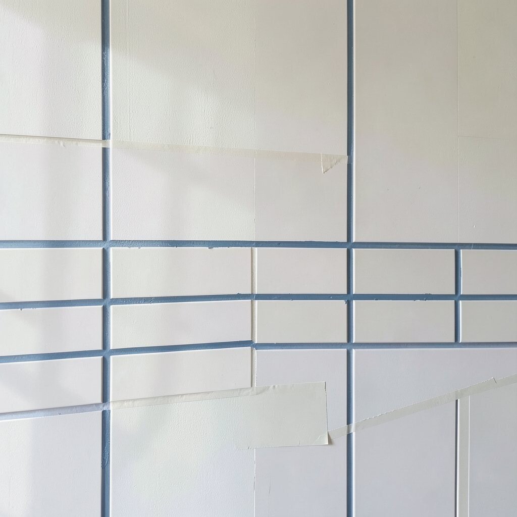
You can create a tile-inspired wall using simple paint and careful tape work. It’s a fun way to get the look of expensive materials in a fraction of the effort.
Plan your tile size first, then mask lines and paint grout-colored spaces, followed by tile panels. Keep the palette cohesive by choosing colors that match your floor or countertop tones.
This style is practical because it’s mostly straight lines, so it’s easier to fix mistakes early. Use a satin finish for a smoother surface that wipes clean, especially in entryways or kitchens.
15. Bold Color Blocking Around Windows and Doors

Color blocking turns plain architecture into a design feature. Paint sections around windows, doors, or a stair wall so the space looks structured and intentional.
Use a mix of one bold color and one neutral to keep the design balanced. A smart approach is to follow existing lines like trim edges and ledges, which helps the eye move naturally through the room.
Because the design focuses on specific areas, it can be budget-friendly even if you choose a premium paint for the main color. Add matching accessories like a rug pattern or throw blanket to tie it all together.
16. Earthy Terracotta With Warm Accents
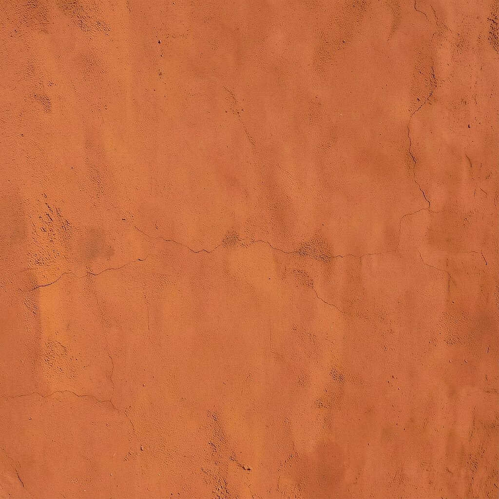
Terracotta walls bring warmth like a sunbaked courtyard. It looks especially beautiful in spaces with natural materials such as wood, rattan, and stone.
Paint an accent wall terracotta and balance it with creamy whites, olive greens, and rich browns. For a modern twist, keep your décor minimal and use one or two large textured pieces instead of many small items.
This idea is unique because terracotta feels both rustic and stylish at the same time. If you’re watching costs, buy one main color in your favorite shade and use neutral paint for the rest of the room.
17. Soft Pastel Polka Dots for a Cute Pop
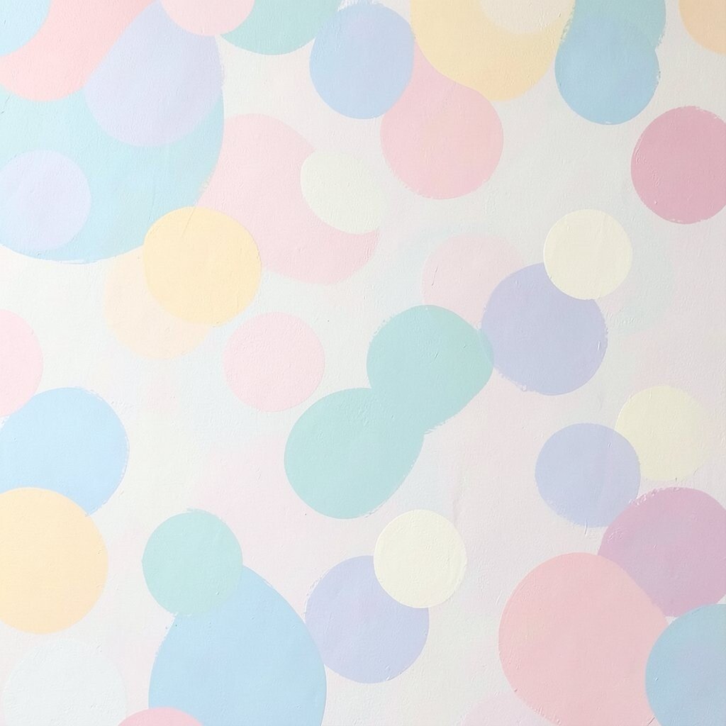
Polka dots can brighten a room in an instant, especially in playrooms, hallways, and powder rooms. Choose small dots for a classy look or medium dots for a more playful mood.
Use a dot stencil or a craft brush with a steady hand, and test your dot size on scrap cardboard first. Paint in light layers so the dots look crisp instead of lumpy.
This design feels actionable because you can tailor it easily around furniture and door swings. Pair it with simple frames and solid textiles so the dots stay the fun focus.
18. Artful Color Wash With Rag Blending

A color wash adds gentle variation, like sunlight moving across fabric. It’s a great choice if you want color but prefer a softer, less solid look.
Apply a base coat, then layer a diluted paint wash and blend with a rag in circular motions. Let some areas stay lighter so you get that airy, textured feel.
Color washes can make a room look professionally styled because they add depth without demanding complicated patterns. Keep your palette close to your existing décor by matching undertones, like warm creams with warm taupes.
19. Color-Blocked Wall Panels for a Modern Look
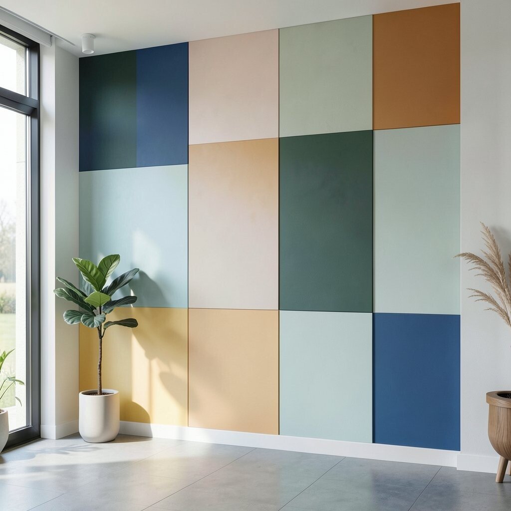
Create a modern vibe by painting geometric panels across a wall. Think of simple rectangles or staggered blocks that look neat and architectural.
Use painter’s tape to define clean edges, then paint each panel in a planned sequence so coverage stays even. It helps to start with lighter colors first, then move toward deeper shades.
This idea is unique because it turns a flat wall into a structured design element. To keep it practical, choose a limited palette and focus on one wall where the effect will be most noticeable.