
Your room can feel off even when you love every piece in it. The fix is often in how the space is arranged.
1. Furniture Anchors in the Wrong Place
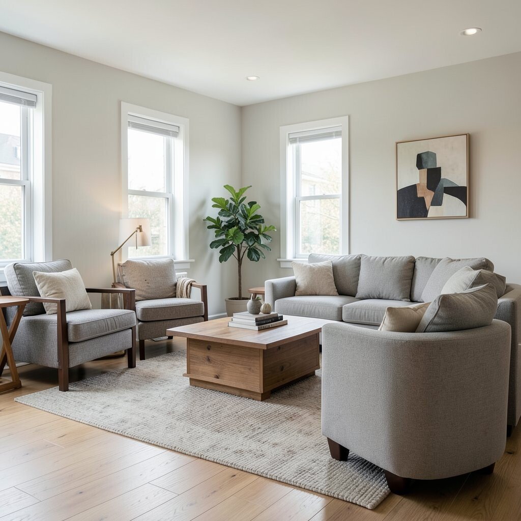
When your biggest furniture pieces float too far from the visual center, the room starts to feel restless. Try placing the sofa or bed so it clearly “owns” the main wall or focal area, and leave a little breathing space around it.
Watch for how the room looks from the doorway, not just from where you usually stand. A strong anchor helps traffic flow, makes the space look intentional, and improves how light and sightlines land on surfaces.
If you share the space, personalize the anchor by matching your rhythm to the main routine. For example, keep pathways wide for daily movement and add a rug that reaches under front legs to tie everything together.
2. Walking Paths That Fight Back
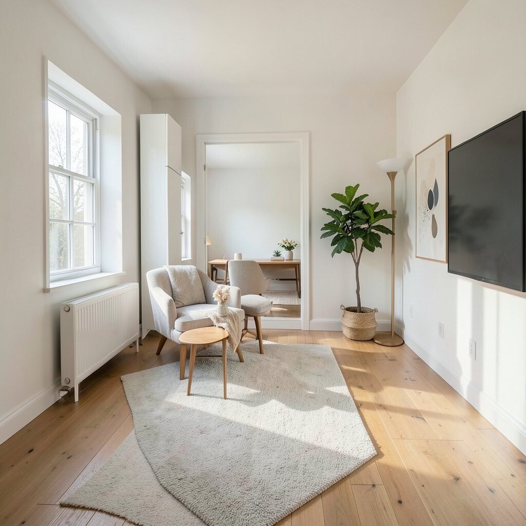
You may be squeezing by without realizing the room is making you do tiny detours. When chairs scrape or you step over cords, your layout is quietly exhausting you.
Clear paths should feel natural, with room to pass without sidestepping. Keep at least a simple lane between seating and doors, and adjust side tables so they don’t pinch the route.
Look at your day for a moment and picture where you move most. If you often walk from kitchen to living room, align seating to support that flow instead of blocking it.
3. Skipping the Rug Size That Controls Everything

A rug that’s too small makes the room look cut into pieces. It can also cause chairs to wobble and make the floor plan feel shaky.
Go bigger than you think for the main seating zone so the rug sits under key furniture. When the rug edges align with furniture, the room looks grounded, and you get a softer feel underfoot.
If budget is tight, start with the largest affordable option and place a smaller runner at a doorway first. Many people also upgrade in phases by layering a new rug over an older one to get that designer look without replacing everything at once.
4. Too Many Small Items With No Visual Pause
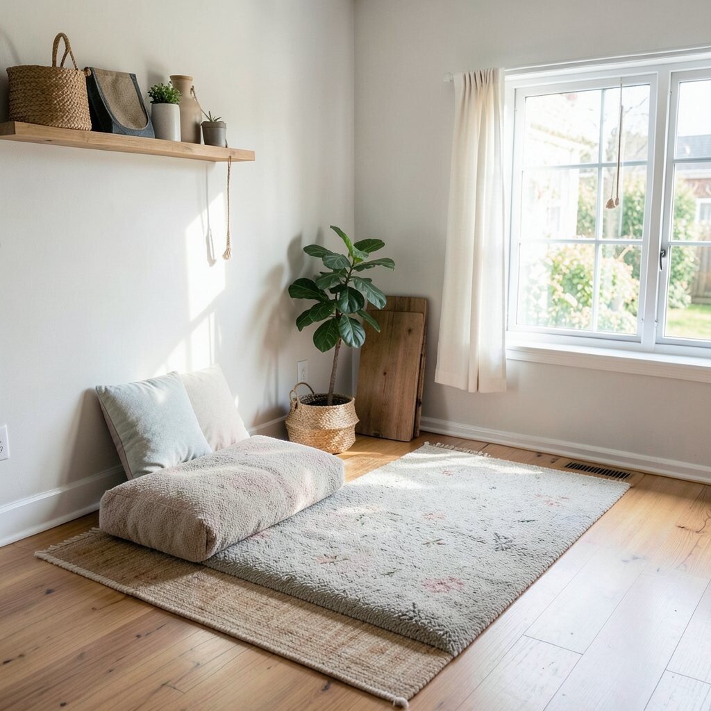
When shelves and surfaces overflow with tiny decor, your eyes never get to rest. The room can feel busy even if every item is pretty on its own.
Create visual pause with larger pieces and fewer groupings. A single bold art frame, a taller plant, or a lamp with a strong silhouette helps the space feel calmer and more focused.
Instead of spreading items everywhere, cluster them in places you naturally look at. That simple change makes the room feel unique, like it was styled on purpose rather than collected by accident.
5. Chairs That Don’t Face Real Conversation

If your seating faces the TV but not each other, the room loses its social energy. Even when you host friends, the layout can quietly push people into parallel lines.
Try angling a couple of chairs or using a sectional that forms a gentle “talking shape.” When people face one another, conversations start faster, and the room feels warmer.
Personalize by matching seating to how you actually hang out. If you love game nights, make sure there’s a clear center area for a table, snacks, or a place to set cards.
6. Overloading Walls With Furniture Instead of Space

When too many pieces hug the walls, the center feels empty while corners feel crowded. The room ends up looking imbalanced, like it’s missing a stage.
Pull some furniture slightly off the wall to create depth. This small shift adds visual layering, improves light reflection, and makes your room feel larger.
7. Blocking Natural Light With Tall Storage

It’s easy to place a tall cabinet where it seems convenient, then wonder why the room feels dim. Dark corners and heavy shadows can creep in, especially near windows.
Set taller furniture on one side and leave the window side lighter. If you need storage, choose open shelving or lighter finishes to keep air and brightness in the room.
Choose current trends like airy wire baskets, slim profile bookcases, or reclaimed wood tones. They can still store a lot, but they visually float, which feels modern and practical.
8. Ignoring How Door Swing Changes Everything

A beautiful layout fails when doors collide with furniture. You might not notice it at first, but you feel it every day when you rush through.
Test the door swing by moving it fully open and closed in your layout plan. Keep clearance for entry doors, closet doors, and even bathroom doors so hinges have room to move.
9. TV Placement That Forces Neck Strain

If viewers sit too far or the screen is too high, you’ll end up leaning forward. That makes the room feel uncomfortable even when the seating is otherwise perfect.
Center the TV at eye level when seated and check the viewing angle from multiple spots. A better angle improves comfort, reduces strain, and makes the setup feel intentional.
If you rent or can’t mount the TV, use a stable console and add small leveling adjustments with coasters. That keeps the screen stable and makes the room look tidy without big renovation costs.
10. Not Using Negative Space on Purpose
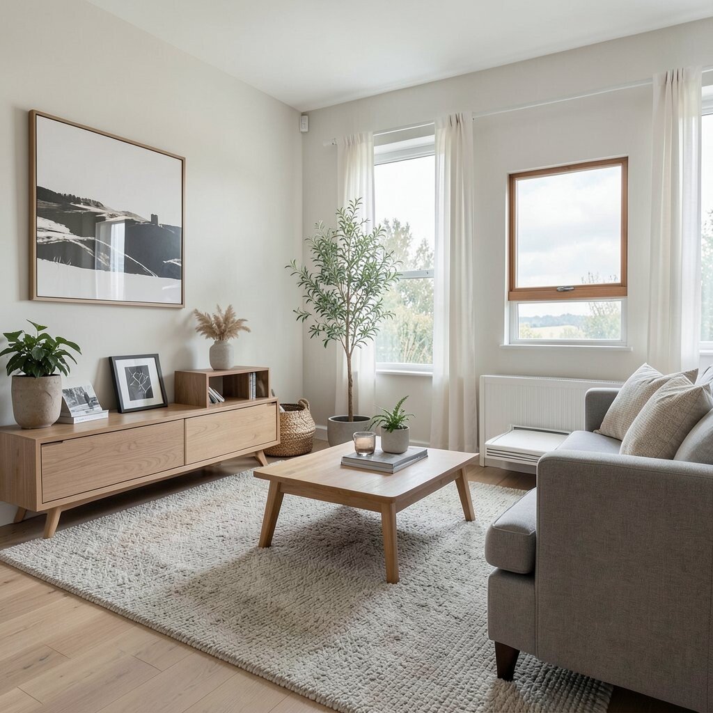
Negative space sounds fancy, but it’s really just the area that stays open. When you fill every inch, the room can look flat and hard to breathe in.
Leave small gaps around furniture and let one or two surfaces stay clear. This gives the eye a place to rest, and it makes the room feel more premium and less cluttered.
Personalize the open space by showing something meaningful in it, like a framed print or a sculptural lamp. Even simple choices create uniqueness because the room starts to reflect your taste instead of your storage.
11. Lighting Layering That Works Against You

One overhead bulb usually makes corners too dark and highlights glare on shiny surfaces. Rooms can look harsh when there’s no mix of light sources.
Use a blend of ambient, task, and accent lighting so the space feels even and cozy. Table lamps, floor lamps, and dimmable options help you set the mood with little effort.
Choose bulbs with warm tones for living areas and try adjustable lamp shades for a softer look. This keeps the room inviting and supports modern trends toward gentle, lived-in lighting.
12. Forgetting the Power of a Clear Entry Landing
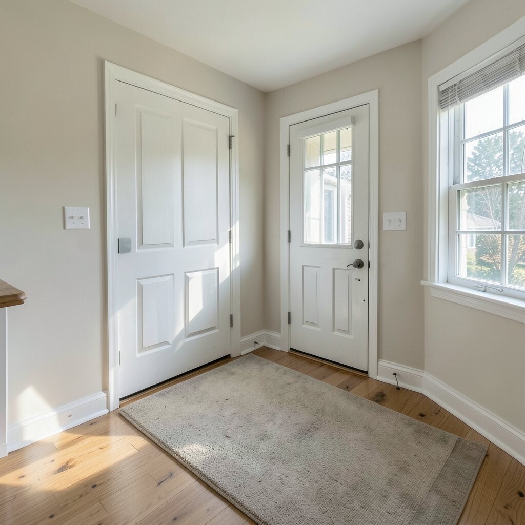
If your front entry dumps you into the room, it can feel chaotic. Shoes, bags, and keys may pile up because there’s no defined drop zone.
Create a small entry landing by placing a slim console, bench, or cabinet near the door. Add a tray for keys and a catch-all basket for daily items so the room starts organized.
Personalize with hooks or a small wall mirror that fits your style. Even a modest organizer makes your space feel more unique because it reflects how you live.
13. Bedside Tables Too Small or Too Big
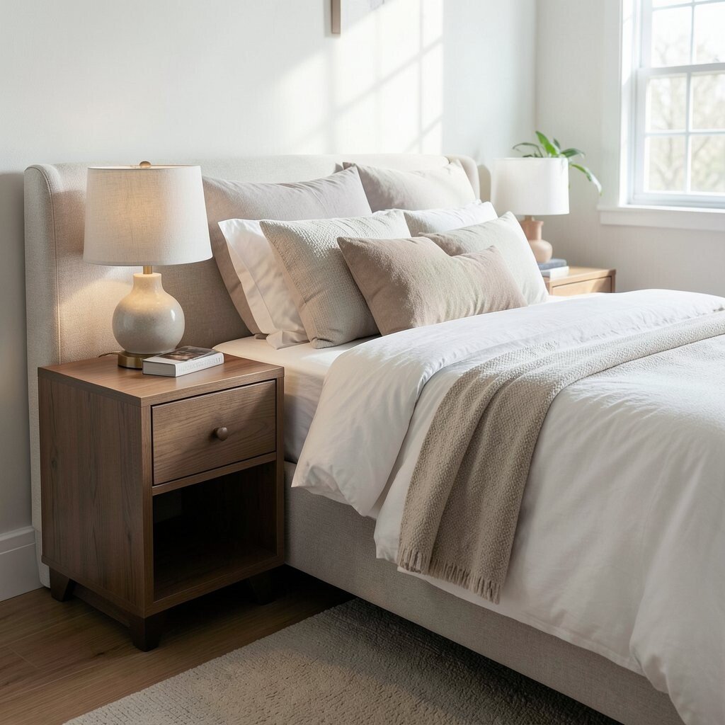
A bedside table that’s tiny can feel impractical, while an oversized one can crowd the walkway. Either way, your routine becomes harder when you reach for water, books, or a charger.
Match the table height to your mattress height so lamps and essentials sit where your hand naturally lands. Aim for enough space for daily items while keeping the path beside the bed comfortable.
If you’re working with a small budget, look for thrifted pieces with solid shelves. A quick paint refresh or new lamp shade can make it feel custom without buying everything new.
14. Storage That’s Hidden but Hard to Reach
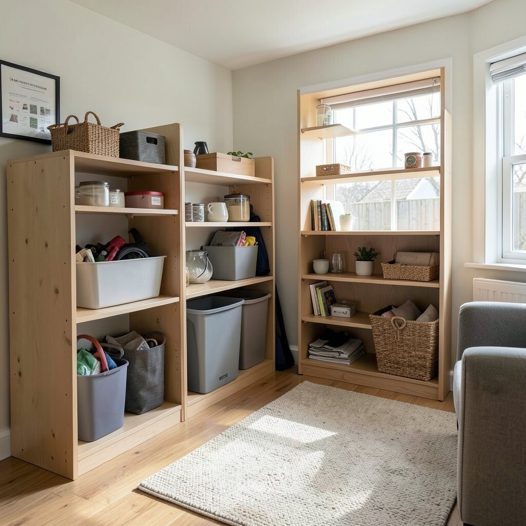
Closed storage is helpful, but only if you can grab things without turning your whole routine into a chore. When items hide behind doors or deep drawers, they often end up back on the floor.
Place the most used items where you can reach them easily at standing height or within arm’s length. Use labeled baskets or simple dividers so storage feels neat, not complicated.
Keep seasonal items in harder-to-reach spots, and keep everyday items front and center. This layout approach saves time, reduces clutter, and makes your room feel smoother day to day.
15. Dining Sets Without Enough Clearance
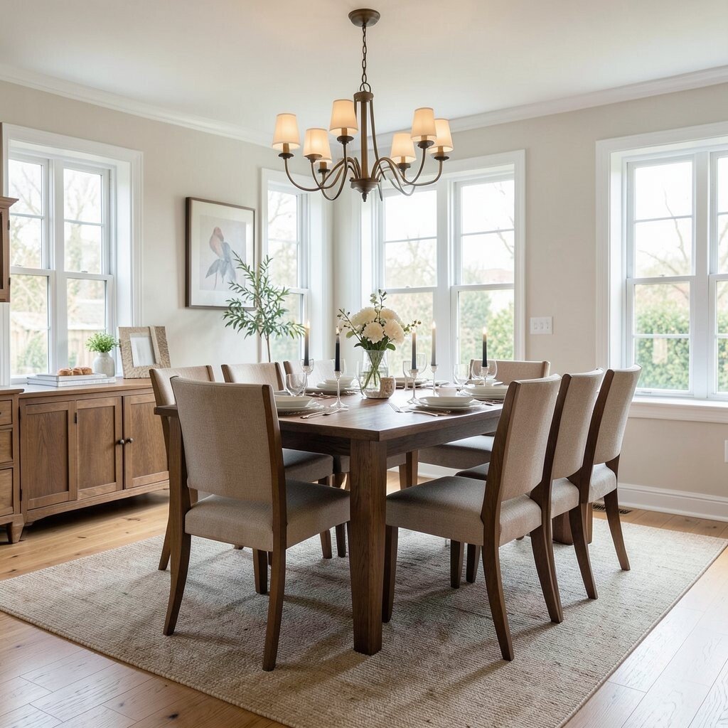
If chairs scrape or people squeeze around the table, the dining area stops feeling relaxing. Dinner should feel open, not like a game of careful angles.
Leave enough room for chairs to pull out comfortably. When the legs have clearance, you get easier movement, fewer scuffs, and a more elegant look.
Personalize by choosing table shapes that match your space, like a round table for tighter rooms. Round tables also create a friendlier vibe because everyone faces each other more naturally.
16. Corner Placement That Creates Dead Zones

Corners can become awkward storage pits if you place furniture there without a plan. The result is often wasted space that never gets used well.
Add a purpose to corners by placing a small chair, a reading lamp, or a corner shelf. When corners serve a job, the room feels complete and more like your home.
For a modern look, try floating shelves or a tall narrow plant stand. Small upgrades like these can be surprisingly affordable and still feel like a trend-forward choice.
17. Artwork Hung Without Considering Furniture Height
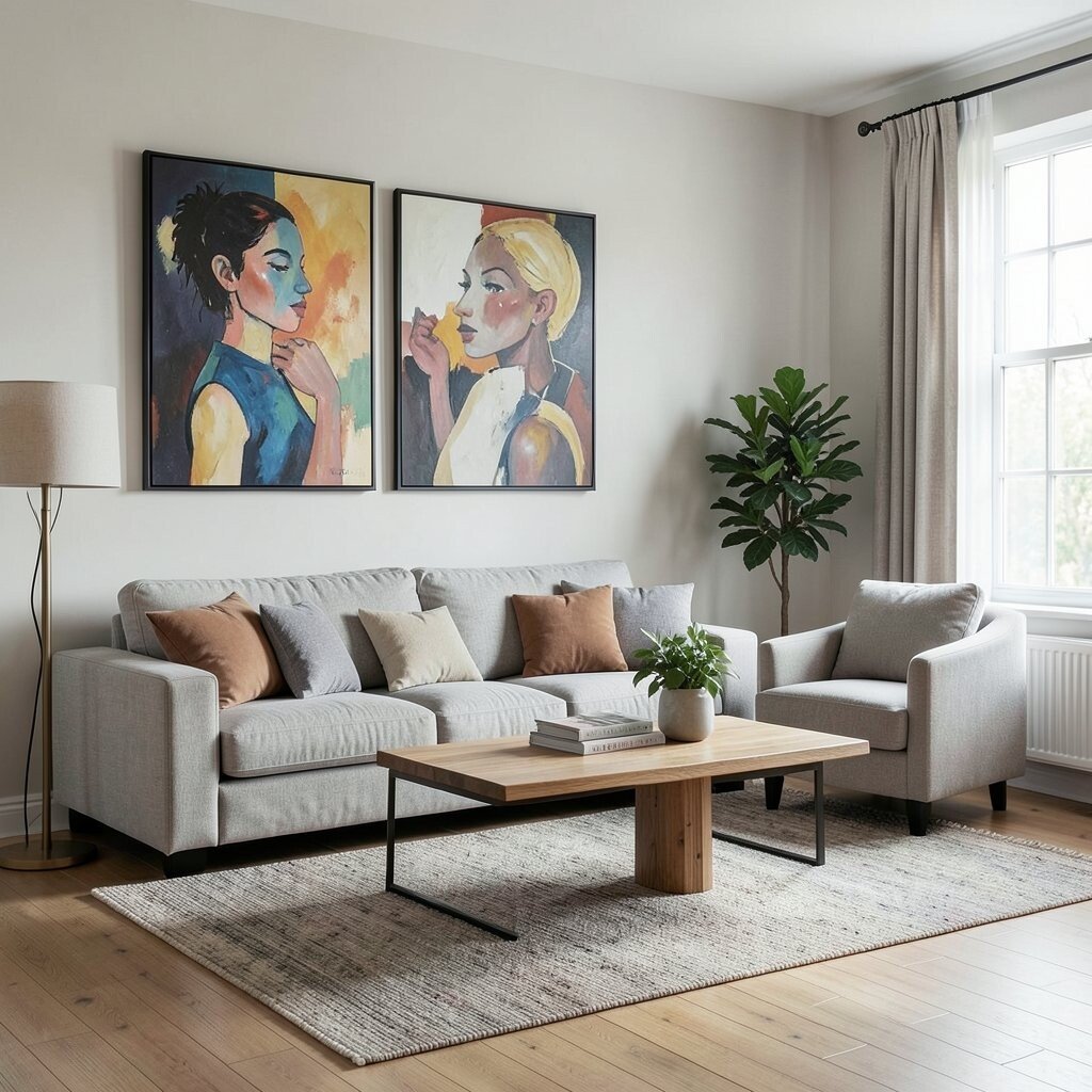
When wall art is too high or too low, it competes with furniture instead of complementing it. Even great prints can look “off” when the layout math isn’t right.
Hang art so its center aligns with the typical eye line when you’re seated. If you’re placing art above a sofa or console, consider the furniture height so the scale feels balanced.
Personalize with a gallery wall that mixes sizes, but keep spacing consistent. This gives a custom vibe while still keeping everything organized and visually clean.
18. Curtains That Don’t Reach Far Enough

Short curtains make windows look smaller and rooms feel unfinished. The window can look like it’s wearing clothes that don’t fit.
Hang curtains higher and extend them wider than the window frame. This adds height, makes the room feel taller, and improves privacy without extra cost.
Choose current trends like textured linen blends or soft, neutral tones. They bring warmth and calm, and they make a room feel more stylish even when the furniture stays the same.
19. Night Zones Without a Reading Route
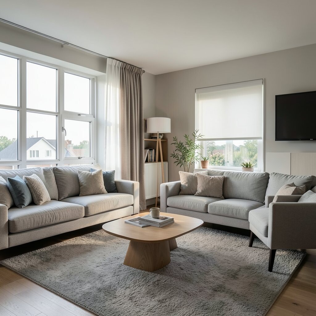
Sleeping spaces should support calm movement, but many rooms hide the reading or charging area. You might end up walking around clutter because there’s no clear spot to settle in.
Create a night zone with a clear path from bed to bathroom and a comfortable spot for reading. Add a small lamp, a book holder, and a charger spot near where you actually sit.
Personalize by choosing a tray for nighttime essentials so everything stays together. It’s a small change that reduces daily mess and makes the room feel like a retreat.
20. Mirrors Placed to Reflect Chaos

A mirror can brighten a room, but it can also reflect clutter and make it seem endless. If it catches stacks of items or messy corners, the space will feel busier than it is.
Place mirrors to reflect light, open areas, or a clean wall with art. When you choose the reflection carefully, the room feels bigger and calmer.
For uniqueness, pick a mirror with an interesting frame shape or material that matches your vibe. This keeps the upgrade feeling personal rather than purely practical.
21. Relying on One Statement Piece Without Support
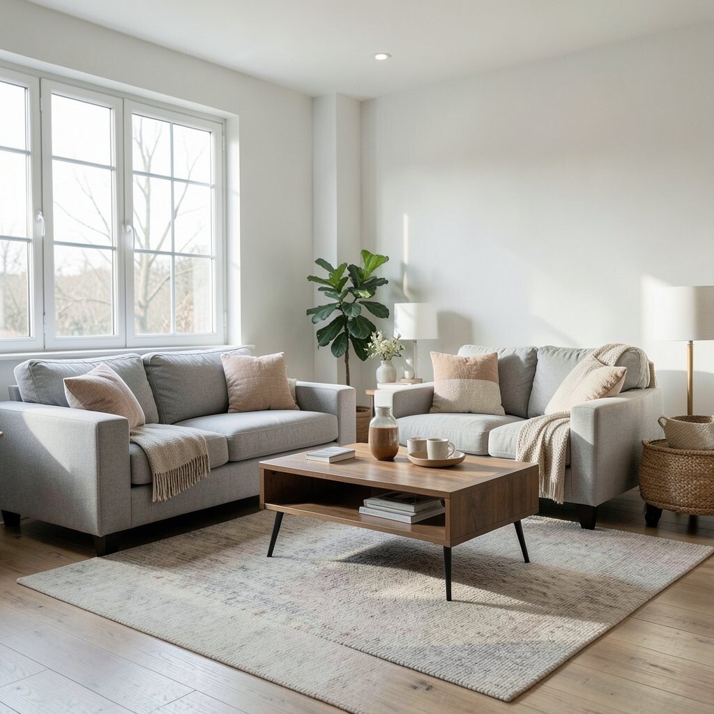
A bold chair, big rug, or dramatic lamp can look amazing, but it still needs surrounding support. If everything else feels random, the statement piece becomes lonely.
Build a layout that repeats colors, shapes, or materials in smaller ways. That makes the room look cohesive, improves visual rhythm, and helps the main piece feel like part of a plan.
Personalize by styling around what you love, such as adding two matching pillows, a similar wood tone, or coordinated frames. Even with a careful budget, repeating details makes the space look designer-level without buying everything at once.