
Calm colors make a room feel safer for your mind. When the palette feels right, even busy days slow down.
You can create that feeling in many ways, from gentle wall tones to soft accents that you can change anytime.
1. Foggy Blue and Cloud White

Imagine walls that look like early morning skies, soft and never too bright. Pair them with cloud-white trim so the whole room feels light and easy.
This palette helps your eyes rest, which is great for bedrooms, reading corners, and even home offices. Choose matte paint for the walls so the color stays calm in different lighting.
2. Sage Green and Warm Linen

Sage green has a mellow, grown-up feeling, like plants outside your window. Warm linen brings in a cozy cream tone that keeps the space from feeling chilly.
You’ll get a fresh, breathing vibe that works well with natural materials. Add simple wood frames or rattan baskets to make it look intentional.
If you want it to feel personal, mix in a few soft muted greens in textiles like throw pillows or curtains. A real plus is that linen shades often pair well with many styles, so you won’t have to replace everything at once.
3. Dusty Rose, Putty, and Oatmeal

Dusty rose adds a gentle warmth without going loud, like a rose petal left in shade. Putty and oatmeal create a grounded base so the room stays balanced.
This combination feels comforting and slightly romantic, which can be perfect for a guest room. Use it with textured fabrics like boucle or knit to make the palette look softer up close.
Try painting one accent wall dusty rose and keep the rest in putty or oatmeal. For cost control, update your look by swapping pillows and a blanket before buying any new furniture.
4. Seafoam Green and Soft Gray

Seafoam green feels airy, like bubbles floating past a window. Soft gray keeps the look modern and quiet, without losing color.
This pairing can help your space feel tidy and calm, especially in bathrooms or small living rooms. Look for light gray with a slightly warm undertone so it doesn’t fight the seafoam.
5. Lavender Haze and Milky Cream

Lavender haze gives a dreamy glow, but when it’s pale it stays soothing rather than playful. Milky cream makes the lavender feel smooth and grounded.
This palette is great for places where you want relaxation, like bedrooms and meditation nooks. Choose sheer curtains in a milky tone so daylight spreads gently.
If you love personalization, add a single deeper purple in artwork or a vase to bring depth. You can often find affordable prints in calming tones, so it’s an easy upgrade.
6. Charcoal Dusk and Cool White
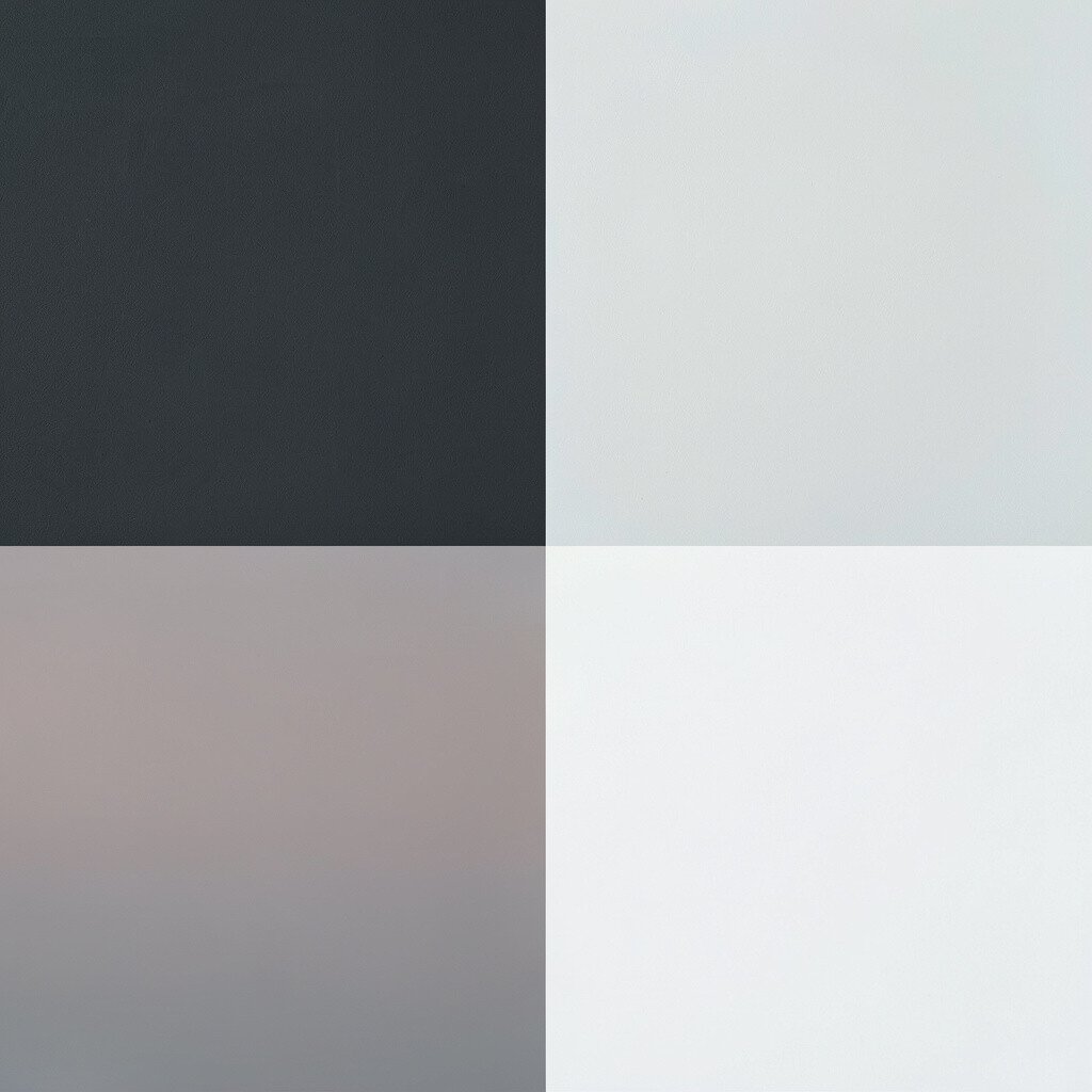
Charcoal dusk sounds bold, but when used in small amounts it can feel very serene. Cool white keeps everything crisp and prevents the dark tones from feeling heavy.
This palette works nicely for modern spaces, especially where you want a clean, quiet mood. Try charcoal for a feature wall behind a desk, then balance with cool white shelving and linens.
To keep it soft, use textured materials like a felt lamp shade or a woven rug. Cost-wise, you can get the look with paint plus a few decor pieces rather than replacing big items.
7. Creamy Yellow and Pale Sand

Creamy yellow feels like warm sunlight, but pale sand keeps it gentle. Together they create a light, friendly space that still feels calm.
This palette can make a room feel more open, which is helpful in apartments. Pair it with natural wood and simple white accents for a balanced, airy feel.
For a personalized touch, add accents in soft gold or muted mustard through picture frames or ceramic pieces. Keep the yellow on the lighter side so it stays soothing and not energizing.
8. Teal Smoke and Dove Gray
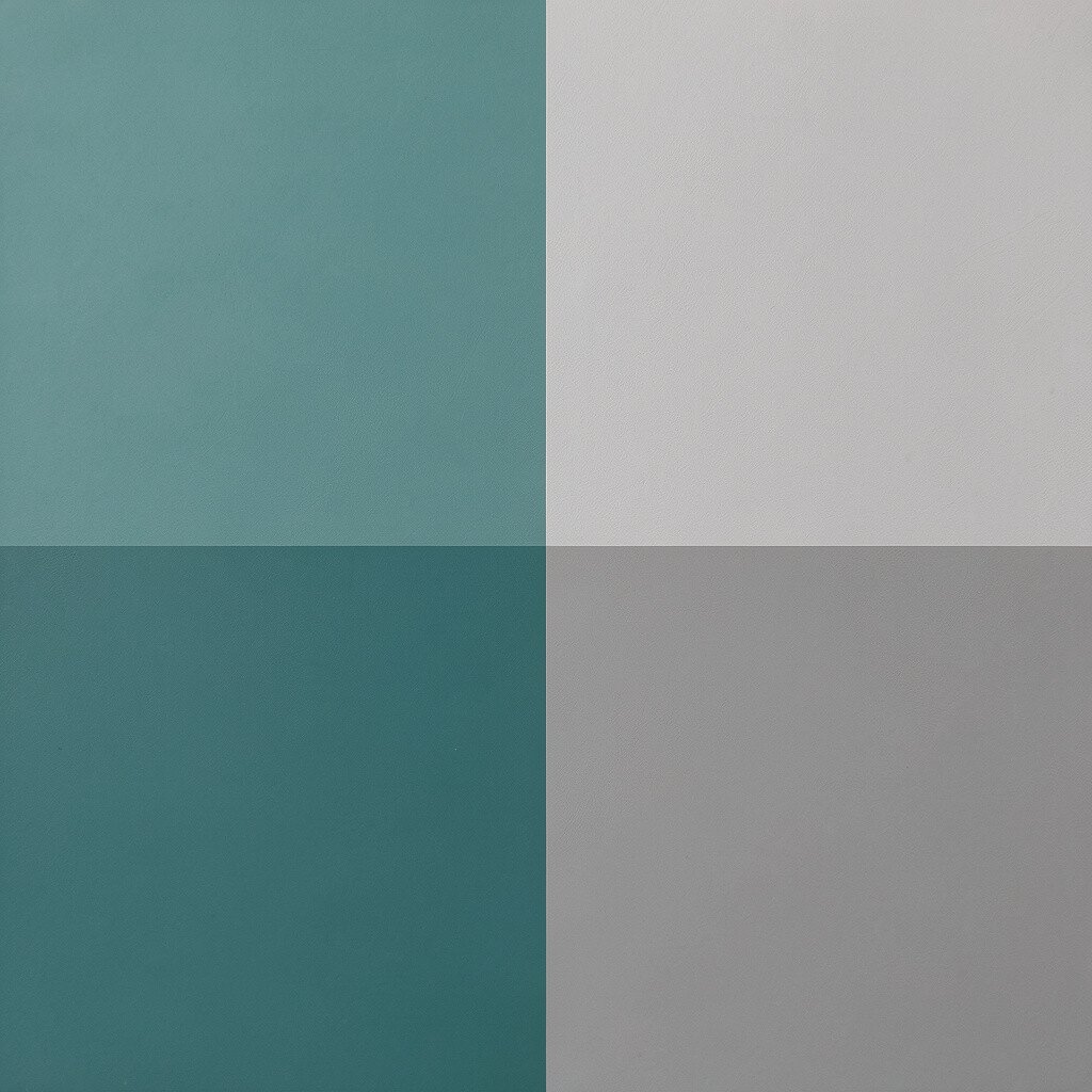
Teal smoke is deep enough to feel calming, yet it won’t overwhelm the room. Dove gray adds a soft backdrop that helps the teal look muted and smooth.
This color combo feels especially nice in a living room because it’s comforting and a little sophisticated. Choose a satin finish if you want the walls to catch light without shining too much.
9. Whitewashed Wood and Soft Sage
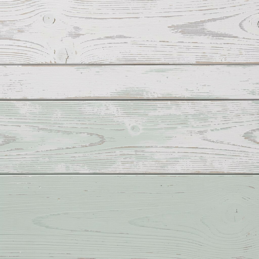
Whitewashed wood brings a quiet, beachy neutrality that instantly relaxes the eye. Soft sage adds a little color that feels like greenery without demanding attention.
This palette is unique because it leans on materials more than heavy paint colors. It’s also practical since wood finishes can hide minor wear better than high-gloss surfaces.
Try soft sage on curtains or a small set of chairs while keeping the walls warm white. If you’re watching your budget, refresh with paint for trim and add a rug in sage tones instead of replacing furniture.
Current trends also favor nature-forward looks, and this one fits right in. Keep patterns simple so the calm feeling stays strong.
10. Powder Blue and Oat Milk
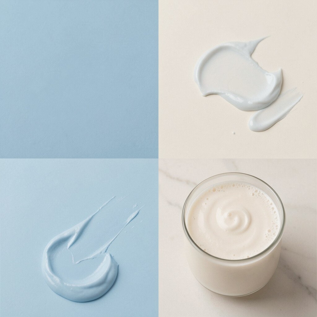
Powder blue is delicate, like the color of a ceramic bowl on a bright shelf. Oat milk tones make it creamy and cozy rather than cold.
This palette is ideal for nurseries, bedrooms, and anyone who likes a gentle, airy mood. Use blue for smaller areas like a dresser, an entryway wall, or a set of cabinets.
To make it feel more personal, add a few off-white and taupe textures so it doesn’t look flat. You can update cheaply with painted accents and slipcovers.
11. Deep Olive and Linen Beige
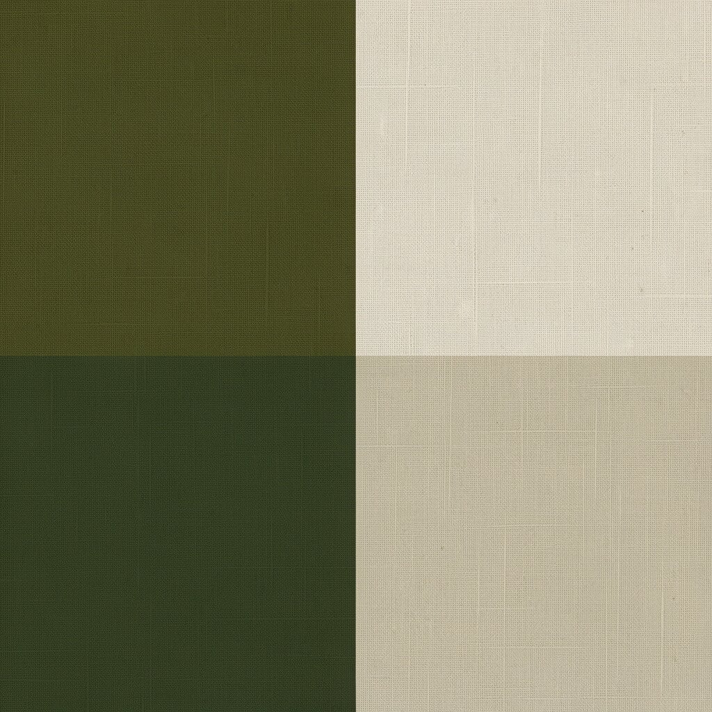
Deep olive feels grounded and calm, like an evening garden. Linen beige softens the richness so the room feels warm and balanced.
This combination is great for spaces where you want a slower pace, like a reading nook or office. Add earthy patterns such as small botanical prints or subtle stripes.
If you want an easy personalization, paint a bookshelf olive and keep everything else linen beige. Olive also hides dirt better than very light colors, which is a practical win.
12. Pale Aqua and Light Sandstone

Pale aqua brings a water-like calm, while light sandstone adds a warm, natural feel. Together they create a spa vibe without needing a complicated design.
It’s a smart choice for bathrooms, kitchens, and sunrooms. Use aqua on the walls only if you can keep it light, since deep aqua can feel more dramatic than soothing.
For a balanced look, add stone-inspired elements like textured tile, woven baskets, and matte fixtures. This can fit many budgets because accessories are easy to swap over time.
13. Greige and Soft Blush
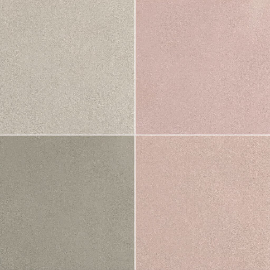
Greige, which lives between gray and beige, is the quiet friend that makes everything feel steady. Soft blush adds a gentle warmth that keeps the space from feeling too neutral.
This palette is both modern and comforting, and it works for almost any room. It’s also trendy because people keep choosing calming neutrals with small pops of color.
Try using greige on the walls and blush through curtains, art, or a throw blanket. If you’re worried about cost, start with textiles and paint a single wall before committing to a full refresh.
Personalization is easy here because blush pairs with many metals, including brushed brass and matte black.
14. Charcoal Green and Soft Cream
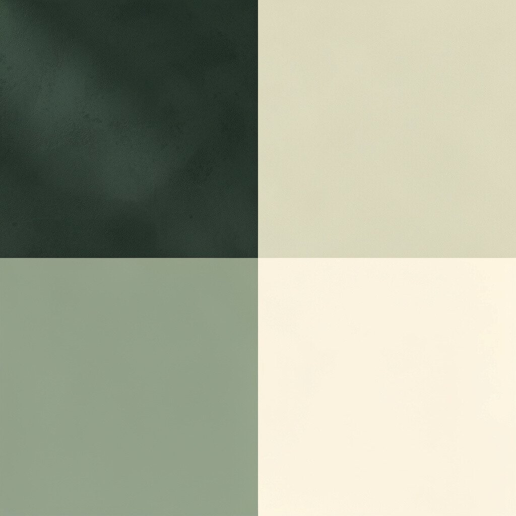
Charcoal green is like an older forest shade, calm and quietly rich. Soft cream brightens it so the room feels inviting, not dark.
This palette can make a space feel like a retreat, especially when paired with warm lighting. Choose warm bulbs so the green stays soothing rather than blue.
To keep it practical, use cream for larger surfaces like walls and upholstery. Add charcoal green through accent chairs, picture frames, or a rug with subtle pattern.
15. Warm Taupe and Light Cocoa
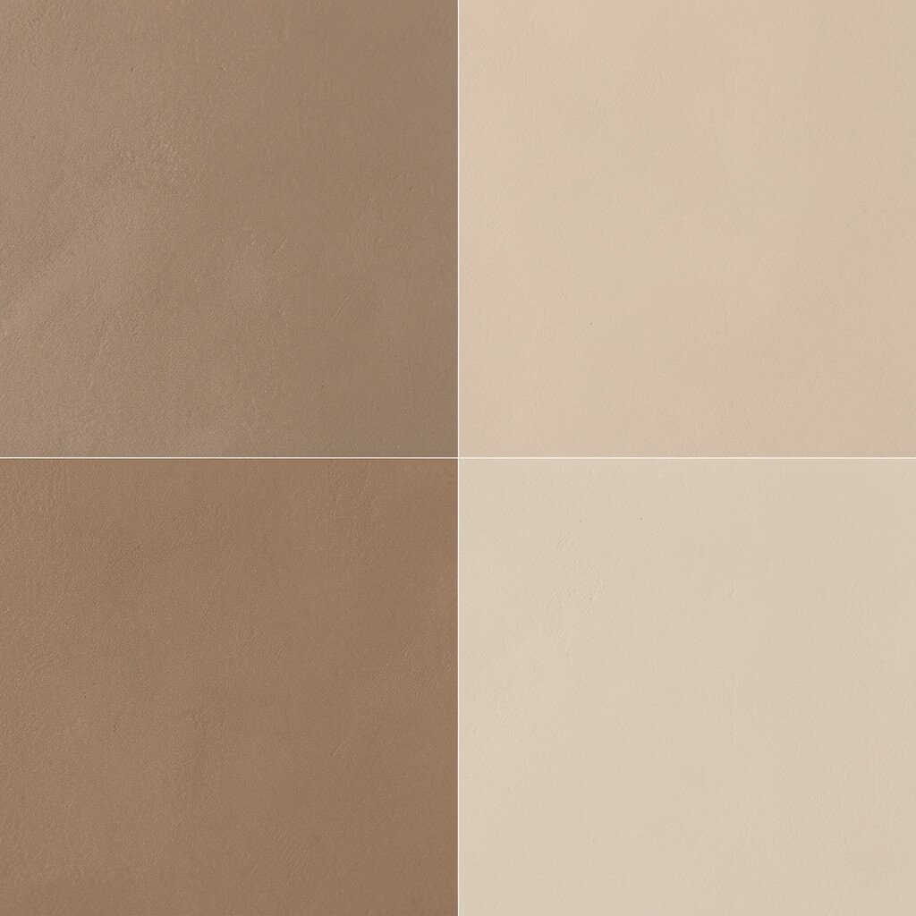
Warm taupe gives a steady, neutral base that feels cozy. Light cocoa adds a gentle depth that feels like chocolate powder, not heavy darkness.
This combination is ideal for living rooms and bedrooms because it feels grounded and calm. It’s also forgiving, meaning it looks good even when your decor changes over time.
Try taupe walls with light cocoa curtains or a soft leather sofa in that tone. If you want the room to feel more airy, add plenty of off-white in bedding and lampshades.
For a personalization boost, include a few warm metals like copper or bronze in small decor pieces. Cost can be managed by choosing paint and a rug first, then layering smaller items later.
16. Lilac Tint and Butter White
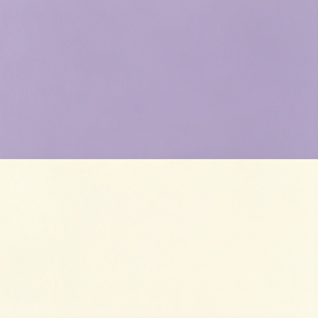
Lilac tint is a soft purple that feels gentle and friendly. Butter white adds a warm glow that makes the color feel calm instead of sharp.
This palette creates a light, creative mood that still supports rest. It works especially well in bedrooms, creative studios, and kids’ rooms where you want calm focus.
To make it actionable, paint the ceiling butter white and use lilac tint on the walls for a cozy wraparound feel. You can keep the look budget-friendly by using removable wallpaper on one section if you like change.
17. Pale Mint and Natural Linen

Pale mint feels fresh without being bold, like a cool breeze on a summer morning. Natural linen brings texture and warmth, helping the palette feel lived-in.
This pairing is excellent for kitchens and dining areas because it feels clean and light. Add simple wooden utensils or ceramic bowls to reinforce the natural vibe.
If you want variety, use mint in smaller areas like backsplashes, cabinet fronts, or a chair accent. Linen is often easy to find in affordable shades, which helps keep the cost under control.
18. Soft Navy and Sky Mist

Soft navy adds depth that can feel calming rather than intense. Sky mist brightens everything so the navy stays soothing and not heavy.
This palette looks especially good with white trim and warm wood floors. Use navy for a headboard wall, a built-in shelf, or a rug with a subtle pattern.
To personalize, add accessories in small sky-blue shades or pale gray so the theme feels consistent. This trend stays popular because it’s a modern take on classic coastal and nautical calm.
If you’re working with a budget, focus on paint and a single statement textile, like a curtain set or throw, before buying more furniture.
19. Blush Gray and Chalk White
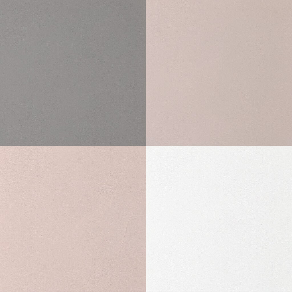
Blush gray sounds gentle because it’s exactly that, a muted pink-gray that feels soft to the touch. Chalk white keeps the palette airy and helps the room feel calm and open.
This combination is perfect when you want color without clear bold lines. It’s also great for hallways since the subtle tones make spaces feel smoother as you walk through.
Try using blush gray on walls and chalk white on doors and trim for an elegant look. For practicality, consider semi-matte paint in hallways because it resists scuffs better than flat finishes.
20. Rose Clay and Pale Sandstone
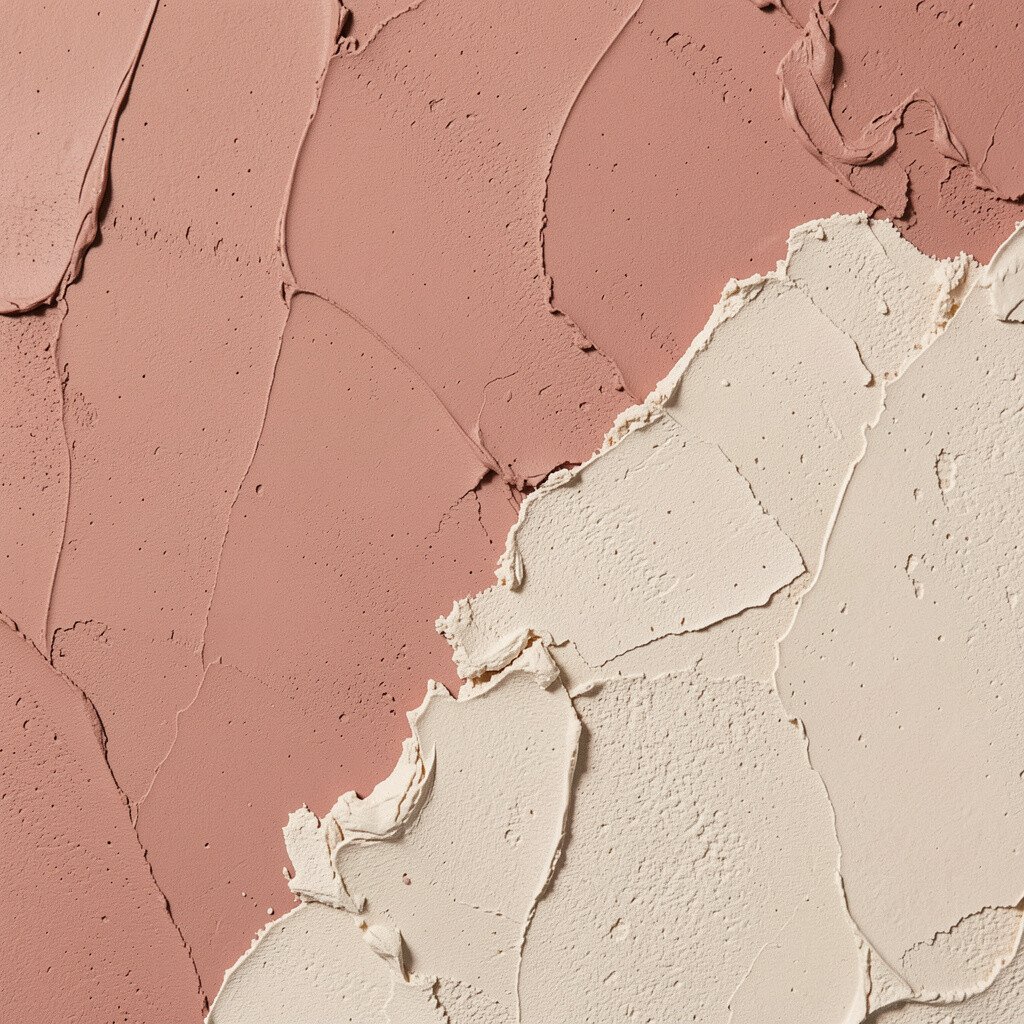
Rose clay feels earthy and comforting, like sunbaked pottery in warm light. Pale sandstone adds a neutral, soothing base so the rose tone stays calm.
This palette is unique because it blends warm color with a natural mineral feel. It’s a great choice for living rooms and bedrooms where you want a cozy mood that still looks clean.
To make it actionable, paint the walls rose clay and keep major pieces like sofas and beds in pale sandstone or cream. For personalization, add small accents in terracotta, dusty pink, or olive to echo the clay theme.
Cost can be manageable since you can get a big visual change with paint, then refine the look with affordable art prints and soft textiles. Current styling trends also favor warm, earthy colors like these because they feel calm, grounded, and timeless.