Your home’s first impression lives in the details. The right shutter finish can make that impression feel warm, crisp, and full of personality.
1. Classic Painted White Shutters
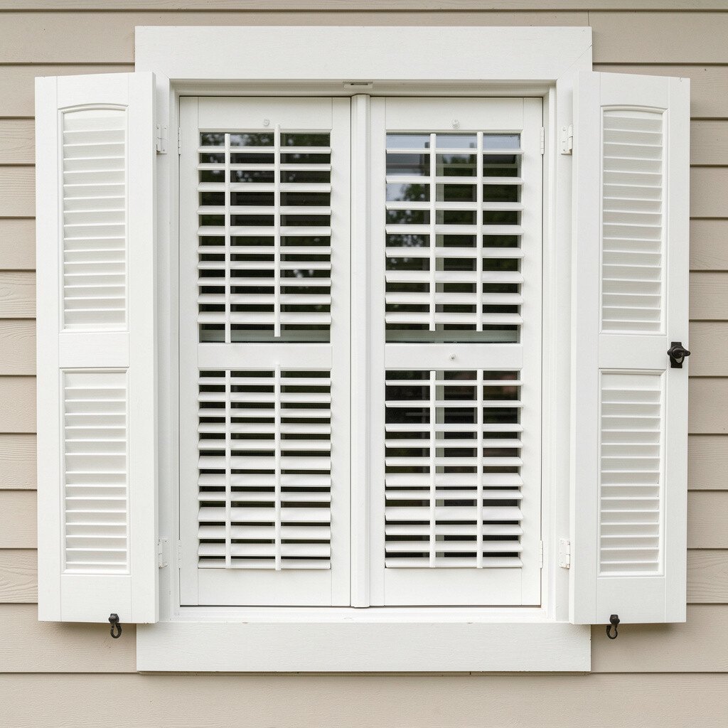
White shutters look clean, bright, and timeless. They catch daylight and make window areas feel sharper from the street.
Pick a high-quality exterior paint made for siding and trim so the finish resists fading and chalky wear. For a practical approach, match the shutters to your window trim or door trim, then keep the surrounding color slightly deeper to create contrast.
2. Soft Off-White for a Gentle Welcome
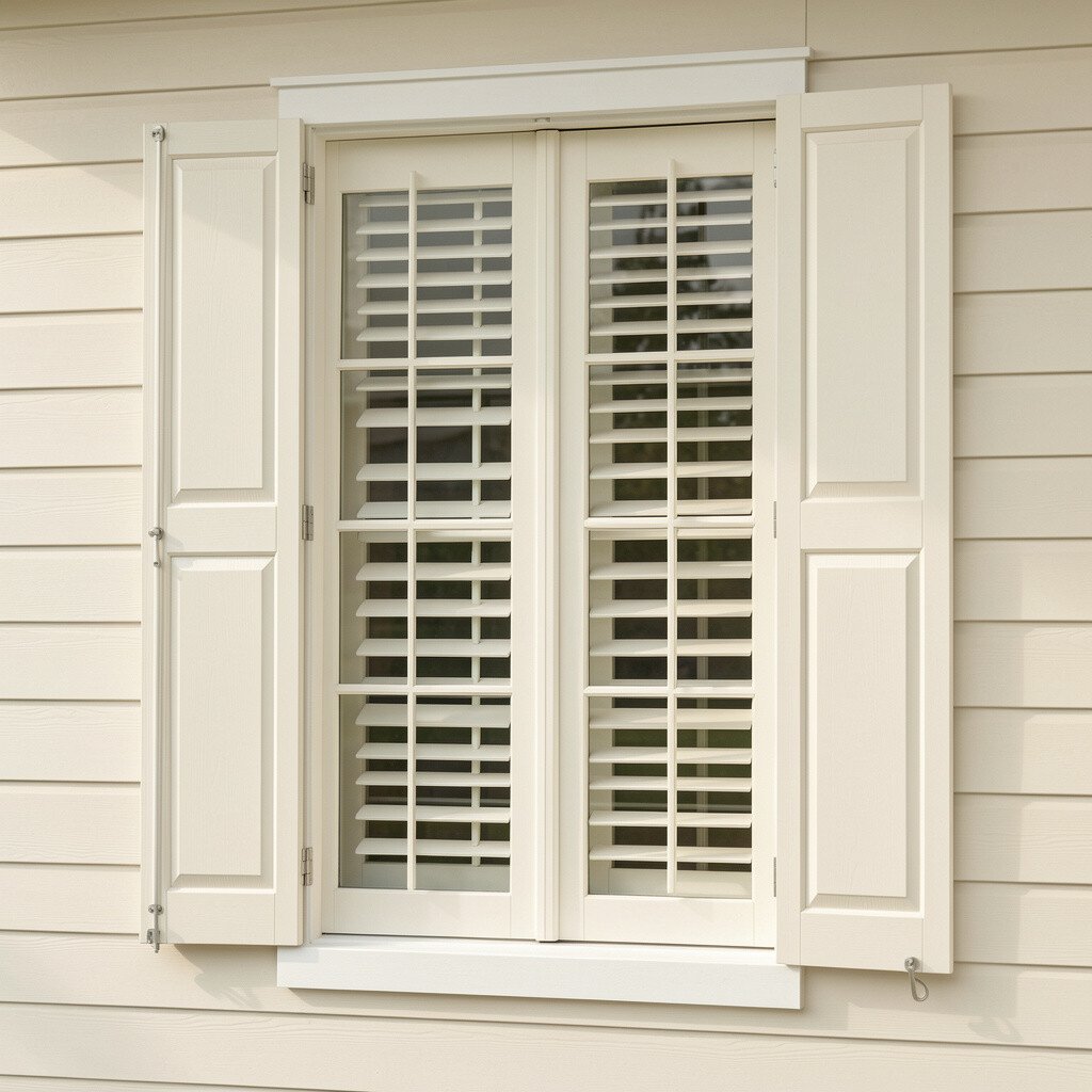
Off-white shutters bring the same fresh look as white, but with a softer mood. They pair beautifully with warm brick, sandy stucco, or creamy siding tones.
Choose an off-white with a hint of warmth so it doesn’t look icy near landscaping. This finish also helps cover minor color variation across older wood or older composite shutters, which can be a real time-saver during repainting.
If you like personalization, try subtle sheen control by selecting a low-sheen or satin exterior paint. It will look smooth up close while still reflecting just enough light to brighten your facade.
3. Deep Navy Shutters That Feel Bold

Navy shutters add instant personality without looking flashy. They create a crisp frame around windows, and the color looks rich even on cloudy days.
Consider navy when your home has light siding, neutral stonework, or dark roof shingles, because the shutters help tie the palette together. For a practical tip, keep the hardware and trim finishes consistent, since mixed metals can steal attention from the shutter color.
To personalize, add a wreath or seasonal planters in colors that echo navy, such as crisp white or warm tan. You’ll get a coordinated look that changes with the seasons without repainting.
4. Weathered Gray for Modern Farmhouse Charm
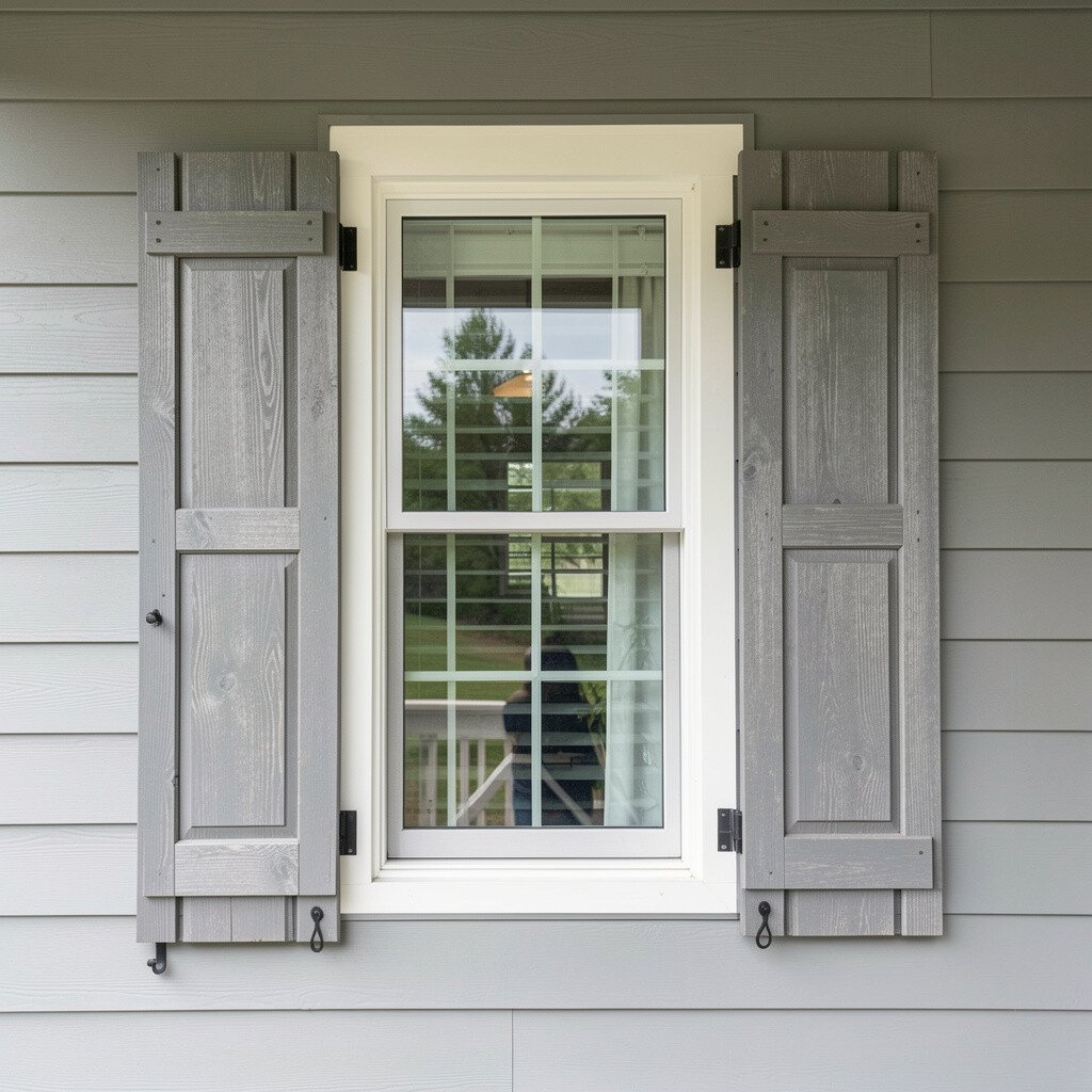
Weathered gray shutters look lived-in and full of character. The tone gives a relaxed vibe that works well with farmhouse lines and modern simplicity.
Use this finish when you want curb appeal that feels grounded, not too perfect. Pair gray shutters with black metal porch railings or lantern-style lighting for a clean, current look.
If your home already leans toward charcoal accents, gray shutters can connect the color story across your exterior. A good practical approach is to test samples in the sun and shade, since gray can shift depending on the time of day.
5. Natural Wood Stain with Clear Protection
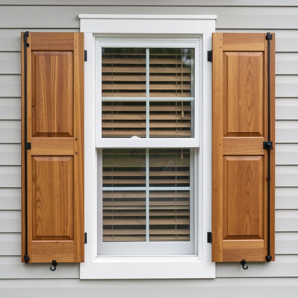
Natural wood tones bring an organic warmth that painted finishes can’t quite match. You’ll see the grain and texture, which adds depth near the windows.
Choose a stain that fits your climate and then seal it with a clear exterior coat for durability. This method lets you keep the wood looking genuine while helping resist moisture, sun fade, and light mildew.
For personalization, you can tint the stain slightly to match nearby decks, pergolas, or fence boards. It’s also a smart route if you prefer low visual contrast, since natural tones blend while still adding richness.
6. Charcoal and Graphite for Sleek Contrast
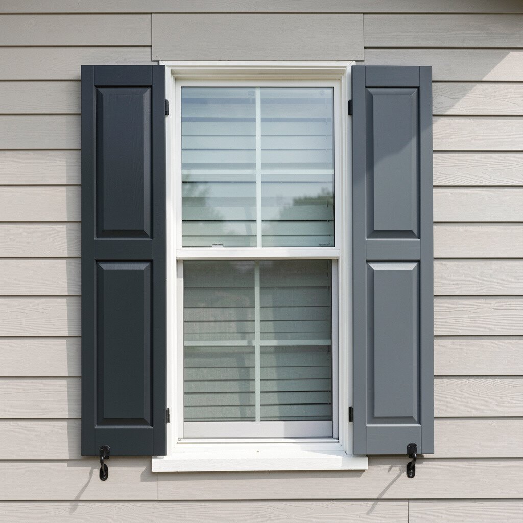
Charcoal shutters make a home look polished and architectural. The dark shade provides a strong outline for windows, especially against light siding.
Graphite tones are a great option if you want dark but not as intense as black. Try pairing them with white trim or light stone so the facade stays bright while the shutters bring structure.
Keep an eye on heat and sun exposure, since darker finishes can feel warmer to the touch. Choosing a quality exterior coating and proper installation helps the look stay steady across seasons.
7. Warm Brown for Traditional Street Appeal
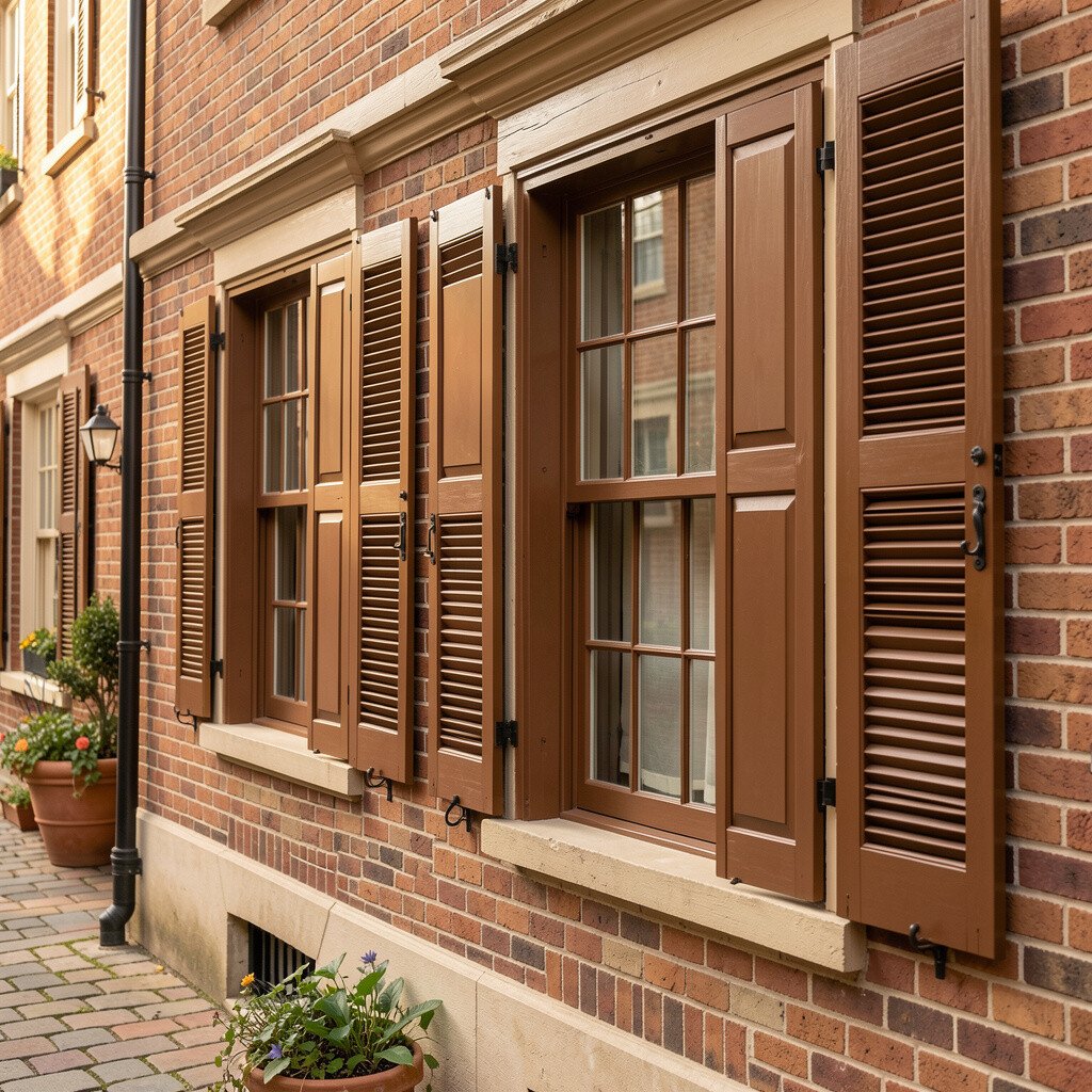
Warm brown shutters feel classic and welcoming. They look especially good on homes with brick, warm siding colors, or earthy landscaping.
Pick a brown finish that matches your roof tones or porch wood so the exterior feels cohesive. If you have a timber deck or matching railings, tying the shutter tone to those materials makes the design look intentional.
For practical maintenance, ask about finishes that resist peeling and provide consistent color over time. You can also choose a slightly lighter brown than you expect to help brighten window areas from a distance.
8. Black Shutters That Make Windows Pop
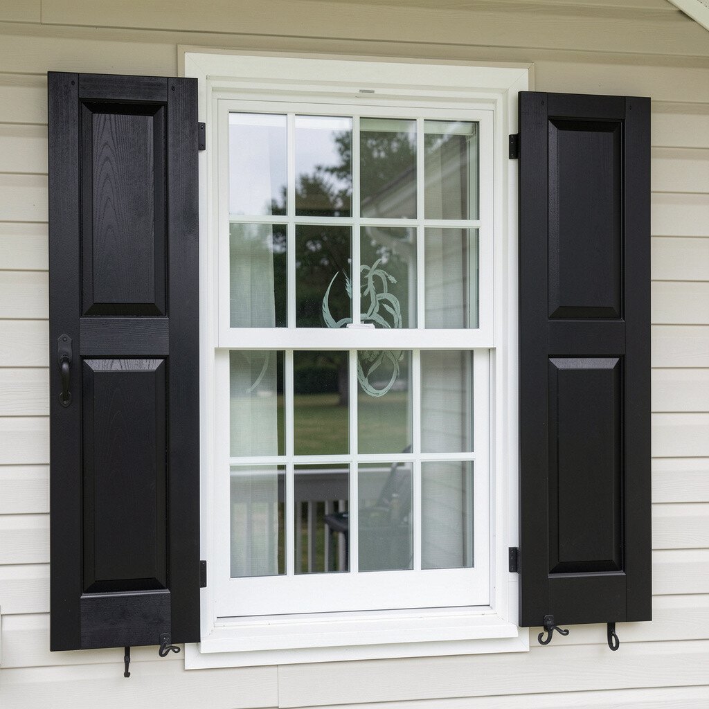
Black shutters create sharp contrast that many people notice right away. They frame the face of your home and make the windows look extra crisp.
Use black when your home has light siding, pale stucco, or bright trim, because the contrast lifts the whole facade. A practical tip is to avoid glossy finishes if you want a more modern, soft look from the street.
To personalize, combine black shutters with other black accents like house numbers or light fixtures. This makes the exterior feel styled, not random.
9. Olive and Sage for a Soft, Botanical Look
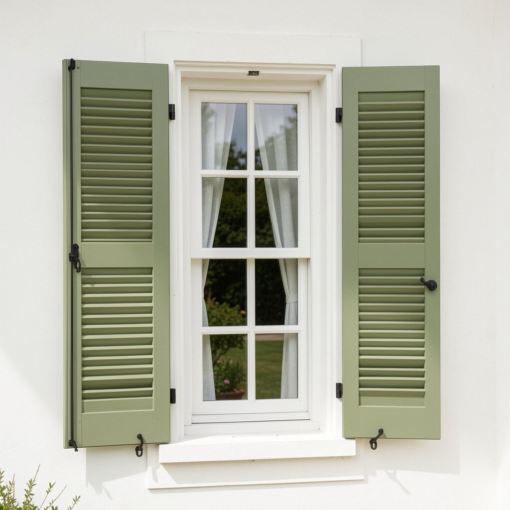
Olive or sage shutters add a calm, garden-like feeling to your home. They complement greenery and look especially pretty when the landscaping is well maintained.
This finish is unique because it brings color that feels natural rather than loud. If your exterior has beige, cream, or light gray tones, these muted greens can add depth while still keeping the overall look light.
Try matching the undertone to nearby colors like stone or garden accents. A small practical step is to test a sample on a shutter panel near a window so you see how it works throughout the day.
For personalization, pair sage with warm wooden porch details or brass hardware to create a gentle, inviting style.
10. Red Shutters for a Festive, Historic Flavor
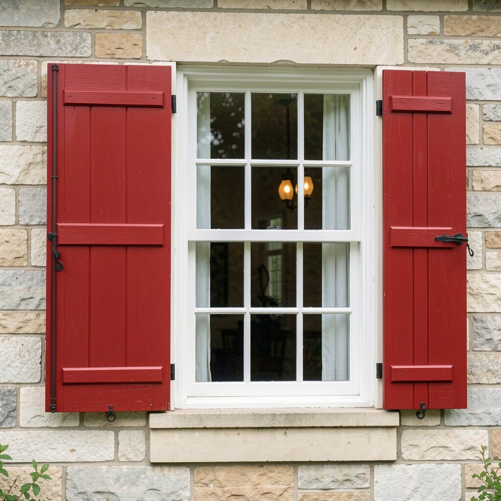
Red shutters bring energy and charm to curb appeal. They also remind people of classic homes, which can make your facade feel memorable.
Choose a red that fits your home’s overall palette, such as brick-red for warmer exteriors or deep barn-red for cooler tones. If you have neutral siding, red shutters often become the main focal point, so keep other elements tidy and consistent.
To keep things looking intentional, repeat red in small ways like door mats, planters, or seasonal wreaths. This helps the shutter color feel like part of a full design rather than a single bold decision.
11. Two-Tone Shutters for Depth and Dimension
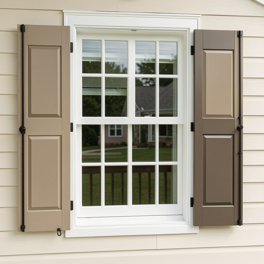
Two-tone shutters add dimension by using contrasting colors in different parts of the shutter. This finish can make windows look more detailed even from far away.
A popular approach is to keep the frame light and the panels darker, or the reverse, depending on your siding color. For practical results, choose colors from the same paint family so they coordinate without clashing.
If you want uniqueness, try a light neutral paired with a muted accent like navy, olive, or charcoal. It’s a fun way to personalize without committing to an all-over bold shade.
Also consider how the color will look in shadow, since the interior shade lines can change the overall contrast.
12. Weather-Resistant White with Subtle Texture
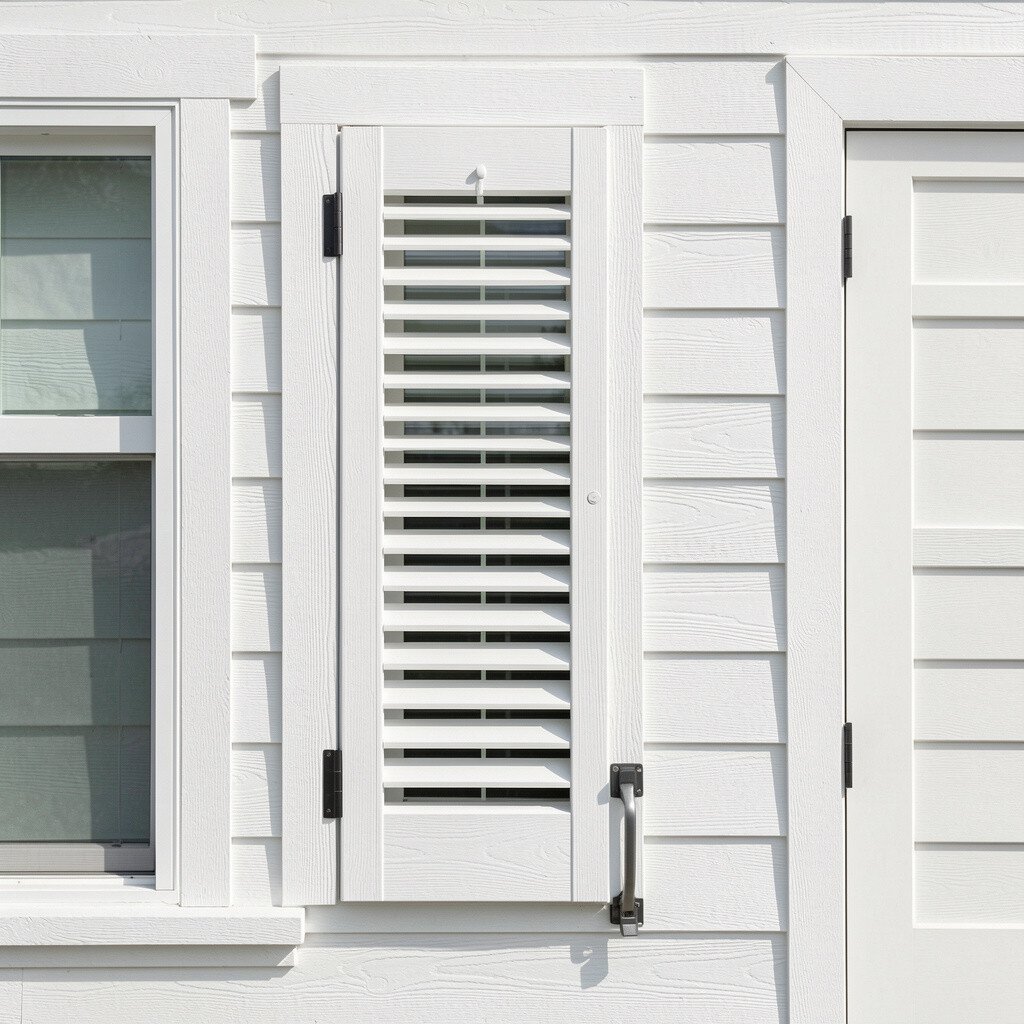
Not all white looks the same, and a subtle textured finish can make shutters look more premium. Texture catches light in a gentle way, which makes windows feel more inviting.
This style works well with modern siding because it adds visual interest without strong color drama. Look for coatings designed to handle moisture and temperature changes, especially if your area gets lots of rain or freeze-thaw cycles.
For personalization, pair textured white shutters with matching trim that has a similar sheen level. When sheen and texture line up, the whole facade looks more intentional.
13. Beige and Sand Tones for Sunny Softness
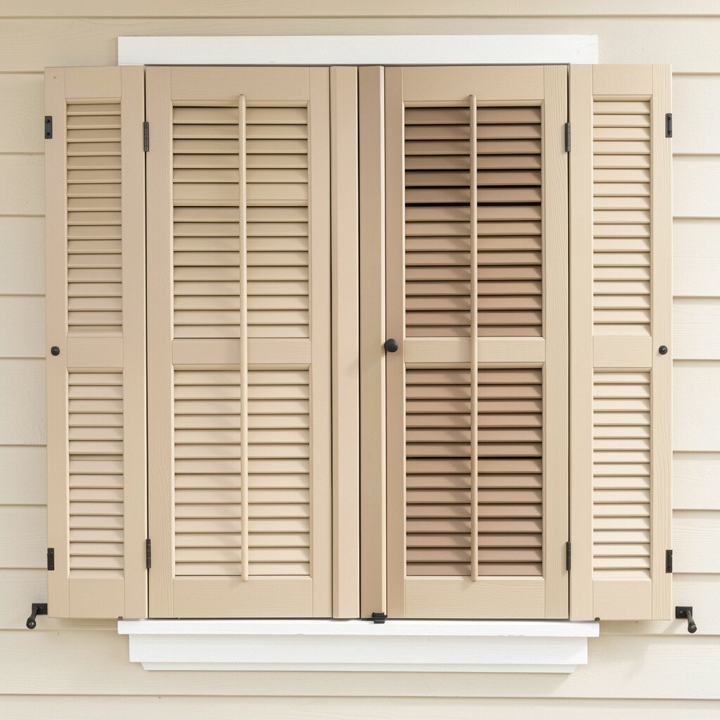
Beige and sand shutters deliver a sunny, relaxed curb appeal. They can make a home look brighter without the stark contrast of pure white.
Pick a beige that matches the warmth of your siding or stucco. If your exterior has golden undertones, a sandy shutter finish will keep everything feeling harmonious.
For practical tips, consider a durable exterior coating that resists scuffing from storms and passing yard tools. Also plan your color based on landscaping, since blooms and greenery can shift how the shutters appear.
14. Metallic Gray for a Contemporary Edge
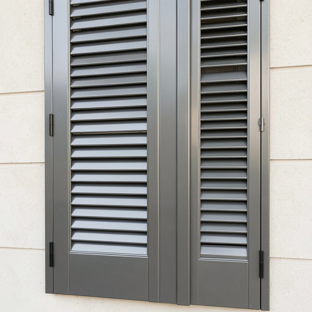
Metallic gray shutters bring a modern sparkle that feels like a design upgrade. The color can look subtle in daylight and more dramatic at dusk.
Choose metallic finishes carefully, because too much shine can feel flashy on a smaller facade. A matte or satin metallic look often gives the most balanced curb appeal.
This finish feels unique when paired with clean lines, updated entry doors, and modern lighting. For personalization, match nearby accents like door hardware or mailbox numbers to the same cool undertone.
15. Warm Cream for Traditional Elegance
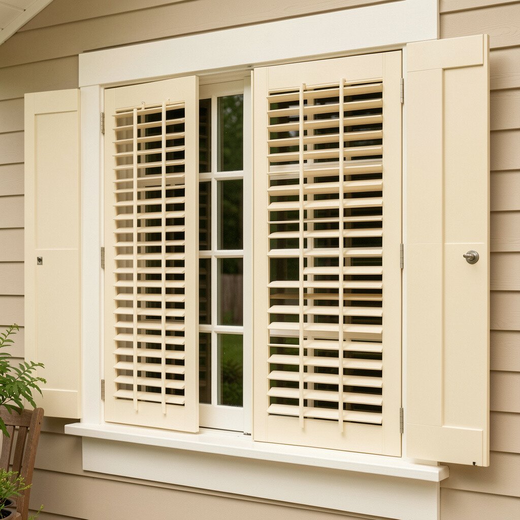
Cream shutters feel soft, elegant, and easy to live with. They create a classic framing effect that works across many home styles.
Consider cream when you want a lighter look but your trim or siding already has warmth. This is especially helpful if pure white looks too harsh next to your exterior materials.
For practical maintenance, make sure the finish is formulated for exterior sun exposure. You can also choose a paint system that includes primer, which helps keep color even over time.
If you like personalization, add coordinating window boxes or seasonal flowers in complementary colors like dusty rose or sage.
16. Limewashed White for Cottage-Style Charm
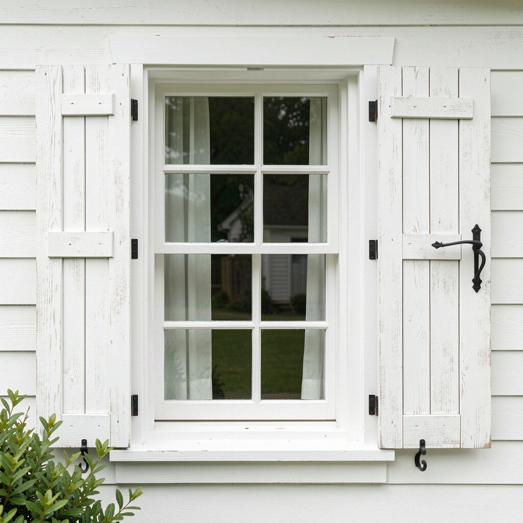
Limewashed shutters add a casual, cottage feel with an artistic, mottled look. The finish looks like light has been playing on the surface all day.
This is a great choice if you want curb appeal that feels handcrafted rather than factory-perfect. It also hides small imperfections better than smooth finishes, which is helpful on older shutters.
For practical tips, choose products meant for exterior use and follow drying times carefully. Limewash can be sensitive to heavy rain early on, so plan your schedule around dry weather.
To personalize, pair limewashed shutters with natural wood porch railings or vintage-style lanterns.
17. Distressed Black for Old-World Character
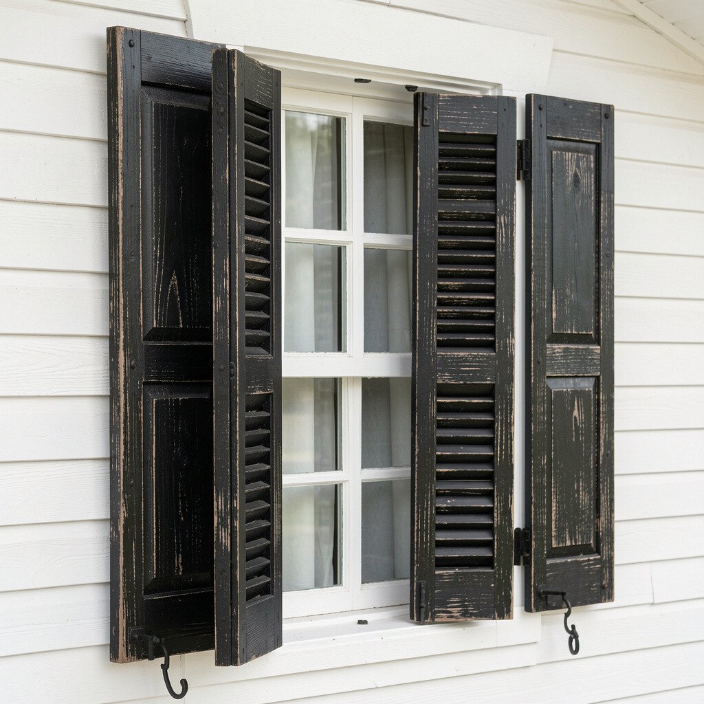
Distressed black shutters bring old-world charm with a worn, rustic feel. They make a facade look lived-in and full of story.
This finish feels unique because it adds depth through intentional variation. It can also soften the look of harsh architecture, making the windows feel friendlier.
If you’re concerned about maintenance, choose a distressed finish designed for exterior durability. A practical approach is to keep nearby trim colors simple so the shutters remain the star.
For personalization, pair distressed black with warm wood tones and classic house numbers in brushed metal.
18. Clear Stain with a Natural Matte Finish
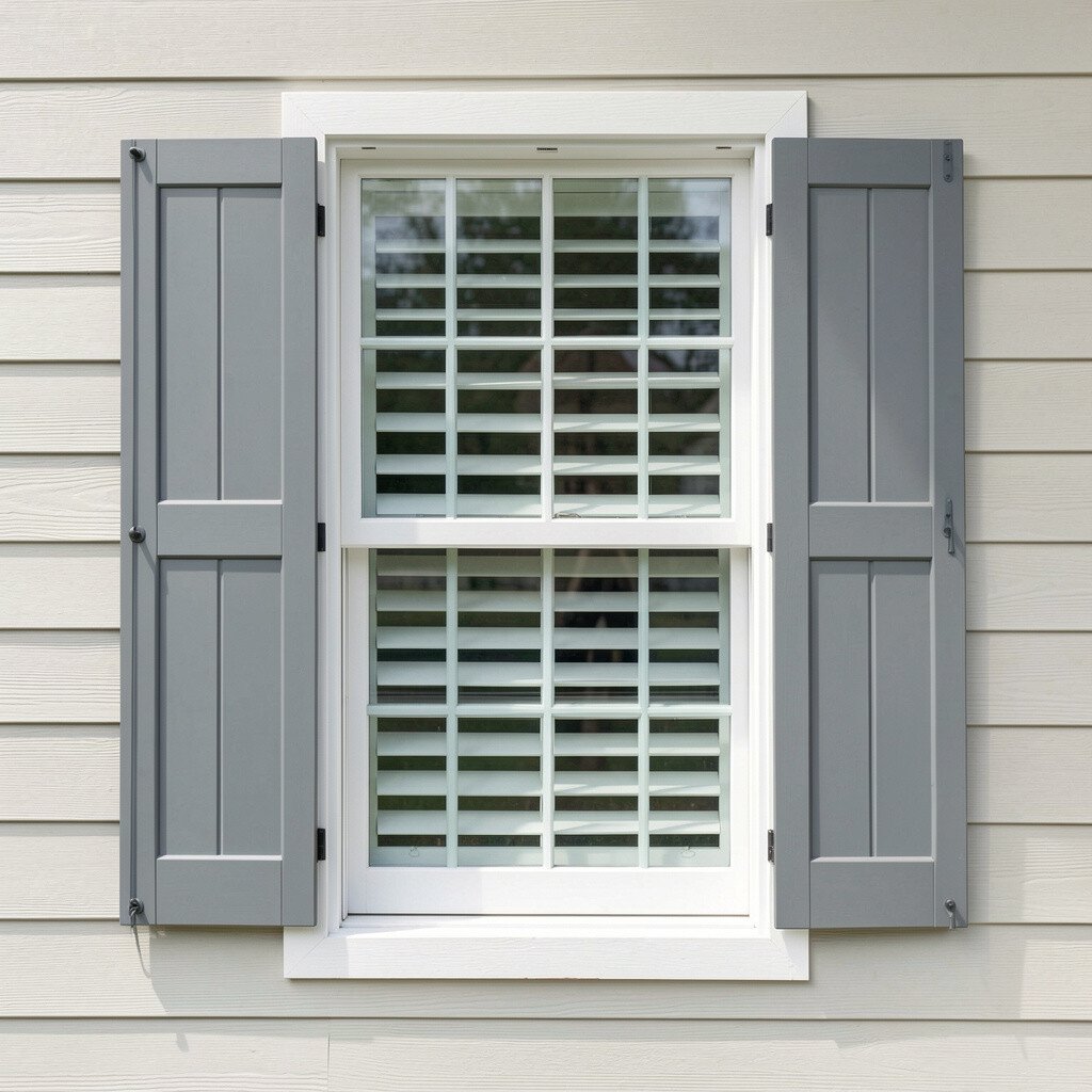
A clear stain with a matte look keeps shutters looking airy and understated. The wood still feels like wood, but it won’t glare in bright sun.
This finish is excellent if you love the idea of natural warmth without heavy color changes. It also blends well with many siding types, from light vinyl to textured stucco.
For practical tips, choose a UV-resistant clear coat to help slow fading. If your climate has strong sun or frequent storms, reapply protection on a schedule that matches local weather patterns.
19. Bright White with Bold Hardware Accents

Bright white shutters look fresh, especially when paired with striking hardware. The combination creates a neat, curated look that feels high-end.
Choose handles, hinges, or tilt rods in finishes like matte black, brushed nickel, or aged brass. This kind of pairing can be a simple personalization move that doesn’t require changing the shutter color.
From a practical standpoint, keep the hardware clean and inspect it after heavy storms. If hardware is worn or mismatched, it can dull the overall look even when the shutters are new.
20. Soft Gray with a Clean Satin Sheen
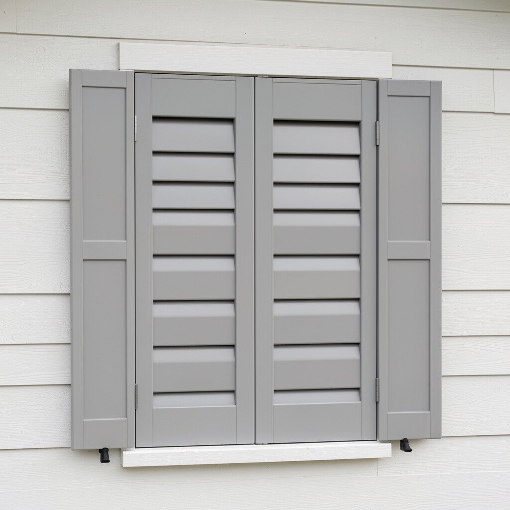
Soft gray shutters feel calm and modern, and they don’t overpower the rest of the home. A satin sheen helps them look smooth while keeping glare low.
This finish is great for homes that already have gray roof tones, stone pathways, or cool-toned siding. It creates a balanced exterior that still feels bright, especially when paired with white trim.
For practical tips, plan your paint selection with undertone in mind, since gray can lean blue, green, or warm. Testing a small sample helps you avoid surprises in different lighting.
To personalize, add colorful seasonal planters or a welcoming doormat so the shutters frame the entrance without competing for attention.
21. Custom Color Matching Your Exterior Mood
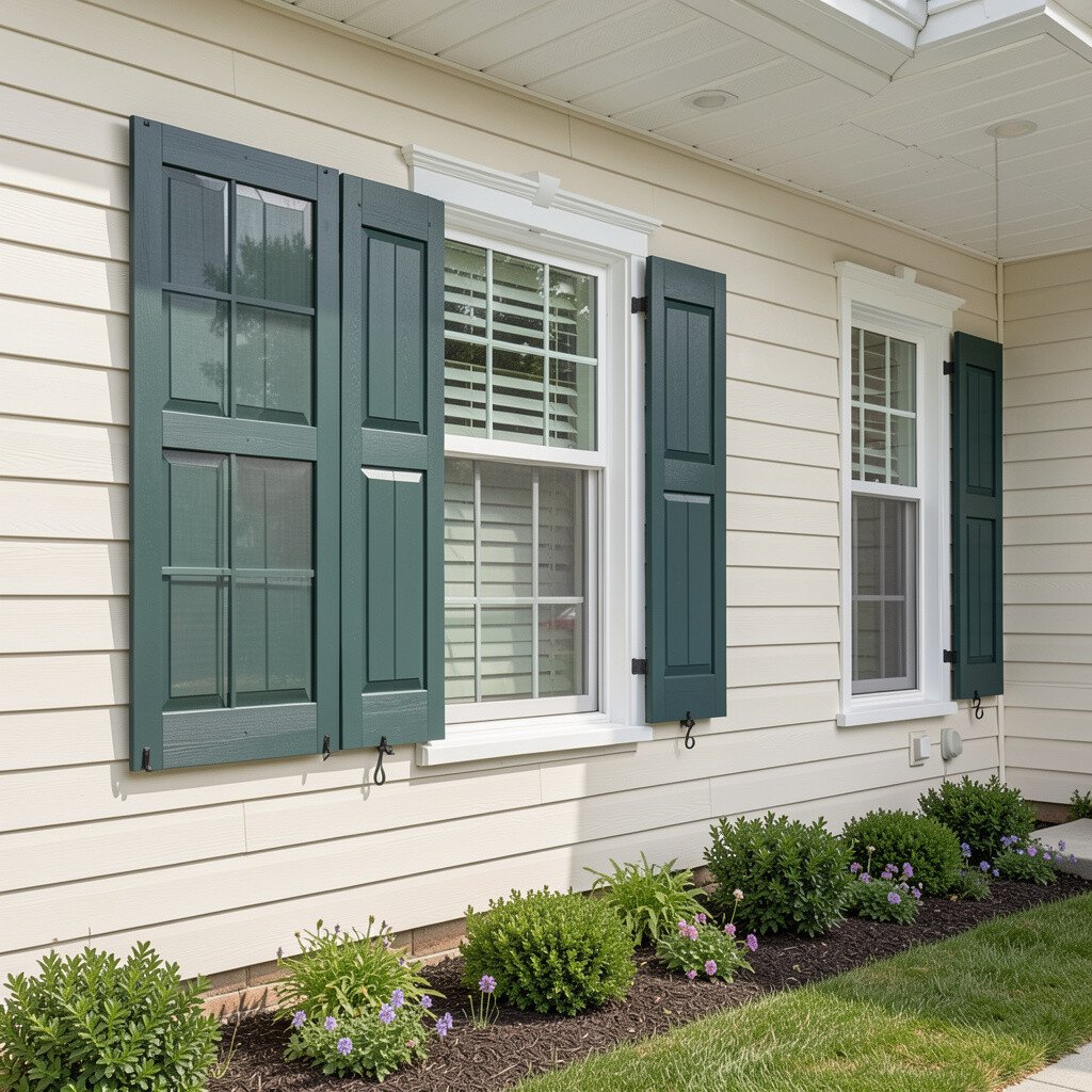
Custom color matching is one of the most satisfying ways to brighten curb appeal. When shutters echo your home’s real tones, the exterior feels cohesive and polished.
Start by looking at your siding, trim, roof, and even brick or stone in full daylight. You can pick a slightly lighter or darker shade to create contrast while keeping everything in the same family.
For practical cost considerations, custom matching can mean extra paint mixing or sample testing, but it often prevents repainting later. If you plan to install new shutters, coordinating color up front can save money by avoiding returns and rework.
To personalize uniqueness, consider a custom shade that reflects your landscaping, like a hue close to autumn leaves or a subtle tone pulled from stone. When the color feels personal, the house starts to feel like yours in a deeper way.