
Bold countertops can make your whole kitchen feel energized. When your surfaces pop, the room feels more alive and more “you.”
From color-drenched stone to playful patterned finishes, these ideas help you choose something unforgettable. You can start small with accessories or go big with the counter itself.
1. Citrus-Colored Solid-Surface Countertops
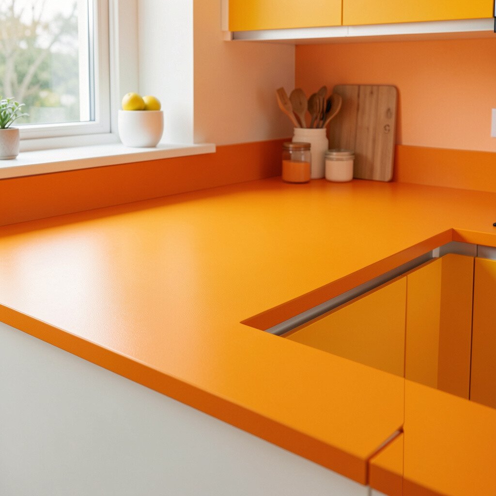
Picture a bright countertop that looks like sunshine caught in glass. A citrus solid-surface finish can make daily cooking feel more cheerful and less routine.
This style hides minor wear well and is easy to keep clean with gentle soap and water. Because the surface is seamless, crumbs and spills wipe away without stubborn gaps. Choose a warm lemon, tangerine, or lime tone to match your cabinet color and lighting.
2. Deep Teal Quartz With a Glossy Finish
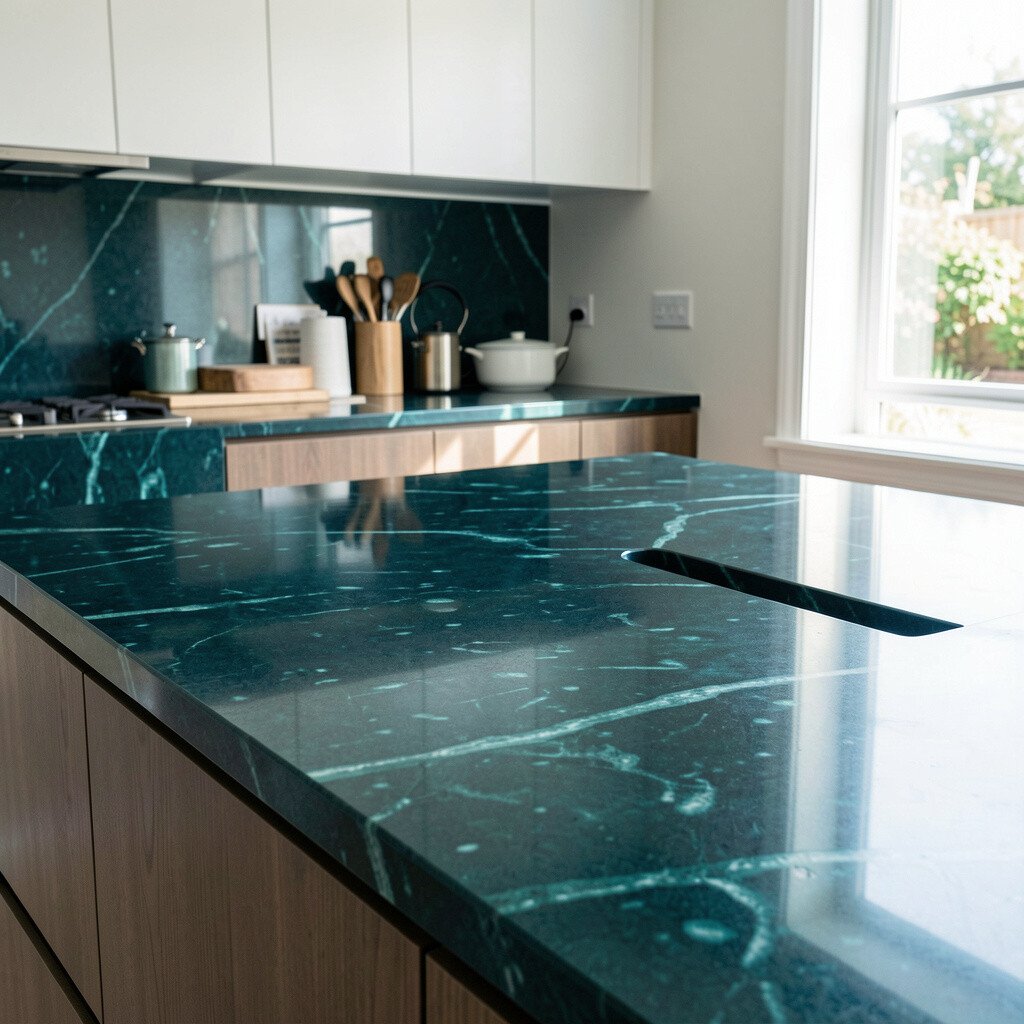
Deep teal quartz brings a rich, spa-like mood that still feels bold. The glossy finish reflects light and makes the kitchen look brighter even on cloudy days.
Quartz is practical for busy homes because it resists stains and usually needs less maintenance than natural stone. For a personalization boost, pair the teal with brass fixtures and off-white cabinets for a sleek, modern contrast.
Plan your cost by thinking about full installation versus partial sections, especially if you only want color at the island. Many homeowners also save by choosing a slab with subtle movement instead of the rarest patterns, while still getting that high-impact teal look.
3. Terracotta-Red Countertops for Warmth and Drama
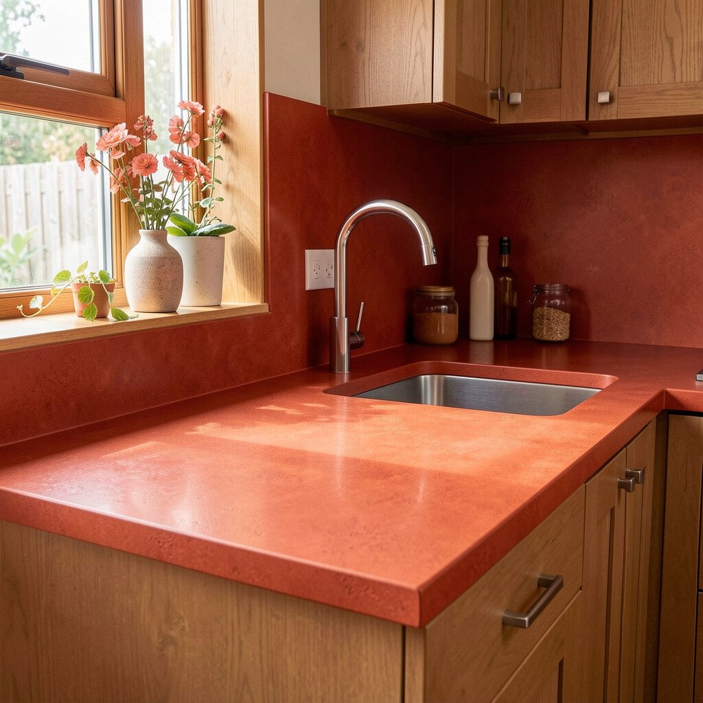
Terracotta countertops add instant warmth, like clay baked under a hot afternoon sun. The color looks especially striking with light woods and simple cabinet lines.
This choice can make your kitchen feel cozy, even if your decor is modern. It also blends naturally with earthy materials like woven baskets, matte ceramics, and linen dish towels.
For practical upkeep, go with a finish designed for stain resistance and use coasters for anything acidic. If you want a unique spin, choose a countertop that slightly varies in tone so it looks artisanal rather than perfectly uniform.
Cost can vary based on the material, so compare fabrication fees and thickness options before you commit. If budget is tight, consider terracotta as an accent island top while keeping the perimeter a calmer neutral.
4. Patterned Concrete Tops With Color Puddles

Concrete can look bold without feeling flashy, especially when it includes colored flecks. Imagine soft swirls of teal, mustard, or rose trapped in a smooth, polished surface.
This trend is popular because it offers a custom look that no two kitchens share. Concrete also pairs well with industrial lighting, open shelving, and dark cabinet hardware for an edited, stylish vibe.
To keep it practical, seal the surface regularly and wipe spills quickly. You can personalize by asking for a specific pigment blend that matches your backsplash tiles or favorite paint color.
Concrete can cost more when custom forms and specialty finishes are needed, so request a detailed quote early. If you love the look but want to spend less, do a concrete-look overlay on the island and keep the main counters simpler.
5. Electric Blue Marble-Look Laminates
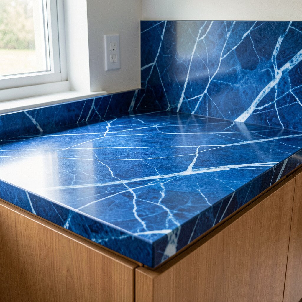
Electric blue laminate can be surprisingly vibrant and fun. A marble-look pattern helps the color feel stylish instead of childish.
Laminate is budget-friendly and easy to replace if you ever want a new look. It’s also a smart way to test bold color before you invest in stone or solid surface.
For best results, choose a thickness and edge style that matches your cabinet style so the countertop feels intentional. Pair the blue with white or warm gray cabinetry and keep the rest of the decor simple so the counter stays the star.
6. Bold Black Quartz With Subtle Metallic Veins
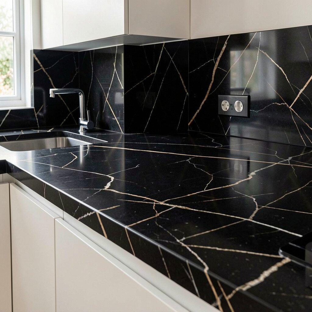
Black countertops instantly add contrast, and a metallic vein makes them feel extra luxe. Think of tiny gold or silver streaks that move when the light hits.
Quartz stays durable for everyday cooking and wipes clean quickly, which helps if your kitchen sees a lot of action. To keep the look grounded, style the space with matte cabinet hardware and warm-toned lighting.
This option feels unique because the right veining pattern can look different from room to room. Ask for slab samples in your kitchen lighting so you can choose the vein intensity that fits your taste.
Cost-wise, black quartz usually sits in a mid-to-premium range depending on thickness and fabrication. You can manage expenses by choosing a popular pattern and focusing the most dramatic veining on the visible island front.
7. Hot Pink Porcelain Slabs for a Playful Edge
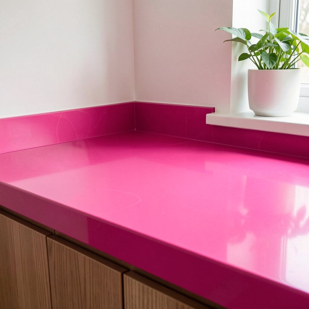
Hot pink porcelain feels bold, graphic, and full of energy. It instantly turns an ordinary kitchen into a statement room.
Porcelain is known for strong durability and low porosity, which helps with stain resistance. You’ll also like how the surface handles daily cleaning without worrying too much.
To personalize, consider a slightly more subdued pink for the perimeter and reserve the brightest shade for the island. Pair the counter with black accents, glossy white tiles, or even a patterned rug to keep the color from feeling too intense.
Costs can jump with premium slabs, so check lead times and fabrication fees. If you’re budget-conscious, use a hot pink counter only where it’s most visible, like an island or bar top.
8. Emerald Green Stone With Natural Movement
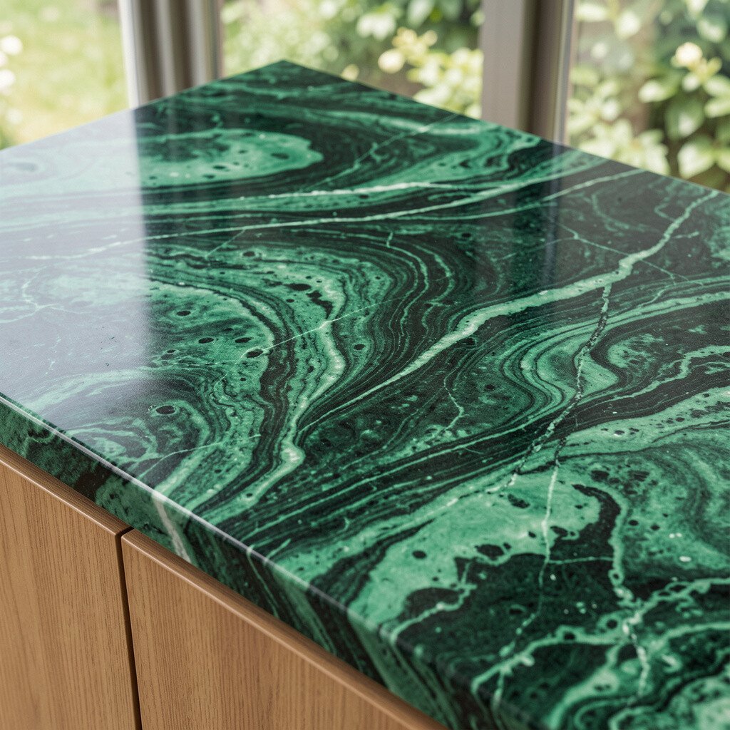
Emerald green countertops look rich and luxurious without needing extra decor. The natural movement in the stone makes the color feel alive and layered.
Natural stone can be a great choice if you love one-of-a-kind variation. You’ll enjoy benefits like adding depth to your space and creating a focal point that works with both classic and modern styles.
For practical care, seal the stone as recommended and wipe spills promptly, especially for acidic items. Personalization is easy by coordinating your backsplash and hardware so the green feels intentional rather than random.
Cost considerations vary widely with stone type, so compare pricing for different finishes and thicknesses. To save money, you can choose a finish that hides tiny variations while still giving you that stunning emerald vibe.
9. Sunset Orange Composite Countertops
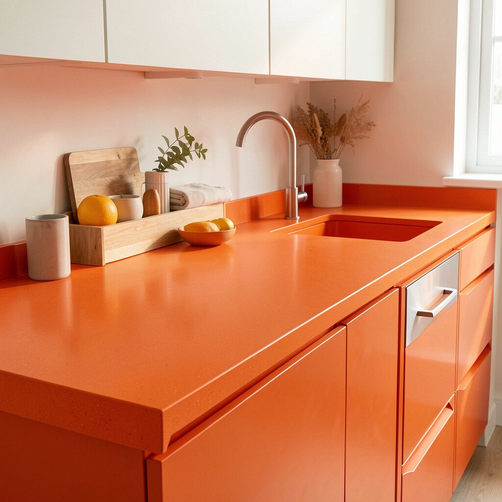
Sunset orange makes a kitchen feel like it’s always welcoming you home. The color looks especially bold with creamy whites and light gray walls.
Composite countertops are popular because they blend strength with a smooth, modern finish. Many types resist staining and are friendly to everyday cleaning routines.
For a practical, stylish look, pick an orange shade with a balanced undertone that matches your cabinets. If your decor leans warm, choose a more terracotta-leaning orange. If it’s cooler, go toward a brighter, slightly red-leaning orange instead.
Cost can be managed by opting for simpler edges and standard sizes when possible. Also, ask about any installation deals since some fabricators bundle sink cutouts and edge finishing.
10. Coastal Blue Whitewashed Wood-Effect Tops
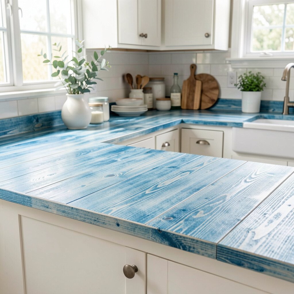
Wood-effect countertops bring a soft, coastal look that still feels lively. A whitewashed finish with faint blue undertones can make your kitchen feel airy and relaxed.
This idea stands out because it gives you color without turning the space too bold in every direction. You can pair it with sea-glass accents, light cabinetry, and woven textures for a calm but bright mood.
For practical tips, look for a surface designed to handle moisture and heat, especially near the sink. Choose a finish that’s easy to wipe and consider using a cutting board to protect the top.
Cost-wise, wood-look materials are often less expensive than real stone and can be easier to refresh later. If you want personalization, add matching cabinet hardware in brushed finishes that echo the coastal theme.
11. Berry-Purple Countertops With High-Contrast Edges

Berry-purple countertops feel like an instant fashion statement. When paired with crisp white cabinets, the contrast looks bold yet clean.
You can choose a solid color or a subtle pattern to control how dramatic the surface feels. A high-contrast edge, like a darker or lighter trim, helps the countertop look custom even if it’s a standard slab.
For upkeep, use products made for your countertop type and avoid harsh abrasives that can dull the finish. Personalization is easy when you match the purple with one or two accessories, such as a single vase, a set of jars, or colorful dishware.
Cost considerations include edge detailing and sink cutout complexity. If you want to stay in budget, keep the color bold but limit the most elaborate edge style to the island.
12. Sunburst Speckle Quartz for a Confetti Look
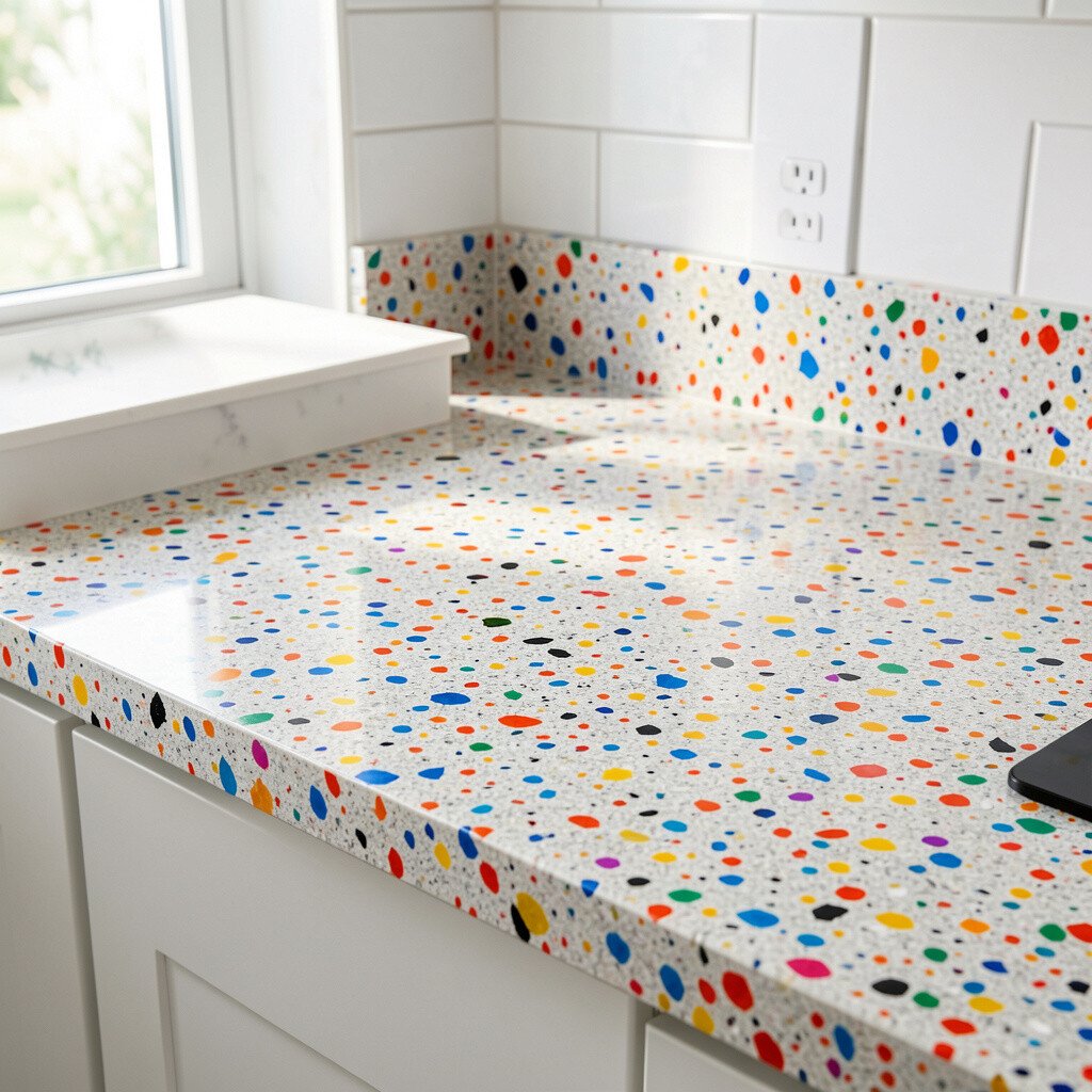
Speckled quartz can create a confetti effect that makes your countertop look dynamic. Bright flecks scattered across a warm base feel playful, yet still polished.
This option is unique because it hides everyday mess better than a solid color. It also helps your kitchen feel energetic without requiring matching accessories in every color.
For practical benefits, speckle patterns tend to mask minor stains and scratches, making maintenance feel easier. Personalize the vibe by selecting flecks that echo your backsplash colors, like gold, coral, or green.
Cost often depends on pattern complexity, so request photos of comparable slabs if your fabricator offers them. You may save by choosing a popular speckle style instead of a rare custom mix.
13. Bold White Marble With a Thick Black Vein

White marble with a thick black vein looks dramatic and classic at the same time. The pattern feels like high-contrast artwork running across your counters.
Marble can be a great choice if you love timeless beauty and natural variation. The benefit is that the look stays elegant while still delivering bold decor energy.
For practical care, use sealant and wipe spills soon, since marble can be sensitive to acidic foods. Personalization can come from choosing hardware finishes, like black faucets or matte nickel, that echo the vein lines.
Cost considerations are important because marble often falls at a premium level. To manage spending, ask about selecting from the same slab group for your backsplash so fabrication costs can be streamlined.
14. Emerald-Lime Composite With a Smooth, Modern Look
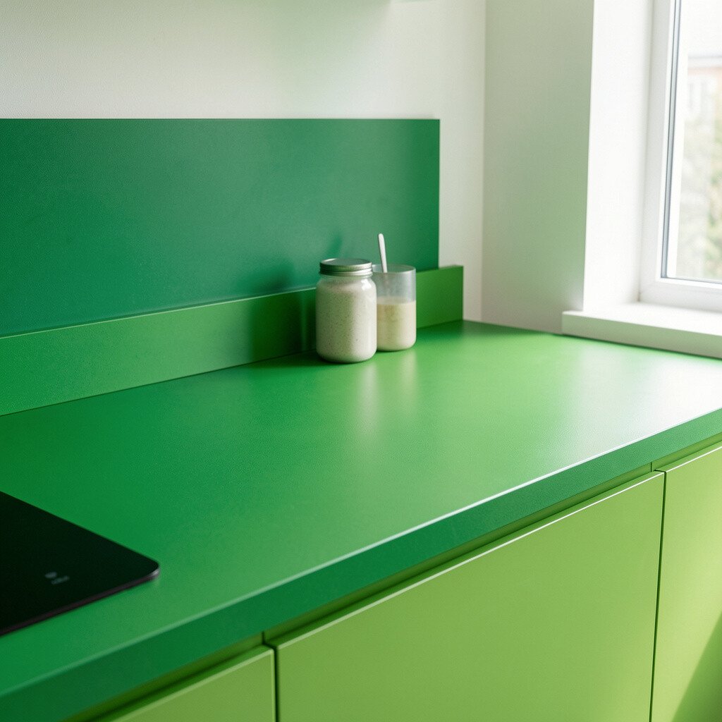
Emerald-lime composite countertops feel fresh, bright, and surprisingly sophisticated. The color sits between green and chartreuse, making it a standout without looking chaotic.
Composite surfaces can offer good durability for daily cooking and usually resist stains well with proper sealing. This benefit makes it easier to live with bold color instead of treating it like a rare decorative piece.
For a personalization touch, keep your backsplash simple so the countertop color leads the design. Add a few matching accessories, like lime-toned mugs or a patterned runner, for a cohesive effect.
Cost can vary depending on color exclusivity and fabrication details. If you want to save, choose a standard edge profile and focus the brightest lime tone on the island where it draws the eye.
15. Terrific Teal-To-Blue Ombre Countertops
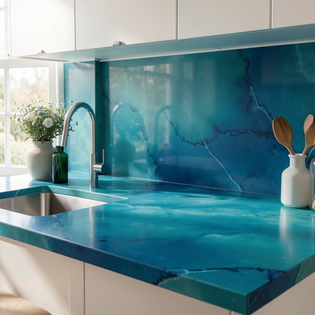
An ombre countertop shifts from one blue shade to another, creating a smooth visual story. It can look like ocean waves or a sunset over the horizon.
This trend feels unique because it’s less common than solid color and more artistic than standard slabs. You’ll also get a personalization benefit since ombre patterns can be tailored to fit the island shape.
For practical planning, confirm how the color will align with the sink and any seams. Many homeowners love adding a complementary backsplash so the gradient feels connected rather than random.
Cost considerations usually reflect customization, so ask for sample swatches and pricing for different gradients. If full customization is too much, choose a countertop with natural movement that mimics an ombre effect.
16. Terracotta and Cream Geometric Tile-Top Counter Style
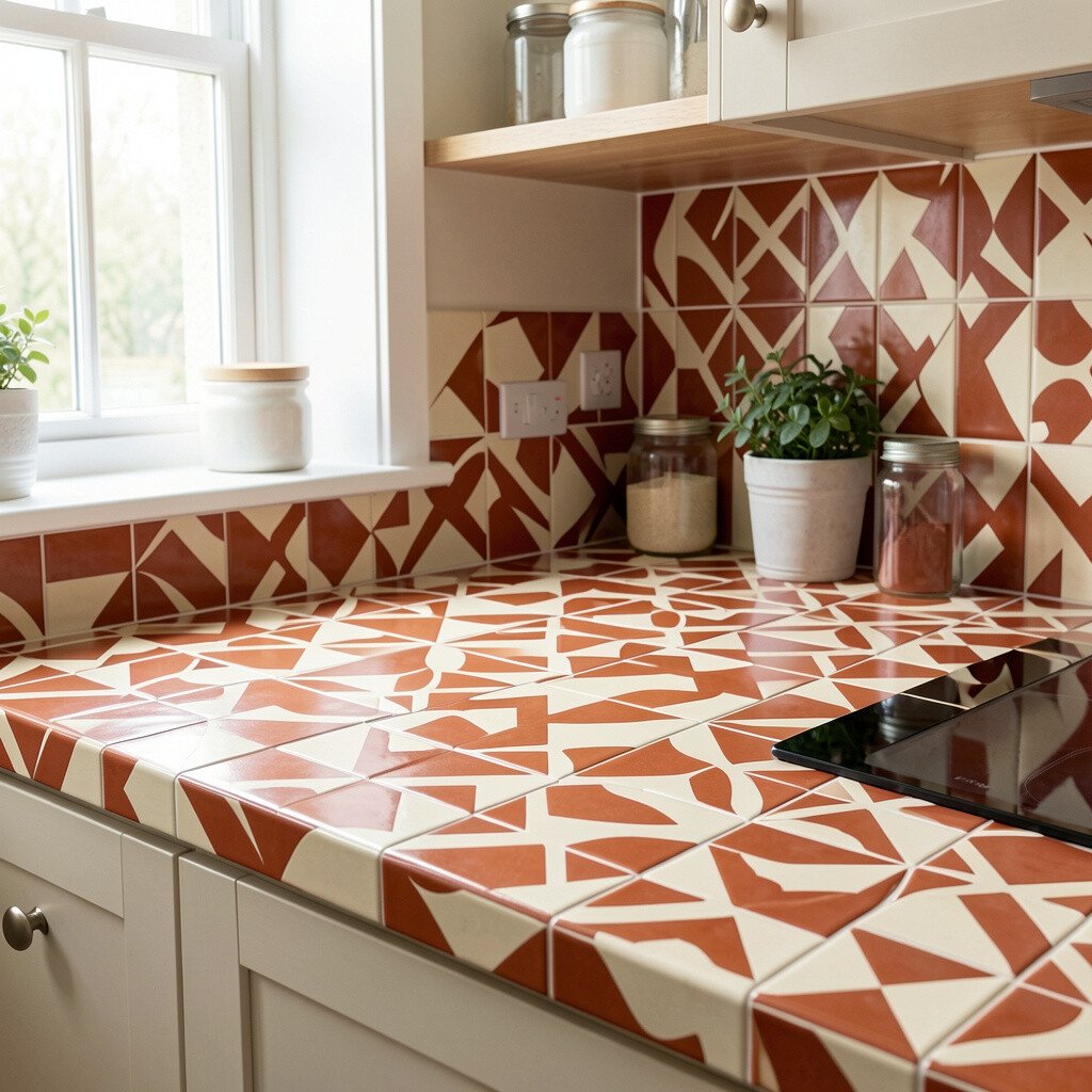
A geometric tile-top countertop can bring bold decor with a handmade vibe. Think of cream shapes outlined in terracotta, forming a pattern that feels playful and structured.
This style stands out because it turns the countertop into a patterned focal point. It also offers practical benefits since you can replace a single tile if something chips over time.
To make it practical, choose grout that’s suited for kitchen use and seal it regularly. Personalize by matching the tile colors to your cabinet tone and adding a coordinating backsplash strip.
Cost can vary based on tile quality and the complexity of the pattern layout. To manage expenses, keep the design limited to a centered island or a smaller prep area rather than covering every countertop surface.
17. Candy Red Resin Countertops With a Glossy Depth
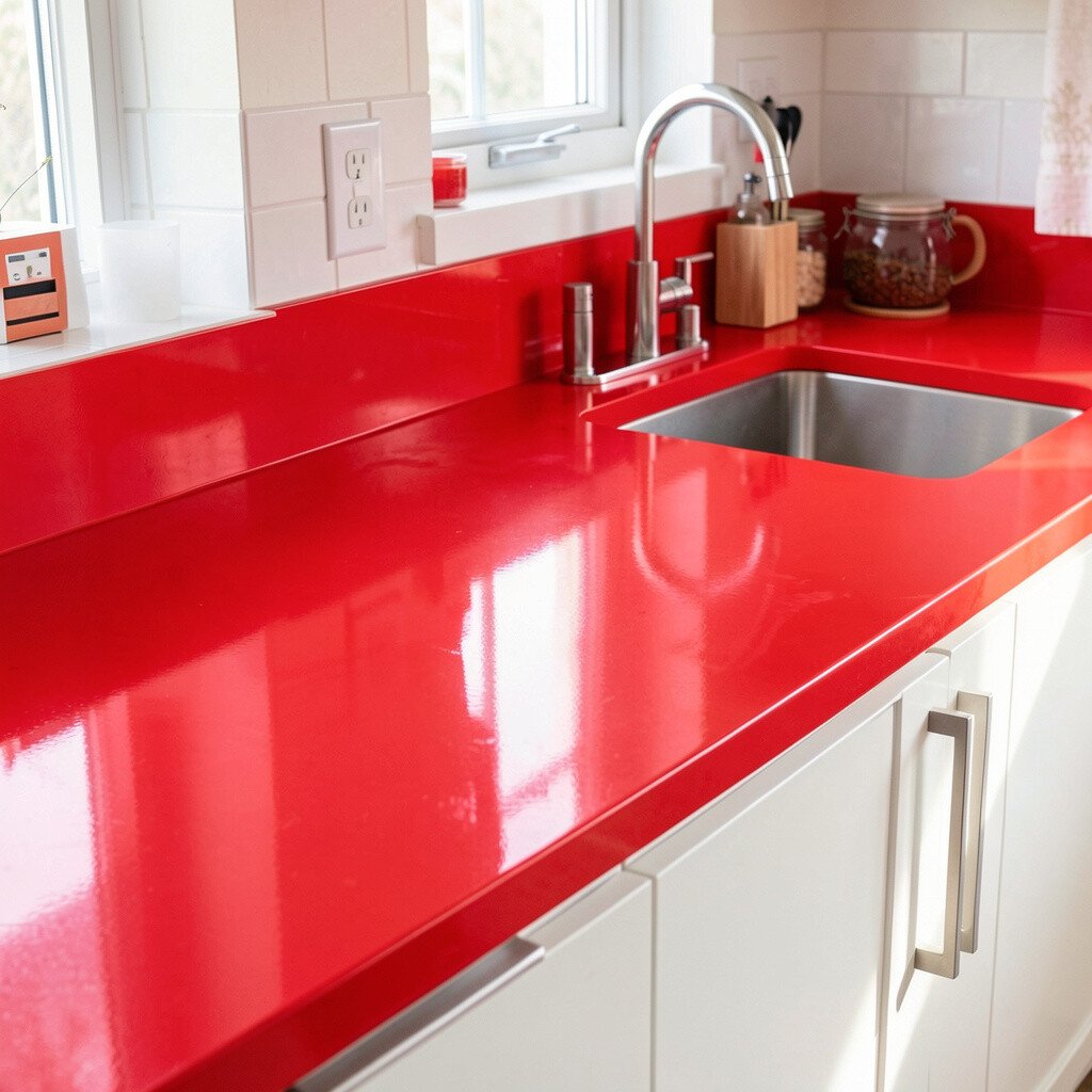
Candy red resin countertops look bold, smooth, and almost liquid. The glossy depth makes them feel like a modern art installation.
Resin can be unique because it allows a deep, saturated color that’s hard to copy with stone. For benefits, it can be seamless in appearance and can feel warm to the touch compared with very cold surfaces.
For practical tips, use cutting boards and avoid placing very hot pans directly on the surface. Ask your installer about recommended care products and how to protect the finish from daily wear.
Cost considerations can be higher due to craft and curing time. If you want a similar vibe on a budget, consider a smaller resin island top while keeping surrounding counters in a neutral finish.
18. Marble-Inspired Sandstone Beige With Bright Accents
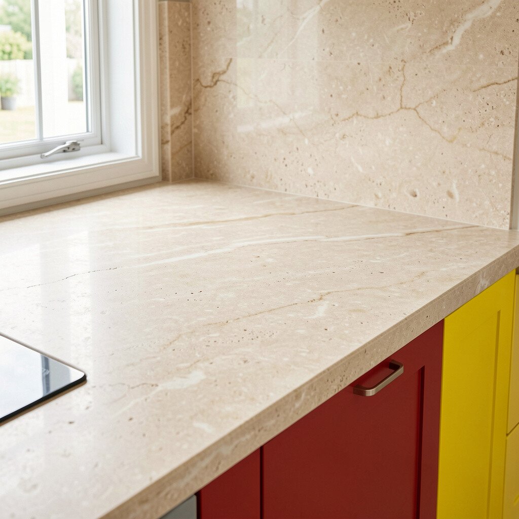
Beige countertops can still feel vibrant when they include warm, marbled movement. Pair that sandy tone with bright accents, and your kitchen will feel lively without getting overwhelming.
This idea is unique because it uses a softer base and lets color show up through accessories and details. The practical benefit is that beige hides everyday wear better than the brightest pigments.
Personalization is easy through hardware, lighting, and a bold backsplash choice that frames the countertop. Choose accents like cobalt ceramics, lime glass, or patterned textiles to make the beige look intentional and fresh.
Cost-wise, sandstone-inspired options can be more budget-friendly than certain premium stones. You can also save by selecting a finish that doesn’t require as much polishing and still looks high-end in photos.
19. Bold Patterned Laminate With Tropical Leaf Prints
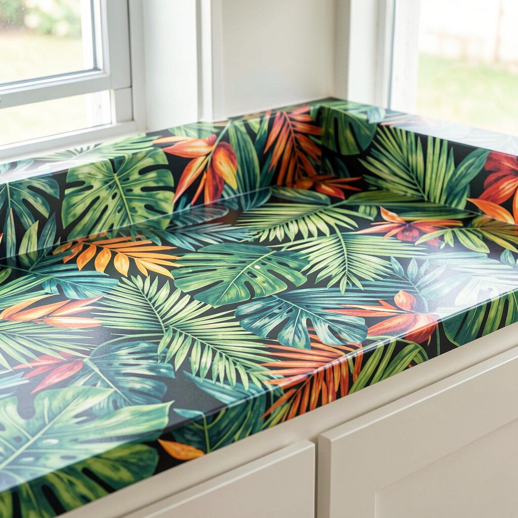
Tropical leaf laminate brings instant fun and a vacation-like mood to your kitchen. A bright pattern can make even plain cabinets feel styled and exciting.
This approach is practical because laminate is usually affordable and easy to install. It’s also a great way to test a bold decor trend before you commit to higher-cost materials.
To keep it balanced, choose a pattern with colors that match your existing room palette. Use a simple backsplash and let the countertop do the talking, or echo the leaves with matching curtains or a decorative canister set.
Cost considerations include edge and seam choices, which can affect the final look. If you want to keep spending low, use the patterned laminate on the island and keep the perimeter counters solid and calmer.
20. Color-Blocked Countertops Using Two Complementary Finishes
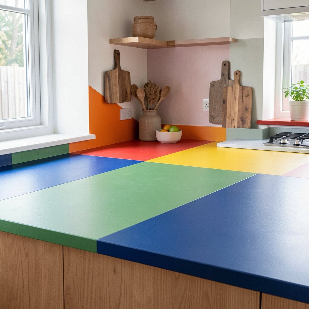
Color-blocked countertops make a bold statement by combining two finishes or two strong colors. Think deep blue on one zone and crisp white on another, separated by clean lines.
This idea feels unique because it lets you personalize your space like you’re designing a piece of art. It also brings practical benefits since you can choose the more stain-resistant finish for the busiest cooking zone.
For practical tips, plan the break line carefully around the sink and main prep areas so it looks neat, not accidental. You’ll also want to coordinate your backsplash and hardware so both colors feel connected rather than competing.
Cost considerations depend on how many materials you use and how complex the fabrication edges become. If budget is tight, consider color-blocking only on the island front or using a single material line that still reads like two colors through its finish variation.