The dining room can feel stuck in time, even when the furniture looks fine. Mid century wall art adds warmth, rhythm, and a fresh focal point.
In the before-and-after style, you can see how a simple change in wall décor can make the whole space feel more intentional. This list is full of practical ways to get that look without making it complicated.
1. Sunlit Gallery Wall That Warms Every Dinner
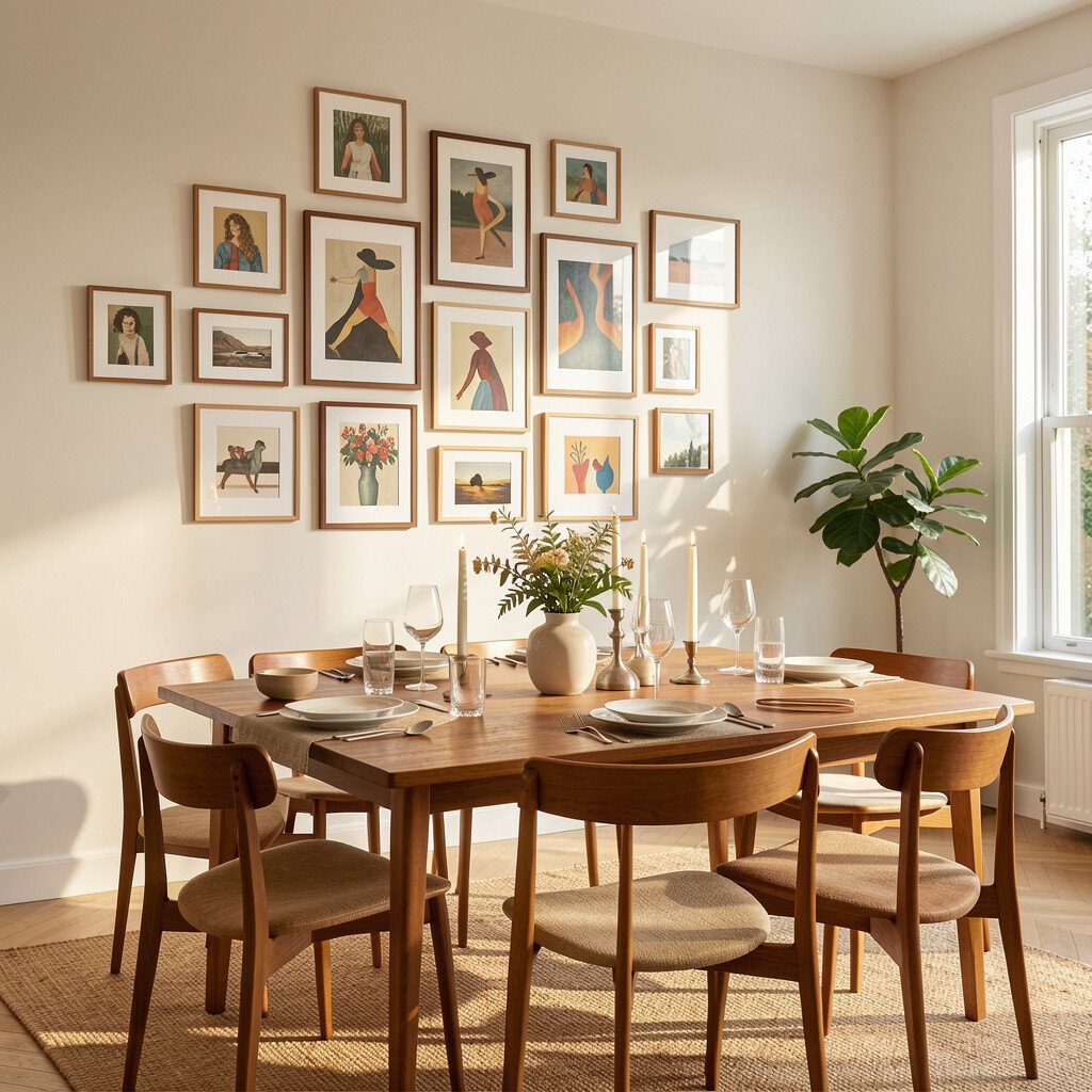
Before, the dining room walls look bare and a little flat, so the light has nowhere exciting to land. After adding mid century wall art, the room feels brighter and more inviting as the pieces catch the eye from across the table.
A curated gallery of framed prints or vintage-style posters brings order and personality. Try mixing one larger artwork with a few medium pieces so the arrangement looks planned, not random. Choose warm tones like mustard, teak brown, or soft orange to echo mid century furniture and create a natural flow.
2. Bold Atomic Shapes for a Fun Retro Centerpiece
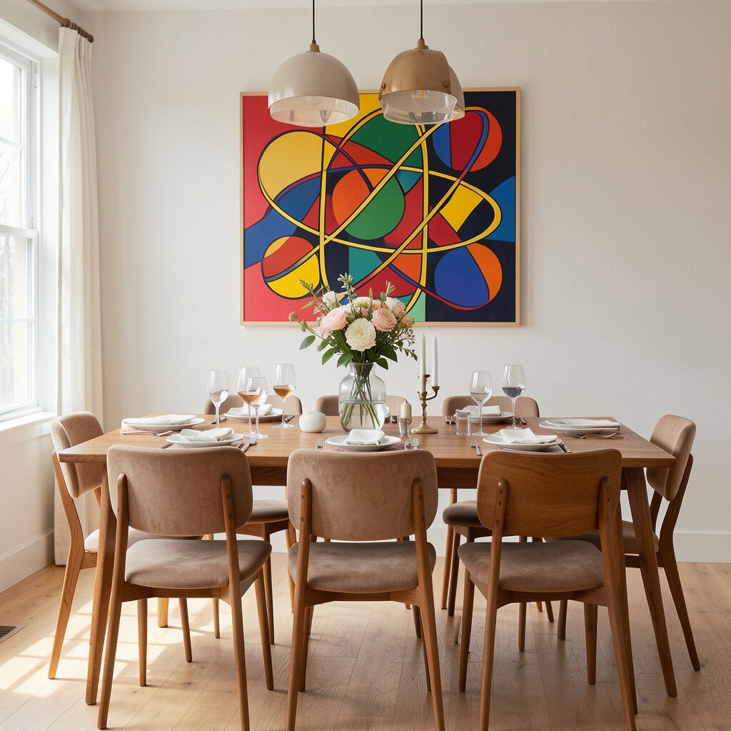
Before, the room’s style feels quiet, so conversations stay inside the chairs instead of bouncing around the walls. After, atomic-inspired art adds a playful focal point that makes the whole dining area feel alive.
Look for wall décor with sunburst rays, circles, or starburst patterns in muted colors. It works especially well above a sideboard or near a buffet where people naturally glance. If you rent or want flexibility, use removable frames or stick-on hanging solutions so you can adjust the layout later.
To keep it balanced, choose one statement artwork and let the rest of the wall be calmer. This kind of design trend keeps showing up in modern homes because it brings mid century energy without clutter. When you match the palette to your chairs or curtains, the “retro” vibe stays classy and cohesive.
3. Before and After: One Large Teak-Toned Artwork
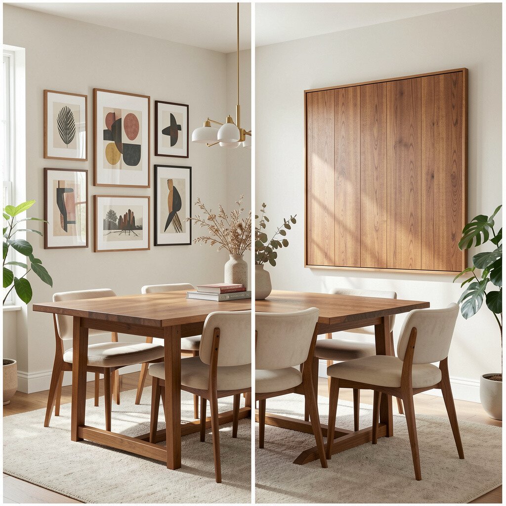
Before, your wall space may feel awkward, especially if you have a long dining table and nothing truly anchors the room. After, a single large mid century wall piece adds structure and makes the room look finished.
Choose artwork that feels like it belongs to the room’s materials, such as warm wood tones, cream backgrounds, or gentle abstract shapes. Position it so the center aligns with the eye line when you stand or sit at the table. This simple placement trick helps the dining space feel tidy even when you’re busy.
For personalization, add small accent items near it, like a matching ceramic bowl or a simple brass lamp. Cost can stay reasonable if you pick a print you love and frame it yourself with a mid tone frame. Many people are trending toward fewer, better pieces right now, and this approach fits that perfectly.
If your budget is tight, search for thrifted frames and then use a new print. A clean frame makes affordable art look high-end and intentional.
4. Abstract Color Blocks That Lift a Neutral Room
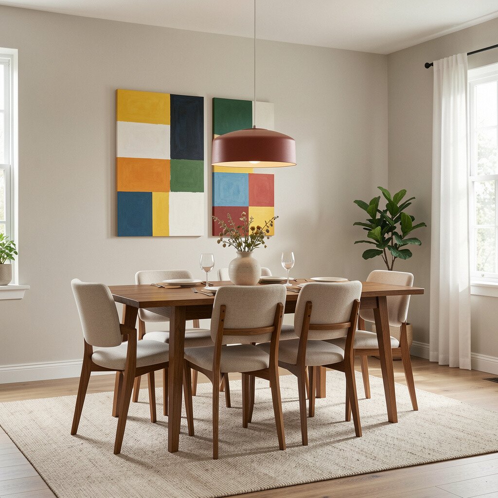
Before, a dining room with beige walls and simple furniture can feel calm but also a little too plain. After, color block mid century art adds lift and movement without demanding a full renovation.
Select artwork with three to five colors that echo your dining set, like olive, cocoa, and off-white. The benefit is that the visuals guide your eye across the table, making the space feel more styled during everyday meals. Keep the rest of the décor simple so the wall art stays the hero.
5. Textured Wall Art for a Cozy, High-End Feel
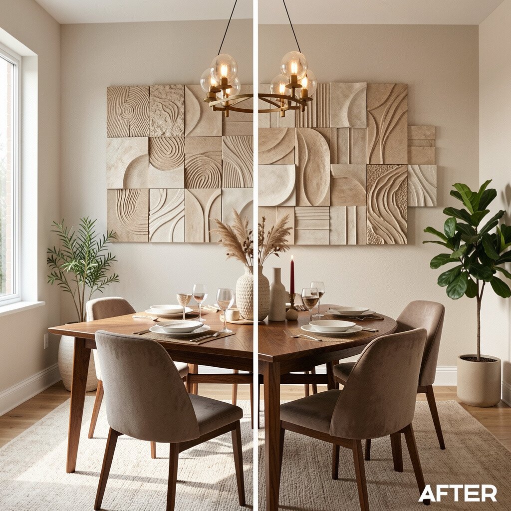
Before, smooth walls and glossy finishes can make the dining room feel cooler than you want. After, textured mid century wall art brings a softer look that feels cozy and grounded.
Consider pieces with layered paper, fabric-like surfaces, or relief patterns that resemble vintage craft. Textural art also helps hide minor wall imperfections, which is a practical bonus. Pair it with warm lighting, like a dimmable sconce or a shade that diffuses the glow.
If you want it to feel unique, choose art with irregular edges or hand-finished details. Cost can vary, but you can often find affordable textural prints that still look rich when framed well. A lot of people are leaning into tactile décor lately because it adds comfort to sleek, modern homes.
6. Mid Century Prints That Match Your Table’s Era
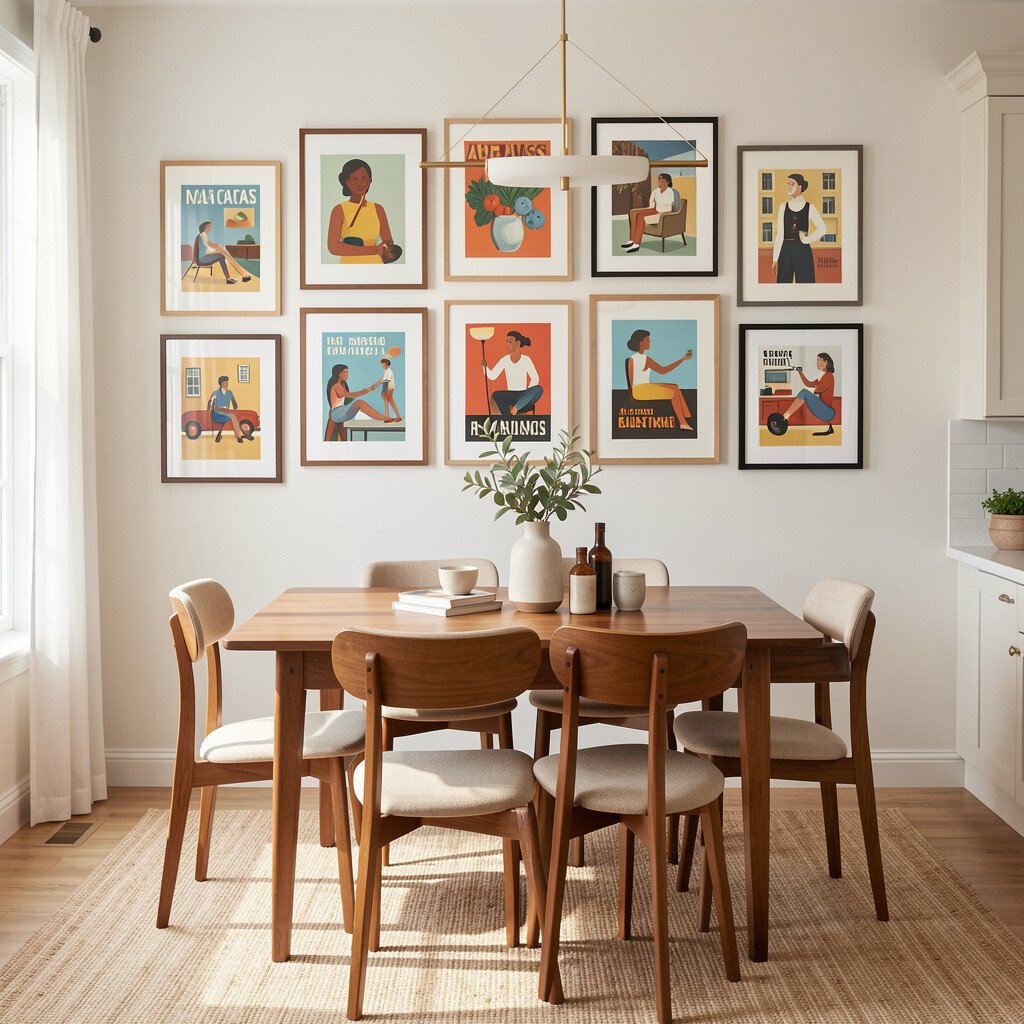
Before, the dining room may have mid century furniture but the wall décor feels modern in a different way. After, matching the style of your prints to your furniture creates a smoother, more connected look.
Pick prints with vintage-inspired typography, gentle abstract forms, or classic travel-poster vibes. This visual match makes the space feel purposeful, not accidental. If you have a walnut or teak dining set, choose artwork with similar warm undertones and darker outlines.
To personalize, repeat one color from the wall art in small accessories like napkin holders or a runner. You don’t have to copy the exact pattern, but repeating a hue keeps the room cohesive. When you buy new art, framing is often the biggest cost driver, so choose a frame finish you already love.
7. A Framed Compass Map for Curious Conversation
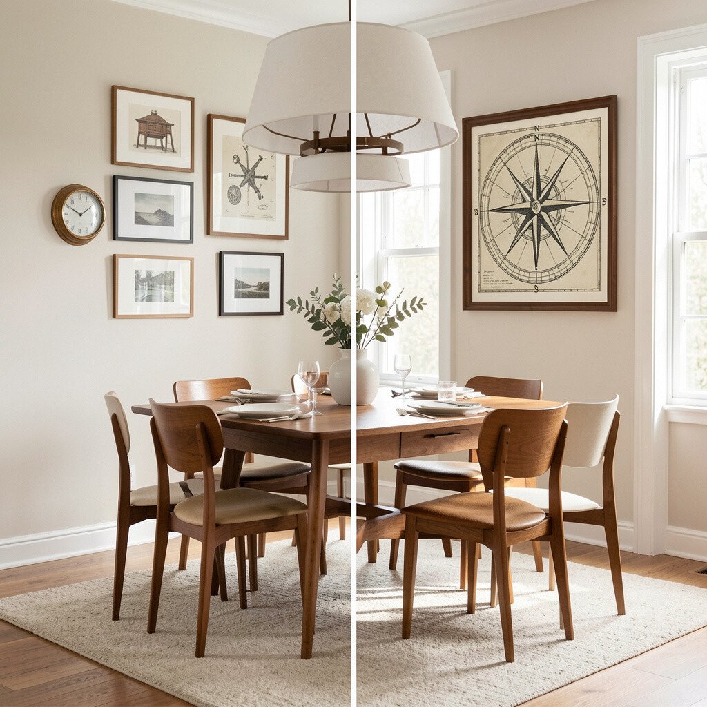
Before, your dining wall might look like it’s waiting for a story. After, a mid century map or compass-style artwork turns the wall into a conversation starter.
Go for maps with soft muted greens, warm paper tones, and simple iconography. These designs fit current trends because they feel nostalgic yet still clean. The benefit is that they look great even when you don’t change anything else around the room.
For practical placement, hang it at the same height as where a gallery would sit, with enough space above for airflow from a pendant light. If you like the look but want something affordable, print a high-quality digital version and use a simple mat to make it look custom. Personalize by adding a small tray or vase in a matching color near the artwork.
8. Record-Style Wall Art That Feels Alive
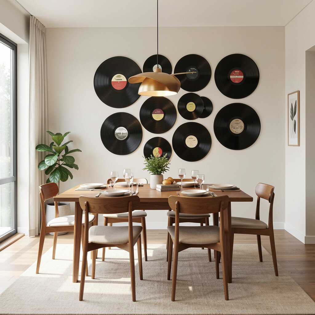
Before, the room’s mood might be quiet, even during lively gatherings. After, mid century wall art with record themes or music-inspired shapes adds rhythm and personality.
Look for designs that use bold circles, clean lines, and warm accents that resemble vintage album graphics. This style can make the space feel more social because it visually echoes entertainment. Keep the rest of your décor steady, so the music theme stays charming instead of busy.
9. Before and After: The Sideboard Focal Point Upgrade
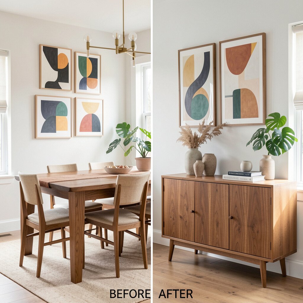
Before, the dining sideboard might look like storage with no strong center point. After, mid century wall art above it makes the whole area feel styled and balanced.
Choose a piece that matches the width of the sideboard or slightly wider, so it doesn’t look like an afterthought. Hanging it too high or too low can throw off the room, so measure from the floor and aim for a centered eye level. This is one of those practical upgrades that changes the room fast.
To personalize, add a small grouping of objects under the art like framed photos, a sculptural vase, or a simple candle tray. Cost considerations are easier here because you can focus on one high-impact piece rather than filling the wall with many items. And right now, people are leaning into “one strong focal point” looks because they feel calm and modern.
10. Minimal Line Art for a Sleek, Calm Dining Room
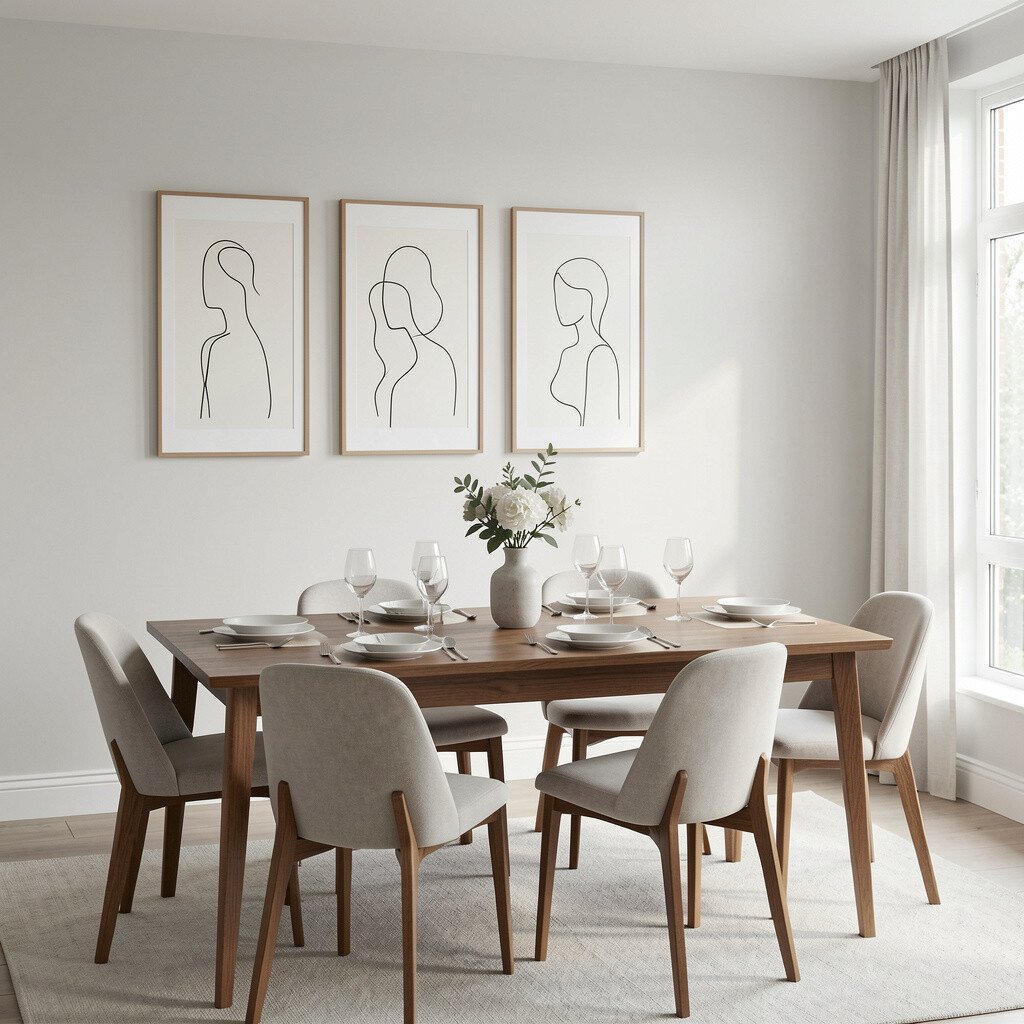
Before, the dining room might be full of furniture details, yet the walls still feel like a blank backdrop. After, minimal line art adds interest without overwhelming the space.
Pick mid century inspired line drawings in neutral colors like black, deep brown, or muted gray. The benefit is that line art works with almost any color palette, especially if your dining room already has patterned textiles. If you want it to feel warmer, choose off-black lines rather than pure black.
For a personal twist, hang two matching pieces instead of one, spaced evenly. If you’re watching your budget, consider smaller prints in simple frames, which often cost less than large statement art. This “quiet trend” is popular because it gives you style that doesn’t compete with dinner conversation.
11. Geometric Wall Art That Brings Order
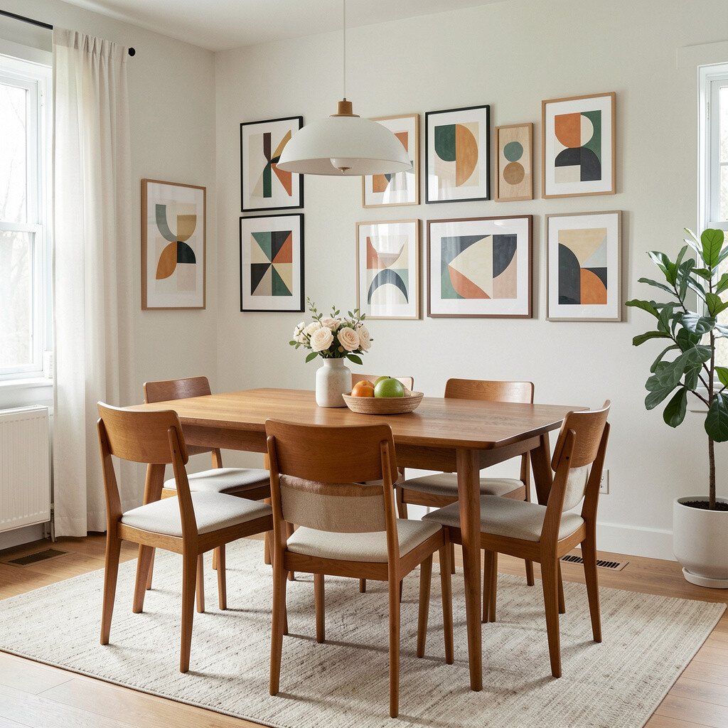
Before, curved furniture shapes can make the room feel soft but not fully organized. After, geometric mid century wall art adds structure, and the dining space starts to feel well composed.
Look for designs with triangles, waves, or symmetrical shapes that echo the legs of your chairs or the lines of your table. A practical tip is to choose a pattern scale that matches the room size so it feels balanced, not tiny. When the geometry ties into furniture silhouettes, the whole room looks intentional.
To personalize, swap frame colors to match your hardware, like brass for warm accents or black for contrast. Cost can be controlled by buying one original print and framing it well. Many current interiors favor patterned but controlled wall art because it gives personality while staying tidy.
12. Vintage-Inspired Portrait Panels for Warm Character

Before, the dining room might feel like it’s missing personality, especially if the furniture is simple. After, mid century portrait-style wall art adds human warmth and visual charm.
Choose artwork with soft facial details, gentle expressions, or stylized figures that feel vintage yet not too heavy. This uniqueness helps the room feel less like a showroom and more like your home. Place the artwork so it’s visible from the doorway, which makes the greeting feel special before anyone sits down.
For personalization, match the artwork’s background color to your curtains or runner. If your budget is limited, you can find affordable portrait prints and use mats to make them look richer. People are trending toward character-driven décor because it makes spaces feel lived-in, not staged.
13. Before and After: The Pair of Matching Wall Pieces
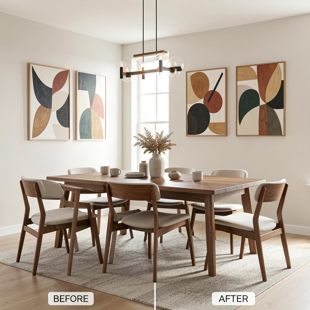
Before, a wide wall can feel awkward because there’s too much space for nothing. After, a matching pair of mid century artworks fills the area and creates a symmetrical, polished look.
Pick two pieces with related colors or the same frame style so they feel like a set. This gives a benefit of balance, especially in dining rooms where symmetry makes people feel comfortable. Hang them with consistent spacing so the center line of the wall stays aligned.
To personalize, choose one piece slightly different in tone to add subtle variety, like a brighter version of the same print. Cost can stay manageable because you can often buy sets at better prices than single large pieces. If you love this trend, it’s also a great way to mix styles while still keeping a cohesive finish.
When you want to refresh later, swapping one print is easier than replacing an entire wall.
14. Mid Century Color Wheels for a Playful Lesson

Before, the dining room may have colorful accessories, but the walls don’t share the same energy. After, color wheel style mid century art adds fun structure and brings harmony to the palette.
Choose artwork with clean circles and limited colors, then tie it to your table linens or chair upholstery. The benefit is that the design subtly makes the room feel more coordinated. It also adds uniqueness without needing extra décor.
15. Abstract Landscape Panels for a Soft Escape
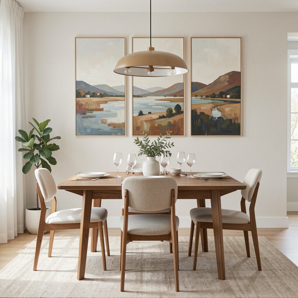
Before, the wall might feel too close and heavy, especially if the room uses dark tones. After, a mid century landscape panel with gentle horizons makes the room feel lighter and more open.
Go for artwork with airy gradients, minimal silhouettes, and warm daytime colors. This style is trending because it offers calm, nature-inspired vibes while still keeping the mid century look. Practical tip for placement is to leave some breathing space around the artwork so it doesn’t crowd wall fixtures.
To personalize, choose a landscape that includes colors from your home, like sage greens or sand beiges. Cost considerations are easier when you frame a medium-size piece, since it often offers more impact than tiny prints. If you want to keep it budget-friendly, print on quality paper and use a sturdy frame for longevity.
16. Patterned Textiles Look Like Wall Art, Too
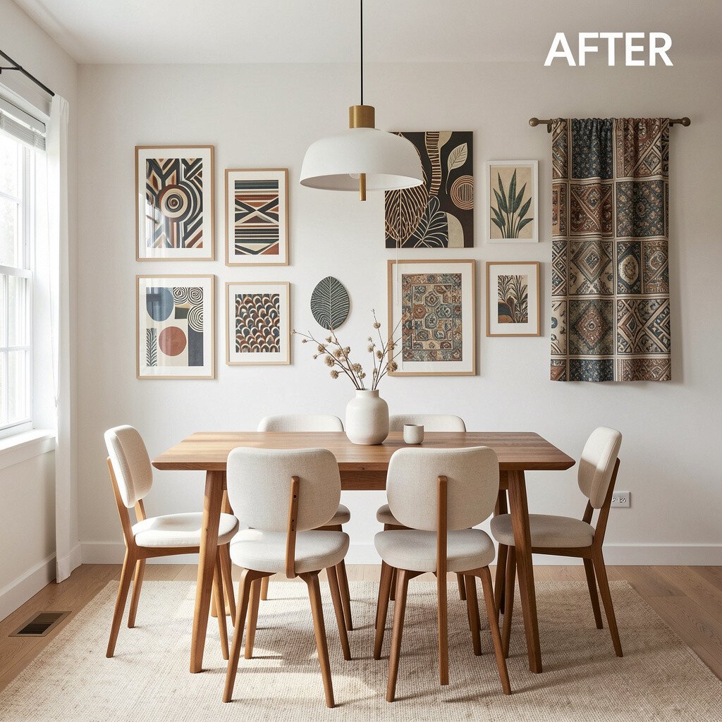
Before, you might rely on curtains and table linens for all your pattern, leaving the wall feeling flat. After, a mid century-inspired wall hanging adds texture and visual depth without feeling like “just another picture.”
Try woven wall hangings, vintage-style tapestries, or framed textile panels that echo mid century motifs. This uniqueness works great because it adds softness and makes the dining room feel more welcoming. It also helps absorb sound slightly, which can make dinner feel calmer.
For practical tips, measure wall space and choose a hanging size that is about two-thirds the width of the furniture below it. Cost can vary, but many woven options look expensive even when they’re affordable. Personalize by matching the hanging’s colors to the underside of your chair frames or to your centerpiece colors.
17. Mid Century Movie Poster Style for Modern Nostalgia
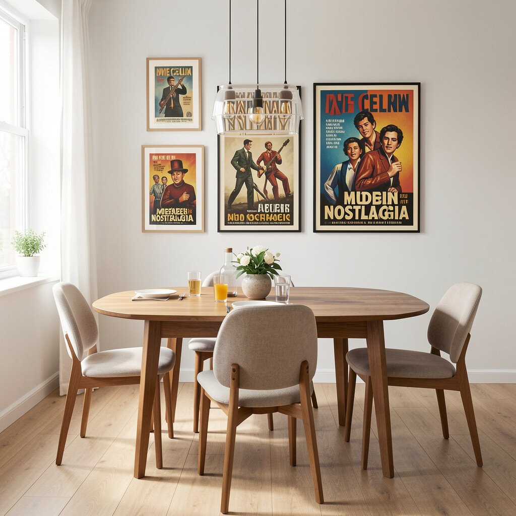
Before, the dining room might lack a clear theme, so everything feels separate. After, movie-poster inspired mid century art adds a playful theme that still feels stylish.
Look for simplified poster graphics with bold borders and muted color palettes. The benefit is that posters add storytelling, but you can keep the look clean by choosing one poster as the main focal point. If you prefer a calmer vibe, pick posters with soft colors rather than bright neon.
For personalization, frame with a mat that matches your wall color, which makes the art feel crisp. Cost is often manageable since prints are widely available, and you can choose a size that fits your space. This current trend is popular because it brings nostalgia while still aligning with modern design lines.
18. Wood Framed Abstracts That Match Warm Floors
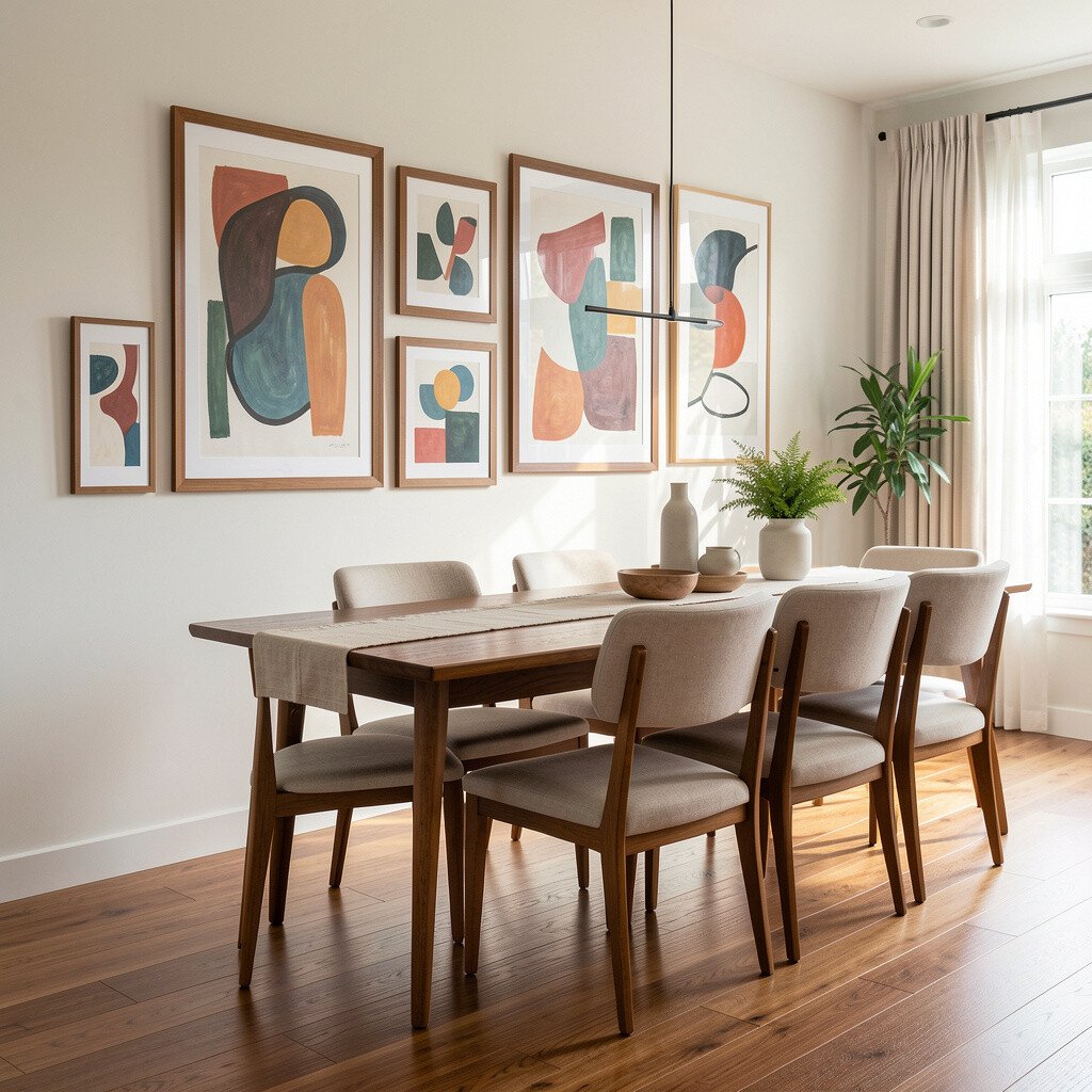
Before, the dining room may feel like it has beautiful natural materials, but the walls don’t share that warmth. After, wood framed mid century abstract art ties everything together and makes the room feel cohesive.
Choose frames in oak, walnut, or teak tones and pair them with artwork that has warm neutrals or muted blues. A practical tip is to coordinate the frame finish with your table legs or cabinet hardware so it looks like one set. This benefit shows up when you look at the room from the doorway, since everything reads as intentional.
To personalize, hang two smaller pieces with the same frame style rather than buying one huge piece. Cost can be controlled because you can mix one statement print with smaller budget options. Many people now prefer “warm minimalism,” and this approach fits it perfectly.
Just make sure the frame isn’t too glossy, or it can reflect pendant lights and distract from the art.
19. Before and After: A Retro Clock That Becomes Art

Before, the wall might have empty space that begs for something functional, like a clock or shelf. After, a mid century inspired clock adds function and decoration at the same time.
Look for clocks with graphic faces, bold numbers, or atomic details. This uniqueness makes the room feel lively, and it gives guests something to notice besides the centerpiece. Position the clock so the table doesn’t block it when people sit down.
For practical considerations, choose a clock with quiet movement or a wall mount that holds securely. Cost varies, but you can often find mid century style clocks in a wide range of prices. Personalize by selecting colors that match your art frames or lamp shades.
20. Retro Botanical Prints for Gentle Color and Balance
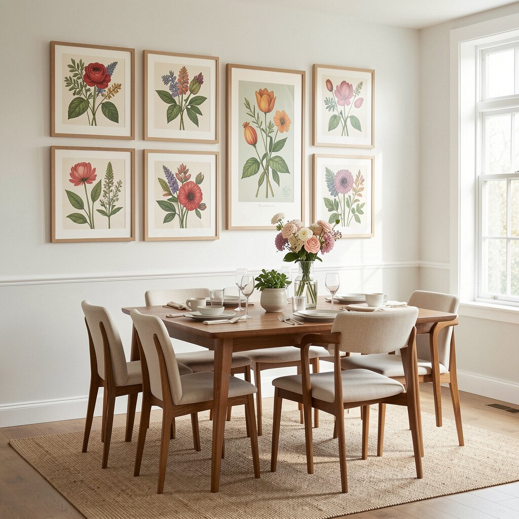
Before, your dining room may feel structured but not soft, especially if you have straight lines and solid wood. After, botanical mid century prints add gentle curves and a feeling of calm.
Pick prints with clean illustration styles, like leaves in simple outlines or stylized flowers with muted color. The benefit is that botanicals look good year-round and they work with both modern and vintage décor. Keep the frames consistent so the room feels neat and well planned.
To personalize, choose one botanical that includes a color you love and then repeat that color in a small vase or centerpiece. Cost considerations depend on frame quality, so invest in frames and consider more affordable prints. Right now, botanical décor is trending again because it feels fresh and human in everyday spaces.
If you have a gallery wall already, botanicals can act like “soft anchors” among bolder designs.
21. Mid Century Typography That Makes the Wall Feel Personal

Before, the dining room might not feel like it has your voice, even if the furniture looks great. After, typography-style mid century wall art adds personality without needing many objects.
Choose quotes, dates, or short phrases presented in vintage fonts with clean layouts. The uniqueness comes from the message, while the mid century style keeps it grounded in design tradition. A practical tip is to keep the text size readable from the table, especially if guests will be seated for long dinners.
Personalization is easy here because you can match the words to your family, like a favorite proverb or a meaningful anniversary. Cost can stay reasonable by using printed typography and a simple frame. This trend works well in current homes because people want décor that feels personal, not generic.
22. The “Before and After” Mix: Vintage Meets Modern Frames

Before, you might have a few older décor pieces and some newer ones, but the wall still feels mismatched. After, carefully mixing mid century wall art with a consistent frame finish creates a smooth, magazine-ready look.
Try combining vintage-style artwork with modern frames in matte black or warm wood so everything looks intentional. The benefit is that you get uniqueness from the artwork variety but unity from the frame choices. A practical tip is to keep spacing consistent, so the arrangement feels organized even when the art styles differ.
For personalization, add one artwork that reflects your hobbies, like travel art, musical graphics, or botanical prints. Cost considerations are smart here because you can buy one higher-priced piece for the focal area and fill the rest with more affordable prints. Many current designers favor this “mixed era” approach because it looks curated and lived-in.
When you step back, you should feel the room ties together, and the dining table becomes the center of a stylish scene.