The colors outside your window can make your rooms feel calmer and more put together. They also help you choose shades that actually match what you love.
Even if you’re starting small, nature-inspired palettes give you a clear path from mood to paint chips, textiles, and decor.
1. Misty Morning Sage
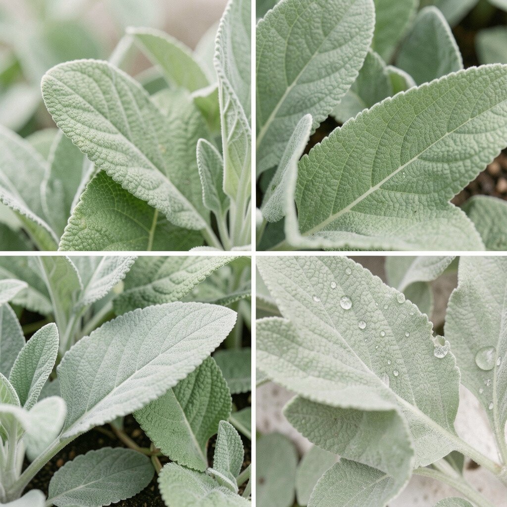
Soft sage tones feel like fresh air moving through a room. They sit between green and gray, so they look balanced rather than loud.
Try sage on walls, then add warm white trim so the light stays bright. Pair it with light oak, linen curtains, and simple ceramic bowls for a clean, lived-in look.
2. Coastal Sand and Sea Glass
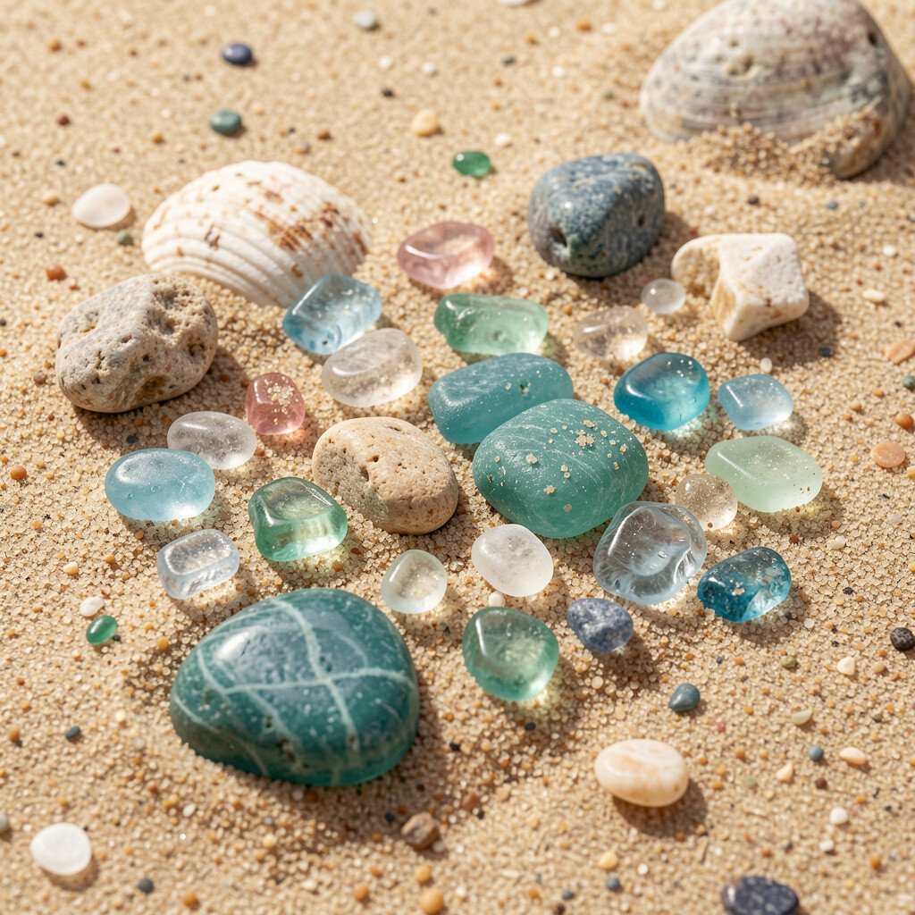
Coastal palettes bring a gentle rhythm that’s easy on the eyes. Think of pale sand, muted aqua, and a hint of sea-glass sparkle.
Use sand as your base wall color, then add sea-glass accents through pillows, glass vases, or a bathroom vanity. This combo helps small spaces feel open because the light color reflects more during the day.
If you love texture, layer in woven baskets and a jute rug to make the palette feel richer without extra color. For personalization, choose one “statement” aqua piece, like a framed print or a lamp, and keep the rest soft and neutral.
3. Forest Canopy Evergreen

Evergreen shades add depth the way a thick tree line holds the sky in place. They can feel cozy in cool months and grounded all year long.
Paint a feature wall or use evergreen on built-ins, cabinets, or a dining hutch to keep it from overwhelming the room. Combine it with creamy whites and natural wood to keep the look welcoming.
When you want a practical shortcut, pick one evergreen fabric and build around it, such as a throw blanket or chair upholstery. This approach keeps spending in check because you’re not trying to buy every color at once.
4. Sunlit Terracotta and Clay
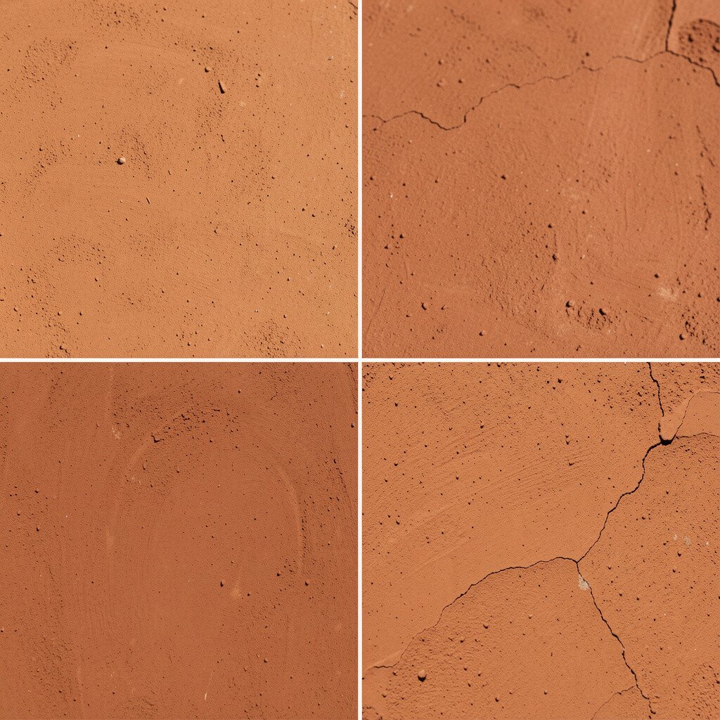
Terracotta brings warmth that feels like sunlight on warm stone. It adds an earthy energy without turning the room into a bright circus.
Try terracotta in powder rooms, entryways, or kitchens where you want a friendly first impression. Pair it with brass hardware, taupe textiles, and whitewashed cabinets for a look that feels both modern and timeless.
5. River Rock Greige
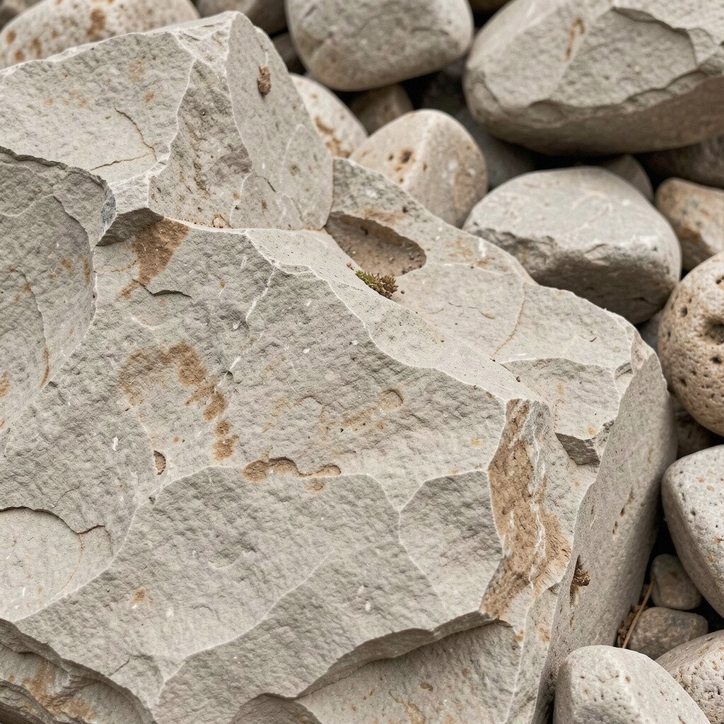
Greige, when chosen with care, looks like smooth river rocks after rain. It has that quiet, steady feel that works in almost any home style.
Use greige as a whole-room wall color, then layer darker charcoal accents through frames, lighting, or a rug. The benefit is simple: it makes changing seasonal decor easy because your base stays neutral.
To personalize, add one playful color from nature, like muted moss or dusty blue, in a small art print or vase. If you want budget control, paint first and switch decor later since neutral walls stretch your spending further.
6. Wildflower Meadow Pink
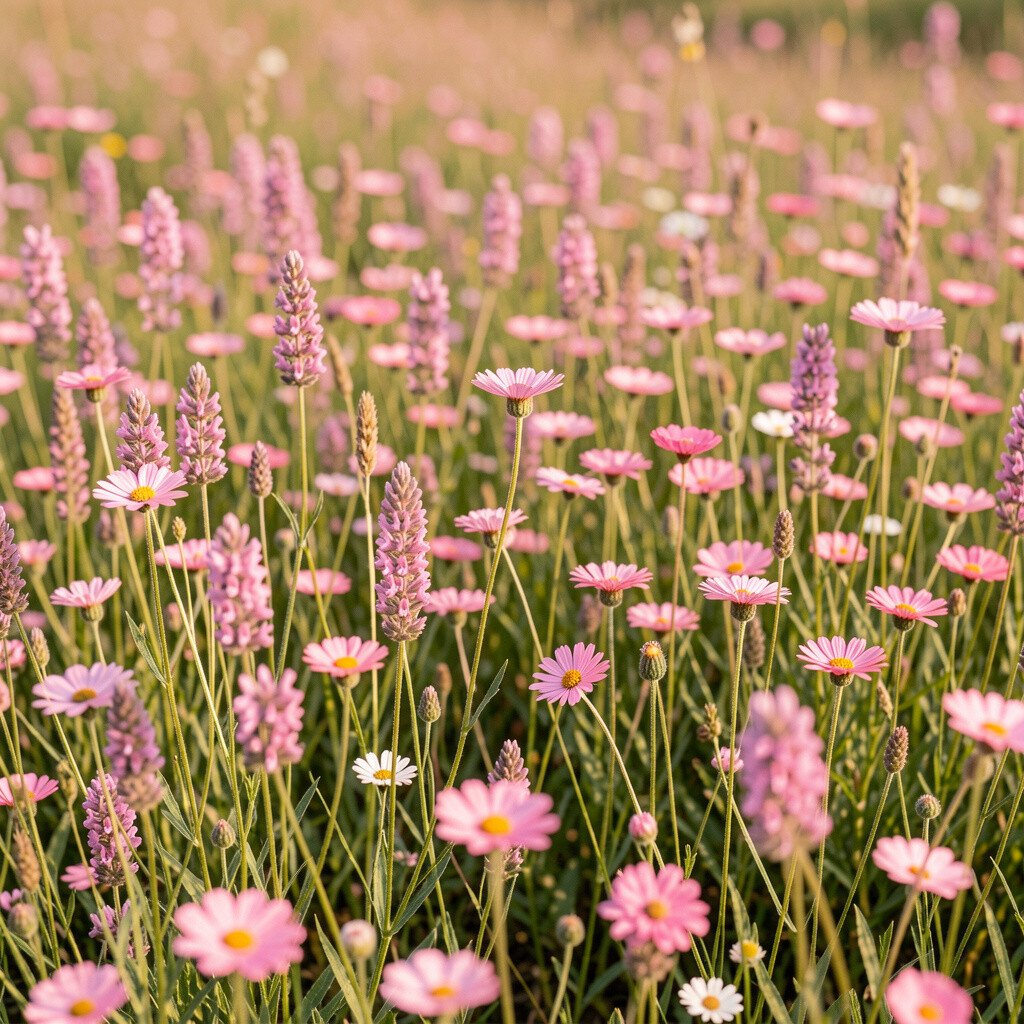
Meadow pink is soft, airy, and full of life. It mimics petals that have faded slightly in the sun, so it feels gentle instead of sugary.
Work this color into bedrooms and nurseries with blush walls or accent pieces like bedding and curtains. Pair it with warm white and pale wood for a fresh vibe that stays calming at night.
7. Autumn Leaf Spice Brown

Spice-brown shades feel like cinnamon bark and toasted leaves. They give rooms a snug, comforting mood that still looks stylish.
Try it in dining rooms, libraries, or cozy reading corners where you want warmth. For a more modern look, balance spice brown with crisp white trim and matte black or dark bronze fixtures.
If you’re worried about a room feeling too heavy, keep the ceiling and trim lighter and bring in natural light with sheer curtains. You can also add lighter textiles, like oatmeal throws and cream rugs, to soften the edges.
Make it uniquely yours by choosing a spice brown undertone that matches your favorite wood, like honey oak or walnut. This tiny matching step helps the palette feel intentional instead of random.
8. Deep Ocean Navy
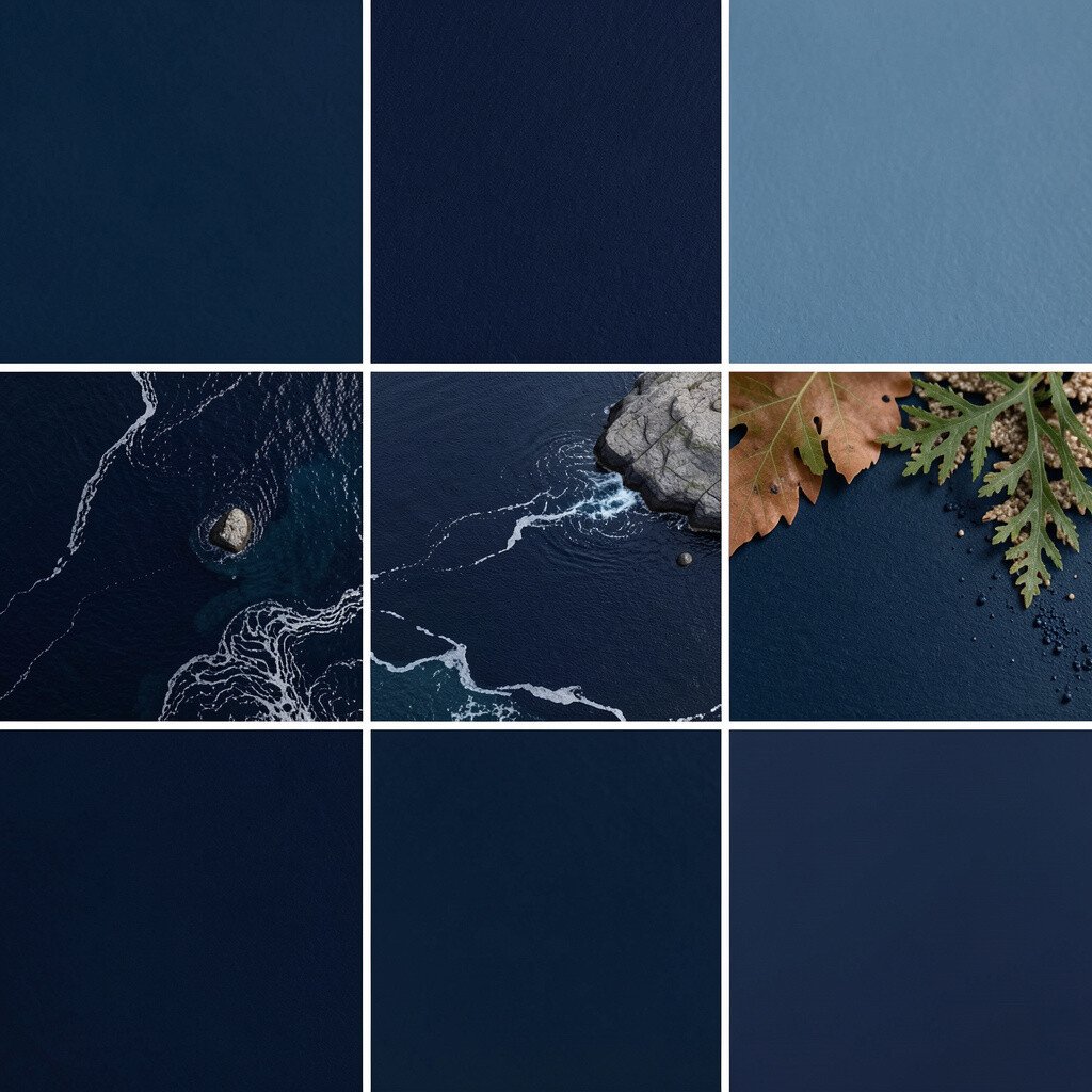
Navy takes on a new personality when it’s inspired by the ocean at dusk. It looks rich and steady, not harsh, especially when paired with the right lighting.
Use navy on cabinets, a study wall, or an accent ceiling to add drama with control. Then bring in sea-inspired brightness with sandy beige, white ceramics, and chrome or nickel details.
9. Fresh Mushroom Umber
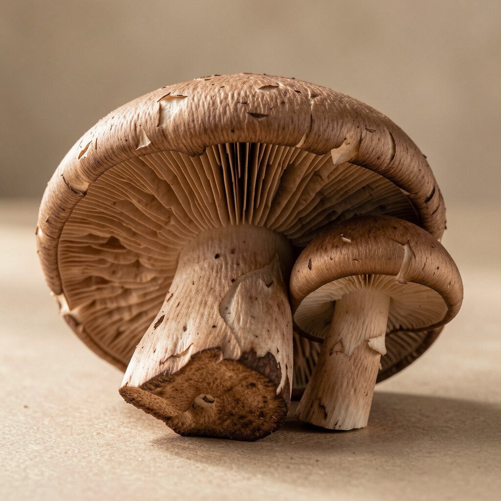
Mushroom umber is earthy, calm, and slightly muted in a way that feels modern. It echoes forest floors covered in leaves and soft growth.
Paint this shade on lower walls or use it on built-ins, then add textured fabrics like cotton canvas or boucle. The practical benefit is that umber hides everyday wear better than very light colors, which helps busy households.
For personalization, add small pops of color from nature, like moss green or smoky teal, through art or a vase. If you’re keeping costs manageable, choose one room for this warmer tone and let the rest of the home stay neutral.
Current styling also favors grounded palettes like this, especially in homes that mix natural materials with clean lines.
10. Mountain Snow White with Cool Gray

Cool white and gray tones bring a clean, crisp look like snow on stone. They can make ceilings feel higher and surfaces feel more refined.
Try snow white on ceilings and main walls, then use cool gray for trim, shelving, or a backsplash. This combo works great for kitchens and bathrooms because it resists looking dingy when paired with bright lighting.
11. Citrus Grove Bright Chartreuse
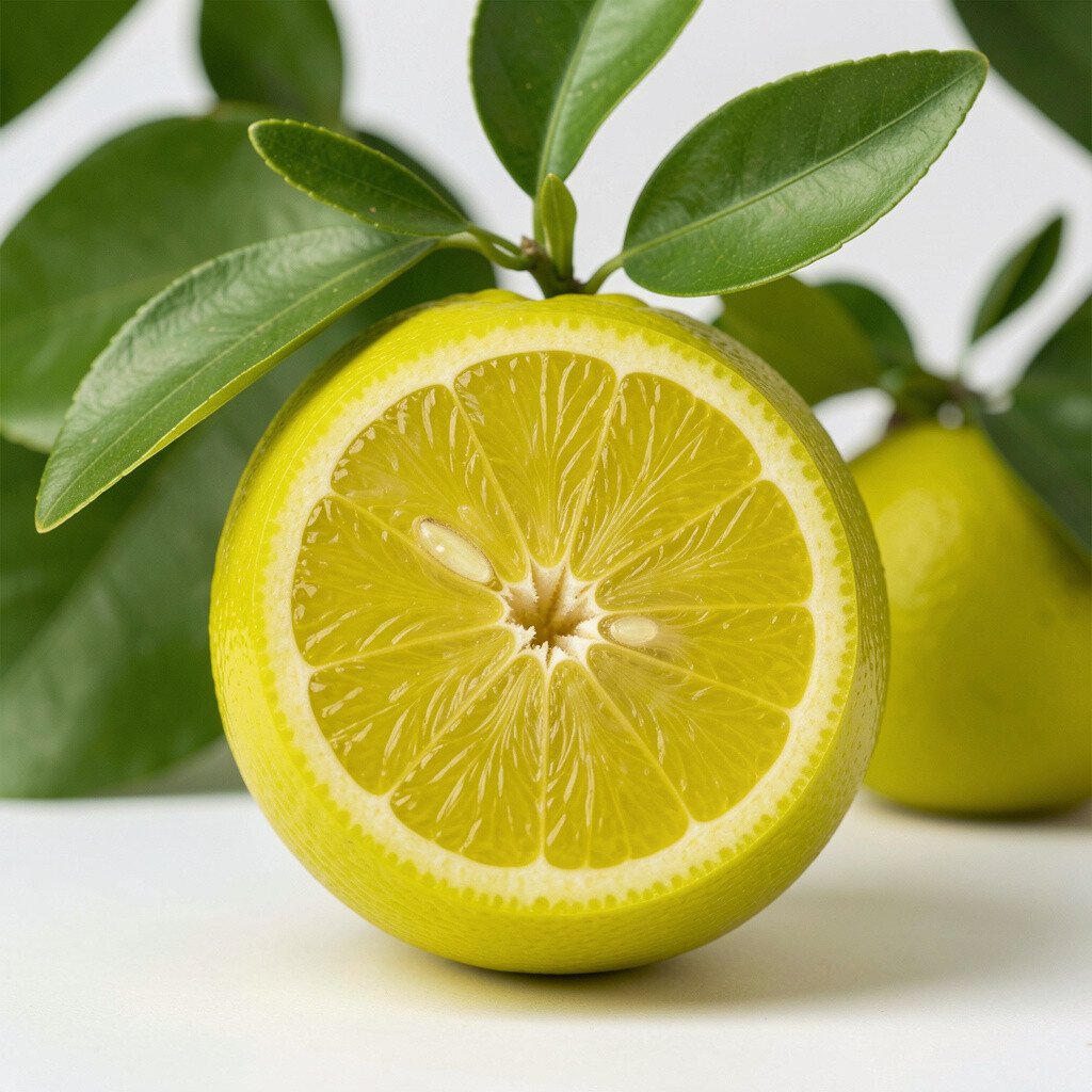
Chartreuse inspired by citrus leaves adds energy without needing neon. It feels fresh like a kitchen herb garden on a bright morning.
Use it carefully in small doses, like bar stools, a single accent wall, or decorative accessories. Because it’s bold, the best practical approach is to anchor it with neutral counters, warm woods, and creamy whites.
Personalize the vibe by choosing chartreuse with more yellow if you want cheerful warmth, or more green if you want a calmer feel. For cost considerations, start with paint samples or one piece of furniture paint before committing to larger projects.
This color is trending in small, curated ways, especially when paired with natural stone and airy lighting.
12. Raspberry Thorn and Rosewood
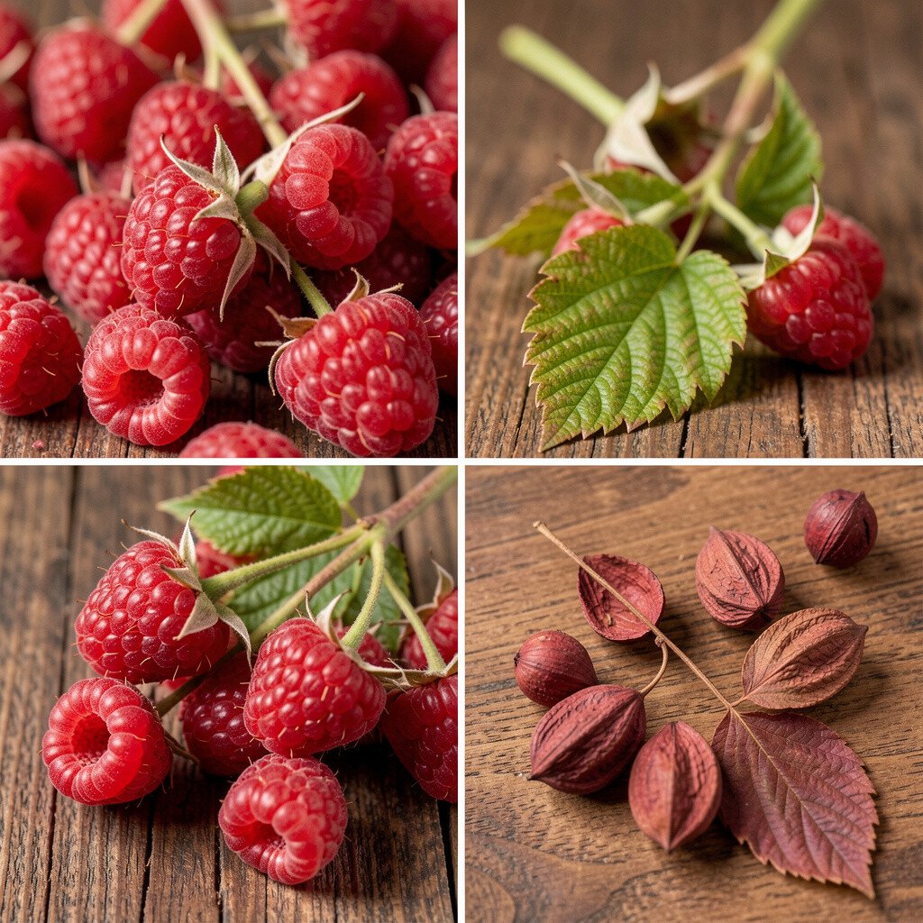
Raspberry and rosewood tones feel like dried blooms and sturdy stems. They add personality to spaces that might otherwise feel too plain.
Try rosewood in a living room with warm beige or oatmeal walls, then bring in raspberry through cushions, a rug pattern, or framed prints. The benefit is that the room becomes more interesting without needing heavy clutter.
If you want a practical win, pick one “texture anchor” such as velvet or a thick knit in raspberry tones. Textiles often give more impact than paint, and they’re easier to swap later.
13. Charcoal Smoke with Ashy Olive
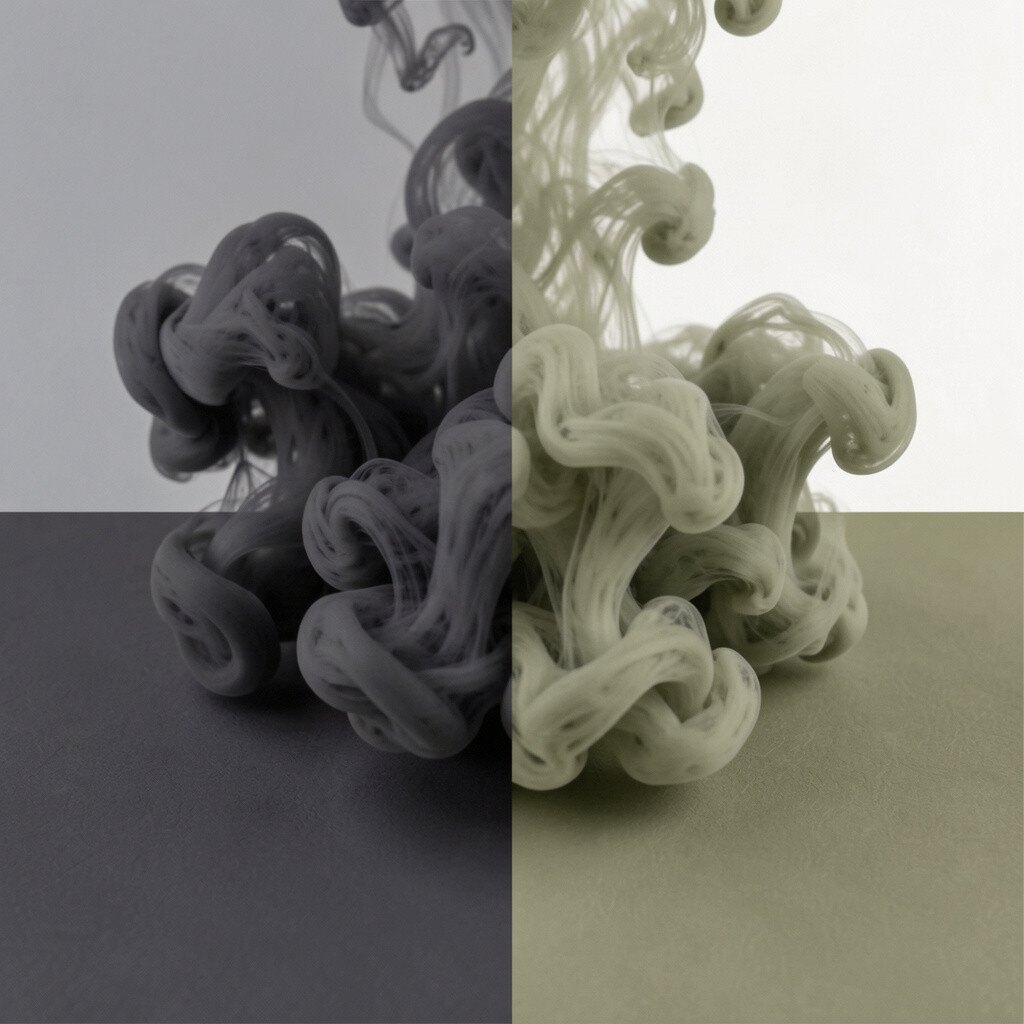
Smoky charcoal paired with ashy olive feels like evenings after a dry, windy day. It looks dramatic, but the olive softens the mood so it stays inviting.
Use charcoal on walls or cabinetry, then balance it with olive accents in blinds, bedding, or decorative ceramics. Keep metals consistent, like matte black or brushed steel, so the palette feels polished.
For uniqueness, choose olive that leans gray rather than bright green, and pair it with natural fibers like flax, wool, and sisal. This combo also helps with practical maintenance since darker tones hide marks better, especially near doors and high-traffic areas.
If you’re thinking about cost, focus on paint and one high-quality rug, then add cheaper accessories to complete the look.