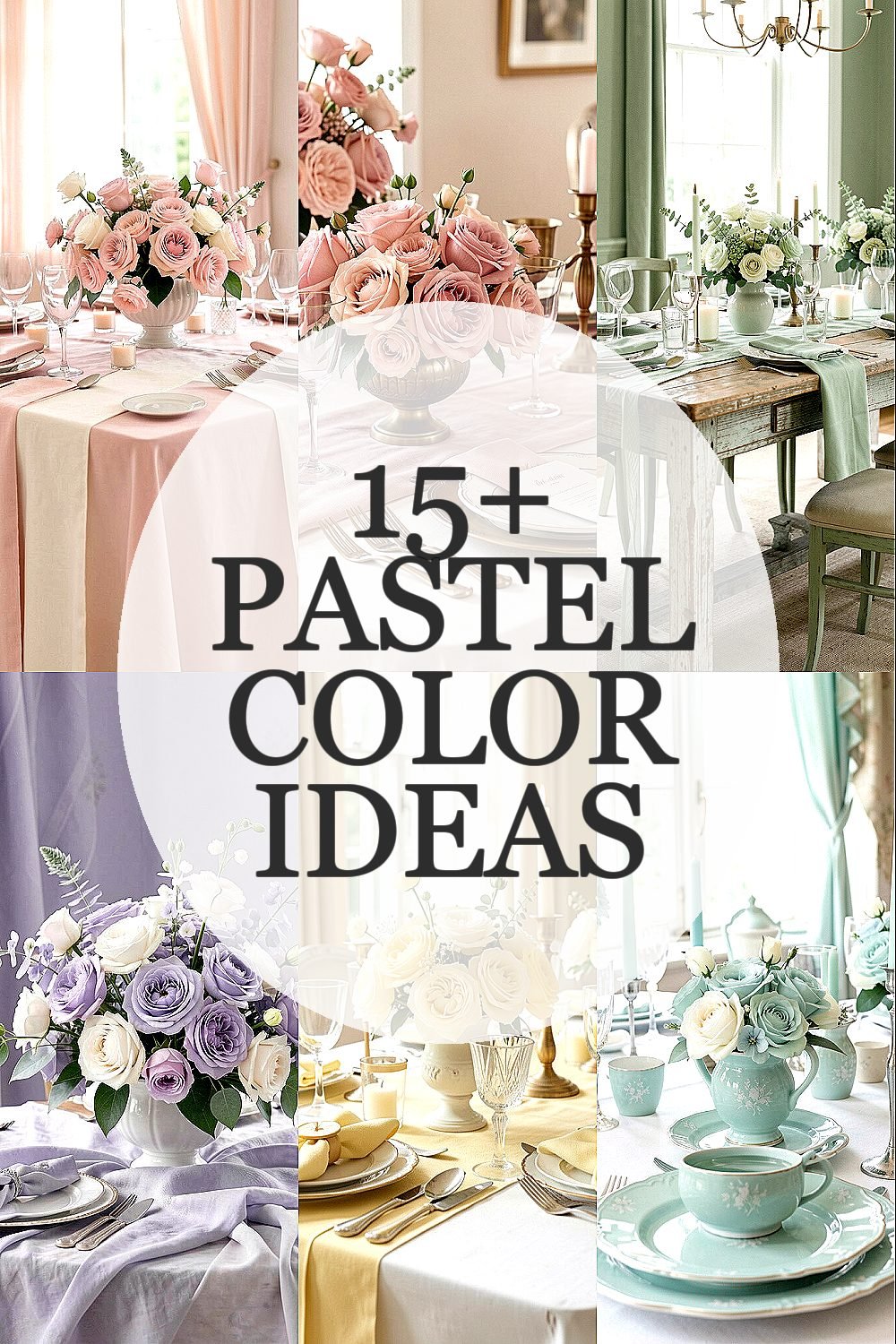
The lightest shades can make a wedding feel like an old love letter. Soft color also helps every photo look gentle and warm.
Here are vintage-inspired pastel ideas you can actually use, from tiny details to big statement moments.
1. Powder Pink With Creamy Ivory Linens

Powder pink feels romantic without being too bold. When it sits beside creamy ivory linens, the whole room looks like it belongs in a soft-focus photo.
Use blush tones on napkins, table runners, or chair sashes for an easy vintage touch. Pairing the pink with warm ivory keeps the palette classic, so it won’t fight with candles or wood tones. This shade is also flattering on many skin tones, which is a big bonus for guest photos and portraits.
2. Dusty Rose And Antique Brass

Dusty rose looks especially pretty next to antique brass accents. Picture a candelabra or picture frame catching the light with a muted glow.
Choose dusty rose for menus, place cards, or the floral edging on centerpieces, then add antique brass for trays, votive holders, and cake stands. That mix feels vintage because brass and rose tones have a long, old-fashioned pairing in home décor. For budget control, buy a few brass items you can reuse, and print rose-colored paper for the rest.
To personalize, match the rose depth to your season by going slightly lighter for spring and a touch deeper for fall. This color is trending in modern vintage weddings because it looks elegant in both indoor receptions and outdoor shade. Keep the rose fabrics lightweight so they drape well and feel airy.
3. Sage Green With Weathered Wood Details

Sage green brings calm and a garden feel that still fits vintage style. It looks stunning against weathered wood, like farm tables and rustic signs.
Try sage in small places first, such as ribbon on bouquets, table numbers, or the leaves in a dried-flower garland. Sage also pairs nicely with natural textures, so you can keep the look grounded and not overly sweet. If you’re using a lot of white flowers, sage accents give them a gentle frame.
For practical tips, keep the sage consistent by using one main shade for paper goods and another for florals, rather than mixing too many greens. This approach helps everything look intentional in pictures. Personalize with a sage-and-cream bouquet wrap using leftover fabric scraps if you like a crafty touch.
Cost-wise, you can often find sage-toned ribbon and craft paper at reasonable prices, especially in bulk packs. It’s a current favorite because it photographs well and doesn’t clash with greenery in outdoor venues.
4. Lavender Mist With Soft Gray Textures

Lavender mist adds a dreamy, vintage mood without turning purple-heavy. When you pair it with soft gray textures, the whole palette looks calm and sophisticated.
Use lavender in reception signage, guest books, or small flower arrangements, then let gray show up in tablecloths, ceramic vases, or upholstered chairs. This combo helps your color feel “old world” because gray has a faded, antique feel. To make it more personal, add a few tiny lavender sprigs into bouquets or use dried lavender bundles as aisle markers.
5. Butter Yellow And Whitewashed Details

Butter yellow feels sunny, but not flashy, which makes it perfect for a vintage wedding. Think of it like warm morning light catching on whitewashed walls.
Use butter yellow on programs, wax seals, or floral ribbon, and keep the rest mostly ivory and whitewashed textures. If your venue has lots of wood, butter yellow will balance the warmth instead of making things look heavy. For practicality, choose one main yellow moment per area so the palette stays elegant.
You can also personalize by using the shade in your cake accents, like fondant flowers or a subtle buttercream ombré. This color is trending because it adds cheerful energy while still reading “retro” on camera. Cost considerations are friendly here since paper goods and ribbon are usually inexpensive compared to large floral installations.
6. Celadon Blue With Porcelain-Inspired Accents

Celadon blue gives off a cool, old-fashioned calm. It reminds people of vintage dishes and porcelain bowls.
Bring celadon into tableware, like using matching napkins or a blue-toned table runner, even if you’re not buying new china. Porcelain-inspired accents, such as stamped ceramic candleholders, make the palette feel cohesive and truly vintage. To keep it practical, look for celadon-colored items at thrift stores or discount home shops, and reserve new purchases for the most visible pieces.
7. Milky Peach With Vintage Lace Overlays

Milky peach feels gentle and friendly, especially when it’s layered with vintage lace. The color looks soft and slightly romantic, like old photographs.
Try peach in your floral palette, such as peach blooms with cream roses, and add lace overlays on tables or dessert displays. Vintage lace also makes the color feel more “heirloom” because it brings texture, not just color. For personalization, drape lace over plain candle sleeves and tie them with a peach satin ribbon.
From a practical angle, lace can be re-used later, and it often costs less than specialty fabric. If you want to stay budget-smart, focus lace on one or two high-visibility areas like the sweetheart table and the cake station. Peach is a current trend because it balances modern softness with classic warmth, and it flatters many skin tones.
Keep the peach milky and light rather than neon, and your wedding photos will look airy instead of intense.
8. Soft Aqua With Antique Mirror Touches

Soft aqua is playful, but it still feels vintage when you pair it with antique mirror details. The color looks like a calm shoreline, while mirrors add that old-glam shimmer.
Use aqua for escort cards, small bud vases, or bridesmaid accessories like ribbon bookmarks for programs. For mirror accents, place a few antique-style frames around the venue or use mirrored trays for desserts. This helps the palette feel more layered, which matters when you want photos to look styled instead of simple.
To personalize, add tiny aqua ribbon bows tied to chair backs, or use aqua ink for guest book writing. Cost-wise, mirrors can be affordable at secondhand stores, and you can focus spending on the items guests notice most. This shade is also trending because it photographs cleanly and complements white flowers beautifully.
9. Antique Teal With Hand-Painted Signage

Antique teal has a deep, vintage personality, like a well-loved book cover. It stands out in photos while still feeling soft enough for a pastel wedding.
Consider teal for hand-painted signage, such as a welcome board or menu boards, because the color looks special when it’s not printed flat. You can also use teal in florals through eucalyptus-toned greens and subtle teal petals, if you want the look to feel intentional. A practical tip is to pick one anchor shade for teal and keep everything else in creams, blushes, and warm whites.
Personalize by choosing a font that feels old-fashioned, like typewriter-style or calligraphy-inspired scripts. From a cost standpoint, hand-painted boards can be cheaper than hiring a full design team, and you’ll get a one-of-a-kind keepsake. This color is currently popular in vintage weddings because teal creates contrast with light blooms without going too dark.
10. Peachy Pink With Vintage Books As Table Decor

Peachy pink is a cozy pastel that feels romantic and not overly formal. It blends beautifully with vintage paper textures like old book pages.
Use peachy pink on table numbers, napkin rings, or small bouquet tags, then sprinkle in vintage books stacked beside centerpieces. That kind of styling feels vintage because it adds history and texture, not just color. If you’re thinking about logistics, collect thrifted books in advance and keep them dry so your décor stays neat through the day.
To personalize, wrap book spines with thin peach ribbon or tuck pastel notes inside pages as place markers. Peachy pink is also budget-friendly because paper goods are often lower cost than large floral arrangements. It’s trending because it pairs well with candid, lifestyle wedding photography and gives a warm, soft glow in pictures.
11. Creamy Apricot With Subtle Gold Thread Details

Creamy apricot feels vintage, warm, and quietly elegant. When you add subtle gold thread details, the palette looks like it belongs in an antique shop window.
Try apricot for table linens, stationery accents, or the color of small floral elements. Then bring in gold through thread, metallic napkin rings, or a gold-dusted garland near the dessert table. This combination is unique because apricot reads softer than coral while gold thread adds a delicate, old-world shine.
For practical planning, avoid using too many different gold shades, since bright gold can look modern next to vintage-leaning colors. Personalize with monogrammed stickers in apricot ink, and you’ll get that custom feeling without extra expense. Cost considerations are gentle here since stationery and small metallic accents are usually affordable, especially if you do them yourself.
12. Soft Coral Pastel With Wicker And Natural Texture

Soft coral pastel brings a lively, friendly energy while staying within the pastel family. It looks especially good with wicker chairs, woven baskets, and natural textures.
Use coral in places like drink labels, signage accents, or petals sprinkled along the aisle. Wicker and natural wood keep the look grounded, so the coral never feels too bright. A practical tip is to choose coral tones that are slightly muted, then let neutrals do the heavy lifting for balance.
13. Cornflower Blue With White And Small Floral Clusters

Cornflower blue looks crisp and vintage when it’s paired with lots of white. Small floral clusters in white and blue hues also feel like classic garden weddings.
Try cornflower blue for bridesmaid dresses in chiffon, if that’s your style, or for accent details like ribbon and printed programs. It’s unique because cornflower sits between bright and pastel, giving you a gentle pop without overwhelming the room. If you’re working with budget constraints, keep big flowers white and sprinkle cornflower accents through smaller blooms.
To personalize, weave cornflower-colored ribbons around bouquets or attach blue-toned charms to chair ties. This shade also matches current trend styling because it looks great in outdoor light and makes photographs feel clear and lively. Cost-wise, blue paper goods can be affordable, so you can spend more on florals in the white base where they’ll stand out most.
14. Pale Sage-Lavender With Dried Flower Garlands

Pale sage-lavender is a calm, airy pastel that looks dreamy with dried flowers. It gives you a vintage look that also feels very “right now” in wedding styling.
Use this color in dried flower garlands by choosing stems with sage tones and lavender hues, then weave them across the mantle, head table, or behind the ceremony arch. Dried florals can lower overall cost compared to fresh bouquets, and they also offer long-lasting keepsakes. For personalization, include a few meaningful dried blooms and tie them with silk ribbons in matching colors.
15. Baby Pink With Satin Ribbons And Cameo Jewelry Styling

Baby pink feels soft and sweet, especially when you use satin ribbons and vintage cameo-style accessories. This combination brings a delicate, romantic vibe that looks great in close-up photos.
Try baby pink on chair ribbons, bouquet wraps, or reception favors, and keep the rest in cream and white. Cameo-inspired details can appear through jewelry worn by the wedding party, or through small cameo motifs on stationery. A practical tip is to keep the ribbon width consistent so the décor looks neat from every angle.
Personalize with a signature bow style, like adding tiny pearl pins or using a specific knot you both love. Cost considerations are manageable because satin ribbon is often budget-friendly, and cameo touches can be subtle rather than expensive. This pastel is trending because it creates that gentle, vintage-lady feel that works beautifully for both intimate and larger celebrations.
For best results in photos, choose satin that catches light but isn’t too shiny, since heavy shine can look harsh.
16. Powder Blue With Soft Pearl And Old-World Stationery

Powder blue is timeless and sweet, like a classic melody you can’t get out of your head. Add soft pearls and old-world stationery, and the whole wedding feels like it was planned long ago.
Use powder blue in your invitations, wax seals, or printed menus, and bring pearls into the styling through small beaded details on centerpieces or table numbers. Old-world stationery elements, like serif fonts and slightly off-white paper, make the pastel feel more vintage than modern. For practical tips, match the ink color to your blue, so everything looks cohesive rather than mismatched.
To personalize, include a favorite quote or line in powder blue ink, then tie the invite to a small pearl charm in a keepsake bag. Cost-wise, printing and paper upgrades are usually easier on the budget than large floral changes, and you’ll get a big visual impact. Powder blue is currently a favorite because it looks elegant in natural daylight and complements both greenery and vintage candlelight.
Keep your blue pale and airy, and you’ll get that classic vintage glow without any heavy color fatigue for your guests.