The right wall art can make a room feel instantly finished. Mid century style does it with charm, color, and smart design.
These ideas are easy to adapt to your home, even if you’re working with smaller spaces. You’ll find practical ways to hang, mix, and personalize your favorites.
1. Danish-Inspired Teak Framed Prints
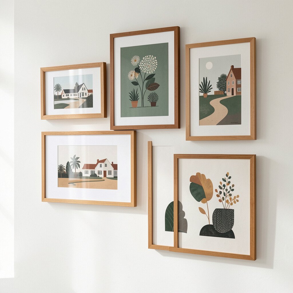
Picture a slim teak frame holding a crisp print with gentle tones and clean shapes. The look feels warm and calm, like sunlight catching a vintage table.
Choose a print that matches your room’s mood, such as abstract lines, botanical forms, or simple geometric scenes. A real teak frame can look richer than you expect, and it instantly adds character. If you’re buying, check measurements twice so the artwork sits centered and not oddly tight to furniture edges.
2. Colorful Atomic Starbursts on a Single Wall
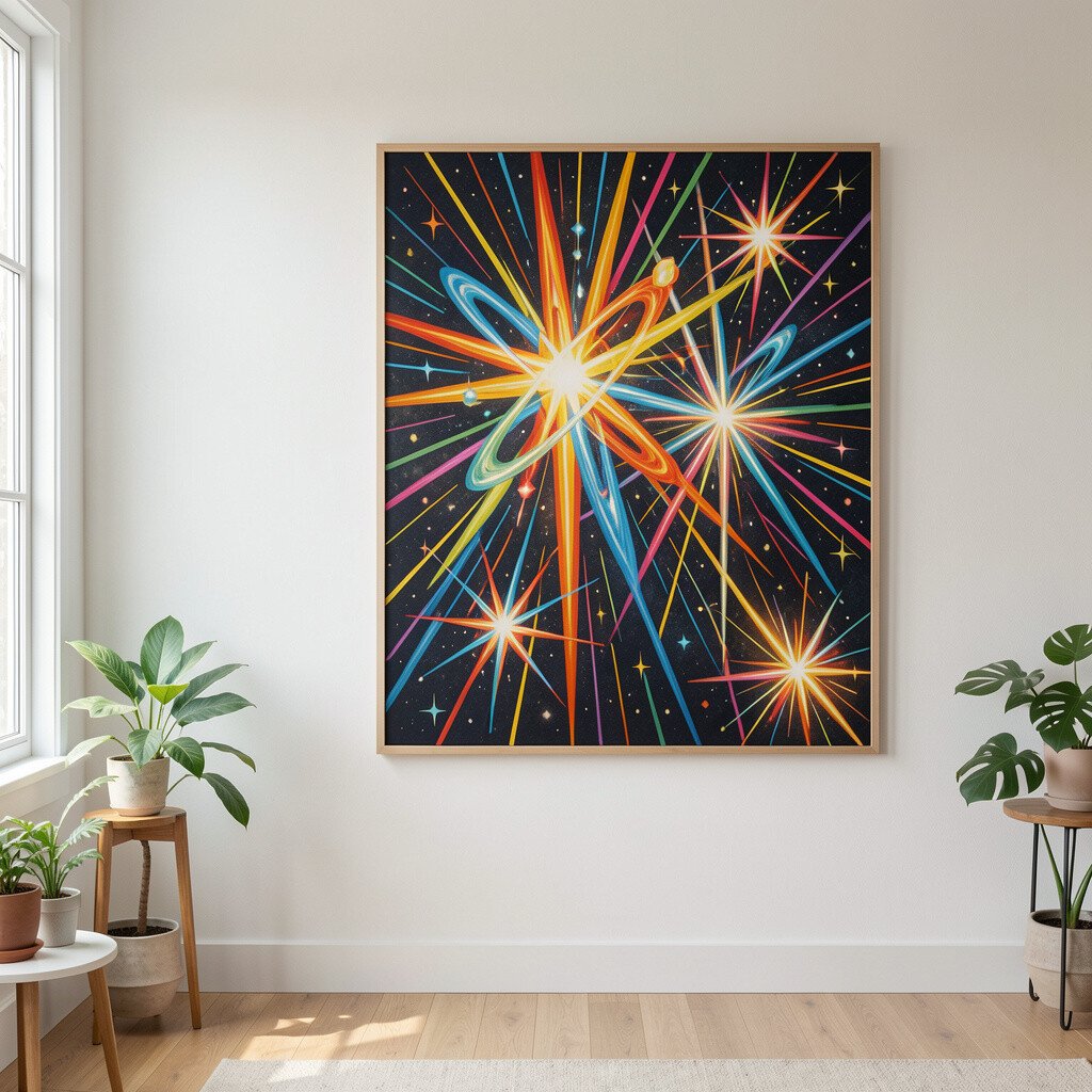
Atomic starburst art brings bold energy without needing a huge space. Think of layered rays radiating outward in sunny yellow, teal, and warm orange.
Hang one large piece as a focal point behind a sofa or console, then keep nearby decor quieter. This style is unique because it feels playful, yet it still fits mid century rules. For practical balance, leave breathing room around the artwork and avoid crowding it with too many small items.
When you personalize, swap colors to match your existing palette and pick a finish that flatters your lighting. Many reproductions cost less than original vintage finds, so you can afford a larger size. If you want a current trend, look for matte paint-like backgrounds and slightly imperfect, hand-finished edges.
3. Oversized Vintage-Style Landscape Silhouettes
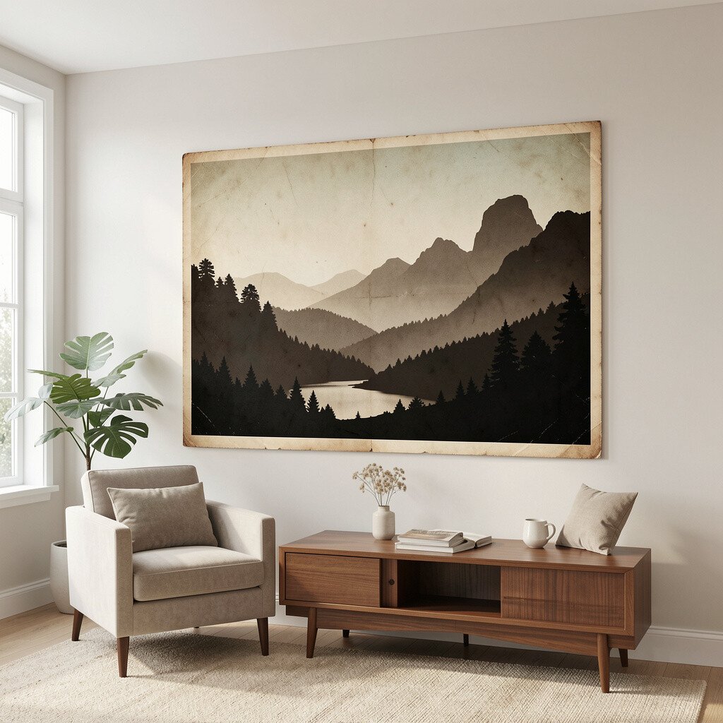
Imagine a wide landscape silhouette with simplified hills and a fading sky tone. It instantly adds depth, making a wall feel longer and more open.
This kind of art is a great choice because it works with both retro furniture and modern basics. It also feels personal since you can pick scenes that match your favorite travel memories or local geography. To make it practical, choose a size that spans most of the wall width, then align its center with the highest point of nearby furniture.
For a more unique look, mix a silhouette piece with one or two small companion prints that repeat the same color family. Cost is usually friendly if you buy quality prints in frames rather than hunting originals. Current trends favor slightly muted colors and grainy textures that look like they came from an old magazine.
You can also add a soft twist by choosing a frame in walnut, black, or a pale wood that echoes your floors. If you’re unsure, start with one statement piece and build around it.
4. Gallery Wall of Mid Century Color Blocks

Color block art can make a gallery wall look neat and intentional. You’ll see rectangles and squares that feel structured, but still fun and bright.
To keep it stylish, stick to one or two color themes like mustard with cream, or teal with warm gray. This approach benefits your space because it creates order while still showing personality. Use painter’s tape to map out spacing before you hang anything, so the layout stays balanced.
For uniqueness, vary the sizes slightly and mix thin frames with thicker ones for a modern-retro mix. Budget can stay under control if you pick affordable poster prints and upgrade only a few frames. Today’s trend leans toward tighter grid layouts with clean spacing, so try keeping the gaps consistent.
5. Sculptural Metal Wall Hangings
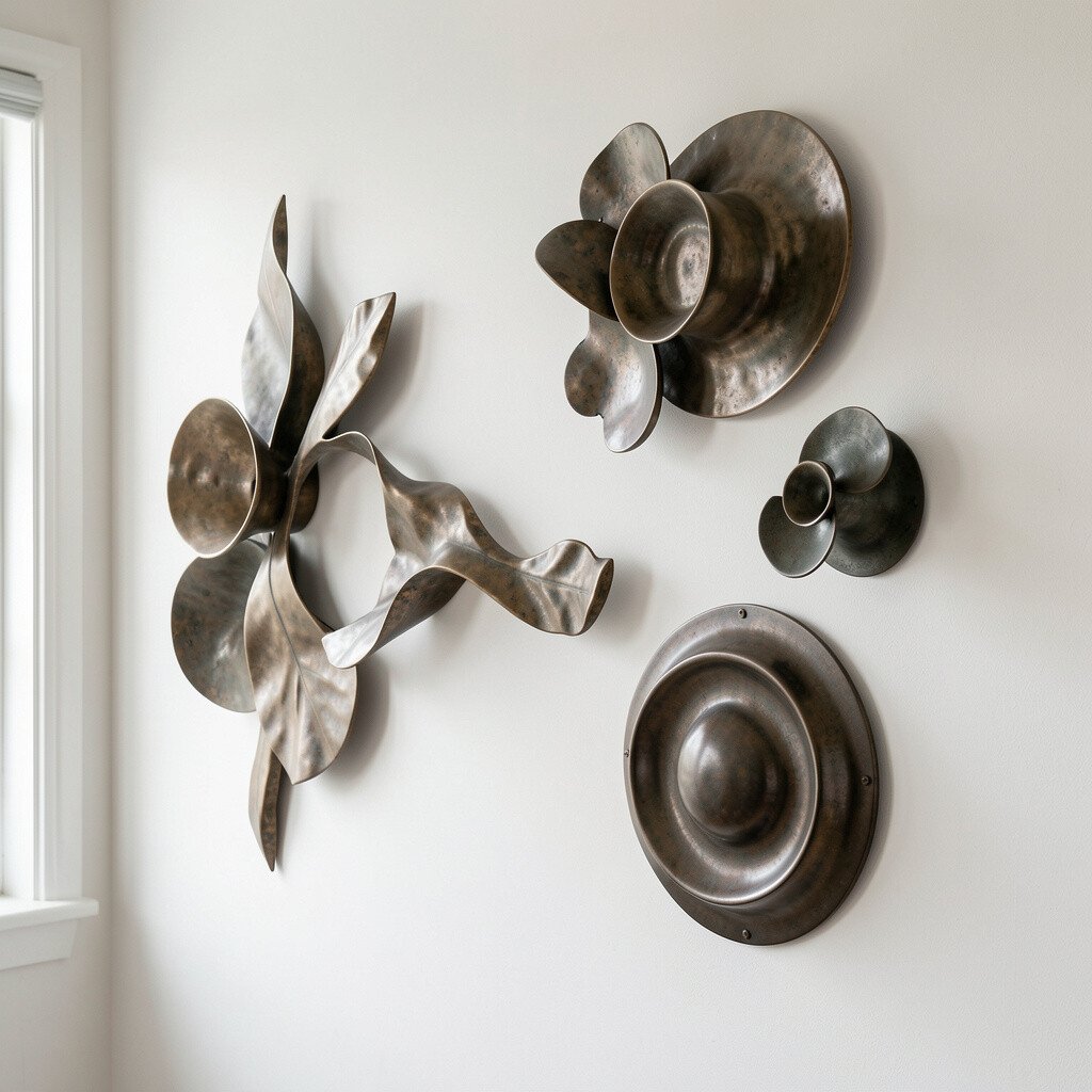
Metal wall art adds dimension, and you can almost feel the texture from across the room. Picture a flowing abstract form cut from metal, finished in brass, bronze, or matte black.
The big benefit is that it catches light in a way flat art can’t. When afternoon sun hits it, you get small shadows that change throughout the day. For practical placement, hang it at eye level and keep it at least a few inches away from other wall items so the shape stays visible.
To personalize, choose a motif that matches your taste, like waves, sunbursts, or gentle curves. Metal pieces can cost more than prints, but you’re paying for lasting materials and a one-of-a-kind look. A current trend is mixing metal art with warm woods and textured textiles for a layered mid century vibe.
6. Ceramic Plate Wall Display With Mod Patterns
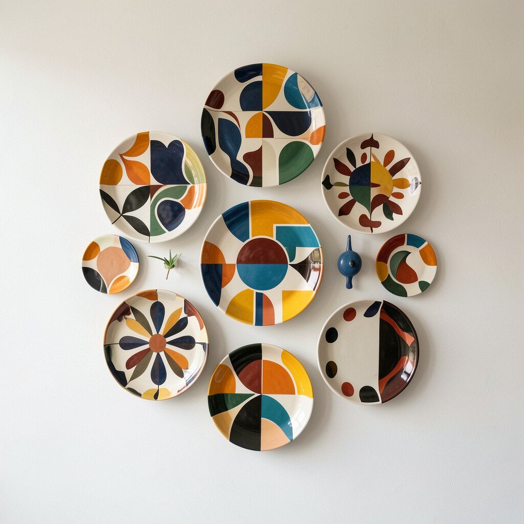
Vintage-style ceramic plates look charming and a little playful on a wall. Imagine small plates with bold mod patterns stacked like a mini gallery.
This idea benefits your space by adding color and texture without clutter. It’s also wonderfully unique because plates feel collected, even when you’re starting fresh. For practicality, use plate hangers or sturdy adhesive mounts, and test them with a light plate before committing.
Personalize by choosing patterns that echo your favorite fabric or rug colors. Cost can be managed since you can find individual plates from many price points. Right now, collectors love mod florals and high-contrast designs, so lean into bold shapes if you want a trendy feel.
7. MCM Abstract Ink Drawings in Simple Frames
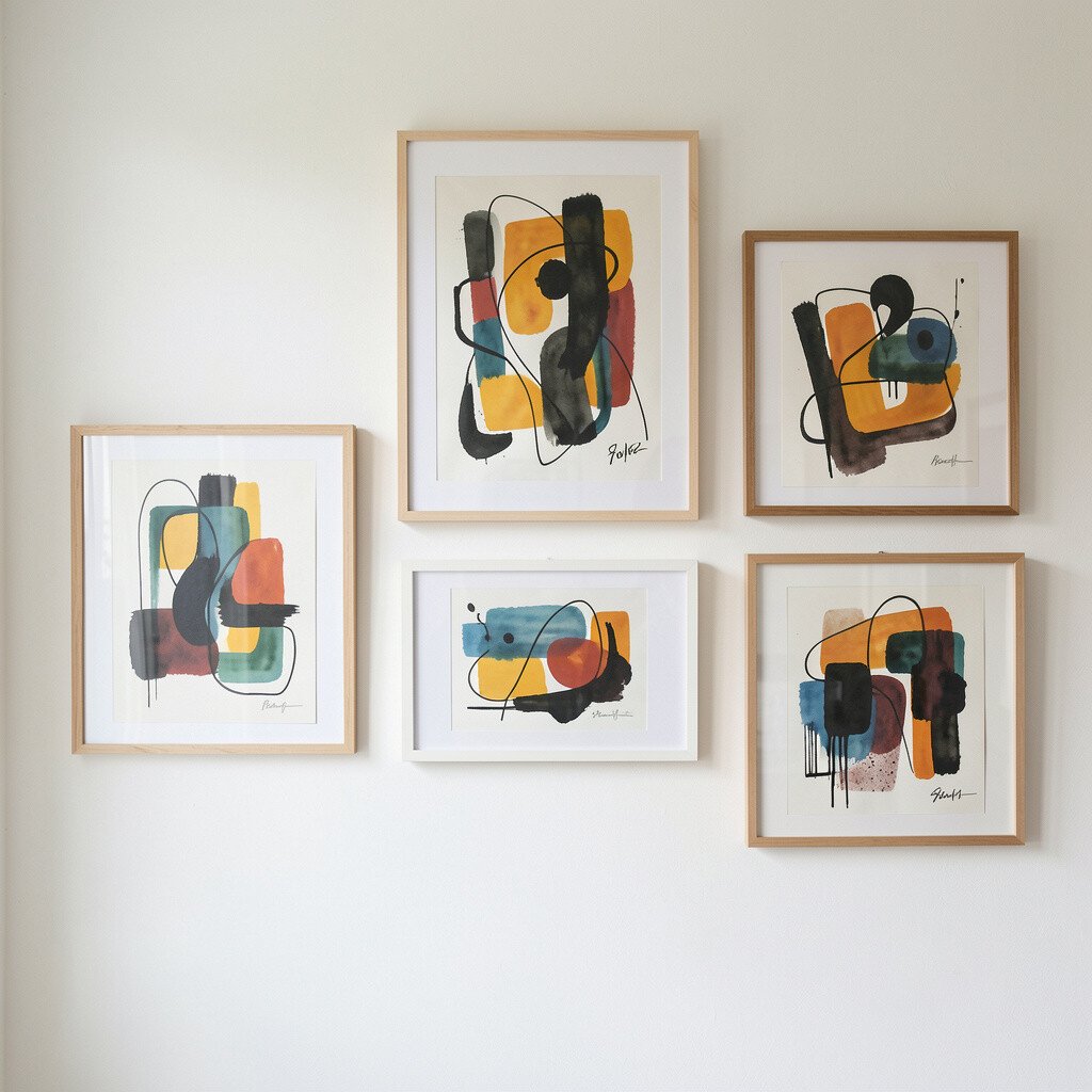
Ink drawings give mid century walls a light, airy vibe. Think black line art with swirling forms, tight details, and lots of negative space.
These pieces feel beneficial because they work with almost any color palette. They also look unique since the line quality is often expressive and slightly different from piece to piece. For practical tips, keep the frame minimal, and choose a mat that creates clean margins around the drawing.
Personalize by matching the line thickness to your room style, like choosing thicker marks for bolder spaces and thinner lines for calm rooms. Cost is usually moderate because you can buy prints, and the look can still feel premium when framed well. A current trend is leaning toward monochrome art paired with warm wood frames, which keeps the overall style cohesive.
If you want extra charm, place the drawing near a textured surface like a woven lamp shade or a soft throw.
8. Retro Typography Prints for a Playful Accent
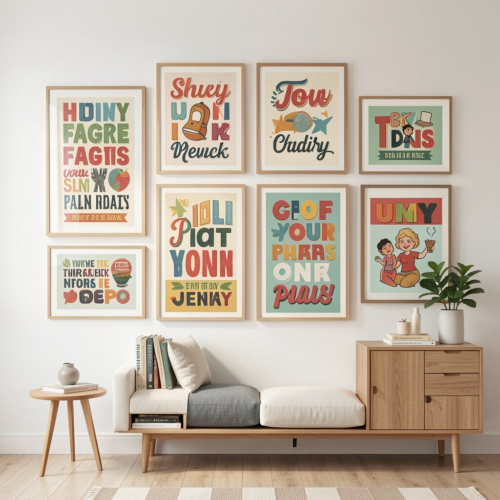
Retro typography art makes a wall feel friendly and alive. You might see words like “Home” or “Music” written in vintage-looking fonts, along with small icons.
This type of art is a benefit when you want personality without complicated imagery. It also feels unique because typography can reflect your hobbies and routines. Keep it practical by choosing one main phrase and pairing it with a frame that matches your other finishes, such as walnut or brushed steel.
Personalize by selecting text that matters to you, like a favorite quote, a family name, or a music genre. Cost is often affordable, especially with print-on-demand options that still look sharp. For trends, look for art that uses limited color palettes and slightly imperfect print textures for a vintage feel.
9. Mid Century Botanical Prints With Warm Earth Tones
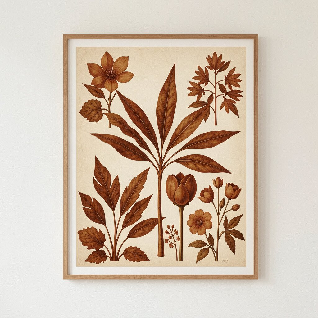
Botanical prints bring gentle color and a calm, lived-in mood. Picture leaves and flowers drawn in a detailed yet simplified way, with earthy greens, clay browns, and soft creams.
This idea benefits your home by making it feel fresh while staying true to mid century style. It’s also unique because the linework can feel both classic and personal. For practical placement, hang botanicals where you can see them during daily routines, like near a dining area or breakfast nook.
Personalize by choosing prints that match the plant vibe you already have, such as matching leafy shapes to your indoor greenery. Cost can vary, but you can find affordable sets of botanical prints and then select one or two favorites for bigger frames. A current trend favors subtle palettes and high-quality paper textures that look like archival reproductions.
To make it look intentional, use consistent frame sizes or consistent mat colors so the collection feels curated.
10. Statement Wall Clocks With Retro Design
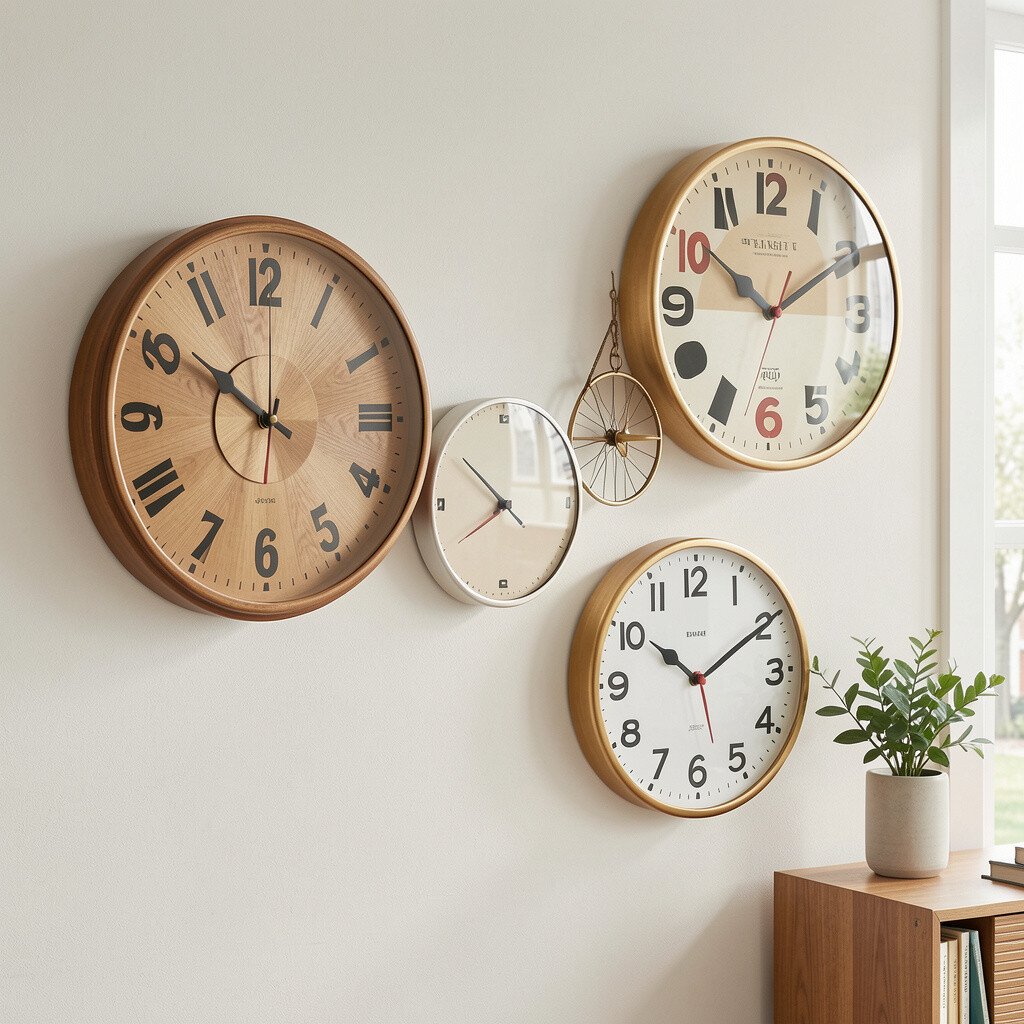
A retro wall clock acts like both art and function. Imagine a round clock with a slim face, bold numbers, and a mid century style frame in wood or enamel.
This approach offers clear benefits because you get decor plus everyday usefulness. It also feels unique since clocks add movement through time, and they anchor a wall visually. For practical tips, center the clock at eye level and choose a size that fits the wall without overwhelming nearby pieces.
Personalize by selecting a color that repeats in your room, like teal cushions or a brass lamp base. Clocks can range in price, so set a budget and focus on finish quality rather than fancy extras. A current trend is using clocks with simple faces and warm-toned frames, which blend nicely with mid century interiors.
11. Vintage-Style Collage Art on Thick Paper
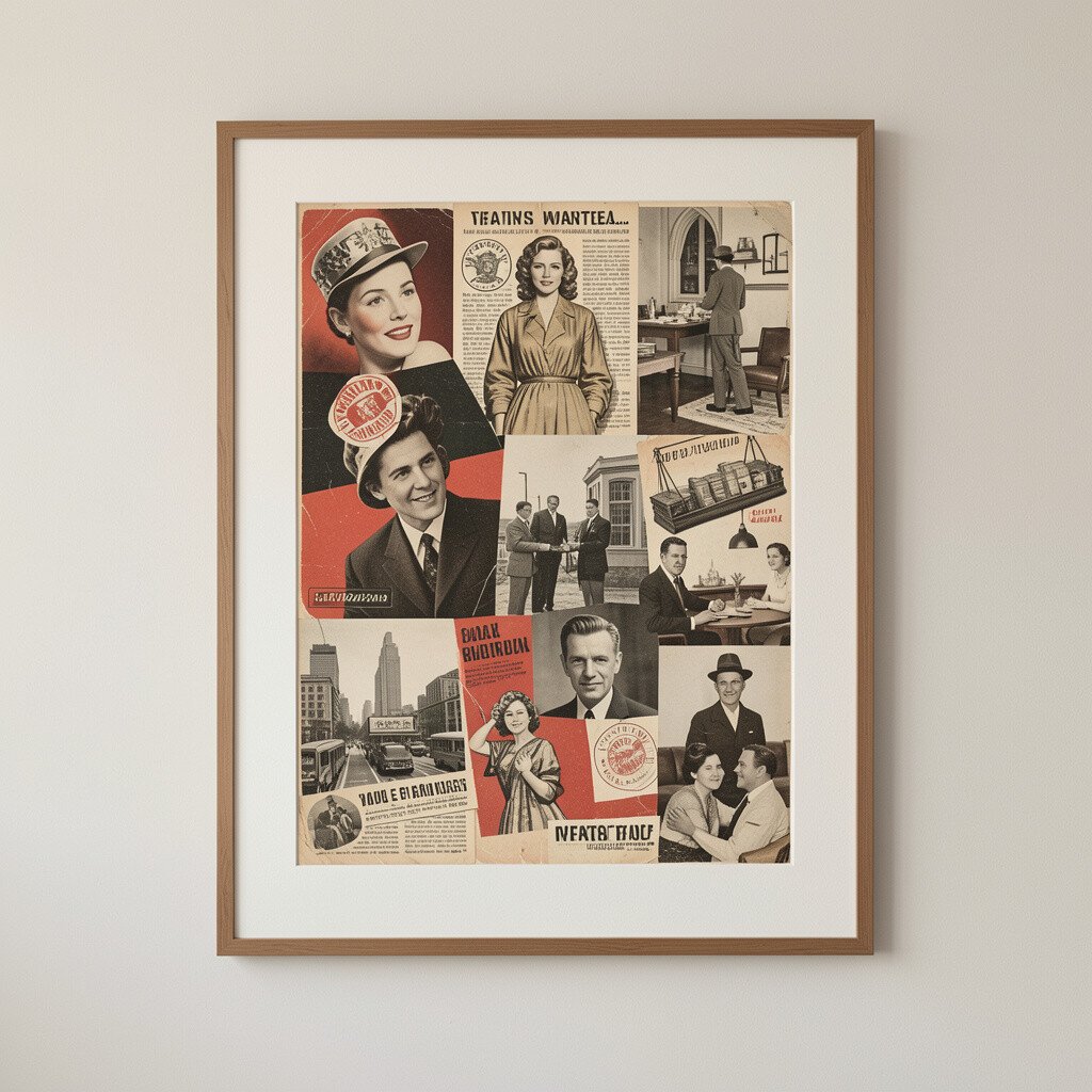
Collage wall art brings a handmade feel that looks rich up close. Picture layered shapes, paper textures, and small visual hints of mid century patterns, all arranged with confident spacing.
One benefit is how forgiving collage is, since it can match many palettes and still look cohesive. It’s unique because each piece carries a different story and texture. For practical handling, use heavier paper art and frame it with sturdy backing so the edges stay protected.
Personalize by choosing a theme like travel, music, or coastal colors, then reuse colors from your sofa or rug. Cost considerations are worth thinking about because custom collage pieces can be pricier, but prints on quality paper can give the same vibe for less. Right now, mixed-media textures are trending, especially when they appear slightly imperfect like real paper layered by hand.
To keep the look fresh, let the collage be the star and avoid placing too many competing items around it.
12. Oversized Geometric Wall Panels and Triptychs
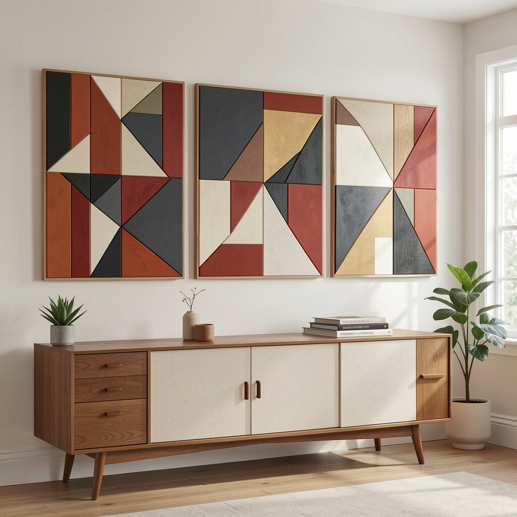
Geometric wall panels create a modern-retro grid that feels bold and clean. Picture a triptych of three panels with repeating shapes, like angled lines, circles, or stepped forms.
This style benefits your room because it adds structure, which helps even busy spaces feel organized. It’s also unique because geometry can be playful while still looking sleek. For practical tips, hang the panels so their seams align at eye level, and keep the overall width proportional to your wall and furniture.
Personalize by picking shapes that match your taste, such as smooth curves for a softer look or sharper angles for a dramatic vibe. Cost can be managed by starting with one set of panels rather than adding many smaller pieces, since one strong layout often gives the biggest impact. Current trends lean toward warm neutrals with one punchy accent color, so consider using cream or sand backgrounds with a bold teal, mustard, or terracotta element.
If you like variety, mix one geometric panel with a simple single print nearby, keeping the colors consistent for a polished finish.