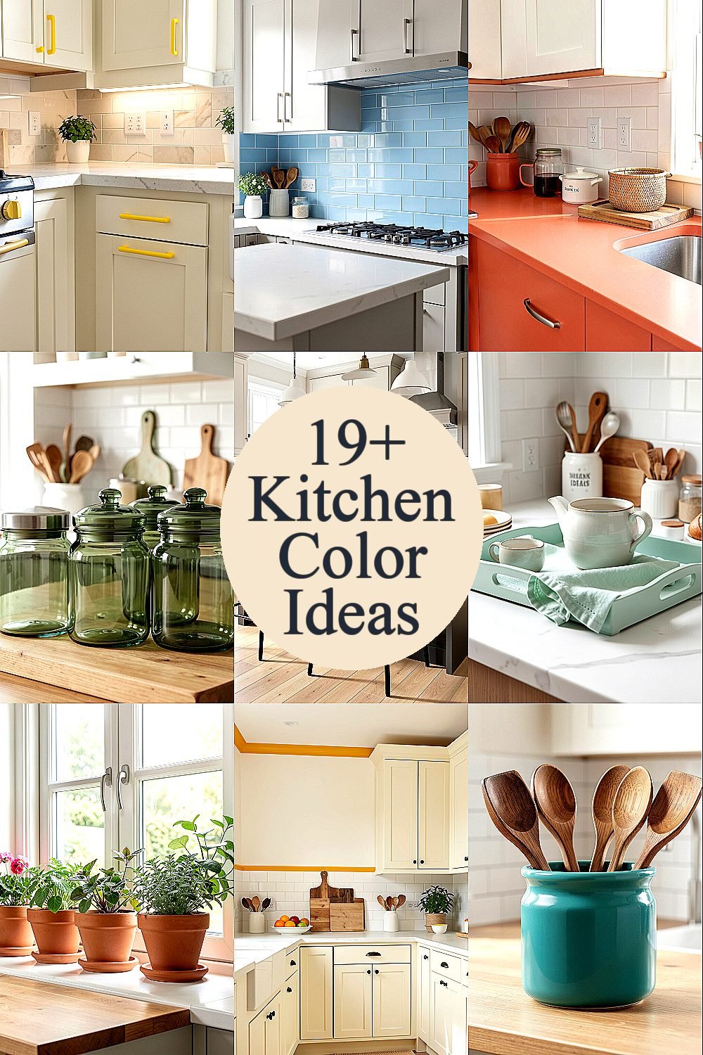
The right color accent can make a kitchen feel sunny even on dull days. Small changes, big mood.
1. Sunny Yellow Cabinet Hardware Glow
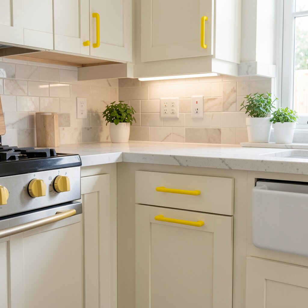
Picture soft sunshine reflected on brushed metal, like your kitchen is gently smiling. Swap out plain hardware for warm yellow-toned knobs or pulls that catch the light every time you open a drawer.
You get an instant lift without repainting cabinets, which is great for busy budgets. Choose durable finishes so the color stays bright through everyday cooking. For a personal touch, match the hardware hue to a nearby item like a kettle, utensil crock, or dish towel. If you love a calmer look, keep the yellow in small accents and let your countertops and backsplash stay neutral.
2. Sky Blue Backsplash Tile Pop
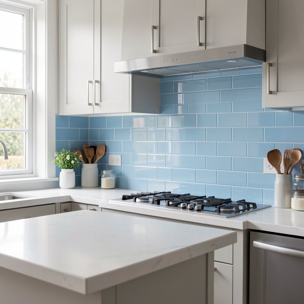
A sky blue backsplash can make your cooking space feel fresh and airy. Think small waves of color behind the stove, paired with clean grout lines for a tidy look.
It also helps the kitchen feel brighter because cool tones reflect light well. If full backsplash coverage feels like a lot, start with a limited section behind the sink or range. Look for tiles with subtle variation, so the color feels natural rather than flat. You can pair sky blue with white cabinets, warm wood floors, or light gray counters for a balanced kitchen.
For cost control, consider peel-and-stick tile sheets for a test run before committing. Choose a grout color that hides everyday splatters, like a light gray instead of bright white. Current trends lean toward soft, calming blues instead of bold primary shades, so this choice feels modern without being loud.
3. Coral Countertop Accessories for Warmth
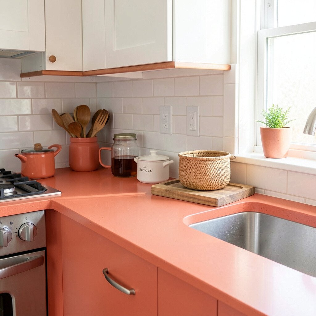
Coral accents bring a playful warmth that works beautifully in kitchens that feel too cool. Imagine a coral cutting board, a set of canisters, or a vase of fresh herbs adding a lively glow.
This is a practical way to brighten your space because you can swap items seasonally without any renovation. Coral also pairs nicely with white, cream, and natural wood, which makes it easy to style. To personalize the look, mix matte coral pieces with glossy accents like ceramic jars or a shiny faucet cover. Keep one coral “anchor” on the counter so the color feels intentional, not scattered.
If you’re watching costs, aim for small essentials you use every day, like dish soap dispensers, oven mitts, and utensil rests. Look for durable, food-safe materials so the color stays vibrant after washing. This trend of warm living-color accents is popular right now because it adds personality while staying simple.
When you’re ready to adjust, add a neutral runner or a pale green plant to soften the coral and keep the kitchen feeling fresh.
4. Sage Green Glass Canisters
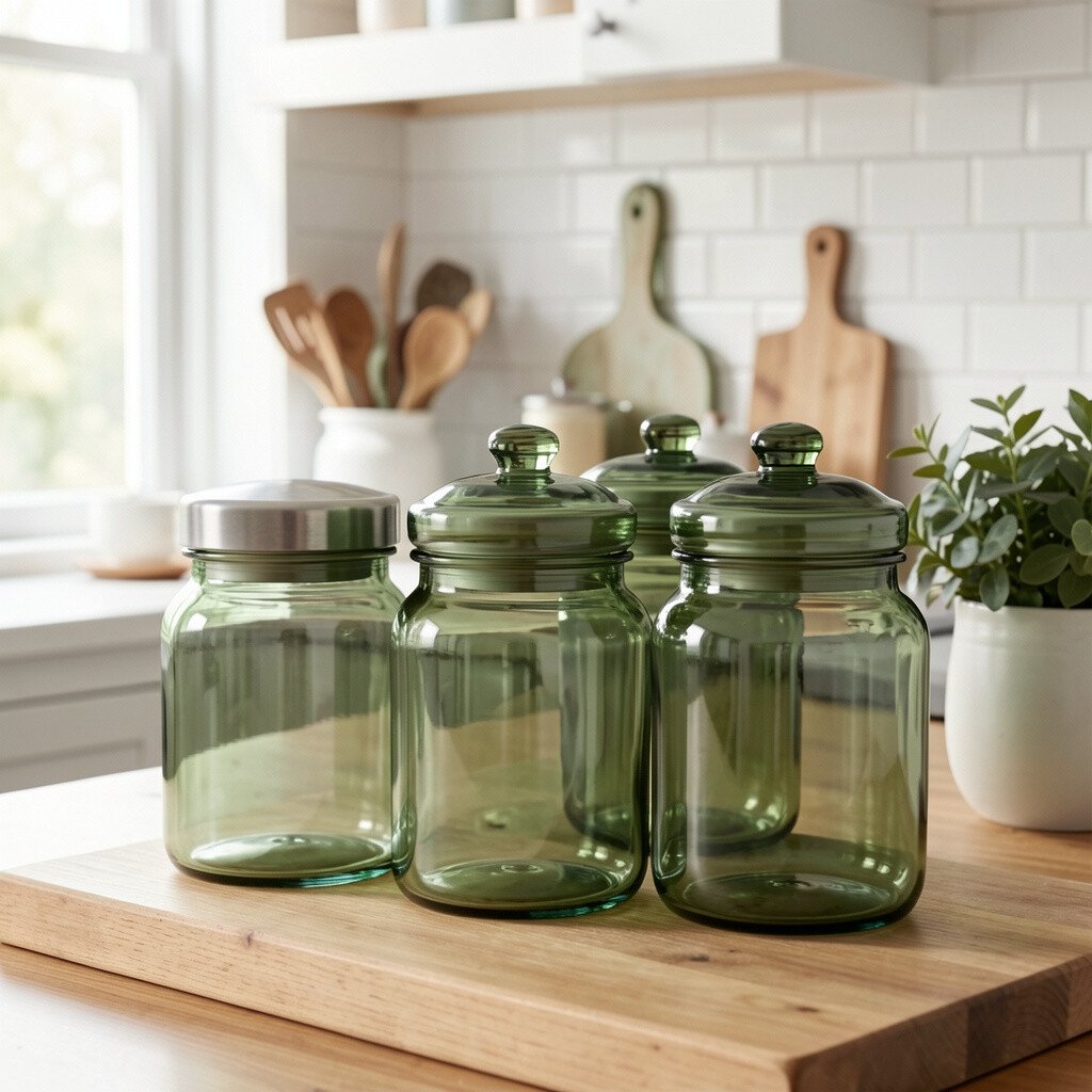
Sage green feels like a gentle breath of calm in the middle of daily cooking. Clear or frosted glass canisters in soft sage create a fresh, organized look on shelves and counters.
It’s a strong choice because green naturally pairs with many materials, including oak, walnut, stone, and white finishes. For practical styling, group canisters by height and keep labels consistent so the colors don’t look chaotic. Try adding sage pieces near the window for extra brightness from natural light. If your kitchen already leans modern, use sleek canisters and minimal label styles for a crisp look.
5. Charcoal Accent Bar Stools
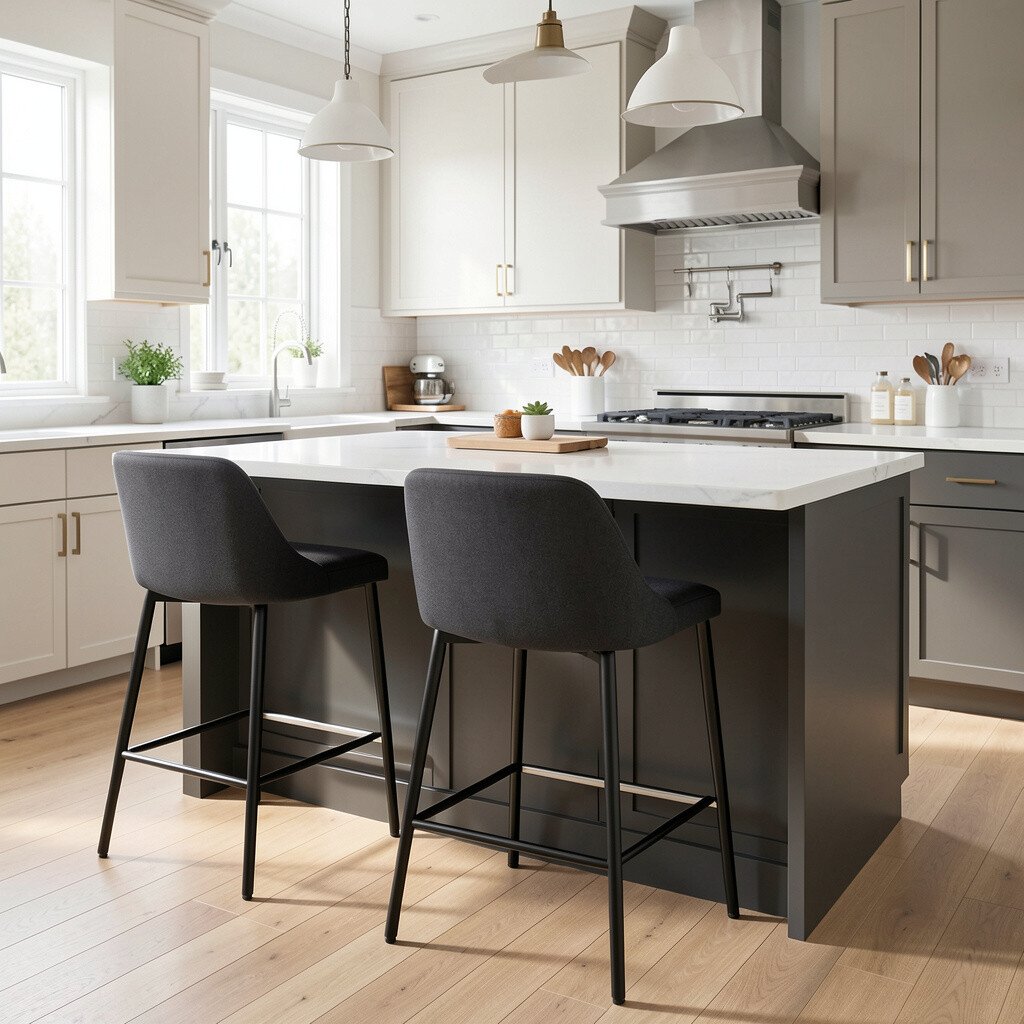
Charcoal brings depth, and depth makes bright colors feel even brighter. Sleek bar stools in charcoal fabric or leather can ground a kitchen that’s otherwise light and airy.
This is a great way to balance color without making your space feel heavy. Choose stools with a warm undertone, like brownish charcoal, if you have wood floors or honey-toned cabinets. Add a pop of lighter accents nearby, such as a patterned rug or a bright bowl on the counter. For personalization, swap in seat cushions that match seasonal colors like teal in summer or marigold in fall.
In terms of cost, stools are an investment, but buying only one or two can give you the look without changing everything. Keep an eye out for durable, stain-resistant fabric if you’re a frequent snacker or have a busy household. Current styling favors darker seating paired with light walls, which creates a clean contrast that feels design-forward.
When you coordinate, let the charcoal echo the hardware or light fixture so the whole kitchen feels pulled together.
6. Mint Green Dish Towel and Tray Set
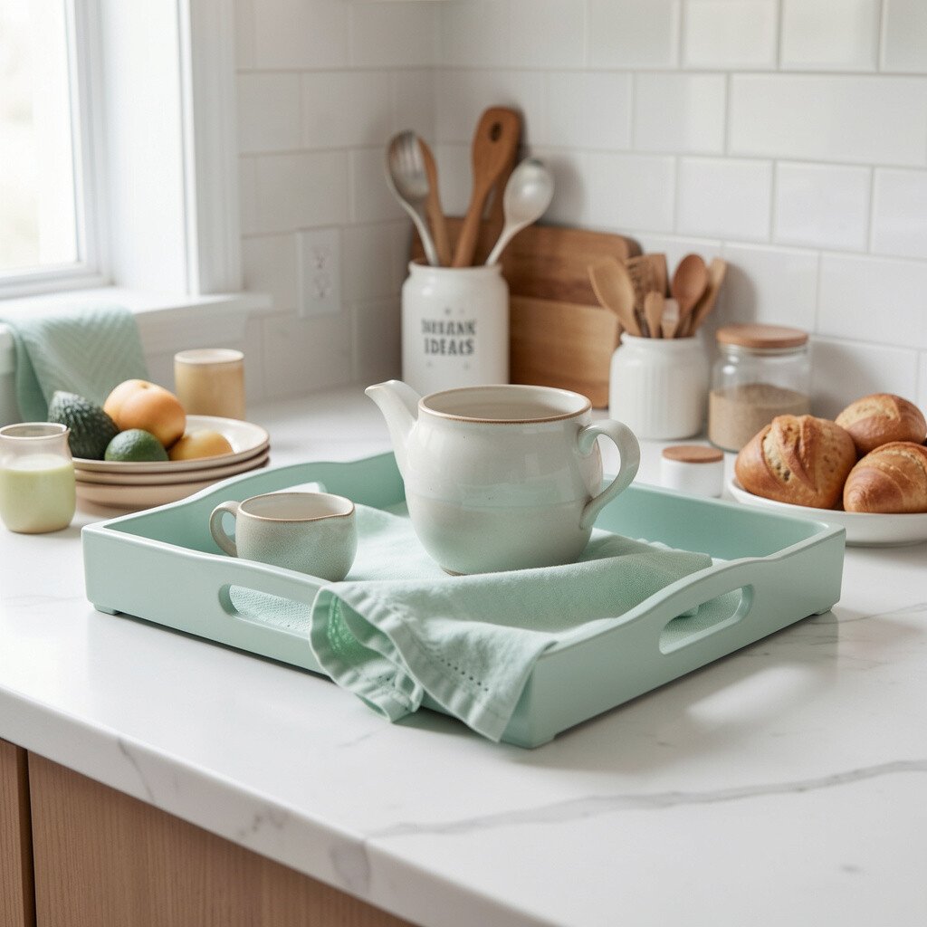
Mint green is cheerful without being overpowering, and it’s perfect for easy refreshes. Imagine a mint dish towel draped neatly, plus a mint tray holding oils, salt, and pepper.
This kind of accent is budget-friendly because textiles are usually affordable. It also lets you personalize fast, since you can change colors for holidays or the seasons. Look for tones that lean toward pale mint, so your kitchen stays bright and not too dark. If you want a cohesive look, repeat mint in a small way elsewhere, like a candle or a plant pot.
7. Terracotta Pot Planters on the Window Sill
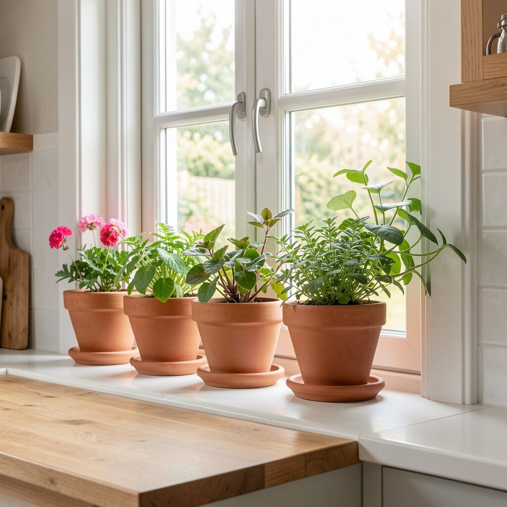
Terracotta adds a warm, earthy charm that instantly makes a kitchen feel lived-in. Picture terracotta planters holding herbs near the window, with sun streaming across the room.
Beyond the look, herbs make the color feel functional, since you get fresh flavor for cooking. Choose lighter terracotta for a softer feel, especially if your kitchen is already dark or small. To personalize, paint tiny accents on a plant pot or use a matching tray underneath so everything looks intentional. If you want to avoid clutter, keep just a couple of herb planters and rotate them as plants grow.
For cost considerations, herb plants can be a small upfront cost that pays off throughout the season. Many kitchens are embracing indoor herb gardens right now because it feels fresh and sustainable. Make it practical by placing a saucer under each pot and checking drainage so your windowsill stays clean.
8. Creamy Off-White Wall Paint With Citrus Trim
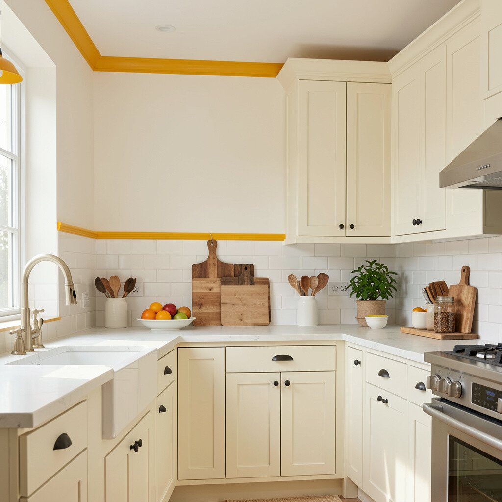
Warm off-white walls can brighten your kitchen while still feeling cozy. Add citrus trim in a small area, like a painted door frame, canister accents, or a narrow shelf edge.
You’ll get a light background that makes almost any color pop, which is helpful if you like changing decor. Lemon and orange tones work well as trim because they add energy without turning the whole room loud. Try using a matte finish on walls for a soft, forgiving look. If you’re renting or prefer no big changes, use peel-and-stick trim or swap in a few citrus-colored accessories instead.
9. Teal Utensil Crock With Matching Wood Spoons
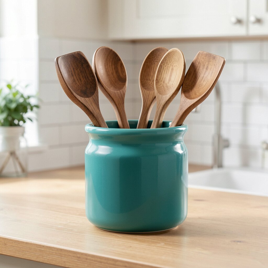
Teal is bold in a friendly way, like a coastal breeze that brings calm energy. A teal utensil crock with warm wood spoons makes the counter area feel styled, not messy.
This accent is unique because it combines color with everyday function, so it won’t just sit there looking pretty. Pick a teal shade that suits your space, whether you prefer deep ocean teal or lighter turquoise. For practical tips, choose a crock with a wide opening so utensils slide in easily after meal prep. Add a matching teal item, like a spice organizer, to make the look feel connected.
Cost-wise, a utensil crock is usually an affordable swap, and it can be replaced whenever you’re ready for a new mood. Current trends often favor jewel tones like teal, especially in kitchens that keep the walls and cabinets light. If you worry about overdoing it, keep the rest of your countertop colors neutral and let teal be the star.
10. Rose Pink Accent Tiles Behind the Sink

Rose pink tiles bring a romantic, modern vibe that feels fresh and unexpected. Just a small strip behind the sink can add visual interest while keeping the rest simple.
Pink accents can also make a kitchen feel welcoming, especially when paired with warm whites or light beige. Look for tiles with a slight texture so they catch light and hide minor splashes. For personalization, choose rose pink with a subtle pattern like small dots or gentle speckles. This keeps the accent playful without needing lots of extra decor.
11. Bright Orange Cutting Board Moment
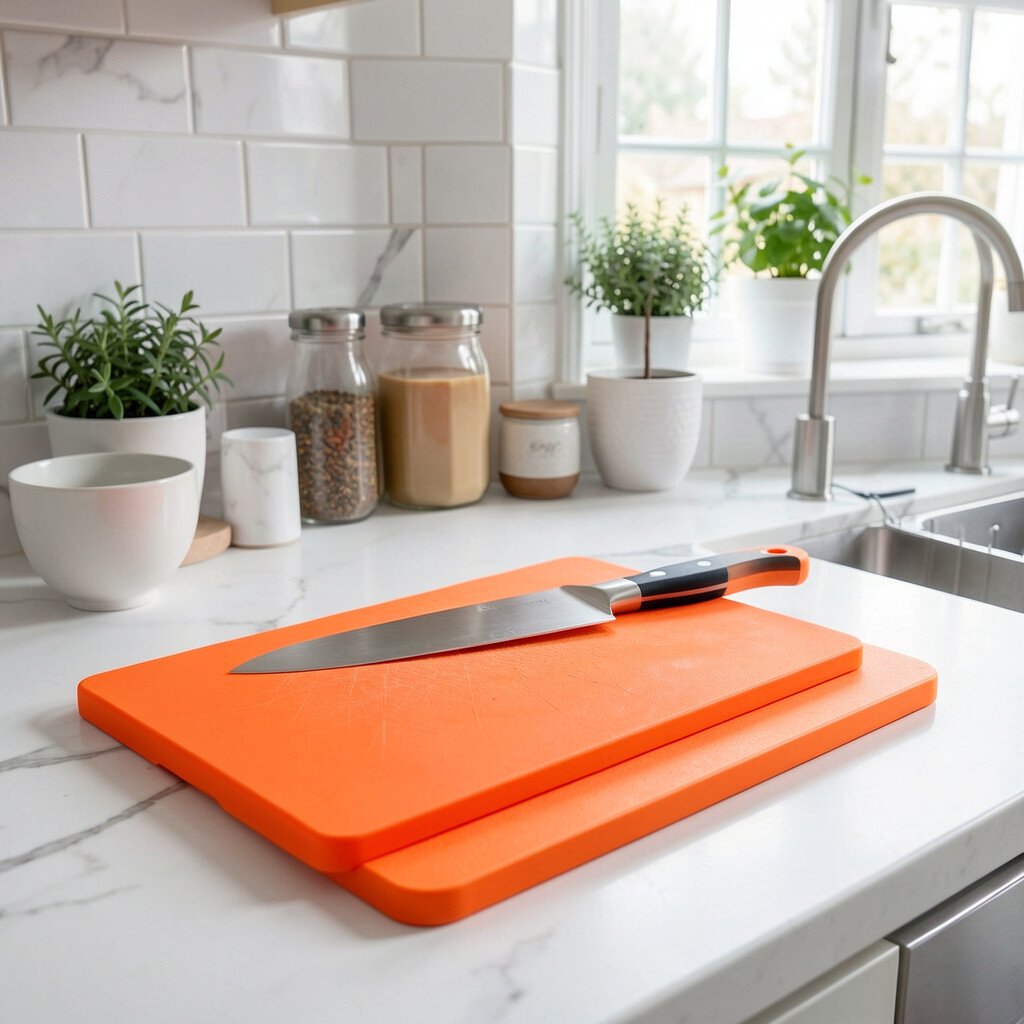
Orange is an instant mood booster, and a bright cutting board is a fun place to use it. Imagine chopping veggies on a cheerful orange board that also doubles as a serving tray.
This idea is easy to personalize because orange pairs with many styles, from modern to farmhouse. Choose a board you can flip or rotate so it ages nicely with daily use. If you have stainless appliances, orange looks especially lively next to them. To keep things balanced, limit orange to one or two items and repeat with a smaller detail like a fruit bowl or oven mitt.
When you consider cost, boards are usually affordable compared with bigger projects. Many people are trending toward bold “functional decor” right now, where everyday items become color accents. Use a wipe-down-friendly material so the bright color stays crisp and clean.
If you want it softer, try a more muted orange like peachy apricot instead of a neon shade.
12. Blue and White Patterned Runner for Flow
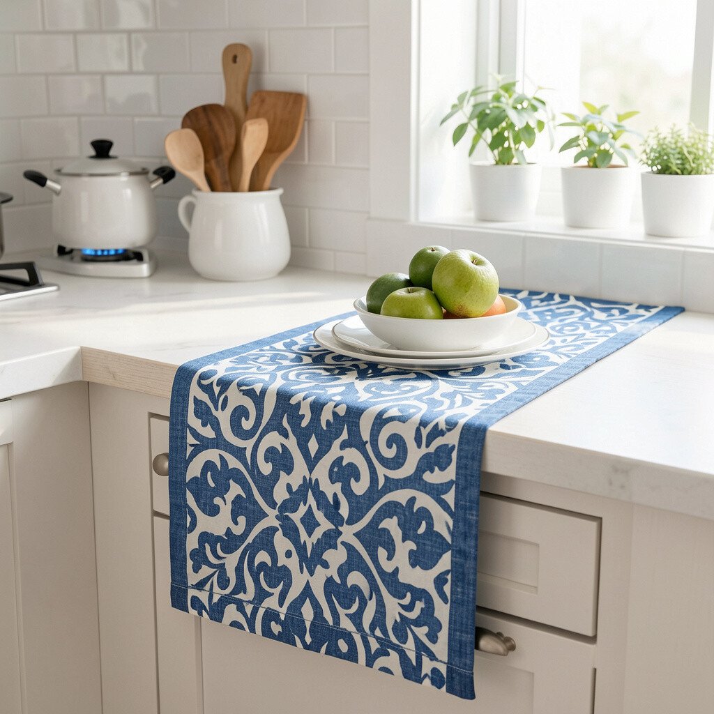
A patterned runner can brighten your kitchen by adding color where light naturally travels. A blue-and-white design looks crisp and can make the space feel neat and cozy at the same time.
It’s practical because rugs protect floors from spills and dropped items, and they’re easier to refresh than paint. Choose a runner with tight pattern detail so it hides small crumbs and splashes. For personalization, keep the blues in the same family as your backsplash or glassware. If you love bright accents, add a small matching bowl or jar on the counter to tie it together.
13. Gold-Tone Light Fixture for Warm Shine
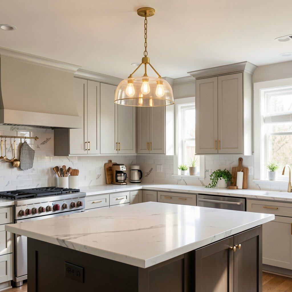
Gold-tone lighting creates a warm glow that makes the whole kitchen feel brighter. Think of a brushed gold pendant over an island, or gold accents on a ceiling fixture.
This gives you a high-impact effect without changing wall color or cabinetry. Gold also pairs nicely with many accent colors, from teal and sage to cream and coral. For practical tips, choose a finish that matches other metals in the room, like faucets or cabinet pulls. Warm lighting helps colors look richer, especially in the evening when you notice the space most.
Cost considerations matter, because light fixtures can vary a lot in price. To make it manageable, focus on a single statement fixture instead of upgrading every light. Current trends often lean toward warm metals and textured finishes, which add depth even when you keep other elements simple.
If you’re unsure, pick a gold fixture with clean lines so it won’t feel dated quickly.
14. Bold Red Canisters for Pantry Drama
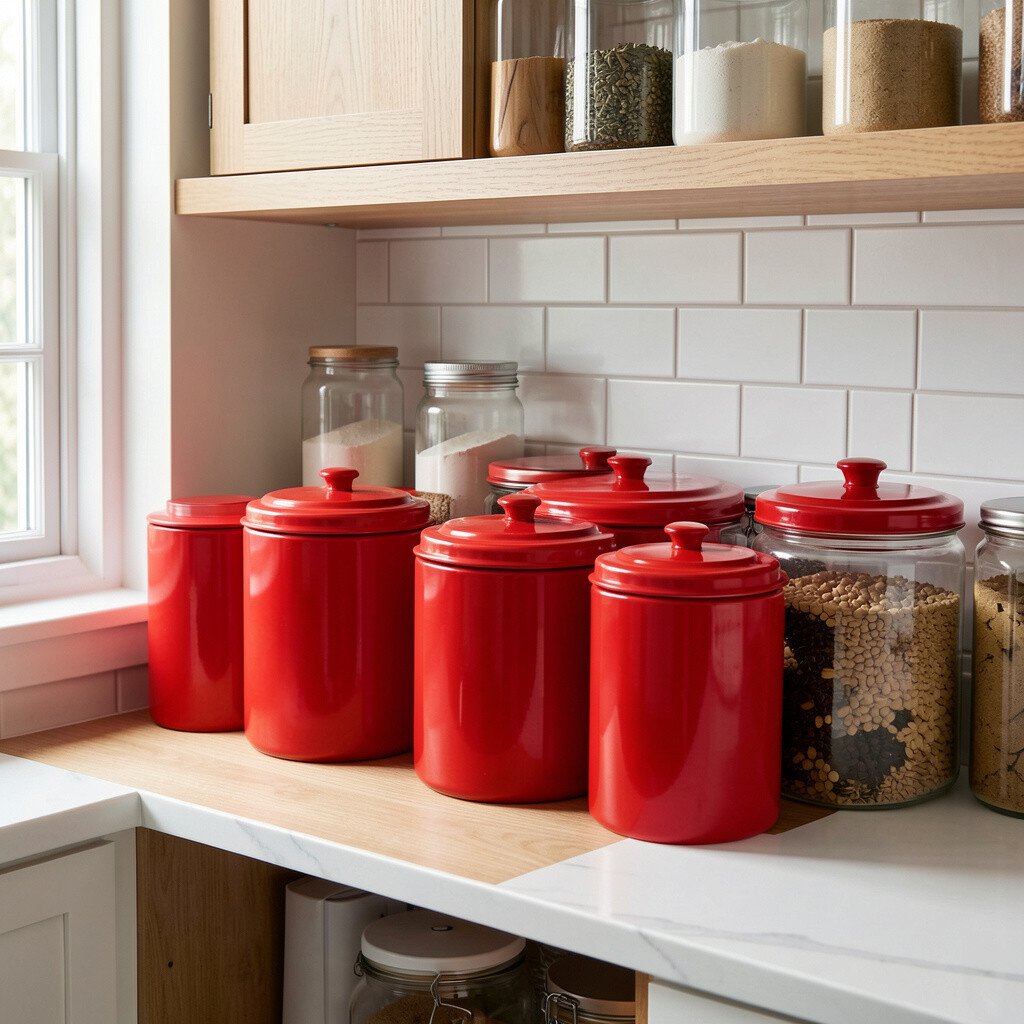
A red accent can feel energizing, especially in a kitchen that’s mostly neutral. Red canisters on open shelving act like little storage sculptures, adding personality every time you reach for flour or pasta.
This choice is unique because it’s both functional and bold, so it doesn’t rely on art pieces to make an impact. Pick a red shade that matches your kitchen lighting, since reds can look different in warm bulbs versus daylight. For personalization, mix matte and glossy red pieces, or pair red with a natural wood spoon and a cream label style. Keep other accents calm so the red doesn’t overwhelm the room.
Cost-wise, canisters can add up, but even two or three matching pieces can create the look. If you’re on a budget, choose a smaller set and refill them with your most-used pantry items. Many kitchens are leaning into strong “statement storage” because it gives order and style at the same time.
15. Warm Brown Leather Bar Accessories
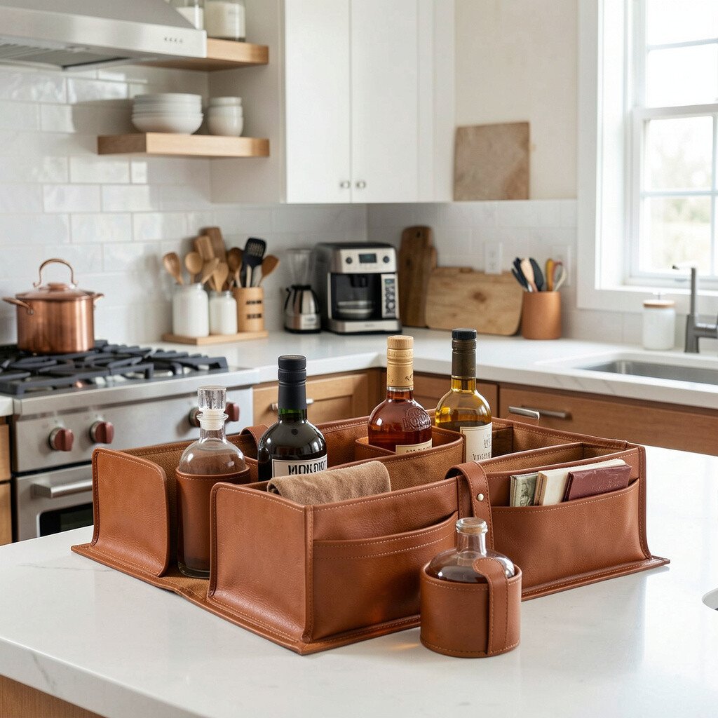
Warm brown adds comfort and texture, making bright kitchens feel more grounded. Leather coasters, a leather utensil roll, or brown-toned cabinet trim accents can soften sharp edges.
You’ll also get a material contrast that looks rich next to lighter colors and glossy surfaces. Choose a brown tone that matches your wood or flooring so the look feels natural. For practical tips, keep leather accessories simple and wipe-clean, especially near the cooking area. Add a bright color nearby, like mint or coral, to keep the overall mood lively.
16. Lavender Ceramic Soap and Sponge Holder
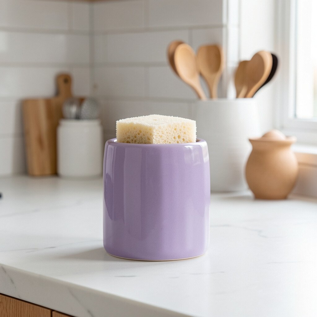
Lavender is a gentle, calming color that can brighten your kitchen in a subtle way. A lavender ceramic soap dispenser or sponge holder makes the sink area feel fresh and cared for.
This is a smart personalization move because small items are easy to switch when you want a new vibe. Lavender also pairs well with white, light gray, and soft wood tones. To keep it from feeling too “sweet,” choose a muted lavender rather than a very bright purple. Consider adding one more lavender element, like a small tray or a dish towel, to make it look intentional.
Cost considerations are simple here since these are usually affordable swaps. Current trends favor soft pastels like lavender because they feel fresh and modern, especially in kitchens with clean lines. Practical care matters too, so pick pieces that are easy to clean and won’t stain easily.
17. Lime Green Accent Bowls for Everyday Use
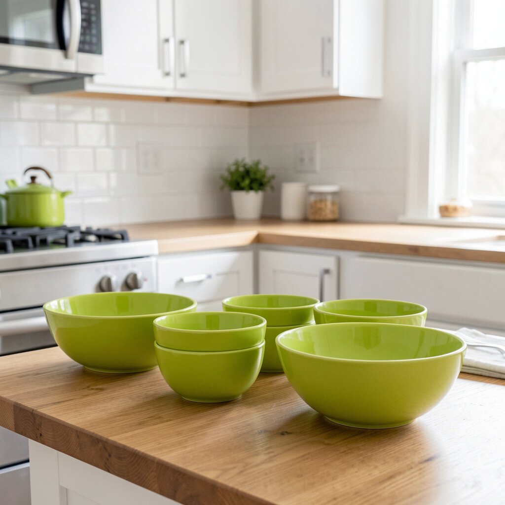
Lime green brings instant energy and makes your kitchen feel playful. Place lime bowls on the counter for fruit, or use them as storage for snacks and onions.
This accent works because it’s visible throughout the day, so it keeps the space lively even when you’re not decorating. Lime also looks great with black hardware, stainless appliances, and white walls. For personalization, choose a set with different shapes, like one bowl and one shallow tray, so it feels designed rather than random. Keep the rest of your counter items in neutral colors to let lime stand out.
If you’re thinking cost, start with one standout bowl and build slowly. People are leaning into bright, “fresh produce” color accents right now, and lime is perfect for that theme. Just remember to wipe the surface often so the bright color stays looking new.
If your kitchen gets a lot of sunlight, lime can glow even more, so keep the shade slightly muted for a balanced look.
18. Monochrome Gray Shelf Styling With Color Pops

Keeping shelves in a clean monochrome gray can make your other accents stand out even more. Add a few bright pieces, like teal jars or coral towels, on top of a gray background.
This strategy is practical because it creates a steady base that works with any color you want to try next. Gray also hides minor dust and small splatters, which is a real-life advantage in kitchens. For personalization, vary textures using matte ceramic, glass, and woven baskets so the gray doesn’t look flat. Then let your colored accents be the “moments” that catch attention.
Cost considerations depend on how you change the shelves, but you can often update the look with shelf liners, bins, and a few decor swaps. This trend is popular because it looks modern and organized while still feeling warm. If you want to keep things easy, stick to a limited color palette and repeat it across several shelves.
19. Emerald Green Glassware for a Jewel Effect

Emerald green glassware adds a jewel-like sparkle that feels special without being too fancy. Think emerald glass cups, a green pitcher, or tinted drink dispensers on the counter.
You’ll get instant visual richness because green glass catches light differently than regular clear glass. It also feels unique since it brings a deep color that works well with both warm and cool kitchens. For practical tips, group your glassware together and keep the rest of the counter clutter-free. If you use the glasses daily, consider choosing sturdy drinkware that’s easy to rinse and won’t get cloudy quickly.
Cost-wise, glassware can range widely, so start with one statement piece like a pitcher and add a few matching cups over time. Current trends often lean toward rich colors and glass textures, so emerald fits right in. To personalize, pair emerald with gold accents or creamy napkins for a polished look.
If you want it softer, use emerald in glass only and keep everything else neutral and light.
20. Sunset Orange and Cream Ceramic Wall Accent

A ceramic wall accent in sunset orange and cream can turn a blank kitchen wall into a warm focal point. Imagine a small arch-shaped tile or decorative plate mounted near the dining nook or above a shelf.
This brightens your space by adding color at eye level, which makes the kitchen feel more styled even when counters are kept simple. It’s also a great way to personalize because you can choose artwork-like designs that match your taste. For practical tips, mount it securely and keep it away from direct splashes if it’s near the sink. Choose a finish that’s easy to wipe so the accent stays neat.
Cost considerations are usually manageable because wall decor often costs less than major renovations. Current trends favor handmade-looking ceramics and warm sunset tones, which feel welcoming and lively. If you want extra cohesion, repeat orange in smaller accessories like a utensil rest, a tea towel, or a ceramic canister.
This idea works especially well when your kitchen already has light cabinets or soft neutral walls, since the accent will pop beautifully.