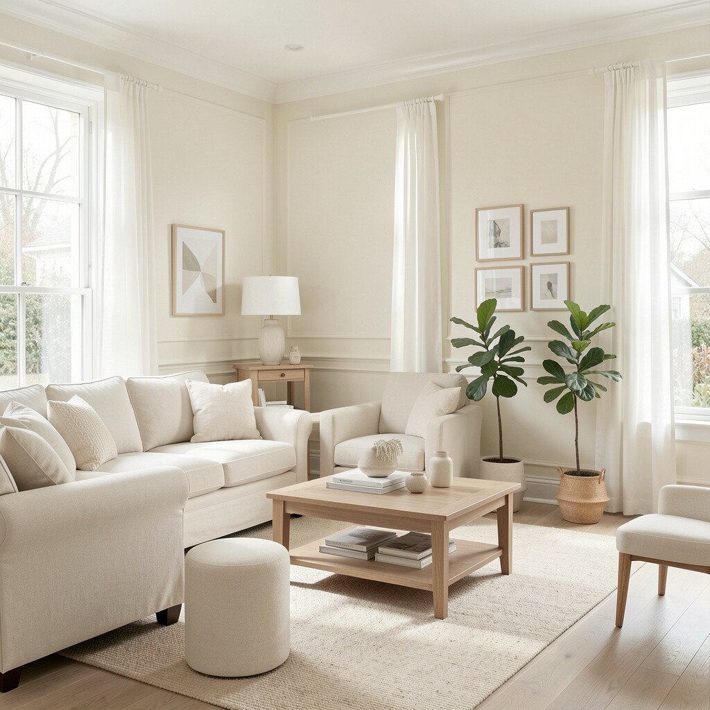
Soft white feels like daylight captured in paint. It brightens walls without looking harsh, so your space stays calm.
Pair it with warm trim in creamy tones for a smooth, expensive look. For practical results, choose a finish like eggshell in living areas and satin on trim for easy cleaning. If you want it to feel more personal, add contrast with natural wood shelves and textured fabrics like boucle or linen.
2. Warm Greige
Warm Greige
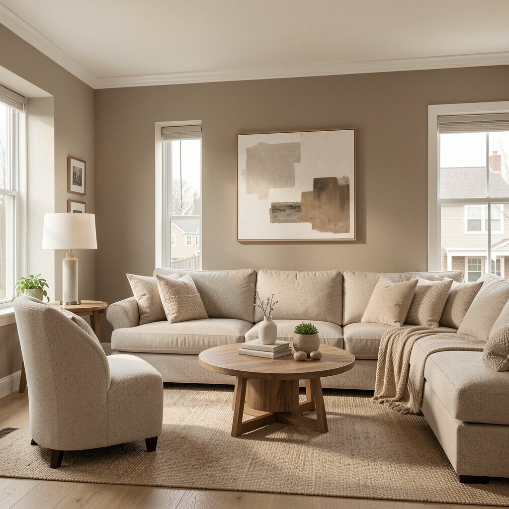
Greige blends the best parts of gray and beige. It makes rooms feel updated while still welcoming.
Use it on large surfaces such as living room walls to keep the light bouncing around. Pair warm greige with off-white ceilings, and you’ll avoid that flat, heavy feeling some grays can create.
For personalization, style with golden brass hardware, caramel leather accents, or colorful art that pops. If you’re working with a tight budget, paint only the main walls and keep existing cabinets, since greige works well with many finishes.
3. Sunny Butter Yellow
Sunny Butter Yellow
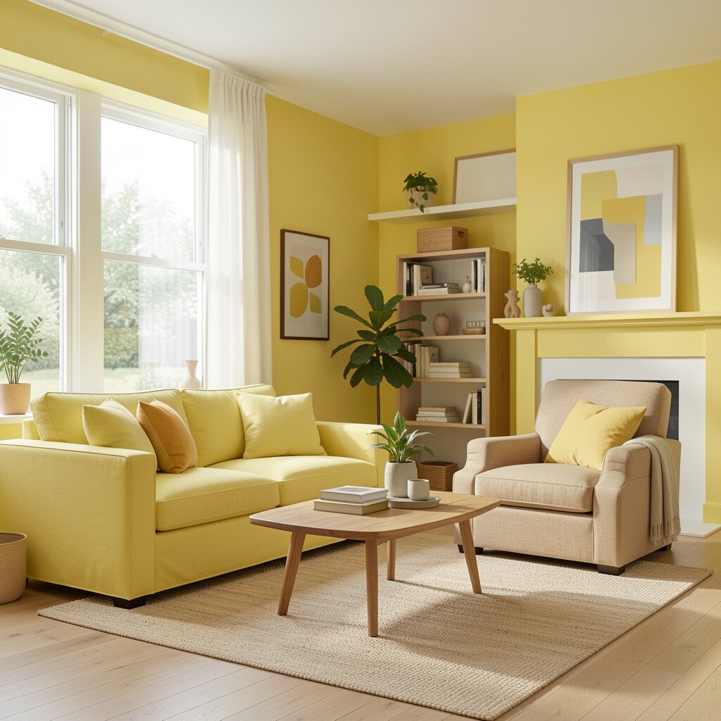
Butter yellow brings instant warmth and a gentle mood lift. It’s bright, but not the loud kind that overwhelms.
Try it in kitchens, entryways, or dining areas where you want energy. Keep the balance by choosing white countertops or pale backsplash tiles so the yellow stays sunny, not sour.
Personalize with black accents like modern light fixtures or simple bar stools. For cost considerations, focus on one or two feature walls first, and test samples on your actual wall under morning and evening light.
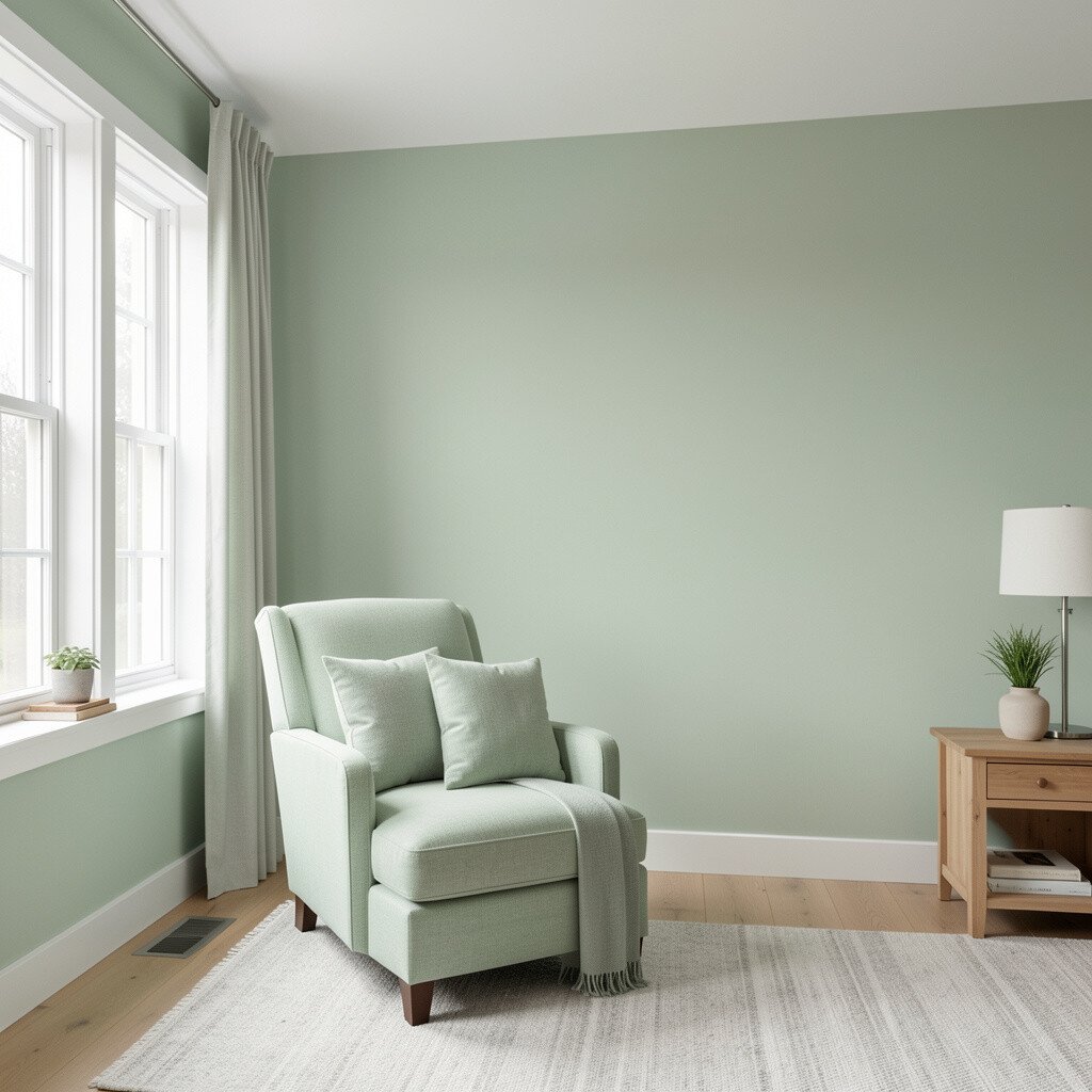
Sage green feels fresh and soothing, like a quiet garden after rain. It creates a breathable look that works in nearly any home style.
Use sage on walls in bedrooms or bathrooms to soften the room and add a spa-like calm. Pair it with creamy whites and warm gray floors for a balanced, modern finish.
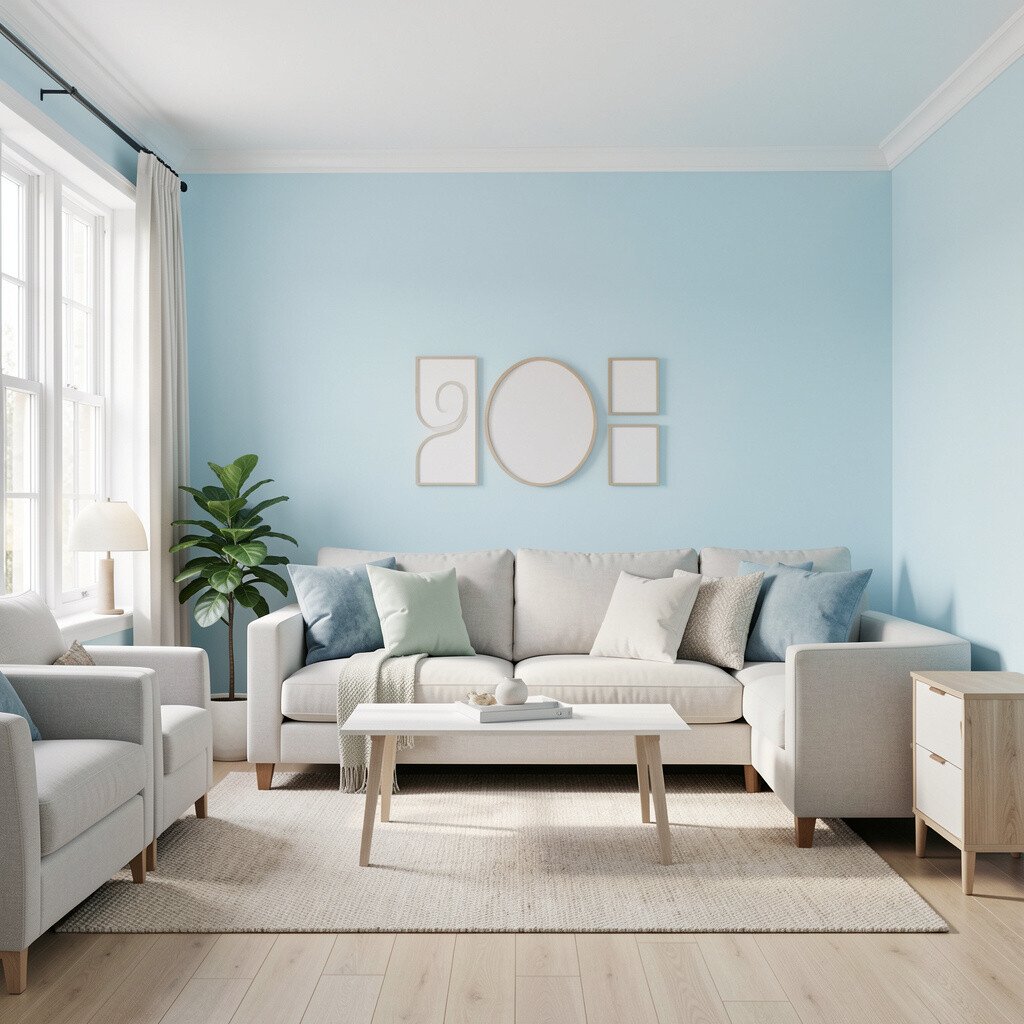
5. Airy Sky Blue
Airy Sky Blue
Sky blue adds openness and makes ceilings feel taller. It gives a clean, breezy look that still feels cozy.
Paint a small room in a light blue, such as a hallway or powder room, to make the space feel bigger. When you pair it with white trim and natural light, the walls seem to glow.
To personalize, use textiles in navy stripes, soft coral throws, or coastal art. If you’re planning a bigger remodel, consider matching cabinet hardware with brushed nickel for a cohesive, current style.
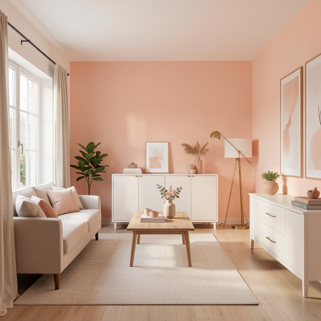
6. Soft Peach Glow
Soft Peach Glow
Peach is warm, friendly, and surprisingly flattering. It brightens skin tones and adds a welcoming vibe to family rooms.
Choose a muted peach rather than a bright orange-leaning shade for a more modern feel. Balance the color with crisp white trim and warm wood accents to keep it grounded.
For uniqueness, combine peach walls with terracotta planters or woven baskets for an earthy, lived-in look. If cost is a concern, paint the walls and update only lighting and hardware later, since peach pairs well with many existing materials.
Keep samples handy because peach can shift under warm bulbs and cool daylight, and the right undertone is everything.
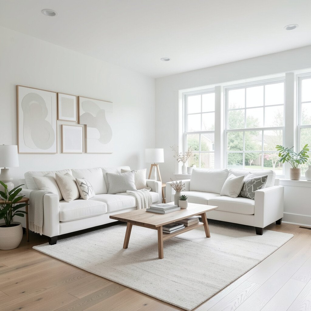
7. Crisp Arctic White
Crisp Arctic White
Arctic white can make a room feel brand new. It reflects light strongly, which is great for small spaces.
Use it when you want a clean, bright base for bold furniture or artwork. Pair it with cool gray floors or sleek stainless accents for a crisp, modern look.
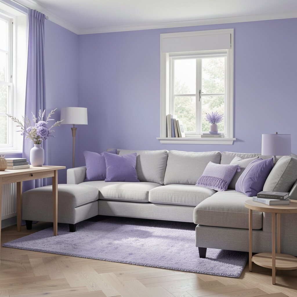
8. Gentle Periwinkle
Gentle Periwinkle
Periwinkle adds a soft, playful touch without feeling childish. It’s a lovely color for brightening rooms while keeping them relaxing.
Try periwinkle in a guest room, office, or reading nook where you want calm creativity. Pair it with warm white trim and light wood to avoid a too-cold feel.
For personalization, add patterned curtains in lilac or muted navy and keep accessories simple. If you’re budgeting, paint only the walls and reuse existing blinds, since the color shift will still feel dramatic.
Current trends often blend gentle color with natural textures, so woven rugs and rattan furniture look especially good next to periwinkle.
9. Honeyed Tan
Honeyed Tan
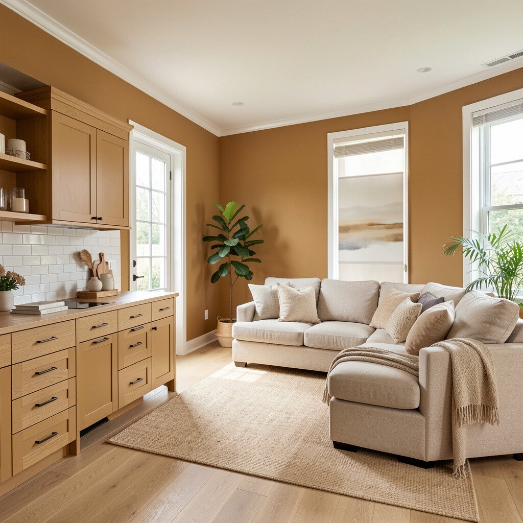
Honeyed tan makes spaces feel warm and lived in. It’s a bright neutral that doesn’t disappear like some beiges can.
Use tan as a backdrop for darker furniture like walnut tables or espresso cabinets. When light hits tan, it brings out the room’s textures and makes everything feel more inviting.
Personalize with color through art, pillows, and small decor rather than painting everything. For cost considerations, tan can cover small wall imperfections well, which may help you use fewer prep products and paint coats.
10. Fresh Linen Gray
Fresh Linen Gray
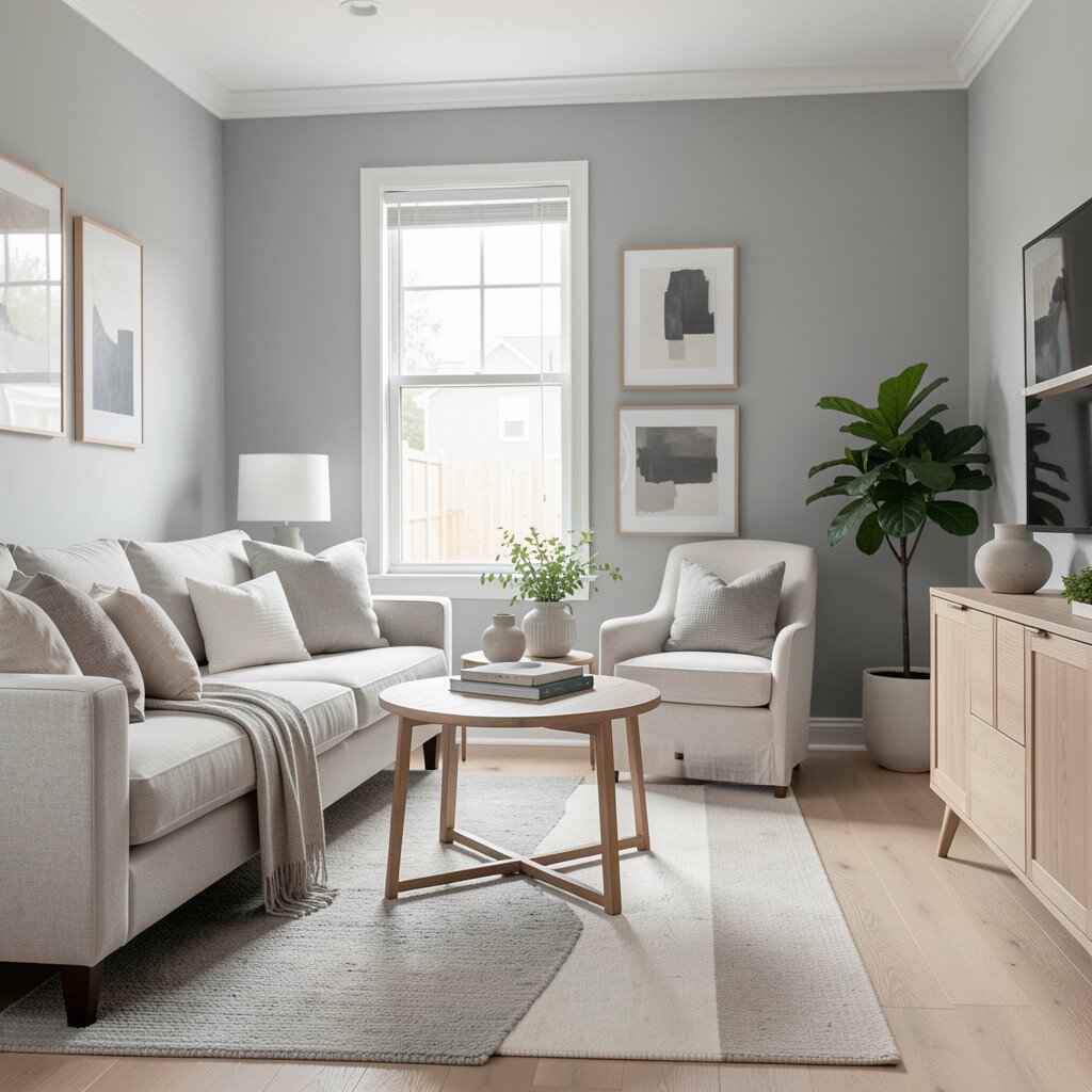
Linen gray looks soft and airy instead of heavy. It brightens by staying gentle, not gloomy.
Choose linen gray for open-plan living spaces where you want consistency from room to room. Pair it with bright whites and light natural stone for a clean, modern feel that still reads warm.
11. Bold Teal Accent
Bold Teal Accent
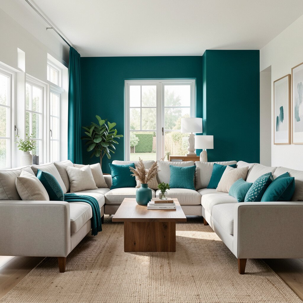
Teal instantly energizes a room and draws the eye to beautiful details. Even when used in small doses, it can brighten your overall color plan.
Paint a doorway, built-in shelf, or half wall in teal to create a lively focal point. Keep the rest of the room in light neutrals so the teal feels crisp and intentional.
For personalization, mix teal with brass, creamy whites, and natural wood for a stylish, layered look. Cost-wise, accent painting usually uses less paint and time, so it’s a smart move when you want big impact without a big budget.
12. Blush Rose Mist
Blush Rose Mist
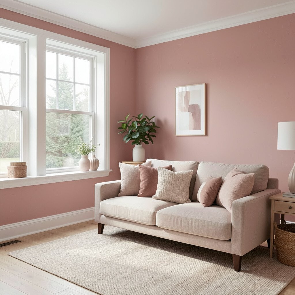
Blush rose adds a gentle romance and makes interiors feel bright and friendly. It’s especially pretty in rooms that need softness.
Use blush on walls in bedrooms, breakfast nooks, or bathrooms for a light, welcoming glow. Pair it with warm white trim and soft gray accents to keep the color balanced.
To make it unique, add contrast with dark bronze fixtures, or choose modern blush curtains with subtle texture. If you’re updating fixtures during the remodel, matching metal finishes can keep the look current and cohesive.
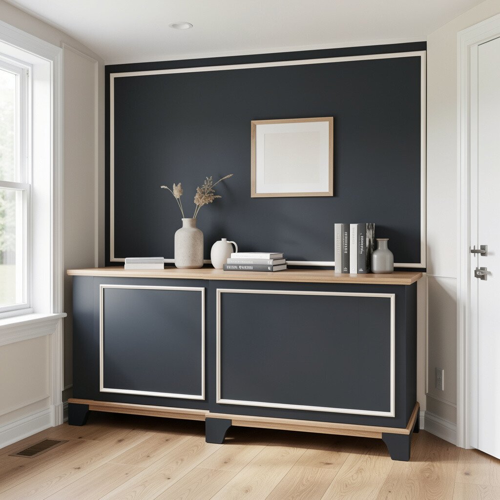
13. Bright Charcoal With Light Trim
Bright Charcoal With Light Trim
Charcoal can brighten your space in a surprising way when paired correctly. The key is using it thoughtfully as contrast, not as the only color.
Try charcoal on a fireplace surround, a built-in cabinet, or a feature wall. Then frame it with bright trim in pure white or arctic white so the room stays open and crisp.
For practical tips, choose a washable finish because accent walls get the most fingerprints and scuffs. Personalize with bold artwork, warm lighting, and soft rugs to prevent the charcoal from feeling too dramatic.
14. Crisp Mint With Natural Warmth
Crisp Mint With Natural Warmth
Mint refreshes your home with a light, clean feel. It reads airy, and it pairs beautifully with lots of natural materials.
Use mint in kitchens, laundry rooms, or a sunny breakfast corner where you want an uplifting vibe. Pair it with white countertops, light wood cabinets, and simple hardware for a current, crisp look.
To personalize, add plant life, woven baskets, and patterned dish towels in gentle greens or soft yellows. If cost is a concern, consider painting just lower cabinets or one small area first, since mint can make a big difference even in limited spaces.
Pay attention to lighting temperature, and you’ll keep the mint fresh rather than too cool.