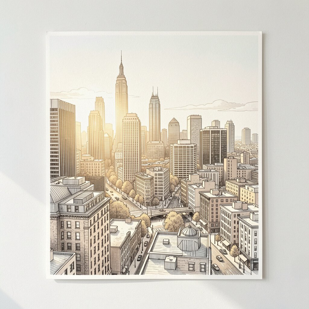
This print shows a city skyline drawn with warm, sunny lines. You can almost feel the golden hour glow as your eyes move from building to building.
The airy spacing helps a room feel less crowded, especially in hallways or small living areas. To make it feel extra personal, pair it with a simple frame in oak or matte black. For best impact, hang it at eye level and keep the wall around it calm so the colors stand out. If you want it to feel current, choose a print with crisp outlines and soft gradients that mimic modern poster design.
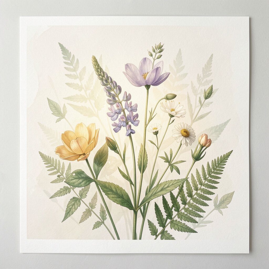
2. Soft-Glow Botanical Study
Soft-Glow Botanical Study
A botanical art print with gentle wash colors can turn a plain wall into something peaceful. Look for leaves that vary in tone, like light moving across plants at morning.
This kind of artwork adds a calm, natural vibe and can make your space feel fresh. Match it with neutral decor and textured fabrics so the greens and creams feel balanced.
For a practical setup, measure the wall first and choose a size that leaves breathing room on all sides. Many current styles mix vintage illustration with modern color softness, so you can get that “collected” feeling without needing old furniture. If budget matters, start with a smaller frame near a plant shelf, then upgrade later when you find the perfect match for your palette. Personalize by adding a narrow strip of matching art mat in a warm white tone.
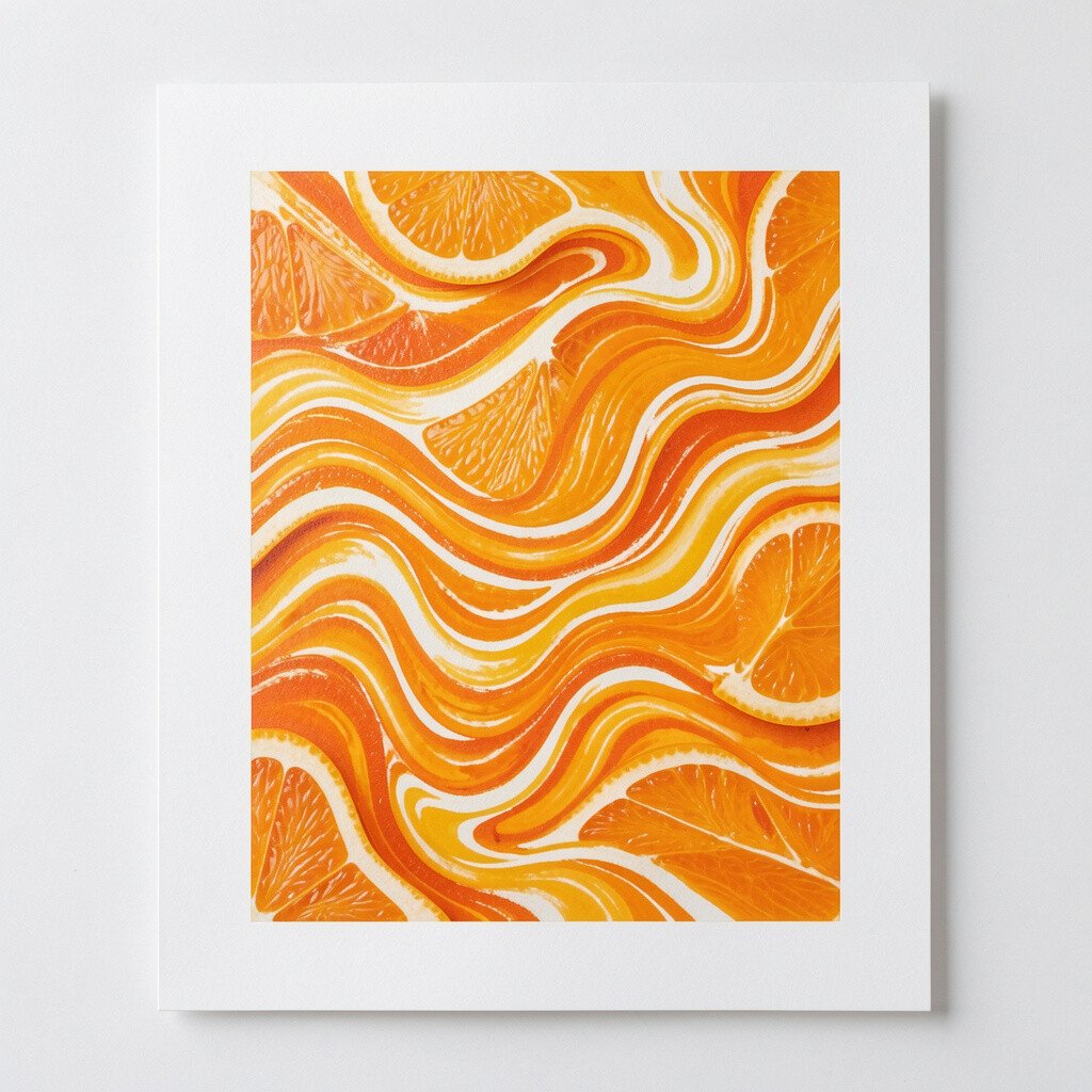
3. Abstract Wave Ripples in Citrus
Abstract Wave Ripples in Citrus
These abstract waves look like bright energy rolling across the print. The citrus tones and smooth curves can make a dull wall feel alive.
You’ll get a strong mood boost because the movement invites your eyes to wander. Place it where you spend time most, like above a sofa or desk, so you notice it throughout the day.
To keep the look tidy, choose a frame with a clean edge and a glass finish that reduces glare. Current trends lean toward bold color fields and fluid lines, so this style can feel modern even in classic rooms. If cost is a concern, consider a print-on-demand option with high-quality paper, since vivid color usually lasts longer than you expect. Personalize it by pairing the print with throw pillows that match the exact citrus shade.
A quick check is to take a photo of your room in daylight and see how the colors match your existing wall paint. That little test can prevent the “why does it look off” feeling.
4. Vintage World Map with Gentle Pastels
Vintage World Map with Gentle Pastels
A world map print with soft pastels can bring a curious, relaxed feel to your space. The faded borders and delicate lines make it look like a keepsake, not a chart.
It benefits your room by adding structure without heavy colors, which helps in offices and bedrooms. For practicality, place it near a reading chair or desk so it supports that calm focus vibe. Choose a frame that matches your furniture metals, like brushed gold or silver, to keep everything cohesive.
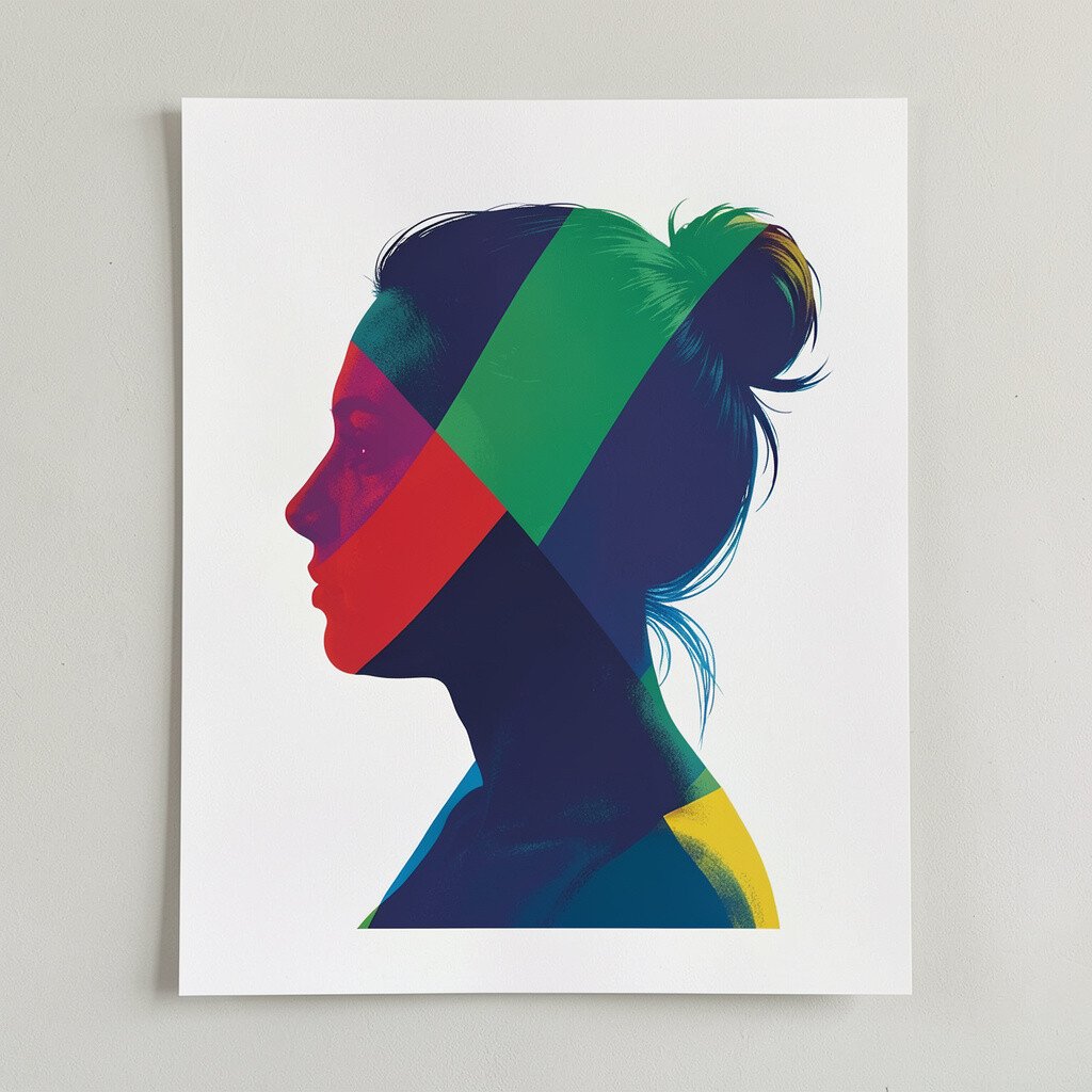
5. Portrait Silhouette with Modern Colors
Portrait Silhouette with Modern Colors
This print features a portrait silhouette with bold modern color blocks. Even without tiny facial details, the strong shape gives the wall presence.
You get a friendly, expressive focal point that feels unique and artistic. For personalization, match the color blocks to one accent you already own, such as a lamp shade, rug stripe, or ceramic vase.
To keep it easy, hang it slightly above eye level over a console or dresser so it feels intentional. Many trends today celebrate graphic portraits, especially ones that mix simple forms with bright color accents. If you’re watching cost, look for prints sold as limited series, because those often feel special without being extravagant. Consider using a thin black frame for contrast, which makes the color blocks pop.
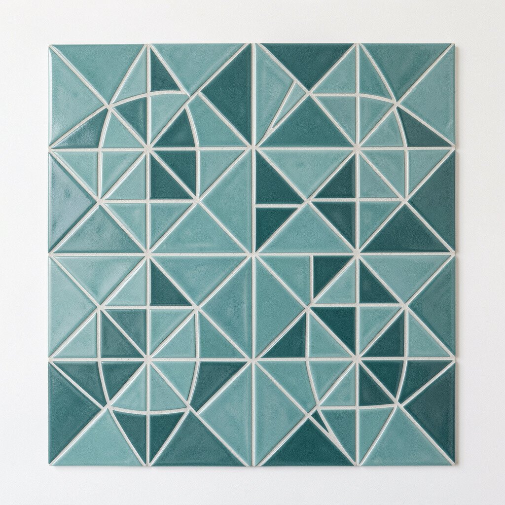
6. Geometric Tiles Pattern in Cool Teal
Geometric Tiles Pattern in Cool Teal
A geometric tile print in cool teal can give your wall a clean, fresh rhythm. The repeating shapes feel orderly, like design you could live with every day.
These patterns brighten a space by adding color without cluttering the room visually. Try placing it in a kitchen nook, entry area, or bathroom for an instant “new” feeling.
For practical styling, keep nearby decor simple and use one matching accent color so the pattern stays the star. Current interior trends love vintage-inspired geometry paired with modern minimal furniture. If you want to control budget, choose a smaller print in this style and add a second coordinating piece later. Personalize it by swapping frame colors, like white for airy rooms or walnut for warmth.
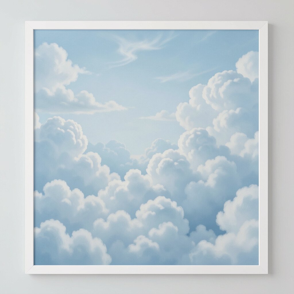
7. Dreamy Cloudscape in Soft Blues
Dreamy Cloudscape in Soft Blues
This cloudscape print feels like a calm breath for your walls. Soft blues and airy whites can make the whole room feel lighter.
It offers a benefit that’s easy to notice, especially in spaces that don’t get much natural light. Hang it in a living room where you want a soothing background, or place it near a window to echo the sky outside.
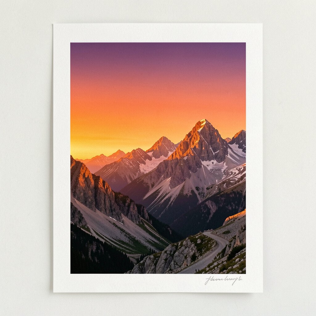
8. Bold Mountain Scene with Sunset Gradient
Bold Mountain Scene with Sunset Gradient
A mountain print with a sunset gradient can bring dramatic energy to your home. The colors shift from warm orange to deeper tones, giving the scene depth.
You’ll enjoy the motivating vibe it creates, because landscapes like this feel hopeful and expansive. For practical placement, try a spot directly across from where you sit most often, so the view feels like part of your routine.
To personalize, pick a frame that matches your room’s warm metals, like bronze or copper. This style is popular right now because it blends natural scenes with modern color grading. If cost matters, consider a poster-sized print with thicker paper rather than an expensive canvas, since the gradient usually holds up well. A helpful tip is to pair the artwork with a textured throw that repeats the sunset warmth.
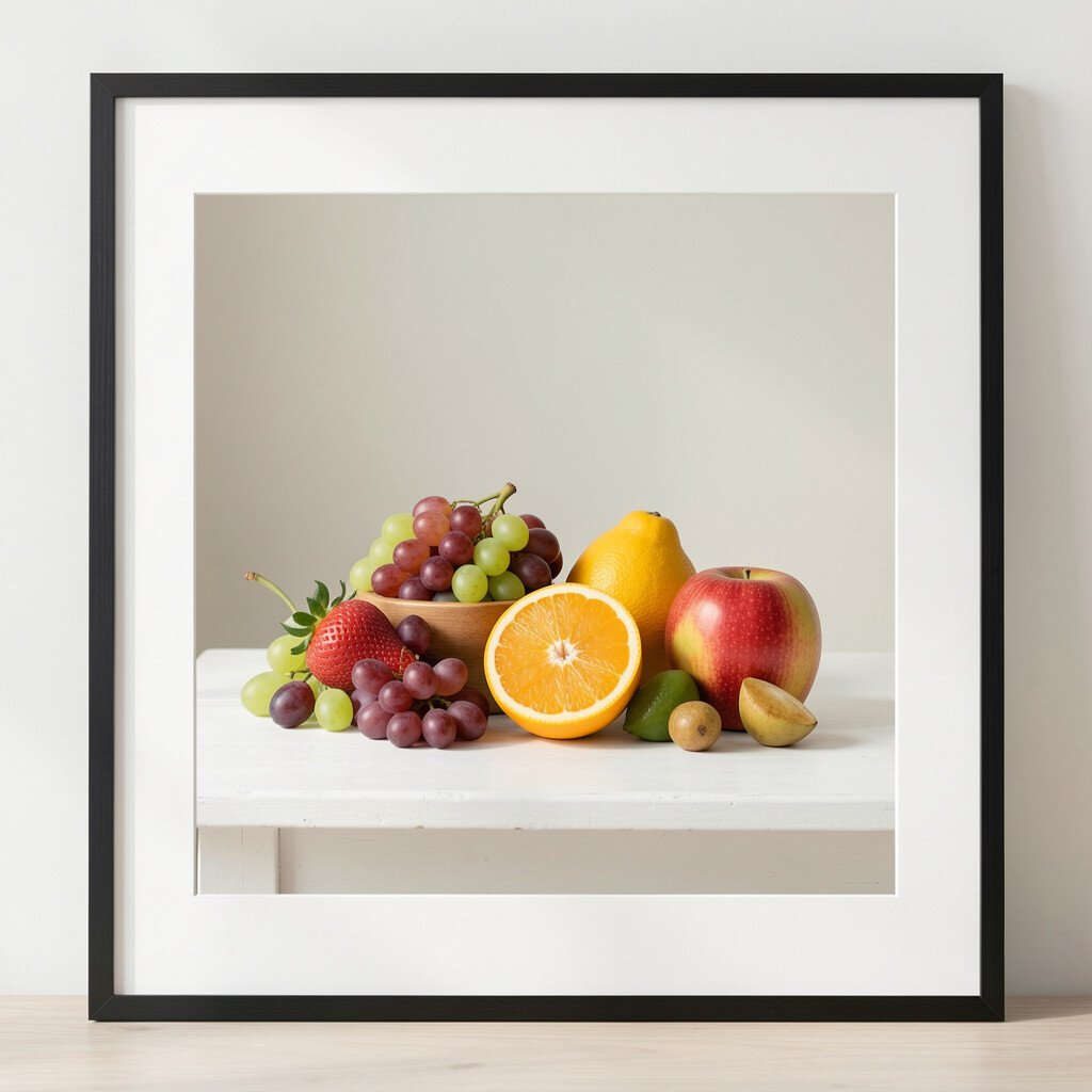
9. Minimal Still Life with Fresh Fruit Color
Minimal Still Life with Fresh Fruit Color
This minimal still life shows fruit and shapes with crisp, confident color. The composition stays simple, but it still feels lively and inviting.
One benefit is that it adds a “made with care” vibe without overwhelming your shelves. Place it in a dining area or kitchen where small bursts of color can make everyday meals feel special.
For practical tips, keep the surrounding wall decorations minimal so the artwork breathes. Many current trends favor small, clean art moments that look good even from a distance. If you want to keep things affordable, choose a standard paper print and spend more on a good frame that protects it. Personalize it by coordinating with your dishware colors, like choosing oranges, reds, or sunny yellows that already appear in your home.
You can also rotate seasonal prints later, using the same frame size so your space changes without stress.
10. Moon Phase Illustration in Cream and Ink
Moon Phase Illustration in Cream and Ink
A moon phase print in cream and ink can give your walls a gentle, thoughtful glow. The linework feels quiet, like nighttime stories you can return to.
This artwork can benefit bedtime routines by creating a calm visual rhythm. Put it in a bedroom corner or above a nightstand where you can see it when you wind down.
11. Pop Art Comic Style with Playful Shapes
Pop Art Comic Style with Playful Shapes
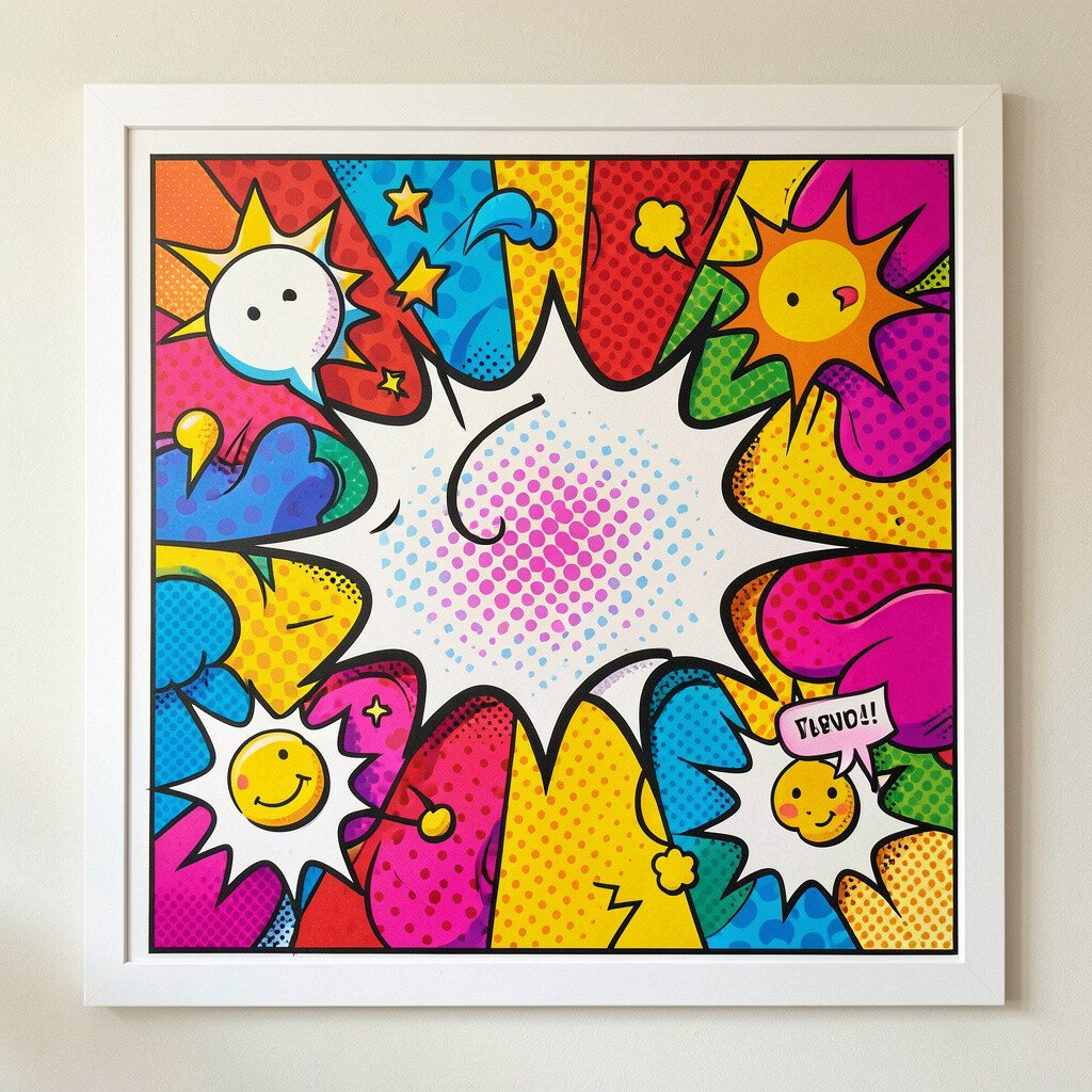
A pop art comic style print can instantly add fun to a room. Bright shapes, halftone textures, and bold lines make the wall feel like a celebration.
The benefit here is energy, especially in spaces where you want people to feel upbeat and creative. Try it in a home office, game room, or kids’ play area where laughter fits naturally.
For practical tips, balance the bold print with calm walls and solid furniture. Current trends often mix pop energy with modern neutrals, so you can still keep the look tasteful. To manage cost, consider a single statement print with strong color rather than several smaller pieces that can add up. Personalize it by choosing a theme that matches your hobbies, like music, sports, or travel icons hidden in the design.
Also check that the dominant colors match your decor, so the print feels like part of your style, not a surprise.
12. Scandinavian Forest Sketch in Soft Greens
Scandinavian Forest Sketch in Soft Greens
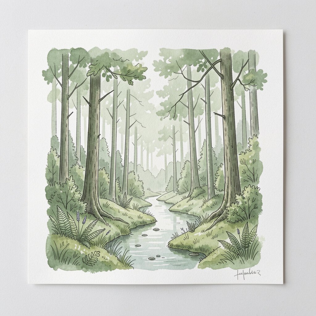
This forest sketch brings a cozy, Scandinavian feel with quiet trees and winding lines. Soft greens and muted tones help your space feel grounded and welcoming.
It benefits your room by adding warmth without bright, loud colors. Place it in a bedroom, entry, or reading nook to make the space feel calm and inviting.
For personalization, choose a frame in natural wood and keep other decor neutral so the print stays effortless. This style is trending because people love “slow” nature aesthetics and hand-drawn textures. If cost is a concern, look for unframed prints that come with strong packaging, then frame them locally for better fit. You can also match the forest colors to your bedding or curtains using one shared shade of green.
13. Color-Blocked Skyline in Bold Primary Tones
Color-Blocked Skyline in Bold Primary Tones
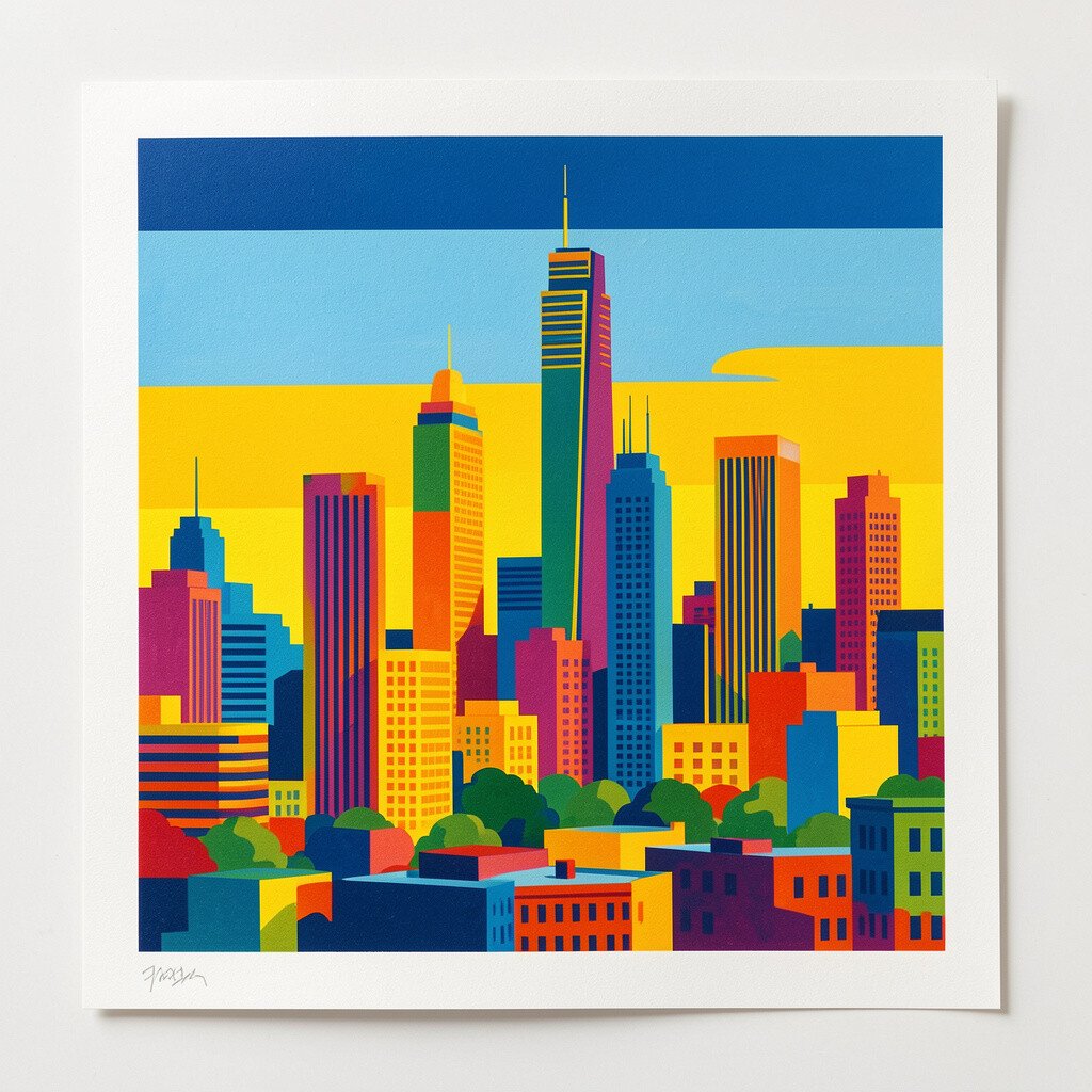
This color-blocked skyline uses bold primary tones to create a modern city look. The strong blocks feel graphic and clean, like design from a contemporary gallery.
One benefit is that it makes even a simple room look designed and intentional. Hang it in a hallway or above a low console where the geometry can guide movement through the home.
For practical tips, make sure your frame has straight edges and a crisp finish so the blocks look sharp. Current trends love color blocking and graphic city art, especially in homes that use simple furniture shapes. If budget matters, choose a print with fewer colors but high contrast, since it often costs less and still looks bold. Personalize it by aligning the color blocks with accent pillows, a rug stripe, or a single painted wall section.
14. Coastal Waves at Dusk with Subtle Metallic Feel
Coastal Waves at Dusk with Subtle Metallic Feel
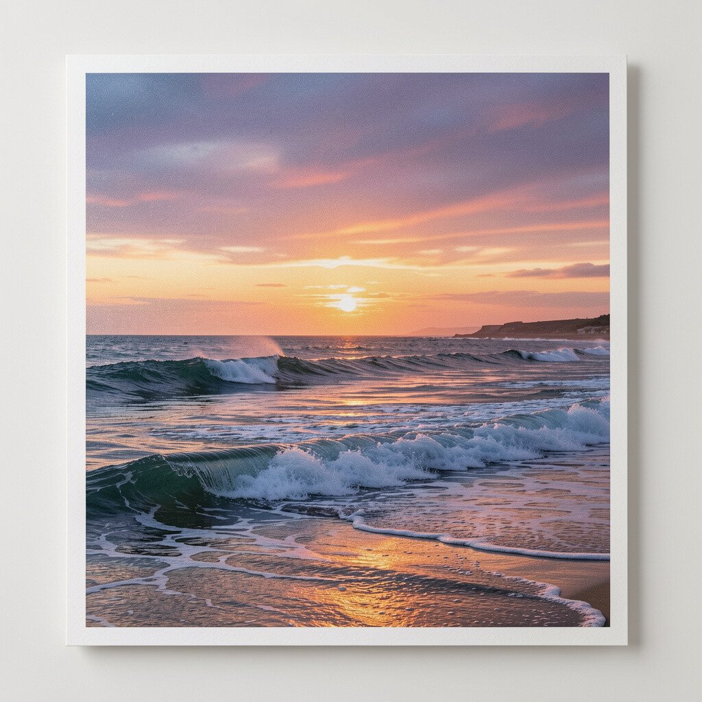
A coastal waves print at dusk can make your room feel like a quiet shoreline. Look for gentle gradients and hints of metallic shimmer that catch the light.
This gives a benefit that feels both relaxing and a bit fancy, because the artwork changes with the room lighting. Place it where you can see it in the evening, like across from a lamp or next to a window.
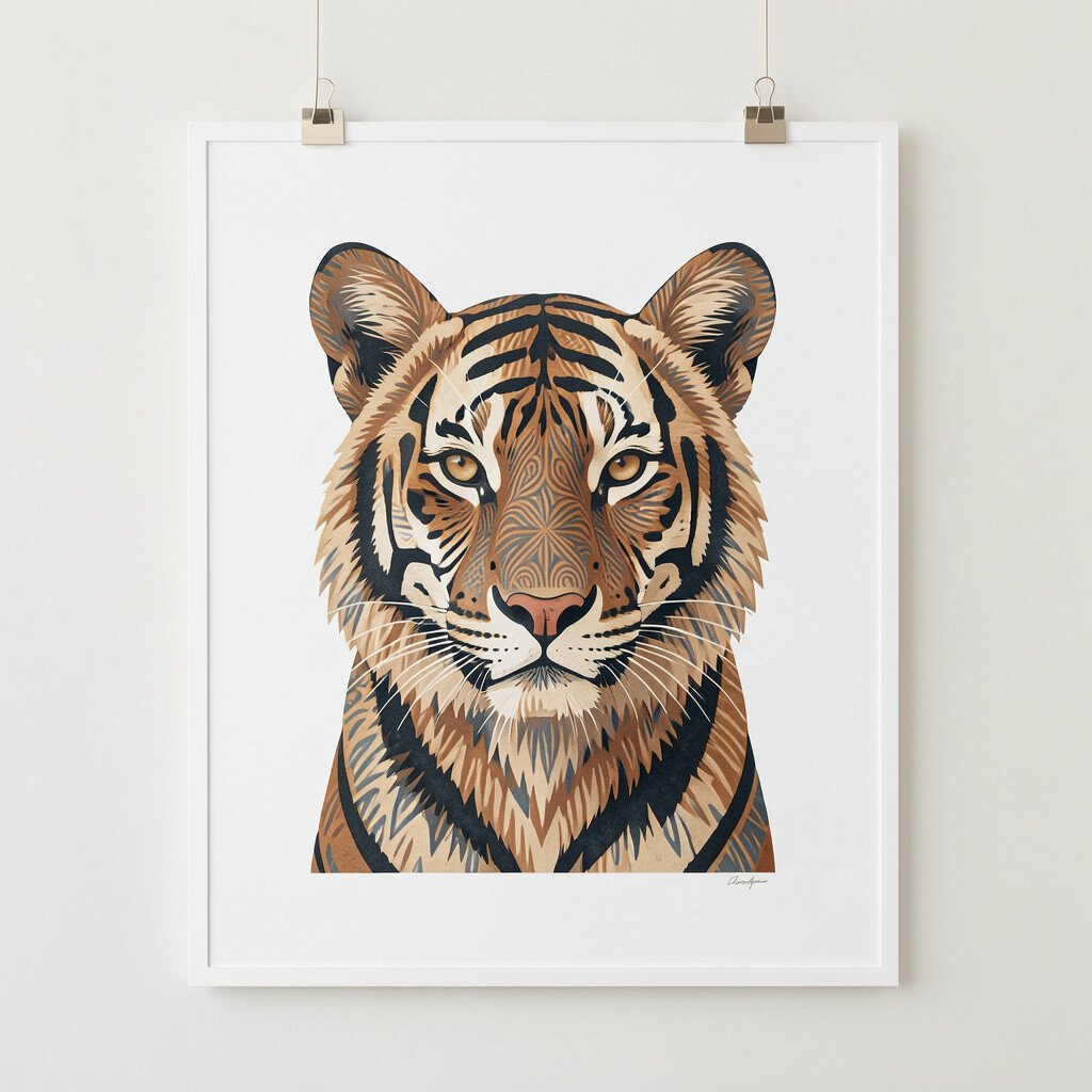
15. Patterned Animal Portrait with Elegant Minimalism
Patterned Animal Portrait with Elegant Minimalism
This print features an animal portrait styled with elegant patterns. The design can be bold, but the layout often stays minimal so it feels refined.
It benefits your space by adding personality without taking over every visual detail. Put it in a living room, office, or bedroom where you want a conversation piece that still matches your style.
For personalization, pick a frame finish that echoes your decor, like black for modern rooms or warm wood for cozy spaces. This style is trending because people want art that feels both artistic and wearable with their interior choices. If cost is a concern, choose a limited edition print in a standard size, then upgrade framing with museum glass to protect the paper. A practical tip is to match one repeated color in the pattern to your accessories, such as a throw blanket or a ceramic planter.
When you hang it, keep the surrounding space open so the animal portrait remains the quiet hero of the wall.