The right accent wall can make a room feel instantly more alive. When color, texture, and light work together, even a simple space starts to feel special.
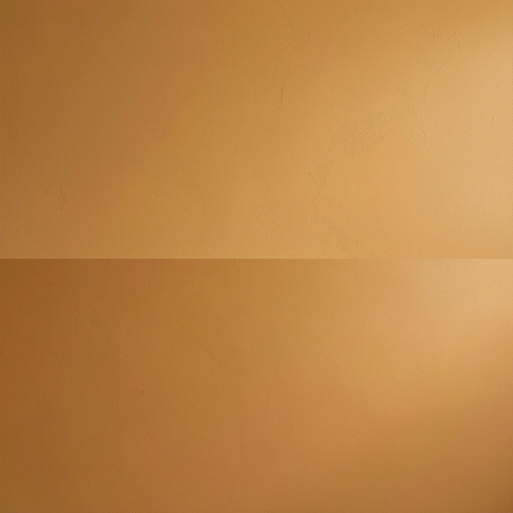
Pick a warm shade like peach, soft terracotta, or honey gold and paint it on one wall. The color will glow in daylight and feel cozy at night, especially if you keep the rest of the room in creamy neutrals.
For a clean look, use painter’s tape to create a straight edge and step back often to check the lines. Choose a finish that matches your lifestyle, since eggshell is forgiving for everyday touch-ups. If you want extra brightness, add a semi-reflective top coat on the accent wall only and place a lamp nearby to bounce light around the room.
2. Sunburst Wallpaper Behind Seating
Sunburst Wallpaper Behind Seating
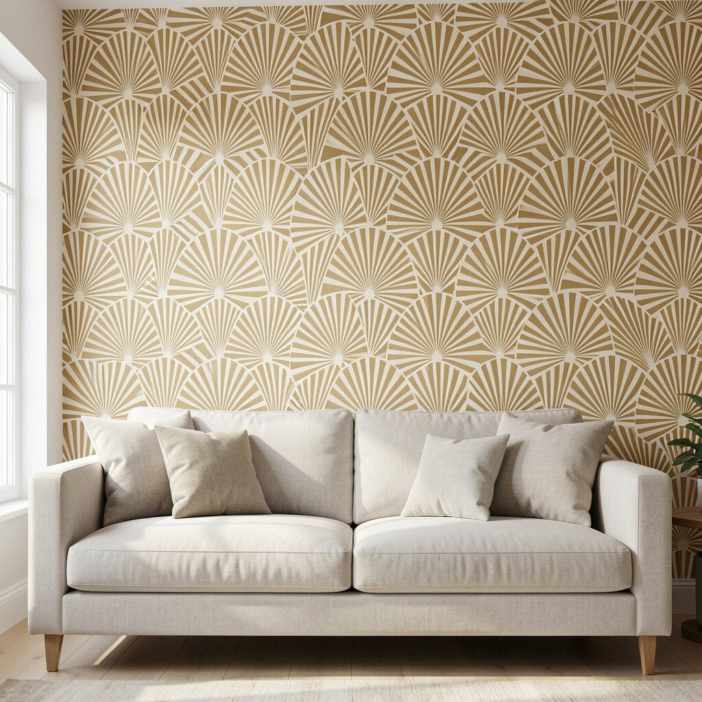
Use bold sunburst wallpaper on the wall behind a sofa, chair, or bench to create instant motion. The rays visually lift the space, drawing eyes upward and outward for a brighter feel.
In current home design, statement wallpaper keeps showing up because it makes rooms look finished without building anything new. Keep the rest of the room calm with solid curtains and simple art so the pattern stays the star.
To keep the job manageable, measure carefully and buy enough rolls for the full height plus extra for pattern matching. If you rent, consider removable wallpaper and test a corner first to check how it peels. A slightly glossy paint on nearby trim can also help the sunburst look even more vibrant.
3. Textured Plaster Effect in Soft Ivory
Textured Plaster Effect in Soft Ivory
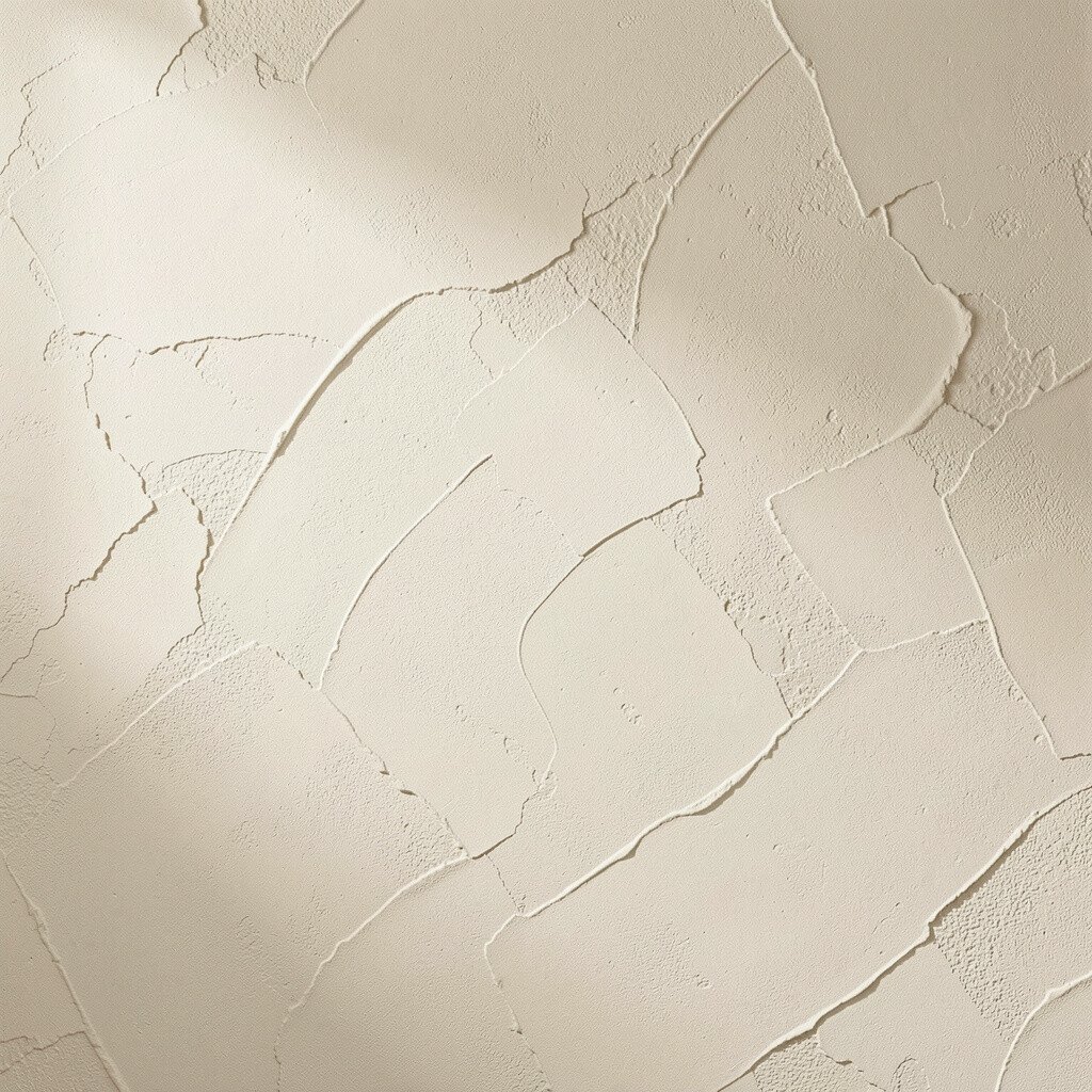
Try a plaster-style finish in soft ivory or warm white to add depth without overwhelming color. When the surface catches light in tiny shadows, the wall looks bright and rich at the same time.
This style is unique because it feels artisan-made, yet it can work in modern rooms, classic rooms, and everything in between. It also hides small bumps better than flat paint, which is great when walls aren’t perfectly smooth.
Use a tinted base paint so it doesn’t look stark, then apply the texture with a roller or trowel tool meant for the effect. Pair the finish with light wood furniture and white or oatmeal textiles to keep the glow. If you want it to feel extra airy, choose warm ivory rather than cool gray and add one bright piece of decor like a framed print.
4. Classic Half-Wall Wainscoting With a Twist
Classic Half-Wall Wainscoting With a Twist
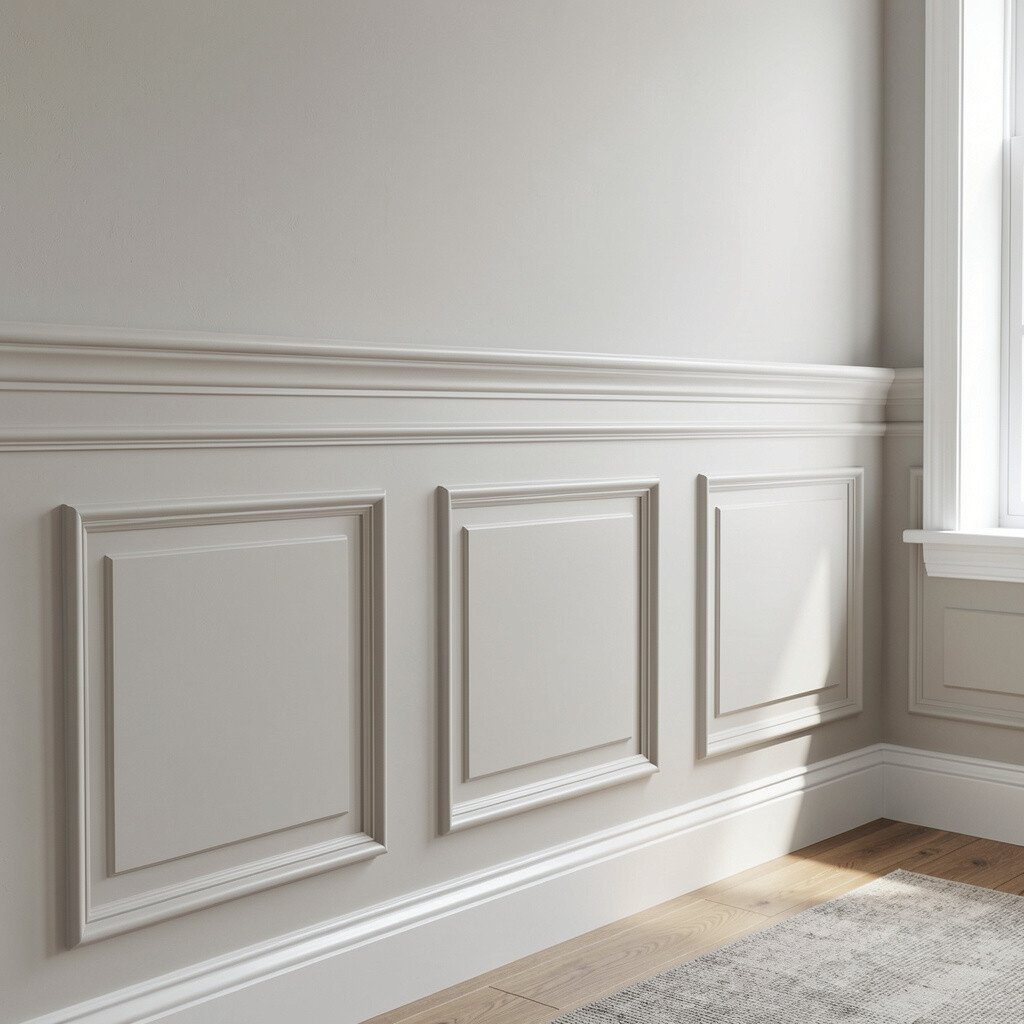
Give an accent wall a vintage feel by painting it with half-wainscoting or adding panel trim at chair-rail height. Then paint the upper section in a bright shade like sage green, powder blue, or warm blush to make the wall feel fresh.
The twist is what keeps it current, so consider mixing materials by pairing matte wall paint with glossy trim. This approach also makes the room feel taller because the lines guide your eye up and across.
Install paneling with careful measuring, and use a level for every piece so the panels look sharp. Budget-friendly options include pre-primed MDF trim and simple paint instead of full custom carpentry. For personalization, add a slightly darker paint on the trim edge to create crisp contrast and a more polished look.
5. Bold Vertical Stripe Accent
Bold Vertical Stripe Accent
Paint vertical stripes in two tones, such as cream and light gold, to make the wall look taller and brighter. Vertical lines naturally pull the eye upward, which is perfect for compact rooms or low ceilings.
Try a stripe width that feels bold but not overwhelming, then repeat the colors in small ways across the room through pillows or a vase. This is a great way to get uniqueness while still keeping the look neat.
To avoid messy stripes, tape the edges and use a small angled brush for crisp corners. If you worry about perfect alignment, start from the centerline of the wall and work outward so both sides look balanced. Choose a quality paint with good coverage since stripes require clean, even layers.
6. Matte Dark Accent With Bright Lighting
Matte Dark Accent With Bright Lighting
Pick a deep color like navy, charcoal, or forest green and keep it matte for a dramatic, bright-in-the-right-light look. A dark wall can make lighter furniture and decor look even more vivid by contrast.
The practical move is to add lighting that bounces, such as a floor lamp with a wide shade or a wall sconce near the wall. This trend works well now because people want cozy, grown-up rooms that still feel open.
Use lighter curtains and keep the floor area uncluttered so the room doesn’t feel heavy. Test the color in the room at different times of day before you commit, since dark shades shift with morning and evening light. If you want an easier path, start with a darker color on just half the wall or pair it with a bright art gallery above the sofa.
7. Color-Blocked Corner Gallery Wall
Color-Blocked Corner Gallery Wall
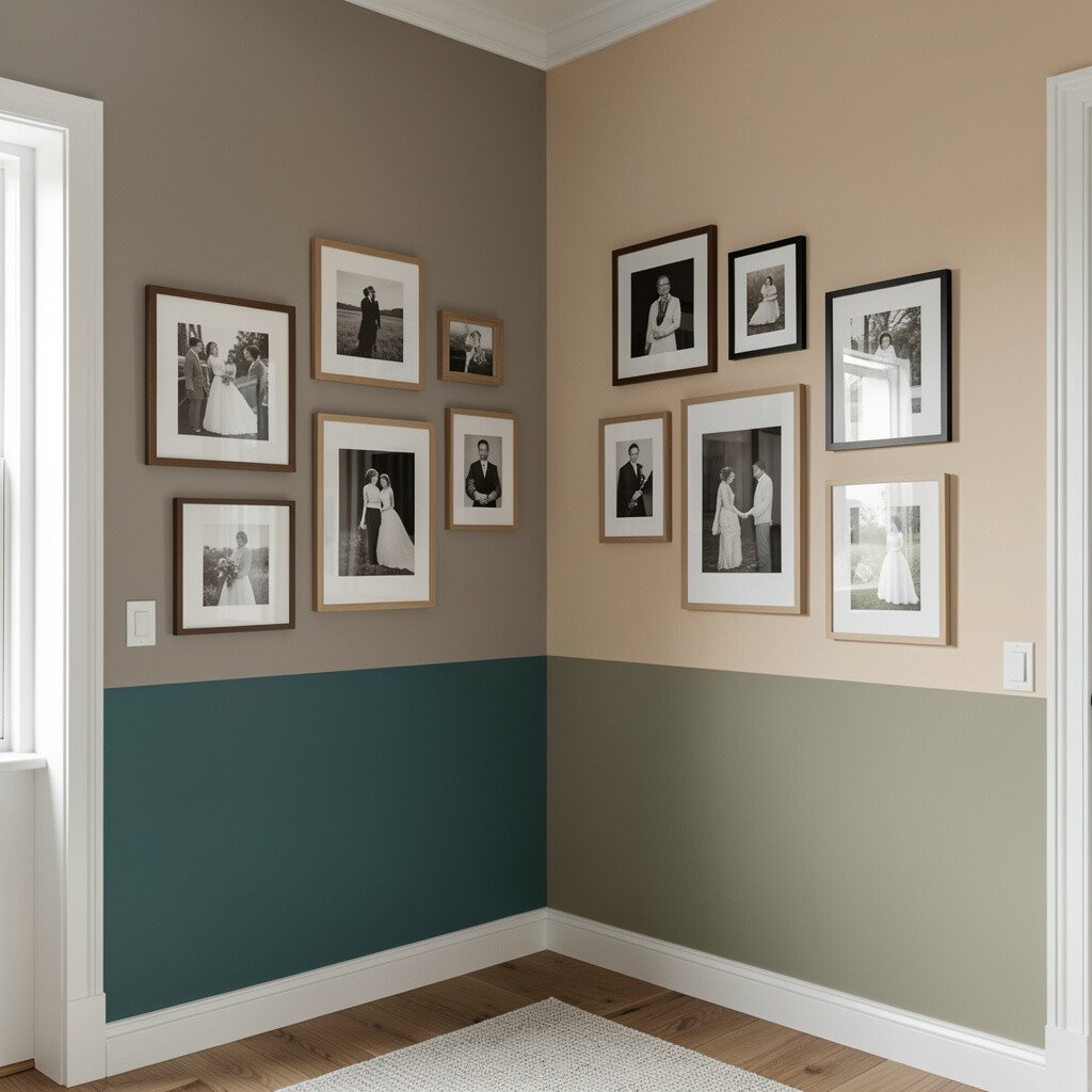
Create a bright corner by painting the corner wall surfaces in two complementary colors, such as mint and warm white. Then treat that area like a mini gallery with framed art or photos that match the new palette.
This idea is unique because the wall becomes both a color moment and a display space. The corner angle helps the design feel intentional, and your decor looks like it’s part of the architecture.
To personalize, choose frames in one finish, like black metal or natural wood, and vary the sizes for visual interest. Hang the frames at eye level and keep spacing consistent for a tidy look. For cost control, swap in affordable prints or family photos and choose one “pop” frame with a brighter mat to anchor the set.
8. Peel-and-Stick Geometric Panels
Peel-and-Stick Geometric Panels
Use peel-and-stick geometric panels to add pattern and shine without painting. The shapes can look like modern tiles, and the wall will brighten as the pattern catches light.
This is a practical option for renters and busy households because it’s fast to install and easy to change later. You can choose colors like off-white, light gray, or soft gold so the overall look stays airy.
Start with the cleanest, smoothest wall you can, then plan the pattern so edges line up at the corner. Press firmly and work slowly to avoid bubbles, especially around outlets or light switches. If you want extra brightness, pick panels with a subtle sheen rather than fully matte and place a lamp so light hits the raised areas.
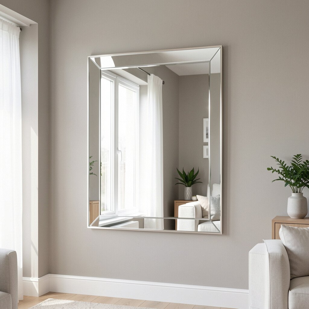
Hang a mirrored panel or install a mirror tile section on your accent wall to reflect light and make the room feel bigger. A mirror can brighten the entire space even if you keep your main wall color neutral.
This idea stands out because it adds sparkle and makes your decor look layered. It also helps when a room has limited daylight, since reflections add visual depth and movement.
Choose a frame style that matches your space, from sleek modern metal to vintage wood. For practical placement, avoid mirrors directly across from harsh glare and instead angle them toward a lamp or window. If you’re worried about cost, look for a single large mirror or mix a few smaller mirrors in a grid so the budget feels spread out.
10. Bright Fabric Wall Using Stretch Panels
Bright Fabric Wall Using Stretch Panels
Try a fabric-covered accent wall using stretch fabric panels for a soft, cozy look. A linen-like texture helps the room feel warmer and can brighten the space by making the wall look inviting rather than flat.
This approach is unique because it feels different from paint and wallpaper, adding softness that works especially well in bedrooms and reading nooks. Choose a fabric in a light tone like pale blue, warm cream, or blush, and the wall will feel airy.
Secure panels with a frame system or mounting tracks so the fabric stays smooth and doesn’t sag. For personalization, pick fabric with a subtle pattern, then match it with bedding or curtains so everything feels connected. It can cost more than paint, but it often lasts, looks premium, and improves sound comfort in the room.
11. Shiplap in a Fresh Light Shade
Shiplap in a Fresh Light Shade
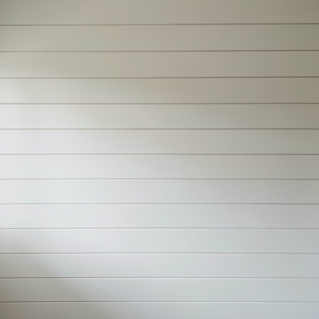
Paint shiplap a bright color to turn it into a glowing architectural detail. Light shades like crisp white, butter cream, or very pale sage keep the texture visible while avoiding a heavy look.
This style fits current trends because textured walls are back, and shiplap remains a favorite for its clean lines. It gives your space character even when you keep furniture simple and modern.
To get the best results, sand lightly and prime first so the paint adheres well to the wood. Use a brush for grooves and a roller for flat areas to save time while keeping the lines smooth. If you want to personalize, add a matching painted mantel or a floating shelf to make the accent wall feel like a full design moment.
12. High-Contrast Paint With a Soft Ombre Edge
High-Contrast Paint With a Soft Ombre Edge
Paint an accent wall with an ombre effect that fades from a darker shade into a brighter one. The gentle gradient looks creative, and the light end of the ombre helps the room feel open and cheerful.
This idea feels unique because it blends drama with softness, avoiding the harsh look some bold walls can have. It’s also practical since you can tailor the fade height to match your furniture layout.
Use a sponge or blending tools and work in thin layers so the transition looks smooth rather than streaky. Start with the darker tone at the base or lower third, then fade upward toward a light color. For personalization, repeat colors in decor through cushions, a rug pattern, or a framed print so the ombre feels connected to the rest of the room.
13. Monochrome Mural With a Bright Accent Highlight
Monochrome Mural With a Bright Accent Highlight
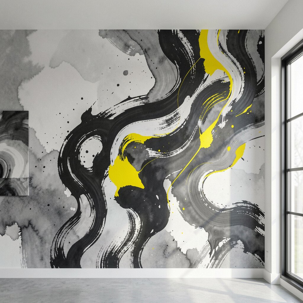
Choose a monochrome mural in whites and light grays, then add one bright highlight color in the design. For example, a subtle botanical line drawing can feel calm, while a pop of coral or sunny yellow brings energy.
Murals look modern right now when they’re not overly busy, so a simplified scene works beautifully behind a bed or dining area. The benefit is that you get a custom-feeling look without repainting the entire room.
Use a removable mural or a wall decal system if you want flexibility later. Check the wall space first and keep furniture scale in mind so the mural doesn’t overwhelm the room. To control cost, consider ordering a mural panel that fits your wall size or using a stencil approach for a similar look.
14. Statement Tile Look in Warm Neutrals
Statement Tile Look in Warm Neutrals
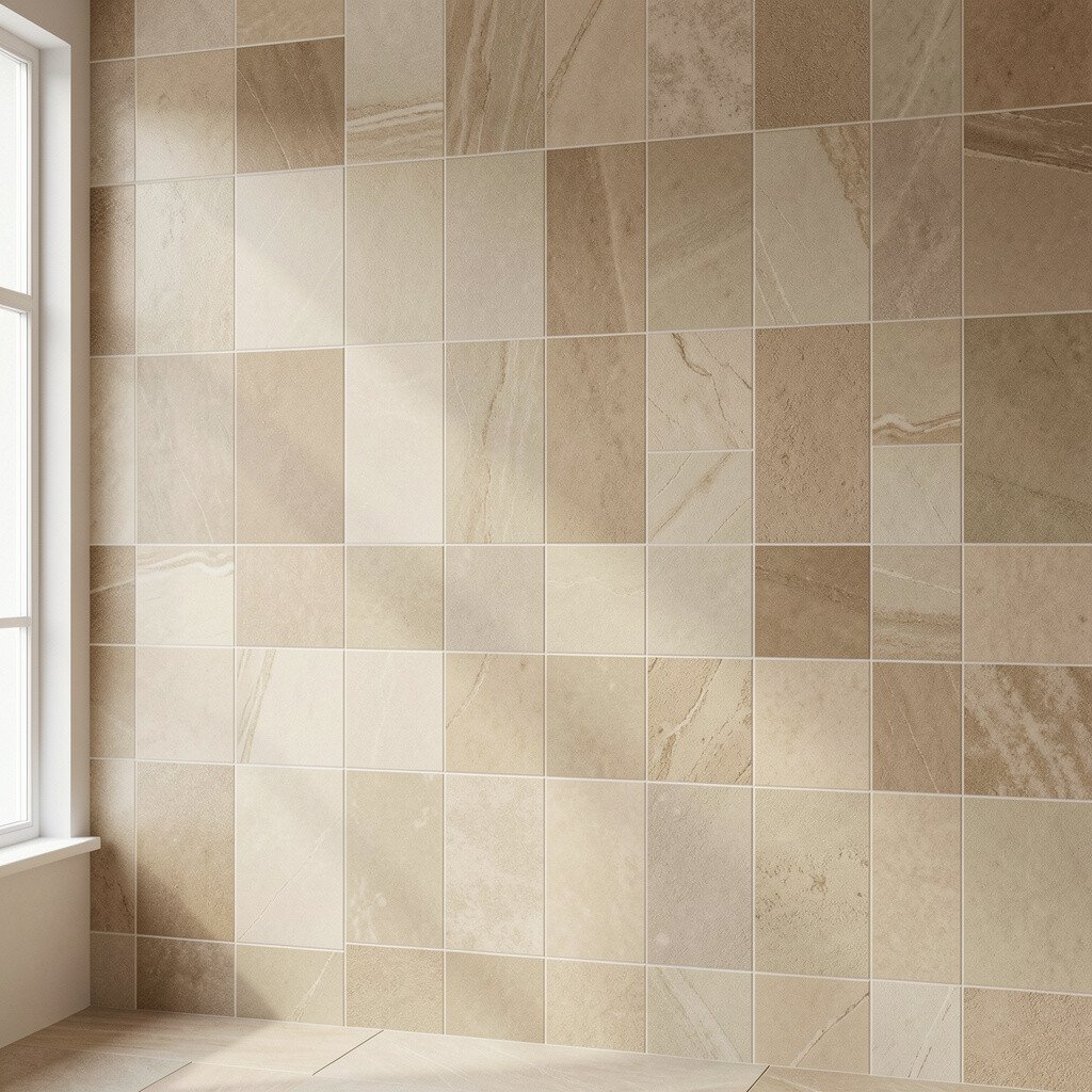
Install peel-and-stick tile panels or use a few real tile sections for a backsplash-like accent on a wall. Warm neutrals such as cream, sand, and light terracotta can brighten the space without turning it into a loud color blast.
This is a smart way to add uniqueness because tile adds pattern, shine, and a slightly spa-like vibe. It also works in kitchens, entryways, and bathrooms where moisture or cleaning matters.
Plan the layout so the pattern centers around a focal point, like a mirror or a console table. Seal peel-and-stick options if recommended by the brand, and wipe gently using mild cleaners to protect the finish. If you’re budget-conscious, cover only the most visible section and frame it with painted walls on either side for a high-impact look.
15. Gallery-Led Accent Wall With Color-Matched Frames
Gallery-Led Accent Wall With Color-Matched Frames
Instead of painting the whole wall, build an accent wall through a curated gallery of art framed in one or two coordinating colors. When your frames match, the collection looks intentional, and the wall feels brighter because your eye can move easily across the set.
This approach is trending for personal homes because it blends style with memories, and you can update it as your tastes change. The uniqueness comes from how you theme it, like using ocean tones, warm landscapes, or bold abstract prints.
Choose mat colors that reflect light, such as off-white or pale gray, and avoid overly dark mats that can feel heavy. Use consistent spacing so the wall looks neat, then add one larger piece as an anchor. For cost considerations, mix pricier originals with affordable prints and consider printing at a local shop to keep the look polished without overspending.
16. Bold Doorway Color and Frame Contrast
Bold Doorway Color and Frame Contrast
Make the wall around your doorway part of the accent by painting the doorway surround a bright, confident color. This creates a built-in focal point that makes the whole room feel designed, even if you only change one area.
It’s practical because it highlights an existing architectural feature, so you don’t need to cover a huge wall surface. Choose a shade that connects to your room palette, like a sunny yellow that matches warm woods or a cool teal that echoes subtle blue accents.
For personalization, paint the door itself a complementary tone or keep it neutral and focus the brightness on the frame. Add simple trim details with a crisp white edge to keep everything sharp and clean. If you want a lower-cost approach, start with just the trim and surround using painter’s tape and sample pots, then decide later if you want to paint the door too.