Cabinet color can make a room feel like sunshine without changing a single lightbulb. It’s one of the easiest ways to bring new energy to your everyday routines.
With the right shade, your kitchen, bath, or laundry area can look cleaner, calmer, and more welcoming. The best part is that you can keep it budget friendly or go all out, depending on your style.
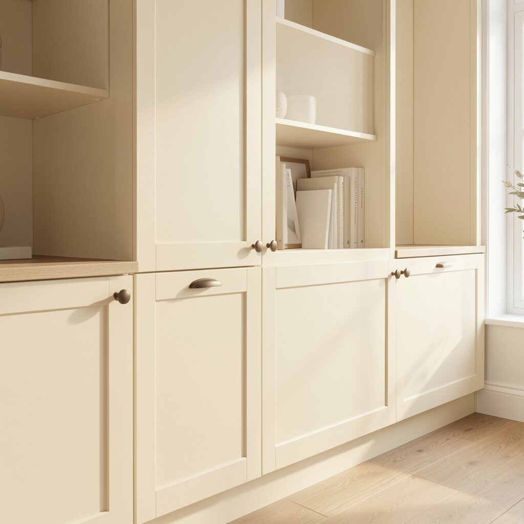
Soft cream cabinets look gentle and cozy, like morning light slipping across a countertop. You’ll notice how the space feels brighter even when the day is cloudy.
Cream is especially flattering on textured doors and shaker styles because it highlights the shape without shouting. For practicality, pair cream with warm white walls and light wood shelves to keep the look fresh. If you want extra pop, add brushed nickel or aged brass hardware that catches light as you move.
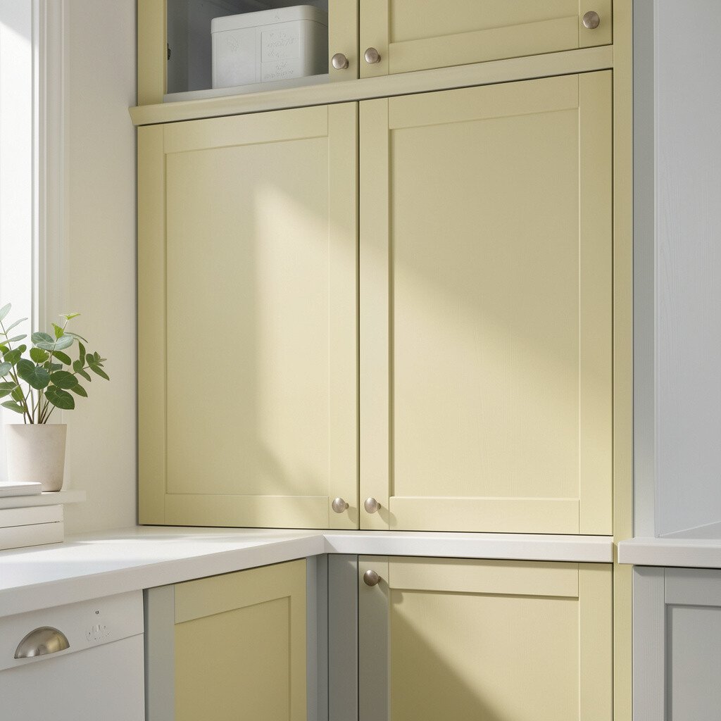
2. Sunny Butter Yellow With a Cheerful Glow
Sunny Butter Yellow With a Cheerful Glow
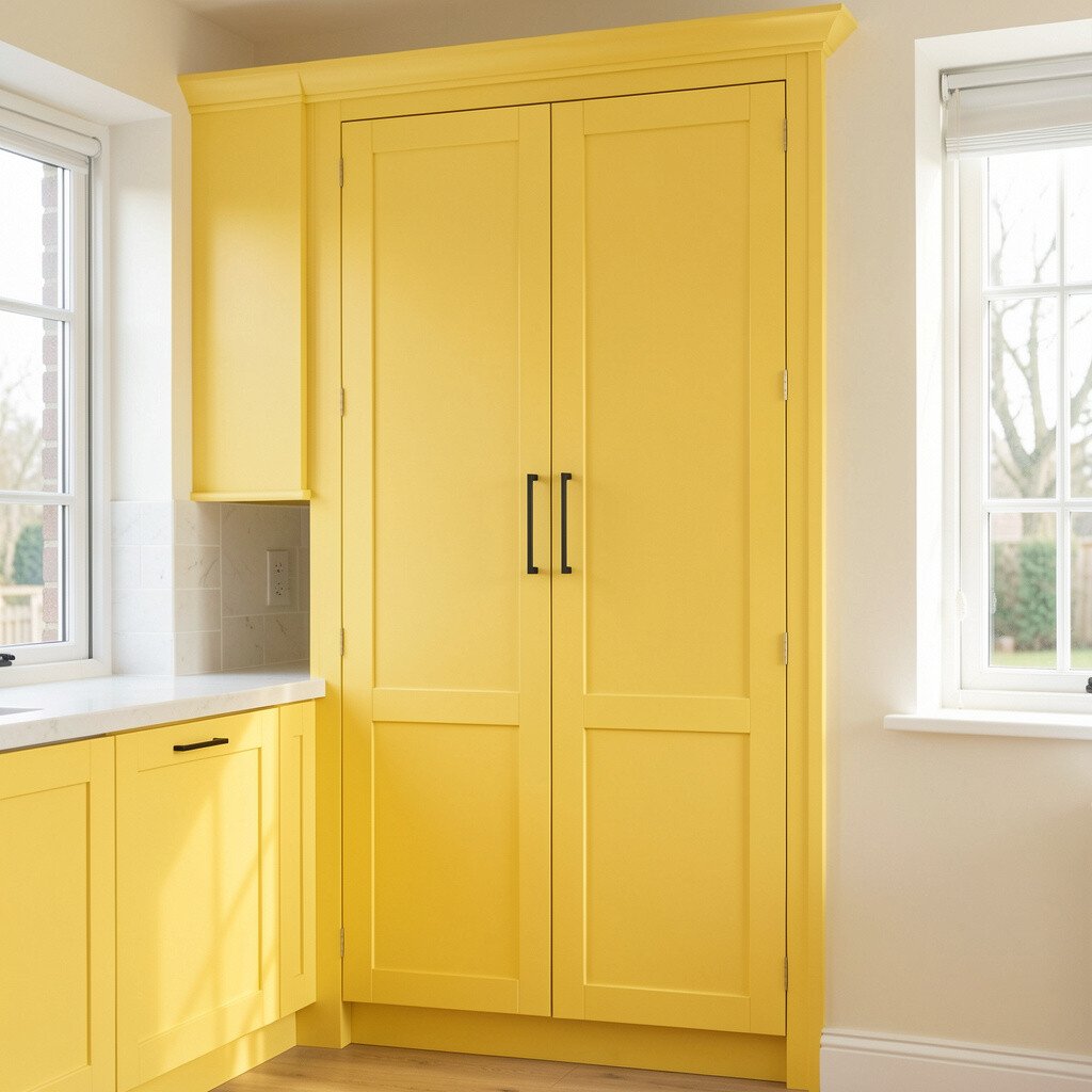
Butter yellow cabinets can turn an ordinary kitchen into a lively spot where everyone wants to linger. They look stunning with neutral floors and simple lighting.
This cheerful tone works best when you balance it with white, cream, or light gray counters to avoid visual overload. Choose matte paint if you want a soft, modern finish, and gloss if you want a brighter, more reflective effect.
To personalize it, match your yellow with accents like lemony artwork, patterned dish towels, or a warm-toned rug. If you’re keeping costs down, repainting cabinet boxes while leaving doors to update later can stretch your budget.
3. Airy White Cabinets With a Fresh, Clean Feel
Airy White Cabinets With a Fresh, Clean Feel
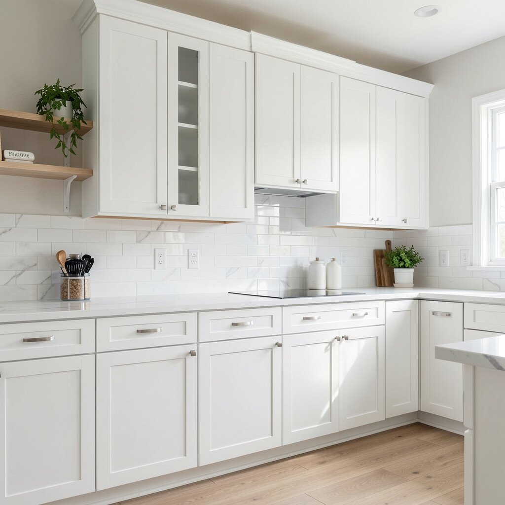
Airy white cabinets give a crisp, tidy vibe that makes rooms feel open and ready for anything. They’re a classic choice, yet they can still feel new when you pick the right undertone.
Look for warm white if your space gets yellow light, and choose cool white if your lighting feels bluish. Try pairing white cabinets with light oak, black accents, or subtle veining in your backsplash for a bright contrast. For personalization, swap out dated pulls for slimmer hardware to make white cabinets feel more modern.
If you’re worried about maintenance, choose a durable cabinet paint and plan to clean with gentle soap. You’ll get the bright look without constant touch-ups, especially in high-traffic areas.
4. Pale Sage Green for Calm, Bright Energy
Pale Sage Green for Calm, Bright Energy
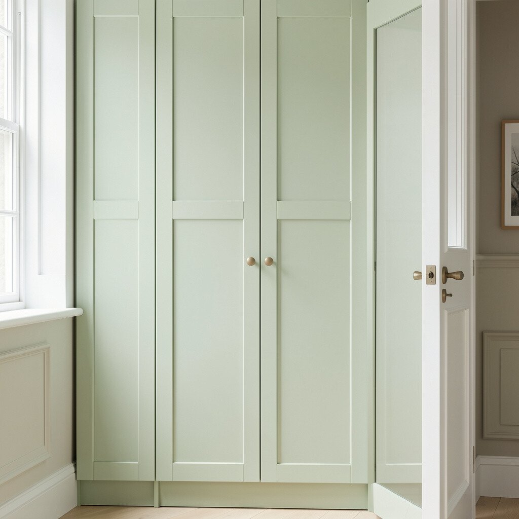
Pale sage green cabinets bring a peaceful, spa-like feeling while still lifting the room’s mood. The color looks soft against white walls and brightens the space without feeling loud.
Sage is also great for personalization because it pairs beautifully with natural materials like rattan, woven baskets, and light stone. For a practical approach, use it on lower cabinets only, then keep upper cabinets a lighter shade to maintain airy balance.
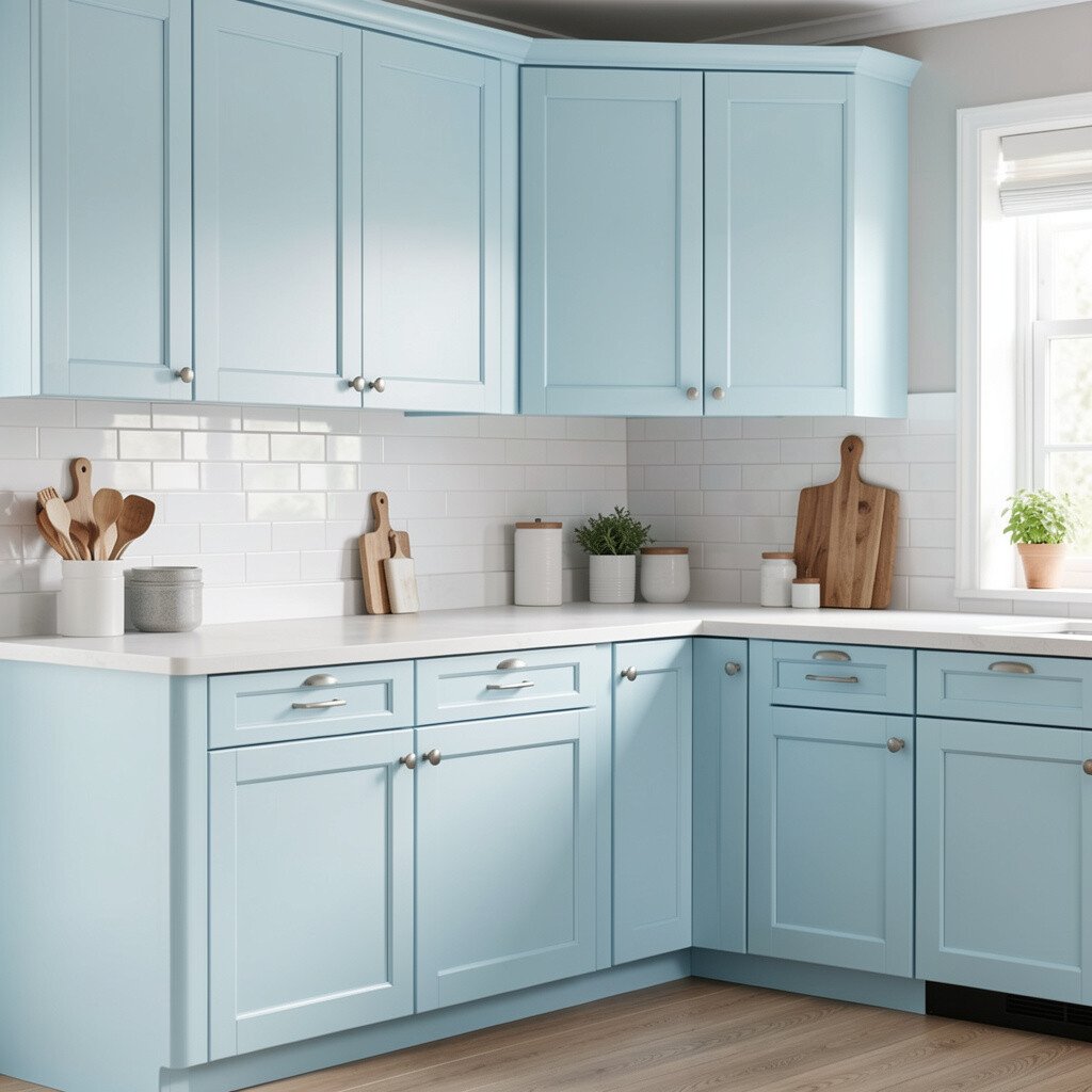
5. Sky Blue Cabinets That Feel Light and Fun
Sky Blue Cabinets That Feel Light and Fun
Sky blue cabinets can make your kitchen feel like a breath of fresh air. The shade reminds people of open skies, which naturally makes the room feel less heavy.
To keep it wearable, choose a light blue rather than a deep navy so the space stays bright. Add white countertops and warm wood details to create a friendly contrast that feels inviting.
If you want uniqueness, consider a two-tone look with blue on the island and white on the perimeter. This can also help you control cost by focusing color work where it matters most visually.
6. Coastal Teal for a Stylish Pop of Brightness
Coastal Teal for a Stylish Pop of Brightness
Coastal teal cabinets add a refreshing splash of color that still feels elegant. You’ll see how teal brings depth while keeping the room cheerful and lively.
Pair teal with creamy whites, light gray, and brushed stainless hardware for a balanced modern look. If your lighting is strong, a slightly muted teal can prevent the room from feeling too intense.
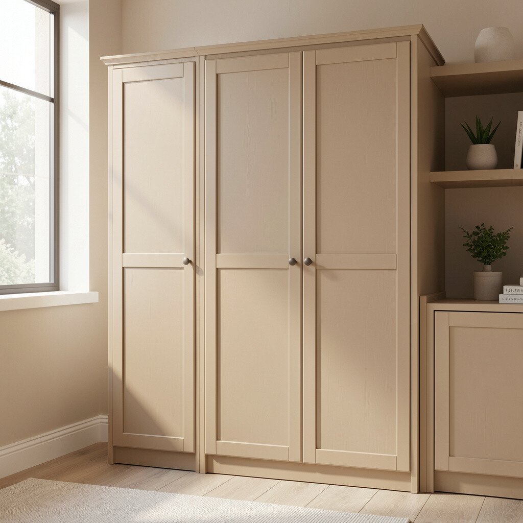
7. Sand Beige for a Warm, Sunlit Neutral
Sand Beige for a Warm, Sunlit Neutral
Sand beige cabinets create a warm, sand-dune glow that makes spaces feel cozy and bright. It’s a smart choice if you love neutral colors but want something more interesting than plain white.
Beige also helps hide everyday scuffs better than very dark colors, which is a practical benefit for busy homes. Keep the look airy by using lighter backsplash tiles and avoiding heavy, smoky shades nearby.
To personalize, add a soft patterned rug and choose hardware in warm finishes like antique gold. If you want to save money, repainting with a quality primer and topcoat can deliver a big change without replacing everything.
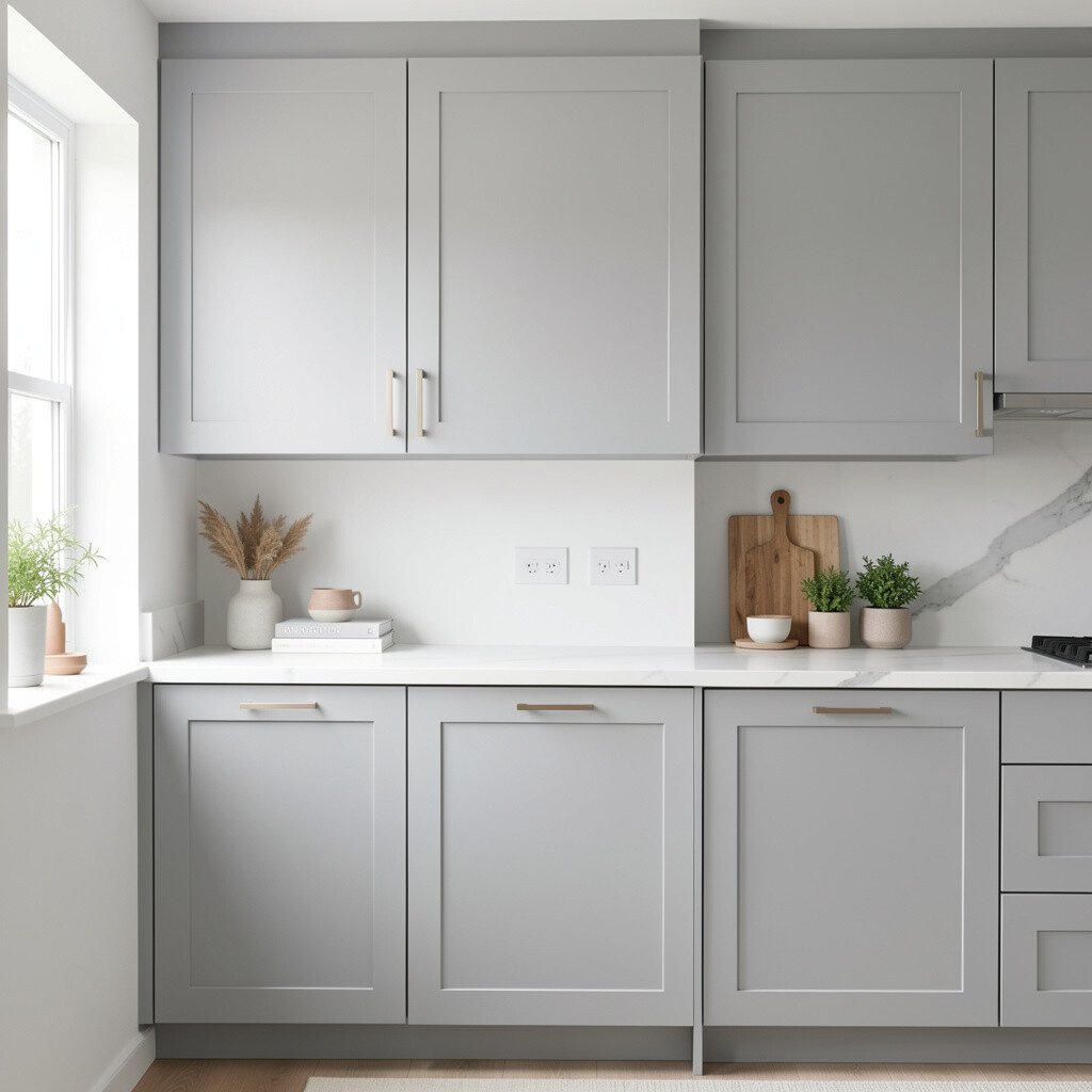
8. Soft Gray That Gives Bright Balance
Soft Gray That Gives Bright Balance
Soft gray cabinets are a modern way to brighten a room while still keeping things calm. They reflect light well and make countertops look more crisp.
For a natural, easy look, pair gray cabinets with white or pale stone surfaces and simple black or chrome hardware. This color works especially well in rooms with lots of natural light, because gray can stay clear and fresh instead of dull.
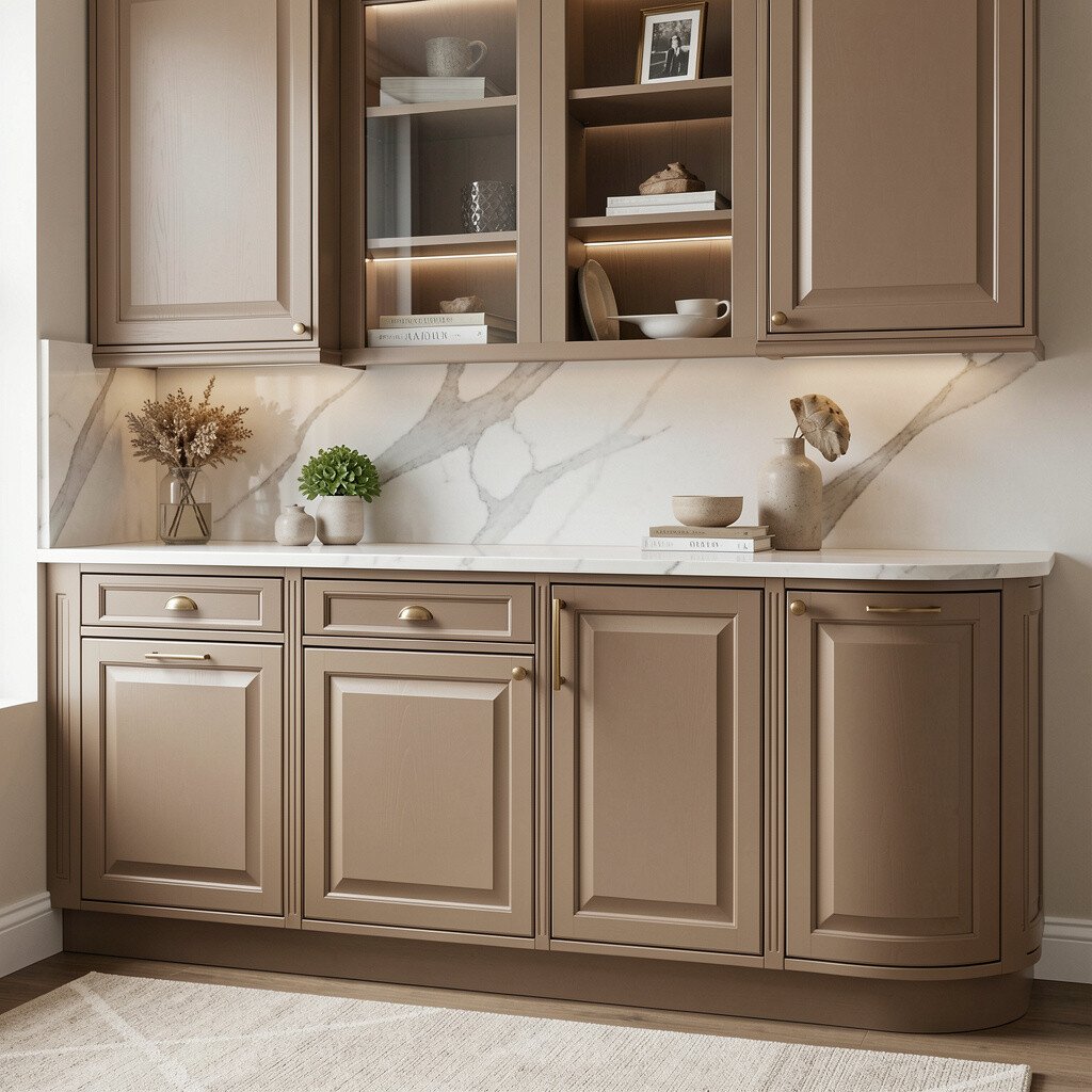
9. Warm Taupe for an Upscale, Cozy Look
Warm Taupe for an Upscale, Cozy Look
Warm taupe cabinets feel grounded and welcoming, like a comfortable sweater for your home. They brighten the space by adding warmth without being yellow.
Taupe is a great pick if your home has wood floors, because it blends in while still making the cabinets the star. To keep it practical, choose a satin finish that wipes clean and resists fingerprint smudges.
For uniqueness, try taupe with textured cabinet doors, brushed bronze hardware, and a backsplash with subtle movement. This combo can look high-end even if your update is mostly paint and new hardware.
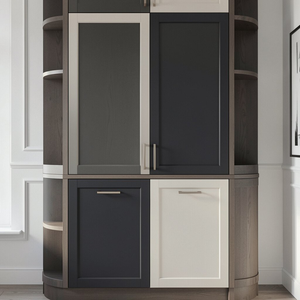
10. Charcoal-Blue for Dramatic Bright Contrast
Charcoal-Blue for Dramatic Bright Contrast
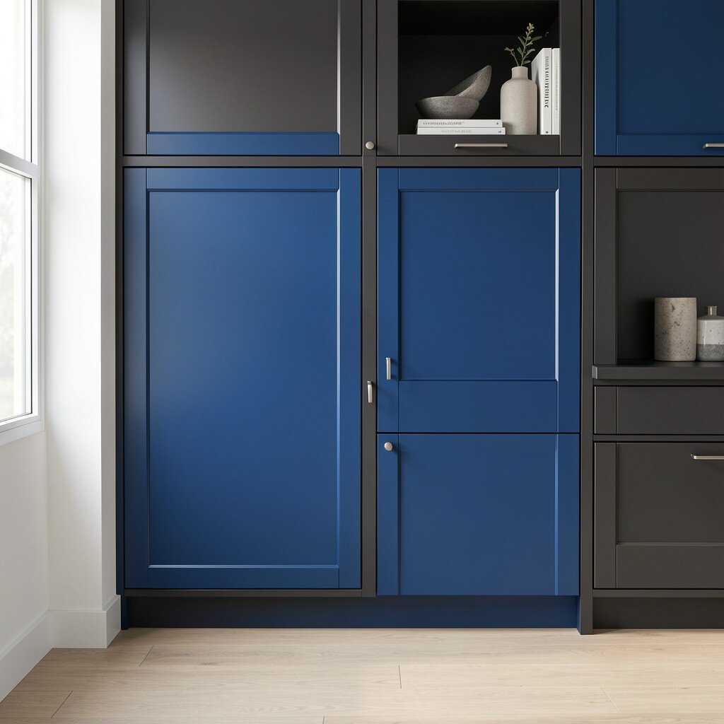
Charcoal-blue cabinets may sound bold, but they can actually brighten a room when used smartly. The blue undertone keeps the dark color from feeling flat.
Use charcoal-blue as an accent for islands or lower cabinets while keeping upper cabinets a light shade. This creates strong visual contrast and makes the room feel more designed, not darker.
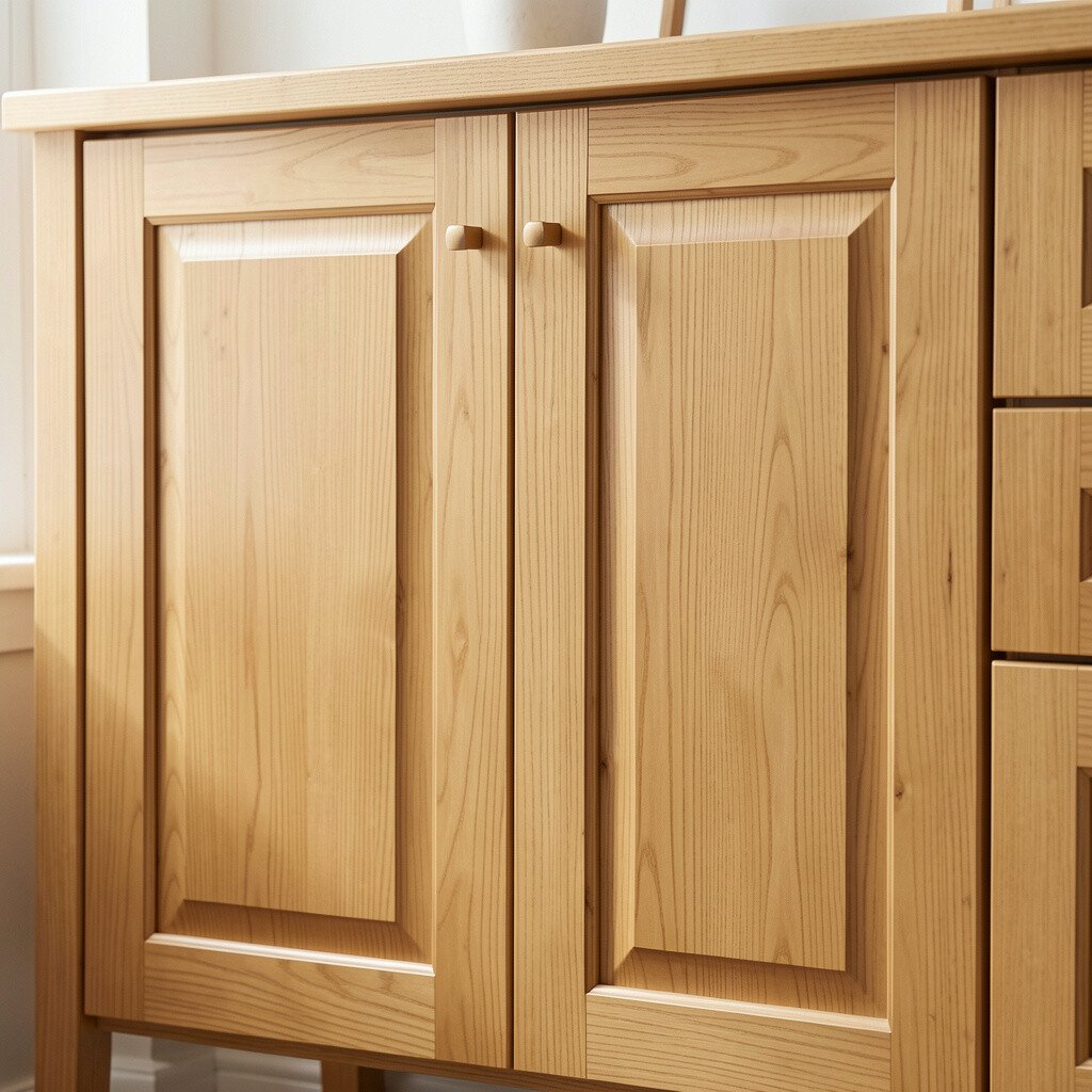
If you want brightness without paint, light walnut stain can do the trick. It brings a sunny wood glow that looks clean and stylish.
This option is unique because it keeps the grain visible, which adds character and warmth. For practical tips, refinish only what needs attention and protect the surface with a quality topcoat for durability.
Pair light walnut with white counters and simple hardware in brushed nickel or matte black for a modern look. Cost-wise, staining or refinishing can be less expensive than replacing doors, especially if the cabinet boxes are in good shape.
12. Peachy Apricot for a Friendly, Lively Mood
Peachy Apricot for a Friendly, Lively Mood
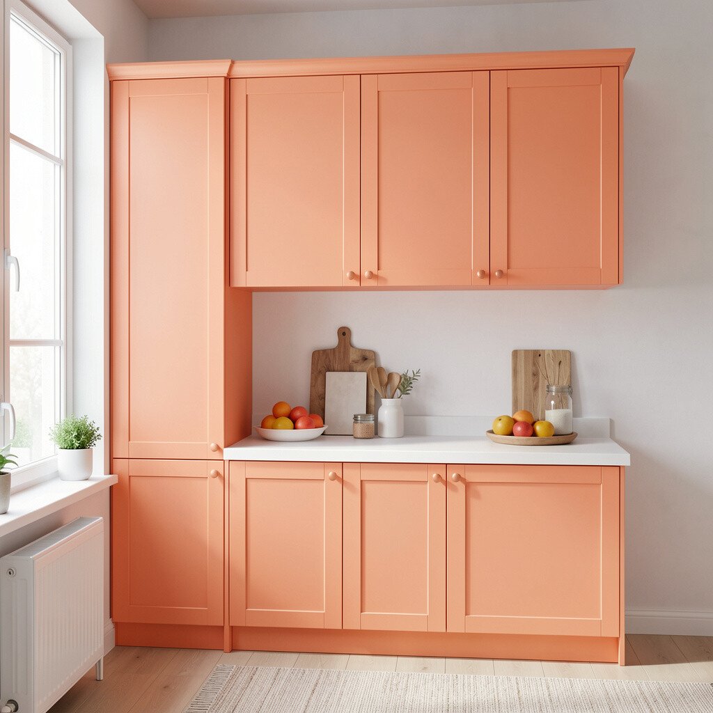
Peachy apricot cabinets bring a gentle, friendly warmth that feels cheerful all year. They’re great for kitchens that need a little more color without going too bright.
This shade looks lovely with cream walls, warm whites, and light marble or quartz with soft movement. Choose hardware in bronze or gold tone to make the color feel even more inviting.
To personalize, repeat the peach theme in small touches like matching canisters, artwork, or a fruit bowl. If you’re budgeting, focus on repainting cabinets and refreshing the backsplash instead of multiple bigger projects.
13. Mint Green for a Fresh, Retro-Friendly Vibe
Mint Green for a Fresh, Retro-Friendly Vibe
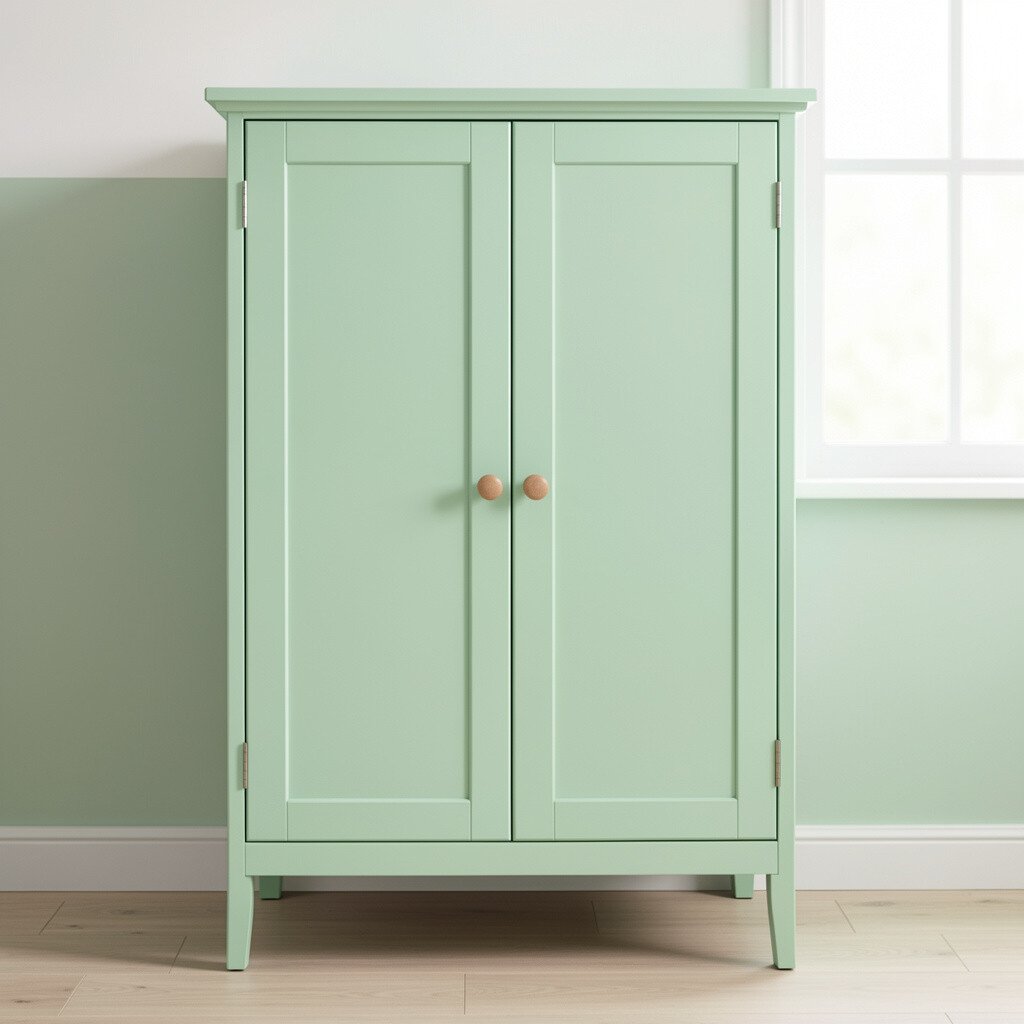
Mint green cabinets feel playful and fresh, like a cool drink on a warm day. The color gives your room instant energy and makes everything look brighter by comparison.
Mint works well with white or off-white walls and retro-inspired details such as ceramic knobs or classic bar pulls. To keep it from feeling too themed, choose a muted mint and pair it with more modern lighting.
For practicality, use a paint formulated for cabinets and seal it well so it holds up to daily cleaning. If you want a unique approach, try mint on the island and keep the rest neutral.
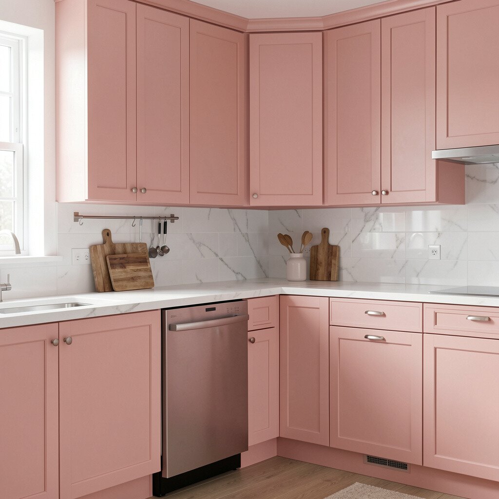
14. Blush Pink Cabinets for Soft Elegance
Blush Pink Cabinets for Soft Elegance
Blush pink cabinets add a delicate glow that feels both modern and romantic. They brighten the room while keeping the overall look calm and tasteful.
To make blush feel grounded, pair it with warm white countertops and natural wood accents. Hardware in brushed gold or antique brass can enhance the color and make the whole space look styled.
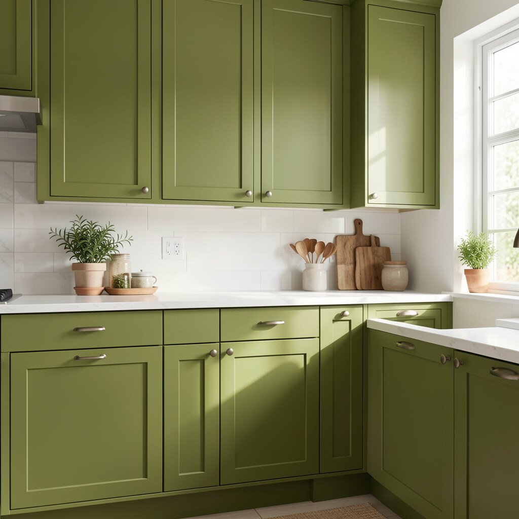
15. Olive Green for a Fresh, Earthy Brightness
Olive Green for a Fresh, Earthy Brightness
Olive green cabinets bring a rich, earthy tone that still feels lively and bright. The color adds depth, and it also pairs beautifully with warm lighting and natural textures.
For practical balance, pair olive with cream backsplashes, light stone, and simple black hardware. Olive also looks great in homes with earthy decor, like linen curtains and woven storage.
To personalize, choose a slightly different green for open shelving so you get layers of color. This can help you stay within budget by painting fewer surfaces at a time.
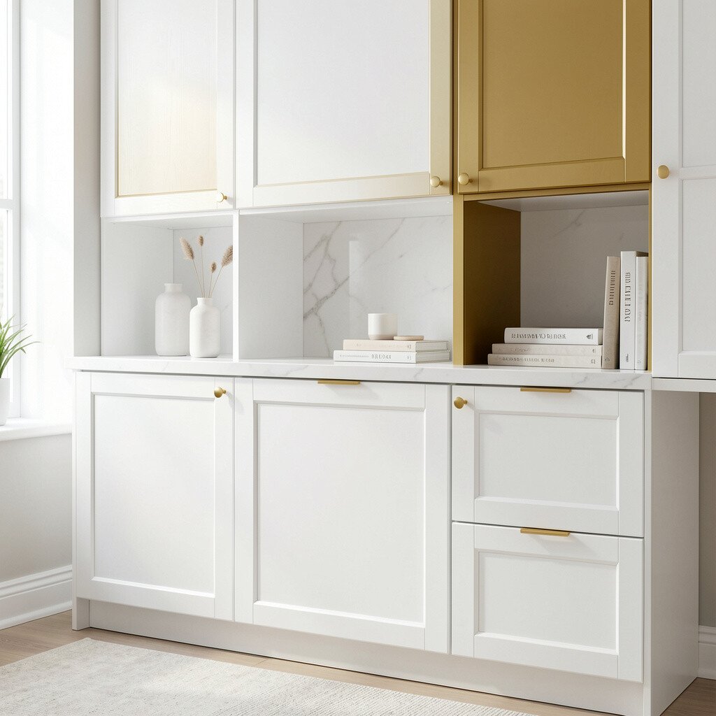
16. Bright White With a Hint of Warm Gold
Bright White With a Hint of Warm Gold
A bright white cabinet color with a warm undertone can make your whole room feel crisp and sunlit. It’s like brightening your space without turning it into a sterile showroom.
Pair it with warm lighting, brass hardware, and a backsplash that has golden or creamy flecks. If you want a uniqueness boost, choose cabinet doors with subtle detailing that catches light differently at different times of day.
Cost considerations are usually favorable here because white is forgiving for touch-ups and works with many countertop colors. When you update hardware and light fixtures too, the overall look feels brand new.
17. Light Navy for a Clean, Coastal Edge
Light Navy for a Clean, Coastal Edge
Light navy cabinets give a confident color pop that still keeps the space feeling bright. Navy can make white countertops and backsplashes look extra crisp.
To keep the vibe friendly, pair light navy with soft whites and natural wood. Avoid overly dark flooring if you want the room to feel open, and choose slim hardware to prevent the look from feeling heavy.
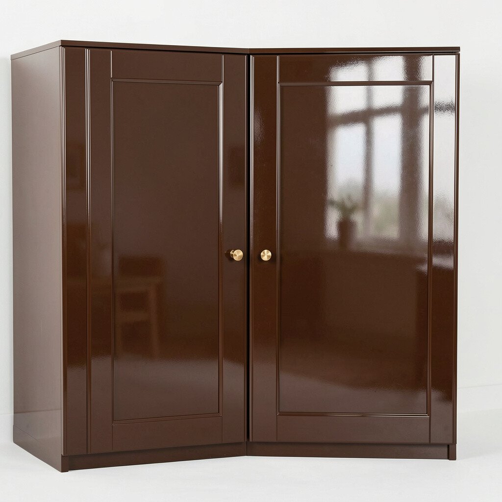
18. Chocolate Brown With a Glossy Shine
Chocolate Brown With a Glossy Shine
Chocolate brown cabinets can brighten a room when they’re finished to reflect light. A glossy or satin topcoat helps the color look rich and polished.
To make brown feel airy, add lighter elements like cream walls, light stone counters, and plenty of under-cabinet lighting. This color is unique because it adds drama without being as dark as espresso tones.
If cost is a concern, consider painting cabinet faces while keeping interiors natural for a quick visual upgrade. You’ll still get the bright, stylish feel where people look most.
19. Turquoise With a Modern, Beachy Feel
Turquoise With a Modern, Beachy Feel
Turquoise cabinets can bring a lively beach mood while staying modern. The bright color energizes the whole room and makes neutral decor feel more exciting.
Balance turquoise with white counters, light gray grout, and clean lines in your backsplash. For practical tips, use durable cabinet paint and consider a protective topcoat so daily cleaning doesn’t dull the color.
To personalize, mix turquoise with textured elements like woven shades and simple ceramic vases. This helps the space feel curated instead of costume-like.
20. Soft Yellow-Gray for Subtle Sunshine
Soft Yellow-Gray for Subtle Sunshine
Soft yellow-gray cabinets create a gentle glow that doesn’t feel overwhelming. They’re a great middle ground if you love sunshine but want something calm.
This color works well with both warm and cool lighting, so it’s flexible as the seasons change. Add white subway tiles or a pale quartz countertop to keep the space bright and easy to maintain.
21. Monochrome Charcoal With Lighter Accents
Monochrome Charcoal With Lighter Accents
Monochrome charcoal cabinets can make a room feel sleek, but they can also brighten it with the right setup. The trick is to pair dark cabinets with strong light sources and lighter surroundings.
Use bright white walls, glossy light countertops, and reflective hardware so light bounces around. For uniqueness, keep the island or open shelves in a lighter gray or white so the contrast feels intentional rather than heavy.
Cost considerations are usually manageable because you can use charcoal paint on visible areas while leaving less visible parts for later. This staged approach helps you get a dramatic upgrade without rushing the budget.
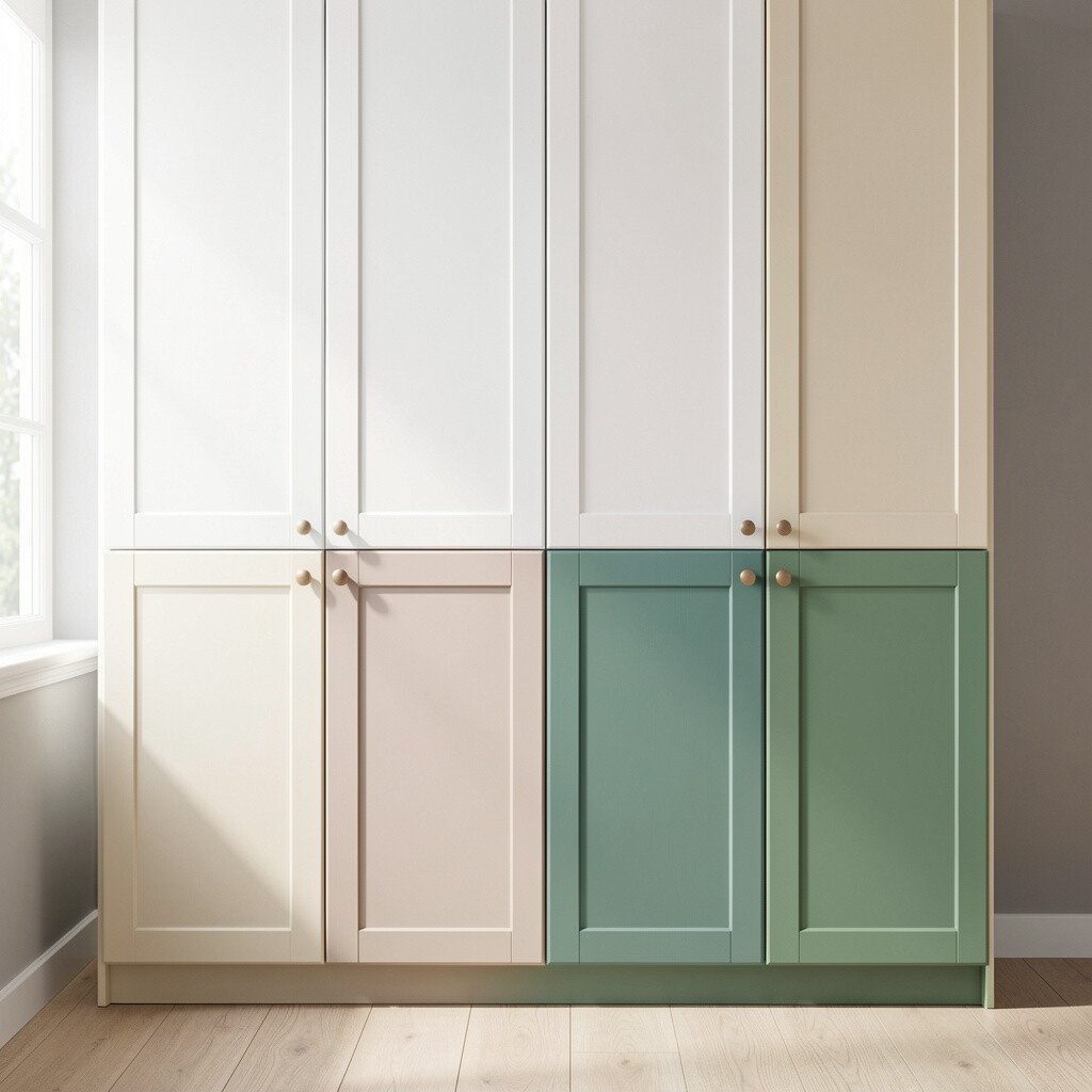
22. Two-Tone Color Pairings for Maximum Light
Two-Tone Color Pairings for Maximum Light
Two-tone cabinet color ideas can brighten your space quickly because they create visual layers. You might choose a light shade on top and a deeper, richer color below for a grounded look.
For practical balance, keep the contrast clear but not harsh, using undertones that work together. This is also an easy personalization method since you can match one tone to your flooring and the other to your countertop style.
If you’re thinking about cost, two-tone designs can be flexible since paint covers differently depending on the number of cabinet faces and doors. A smart trend right now is pairing matte finishes with brighter glossy hardware or accents, because the combination adds light even before you turn on extra bulbs.