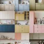
Picture cabinets in a warm white that glows when the sun hits the counters. You’ll notice the room feels cleaner and calmer, even on busy days.
For a realistic look, use swatches near the sink and the brightest window so the color doesn’t surprise you later. Pair the tone with soft brass or warm nickel hardware, and consider adding a light wood floor to keep everything cozy. If you want a simple upgrade without big spending, choose paint or a refinishing option and keep the cabinet style the same for the best value.
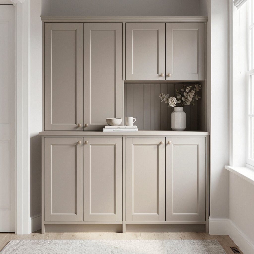
2. Soft Greige for a Cozy, Modern Balance
Soft Greige for a Cozy, Modern Balance
Imagine cabinets in a greige shade that sits between gray and beige. It makes walls and flooring feel more connected, especially in open floor plans.
To visualize it well, tape printed paint samples on cabinet doors and view them at different times of day. This color is popular right now because it works with many decor styles and hides small imperfections better than crisp whites. If you’re on a budget, greige is forgiving, so minor wear or patching looks less obvious after a refresh.
Try styling one corner with neutral textiles and a medium-tone wood bowl so you can judge how the cabinets react with your real items. Many homeowners love greige because it feels modern without looking cold.
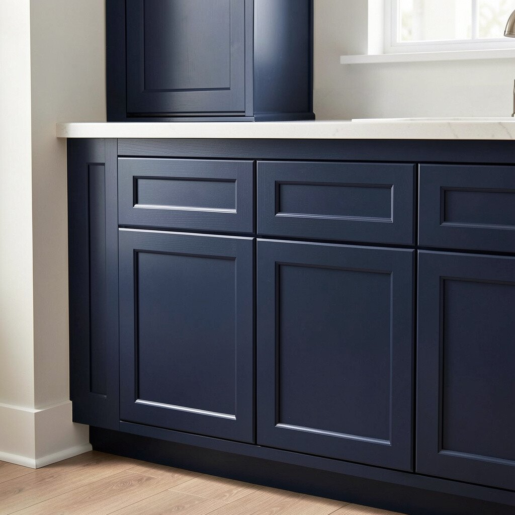
3. Deep Navy Cabinets for a Bold, Grounded Look
Deep Navy Cabinets for a Bold, Grounded Look
Think about deep navy cabinets that look almost black in shadow but turn rich and glossy in bright light. The contrast can make countertops and backsplash stand out in a sharp, elegant way.
Use a dark color test by painting a small section of an inside panel or a hidden door first. Then stand back and watch how the room feels at night, since navy can look moodier with warm bulbs. Navy is unique because it adds personality without needing complicated patterns.
Hardware choices make a big difference, so try brushed brass for warmth or matte black for drama. If you want to keep cost lower, repaint only the cabinet fronts and leave the box interiors for later, especially if they’re not often seen. This trend keeps showing up because it pairs well with marble-look counters and classic white walls.
4. Sage Green for a Fresh, Relaxed Kitchen
Sage Green for a Fresh, Relaxed Kitchen
Picture cabinets in sage green that feel like herbs on a windowsill. The color brings a gentle calm that works well in both farmhouse and modern homes.
To see how sage will look, compare it against your backsplash tiles and countertop samples, since green can shift depending on undertones. Choose a matte or eggshell finish if you want a soft, calming look, and choose semi-gloss if you want easy cleaning. Sage cabinets can also help mask everyday smudges, which is a practical bonus for active households.
5. Classic Charcoal for Sleek Drama
Classic Charcoal for Sleek Drama
Imagine charcoal cabinets that bring a strong, tailored feel to your kitchen or office. They look especially striking with light stone countertops and simple, clean lines.
For visualization, place a charcoal sample next to your appliances, then check if the color clashes with your fridge or oven tones. Many people love charcoal because it hides dust and minor scuffs better than lighter colors. When you want to personalize, mix in textured details like a subtle grain finish or decorative panel doors.
To manage cost, you can often refinish existing cabinets instead of replacing them, and charcoal can still look high-end with fewer changes to the overall layout. Current design trends favor charcoal for modern spaces because it feels bold yet still timeless.
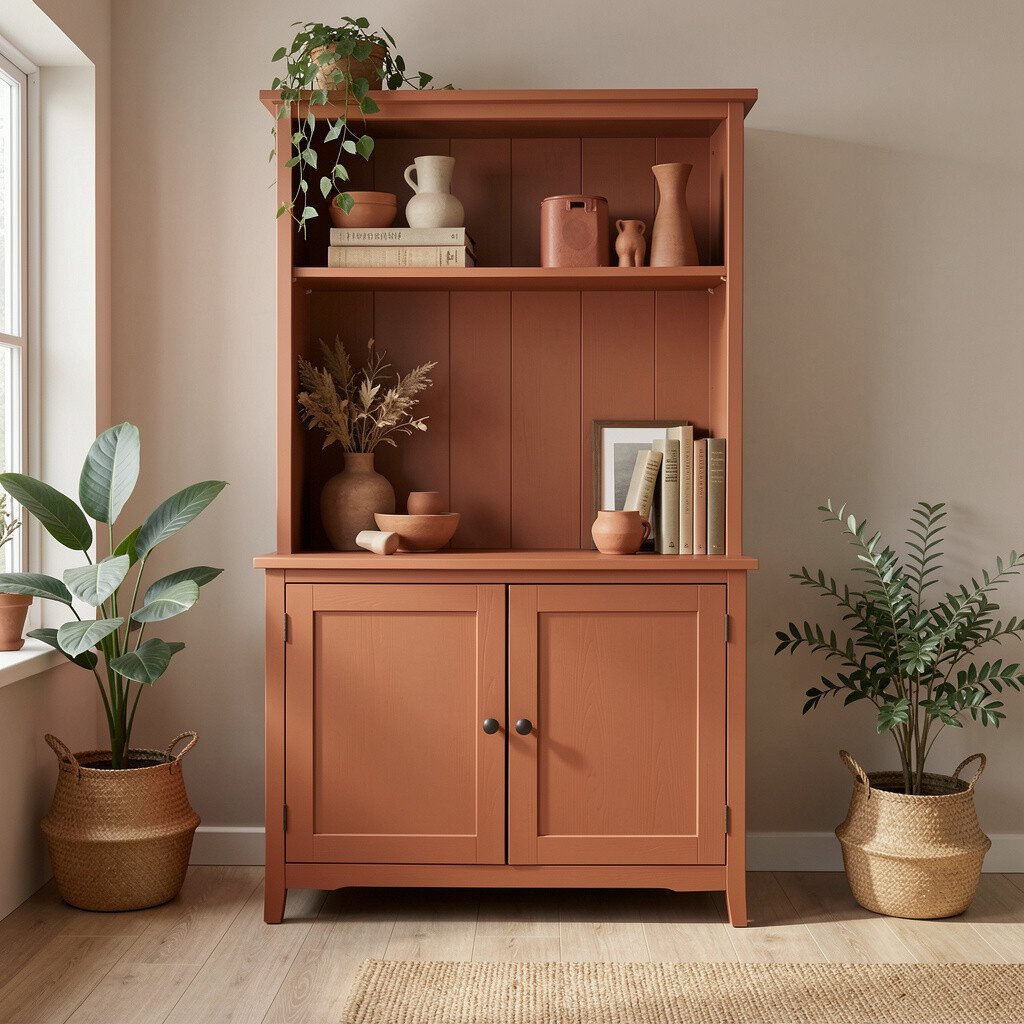
6. Earthy Terracotta for a Cozy, Artsy Mood
Earthy Terracotta for a Cozy, Artsy Mood
Picture terracotta cabinets with a warm reddish-brown that looks like baked clay. The room starts to feel inviting and a little artistic, even with simple decor.
To preview terracotta, test a few shades because some lean more orange and others lean more red. Pair terracotta with cream walls, natural linen, and darker accents like blackened metal so the color doesn’t overpower everything. You’ll get a unique look that stands out in a sea of standard neutrals.
If you’re thinking about cost, terracotta is a great match for paint refreshes since it can hide the idea of wear when applied evenly. For personalization, add open shelving with warm-toned dishware so the cabinet color becomes the backdrop instead of the only hero. This earthy vibe is trending in homes that want warmth without going overly traditional.
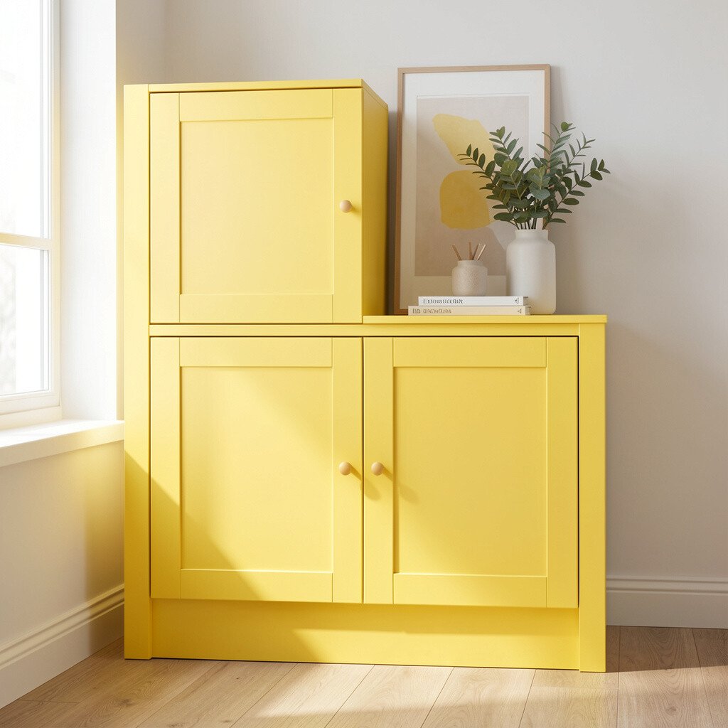
7. Sunny Butter Yellow for Cheerful Energy
Sunny Butter Yellow for Cheerful Energy
Imagine butter yellow cabinets that instantly lift the mood when you walk into the room. The color feels bright and friendly without being neon or loud.
Use visualization by putting a sample on both upper and lower cabinets to see how the shade changes with wall height. Consider balancing butter yellow with calm whites or light grays so the overall space stays easy to live in. Yellow cabinets are unique because they bring sunshine, and they can help a kitchen feel bigger when paired with reflective surfaces.
For practical tips, pick hardware in warm metals and keep the backsplash simple so the cabinets stay readable. If you want to watch your budget, repaint rather than replace, and focus first on the most visible cabinet faces. Butter yellow is also showing up more in current styling because people want joy in everyday rooms.
8. Glossy Red for a Show-Stopper Accent Kitchen
Glossy Red for a Show-Stopper Accent Kitchen
Think of glossy red cabinets that catch light like lacquer. They make the whole space feel like a stylish set, especially when you pair them with neutral walls.
To visualize red realistically, check your sample under the lighting you actually use, since red can look different in warm versus cool bulbs. A high-gloss finish can look stunning, but it can also show fingerprints, so consider semi-gloss if you want an easier daily life. Red cabinets feel bold and unique, and they work best when you keep other elements simple and steady.
9. Light Oak Stain Look for Natural Warmth
Light Oak Stain Look for Natural Warmth
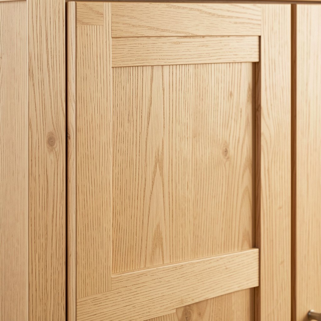
Picture cabinets stained to show a light oak grain that looks airy and natural. The finish adds warmth and makes the kitchen feel welcoming without forcing a strong color change.
To preview this style, test stain on an inside door first, because undertones can vary from piece to piece. Pair light wood tones with white or cream walls and soft black accents for a modern farmhouse feel. This idea can also be practical since wood finishes often look great with normal wear.
For cost considerations, staining or refinishing can be less expensive than full replacement, and you keep the cabinet structure you already have. Personalize by choosing a slightly warmer or cooler stain based on your flooring, so everything feels connected instead of competing. Light wood looks remain popular because they fit both cozy and modern home trends.
10. Cool Ice Blue for a Breezy, Modern Feel
Cool Ice Blue for a Breezy, Modern Feel
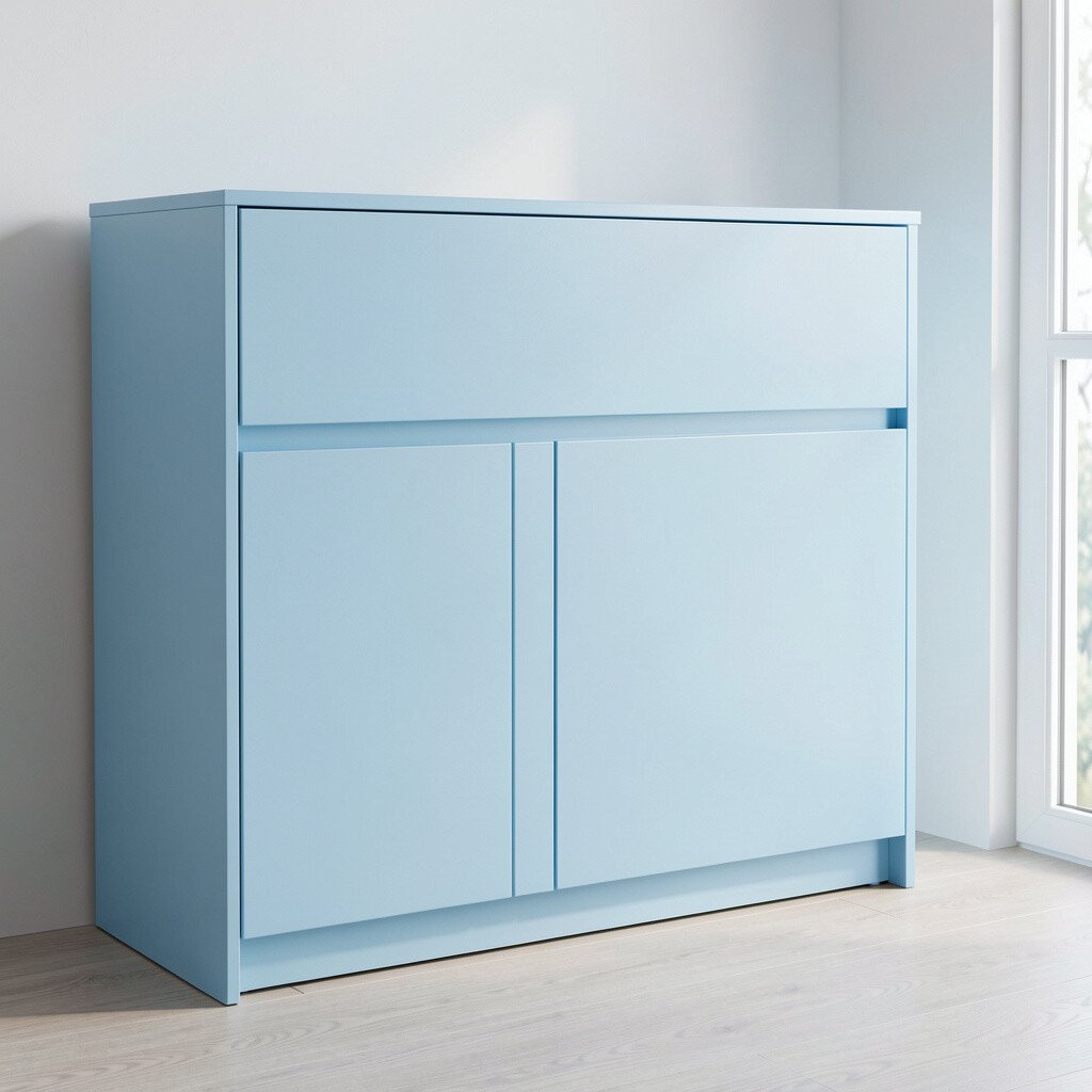
Imagine ice blue cabinets that look fresh and airy like a winter morning sky. This cool color can make a room feel lighter and more open.
To visualize it, place the sample where daylight is consistent, then step back from the room the way you would normally stand while cooking. Ice blue shines when paired with white countertops and stainless accents, and it can look especially clean with simple shaker-style doors. Choose a durable cabinet paint and a quality topcoat so the color stays smooth.
Picture milky pink cabinets that feel subtle and sweet, not childish. The color can add warmth to gray countertops and keep a room feeling soft and inviting.
For visualization, hold your sample near your backsplash and check how it interacts with tile tones, since pink can swing toward peach or mauve depending on lighting. Many homeowners like milky pink because it adds personality while still reading as neutral. If you want personalization, add warm brass hardware and pair with natural stone or creamy quartz so everything feels cohesive.
To keep costs controlled, paint existing cabinets and replace only the most worn hardware first. Milky pink also matches a current trend toward softer colors, especially in homes that want a calm, lived-in style.
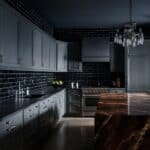
12. Black Cabinets for Sharp, Luxurious Minimalism
Black Cabinets for Sharp, Luxurious Minimalism
Think about black cabinets that create clean lines and a high-end vibe. The contrast can make your countertops, faucet, and lighting feel more dramatic.
To see the real effect, test black near your floor and backsplash, because black can shrink a room if it’s surrounded by very dark finishes. Balance with lighter countertops or open shelves, and consider matte black for a softer look that hides smudges better than full gloss. This color is unique because it anchors the room, giving everything else a clearer frame.
For practical tips, use a primer designed for cabinets so the finish stays even and lasts longer. Cost-wise, a paint refresh with quality materials can be far cheaper than replacing cabinets, especially if your door frames are in good shape. Black cabinets remain a strong trend for modern, minimalist homes.
13. Two-Tone Color for a Custom, Designer-Style Look
Two-Tone Color for a Custom, Designer-Style Look
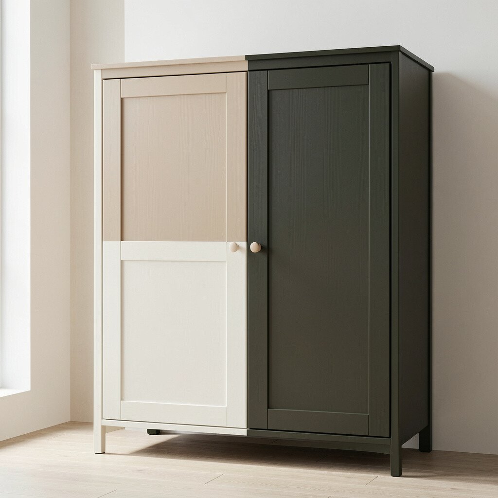
Picture two-tone cabinets where the uppers feel light and airy while the lowers feel deeper and grounded. This design instantly looks custom because it adds depth without requiring expensive materials.
Try visualizing by choosing one color for upper cabinets and a different shade for lowers, then test both samples on your actual doors. A popular combination is warm white above with sage or greige below, or charcoal below with crisp white above for contrast. Two-tone styling is unique because it lets you personalize each zone of the kitchen based on what you want to highlight.
For practical tips, keep the hardware consistent so the look feels intentional rather than busy. You can also manage cost by focusing paint or staining changes on the fronts you’ll notice most, then finishing the rest later if needed. Current trends favor two-tone cabinets because they create visual interest while still letting you control how bold the room feels.