Your cabinets do more than hold dishes; they set the mood of the whole room. A small color change can make your kitchen feel brand new without a full remodel.
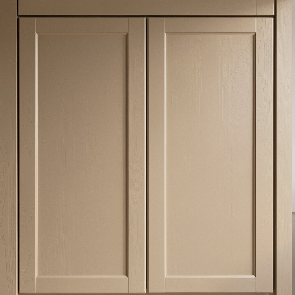
Greige sits between gray and beige, so it looks calm in lots of lighting. Imagine your cabinets dressed in a creamy neutral that still feels cozy at night.
Pick a warm greige with subtle yellow or beige undertones to keep it from looking too cold. Pair it with brushed nickel or warm chrome hardware for an easy modern feel. For a practical boost, add a satin topcoat because it wipes clean and holds up well for daily life.
2. Creamy Off-White With a Matte Finish
Creamy Off-White With a Matte Finish
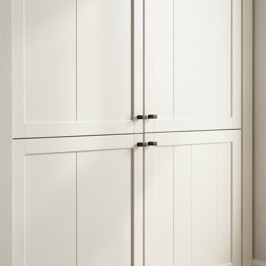
Off-white cabinets feel bright and airy, like fresh paint on a cloudy day. A matte finish also hides tiny scuffs, fingerprints, and everyday wear.
Choose an off-white that leans slightly warm so it doesn’t look flat next to stainless appliances. Add soft white quartz or light stone for a smooth, inviting look. If you want personalization, stain or glaze the surrounding trim in a shade one step deeper for gentle contrast.
For cost, repainting is usually far less than replacing cabinets, and you can often keep the doors and boxes. Stick with quality primer and cabinet-grade paint to avoid peeling later.
3. Deep Navy For Bold Contrast
Deep Navy For Bold Contrast
Deep navy cabinets create a rich, dramatic frame for your kitchen. Think of polished dark blue that looks elegant in the daytime and cozy after sunset.
Balance the dark color with lighter countertops and a warm backsplash so the room stays open. Hardware in antique brass or oil-rubbed bronze can make the navy feel intentional and unique. To keep it practical, choose a durable paint system made for cabinets and schedule proper curing time before heavy use.
Consider a two-tone look by painting only the lower cabinets navy and keeping uppers a soft white. That style keeps things visually grounded while still feeling fresh. If you like current trends, deep blues are showing up again because they read modern yet timeless.
To personalize, add a subtle glaze inside the cabinet frames or around recessed panels for extra depth.
4. Classic Charcoal With Sleek Edges
Classic Charcoal With Sleek Edges
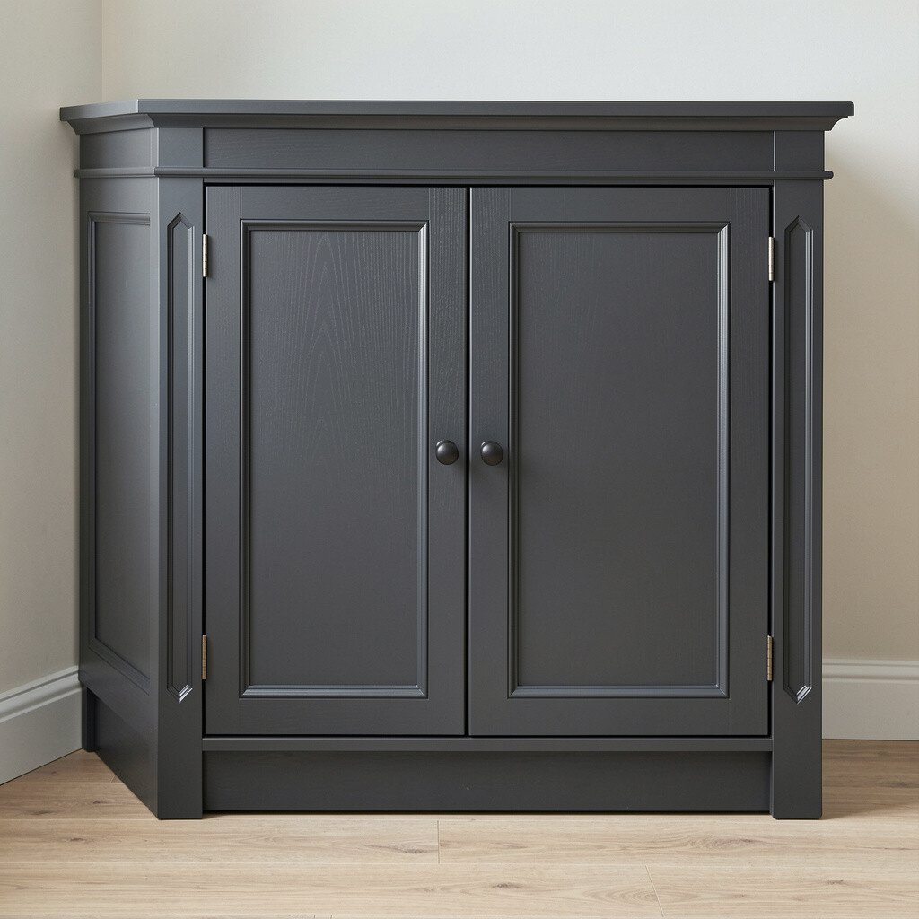
Charcoal brings a strong, grown-up vibe and pairs beautifully with many finishes. It also tends to hide smudges better than lighter colors, which is handy for busy homes.
Use charcoal on flat-front doors for a clean, modern look, or pair it with traditional hardware for a more classic feel. Add warm wood accents like a butcher block island or open shelving to keep the space from feeling too heavy. For practical tips, make sure your lighting is bright enough since charcoal reads darker than you expect.
5. Forest Green For a Nature-Led Kitchen
Forest Green For a Nature-Led Kitchen
Forest green cabinets can make your kitchen feel grounded and calming. Picture a darker green that nods to pine trees, especially when paired with natural stone.
Choose a green that isn’t too bright so it feels refined rather than trendy. White or cream countertops keep the color from stealing the spotlight, while a light tile backsplash adds crisp contrast. For personalization, consider glass-front upper cabinets so you can display dishes or glassware like decor.
To keep maintenance easy, use a semi-gloss or satin cabinet finish that wipes clean without feeling overly shiny. If you want a cost-friendly upgrade, repainting just the cabinet boxes and doors while swapping handles can be enough for a big change.
6. Soft Sage For a Gentle, Modern Calm
Soft Sage For a Gentle, Modern Calm
Sage green feels light and soothing, like fresh leaves in the morning. It can bring a soft pop of color without overpowering the whole room.
Sage works especially well with warm metals and light wood tones. Try pairing it with a white quartz counter and a simple subway tile backsplash for a clean, current look. If you like practical upgrades, use a slightly textured paint technique on the doors to reduce visible fingerprints.
For personalization, add an accent color in the backsplash grout or in barstool cushions to tie the palette together.
7. Light Walnut Stain With Clear Lacquer
Light Walnut Stain With Clear Lacquer
Stained cabinets can keep the warmth of real wood while giving you a cleaner, updated tone. A light walnut stain often looks modern because it shows natural grain without going too dark.
Ask for or do a stain finish that includes a clear topcoat designed for cabinets, since durability matters in kitchens. This color choice is unique because it changes with lighting, so your kitchen can look different from morning to evening. Add matte black hardware for contrast, or go with brass if you want a softer vibe.
If your cabinets are already wood, refinishing may cost less than full replacement and can be easier than starting from bare surfaces. Keep a consistent finish on doors and frames so everything looks intentional.
To personalize further, paint only the interior shelves a matching stain tone or a warm cream for neat display contrast.
8. Vintage Honey Tone For a Cozy Glow
Vintage Honey Tone For a Cozy Glow
Honey-toned cabinets bring instant warmth and a welcoming feel. They look especially charming in kitchens that get lots of natural light.
Pair honey with off-white countertops and warm beige backsplash tiles to keep the color family cohesive. For a practical tip, use a durable varnish that resists daily wear since honey finishes can show scratches if the topcoat is weak. Uniqueness comes from the balance, so keep hardware simple and consistent across all drawers.
9. Bold Red For a Playful Statement
Bold Red For a Playful Statement
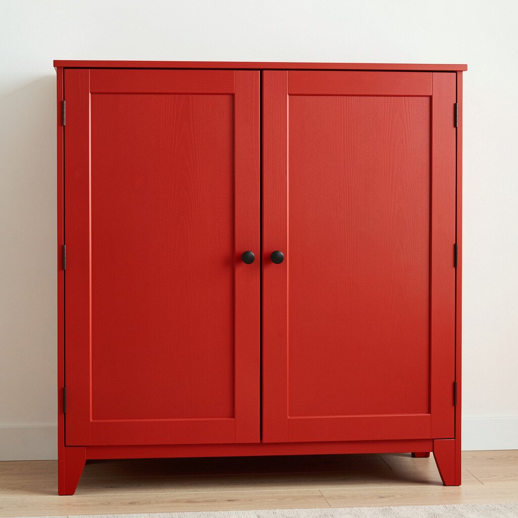
Red cabinets feel lively and confident, like a centerpiece you can live with. The key is choosing the right red shade, because some reds look modern while others can feel too loud.
Try a muted brick red or a deeper cherry red for a more stylish look. White countertops and a light backsplash help keep the room airy. For practical tips, consider semi-gloss or satin paint because red can highlight uneven texture, so a smooth finish really helps.
If you want personalization without a full commitment, paint just the island red and keep perimeter cabinets neutral. This makes a big visual impact while managing cost more easily. Red trends keep cycling back, especially in homes that want personality and charm.
10. Soft Blue With a Coastal Touch
Soft Blue With a Coastal Touch
Soft blue cabinets can make a kitchen feel calm and fresh. Imagine a gentle powder blue that works like a breath of sea air indoors.
Keep the blue slightly gray so it feels modern rather than childish. Pair it with white stone counters and simple hardware to keep the vibe clean and current. For a practical upgrade, choose a cabinet paint that includes primer so coverage is even and you spend less time on extra coats.
Glossy white cabinets give a crisp, polished look that bounces light around the room. If your kitchen feels dim, this is one of the fastest ways to brighten it.
Go for a cabinet-grade glossy finish so it stands up to cleaning and cooking splashes. Glassy surfaces can show every smudge, so wipe-down routines matter, but it is worth it for that crisp look. Personalize by using a mix of hardware finishes, like chrome on drawers and pulls in a matching style on doors.
For cost considerations, bright white paint often covers well, which can reduce the number of coats needed compared to darker colors. Always plan for proper ventilation and curing time so the finish stays durable.
12. Muted Pink Rosewood For a Surprising Warmth
Muted Pink Rosewood For a Surprising Warmth
Muted pink cabinets can feel surprisingly elegant when the tone is earthy. Picture rosewood pink that reads like warm clay with a soft blush.
Pair rose-toned cabinets with warm white countertops and textured backsplashes like glazed ceramic or subtle pattern tile. This color is unique because it adds personality while still blending nicely with lots of decor styles. If you want practical tips, test sample swatches in your kitchen lighting before you paint anything permanent.
To keep maintenance easy, use a satin finish because it balances smooth wipeability with less glare than high gloss. If budget is a concern, paint only the main cabinet faces first and upgrade hardware later as a second step.
13. Classic Teal For a Modern Heritage Feel
Classic Teal For a Modern Heritage Feel
Teal brings together blue calm and green grounding in a way that feels special. It can look like a modern heritage choice that still feels timeless.
Choose teal that is slightly muted so it doesn’t look neon. Pair it with natural materials like oak floors or a light wood shelf to keep the room welcoming. Add hardware in aged brass or brushed nickel for a balanced style.
For personalization, consider staining the inside of the doors or adding a subtle contrast glaze on panel edges. This makes the cabinet doors look richer without changing the whole color scheme again.
14. Two-Tone Upper And Lower Color Play
Two-Tone Upper And Lower Color Play
A two-tone setup lets you get creative while keeping the room balanced. It also helps define spaces, like uppers for lightness and lowers for grounding color.
For example, paint uppers in a soft off-white and lowers in a warm greige or gentle charcoal. This approach is unique because it makes your kitchen look designed, not just painted. Practical tips include using the same sheen level across both colors so the cabinets look cohesive.
To personalize, choose a color that matches your backsplash accent tile, then repeat that tone in drawer pulls or cabinet knobs. For cost considerations, two-tone may require extra masking, but it can still be cheaper than buying new cabinetry.
15. Warm White With a Subtle Gray Wash
Warm White With a Subtle Gray Wash
Warm white with a gray wash can create a softly aged look that feels curated. It is a smart choice if you want the bright feel of white but with more depth.
The gray wash gives cabinets dimension, especially in shaker-style doors where panel edges catch light. Pair it with stainless steel appliances or black accents for a modern contrast. For practical tips, apply the wash evenly and seal it with a durable topcoat so it resists daily cleaning.
If you want uniqueness, test the wash strength first since you can go light for a whisper or deeper for a more dramatic vintage vibe. This style can hide imperfections better than a flat solid color, too.
Blackened bronze cabinets look rich and artistic, like dark metal with depth. This color can make your kitchen feel upscale without looking out of place.
It pairs beautifully with light countertops and warm lighting, so plan for bulbs that show true color. Hardware in matte black or brushed brass can keep the metal theme consistent. For practical tips, use cabinet paint meant for frequent cleaning and choose a finish that resists smudges.
To personalize, add a warm wood floating shelf above a darker cabinet run so the room feels balanced. Cost-wise, darker finishes can be more forgiving, since minor scuffs blend in better than light colors.
17. Butter Yellow For a Sunny Kitchen Mood
Butter Yellow For a Sunny Kitchen Mood
Butter yellow cabinets feel cheerful and welcoming without being too loud. This tone is bright enough to lift the space yet soft enough to stay cozy.
Pair butter yellow with white or cream counters and a simple patterned backsplash for charm. If you want uniqueness, choose a buttery shade that looks slightly buttery-gray, which tends to feel more modern. For practical tips, keep hardware brushed nickel or antique brass so the hardware doesn’t fight the color.
Consider cost by focusing on the most visible areas first, like front-facing doors, and reusing hardware if it’s already in good shape. A satin finish will help with everyday cleaning and keep the color looking fresh longer.
18. Charcoal With a Linen Texture Paint Effect
Charcoal With a Linen Texture Paint Effect
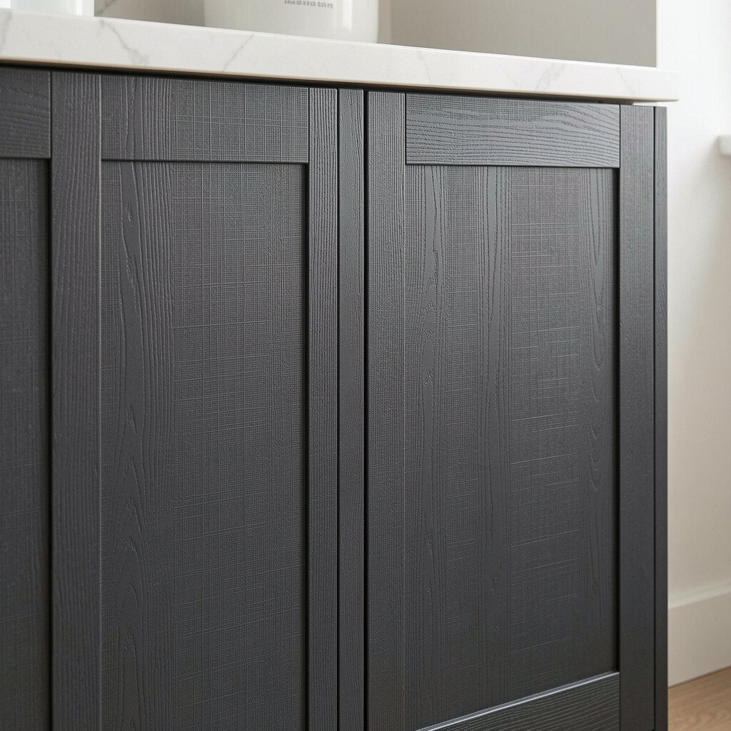
Texture paint can make cabinets look handcrafted, even when the change is simply a new color and finish. Charcoal with a linen-like texture adds depth and helps hide minor dings.
Choose a paint system designed for cabinets so the texture remains smooth to touch and easy to wipe. This idea is unique because the color isn’t just painted flat; it has dimension that catches light in a gentle way. Pair with warm countertops and soft, rounded hardware for a friendly look.
For practical tips, apply texture evenly with the right roller or sprayer, and practice on a spare board. Texture paint can cost a bit more due to specialty materials, but it often reduces the need for extra touch-ups.
19. Light Gray With Cool Stone Inspiration
Light Gray With Cool Stone Inspiration
Cool light gray cabinets can look clean and modern, like stone in a bright room. They create a calm backdrop for colorful dishes, artwork, or seasonal decor.
Pick a light gray that has enough warmth to avoid a blue-leaning feel unless that is the look you want. Pair with white countertops and a backsplash that adds warmth, like beige or cream stone tiles. This color choice supports personalization because you can easily switch accents without repainting cabinets.
For cost considerations, light colors often require fewer touch-up materials because it is easier to blend small imperfections. Keep the finish satin for a practical balance of durability and low glare.
20. Warm White With an Espresso Stained Glaze On Details
Warm White With an Espresso Stained Glaze On Details
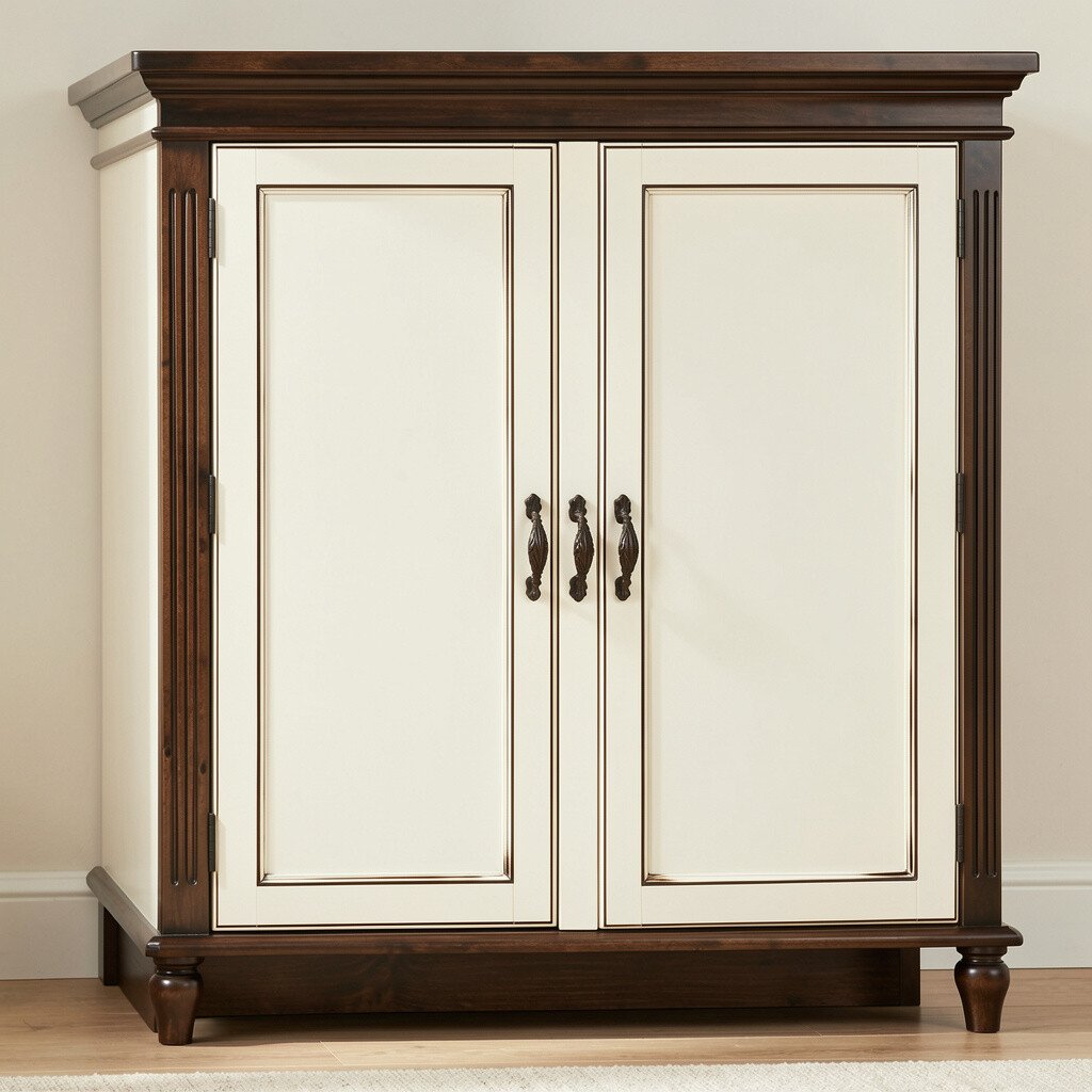
Warm white cabinets with an espresso glaze on edges can look like high-end craftsmanship. The espresso detail makes doors feel deeper and gives your kitchen a richer, more layered style.
When the base is warm white, the espresso glaze adds uniqueness without turning the whole space dark. Pair with light countertops and a backsplash that has hints of brown or tan so the glaze feels cohesive. For practical tips, seal the glaze carefully, because kitchen grease and water can challenge unprotected surfaces.
If you want personalization, focus the glaze in panel corners and along trim lines, then keep hardware in a complementary finish like antique brass or bronze. This approach can cost less than full replacement, and it makes existing cabinet doors look custom.
Try a consistent look across all doors, and take time to blend glaze evenly for a polished result.