15+ Unique Cabinet Color Ideas For Open-Concept Living
A great cabinet color can make an open-concept home feel instantly more put-together. It can also guide the eye so your kitchen and living spaces look like they belong together.
Here are cabinet color ideas that feel fresh, stylish, and practical, with details you can use right away.
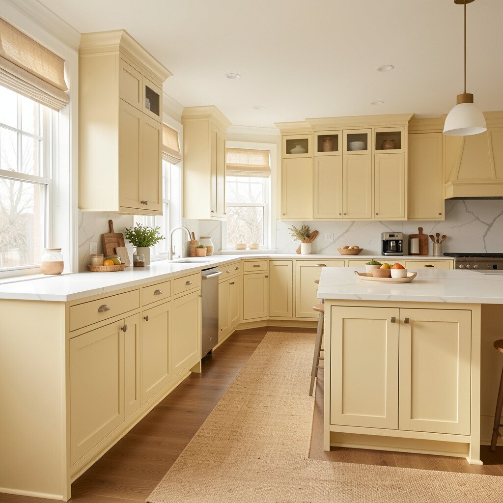
Butter cream cabinets look soft and cozy, like morning light on a countertop. In an open-concept space, they help rooms feel connected without looking matchy.
You can pair butter cream with light oak floors, a white or pale stone backsplash, and warm brass hardware for a gentle glow. Choose a satin finish to keep the color looking smooth, even when the kitchen is busy.
2. Moody Espresso Brown for a Grounded Contrast
Moody Espresso Brown for a Grounded Contrast
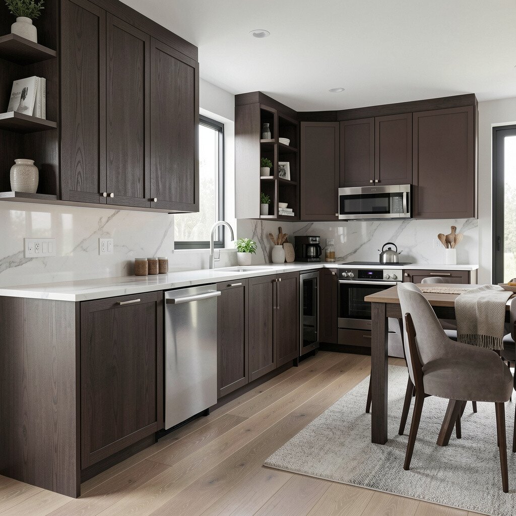
Espresso cabinets bring depth and calm, especially when your living area has neutral walls. The rich brown tone can make open spaces feel more anchored and intentional.
Go for matte or low-sheen paint if you want a modern look that hides everyday smudges. For a practical balance, add lighter countertops and a bright ceiling light so the room stays airy.
If your home gets strong afternoon sun, test a few sample swatches because espresso can look warmer or cooler depending on the light. This color also pairs nicely with black fixtures and creamy textiles in the living room.
3. Soft Sage Green for a Fresh Everyday Mood
Soft Sage Green for a Fresh Everyday Mood
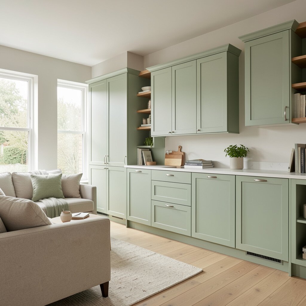
Sage green cabinets give a relaxed, nature-inspired feel that works beautifully in open layouts. They look especially good when your space includes wood beams, rattan, or plants.
To keep the look clean, choose a crisp white backsplash and hardware in brushed nickel or aged brass. Sage also makes stainless appliances feel less harsh, which many people love in daily use.
For personalization, try a slightly greyer sage so it feels tailored rather than farmhouse-only. Budget-wise, repainting cabinets is often cheaper than replacing them, and it can still look high-end with good prep and topcoat.
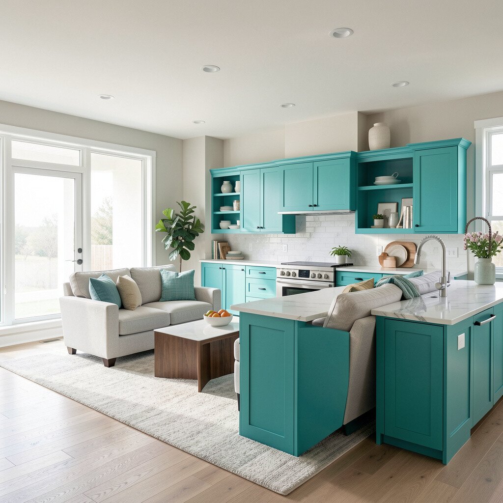
Teal cabinets can feel bold, but the right shade makes them look stylish instead of loud. In an open-concept home, teal can act like a color bridge between kitchen and living room accents.
Pick a semi-saturated teal and pair it with warm whites, light wood, and gold or bronze hardware. Use simple cabinet lines and tidy styling so the color stays the star.
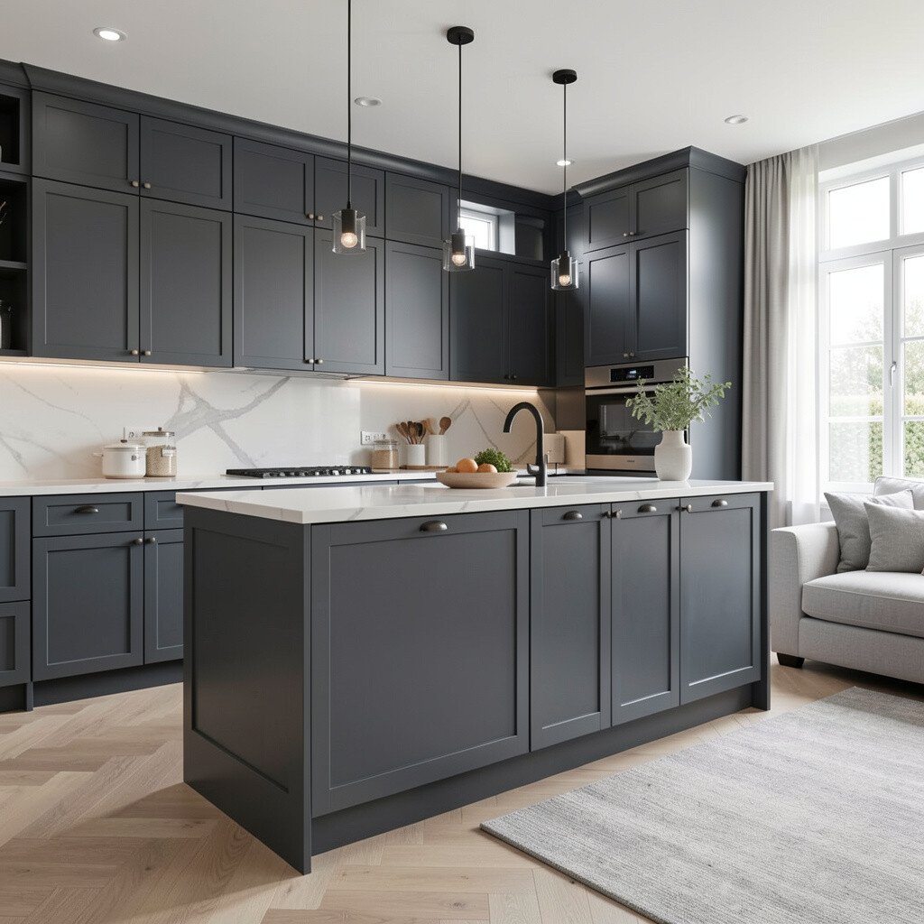
5. Charcoal Gray for Modern Elegance with Easy Styling
Charcoal Gray for Modern Elegance with Easy Styling
Charcoal cabinets create a sleek look that feels current and confident. They also make it easy to coordinate with many wall colors and flooring options.
To make the space feel welcoming, add warm lighting and choose a countertop with movement, like speckled quartz or a light butcher block. If you want a softer vibe, consider pairing charcoal with off-white walls instead of bright white.
For practical living, use a durable cabinet enamel or a quality paint designed for doors and drawers. A consistent finish helps the whole open space look cohesive, even when people move between rooms all day.
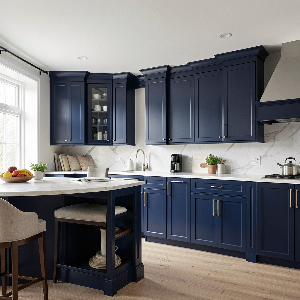
6. Classic Navy for a Dramatic Room-Joining Effect
Classic Navy for a Dramatic Room-Joining Effect
Navy cabinets can add drama without turning your home into a themed space. When used in kitchens that open to living rooms, navy gives the eye a clear focal point.
Balance navy with light countertops, a simple subway tile, and brass hardware to keep the look warm. If you have darker upholstery, navy can tie everything together in a very natural way.
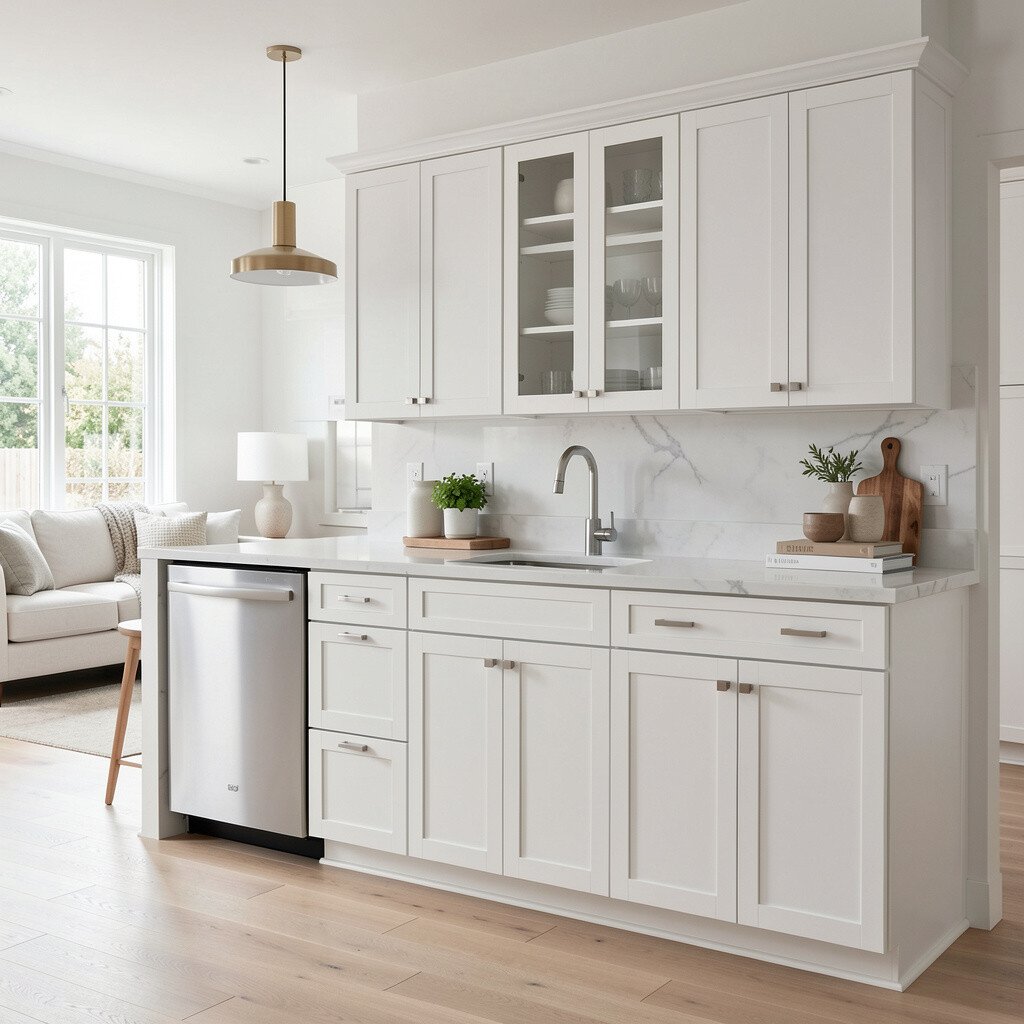
7. Crisp White with a Tinted Undertone for Timeless Calm
Crisp White with a Tinted Undertone for Timeless Calm
White cabinets never really go out of style, but undertones are what make the difference. A tinted white, like warm ivory or cool pearl, can keep the whole open-concept space from feeling sterile.
Choose hardware that matches your other finishes, such as nickel or black steel, so everything feels intentional. For personalization, add a subtle glaze or choose a satin finish to prevent the surface from looking flat.
Cost-wise, white is often the easiest shade to maintain because scuffs and small marks are less noticeable than on darker colors. If you ever plan to change wall art or textiles, a tinted white base gives you lots of flexibility.
8. Light Pink Blush for a Soft, Unexpected Home Feeling
Light Pink Blush for a Soft, Unexpected Home Feeling
Blush pink cabinets can make your kitchen feel gentle and creative. In open-concept homes, they add personality while still pairing well with many neutrals.
Try blush with warm white walls, marble-look counters, and gold or rose-gold hardware. You can also echo the pink through small decor items like vases, dishware, or throw pillows in the adjacent living space.
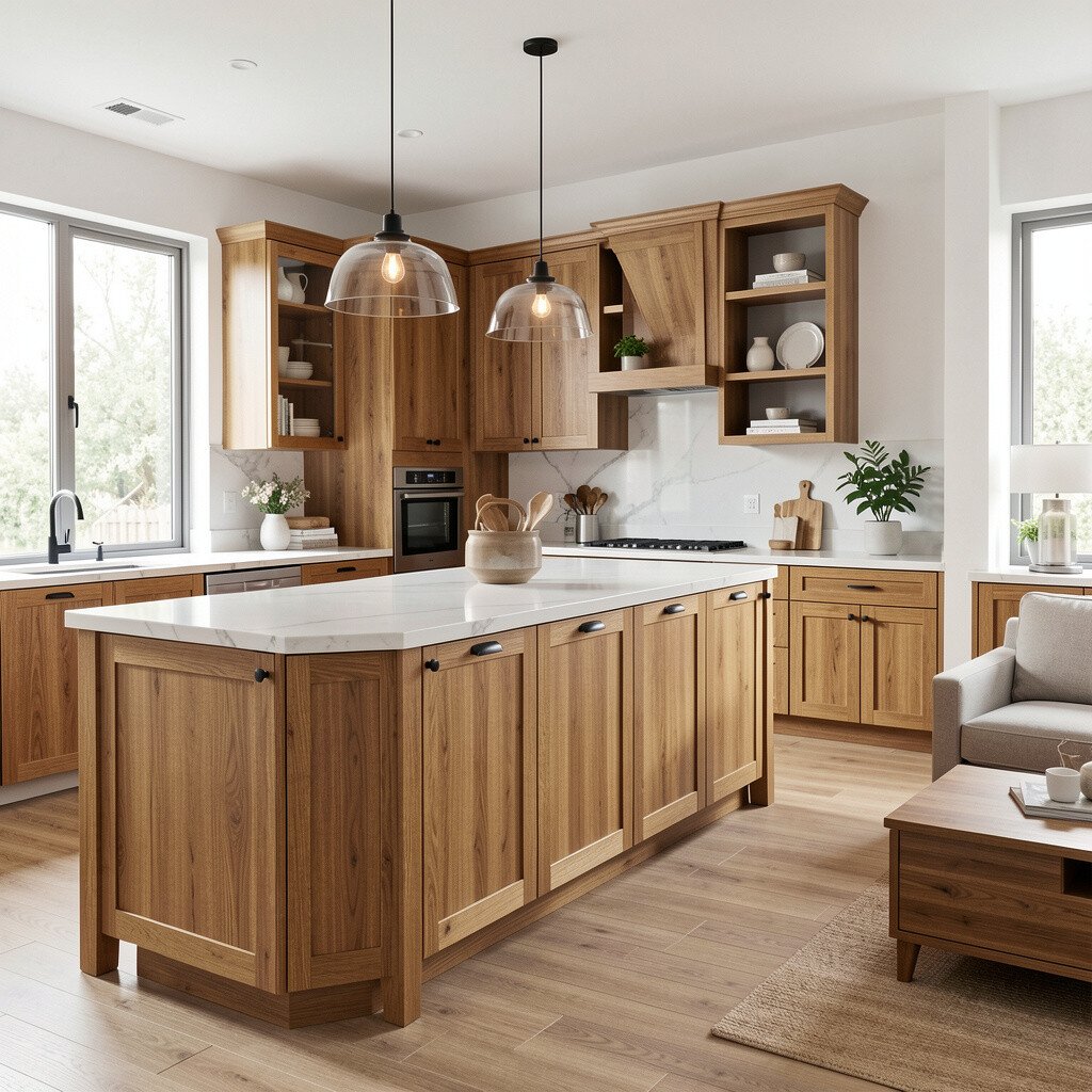
Stained wood cabinets look inviting and timeless, especially when your living room includes natural textures. A clear or medium stain can highlight grain without overpowering other colors.
For a more modern twist, consider a slightly darker stain paired with matte black pulls. This approach can help your open space feel layered, not one-note.
To personalize, match the stain family to your flooring undertones, whether they lean golden, honey, or cooler. If you want cost control, refinishing existing cabinets can be far less expensive than installing a brand-new cabinet set.
It also helps to seal wood properly for everyday spills, since open layouts often see more foot traffic and quick cleanups.
10. Off-White Linen for a Quiet, Luxurious Look
Off-White Linen for a Quiet, Luxurious Look
Linen-toned cabinets feel like a calm fabric draped across the kitchen. They look upscale, yet they stay friendly and easy to live with.
Pair them with textured backsplashes, like small format tile or a subtle herringbone pattern. Off-white also works well with most cabinet hardware styles, so you can choose a finish that matches your living room lamps and frames.
11. Muted Mustard for Cozy Vintage Energy
Muted Mustard for Cozy Vintage Energy
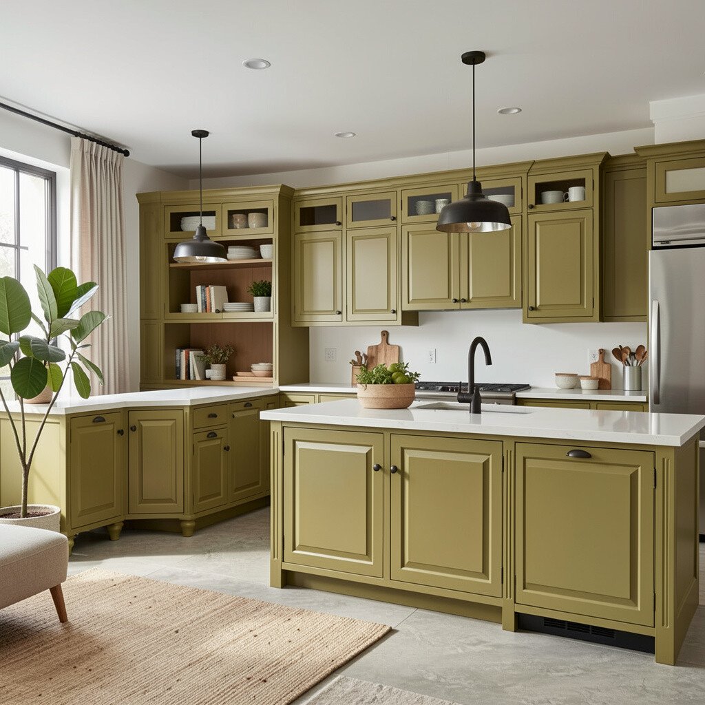
Muted mustard cabinets bring warmth and a little vintage charm to open-concept living. This shade can look incredible in homes that already have earthy materials like wood, leather, or stone.
Keep the rest of the room simple, using cream walls and warm white countertops. Hardware in oil-rubbed bronze or brushed brass can make mustard feel intentional and not random.
If you worry about going too bold, start with a slightly dusty mustard rather than a bright yellow. A satin finish can also help the color look calm, especially in kitchens with lots of natural light.
12. Milky Gray for a Soft Neutral That Still Pops
Milky Gray for a Soft Neutral That Still Pops
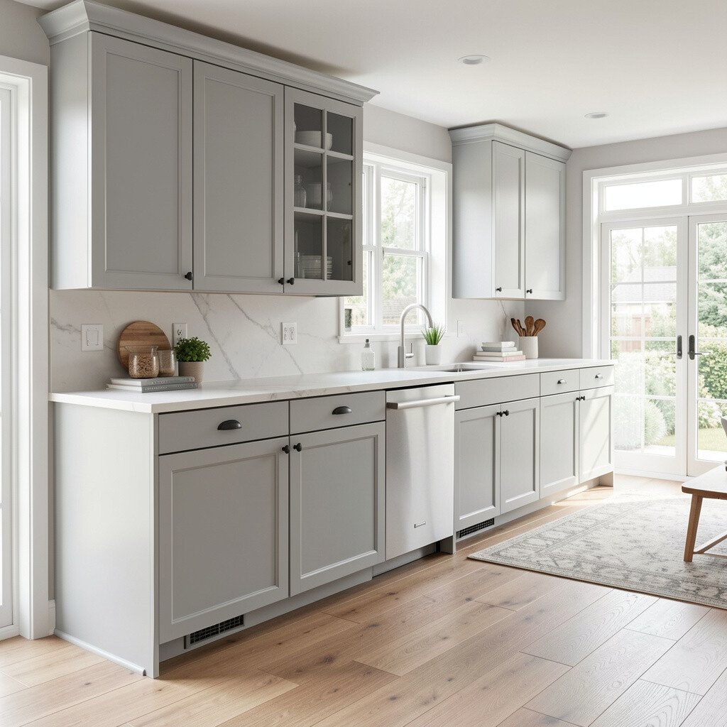
Milky gray cabinets sit between white and gray, which makes them flexible for many open floor plans. They look clean, but they also add depth compared to plain white.
Choose a countertop with gentle contrast, such as warm quartz or a light concrete-style surface. This color works great with both modern and classic living room styles, so your whole open space feels united.
13. Forest Green for a Bold Nature Statement
Forest Green for a Bold Nature Statement
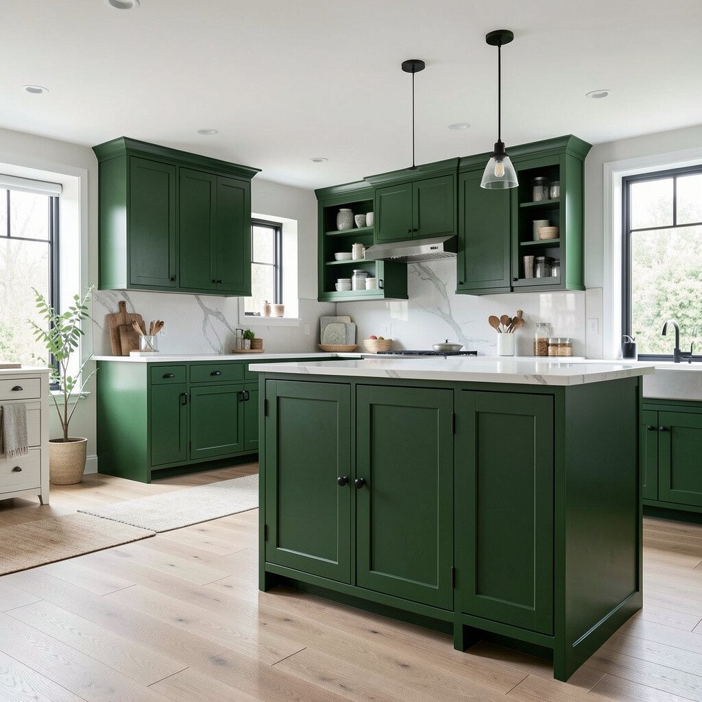
Forest green cabinets feel rich, elegant, and full of character. In an open-concept home, they can make the kitchen feel like a destination, while the living room becomes the perfect backdrop.
Use warm metals like brass or antique copper to keep forest green from looking too cold. A light backsplash, such as marble-look tile or creamy stone, helps the dark color stay balanced and bright.
For practical tips, choose a high-quality topcoat that resists daily wear. Forest green also pairs nicely with wood accents and cozy textiles, which makes it feel grounded even in large open rooms.
14. Classic Black for a High-Contrast, Gallery-Like Kitchen
Classic Black for a High-Contrast, Gallery-Like Kitchen
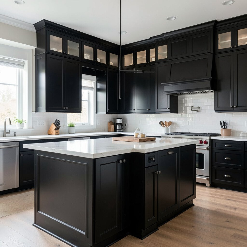
Black cabinets can look dramatic, sleek, and like a designer showroom. When your kitchen opens to a living space, black can frame the area and add strong visual structure.
To prevent the look from feeling heavy, pair black cabinets with light walls, reflective lighting, and a countertop with shine or variation. Choose hardware that gives the right vibe, such as satin nickel for a softer modern feel or polished chrome for a sharper look.
Cost considerations matter here because black often hides less color change over time, so proper prep and painting technique are key. Consider using a cabinet-grade paint system and letting doors cure fully before heavy use.
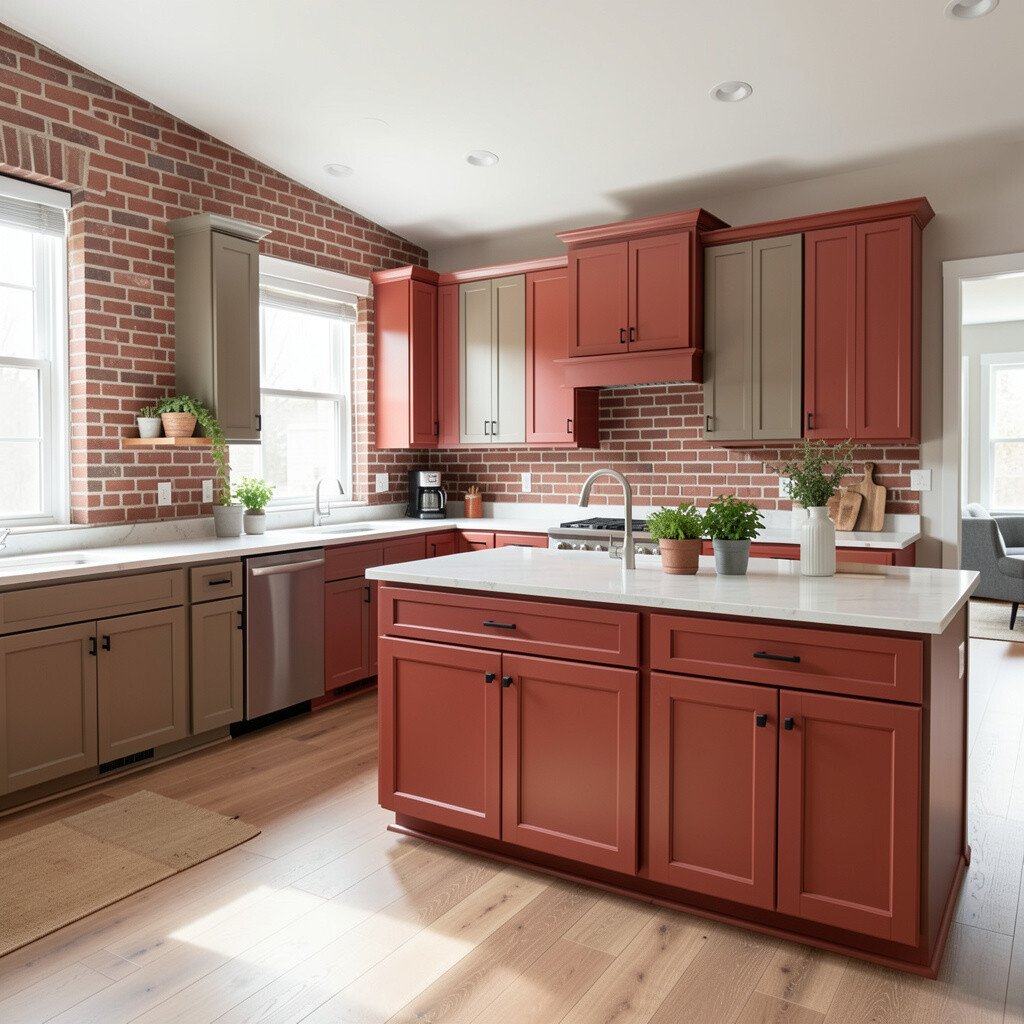
15. Red Brick Tones for a Cozy, Energetic Heart
Red Brick Tones for a Cozy, Energetic Heart
Red brick or terracotta-red cabinets bring a warm, inviting feeling that suits open-concept living. They can make a big space feel more intimate, like you’ve added a hearth.
Balance the warmth with light beige or cream walls, simple white countertops, and natural stone or textured tile. Terracotta also looks great with black hardware and woven accents, which helps the kitchen feel styled but still livable.
For personalization, match the red hue to your existing textiles, like rugs or curtains. If you love seasonal changes, this color can be a perfect base for swapping decor without repainting.
When planning costs, remember that paint quality affects both longevity and shine, so it’s worth choosing a durable finish for everyday cooking and cleaning.
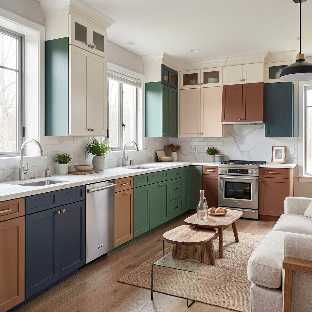
16. Two-Tone Cabinet Color for Built-In Style That Feels Custom
Two-Tone Cabinet Color for Built-In Style That Feels Custom
Two-tone cabinets add depth and make your kitchen feel custom, especially in an open-concept home. You can use one color on the upper cabinets and a deeper or contrasting shade below for a clear visual rhythm.
Many people choose lighter uppers for brightness and deeper lowers for grounding, then tie the colors into the living room through accessories. This is also a practical personalization option because you can keep the most visible area cohesive with your adjacent space.
Try pairing warm white uppers with charcoal or espresso lowers, or choose sage uppers with natural wood tones below. For a trend-forward look, keep the hardware consistent across both colors so the design feels intentional.
If you’re thinking about cost, two-tone can be slightly more work, but it often saves money compared to more complex upgrades. With careful masking and steady brushing or spraying, the result can look like a high-end renovation.