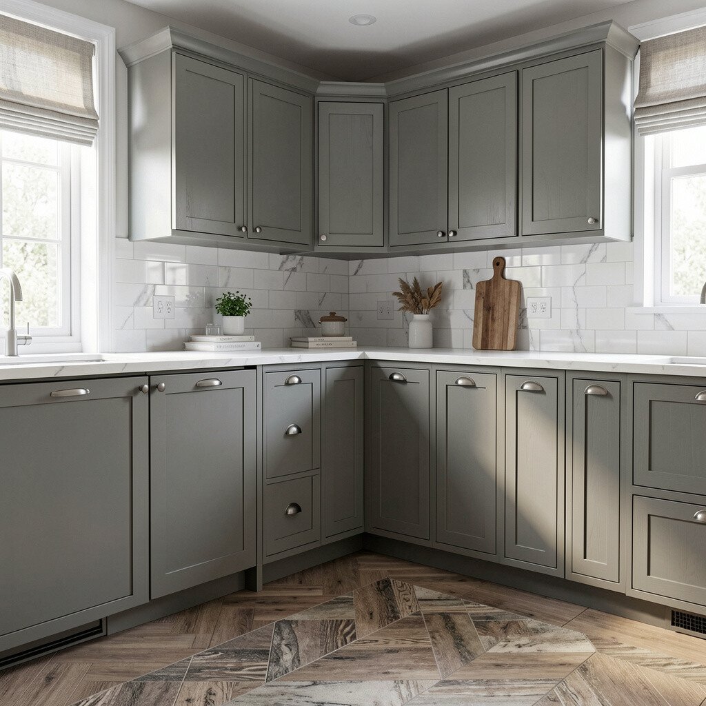
Choosing the right cabinet color can make your whole kitchen feel brand new. The trick is matching it to the rest of your space so it looks planned, not random.
Look at your floors and countertops first, because they already set the mood. Notice the undertone in the materials, like warm honey tones, cool gray veining, or creamy beige surfaces.
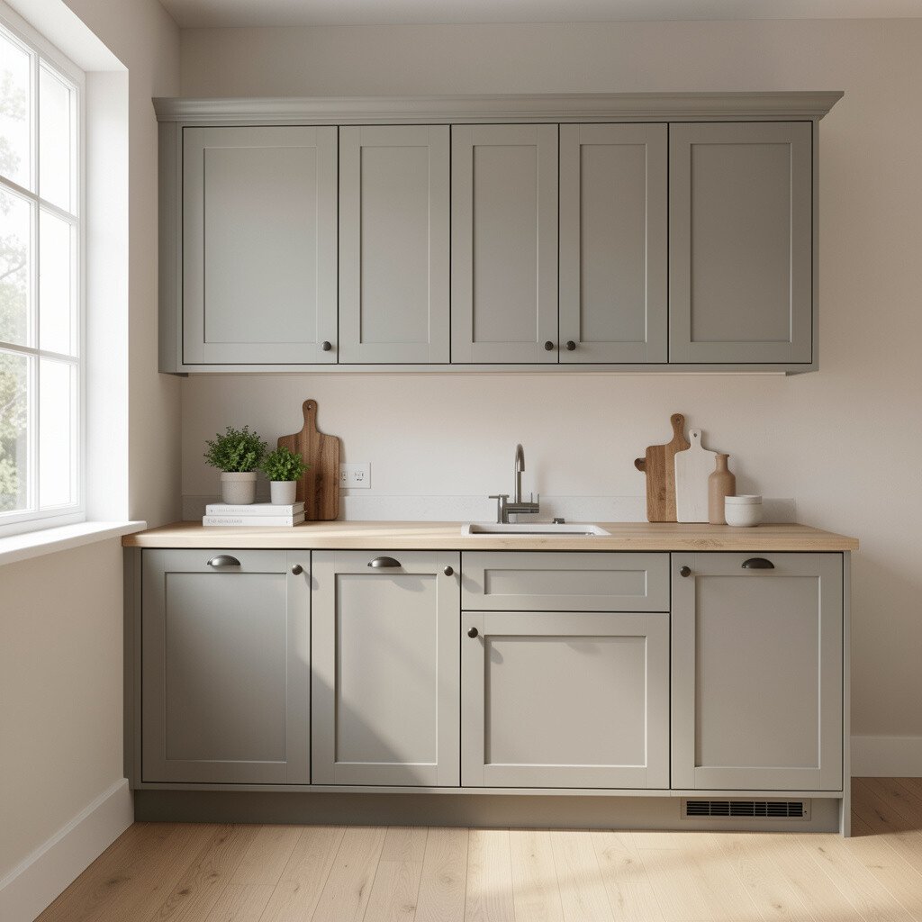
When you match cabinets to those tones, everything starts to feel like it belongs together. If your counters have soft gray movement, consider cabinets in a calm gray-beige. If your floors lean warm, choose cabinet colors that echo that warmth without turning orange or too dark.
2. Identify Your Wood Undertone Before You Pick a Shade
Identify Your Wood Undertone Before You Pick a Shade
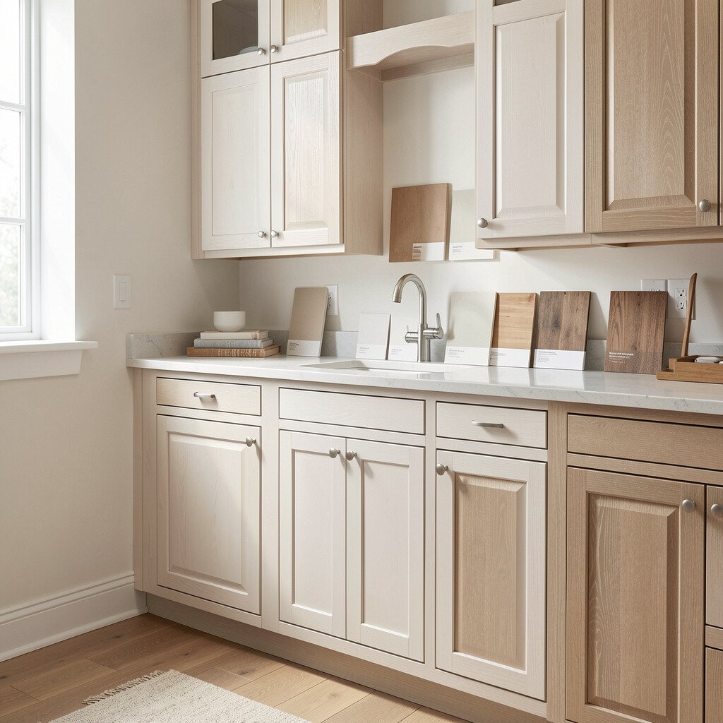
Even if two samples both say “oak,” they can look totally different in real light. Hold your cabinet paint chips or stain cards near the wood you already have, including trim and any nearby furniture.
Warm undertones often show as golden, honey, or reddish highlights. Cool undertones look more like taupe, ash, or softly smoky brown. Matching the undertone helps you avoid a cabinet color that fights with your trim, doors, or floor edge details.
Once you see the undertone pattern, you can pick a cabinet color that blends smoothly. This approach also helps you choose matching hardware without guessing. It’s a small step that saves you money later because you’re less likely to redo finishes after installing them.
3. Match Cabinet Color to Wall Paint for a Seamless Flow
Match Cabinet Color to Wall Paint for a Seamless Flow
Walls and cabinets work together like a team, so your cabinet color should echo the wall’s temperature. If your wall paint is creamy, pick cabinet tones with similar creaminess.
Try pairing soft off-white walls with warm white cabinets, or crisp cool walls with cooler cabinetry. In many homes, people get the best results by staying within the same color family while changing only the depth. You can also use a light glaze or matte finish to keep things from feeling too flat.
To personalize the look, bring in a wall accent color through backsplash tiles or small decor. That way, the cabinets feel anchored instead of floating. You’ll also keep the kitchen feeling airy, which is a big reason people love this matching strategy.
4. Use Lighting to Test Colors at Different Times of Day
Use Lighting to Test Colors at Different Times of Day
Cabinet colors can look warm in sunlight and cooler at night, especially with under-cabinet lighting. That means your sample should be tested in the morning and evening, not just at one moment.
Place paint samples on cabinet doors or cardboard panels and move them around the room. Look at how the color behaves near your backsplash and appliances, since stainless steel can push the tone cooler. This gives you practical confidence before you commit to paint or stain.
5. Choose a Shade That Matches the Level of Contrast You Want
Choose a Shade That Matches the Level of Contrast You Want
Decide how bold you want the kitchen to feel before picking a cabinet color. Low contrast looks soft and calm, while higher contrast looks crisp and modern.
If you want a fresh, easy look, choose cabinets that are one to two shades lighter than your countertops. For a stronger style, pick a cabinet color that clearly stands out against the counters and backsplash. This is also where trends show up, because many current kitchens lean toward gentle contrast rather than harsh black-and-white.
Consider how your cabinets will handle daily life too, since darker tones can show fingerprints more. Lighter colors often hide minor smudges, which many homeowners love for busy kitchens. When you get the contrast right, the whole room feels balanced and easier to live with.
6. Coordinate Cabinet Color With Your Backsplash Materials
Coordinate Cabinet Color With Your Backsplash Materials
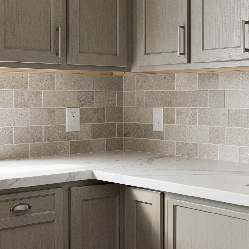
Your backsplash is like the bridge between cabinets and counters. If it has warm specks of beige or tan, cabinets that share that warmth will feel natural.
If the backsplash is more modern with clean whites and cool grays, choose cabinetry with similar cool undertones. Look closely at tile colors, especially grout, because it can shift the overall temperature. Matching the cabinet color to the backsplash helps the room feel intentional, not mismatched.
7. Pair Cabinet Color With Your Appliances and Fixtures
Pair Cabinet Color With Your Appliances and Fixtures
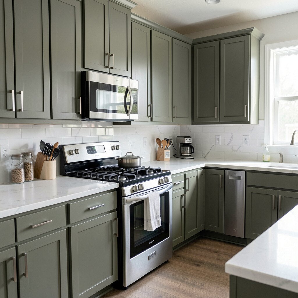
Stainless steel appliances and faucets have a strong effect on perceived cabinet color. When you stand back, the metal can pull your cabinets warm or cool depending on its finish.
If your fixtures are bright silver and sleek, cooler cabinet tones often blend nicely. If you have brushed finishes, warm cabinet colors can look softer and more inviting. This is a practical way to keep your kitchen from looking like it has separate “sections” that don’t agree.
You can also choose hardware finishes that support your cabinet color, like brushed nickel for cooler tones or bronze for warmer palettes. That small pairing makes a big difference. It’s also budget-friendly because hardware changes are usually simpler than repainting cabinets.
8. Decide Between Warm and Cool White for the Right Mood
Decide Between Warm and Cool White for the Right Mood
White cabinets are popular because they feel bright, but not all whites are the same. Some whites lean creamy, and others lean crisp and grayish.
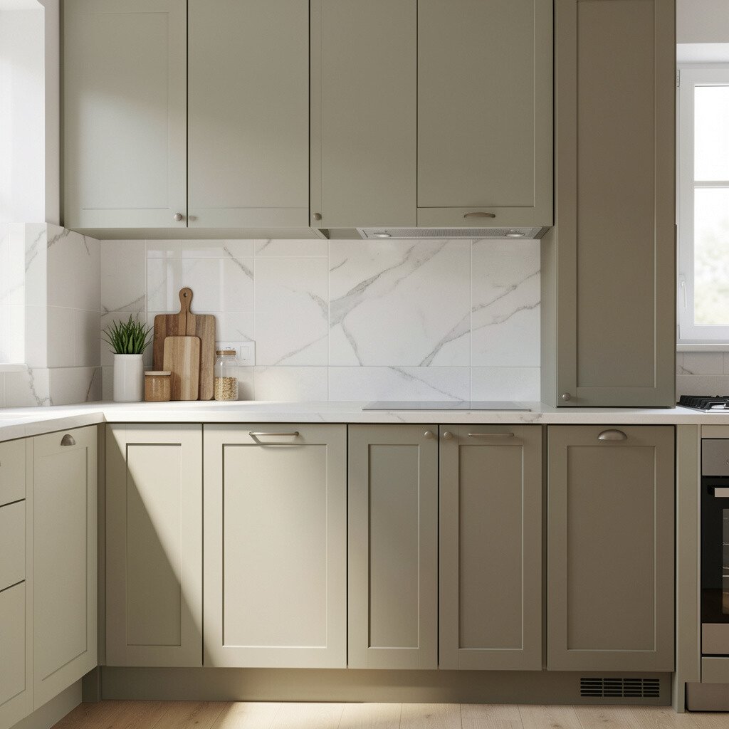
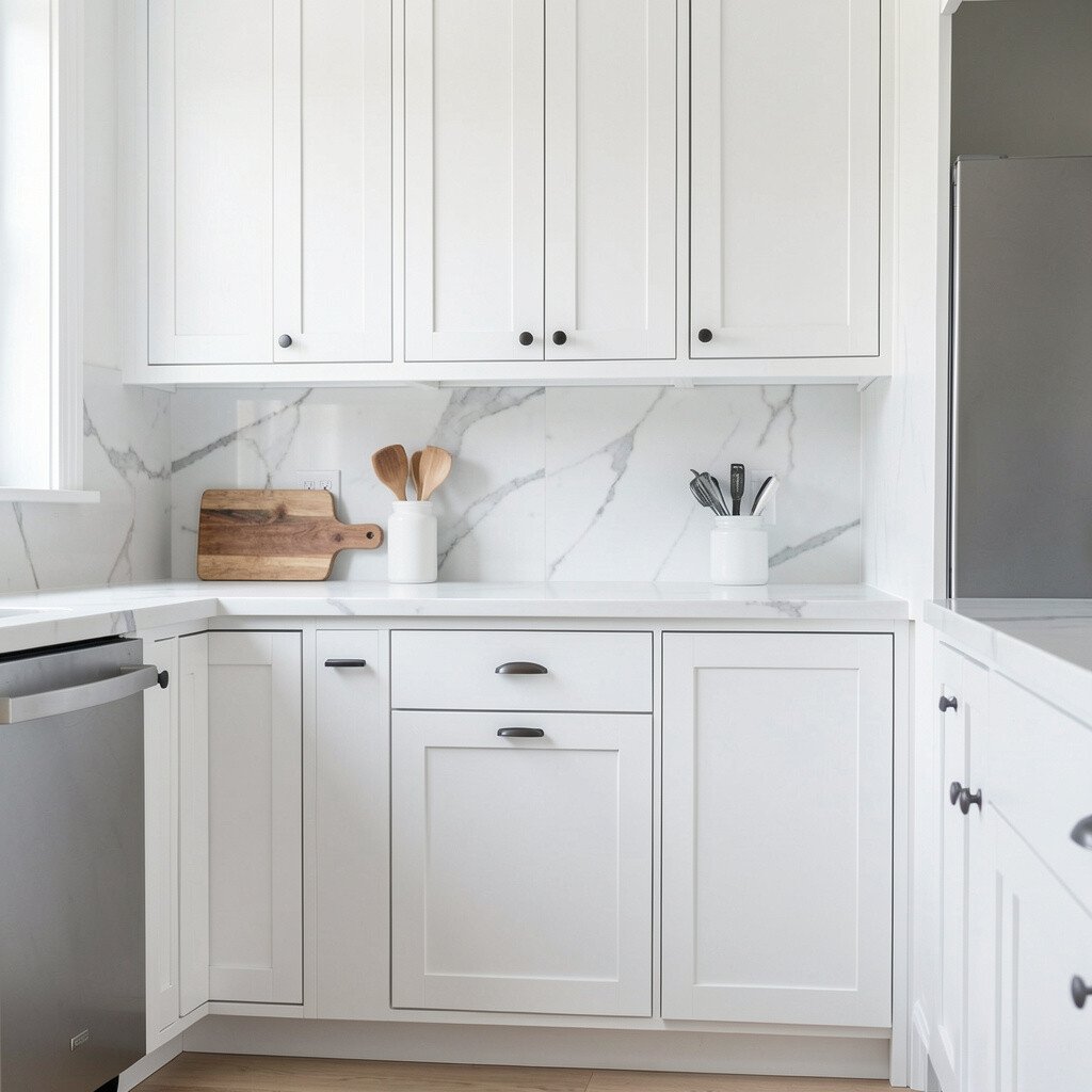
Warm white cabinets pair beautifully with wood floors and beige backsplashes. Cool white cabinets look great with gray veining, marble tones, and modern stone counters. Selecting the right type of white helps you match better without needing complicated steps.
9. Use Paint Swatches and Stain Samples in Real-Size Areas
Use Paint Swatches and Stain Samples in Real-Size Areas
Small paint dots can trick your eyes, so use sample sizes that match real cabinet surfaces. When possible, paint a section of a door panel or use a larger sample sticker.
Look at the finish too, because satin, eggshell, and matte each reflect light differently. Satin can look richer and slightly more polished, while matte can hide imperfections. If your goal is a fresh, clean look, matte or soft sheen often feels modern and comfortable.
For stained cabinets, request samples with the same wood species and same sanding level. That level affects final color depth. This practical testing helps prevent costly missteps that can derail your renovation budget.
10. Match Cabinet Color to Existing Trim and Doors
Match Cabinet Color to Existing Trim and Doors
Trims, baseboards, and interior doors set your home’s color rules. If your trim is warm white with yellow undertones, very cool gray cabinets may look off.
Try matching the undertone rather than making everything the exact same shade. When cabinet and trim undertones agree, the kitchen feels smoother and more connected. You can still choose a different depth for variety while keeping the overall story consistent.
11. Add Depth With Two-Tone Cabinet Schemes
Add Depth With Two-Tone Cabinet Schemes
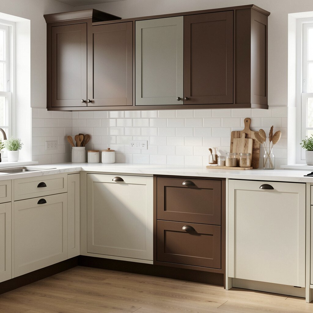
Two-tone cabinets can create a fresh look without feeling chaotic. Many people choose darker uppers or contrasting island cabinets to add focus.
When you go two-tone, keep one color tied to your countertops or backsplash undertone. The second color can be drawn from your floor warmth or your wall color temperature. That way, the scheme stays unified even with different shades.
To keep cost reasonable, consider painting only the uppers or only the island. You can also refinish one set of cabinets and paint another, depending on which part of the room shows most. This approach feels unique and gives you big visual impact for less money than replacing everything.
12. Keep Hardware Finishes in the Same Color Family
Keep Hardware Finishes in the Same Color Family
Cabinet color looks better when hardware supports it. If you pick warm cabinets but choose cold hardware, the kitchen can look pulled apart.
For warm cabinetry, consider bronze, antique brass, or warm brushed finishes. For cool cabinetry, nickel or chrome often looks crisp and clean. Matching the finish also helps create a consistent style across faucets, lighting, and cabinet pulls.
Pay attention to your lighting fixtures too, because warm bulbs can change the look of metal. If you want a modern vibe on a budget, swapping pulls and knobs is a simple upgrade that makes cabinets feel freshly styled. It’s one of the most satisfying changes because it’s fast and visible.
13. Plan for Undertone Matching With Your Backsplash Grout
Plan for Undertone Matching With Your Backsplash Grout
Grout color might seem small, but it changes how light bounces across your backsplash. White grout can brighten a room, while gray grout can add a cooler, calmer tone.
When your grout is warm white, pair it with cabinets that have similar warmth so the transition feels smooth. If grout is cool gray, you’ll usually get a better match with cabinets that lean cooler too. This kind of careful coordination helps everything look like it was chosen together.
To personalize your kitchen, use grout and cabinet sheen to shape the vibe you want. Matte cabinets with lighter grout often feel airy, while deeper cabinets with darker grout can feel cozy and rich. This is also a helpful budgeting angle, since adjusting color choices before installation can prevent expensive rework.
14. Match Cabinet Color to Your Style Goals, Not Just Color
Match Cabinet Color to Your Style Goals, Not Just Color
Cabinet color should support the style you want, like farmhouse warmth, modern simplicity, or classic elegance. For a modern look, clean lines and smooth finishes often pair well with gray-beige or crisp whites.
For a cozy, fresh vibe, consider warm whites, light browns, or soft greige that feels inviting. If you love classic style, a richer neutral like warm taupe can feel timeless. When your cabinet color matches the mood, the room feels more expensive and more comfortable.
Current trends often favor soft neutrals over harsh extremes. People also like finishes that look lived-in but neat, like satin paint or lightly distressed stains. Picking a shade aligned with your style goals makes the whole kitchen feel personal, not copied from a showroom.
15. Use an Accent Color Through Accessories to Make the Match Pop
Use an Accent Color Through Accessories to Make the Match Pop
Even when cabinets match well, you may want a little personality to make the kitchen feel like yours. Accent colors can be added through rugs, bar stools, dishes, or a vase near the window.
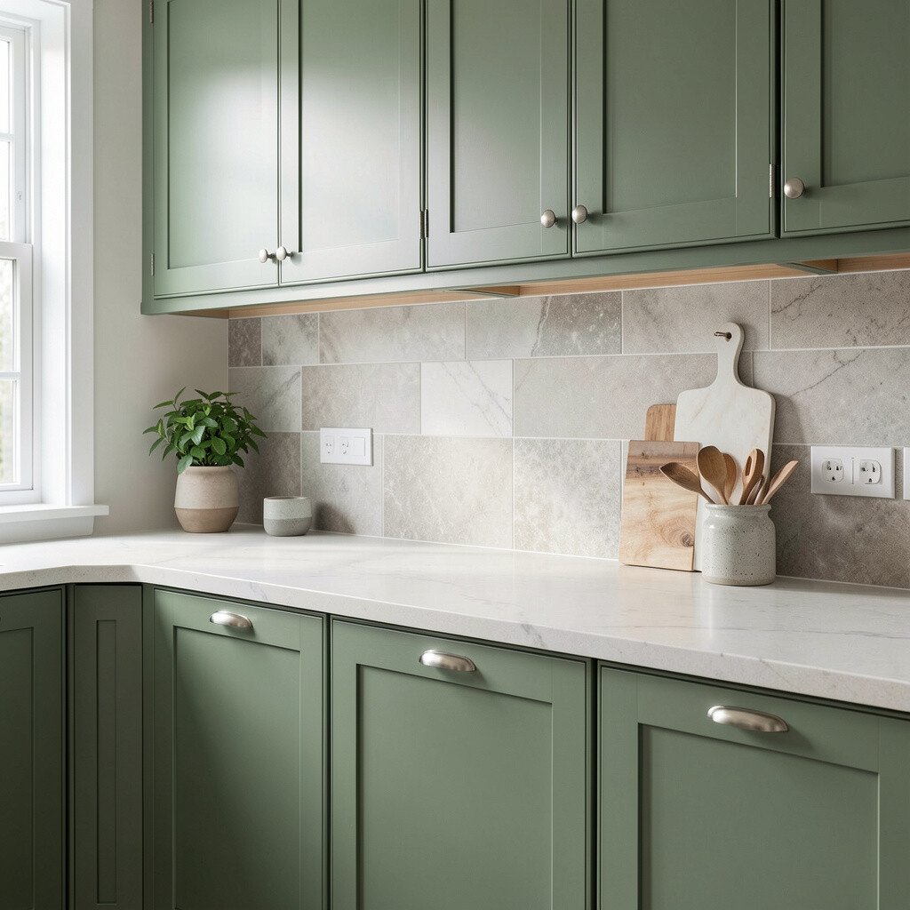
Choose an accent color that already exists somewhere else in the room, like your backsplash pattern or wall art. If you have a hint of green in the tile, repeat that tone in a small way. This helps the cabinet color feel more connected instead of simply “matching” on paper.
For cost-conscious upgrades, accessories are one of the cheapest ways to test new style directions. You can also change them seasonally, which keeps the room feeling fresh without major spending. When the accents work, the cabinet color becomes the calm base that makes everything look brighter.
16. Consider a Light Cabinet Color to Make Small Spaces Feel Bigger
Consider a Light Cabinet Color to Make Small Spaces Feel Bigger
If your kitchen feels tight or low on natural light, lighter cabinet colors can make a huge difference. Pale warm whites and soft greiges reflect light and create an open feeling.
When paired with a matching backsplash and light countertops, the room can visually stretch. You’ll also feel more relaxed because the space won’t look heavy or crowded. This is one reason many homeowners choose lighter cabinets when planning a fresh update.
If you’re worried about maintenance, choose a durable paint finish and consider easy-clean hardware. You can also balance the lightness with darker accents like a black faucet or warm wood cutting boards. The result is airy, yet still practical for everyday cooking.
17. Balance Cabinet Color With Window Treatments and Flooring Patterns
Balance Cabinet Color With Window Treatments and Flooring Patterns
Window treatments and rugs can add patterns and color that influence how cabinets appear. If your curtains are cool gray, warm cabinetry may look too orange unless the undertones are matched well.
Take a quick look at your flooring patterns too, because patterned tile can include several undertones. Pull one tone from that pattern, then choose cabinet color that stays in the same temperature range. This practical approach keeps the kitchen from feeling like different decor worlds are competing.
To add uniqueness, try a subtle pattern in the window treatment that ties back to your backsplash or hardware. That small “repeat” helps the cabinet color feel like part of a cohesive design plan. It also lets you enjoy creativity without spending on cabinet replacements.
18. Plan for Resale Value With Safe Neutrals and Durable Finishes
Plan for Resale Value With Safe Neutrals and Durable Finishes
Cabinet color choices can affect how buyers imagine living in your home. Neutral shades tend to be easier to accept because they match many decor styles.
Opt for safe neutrals like soft whites, warm greiges, or gentle taupes if you want broad appeal. Choose durable finishes that resist everyday wear, especially in high-use areas. This helps your cabinets look fresh for longer and can reduce future costs.
You can still create personality with hardware, lighting, and accent accessories. That way, the foundation stays widely appealing while your personal style shows through the details. It’s a smart way to balance creativity with practical cost considerations.
19. Take a Final Step With Full-Room Photo Checks and Samples
Take a Final Step With Full-Room Photo Checks and Samples
Before you decide, use sample cards and take photos from different angles. Lighting changes throughout the day, and photos help you see the color relationships more clearly.
Place the sample next to the real materials, including the backsplash, countertops, and hardware. Compare how the cabinet color looks against shadows, since cabinets sit in darker areas than walls. When the tone works in shadow, it usually looks right everywhere.
If you want to keep things budget-friendly, you can often do mockups in paint before committing. Test in the most visible cabinets first, then evaluate after a few days. This final check supports a fresh look that feels confident, unique, and genuinely matched to your space.