Powder blue walls look airy and gentle, like morning sky over clean glass. Pair it with crisp white trim so the room feels neat and bright, even on cloudy days.
To keep it feeling cozy, add warm white lighting with dimmers. Choose curtains in cotton white or pale cream for a soft edge that doesn’t fight the wall color. For a practical start, paint a small section first and check it in daylight and at night.
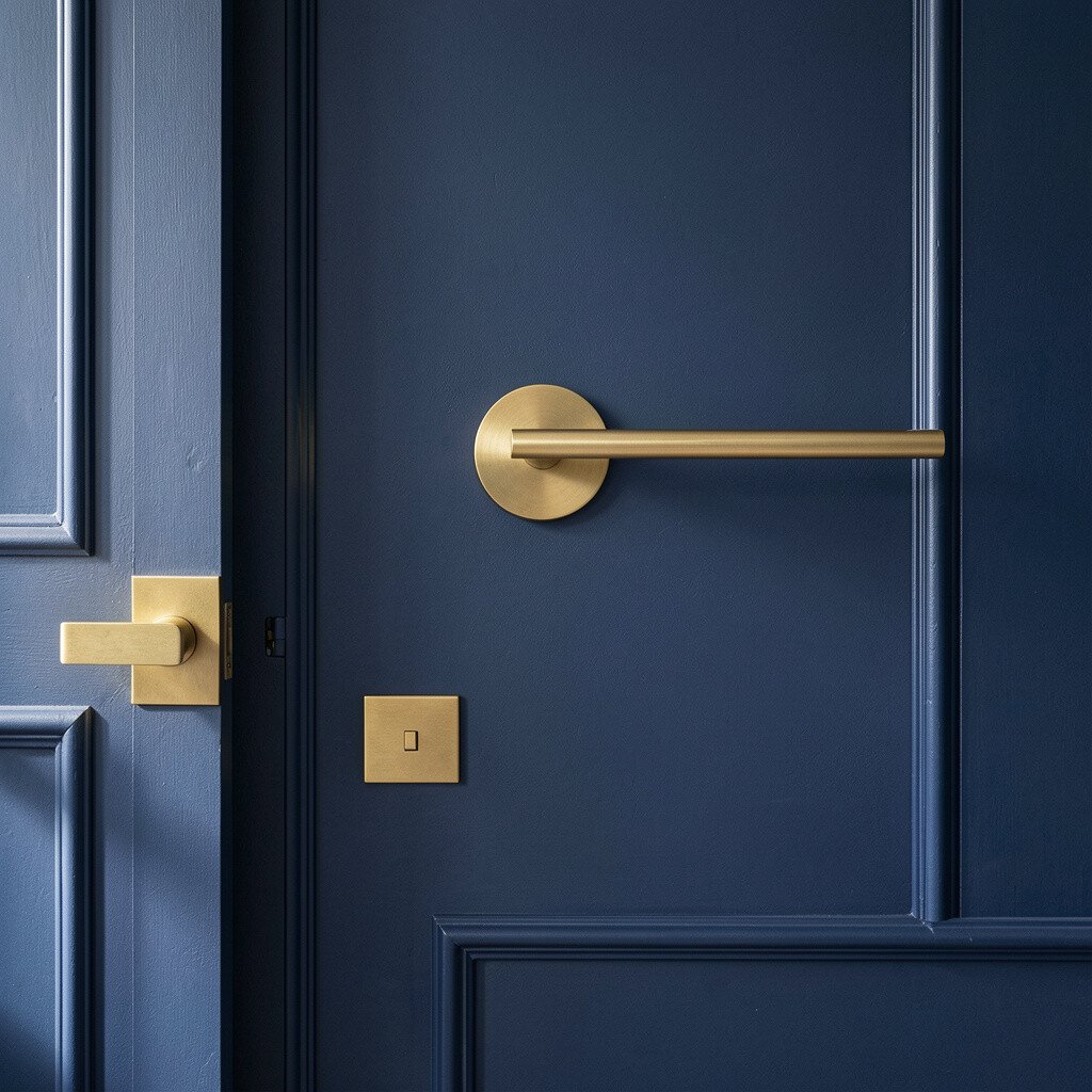
2. Navy Accent Wall With Gold Hardware
Navy Accent Wall With Gold Hardware
A navy accent wall gives instant depth and makes furniture stand out. It can feel bold without being harsh when the rest of the room stays lighter.
Use matte gold touches like cabinet knobs, picture frames, or a simple shelf bracket. Keep patterns minimal at first, then add one patterned pillow or throw to balance the dark tone.
If you want the look to stay flexible, choose washable paint and consider a satin finish for easier cleaning. In current home styling, navy still shows up because it works with modern lines and classic materials. It also hides scuffs better than very pale paint, which can save time later.
3. Light Denim Blue With Natural Wood
Light Denim Blue With Natural Wood
Denim blue brings a casual, lived-in feel that works with almost any everyday room. The texture of denim-inspired paint or wall finish can mimic the comfort of a favorite jacket.
Match it with natural wood tones like oak, walnut, or bamboo for a warm contrast. Add a jute rug or woven basket so the room feels layered, not flat.
For personalization, try a slightly varied shade across the wall using a roller technique or a subtle glaze. Many people are leaning into tactile surfaces right now, and denim blues are a big part of that trend. If you’re budgeting, you can start with one wall and see how it changes the whole layout before committing more.
When it comes to cost, a single accent wall is usually cheaper than painting an entire space. Plus, you can update décor later without repainting everything.
4. Blue and White Horizontal Stripes
Blue and White Horizontal Stripes
Horizontal stripes in soft blue and white can make a room feel wider and more open. They also look timeless, like a clean nautical postcard.
Keep stripe spacing consistent and use painter’s tape for straight lines. Choose one shade of blue that matches your existing textiles so the pattern feels intentional.
For practical placement, stripes can look great behind a headboard or across the back wall of a dining nook. If you worry about stripes feeling too strong, paint them slightly thinner or start with a lighter blue version. You can personalize by adding a framed gallery that follows the rhythm of the stripes.
5. Ocean Ombre With a Soft Gradient
Ocean Ombre With a Soft Gradient
An ombre wall that fades from deeper blue to pale sky can look like waves rolling in. This style feels calming and artistic, especially with smooth, clean lighting.
To pull it off, blend using a sponge or a specialized blending kit so edges stay gentle. Work from the bottom up and keep checking your progress from the doorway, not just up close.
Personalize the gradient by adding a tiny hint of teal near the middle for a more ocean-like color. Current trends favor blended color walls because they feel modern and custom. If you want lower cost, consider painting only the top half as a sky effect and leaving the lower part neutral.
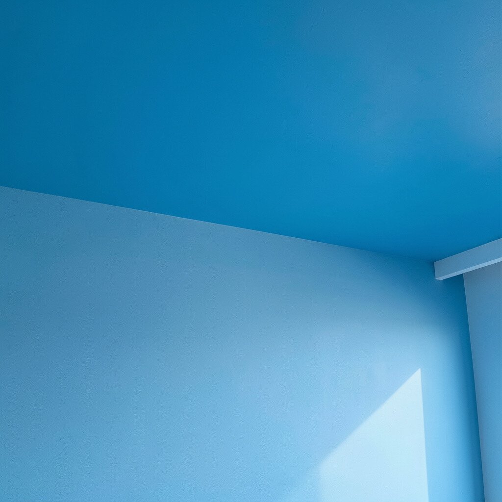
6. Cerulean Blue With Matte Ceiling Lift
Cerulean Blue With Matte Ceiling Lift
Cerulean blue can feel energetic, like fresh color in a room that needed a lift. When you paint the wall in matte and bring the tone slightly onto the ceiling, the space feels taller.
Use a matte finish to reduce glare, especially in rooms with big windows. Keep the ceiling a softer shade or tint it very lightly so the room stays balanced.
Add simple wall art with white matting to let the bold color breathe. If you prefer practicality, choose paint with low odor and quick drying so you can finish faster. For personalization, switch décor seasonally by swapping frames and textiles rather than repainting.
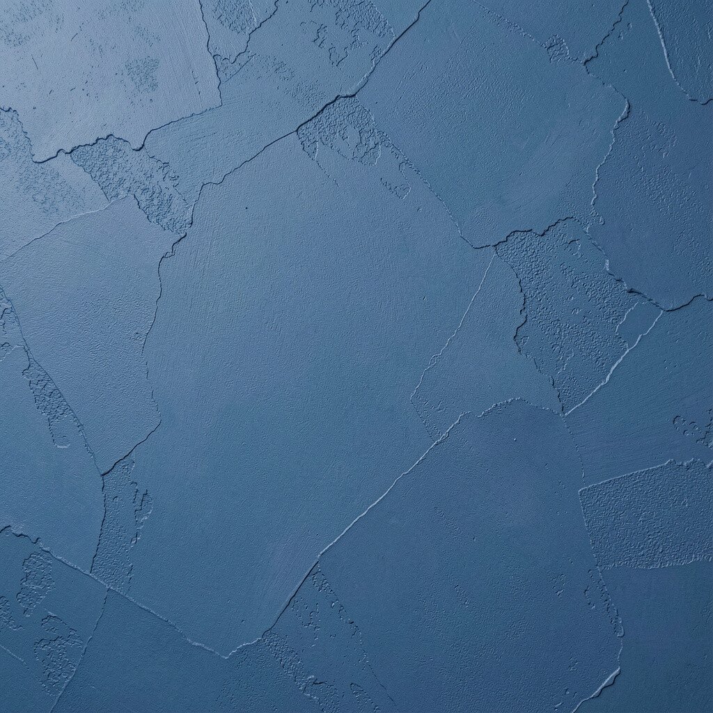
7. Textured Slate Blue Plaster Look
Textured Slate Blue Plaster Look
A slate blue plaster look adds personality without needing busy patterns. The surface catches light differently as you move, giving the wall a subtle, luxurious feel.
Look for paint products labeled for textured walls and apply with a trowel or sponge for variation. Pair this blue with simple, solid furniture so the texture becomes the star.
This is a great option for hiding minor wall flaws because the texture adds visual cover. If you’re cost-conscious, you can focus texture on one feature wall and keep the other walls a cleaner shade. Many current interiors lean toward artisan finishes like faux plaster because they look custom and warm.
Personalize by adding a slightly lighter glaze in one direction so the texture shows depth in the light.
8. Powder Blue Botanical Wallpaper Accent
Powder Blue Botanical Wallpaper Accent
Botanical wallpaper in blue tones can make a room feel fresh and alive. Even if the wallpaper is an accent, the leaf shapes create movement and softness.
Choose a pattern that doesn’t crowd the furniture, then place it behind a sofa, desk, or bed. If you can, match wall color edges with a paintable trim so corners look neat.
For practical tips, seal the wallpaper if the room gets lots of sunlight. Many homeowners are trending toward wallpaper accents again because removable options make it less risky to try something new. For cost considerations, a single accent panel is often more budget-friendly than covering the whole room.
9. Cornflower Blue With Mid-Century Lines
Cornflower Blue With Mid-Century Lines
Cornflower blue feels cheerful and confident, especially when paired with mid-century furniture. The combo creates a room that feels designed, not random.
Pick a shade that sits between bright and soft so it doesn’t overpower your décor. Add rounded furniture, tapered legs, and warm-toned metals for a vintage-modern look.
Personalization is easy here by using art with bold shapes or simple abstracts. If you like flexibility, keep the wall as the main color and let your pillows and rugs handle seasonal changes. In terms of cost, paint is usually one of the cheapest ways to get a big style upgrade compared with buying lots of new furniture.
10. Blue Paint With Subtle Color-Block Panels
Blue Paint With Subtle Color-Block Panels
Color-block panels in blue create a structured look while still feeling playful. This can be as simple as small rectangles behind a chair or as bold as paneling on an entire wall.
Use painter’s tape to define crisp edges and pick two or three shades that belong in the same family. A pale blue with a slightly deeper blue often looks richer without feeling too busy.
For a practical approach, start with a small block pattern on one wall near eye level. Personalize by changing the size and position based on where your art frames will hang. This kind of styling stays popular because it gives a custom feel without requiring a full renovation.
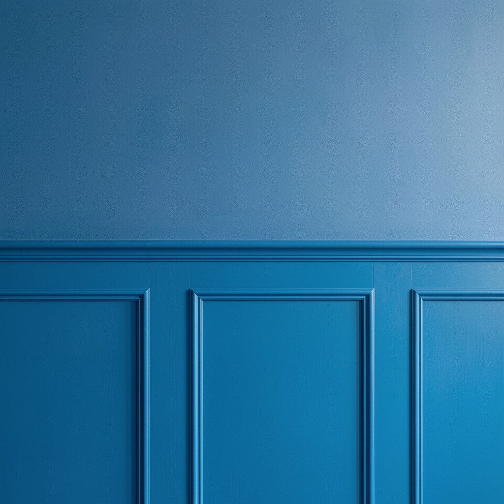
11. Blue Half-Wall Wainscoting Style
Blue Half-Wall Wainscoting Style
A blue half-wall with a wainscoting look makes a room feel classic and tidy. It’s especially charming in dining areas, hallways, or a cozy nook where you want structure.
Paint the lower section blue and keep the upper section light, then add trim for clean lines. This design helps hide everyday scuffs on the lower part and keeps the room feeling bright.
Choose a durable paint for the lower band so it’s easier to wipe. For personalization, add a matching blue rail shelf or a small ledge to show books and framed photos. Cost-wise, you can get the look with simple trim pieces and paint rather than building anything complicated.
12. Blue and Gray Weathered Wash
Blue and Gray Weathered Wash
A weathered wash in blue and gray looks like sun-faded color on old walls. It feels artistic, relaxed, and great for spaces where you want calm energy.
To create it, use layered thin coats and wipe back before the paint fully sets. This technique makes each section unique, so your wall never feels flat or mass-produced.
Pair the look with neutral bedding, warm lamps, and textured materials like linen or boucle. Current trends show more people choosing imperfect finishes because they look lived-in and human. If you’re working with a budget, a wash technique can use less paint than full coverage schemes since you’re blending layers.
Personalize by leaning slightly more blue for a cooler mood or more gray for a more modern, muted feel.
13. Blue Wall With Polished Marble-Look Veins
Blue Wall With Polished Marble-Look Veins
A marble-look wall in blue tones can make your space feel elegant. Think cool, clean veining that looks like stone but stays bright and smooth.
You can try a faux technique using a base blue color plus a thin veining glaze. Use a fine brush to draw delicate lines, then soften them with a light wipe so they don’t look too sharp.
This style benefits your décor by making even simple furniture look upscale. Personalization is simple because you control where the boldest veins sit, like around a fireplace or behind a desk. For cost considerations, faux finishes are often cheaper than actual stone and can be done as a DIY project if you have patience.
14. Blue Gallery Wall With Color-Matched Frames
Blue Gallery Wall With Color-Matched Frames
If you want blue energy without committing to one full shade, use your walls as a backdrop for art. Painting a light blue base and then styling a gallery wall brings color in layers.
Choose frames in white, natural wood, or brushed metal and keep mat boards in shades that match the blue. This makes your art feel curated and not accidental.
For practical tips, plan your layout on the floor first and measure spacing carefully. Personalize by including one larger statement piece that anchors the group. This trend stays strong because it’s easy to update later, so you can change your mood without repainting.
Keeping the base light also helps costs, since you can touch up and adjust the art display more often than repainting a dramatic wall color.
15. Deep Indigo With Soft Fabric Panels
Deep Indigo With Soft Fabric Panels
Deep indigo walls can feel dramatic and cozy, especially when you add soft fabric panels. The mix of rich color and soft texture makes a room feel inviting, even at night.
Use fabric panels like upholstered wall segments, or attach removable fabric panels to a frame so you can switch them later. Add matching curtains and layered throws to keep everything comfortable and visually connected.
For benefits, fabric helps absorb sound, which can be a big deal in offices, living rooms, or bedrooms. Personalize by choosing a fabric pattern in subtle blues so the wall stays cohesive. For cost considerations, removable panels can be more budget-friendly than custom build-outs, and they let you refresh your look without starting over.
This style is popular right now because people want rooms that feel calm, warm, and a little more tactile than glossy surfaces.