Bright yellow pushpins look like tiny pinpricks of daylight on cork or fabric boards. When they catch the light, they add a warm, friendly vibe that makes your notes feel more welcoming.
Use them for things you want to notice often, like weekly plans, school reminders, or a menu for guests. Place a few in a cluster to create a “happy corner,” and keep the rest of your board calmer so the yellow stands out.
2. Ocean Teal Pushpins That Feel Cool and Calm
Ocean Teal Pushpins That Feel Cool and Calm
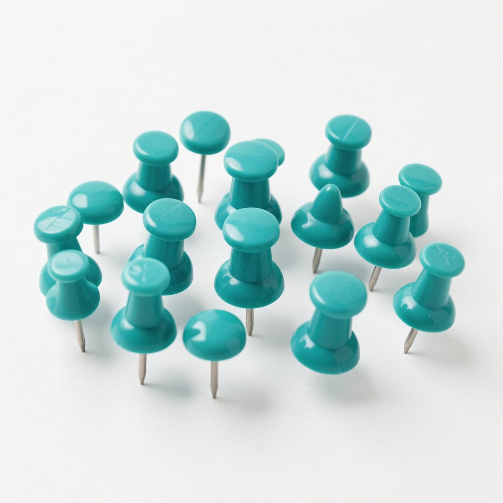
Teal pushpins bring a fresh, ocean-like color that feels steady and relaxing. They look great against beige walls, light wood frames, and neutral paper tones.
Try using teal for schedules, habit trackers, and reading lists so your focus feels smoother. A simple way to personalize is to match teal pins with teal sticky notes or a teal pen set so everything looks planned, not random.
If you’re watching costs, buy a small mixed pack and use teal only on the most important papers. Over time, you’ll know which color you truly reach for every day.
3. Hot Pink Pushpins for Bold Messages
Hot Pink Pushpins for Bold Messages
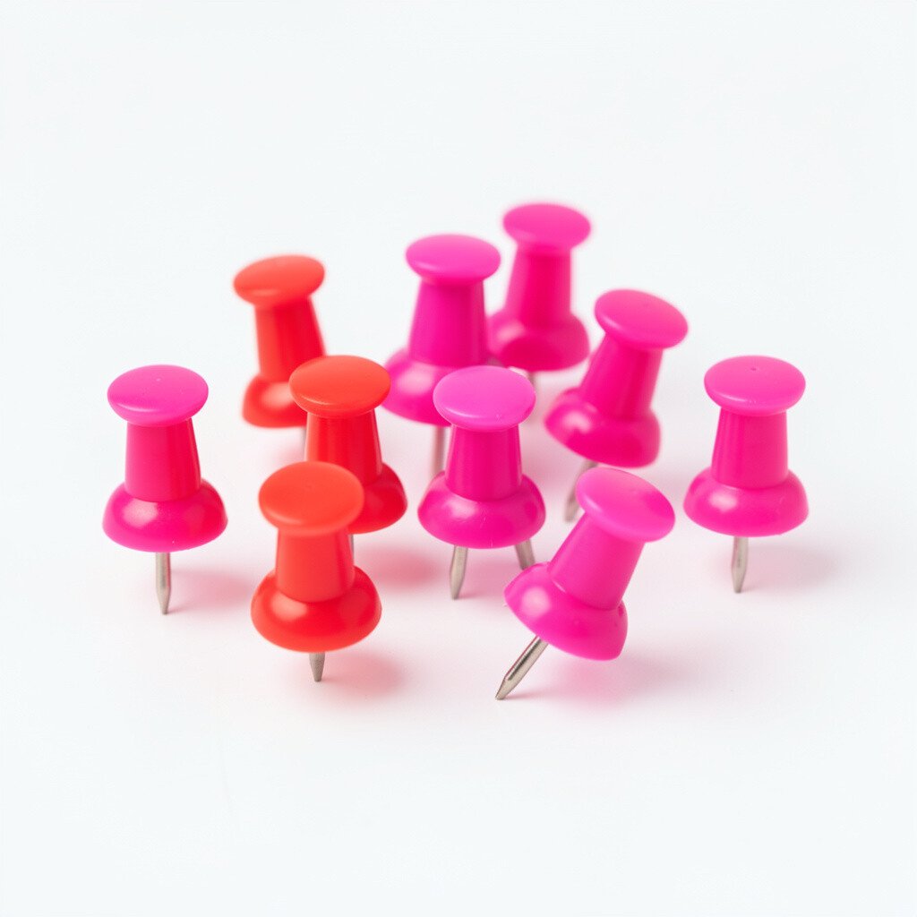
Hot pink pushpins make your board pop with instant energy. They’re especially fun near photos, goal lists, and any place you want to feel motivated.
For a practical setup, use pink for time-sensitive items like deadlines or upcoming events. Put the pink pins closer together and vary the heights of pinned corners so the display looks lively instead of flat.
Consider pairing hot pink with white paper and black ink for a clean, modern contrast. If you love current trends, bright accents like this are popular in home offices because they add personality without clutter.
4. Classic Red Pushpins That Keep You Moving
Classic Red Pushpins That Keep You Moving
Red pushpins are bold and direct, which makes them perfect for reminders you cannot miss. They can feel like a gentle nudge, even when you’re just scanning a board while making coffee.
Use red for top priorities, like bills due, workout days, or a “must call” list. To make the whole board look intentional, keep red to a single role and reuse the same pin positions each week.
5. Soft Lavender Pushpins for a Cozy Look
Soft Lavender Pushpins for a Cozy Look
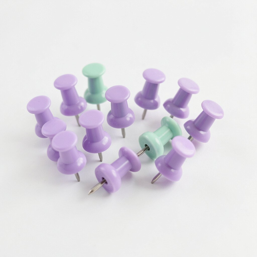
Lavender pushpins give a calm, cozy touch that feels like fresh flowers in a vase. They look dreamy on cork, magnetic boards, and even on fabric backdrops.
Place lavender pins on calming visuals like affirmation cards, slow-living schedules, or weekend plans. If you want an easy personalization idea, pair lavender pins with matching ribbon or a small fabric strip around your board edge.
To manage cost, choose fewer lavender pins and repeat them in the same sections. Repetition makes a small collection look curated, not sparse.
6. Emerald Green Pushpins for Nature-Inspired Organization
Emerald Green Pushpins for Nature-Inspired Organization
Emerald green pushpins bring a fresh, grounded feel that echoes leaves and gardens. They make your pinned items look like part of a living, breathing space.
Try emerald pins for meal planning, grocery reminders, and “weeknight wins” so the board feels useful. For personalization, add a tiny leaf-themed photo and let the green pins frame the image like a border.
Green hardware is also trending in home decor because many people are leaning into earthy colors for a restful style. If you’re buying new, consider a set that includes green and other jewel tones so you can mix without overthinking.
7. Sky Blue Pushpins for Clear, Airy Vibes
Sky Blue Pushpins for Clear, Airy Vibes
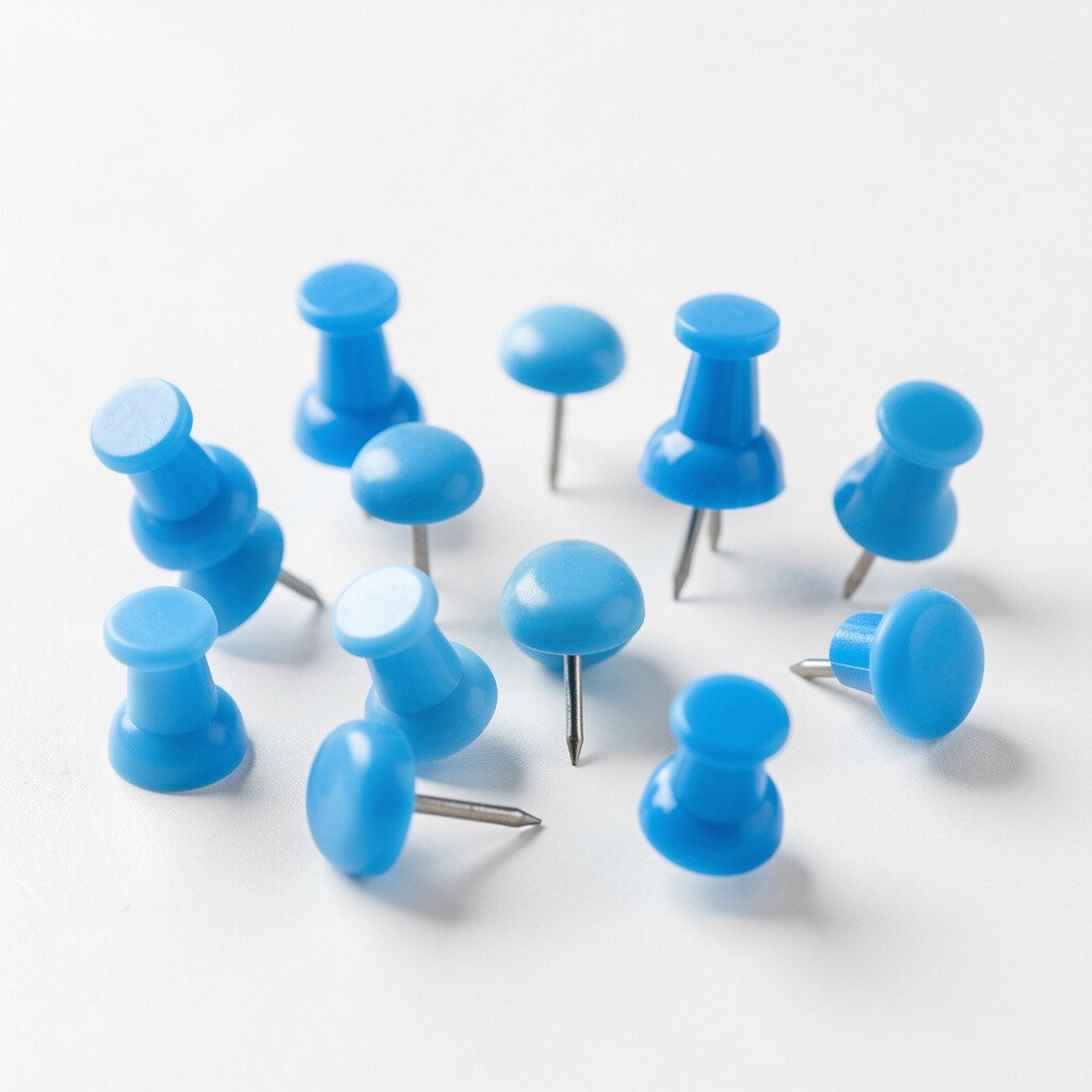
Sky blue pushpins feel light and open, like the room has more breathing space. They’re a great match for white desks, pastel folders, and airy wall art.
Use sky blue for brainstorming pages and drafts that you update often. A practical trick is to keep blue pins on papers you rotate monthly so the board stays current without looking messy.
Cost-wise, you can stretch a small set by pinning only corners and reusing the same spot for new sheets. It’s a simple way to keep the look bright while avoiding lots of extra hardware.
When you want a quick personalization upgrade, add a thin blue marker line on the paper so the color feels connected from pin to content.
8. Sunburst Orange Pushpins for Creative Energy
Sunburst Orange Pushpins for Creative Energy
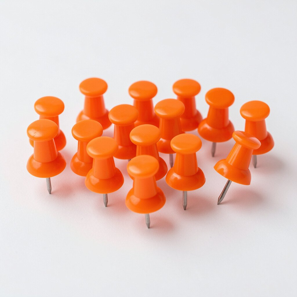
Orange pushpins add a playful spark that feels creative and upbeat. On a board, they look especially fun next to sketches, comic clippings, and project goals.
Try orange pins for active projects, like a photography plan or a craft list. If you enjoy hands-on planning, use one orange pin color as the “progress marker” and move it as you finish each step.
This color trend shows up a lot in maker spaces and creative corners because it signals action. You can keep costs down by buying a mix pack and using orange only for your most visible workflow pieces.
9. Charcoal Gray Pushpins for Sleek Minimal Accents
Charcoal Gray Pushpins for Sleek Minimal Accents
Not every bright pin needs to scream, and charcoal gray pushpins prove it. They add a modern accent that still pops against lighter paper.
Use gray pins for printed schedules, tidy layouts, and clean reminders that you want to look sharp. Pair them with black-and-white photos or minimalist typography for a polished feel.
For personalization, try arranging gray pins in a grid pattern on one side of the board, then switch to bright colors on the other side for contrast. This balance helps your board feel designed rather than random.
10. Royal Purple Pushpins for a Regal Pop
Royal Purple Pushpins for a Regal Pop
Royal purple pushpins bring a rich, dramatic color that makes everyday notes feel a bit special. They look stunning near gold frames, deep-toned art, or velvet-like textures.
Use purple pins for announcements, invitations, and celebratory plans so the board feels like an occasion. A practical tip is to keep purple to weekend and event items, which makes it easier to scan at a glance.
11. Lemon Lime Pushpins for Fresh, Playful Organization
Lemon Lime Pushpins for Fresh, Playful Organization
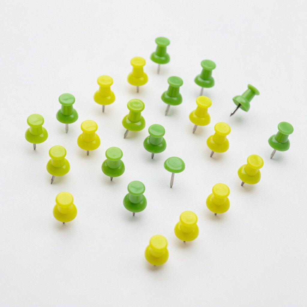
Lemon lime pushpins feel bright and fun, like a smoothie color for your walls. They’re a cheerful pick for playful spaces, from kids’ rooms to casual work corners.
Try lemon lime for lists that you update daily, such as chores, morning tasks, or daily affirmations. If you want personalization, add small doodles or themed stickers near the pins so the board feels like your own mini gallery.
For cost considerations, keep lemon lime pins for a small “daily zone” while using calmer colors around it. That way, you still get maximum brightness without using every pin you own.
When you’re setting up for trends, bright neon-adjacent colors like this are popular because they read clearly from across the room.
12. Teak Brown Pushpins for Warm Vintage Charm
Teak Brown Pushpins for Warm Vintage Charm
Teak brown pushpins add a warm, vintage feel that looks great with kraft paper and old book pages. They can make your board feel cozy instead of too loud.
Use brown pins for letters, printed receipts you want to keep, and “memory” photos. For a practical display, pin thicker items with brown so the texture differences look intentional.
If you want personalization, try adding a small twine loop around one pinned photo and match the pushpins to the twine color. Brown is also a current style choice because many rooms are moving toward warmer, natural tones.
13. Bright Turquoise Pushpins for Vacation Mood
Bright Turquoise Pushpins for Vacation Mood
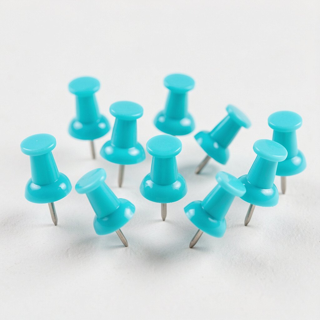
Turquoise pushpins remind you of clear water and warm days away. They bring a vacation vibe to home offices, entryway boards, and study corners.
Use turquoise pins for travel wish lists, packing notes, and “someday” bucket lists. A helpful tip is to group all travel papers together so the board becomes your personal map of goals.
To keep spending reasonable, rotate turquoise pins between boards by using one board for big ideas and another for current tasks. That way, you get more use out of the same hardware.
14. Bright White Pushpins for Clean, Fresh Styling
Bright White Pushpins for Clean, Fresh Styling
White pushpins look simple and crisp, and they can still feel bright. They’re ideal when your space is already colorful and you need a neat, light touch.
Use white pins for minimal design boards that hold announcements, classroom schedules, or menu cards. For personalization, place white pins in a neat row along one edge so the board looks organized and airy.
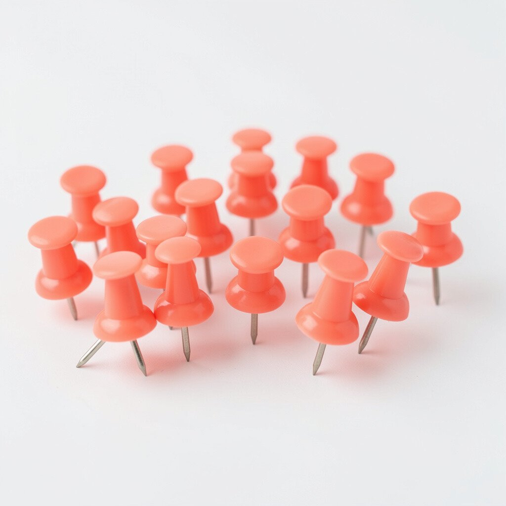
15. Coral Pink Pushpins for Friendly, Social Spaces
Coral Pink Pushpins for Friendly, Social Spaces
Coral pink pushpins give a warm, inviting color that feels friendly rather than intense. They work well for spaces where people gather, like kitchens, hallways, and family rooms.
Use coral pins for shared calendars, reminder notes, and message threads between roommates or family members. A practical tip is to color-code only a few categories, like meals, appointments, and birthdays, so the board stays easy to use.
To personalize, match coral pushpins with coral phone stands, a coral mug, or a coral accent pillow. This kind of coordinated detail is a common home trend because it makes spaces feel styled without major renovations.
If cost is a concern, focus on one accent color like coral and let it guide your entire board theme.
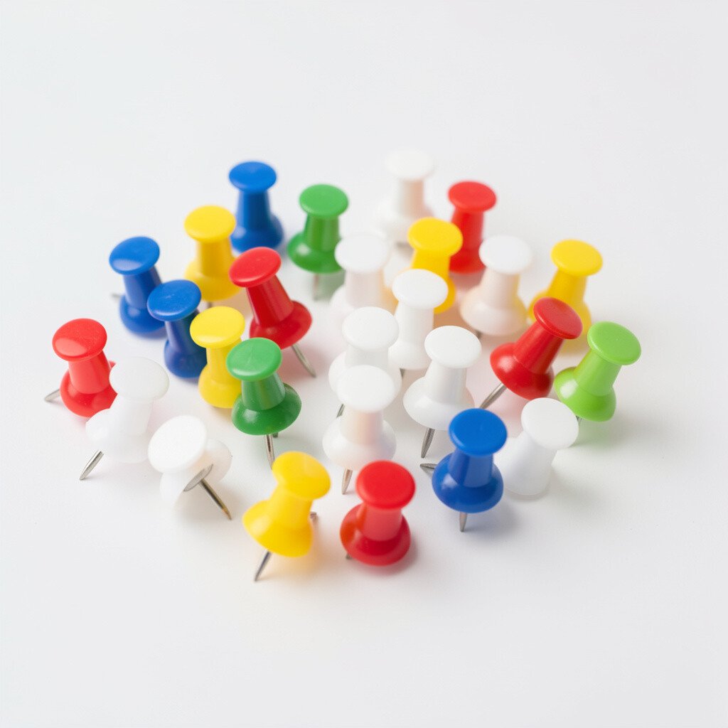
16. Multi-Colored Pushpins for a Fun, Patchwork Board
Multi-Colored Pushpins for a Fun, Patchwork Board
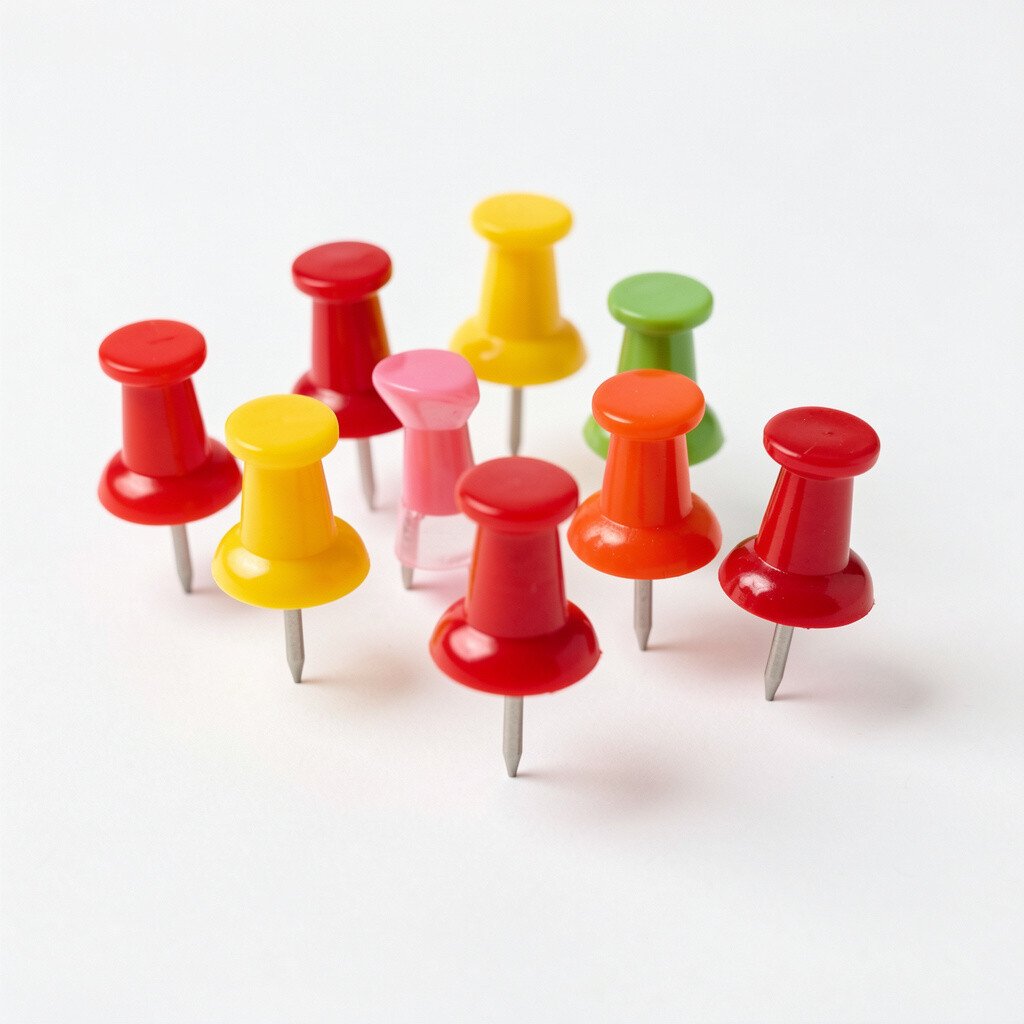
Multi-colored pushpins create a patchwork effect that instantly makes your space feel lively. When you scatter colors thoughtfully, your board turns into a cheerful collage instead of a plain organizer.
Use them to separate categories in a way that still feels playful, like green for school, blue for work, and pink for personal goals. A useful practical tip is to limit the number of colors per paper so everything looks consistent, not chaotic.
For personalization, try a pattern like rainbow arcs across one strip of the board, then switch to solid color clusters elsewhere. Multi-color sets can be budget-friendly too because you’re getting variety in one purchase, and you can decide later which colors you truly want to keep using.
If you want to stay current, mixed-color boards are popular because they add character to neutral rooms and feel welcoming to anyone who walks in.
When you’re ready, attach small decorative borders of tape or washi paper to frame each section, letting the pushpins become the colorful finishing touch.