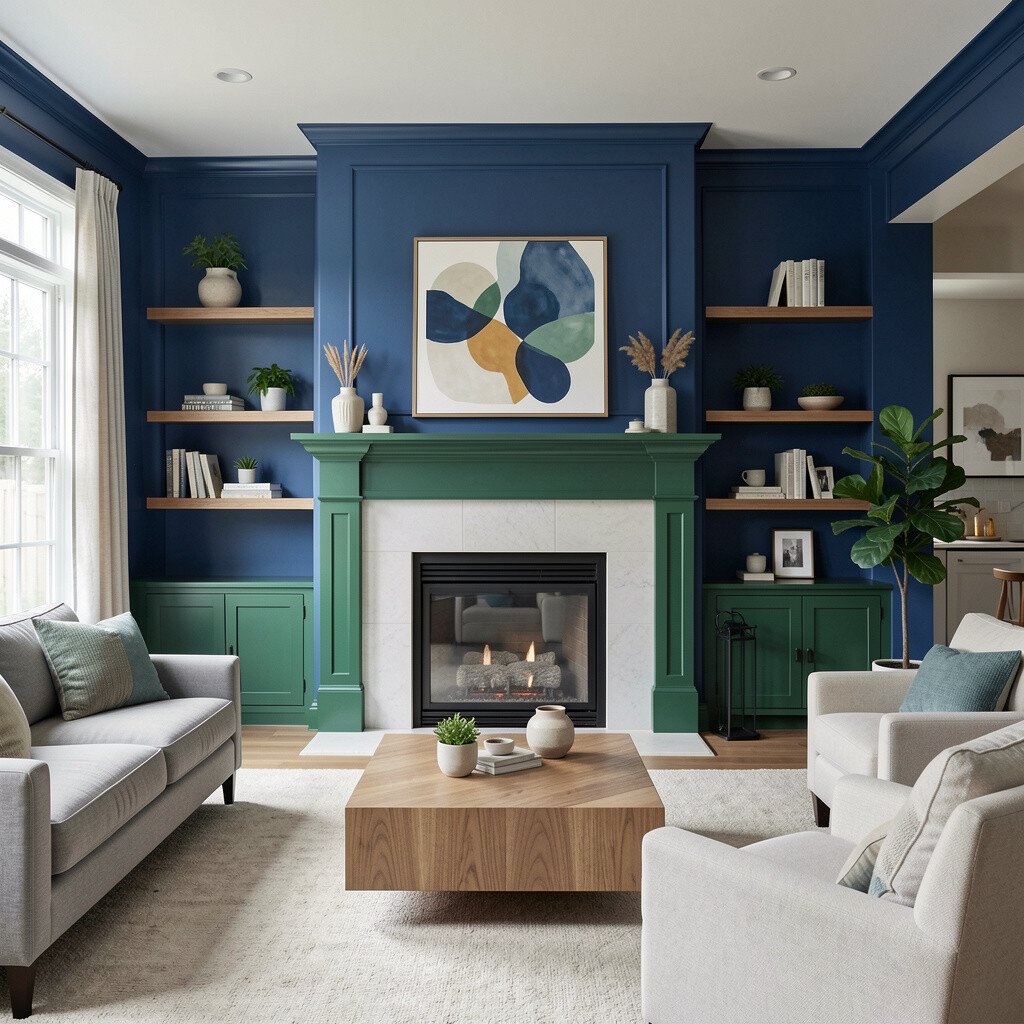
The walls set the mood before you even notice them. Blue can guide sightlines, calm the space, and make open living feel intentional.
Used thoughtfully, blue wall transitions help separate zones without building barriers. The result is a home that feels connected, yet each area still has its own personality.
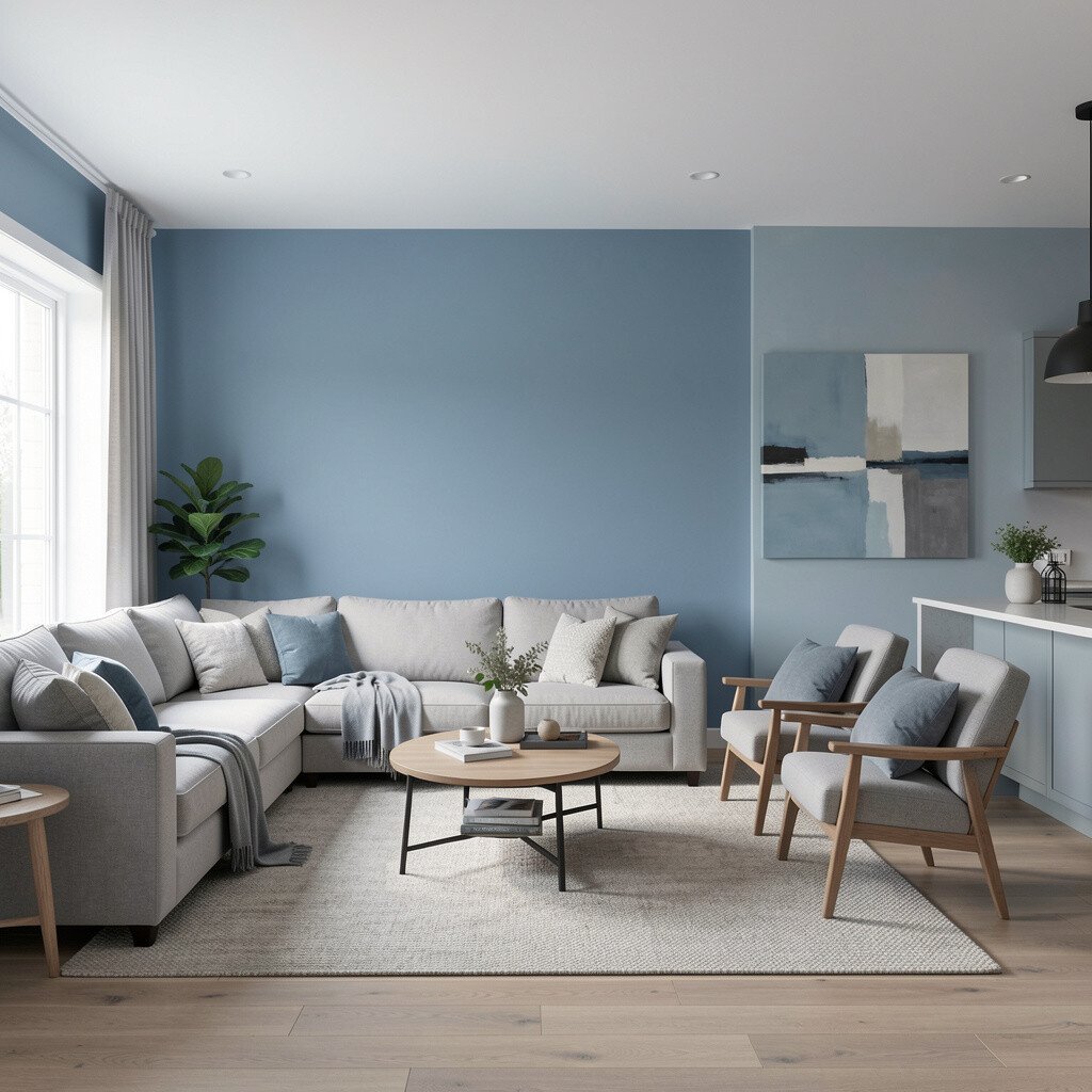
Start with a soft coastal mist on the main wall, then nudge the tone darker as it reaches the living room. You’ll see a gentle gradient that feels like morning light moving across water.
This transition makes the open area feel airy while still giving the seating zone a clear anchor. Choose a matte or eggshell finish for the lighter shade, then use a slightly more durable finish in the darker area where hands and furniture bump most often.
2. Navy Corner Framing Without Closing the Space
Navy Corner Framing Without Closing the Space
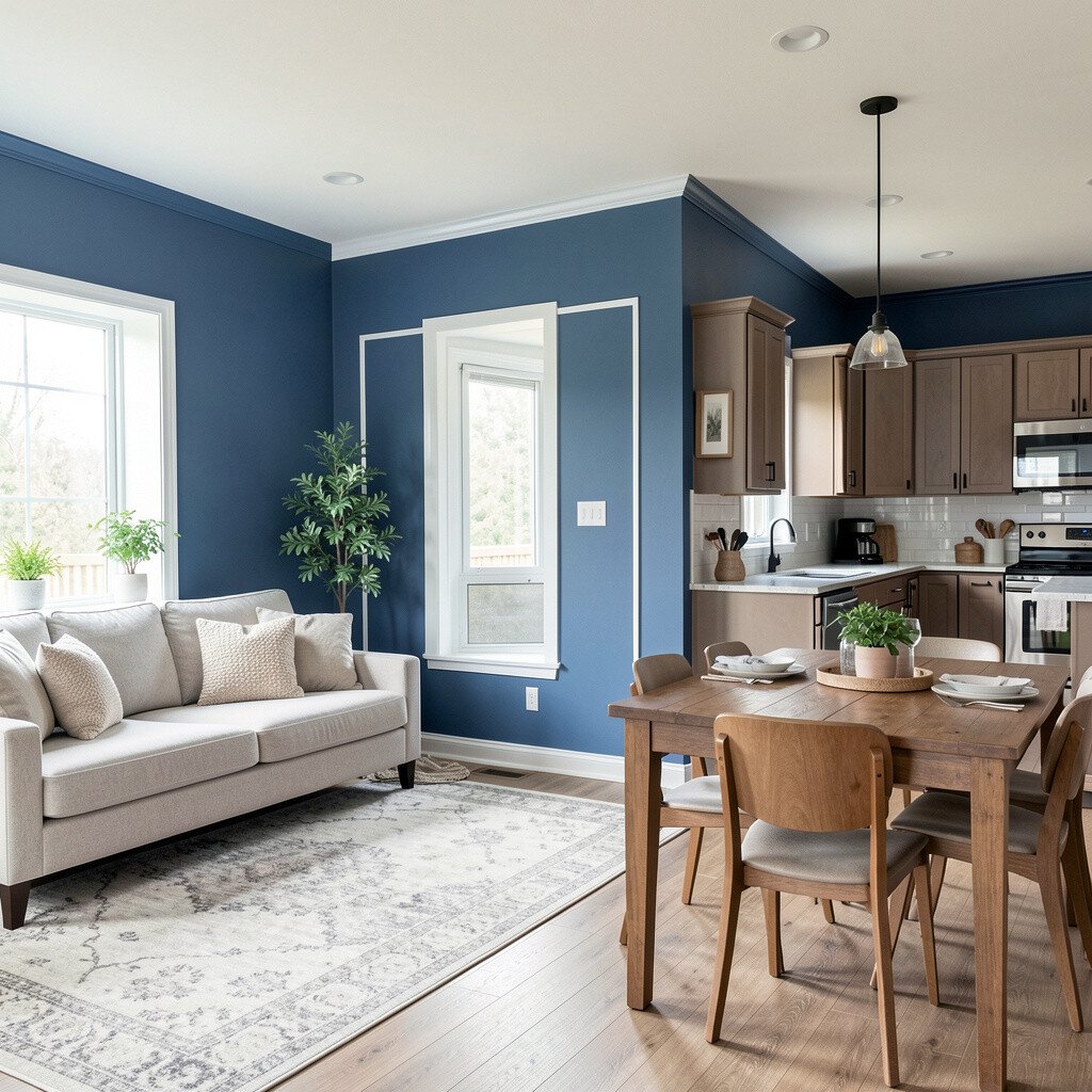
Pick a deeper navy for only the corners that meet in the open floor plan. The space stays open, but those corners look like stylish picture frames.
Paint the rest in a mid blue so the navy never feels heavy. In practice, use painter’s tape to create crisp edges around columns, entryways, and the first wall you notice when you walk in.
To personalize, pair navy with warm woods and light textiles so the room feels balanced. This also fits current trendlines toward bold accents that stay calm because the blue family keeps everything cohesive.
3. Denim Accent Wall Meets Soft Powder Blue
Denim Accent Wall Meets Soft Powder Blue
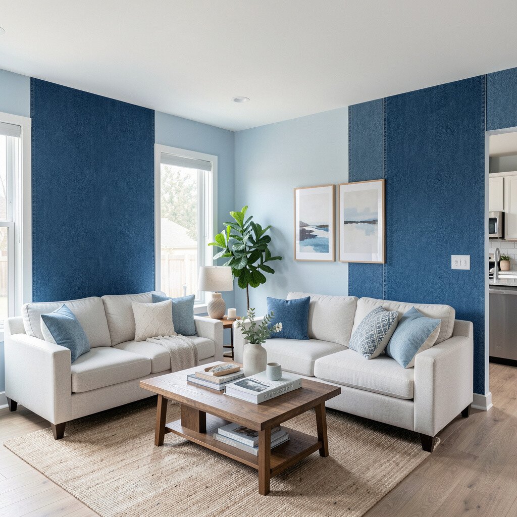
Let denim blue show up as a single accent wall near the TV, dining buffet, or console. Then soften the surrounding walls with powder blue so the accent feels grounded, not overwhelming.
You’ll notice the contrast right away when you enter, because the blue levels shift like a wardrobe of tones. It also helps define the “main” activity zone without adding partitions.
If you worry about cost, consider painting just one accent wall first. Many people get the look they want with less paint, fewer supplies, and less time, then decide later if they want to continue the scheme.
For personalization, add framed artwork that includes one color from the denim and one from the powder. That simple trick makes the transition feel planned instead of accidental.
Use ocean teal on the wall edge that visually separates kitchen and dining, even when the rooms blend. Think of it like a thin current that guides you from one activity to the next.
Because teal holds both blue and a hint of green, it works beautifully with natural light and stainless fixtures. If your kitchen has bright hardware, keep the teal slightly muted so reflections don’t compete with it.
5. Sky Blue Around Windows for a Bright Flow
Sky Blue Around Windows for a Bright Flow
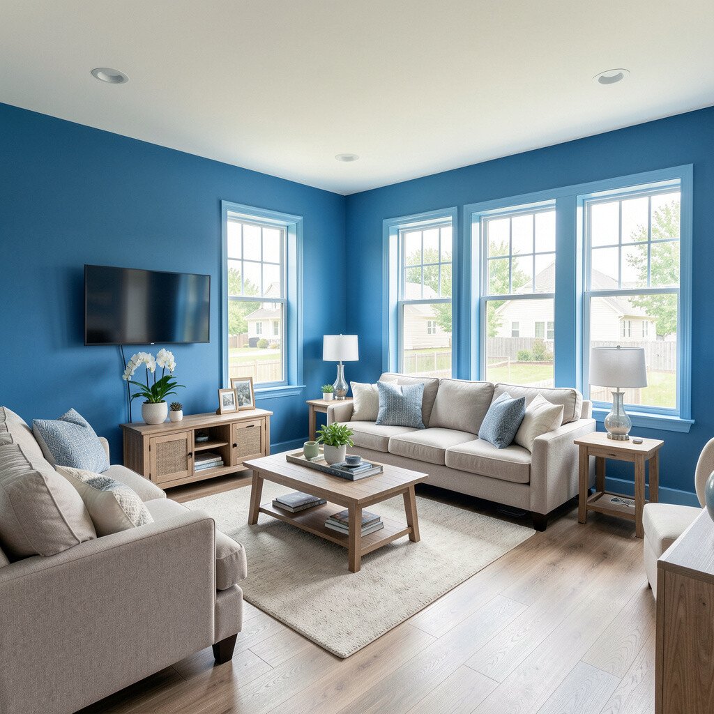
Paint the walls around windows in a sky blue shade to make daylight feel more vivid. The view outside seems to blend into your interior, and the room feels naturally stretched.
When you extend that color a little beyond the window line, the open area gets a smooth visual flow. Use a roller for large surfaces, then cut in carefully so the transition remains clean along trim and molding.
To keep it budget friendly, you can refresh trim colors first, then paint only the window-adjacent wall areas. Current trends keep returning to light, airy blues that feel fresh without looking trendy in a short-lived way.
6. Powder Blue Panels With White Between Rooms
Powder Blue Panels With White Between Rooms
Create a calm, classic transition by painting powder blue on wall sections and leaving white for the “breaks.” The white lines can line up with molding, chair rails, or built-in shelving edges.
This style makes open living feel organized, like it has gentle structure. It also makes your furniture and decor pop, especially if you use soft neutrals like sand, cream, or light gray.
7. Inky Accent Behind Shelving and Open Storage
Inky Accent Behind Shelving and Open Storage
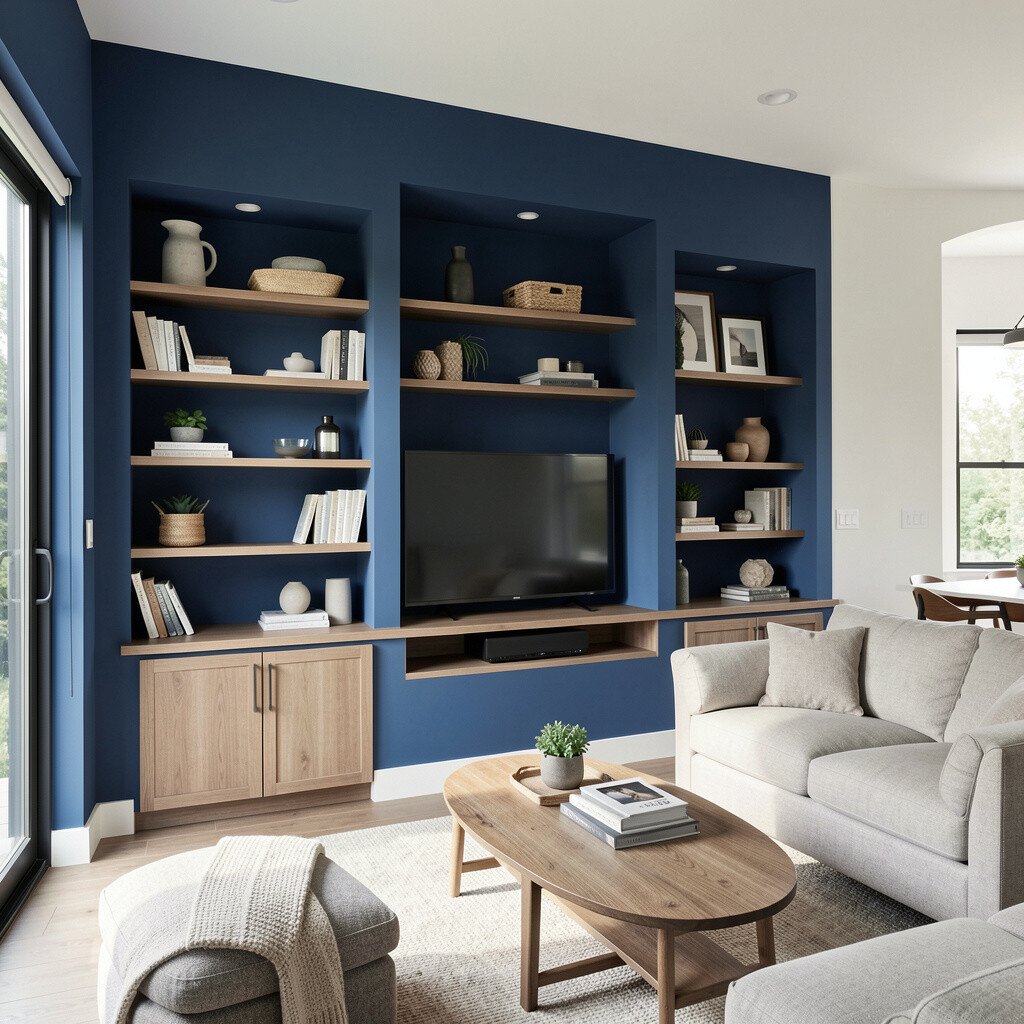
Go inky behind shelves, open storage, or the wall where your books and dishes sit. That deep background makes lighter items look richer and adds depth to an open plan.
Even if the rest of the space uses lighter blues, the inky area becomes a focal point without blocking sightlines. Keep the inky paint to the back panel only, so you get dramatic impact with less coverage.
Personalize by styling shelves with bands of blue and white ceramics, then add one small warm wood element to soften the contrast. This approach fits a growing trend toward layered, lived-in displays rather than bare walls.
8. Blue-Gray Between Entry and Main Living
Blue-Gray Between Entry and Main Living
When someone walks in, their eyes naturally sweep toward the open living area. Paint the entry-adjacent wall a blue-gray so the transition feels welcoming and not abrupt.
The benefit is a smoother handoff from exterior light to interior tones. Pair this with a warm-toned rug so the blue feels cozy, not icy.
For practical application, test the blue-gray on the wall at two heights and watch it in morning and evening light. Blue shifts a lot, and daylight can make the shade look different than indoor lighting.
9. Two-Tone Borders for a Dining Zone Shift
Two-Tone Borders for a Dining Zone Shift
Use a darker blue border along the dining zone walls, with lighter blue above or alongside it. This method creates a clear dining feel while still letting the living space breathe.
Visual separation is one of the biggest wins in open plans, because your dining table needs its own stage. Keep the border thickness moderate and align it with existing trim lines to avoid visual clutter.
10. Blue Ombre on a Transitional Wall Edge
Blue Ombre on a Transitional Wall Edge
Try a gentle ombre on a wall that sits between the kitchen and living area. The color can fade from deeper blue near the floor or from a richer tone at eye level into a lighter wash.
This creates a soft, modern transition that feels artistic and calm. It also flatters bare walls because you’re not relying on heavy decor to create interest.
To make it manageable, use a sponge and create blends gradually, then step back often. You can keep cost down by starting with one transitional wall rather than painting the whole open area.
11. Greige-Blue Walls for a Softer Modern Look
Greige-Blue Walls for a Softer Modern Look
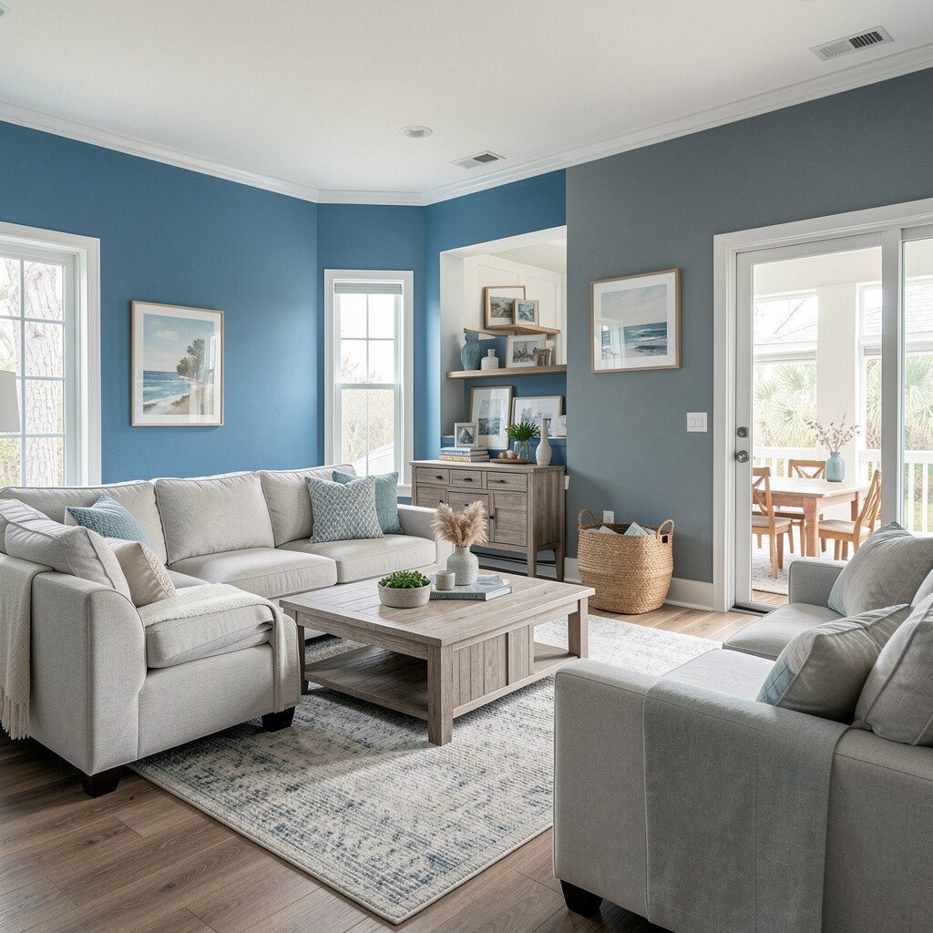
If pure blue feels too bold, blend it into greige-blue by choosing a color that leans neutral. The result looks modern, steady, and easy to decorate around.
This transition helps open living areas feel calm even when you have lots of activity in the room. It also pairs well with both warm and cool lighting because the shade isn’t too saturated.
For practical personalization, pull paint swatches to match your sofa fabric and curtain color. When the blue sits between gray and beige, you get fewer clashes and a more forgiving palette for everyday styling.
12. Royal Blue Statement Wall With Calm Supporting Walls
Royal Blue Statement Wall With Calm Supporting Walls
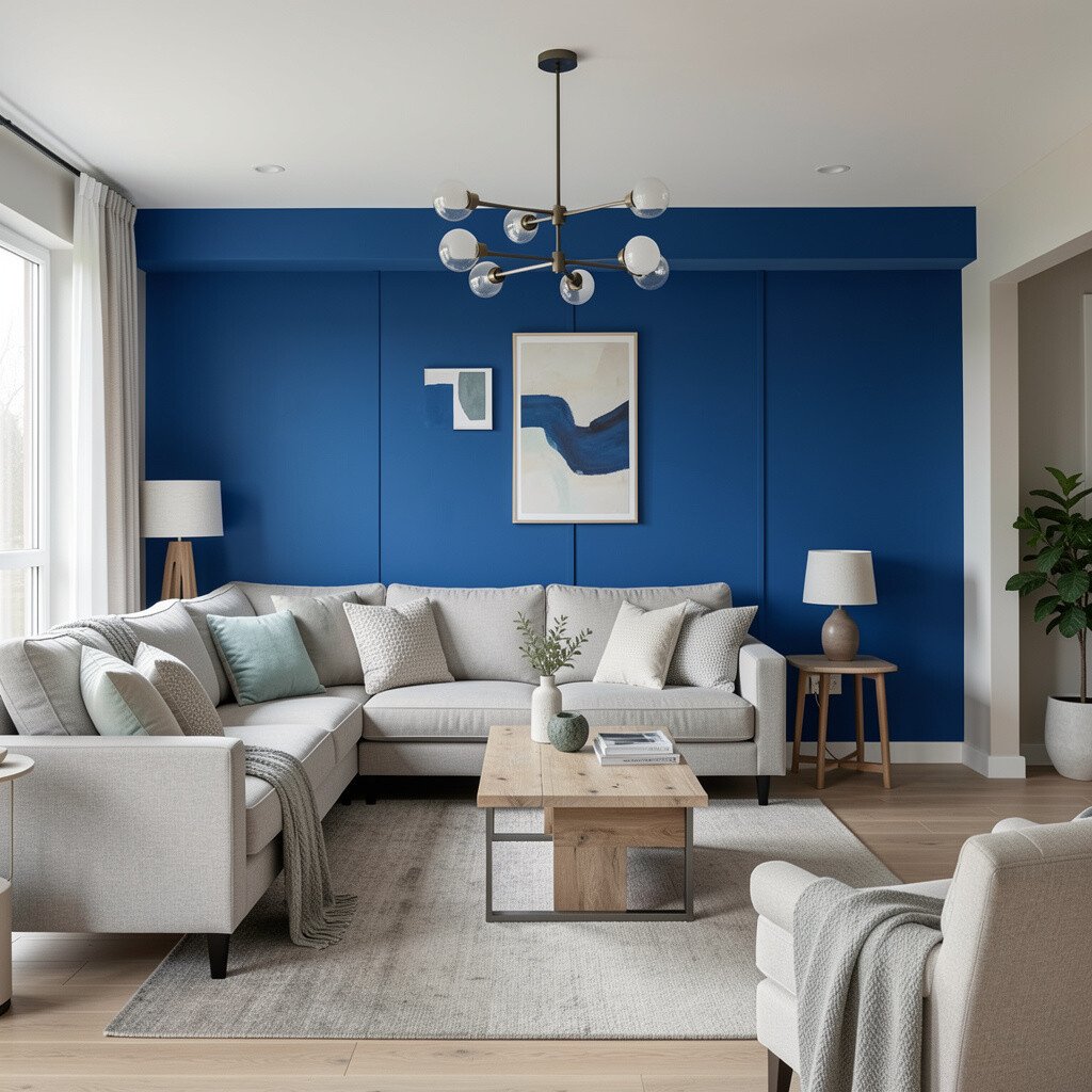
Go bold with royal blue on one statement wall, then keep the rest of the open living area in lighter, supporting blues or soft whites. The room stays cohesive because every wall shares the same color family.
You’ll feel a strong visual center, which is great for open spaces that otherwise feel too spread out. Use royal blue where you want attention, like behind a dining chandelier or the sofa’s back wall.
To manage cost, concentrate paint effort on a single wall and upgrade hardware instead in other spots, like outlet covers or curtain rods. Many current homes aim for one striking wall with simpler surrounding finishes.
13. Fog Blue and Soft Charcoal for Depth
Fog Blue and Soft Charcoal for Depth
Try fog blue on the main walls and add soft charcoal accents on a lower band or around built-ins. The contrast creates depth without shrinking the open area.
Charcoal can also hide scuffs better in high-traffic spots, which is helpful if kids or pets live here. Keep the transition smooth at the edges so it feels designed, not patchy.
For personalization, match charcoal with black metal light fixtures, then choose blue-toned art to keep the theme consistent. This look is popular because it feels sleek while still staying cozy through softer blues.
14. Teal-Blue Behind the Bar or Coffee Corner
Teal-Blue Behind the Bar or Coffee Corner
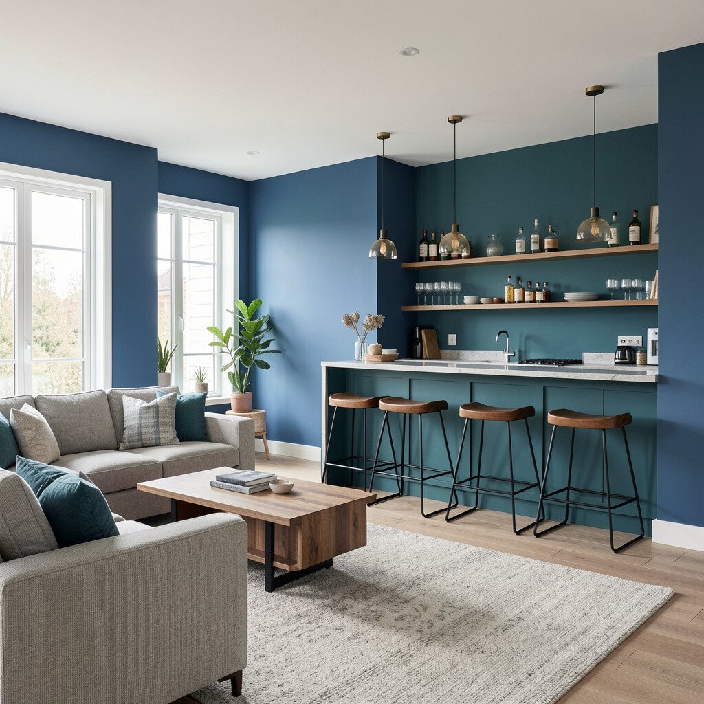
Make your bar cart or coffee corner feel like a destination by painting the background teal-blue. In an open living layout, that little “center” can pull the whole space together.
When guests move through the room, the teal-blue wall reads like a highlight, not a wall that stops movement. Keep it simple with open shelving and glass items so the area stays bright.
For a practical approach, start with a peel-and-stick sample test or small section swatch to confirm sheen and undertone. Cost can stay reasonable because a single wall section is easier to paint and easier to redo if you ever want a new mood.
15. Powder Blue With a Coastal White Ceiling Transition
Powder Blue With a Coastal White Ceiling Transition
Use powder blue on the walls and a coastal white on the ceiling or upper half wall area. That top transition helps the room feel taller, which matters in open living spaces.
It also makes the blue look lighter and fresher, especially in rooms with big windows. Choose a ceiling paint that resists stains because splatters happen more than people expect when cooking and hosting.
To personalize, incorporate ceiling beams or faux panel lines with a slightly warmer white so the blue feels grounded. This approach aligns with current tastes for airy ceilings and gentle color shifts rather than harsh stripes.
16. Blue Green Over Fireplace and Flanking Walls
Blue Green Over Fireplace and Flanking Walls
Paint the wall around the fireplace in a blue-green tone, then carry a lighter version of the same color onto the flanking walls. The fireplace becomes a natural transition point because it already divides the room visually.
Blue-green feels fresh and modern, and it can balance warm brick or wood finishes. Keep the undertone consistent by using the same paint line family so the color shift looks intentional.
For practical planning, protect the mantel and hearth while cutting in around edges, then do touch-ups once the paint has fully dried. This helps you avoid messy edges that stand out on reflective surfaces.
Personalize with earthy decor like woven baskets and linen cushions so the blue-green stays inviting. The combination feels unique because it blends ocean calm with cozy textures, which many open living areas need.
17. Deep Blue Stair or Hallway Lead-In to Open Living
Deep Blue Stair or Hallway Lead-In to Open Living
If your open living area connects to a stairway or hall, use deep blue at the lead-in point. The darker tone creates a dramatic, welcoming moment before you reach the lighter open space.
This transition guides movement and gives the layout a sense of direction. It also makes your main living walls feel brighter by contrast, which is an easy win for smaller or darker rooms.
To keep it practical, use durable paint where scuffs happen, like the wall height near shoes and bags. Personalize with wall art that includes blues from both sides of the transition so the color story feels continuous.
On the cost side, painting the lead-in area first can be a smart starter project. Many homeowners find that a small, high-impact zone sets the tone for the rest of the open plan and helps them choose the final shades with confidence.