16+ Avoid These Mistakes With Bulletin Boards To Succeed
A bulletin board can look simple, yet it shapes how people feel when they walk in. Get it wrong and the room feels messy even when everything else is fine.
Get it right and you’ll see attention, conversations, and pride rise together. The trick is learning which mistakes quietly sabotage your display.
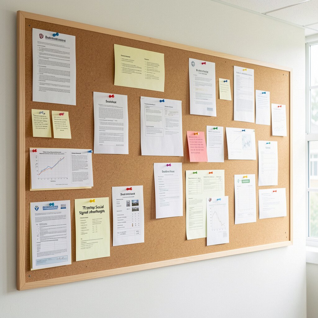
You might stuff flyers and papers onto a board and hope the clutter hides itself. Instead, your board should act like a clear message wall that guides the eye.
Choose a clean theme first, then limit what gets pinned. Leave breathing room around each piece so people can scan fast.
When you curate, you feel in control, and others feel welcome. Start by removing anything that is old, repeated, or no longer useful.
If you need to keep documents, store them in a folder and post only the most current items. This simple shift makes your board feel purposeful and easier to maintain.
2. Ignoring the Reading Distance
Ignoring the Reading Distance
People don’t always stand close to your board, especially in busy halls. If text is too small, your message becomes noise instead of meaning.
Use larger font sizes and bolder headings so key points pop. Place the most important items at eye level where most viewers naturally look.
Consider where people move, like doorways or main paths, because sightlines matter. A board placed in a glance zone works better than one hidden around a corner.
When you design for distance, you reduce frustration and increase engagement. Try stepping back several paces and reading everything without squinting.
3. Choosing Random Decorations That Clash
Choosing Random Decorations That Clash
Your bulletin board should look like one coordinated story, not a pile of leftover crafts. When colors fight each other, the board feels stressful instead of cheerful.
Pick one main color palette and reuse it across cards, borders, and accents. Visual unity helps people notice the message faster.
Add a simple visual texture like a matching background or consistent theme paper. If you love variety, rotate it by section rather than mixing everything everywhere.
Keep borders consistent so the layout feels calm. This kind of design effort can be low cost because colored paper and printable templates are easy to find.
A packed board can seem productive, but it often turns into visual overload. When everything is shouting, nothing stands out.
Limit the number of items visible at once and swap content on a schedule. Use empty space to frame what matters today.
Rotate “must-see” posters to keep the board fresh and prevent people from tuning out. Even if you have lots of information, you can show it in phases.
5. Forgetting to Update Regularly
Forgetting to Update Regularly
A board that never changes can silently signal that the space isn’t cared for. Even good designs lose impact when they become outdated.
Set a simple update rhythm that fits your life, like weekly checks or monthly refresh days. When you remove old items, new information feels more important.
Use a small note in your planning space so you don’t forget deadlines. You can also keep digital files for quick printing when it’s time to update.
Fresh content builds trust and makes people want to read what’s posted. If updates are hard, start with one small change each week.
6. Pinning Things Without a Clear Layout
Pinning Things Without a Clear Layout
If you pin items wherever there is space, the board becomes a puzzle with no picture. A clear layout helps viewers know where to look next.
Try organizing by type, like announcements in one area and community notes in another. Use rows or columns so the eye travels smoothly.
Leave a consistent margin around the edges so the board looks neat. Neatness also makes it easier to add new pieces later without making it chaotic.
When your layout makes sense, people interact more confidently. A small plan before pinning saves time later.
7. Using Poor Lighting or Unhelpful Placement
Using Poor Lighting or Unhelpful Placement
A beautiful board can still fail if it sits in dim light or gets blocked by bags and chairs. Placement and lighting decide whether anyone can actually see what you made.
Choose a spot with steady visibility during the busiest hours. If you can, avoid glare from windows and shiny surfaces that bounce light.
Test with real viewers, like family members or coworkers, and watch where their eyes go. If they miss the center, adjust height or position.
Good visibility makes your board feel respectful and easy to use. You also reduce the chance of repeated questions because people can read quickly.
8. Skipping Durable Materials and Smart Fasteners
Skipping Durable Materials and Smart Fasteners
Cheap tape, weak clips, and flimsy paper can cause posters to curl or fall. Then your board looks worn, even if you tried hard.
Use pushpins, magnets, or clips that match the board type and paper thickness. Reinforce corners with small backing cards if your materials are light.
Pick backgrounds and borders that resist fading so the board stays bright. This is a comfort choice because durable items reduce frequent rework.
You don’t need expensive supplies, but you do need reliable ones. A little investment in sturdier materials saves time and money later.
9. Making Everyone Wait for the Same Information
Making Everyone Wait for the Same Information
If people can’t find key details fast, they feel stuck and move on. Bulletins should support quick answers, not long searches.
Include the most requested information near the top or in a consistent corner. A small “quick scan” area helps viewers locate what they need.
Keep contact details, dates, and meeting times easy to spot. When these items are clear, the board becomes genuinely helpful.
Think about real questions people ask, then design your board around those needs. That practical focus makes your display feel personal and useful.
10. Treating Size as an Afterthought
Treating Size as an Afterthought
A tiny sign on a huge board can look lost, while a large poster on a small board can overwhelm everything. The scale affects readability and mood.
Match poster sizes to the board space and to where your viewers stand. Use a few larger pieces rather than many medium pieces.
Balance big visuals with smaller supporting cards so the board feels structured. Scale planning makes your board feel intentional.
When you get the sizing right, everything looks cohesive without extra effort. You can adjust with simple trimming, repositioning, or layering behind text.
11. Overlooking the Tone of Your Content
Overlooking the Tone of Your Content
Even the nicest design can feel wrong if the message tone clashes with the space. A board in a calm classroom should feel calm too.
Choose wording and visuals that match the audience. Friendly, clear language helps people feel comfortable reading it.
Use graphics that fit the mood, like soft colors for support resources and bold icons for action steps. When the tone fits, the board feels welcoming.
Try reading your posted items out loud and see if they sound natural. If they feel stiff, edit until they sound like you.
12. Ignoring Safety and Accessibility Needs
Ignoring Safety and Accessibility Needs
If pushpins are exposed or items droop, a board can create tiny hazards. Accessibility also matters when people have different heights or reading comfort.
Keep sharp edges covered and avoid placing heavy items at eye level. Make sure important text is readable without leaning or reaching.
Use clear spacing, strong contrast, and simple fonts so more people can engage. Consider color-blind friendly palettes by avoiding only color-based cues.
When you prioritize safety and access, your board feels considerate. That care is part of good culture and makes your space feel safer for everyone.
13. Repeating the Same Layout Every Time
Repeating the Same Layout Every Time
Staying stuck in one pattern can make your board feel predictable and boring. Variety keeps people curious and keeps you excited to update it.
Change the arrangement while keeping the same visual style, like swapping top-left and top-right sections. You can also rotate themes for seasons or events.
Use the same colors but adjust the layout, such as moving from a grid to a “headline plus supporting cards” style. This small uniqueness keeps the board fresh.
When your board changes, people actually notice. It also makes planning feel fun instead of stressful.
14. Relying Only on Printed Pages Without Visual Hierarchy
Relying Only on Printed Pages Without Visual Hierarchy
If everything is the same size and weight, readers don’t know what to focus on. A bulletin board needs visual hierarchy so attention lands where you want.
Use larger titles, bold keywords, and simple icons to guide the eye. Keep paragraph text short so it stays readable.
Group related items and add consistent spacing between groups. The result feels tidy and makes information easier to remember.
Design a clear “main message” area and a supporting details area. When hierarchy is strong, people take action more confidently.
15. Forgetting to Add Personal Touches
Forgetting to Add Personal Touches
A bulletin board can look professional yet still feel cold if it never reflects your community. Personal details help people feel seen and connected.
Add photos, student work, or community highlights that match the space’s values. Even one framed piece can make the whole board feel warmer.
Include small stories behind visuals, like why a project matters or what a group learned. This kind of personalization turns notices into moments of pride.
When people recognize themselves in the board, they engage more often. It’s also a fun way to encourage sharing without extra cost.
16. Not Considering Long-Term Cost and Waste
Not Considering Long-Term Cost and Waste
It’s easy to buy supplies once and then keep replacing them as they wear out. That habit adds cost and creates waste, especially when boards need frequent updates.
Choose reusable materials like durable borders, pocket folders, and laminated cards where helpful. You can also print on quality paper so items last longer.
Plan projects so you can reuse backgrounds and layout pieces across themes. Keeping a small supply stash makes future updates faster and cheaper.
Current trends often favor sustainable touches like reused frames and digital printing combined with simple paper accents. You get a modern look without constantly buying new items.
17. Treating Social Signals as an Afterthought
Treating Social Signals as an Afterthought
Bulletin boards influence how people talk, share, and collaborate. If the board doesn’t invite interaction, it stays like a one-way message.
Add a clear spot for feedback, questions, or community responses using simple, neat formats. This encourages participation without turning the board into a chaotic wall.
Use interactive elements like QR codes for schedules, sign-up sheets in a small section, or rotating “spotlight” cards. Keep these pieces easy to reach and easy to remove.
When your board sparks small conversations, it becomes part of daily life. That social value is one of the biggest benefits, because it builds momentum beyond the posted paper.