1. Choosing a Theme That Doesn’t Fit Your Students
Choosing a Theme That Doesn’t Fit Your Students
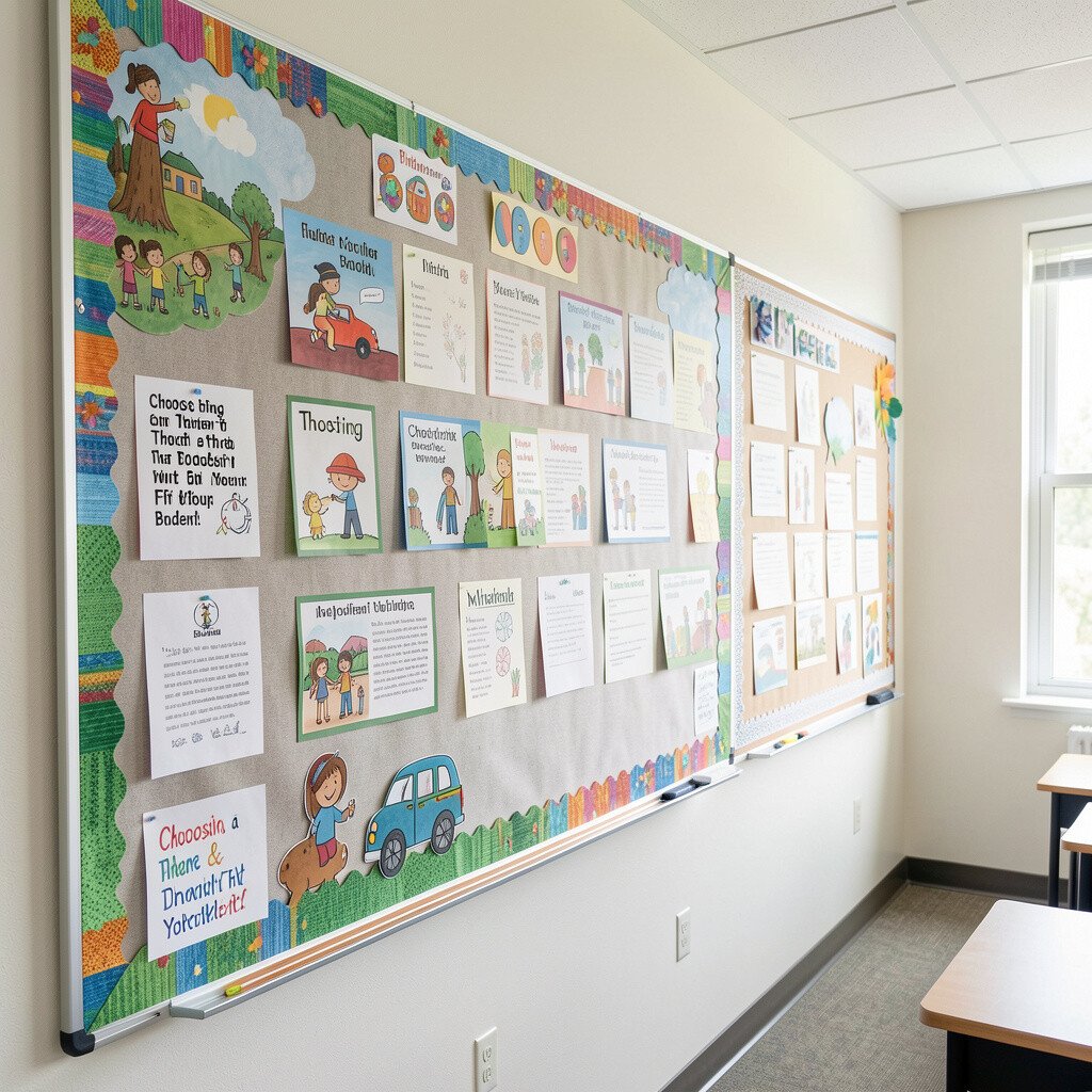
You might love a flashy theme, but it can feel off if it doesn’t match your class. When the visuals fight your routine, students notice the mismatch more than the message.
A better approach is to pick a theme that matches the age group and daily habits, like seasons, science moods, or community helpers. You can keep it unique by letting student drawings and sentence starters quietly shape the vibe. Try rotating tiny parts of the board instead of changing everything at once, so the look stays steady while the content grows.
If your class is working on feelings or friendships, warm colors and calm shapes help the board feel safe. A theme that fits makes students more likely to check the board, follow directions, and feel proud of their space.
2. Using Too Much Text So Nothing Gets Read
Using Too Much Text So Nothing Gets Read
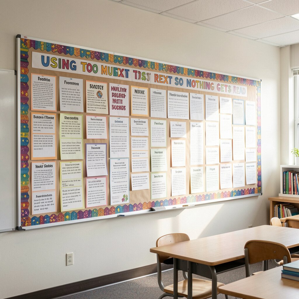
When the board is packed with paragraphs, students tend to ignore it. The eye needs a clear path, like a hallway that doesn’t keep turning.
Instead of writing everything, focus on short lines and big visuals that do one job. Keep directions simple, highlight key vocabulary with student-friendly words, and use spacing so important items stand out.
Consider adding a small “grab-and-go” element where students can easily find what they need, like a pocket for weekly reading logs. You can also use color-coding by subject so the board becomes an instant reference. This also saves time later, since short updates take less effort and less ink.
3. Ignoring Board Layout and Making Important Items Hard to Find
Ignoring Board Layout and Making Important Items Hard to Find
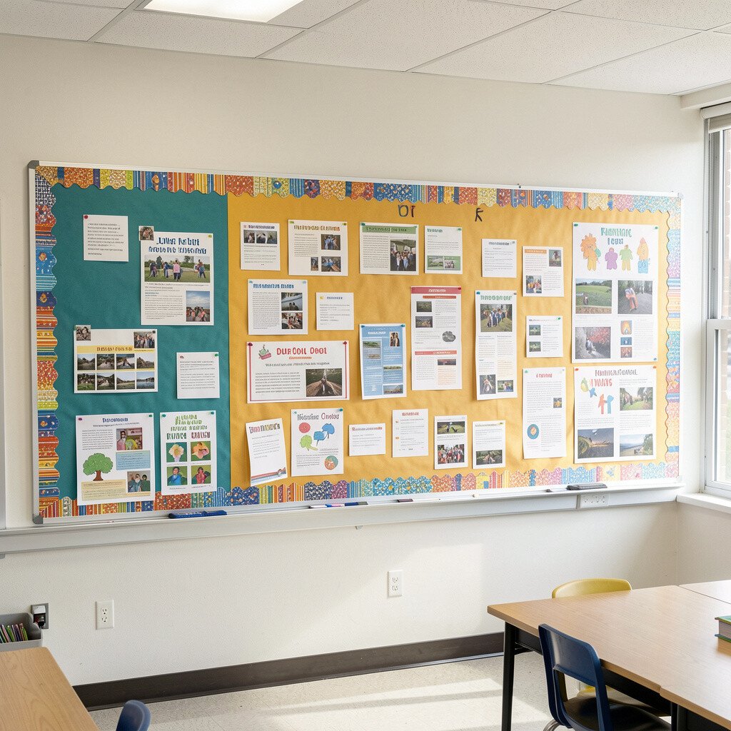
A crowded board that has no pattern can turn into visual noise. Students may stare at it and still miss what you meant them to see.
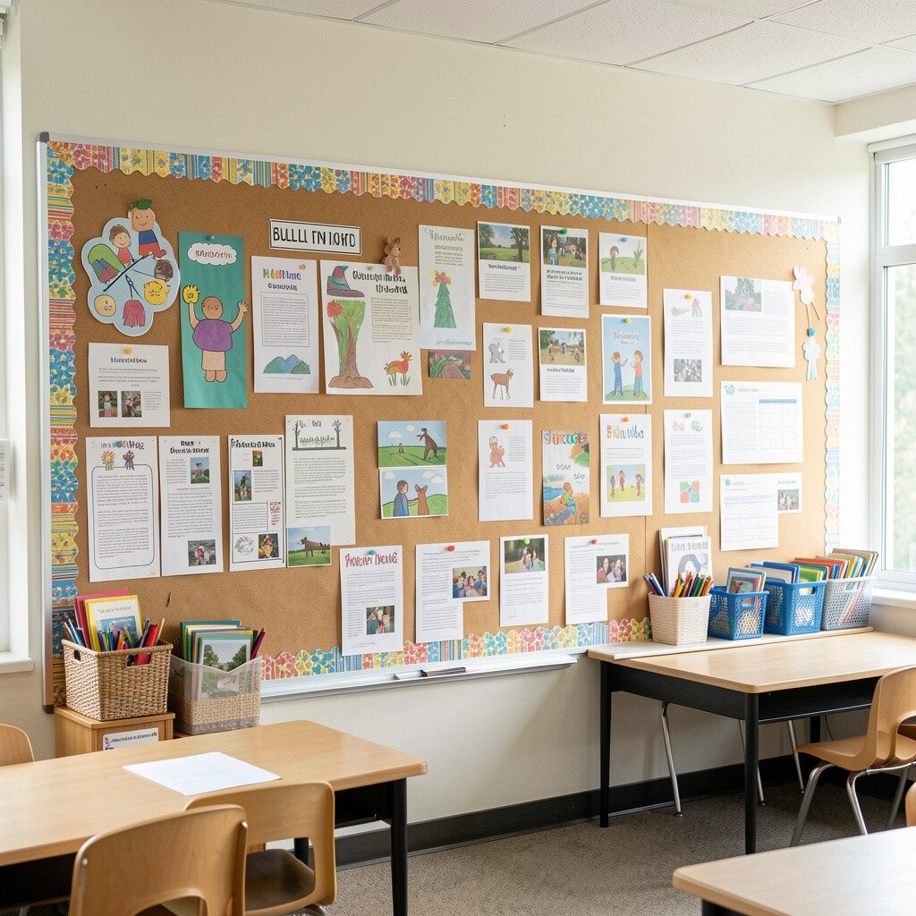
Place your most important information at eye level and group related items together. Leave some clean space around key pieces, so the board looks neat instead of messy.
Use a simple layout like a top “focus” area, a middle “current learning” section, and a bottom “student work” strip. When you keep edges aligned and items consistent in size, the board instantly looks more professional. This is one of the fastest ways to improve organization without spending extra money.
If you want something unique, try a “path” layout where headings lead to small examples, like a guided trail. Students enjoy following it because it feels like a story, not a wall of papers.
4. Forgetting to Update the Board Regularly
Forgetting to Update the Board Regularly
A board that stays the same too long becomes background, and students stop noticing it. Even a well-designed display loses power when it doesn’t connect to what you’re doing now.
Set a small rhythm for updates that matches your class pace, like swapping one section each week. You can reuse materials by covering or rotating pieces rather than starting from scratch.
Consider a “living board” approach where student work moves into new spots as units change. When students see their ideas continuing to matter, it boosts pride and engagement. Teachers also save time, because keeping a steady plan makes updates predictable.
5. Overpaying for Decor Instead of Using Smart Materials
Overpaying for Decor Instead of Using Smart Materials
Bulletin board shopping can get expensive fast, especially when you want everything to look bright. If you keep buying new supplies, your classroom budget can get strained quickly.
Try using affordable options like cardstock, paper from recycled packaging, and printer-friendly shapes. You can get a polished look with solid color backgrounds and simple cutouts, without spending much. Buying in bulk for basics like borders and label sheets usually costs less than lots of tiny purchases.
Repurpose materials you already have, like old file folders or leftover craft paper from projects. For cost-friendly uniqueness, search your home and classroom for textures, such as fabric scraps, wrapping paper, or colored tape. When students help assemble the board, the materials feel more meaningful and not just bought.
6. Making Borders That Distract From the Message
Making Borders That Distract From the Message
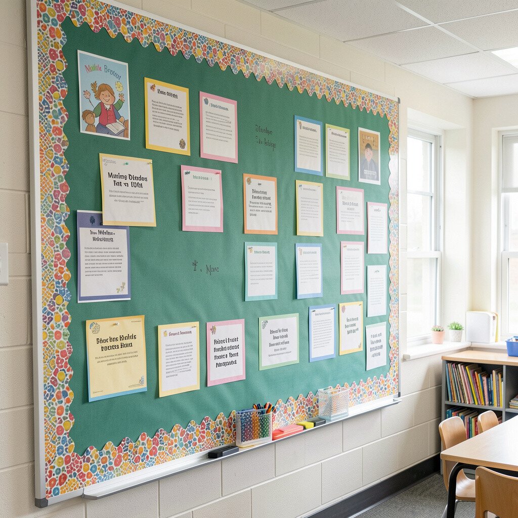
Decorative borders can be fun, but too much framing can steal attention. If the border is louder than the content, students won’t focus on the learning.
Choose borders that support the message, like thin lines, simple patterns, or matching colors. Keep the border style consistent so your board looks planned instead of random.
If you want a fresh look on a budget, use one repeated element, such as a chain of stars or a strip of cloud cutouts. Place the focus area in the center and let the border be the calm background. This keeps your board readable while still showing personality.
7. Letting Student Work Become Clutter Instead of Celebration
Letting Student Work Become Clutter Instead of Celebration
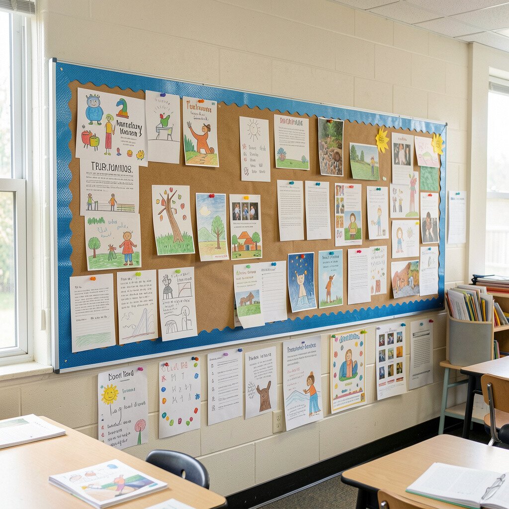
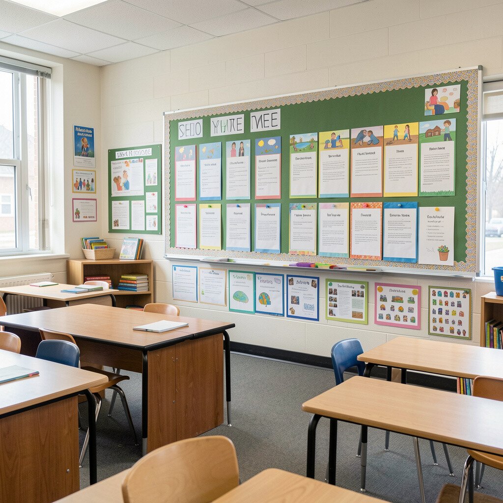
Displaying student work is a big deal, and you might want to show everything. But when the wall becomes packed, students struggle to see what’s strong and what to do next.
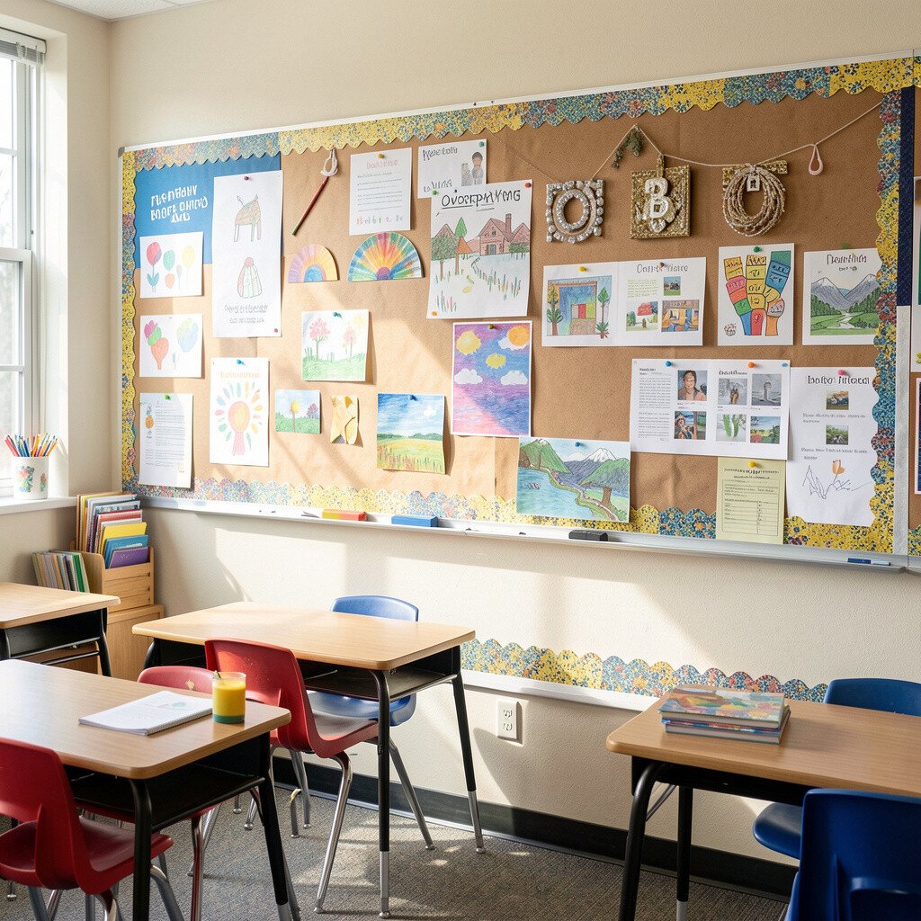
Curate your display by selecting a range of examples that show growth, effort, and different strategies. Try rotating work as new pieces arrive, so every student knows their work has a real chance to be seen.
Use a clear system for turning papers into display-ready items, like trimming edges neatly or adding a small border. Students also learn presentation skills when they see their work presented with care. That careful look makes the board feel special, not messy.
8. Skipping Accessibility for Different Learners
Skipping Accessibility for Different Learners
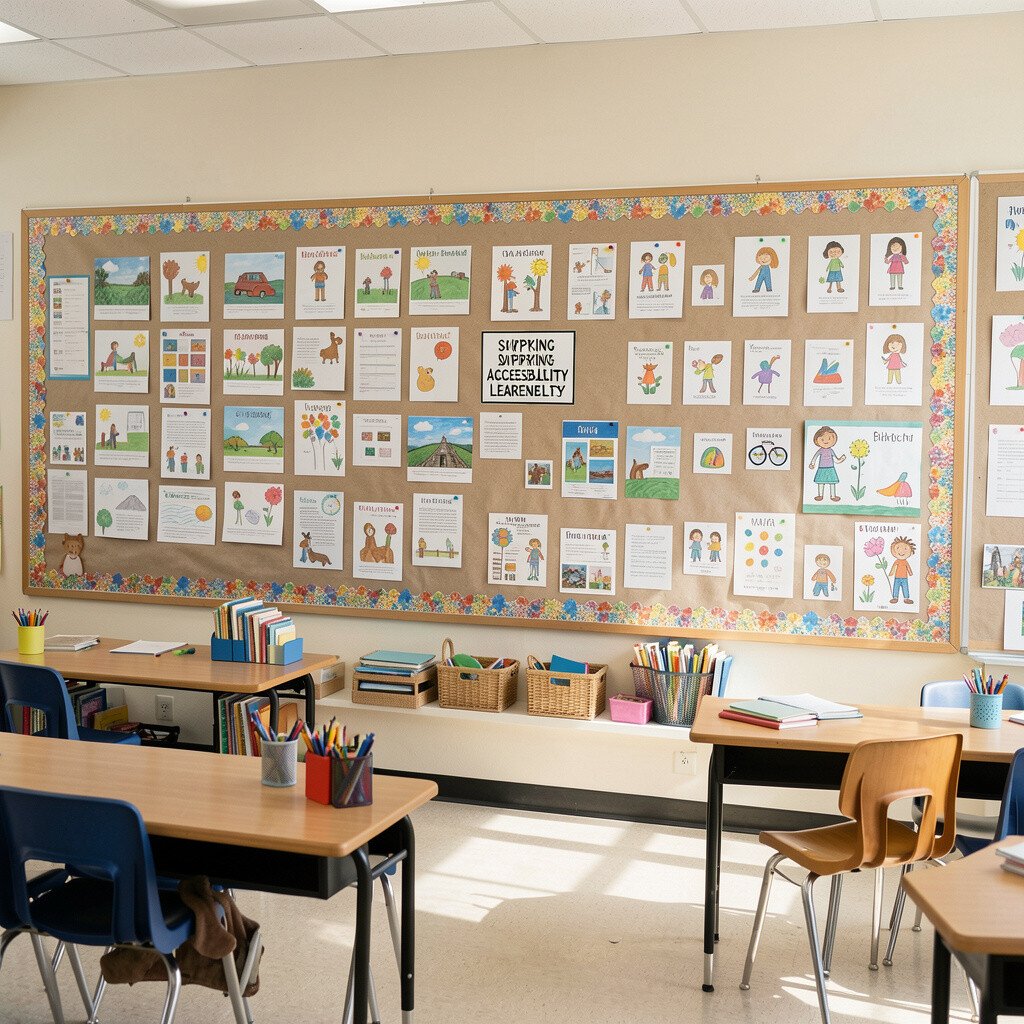
Even a beautiful board can be hard for some students to use if it’s too small or too faint. When text blends into the background, students miss directions and confidence drops.
Use large fonts and high contrast colors so the board stays readable from a distance. Consider adding pictures beside key words to support students who are still building language skills. Lamination or clear sheet protectors can also help keep the board items clean and easy to wipe.
You can personalize the board for your class by including visuals that match your routines, like “first, then” pictures or role icons. This helps students feel guided, especially during independent work times. Accessibility also benefits teachers, because fewer questions get asked when directions are easy to see.
9. Ignoring Safety and Durability in How Things Are Attached
Ignoring Safety and Durability in How Things Are Attached
If items fall off, curl, or tear easily, the board stops looking trustworthy. Students notice when the display looks unstable, and it can also create cleanup stress.
Use sturdy tape, thumbtacks where allowed, and strong adhesives that match the wall type. Keep heavier pieces supported and avoid hanging anything that swings or stretches.
Durability matters for real classroom life, with backpacks bumping corners and hands reaching often. Choose materials that hold up to daily use, like cardstock with thicker backing or sheet protectors for frequently handled cards. This is a practical way to keep the board looking great with less repair work.
10. Using Only One Type of Content So Students Tune Out
Using Only One Type of Content So Students Tune Out
When every section on the board is the same kind of thing, it can feel boring. Students benefit from variety because their attention moves in waves.
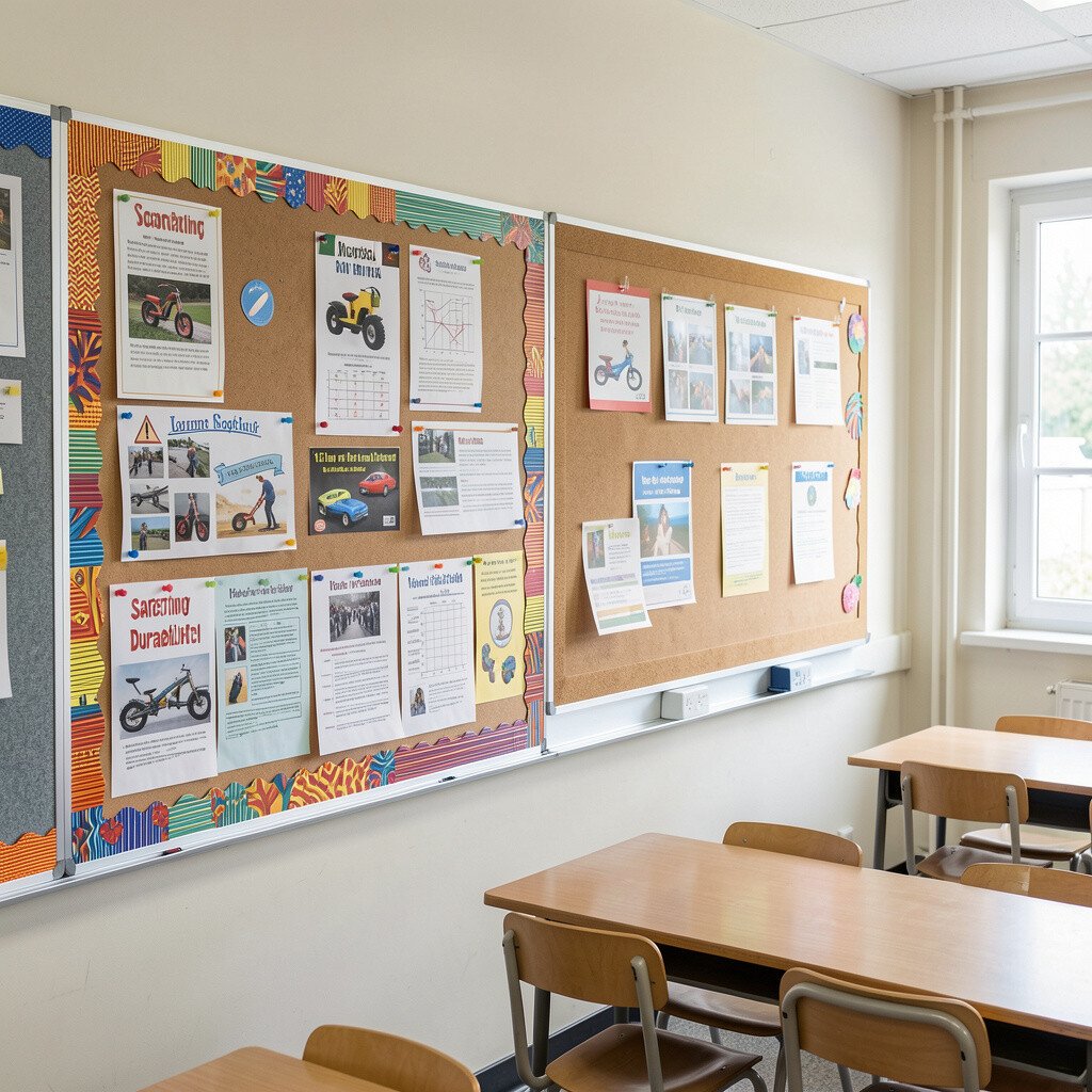
Mix formats like anchor charts, vocabulary cards, mini schedules, and interactive pieces. Add something hands-on, such as a velcro matching area for daily goals or a pocket where students place their exit ticket. Interactive parts can make the board feel like part of learning, not just decoration.
To stay unique, connect content to real classroom moments, like adding a “today’s wins” spot where students add a small star. This keeps the board current and gives families a warm picture of what’s happening in class. Variety also helps different learners, since some students respond better to visuals than text.
11. Making Updates Late or Confusing for Families and Students
Making Updates Late or Confusing for Families and Students
If students can’t understand what’s new, the board loses value. Confusion happens when dates, labels, or expectations are unclear.
Keep dates consistent, use the same label style each time, and make sure the current information is easy to spot. When families peek in, clear organization helps them feel more connected to what students are learning.
You can also add a “what’s happening now” visual that stays stable while content rotates behind it. For personalization, include student names carefully on work highlights so the board feels like a group home, not a random gallery. Clear structure reduces stress for you because you spend less time clarifying things that should be obvious.
12. Forgetting to Plan for Space, Storage, and Future Reuse
Forgetting to Plan for Space, Storage, and Future Reuse
Some teachers build a board that looks amazing, then struggle to store the pieces after. When supplies disappear, updating becomes harder, and the board becomes harder to maintain.
Before you start, plan where materials will live when they aren’t on the wall. Store cut shapes in labeled envelopes, keep backgrounds flat in a folder, and save borders for future units.
This kind of planning supports cost savings too, because reused pieces reduce waste. It also helps your boards stay unique over time, since you can remix the same components in fresh ways. When your board pieces are easy to find, you’re more likely to update them regularly.
13. Avoiding Personal Voice and Classroom Identity
Avoiding Personal Voice and Classroom Identity
Sometimes teachers copy board ideas from everywhere, but the wall still feels generic. Students can tell when a display doesn’t belong to their classroom.
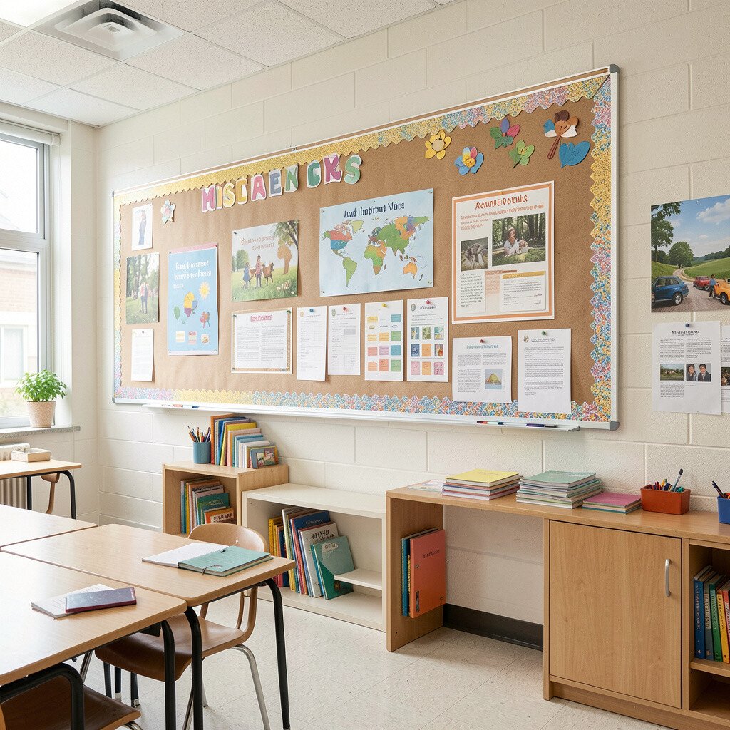
Add a personal voice by including your classroom sayings, student values, and quick acknowledgments of what you notice. Use colors and styles that match your teaching vibe, like calm and cozy or bright and energetic. Personal touches make the board feel like a welcoming space where students belong.
Try adding student-created elements, such as class rules written in student language, a map of “where we are learning,” or a rotating “star strategy” card. These personalization ideas turn the board into a shared effort, not a teacher-only decoration project. The result feels warm, unique, and genuinely useful for learning every day.