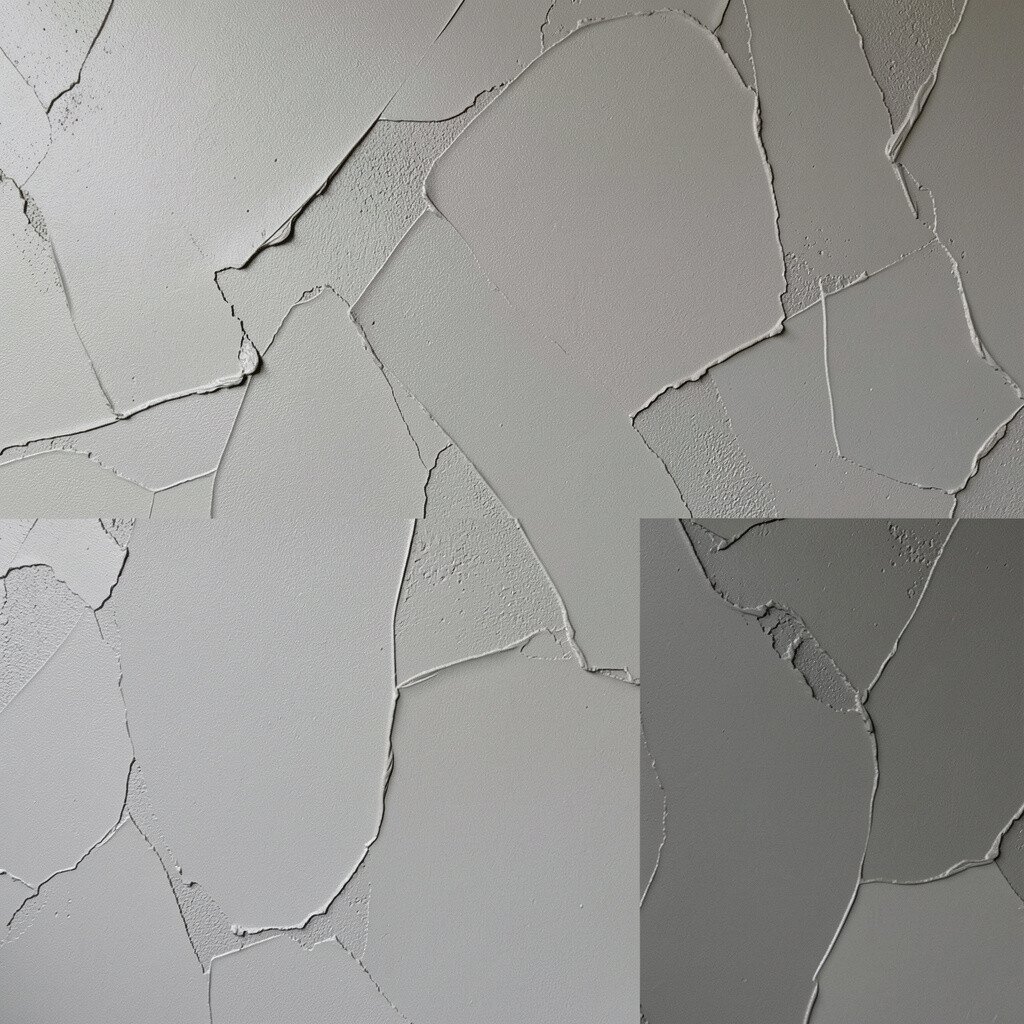
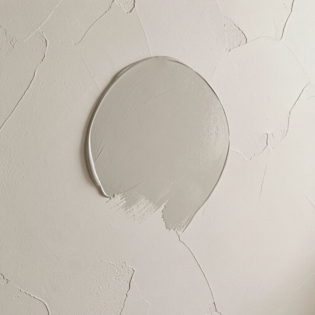
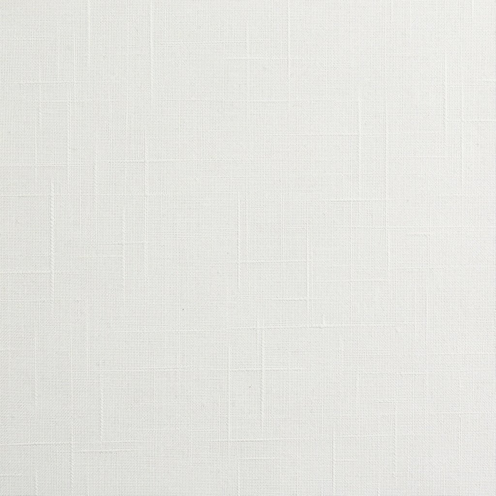
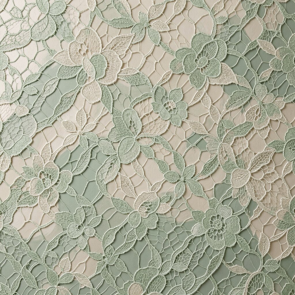
Venetian plaster looks like polished stone with a gentle sheen that catches light as you move. It creates smooth swirls and depth, so your room feels more expensive without looking busy.
Pair it with lime-based or mineral paint systems for a natural, airy look that stays breathable. For a realistic finish, use thin coats and build slowly, because the texture will show through every layer you apply. If you want drama, try warm greige, creamy white, or muted taupe instead of stark cool tones.
2. Knockdown Texture With Modern Matte Paints
Knockdown Texture With Modern Matte Paints
Knockdown texture forms irregular peaks and valleys that make walls look artistic even from across the room. When you paint it matte, the surface turns gentle and forgiving, hiding small flaws without heavy coverage.
Use a high-quality interior wall paint with a soft-matte finish to reduce glare and keep the texture as the star. Consider a tinted base first, especially if your wall has patchy areas, because uneven color is more noticeable on textured surfaces. In many homes, greige, warm gray, or dusty clay are trending since they blend with both wood and metal accents.
To personalize, pick a color that matches your flooring undertone and coat the trim a shade brighter for a clean edge. If you’re cost-conscious, you can often refresh knockdown texture with one solid repaint rather than repairs, as long as the surface is sound. Plan for extra paint consumption because texture creates more area than smooth walls.
3. Orange Peel Texture With Color-Blocking Paint Choices
Orange Peel Texture With Color-Blocking Paint Choices
Orange peel texture is pebbly and evenly speckled, creating a lively surface that feels cozy. It looks especially good when you use paint that balances texture, like eggshell or satin on the right walls.
Choose a slightly warmer white or a soft sand shade to make the tiny bumps look intentional instead of shadowy. If you want a bolder vibe, try color-blocking with two complementary tones, using painter’s tape for crisp lines.
For practical results, apply paint with a roller made for textured walls so you don’t end up with rough patches. You can also tint the primer to avoid dark spots, since orange peel can hold onto old color. Many homeowners like sage green, muted blue, and warm mushroom tones because they feel calm yet modern.
When you personalize, keep accent colors limited to one feature wall so the texture stays readable. Budget carefully because cover time can take longer, but the payoff is a wall finish that hides everyday life. Always let the first coat dry fully, because textured paint can look streaky if you rush.
4. Sand Swirl Texture With Earthy Eggshell Paints
Sand Swirl Texture With Earthy Eggshell Paints
Sand swirl texture brings soft movement, like gentle waves running across drywall. The swirls create shadows that add depth, making even simple furniture look richer.
Use earthy eggshell paint tones such as warm beige, olive, or terracotta to highlight the swirling pattern. If you like a clean look, consider a light neutral but tint it slightly warmer so it feels inviting. Sand swirl walls can look elegant in dining rooms because the texture adds interest without requiring bold decor.
5. Sponge Texture With Soft Accent Paints
Sponge Texture With Soft Accent Paints
Sponge texture creates a mottled, natural look that resembles old-world plaster or artisan finishes. You can make it subtle and calm, or you can intensify it for a playful, artistic wall.
Try using a base color plus a slightly lighter or darker paint for the sponge effect, which helps the texture pop. Warm creams, soft grays, and light clay shades are popular because they feel timeless and match many styles. If your room gets bright sun, choose a satin finish for easier cleaning and better color depth.
Keep the sponge technique consistent by working in small sections and blending edges while paint is still workable. You’ll likely need more time than standard rolling, but the visual payoff can be huge because every wall ends up one-of-a-kind. For personalization, add a second layer using a different sponge pattern on a lower band for a custom look.
6. Stipple Texture With Deep Color Satin Options
Stipple Texture With Deep Color Satin Options
Stipple texture is made of tiny dots that create a dotted pattern across the wall surface. It gives a gentle “fabric” feeling, and from certain angles it looks smooth while still offering depth.
Deep colors like navy, charcoal, or forest green often look stunning with stipple because the highlights skim across the bumps. Use satin paint if you want durability, especially in hallways, and if you prefer easy wipe-downs after daily life.
To keep it from feeling too dark, balance one or two brighter pieces of decor like light curtains or pale trim. If your goal is budget-friendly refresh, repainting is usually easier than retexturing, as long as the old texture isn’t peeling. A quick check with painter’s tape on a corner can help you confirm the surface is stable before you start.
7. Popcorn Texture With Brightening Paint Strategies
Popcorn Texture With Brightening Paint Strategies
Popcorn texture is bumpy and cloud-like, and it can absorb light, making rooms feel quieter. With the right paint, it can also feel fresh and modern rather than outdated.
Choose flat or ultra-matte paint to reduce glare and keep the texture soft, especially in bedrooms and ceilings. If your home shows a lot of natural light, consider a warm white with a hint of cream to avoid a harsh look. For practical planning, budget for careful prep and cleaning, because textured walls collect dust over time.
Personalize by painting only walls in one color and using the ceiling as a slightly lighter shade for visual height. If you want a trend-forward look, pair warm white walls with modern matte black accents. Always protect floors and vents during prep, because popcorn texture can shed tiny particles while you work.
8. Smooth Faux Finish Over Texture With Custom Glazes
Smooth Faux Finish Over Texture With Custom Glazes
A faux finish can be layered over an existing texture to create a smooth, styled surface without starting from scratch. Depending on your technique, it can look like stone, silk, or aged plaster.
Use a base coat in a neutral shade, then add a glaze layer that lets the underlying bumps show through just enough. Many homeowners love warm grays, greige, and soft taupes for this style because they make the glaze look rich instead of smoky. If you want a brighter feel, keep the glaze lighter and let the base do the heavy lifting.
For practical tips, test your glaze color on a hidden spot first, since textured walls can shift how paint reflects. Personalization is easy, because you can steer the finish toward modern sleekness or classic warmth by adjusting glaze thickness. This approach can cost more in materials, but it can save money compared to full resurfacing.
To keep it neat, use consistent brush strokes and avoid overworking once the glaze starts to tack up. If you’re aiming for a luxury look, take your time on application, because the texture beneath is the canvas for your finish. A well-done faux glaze can make a room feel like a design studio, even with simple furniture.
9. Linen Texture With Warm White Anti-Scuff Paints
Linen Texture With Warm White Anti-Scuff Paints
Linen texture gives a woven, fabric-like appearance that feels soft and comforting. It’s visually interesting up close, but it stays calm from a distance, which makes it great for everyday rooms.
Pick warm whites or creamy off-whites and pair them with paint labeled for scuff resistance if you have kids or pets. Linen texture benefits from light-to-mid tones because the weave-like shadows can look dramatic if the color is too cool.
For practicality, apply paint evenly and keep a wet edge so you don’t see roller lines through the subtle pattern. If you want personalization, choose a warmer shade in the main living area and a slightly cooler neutral in bedrooms for a gentle contrast. Cost-wise, linen finishes can require more paint than smooth walls, but the result often reduces the need for extra wall decor.
10. Brushstroke Texture With Artistic Color Layers
Brushstroke Texture With Artistic Color Layers
Brushstroke texture shows swirls and streaks that look like hand-painted artwork. It gives your walls a creative rhythm, and it can make plain rooms feel like they have a story.
Use paints that support blending and layering, like interior acrylics with good flow, and consider two coordinated colors for depth. A popular trend is pairing a muted base with a slightly darker brushstroke color so you get motion without chaos. If you want practical durability, use eggshell in high-traffic areas and matte in calmer spaces.
To keep the texture from looking messy, plan your brush direction and repeat it across the wall. Personalization is simple: you can mimic wide strokes for a modern look or use thinner strokes for a more detailed feel. Many people find this option more affordable than specialty plaster systems because it relies on paint and technique rather than unique materials.
11. Lace Texture With Muted Sage And Pearl Paints
Lace Texture With Muted Sage And Pearl Paints
Lace texture creates delicate patterns, like a soft overlay of raised details. It works beautifully when your color choices stay gentle, so the lace effect looks refined rather than loud.
Try muted sage, creamy pearl, or pale greige with a satin finish that highlights the pattern. Lace texture benefits from light grazing light, like a nearby lamp, because it brings out the raised design in a subtle, lovely way. To personalize, keep the rest of the room simple and let textured walls carry the mood.
Budget-wise, lace can be manageable if your walls are already textured and only need repainting. Always check adhesion before you start, since older layers can trap loose material. When you roll, use a method that covers bumps without flooding them, and plan extra drying time so the surface cures evenly.
12. Brick-Look Texture With Paint Designed For Realistic Depth
Brick-Look Texture With Paint Designed For Realistic Depth
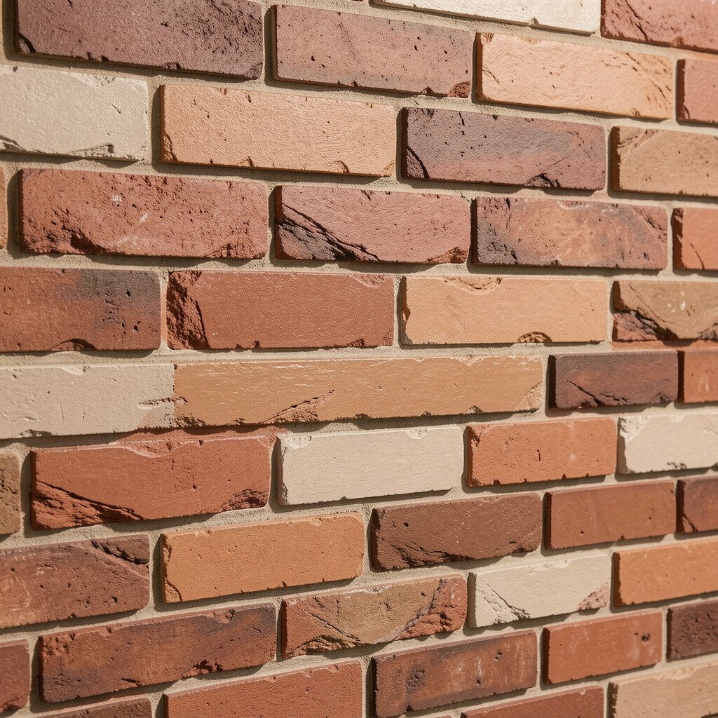
Brick-look texture can be created with molds, stamps, or specialty drywall finishes, giving walls a bold, grounded feel. The best version doesn’t just look like brick, it casts believable shadows that make the pattern feel real.
Choose paint colors that mimic mortar and brick undertones, such as warm ivory for mortar and terracotta, rust, or deep brown for bricks. For practicality, select a durable interior paint system and seal if needed, especially in entryways or kitchens. This finish is unique because it can shift from cozy to dramatic depending on your color temperature.
To personalize, you can age the look by adding a light wash layer that softens the edges and adds warmth. Consider cost by comparing a paint-and-seal plan versus rebuilding, and remember that texture projects can require more prep materials and cleaning time. Current trends often lean toward warm, natural palettes rather than stark industrial grays, so warm tones can feel more modern and inviting.
Work in sections, keep your brush coverage consistent, and step back often to check spacing and shadow balance. With careful paint selection, brick-look texture becomes a focal point that reduces the need for large wall art. If you want a calmer result, paint the brick slightly lighter and let the mortar do the highlighting.