15+ Staircase Color Schemes For Brightening Dark Hallways
Dark hallways can feel like they swallow the day’s light. A staircase, though, can act like a color ladder that pulls brightness upward.
With the right paint, stain, and accents, your steps can look welcoming, cozy, and stylish. Below are practical color schemes that work in real homes and can be tailored to your taste, lighting, and budget.
Soft ivory on the stair walls makes the space feel cleaner and brighter right away. It bounces light even when the hallway lighting is dim.
Pair the main wall color with warm greige on the trim, handrail, and stair edges for a calm, balanced look. This combination feels timeless, and it also helps hide small scuffs that show up on high-traffic stairs.
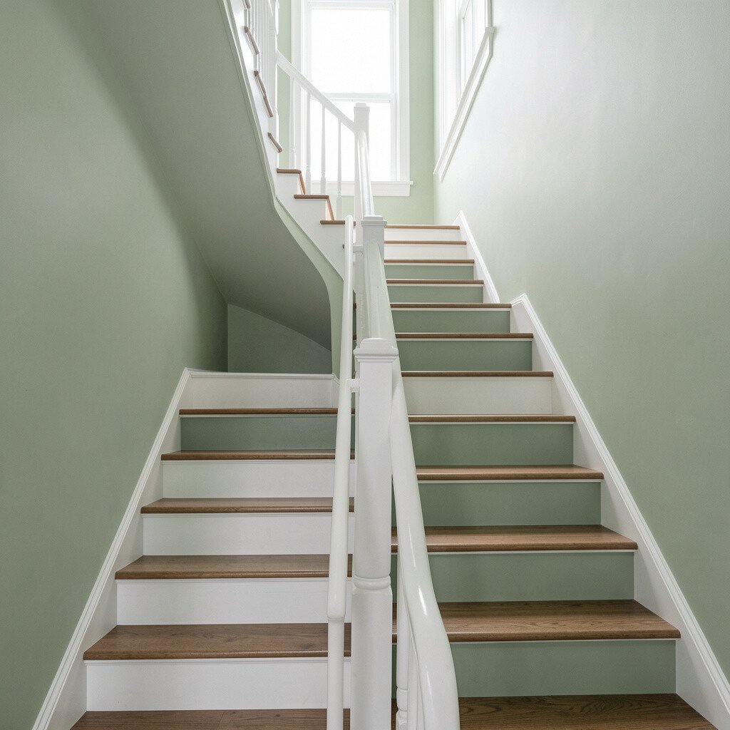
2. Light Sage With Crisp White Railings
Light Sage With Crisp White Railings
A light sage shade can bring a gentle, fresh mood to a dark hallway. It reads like morning air instead of heavy color.
Use crisp white for railings, balusters, and any doorway trim to keep edges sharp and clean. If your hallway gets a little natural light during the day, sage will glow softly without feeling loud.
For personalization, try a slightly deeper sage on the stair risers while keeping the walls light. Choose satin or semi-gloss for railings so they wipe easily after daily use.
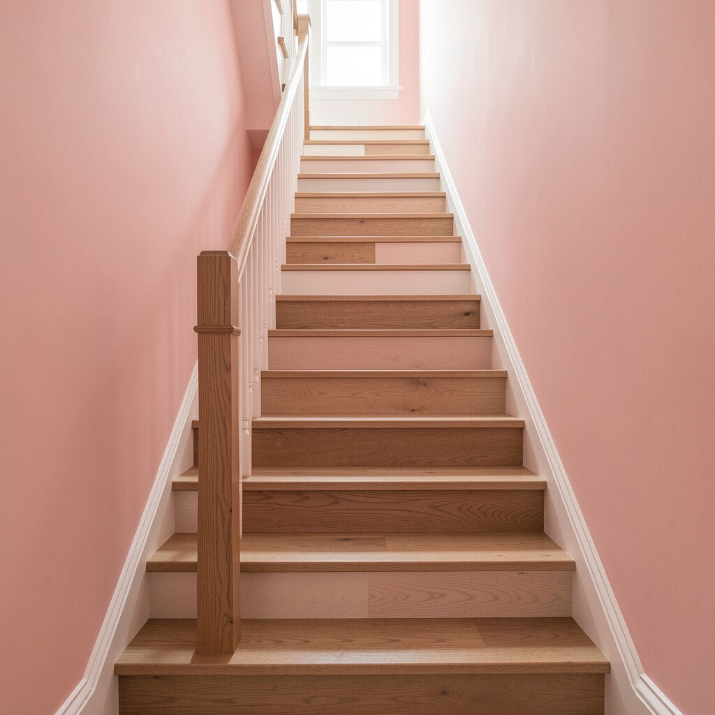
3. Blush Pink Walls With A Wood-First Stain
Blush Pink Walls With A Wood-First Stain
Blush pink can feel surprisingly elegant on stair walls, especially when the hallway lacks warmth. It adds a friendly glow without turning the space into a bold statement.
Keep the wood tone front and center with a clear or lightly warm stain on treads and banisters. The wood undertones and blush balance each other, giving the staircase a lived-in, inviting vibe.
If you want extra brightness, add white-painted details like stair nosing edges or picture-frame trim. Consider using a durable cabinet-grade paint for the wall area where hands often brush.
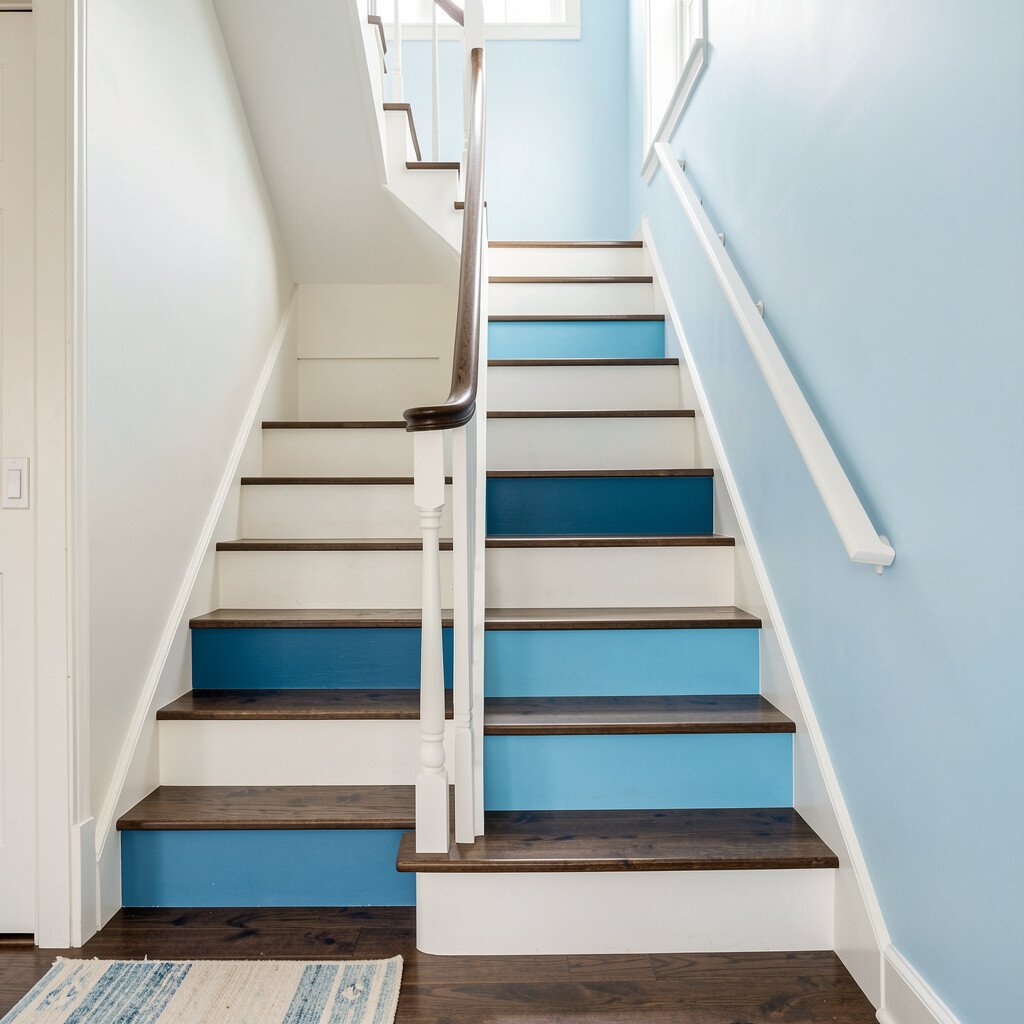
4. Coastal Blue With Bright Off-White Details
Coastal Blue With Bright Off-White Details
Coastal blue makes a dark hallway feel open, like a quiet shoreline at midday. Choose a muted version so it stays calming rather than overwhelming.
Keep off-white details on the railings, baseboards, and trim so the color looks airy. This scheme also helps the staircase look more structured, because the bright accents outline each step.
For a practical twist, match the off-white to your ceiling paint if possible. When everything shares a similar undertone, the staircase blends smoothly instead of looking patchy.
5. Buttery Yellow With Neutral Gray Trim
Buttery Yellow With Neutral Gray Trim
Buttery yellow can turn a gloomy landing into a cheerful spot you want to pause in. Even a low amount of yellow can add warmth that feels like sunshine.
Use neutral gray on the trim and handrail to keep the yellow from feeling too sweet. This creates a grown-up, modern contrast that still feels friendly.
To personalize, paint one feature section such as the underside of the top landing ceiling in the same yellow family. Just make sure the gray trim is cool enough to balance the warmth.
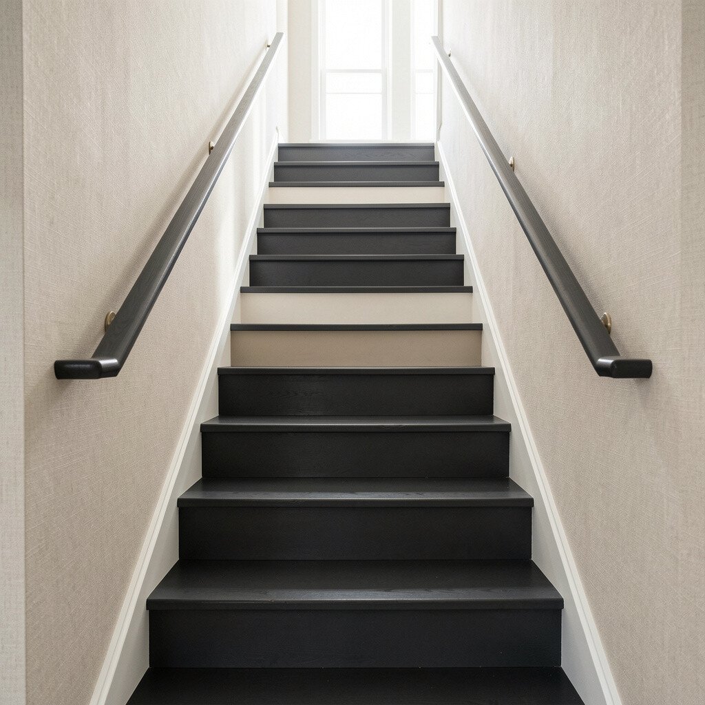
6. Charcoal Steps With Soft Linen Walls
Charcoal Steps With Soft Linen Walls
Soft linen walls keep things bright while charcoal accents add drama and depth. The contrast makes the stairs look designed instead of simply painted.
Try charcoal on risers or stair skirts while leaving walls a light warm neutral. This approach is great when your hallway already has darker flooring and you want the staircase to harmonize with it.
For cost control, you can focus paint and labor on the visible areas like risers and the handrail. Touch up the walls only where needed and use a stain-blocking primer if the surface has old marks.
7. Teal Accent Walls With White Stairs and Railings
Teal Accent Walls With White Stairs and Railings
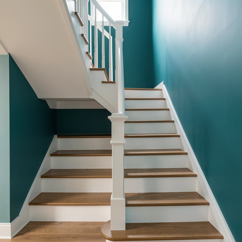
Teal accents bring energy to a dark hallway while still feeling fresh and calm. It’s a good choice if you want personality without going fully dark.
Keep the stairs and railings white so the teal acts like a highlight rather than the main load-bearing color. Bright white also makes the teal look cleaner, especially in lower light.
Personalize by adding a single narrow vertical stripe of teal along the most visible wall section. Pair it with matte paint on the wall for a softer look, and semi-gloss on surfaces you touch often.
8. Warm Taupe With Brushed Bronze Hardware
Warm Taupe With Brushed Bronze Hardware
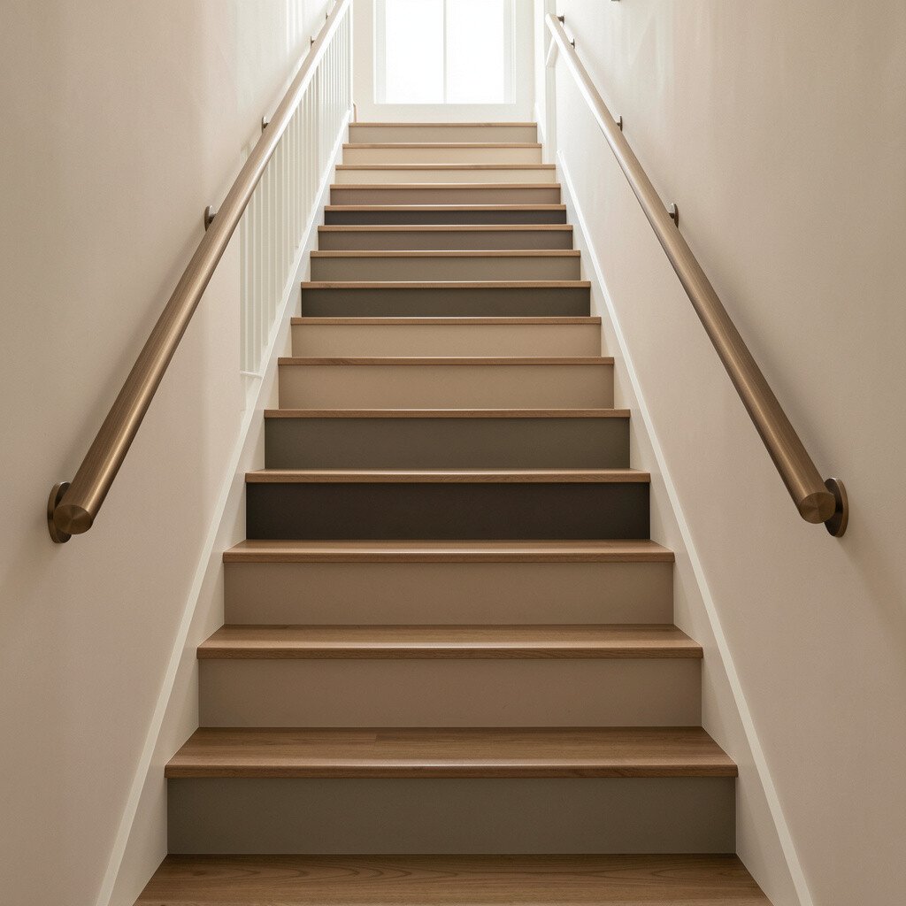
Warm taupe can make a hallway feel cozy and steady, even when the light is weak. It sits between beige and gray, so it works in many home styles.
Choose taupe walls and a lighter matching tone on trim, then finish with brushed bronze for a refined touch. Hardware in bronze tones often looks especially rich against taupe because the undertones stay consistent.
For practicality, consider a paint with good washability since staircases collect scuffs from shoes and hands. If you’re planning to update lighting too, warm LED bulbs will make taupe look richer.
Navy can feel bold at first, but on a staircase it often reads classy and secure. When paired with bright trim, the overall effect becomes crisp rather than heavy.
Go for a deep but not black navy on stair walls, and use glossy white for railings and moldings. The glossy finish reflects more light, which is helpful in dark hallways.
To personalize, consider navy on the risers and keep the wall a slightly lighter blue-gray. This gives you a layered look while still keeping the space bright.
10. Pale Charcoal Walls With Soft White Balusters
Pale Charcoal Walls With Soft White Balusters
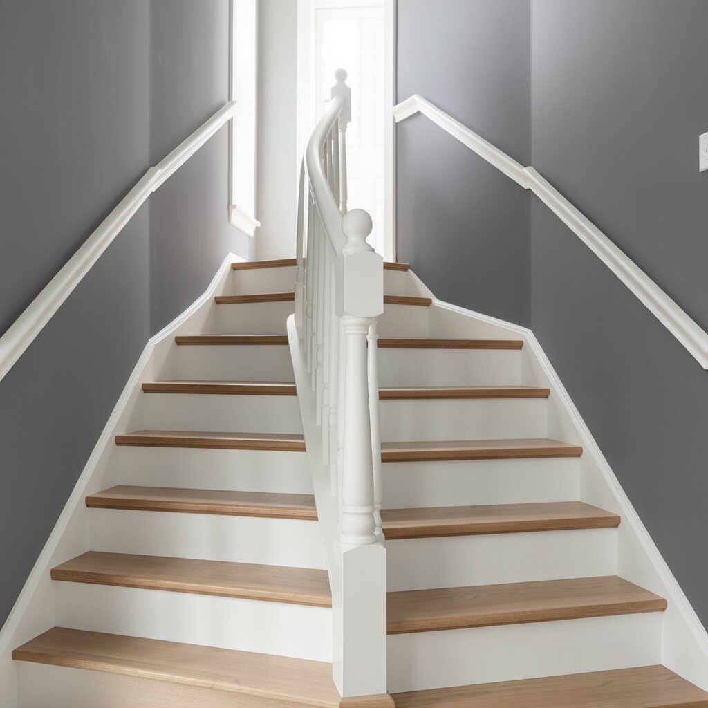
If you love a modern vibe, pale charcoal walls can make the staircase feel stylish and grounded. Just keep the shade light enough that it doesn’t swallow the space.
Then counter it with soft white balusters, railings, and trim for a bright framework. This scheme looks especially good when you have light-colored flooring or neutral furnishings nearby.
For a practical win, use a matte finish on walls and a satin finish on trim. Satin handles cleaning better, and matte hides minor wall imperfections on busy stair walls.
Try adding a runner rug with light patterning to break up the steps visually. Patterns can add brightness without requiring extra paint.
11. Terracotta Warmth With Creamy Off-White Railings
Terracotta Warmth With Creamy Off-White Railings
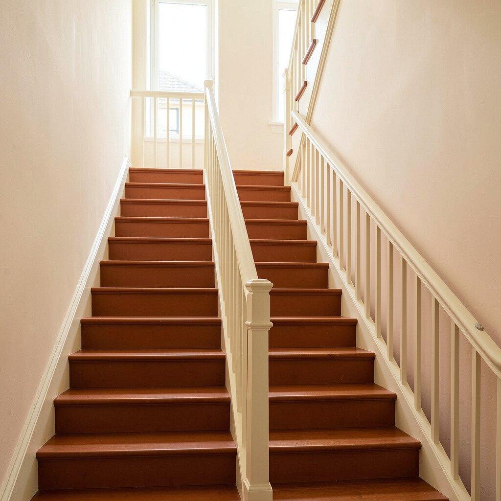
Terracotta brings a cozy, earthy warmth that can brighten a dark hallway from the inside out. It feels welcoming, like warm clay and afternoon light.
Use creamy off-white on railings and trim so the terracotta looks balanced instead of heavy. This color scheme pairs well with natural wood tones and woven textures.
To personalize, choose a lighter peachy terracotta for the walls and reserve deeper terracotta for stair risers. If you like a bolder look, add terracotta to the stair skirts while keeping treads neutral.
Keep an eye on undertones when buying paint samples, since some terracotta shades lean more red or more orange. Testing on a small section near the railing helps you see how it looks at night.
12. Mint Green With Light Wood Treads
Mint Green With Light Wood Treads
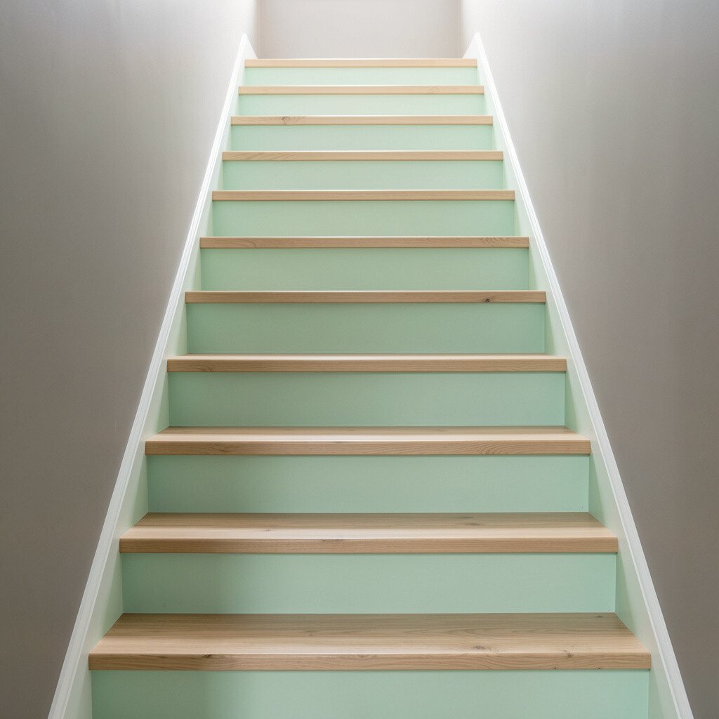
Mint green can make your staircase feel airy and playful without being childish. In dim hallways, it often lifts the mood more than you’d expect.
Pair mint walls with light wood treads for a fresh, bright contrast. The natural grain adds warmth, while mint keeps the overall look light and modern.
For practical tips, consider staining or sealing treads with a clear protective finish that resists daily wear. If you plan to paint, use painter’s tape with extra care around stair edges for clean lines.
13. Fresh White Everywhere With One Color-Edged Step
Fresh White Everywhere With One Color-Edged Step
Sometimes the best brightness comes from starting with fresh white. When your walls are bright, the whole hallway feels wider and more open.
Then choose one accent color to highlight a single element, like a color-edged step or a painted tread stripe. A gentle powder blue, soft green, or warm gray line can add personality while staying crisp.
This scheme is great for renters or anyone worried about long-term commitment, because it’s easy to change later. For a personalization idea, match the accent color to a nearby framed print or a vase color for a coordinated look.
14. Color-Blocked Neutrals With a Light Gray Landing Wall
Color-Blocked Neutrals With a Light Gray Landing Wall
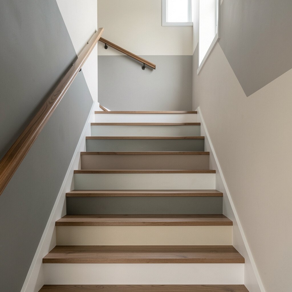
Color-blocking can add structure, especially in narrow hallways where light doesn’t travel far. Light gray on the landing wall creates a bright “window” effect at the top of the stairs.
Use warmer neutrals like beige or cream on the adjacent wall sections, then paint trim in a consistent off-white. The different neutrals make the staircase feel designed without introducing a loud color.
To keep it practical, pick two or three closely related tones so the transition stays smooth. Many homeowners choose this approach because it makes future updates easier when you change rugs or decor.
For personalization, repeat a subtle shade in a small area such as the baseboard or side of a newel post. Repetition helps the look feel intentional.
15. Cherry Red Highlights With Neutral Walls
Cherry Red Highlights With Neutral Walls
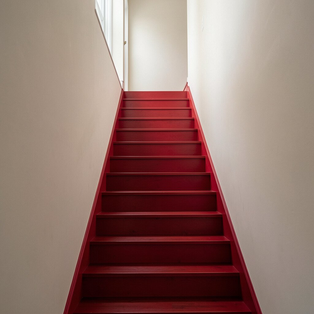
Cherry red is a bold choice, but used as a highlight it can brighten a dark hallway in a dramatic way. It pulls the eye upward and makes the staircase feel lively.
Keep the main walls neutral, like light beige or warm gray, and reserve cherry red for the handrail, stair skirt, or a single stripe. When the red is limited, it feels stylish instead of overwhelming.
For cost considerations, painting smaller trim elements can deliver big impact with less material and labor. Choose a durable enamel paint for the rail so it stands up to frequent contact.
Personalize by matching red accents with seasonal decor, like a wreath or framed art, so the staircase stays cohesive year-round.
16. Sunlit Ochre With Off-White Wainscoting
Sunlit Ochre With Off-White Wainscoting
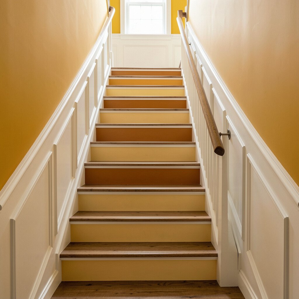
Sunlit ochre adds a sunny glow that feels comforting and inviting. It works beautifully in staircases because the color can follow the upward movement of the steps.
Use off-white wainscoting or panel sections to keep the look elegant and bright. This combination also hides wear better on the lower parts of stair walls, which often take the most scuffs.
For personalization, pair ochre with dark walnut or espresso-toned wood details if your home has those finishes. If not, choose a lighter stain so the ochre still feels light.
To finish the look, add warmer lighting above or near the landing. Warm bulbs make ochre look rich and helps the paint glow instead of looking flat in the evening.