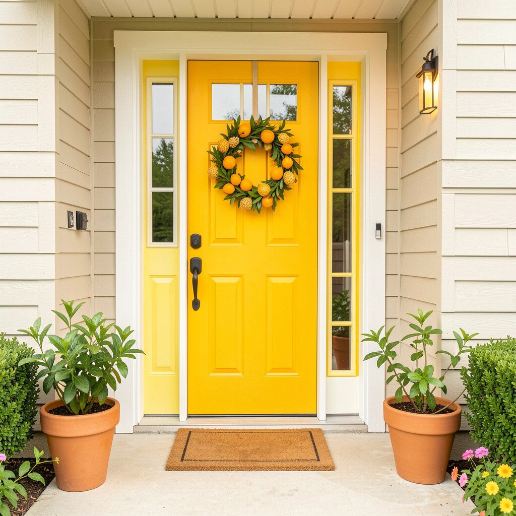
Think of warm citrus tones that glow in daylight, like tangerine and soft golden yellow. Pair them with creamy white trim so everything feels crisp rather than loud. The visual effect is like sunshine on your doorstep.
You’ll get a friendly first impression that works for many home styles, from modern to classic. To keep the look balanced, paint only the front door and maybe the porch posts in the strongest color. Try adding natural textures like a light stone doormat so the brightness still feels grounded. For personalization, choose a door color that matches your favorite citrus shade and then echo it in a small doormat or wreath ribbon. If you want a budget-friendly approach, start with washable exterior paint samples and swap in seasonal decor instead of repainting everything at once.
2. Coral Pop With Soft Sand Walls
Coral Pop With Soft Sand Walls
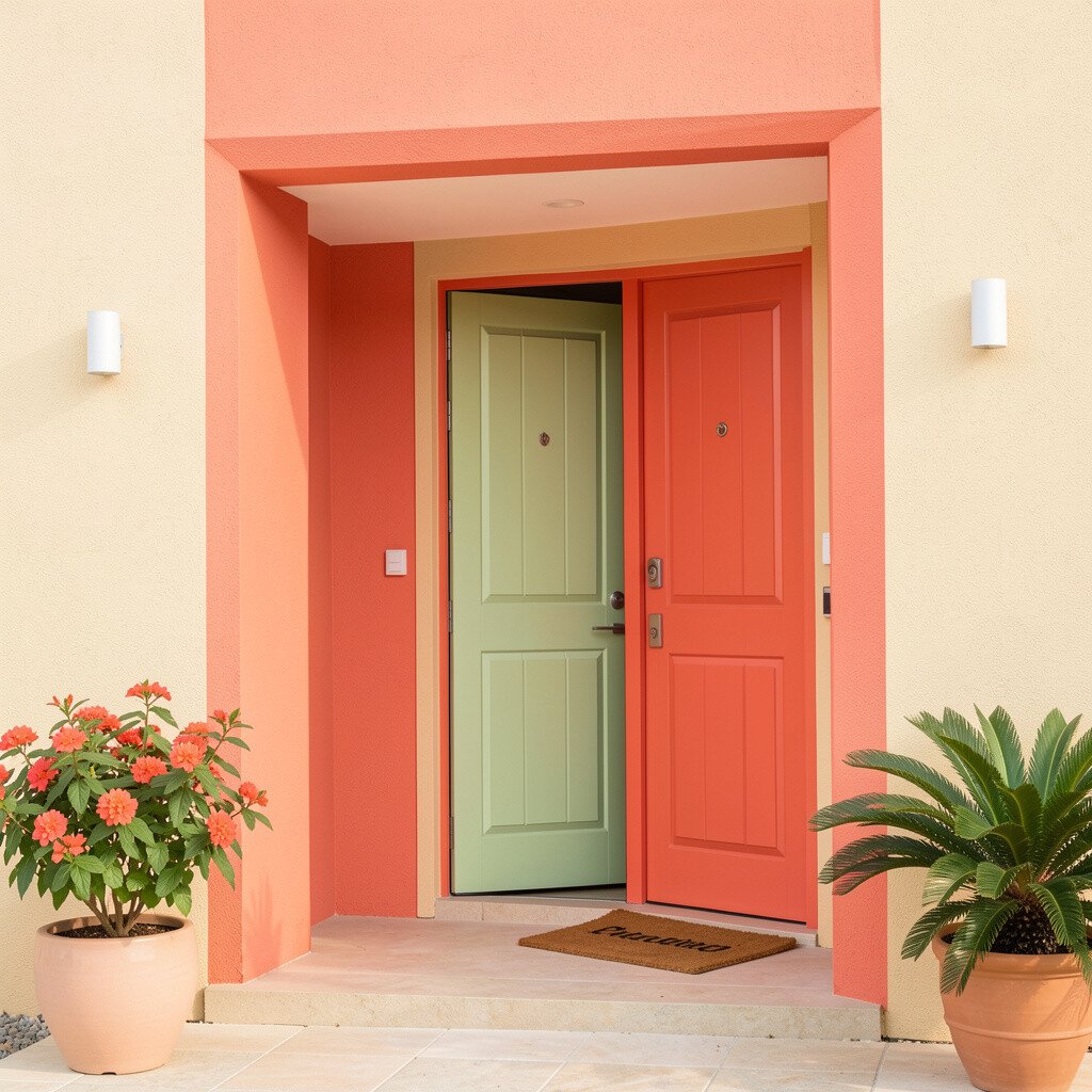
Coral feels playful and warm, especially when paired with sand-colored siding or stucco. You’ll notice how the colors hug each other, making the entry look cozy even on cloudy days.
This palette brings cheerful energy without turning the space into a carnival. Use coral for the door or for one accent element like a planter shelf and keep surrounding walls a gentle sand tone.
To make it practical, seal your door with a durable exterior finish so the color stays vivid through rain and sun. A nice trend right now is pairing peachy tones with natural greenery, so add a wreath that includes eucalyptus or trailing ivy for an easy designer vibe. If cost is a concern, focus your spending on the door hardware, such as a fresh handle or knocker, and save painting for later seasons. You can also personalize by selecting coral undertones that match your front porch lighting, since warmer bulbs make coral look extra inviting.
3. Ocean Teal With Driftwood Brown
Ocean Teal With Driftwood Brown
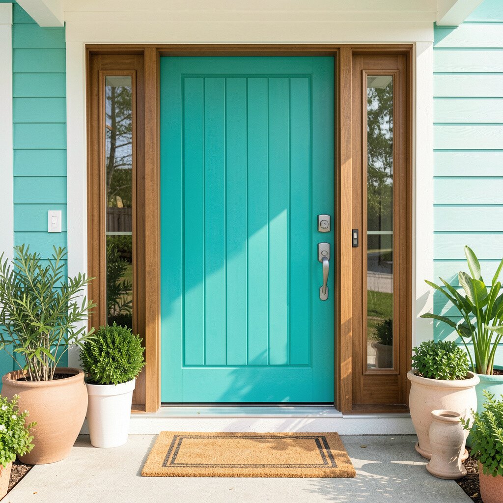
Ocean teal brings a calm, coastal cheer that feels fresh and confident. Driftwood brown trim and railings add the grounding contrast that makes teal look rich instead of harsh.
When you combine cool and earthy tones, the entry reads as welcoming and tidy. This pairing is also great for homes with stone steps or wood features because it matches those textures beautifully.
For practical tips, keep teal on the door and use driftwood tones for posts, shutters, or the framing around the entry. Personalization is easy through accessories, like seashell planters, blue glass lanterns, or a doormat with a wave pattern. Current trends lean toward coastal-meets-modern, so choose clean-lined planters and avoid overly fussy motifs. If you’re watching costs, you can repaint just the door and swap out a lantern or planter set at the same time for a full refresh without a major project.
4. Meadow Green With Warm Cream Accents
Meadow Green With Warm Cream Accents
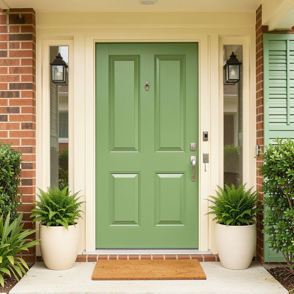
Meadow green creates a fresh, welcoming feeling that instantly softens the look of an entry. Add warm cream accents around the door and window trim so the whole area feels light and friendly.
This palette is unique because it looks cheerful but still natural, like a garden path in spring. It also hides scuffs better than very light colors, which is helpful for high-traffic doors and steps.
5. Berry Wine With Soft Gray Trim
Berry Wine With Soft Gray Trim
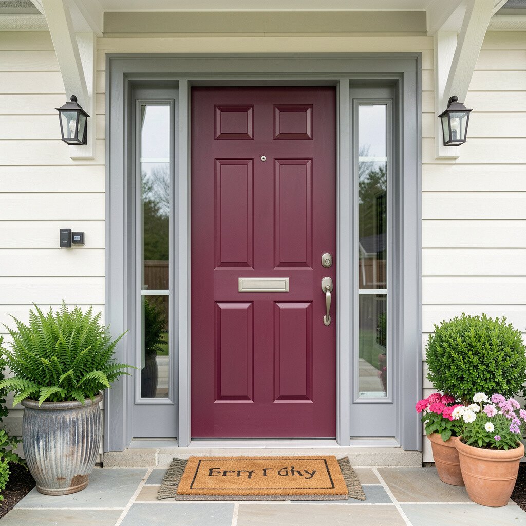
Berry wine tones look rich and celebratory, like a deep magenta or cranberry on the door. When you contrast it with soft gray trim, the entrance feels elegant instead of overwhelming.
You’ll benefit from a color that stands out while still feeling refined, especially if your home has brick or muted siding. For practical results, choose satin or semi-gloss paint for the door so it wipes clean and shines slightly in the evening.
To make this palette feel personal, repeat the berry color in small items like a runner, welcome flag, or planter flowers. A current trend is mixing jewel tones with modern hardware, so try a brushed nickel or matte black lockset to keep it stylish. Cost can be controlled by focusing paint on the door and using affordable floral arrangements for pops of color during holidays. If your lighting is warm, berry shades can look even deeper, so consider testing a sample swatch at night before committing.
6. Bright Aqua With White and Natural Limewash
Bright Aqua With White and Natural Limewash
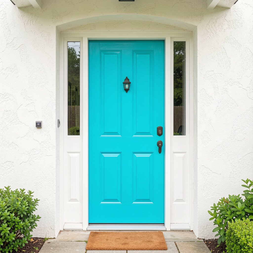
A bright aqua entry feels energetic and fun, like a splash of color against clean white. The charm grows when you add limewash-like texture on walls or columns, since it keeps the look airy.
This palette is perfect if you want a lively vibe that still feels fresh and breathable. It can also make small entries feel bigger because white creates visual space while aqua adds a cheerful focal point.
7. Sunny Yellow With Sky Blue Details
Sunny Yellow With Sky Blue Details
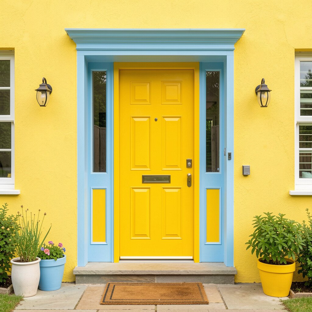
Sunny yellow on the door can make your home feel like it’s greeting people with open arms. Add sky blue details in shutters, railings, or planters so the colors feel coordinated and playful.
Yellow is one of those shades that boosts mood, especially in the morning light. It’s also easy to personalize because you can keep the rest of the entry simple and then play with seasonal decor in matching blues and yellows.
For practical tips, use exterior-grade paint and make sure the surface is properly prepped, because yellow can show uneven coverage. Consider pairing the palette with modern lanterns and a clean welcome mat to follow current trends that favor crisp, graphic looks. If cost is a concern, repainting just the door is often enough, then update planters and seasonal wreaths for the rest. You can also balance the brightness with darker house numbers or doorknob finishes so the entrance feels intentional rather than random.
8. Saffron Orange With Charcoal Contrast
Saffron Orange With Charcoal Contrast
Saffron orange brings a bold, friendly energy that feels warm and inviting. Pair it with charcoal trim so the entrance has strong contrast and looks tailored.
This combination stands out beautifully on siding that is neutral, like beige, white, or light gray. The charcoal also helps hide wear on railings and steps, which is great for real-life use.
9. Raspberry Pink With Whitewashed Wood
Raspberry Pink With Whitewashed Wood
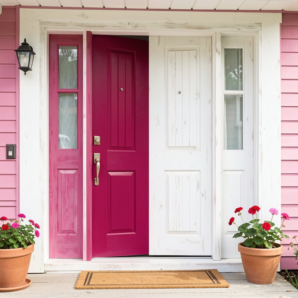
Raspberry pink is cheerful and a little unexpected, especially when you soften it with whitewashed wood tones. The look feels like a quaint garden gate, updated for modern style.
You’ll get a unique entrance that feels personal, romantic, and full of character. Whitewashed elements also keep the palette from getting too heavy, so the area still feels light and welcoming.
For practical tips, use raspberry on the door and keep the rest of the trim in whitewashed or pale wood finishes. Personalize with bright blooms in planters and add a woven doormat to increase texture without extra paint. Current trends favor mixed materials, so pairing painted metal with wood and natural fibers looks right on trend. For cost considerations, start with the door paint first, then add inexpensive accent items like a wreath and seasonal lanterns so the transformation is noticeable fast.
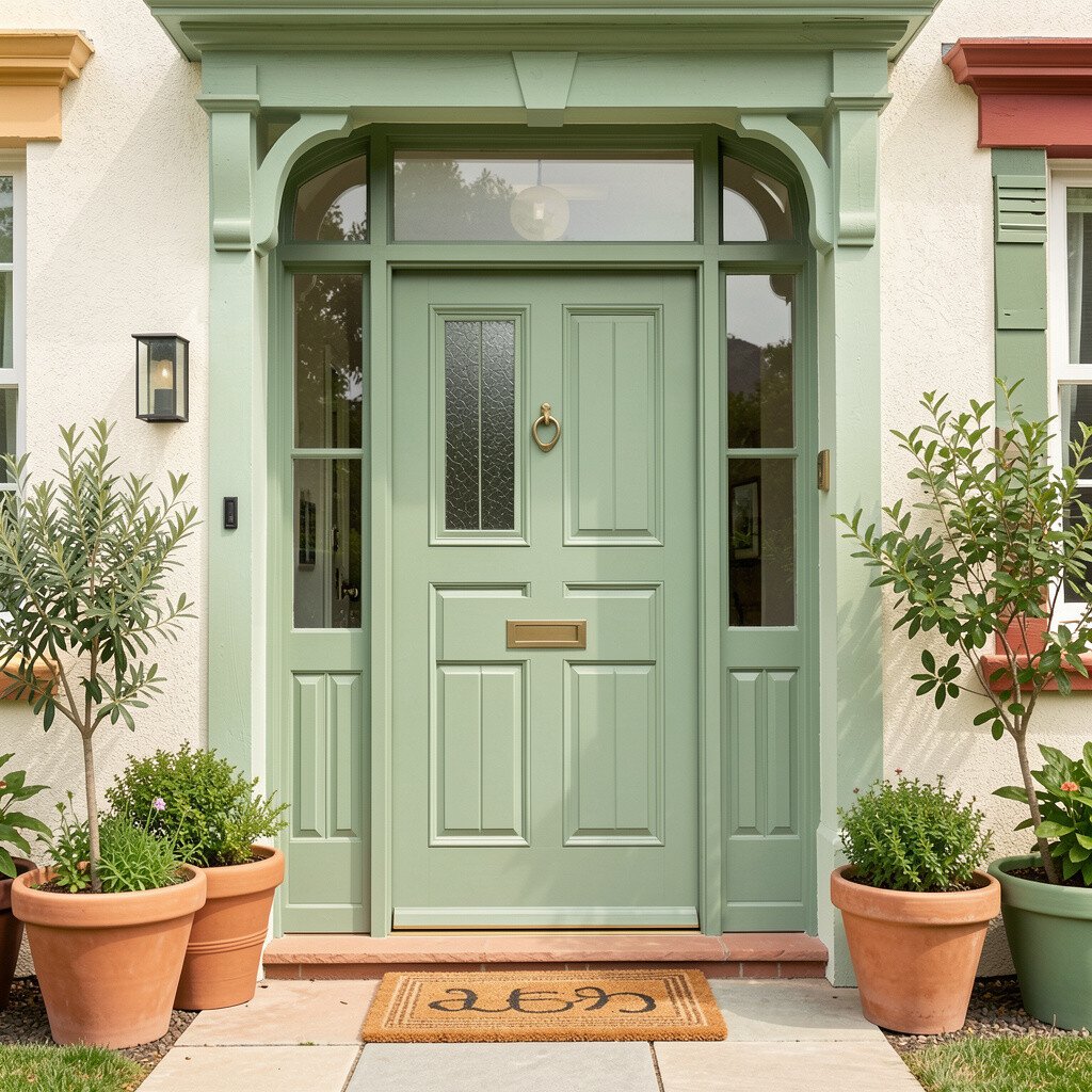
Sage green feels calm, while terracotta adds warmth that makes the entrance feel alive. Together, they create a cozy palette that fits many homes, especially those with brick or earthy stone.
This pairing is practical because it hides dirt and fingerprints better than very bright colors. It also gives you a lot of styling freedom since you can choose herbs, citrusy plants, or classic red flowers to match.
11. Electric Blue With Crisp Buttercream
Electric Blue With Crisp Buttercream
Electric blue can feel bold, but when you pair it with buttercream trim, the entry becomes fun rather than intimidating. The buttercream tone keeps everything soft and creates a friendly contrast with the deep blue door.
This palette helps your home feel memorable, which is a nice benefit if you want curb appeal that stands out in a good way. It also works well with modern house numbers and sleek lighting, so the entrance looks current.
For practical tips, coat the door with a quality exterior primer first, since bright colors often need solid coverage. Personalization can be as simple as matching your planters to the buttercream trim and choosing a wreath with blue and white flowers. A current trend is “color blocking” at the entry, so keep the rest of the facade mostly neutral and let the door do the talking. If you’re watching costs, paint the door and then refresh hardware, like hinges or a knocker, since small changes make a big visual impact.
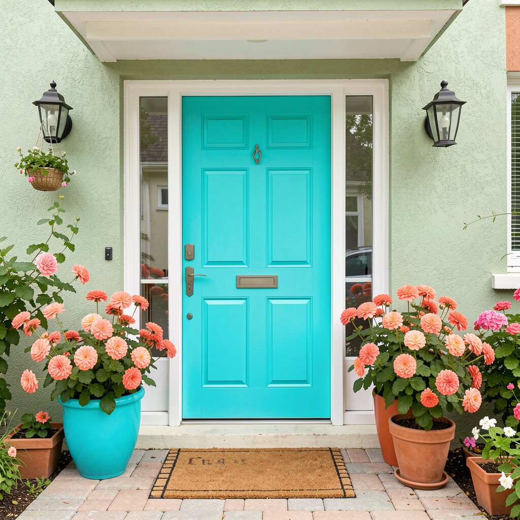
12. Turquoise With Coral Flower Power
Turquoise With Coral Flower Power
Turquoise gives you a lively coastal feel, and coral accents add that extra burst of cheer. The mix feels playful, especially when you use it in planters, door mats, and small decorative items around the entrance.
You’ll enjoy the benefit of flexibility, since you can swap accessories each season without repainting. This palette is also unique because it’s not locked into just one color for the entire doorway, which helps it feel layered and styled.
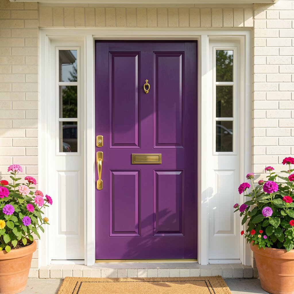
13. Plum Purple With Gold Hardware Shine
Plum Purple With Gold Hardware Shine
Plum purple on the door looks bold and welcoming, like a fancy porch with a warm glow. When you add gold-toned hardware, the whole entry feels festive and polished.
This palette is great for evenings because plum holds depth and gold reflects light nicely. It also offers a strong focal point that pairs well with neutral siding and natural stone pathways.
For practical tips, choose finishes that resist fading and scratches, since purple can look uneven if coverage is too thin. Personalize by adding planters with white blooms or dark green foliage so the gold detail feels intentional. Current trends lean into warm metallics with rich colors, so a brushed gold knocker or address numbers fits right in. Cost considerations can be managed by replacing just one hardware piece first, then painting the door later if needed, since either change makes a noticeable difference.
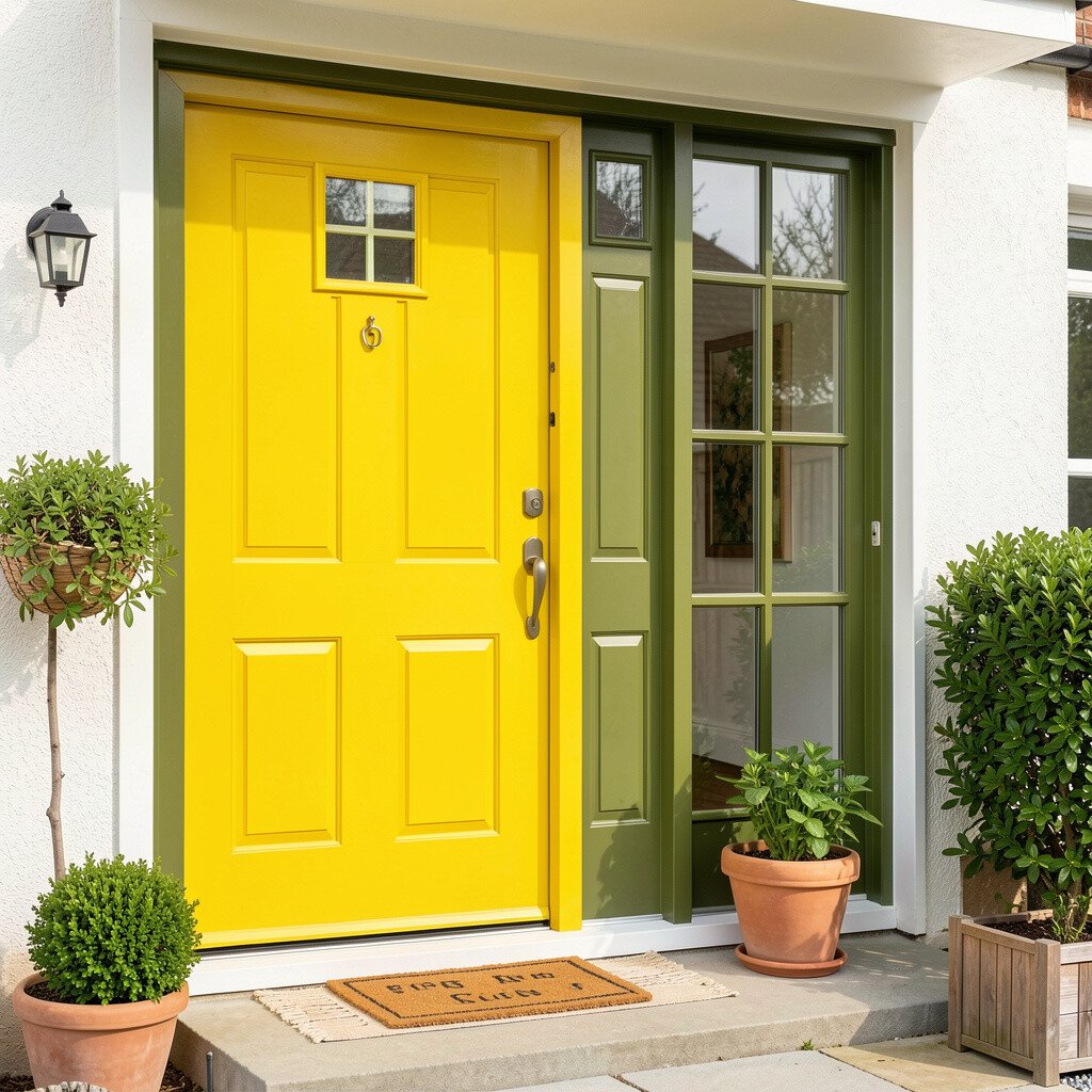
14. Lemon Yellow With Olive Leaf Green
Lemon Yellow With Olive Leaf Green
Lemon yellow feels bright, while olive green adds a soft, rustic calm. Together, they look like a Mediterranean garden doorway that’s always ready for guests.
This palette benefits you by creating a cheerful look that doesn’t feel too loud, especially when olive tones are used for planters and accents. It’s also an easy match for woven baskets, terracotta pots, and simple greenery.
15. Petal Pink With Cool Gray and White
Petal Pink With Cool Gray and White
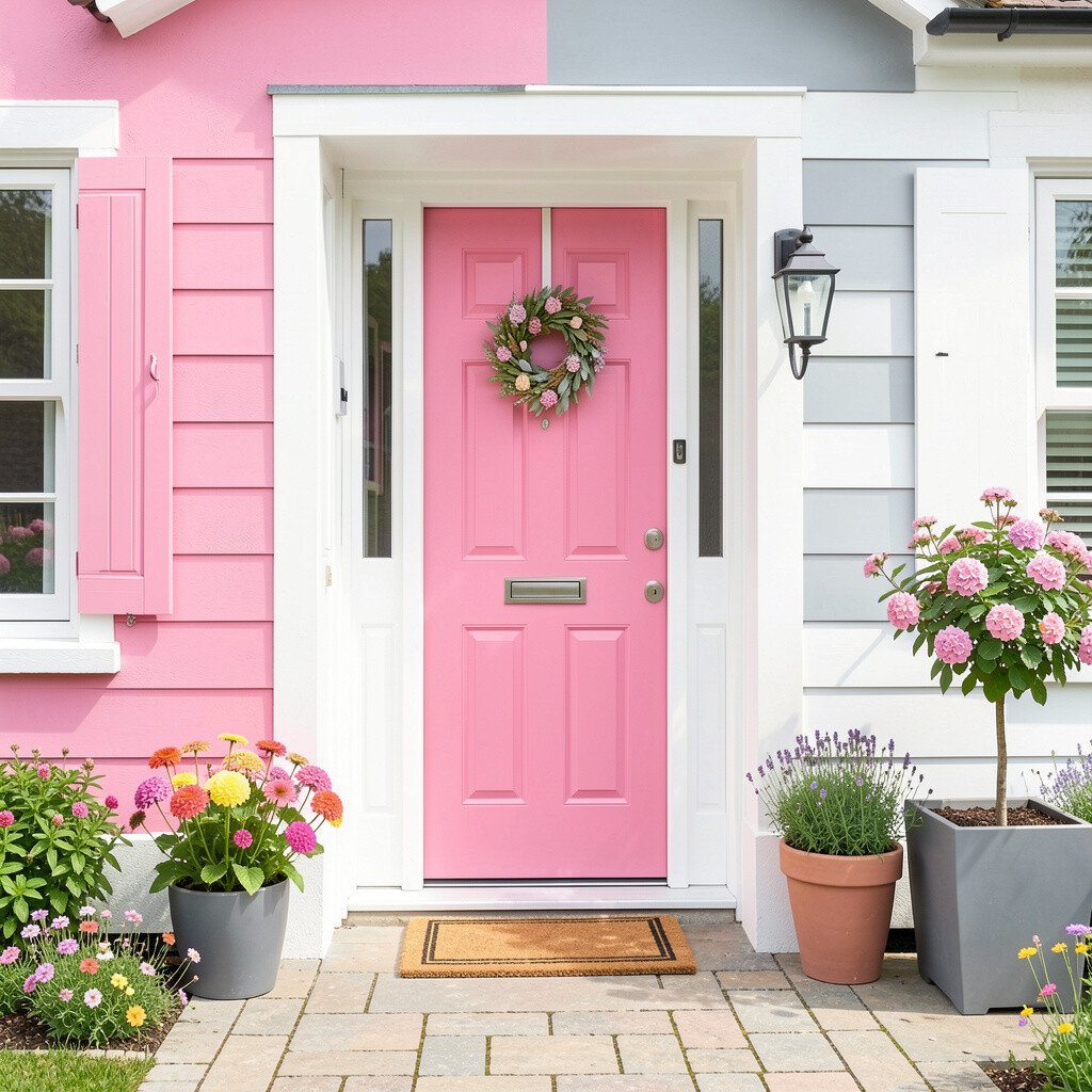
Petal pink is sweet and welcoming, especially when you keep trim colors cool and crisp. Use cool gray and clean white to frame the doorway so the pink feels fresh rather than heavy.
This combination can make an entry feel airy and modern, which is a nice perk for homes that already have light siding. It’s also unique because it blends a soft romantic shade with practical, muted trim that hides scuffs on railings.
For practical tips, paint the door and then repeat the pink in small, removable decor like seasonal wreaths or ribbon on planters. Personalization is easy because pink pairs well with many flower colors, from white to deep magenta to soft lilac. Current trends include soft, “gentle” color stories, so this palette fits well with minimalist front porch styling. If cost is a concern, you can keep the wall trim as-is and spend on door paint plus a couple of affordable planters for a big impact.
16. Charred Teal With Creamy Off-White
Charred Teal With Creamy Off-White
Charred teal looks moody and cheerful at the same time, like a deep ocean at dusk. Pair it with creamy off-white for a warm, inviting contrast that feels elegant.
This palette is unique because it balances richness and comfort, which helps entrances feel welcoming even when the rest of the exterior is simple. It also works beautifully with black or dark bronze hardware for a cohesive look.
For practical tips, consider using teal in a slightly satin finish on the door so it doesn’t look flat in different weather. Personalize with bright doormats, colorful seasonal flowers, or a wreath that mixes teal leaves with warm accents. Current trends show homeowners leaning into deeper tones with soft neutrals, so this choice feels current without being flashy. Cost considerations are manageable since you can paint the door first and add decor later, spreading out expenses while still enjoying the refreshed look right away.
17. Coral Sand With Bright White Trim
Coral Sand With Bright White Trim
Coral sand creates a soft, sunlit feel that’s friendly and easy to live with. When you add bright white trim, the entrance looks clean, cheerful, and sharply finished.
This palette is practical for day-to-day life because coral sand tones tend to show less staining than very pale colors. It also flatters many materials, including vinyl siding, stucco, and painted brick.
18. Forest Green With Sunflower Pops
Forest Green With Sunflower Pops
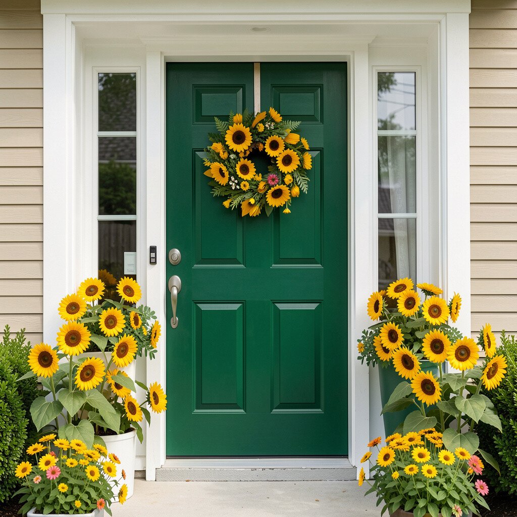
Forest green is bold and classic, and sunflower pops add instant warmth. The contrast feels cheerful and grounded, like a backyard garden that invites you in.
You’ll benefit from a color story that supports both summer vibrance and fall charm, since sunflower accents can change with the season. The uniqueness comes from keeping the base deep and calm while letting small colorful elements bring the joy.
For practical tips, paint the door forest green and use bright sunflower tones in removable items like a wreath, doormat, and planter flowers. Personalize by choosing a specific sunflower shade, such as warm golden or slightly orange-yellow, to match your lighting and house numbers. Current trends favor nature-forward styling, so add textured grasses or dried elements in autumn to keep the porch looking designed. Cost considerations are friendly here because you can refresh the entrance with plants and decorations rather than repeated repainting.
19. Magenta Punch With Light Mint Accents
Magenta Punch With Light Mint Accents
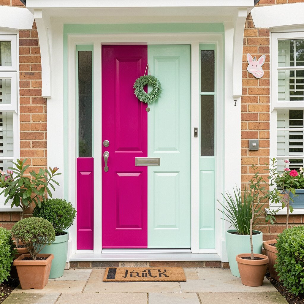
Magenta brings playful excitement, while light mint adds a fresh, modern twist. When you combine them thoughtfully, the entry feels energetic but still balanced and friendly.
This palette stands out because it pairs a bold statement color with a cool accent that feels clean and light. It’s a great choice if you want a front door that becomes the main character without turning the entire facade into a single loud block.
For practical tips, keep magenta on the door and use mint in small areas like planters, painted numbers, or trim details. Personalize by choosing outdoor lighting that flatters both shades, since warmer bulbs can deepen magenta while mint stays crisp. Current trends include refreshing color accents that feel “new” and airy, and mint is a popular way to do that. Cost considerations are easy to manage since you can repaint just the door and swap in mint-colored accessories for a layered, stylish look.