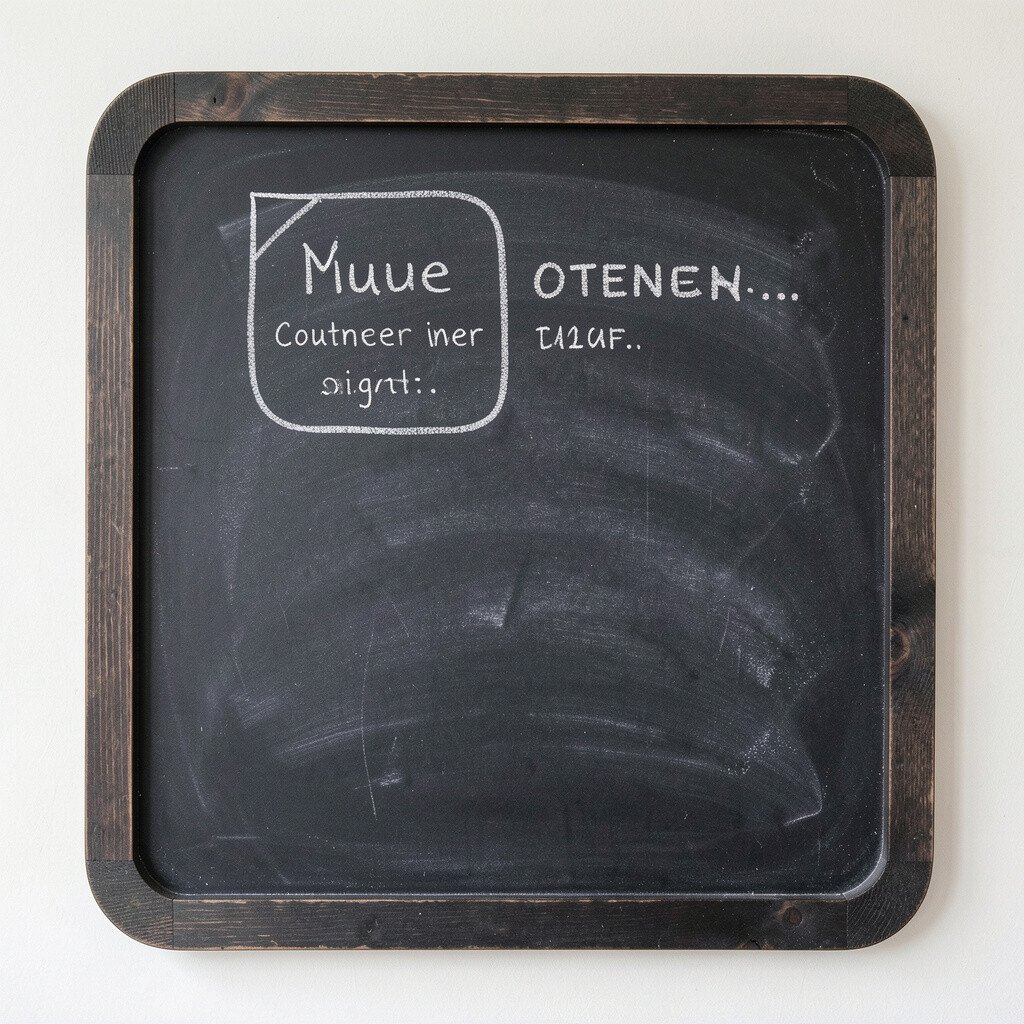
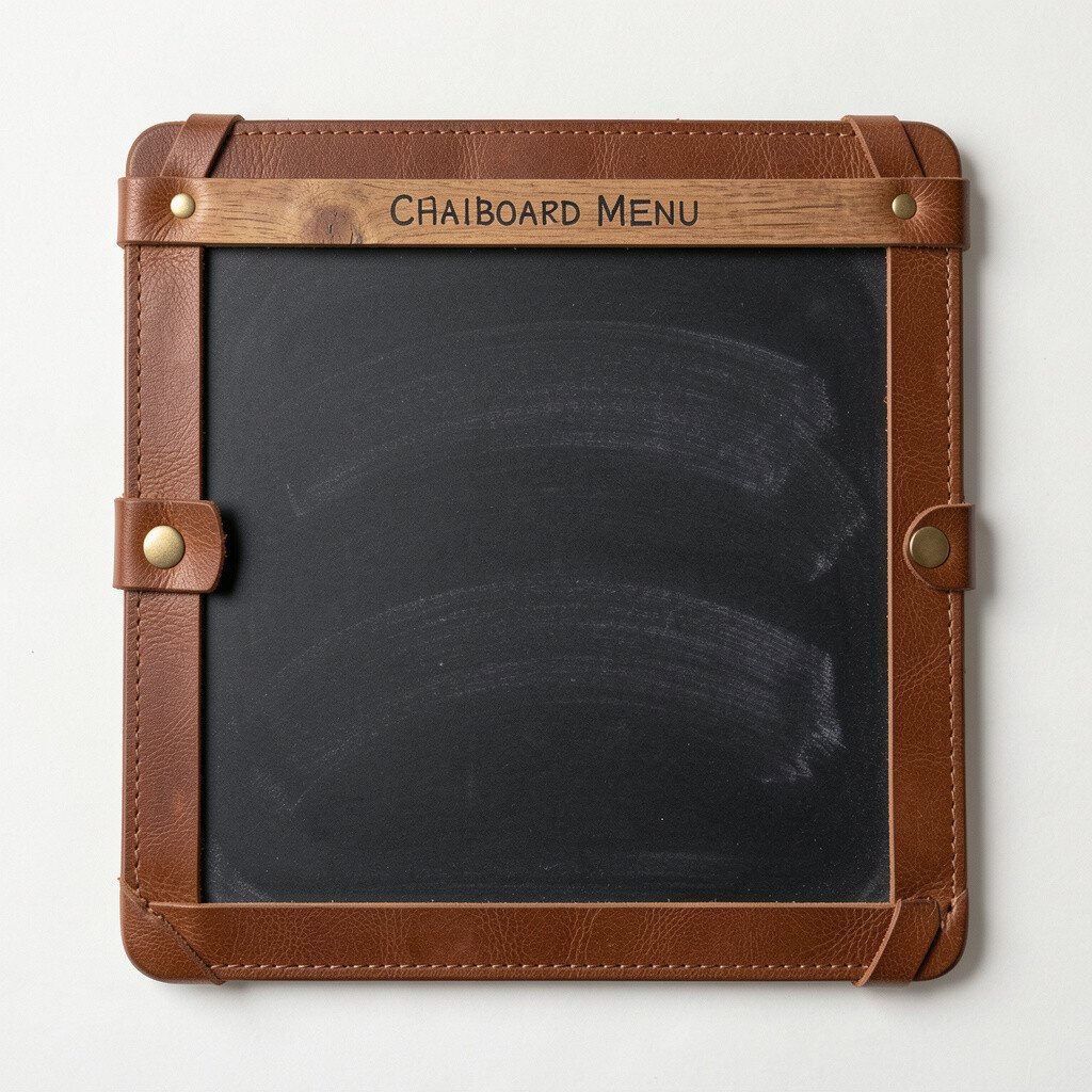
Picture a small chalkboard panel with soft rounded corners sitting right on the counter. The handwritten menu looks warm, like it belongs in your shop, cafe, or studio.
Use thick white chalk for key items so the most important lines pop fast. Keep the layout simple with one section for favorites and another for daily specials. For personalization, write your shop name at the top in a larger script and add a tiny icon beside each category.
2. Vintage Window-Frame Chalkboard
Vintage Window-Frame Chalkboard
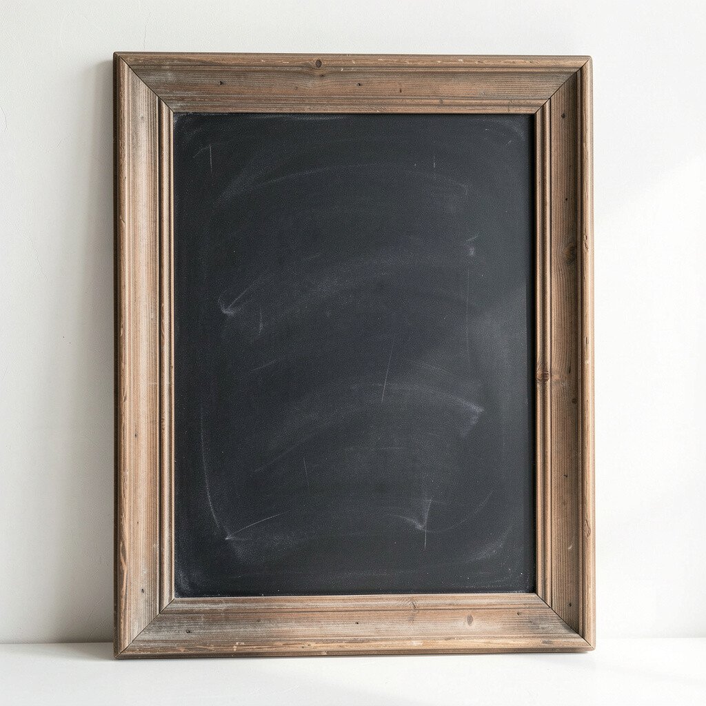
Imagine a chalkboard set inside a reclaimed window frame, with old paint edges peeking out around the writing. From the street or doorway, it feels like a story you can step into.
Write with a casual rhythm, leaving a little blank space so the text breathes. This sign works great near windows because natural light makes the chalk marks look crisp. If you want a budget-friendly twist, hunt for a cheap frame and sand it lightly before mounting your board.
For practical placement, angle the sign slightly so people at different heights can read it. Add small spacing rules by using straight lines for prices and softer swirls for item names. Current trends favor mixed textures, so pairing the rustic frame with clean lettering looks fresh without trying too hard.
3. Vertical Chalkboard Menu on a Stand
Vertical Chalkboard Menu on a Stand
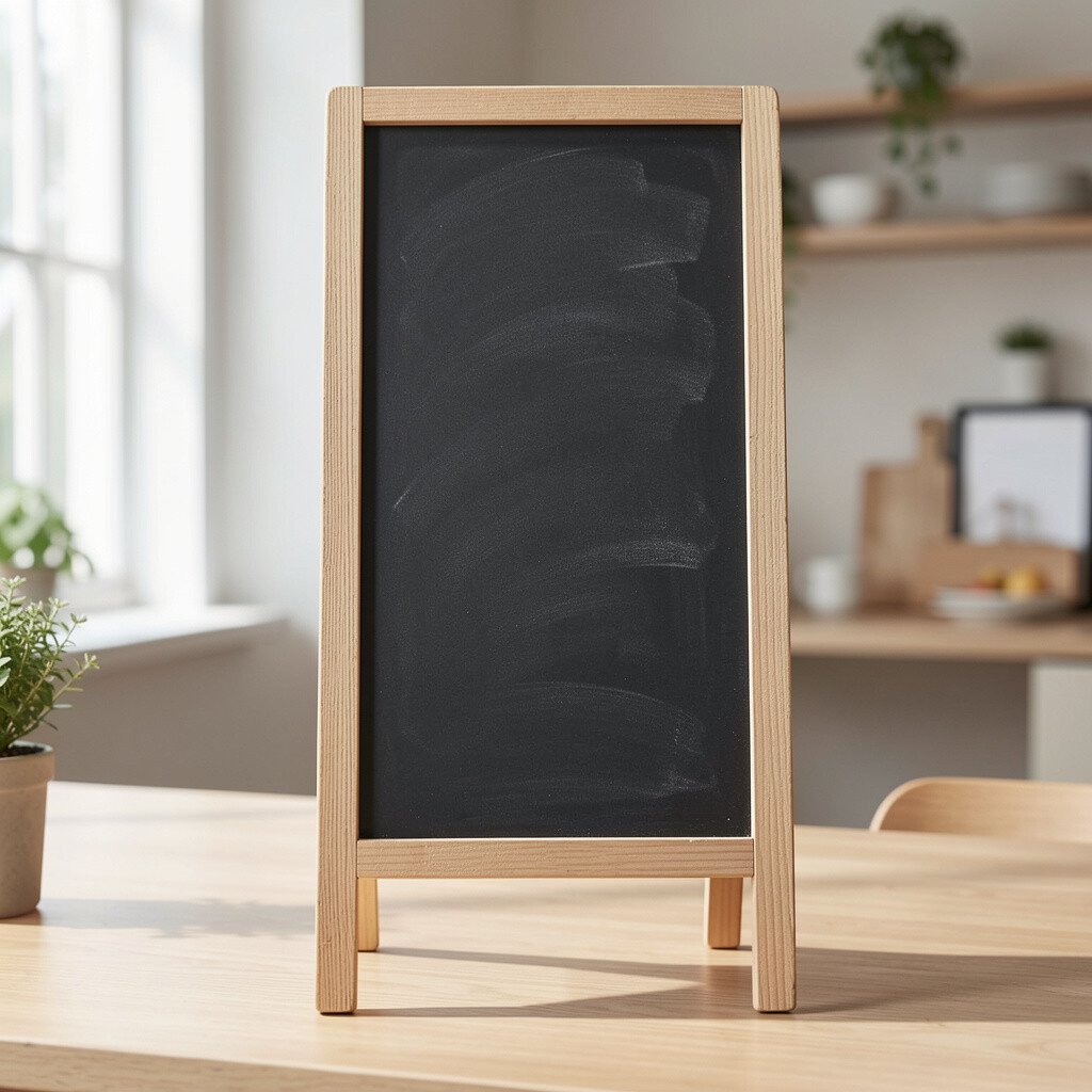
Think of a tall board on a slim stand that faces guests as they wait in line. The vertical layout helps you guide the eye from top to bottom without clutter.
Choose a slim frame to save space, then divide the menu into a few stacked sections. Use different chalk thicknesses to emphasize sections and keep prices aligned. Personalize it by writing seasonal words in a slightly different style, like “Fresh” or “Hot,” to match your vibe.
For practical tips, check readability from about an arm’s length away and adjust your font size. If your board smudges easily, wipe it with a damp cloth, dry it fully, and avoid touching the writing. A current trend is using minimal copy, so keep each line short and let descriptions stay brief.
Cost considerations are friendly here since you can buy a basic stand or even reuse one from an old display. A vertical sign also lasts longer because it’s less likely to get bumped than a wall panel.
4. Weekly Special Grid with Icons
Weekly Special Grid with Icons
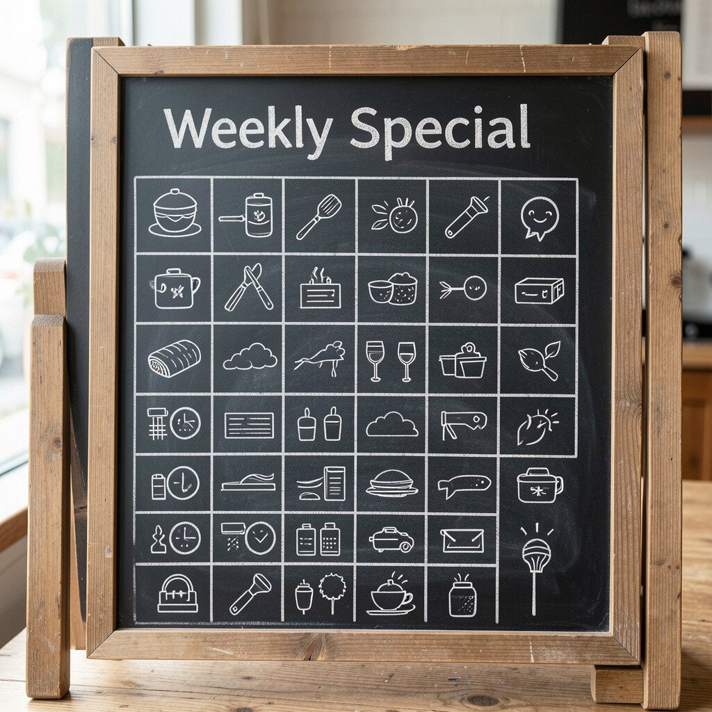
Visualize a chalkboard filled with a tidy grid, where each item sits inside a neat box with a small icon. It feels playful but still easy to scan.
Use icons like a leaf for salads, a flame for hot sandwiches, or a cookie for desserts so guests spot ideas instantly. Keep the grid consistent by using the same box size and spacing. To personalize, swap the icons each week and add a mini note about the mood of the day.
Imagine a classic black surface where most text is white, but a few lines are highlighted with blue, green, or red chalk. Those little color pops make the menu feel current and fun.
Pick one accent color for prices or for vegetarian options so guests quickly understand what matters. This setup keeps readability high even in dim lighting. For personalization, match accent colors to your branding or your season, like warm orange for fall drinks.
Practical tips help keep things clean: use masking tape lightly to guide straighter lines, then remove it before the chalk fully powders. Costs are usually manageable because colored chalk sets are easy to find. A trend you’ll notice in many cafes is selective color use, which makes the board look intentional instead of messy.
6. Mini Blackboard Tags for Bite-Sized Menus
Mini Blackboard Tags for Bite-Sized Menus
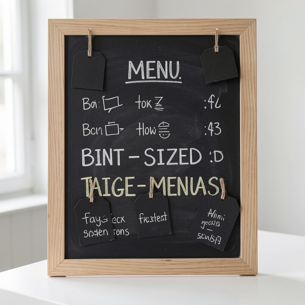
Picture several small chalkboards hanging at different heights, like charming labels for each section. Guests can read bites and highlights without feeling overwhelmed.
Use small tags for drinks, sides, and desserts so each sign stays focused. Hang them with twine or brackets and keep the writing bold and short. This style is unique because it feels like a curated gallery, not a single crowded board.
For practical tips, keep your font size consistent across all tags and avoid long sentences. Personalize each tag with a tiny doodle that matches the item, like a star for signature items. Costs can stay low since you can start with a few small boards and add more later as you refine your menu.
7. Sliding Menu Panel for Easy Updates
Sliding Menu Panel for Easy Updates
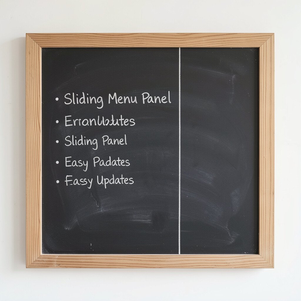
Imagine a chalkboard in a frame with a sliding panel so you can swap portions without rewriting everything. It looks sleek and saves time during busy days.
Write a baseline menu on the fixed section and keep specials on the sliding part. This gives you control over what changes most often while keeping the rest neat. Personalize the frame with your shop colors using a simple paint wash or a stain.
For practical tips, choose a hardware style that moves smoothly, then test it before mounting so it won’t snag. This is a smart option for businesses that update menus daily. Cost considerations vary, but a DIY frame with simple rails can be much cheaper than custom storefront hardware.
8. Chalkboard Menu with Brush-Lettering Style
Chalkboard Menu with Brush-Lettering Style
Think of expressive brush-lettering on a matte black board, with thick and thin strokes that feel artistic. The menu looks handmade, and guests trust that it’s cared for.
Keep the lettering legible by using larger words for items and smaller text for descriptions. Add soft flourishes around section headers so it feels lively. For personalization, practice a signature style for your top three menu items so they stand out instantly.
Practical tips include using a chalk marker if your brush style gets shaky, then switching back to chalk for final accents. This approach feels unique because it combines classic chalk with modern typography. It’s also a current trend in branding, where menus look like small posters rather than just lists.
Cost is usually low since brushes and chalk markers are affordable, and you can reuse them for many updates. The main investment is practice, and the payoff is a board that guests want to photograph.
9. Chalkboard Menu on a Farmhouse Pegboard
Chalkboard Menu on a Farmhouse Pegboard
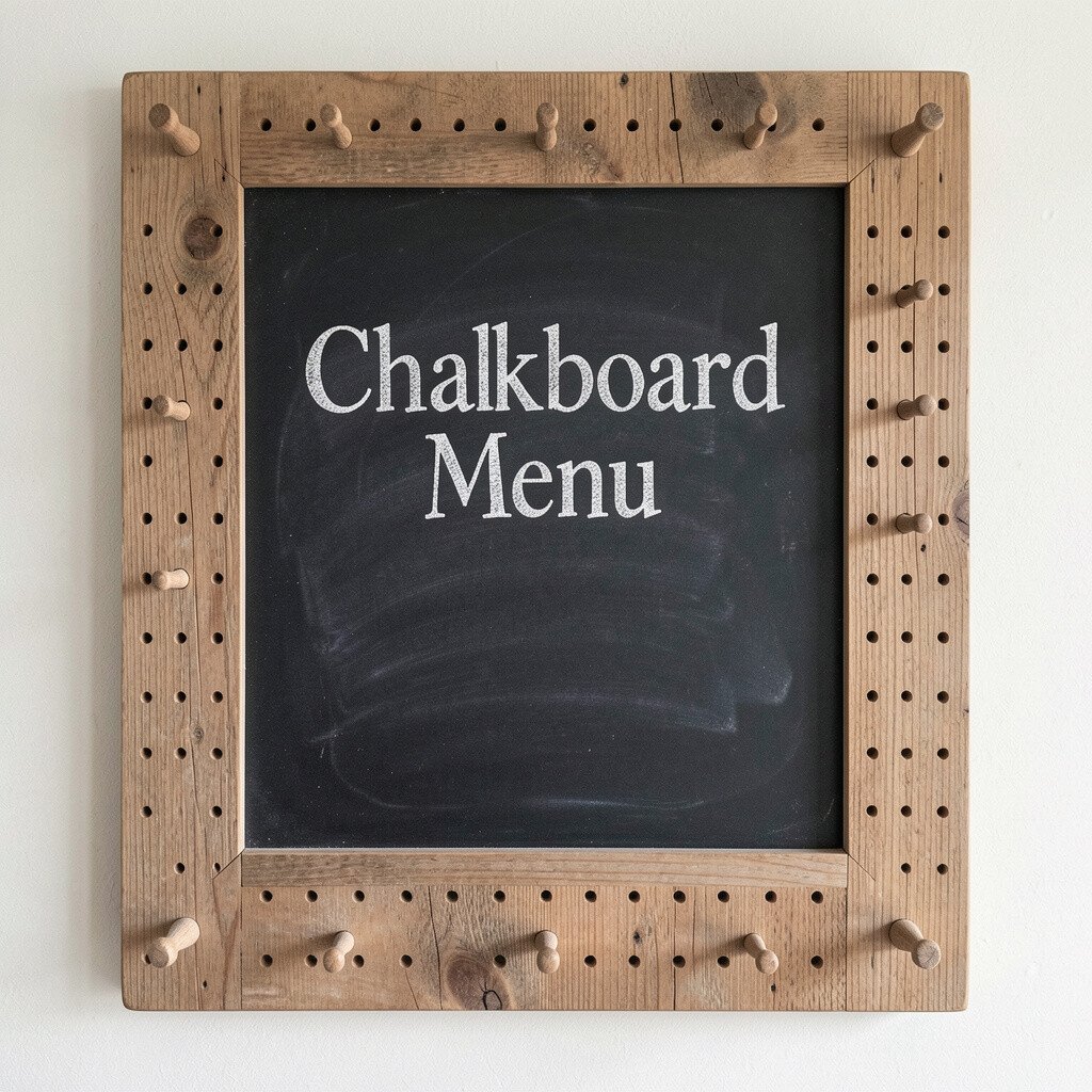
Picture a black chalkboard mounted over a pegboard base, with shelves or hooks holding extras like menus, napkins, or small signage. It brings a tidy, organized look that still feels casual.
Write the menu in a clear block style, then use the pegboard area for small add-ons like allergen cards or seasonal drink names. This helps guests feel informed without adding clutter to the main writing area. Personalize by adding wooden shelves in the same warm tone as your space.
For practical tips, measure your pegboard spacing so chalkboard mounting stays sturdy and level. Costs can be budget-friendly because pegboards are common and easy to find. A trend you’ll see in homes and cafes is mixing functional storage with display, and this setup does both.
When your menu changes, you can keep the chalkboard basics and swap small hanging cards for the rest.
10. Chalkboard Menu on a Leather Strap Display
Chalkboard Menu on a Leather Strap Display
Imagine a chalkboard piece held by a looped leather strap, hanging like a sign from a hook or ceiling bracket. The texture makes the menu feel premium without being too fancy.
Write your menu with clean lines and add a few bold words using thicker chalk. Leather straps frame the board nicely, so even short menu text looks intentional. Personalize the strap by choosing a color that matches your interior, like tan for warm spaces or dark brown for moody ones.
For practical tips, hang it at eye level and test it by standing where guests would stand. Costs depend on materials, but leather straps can be cheaper than full custom frames. This idea feels unique because the movement from a strap makes the sign feel alive, especially near walkways.
11. Chalkboard Menu with Border Doodles
Chalkboard Menu with Border Doodles
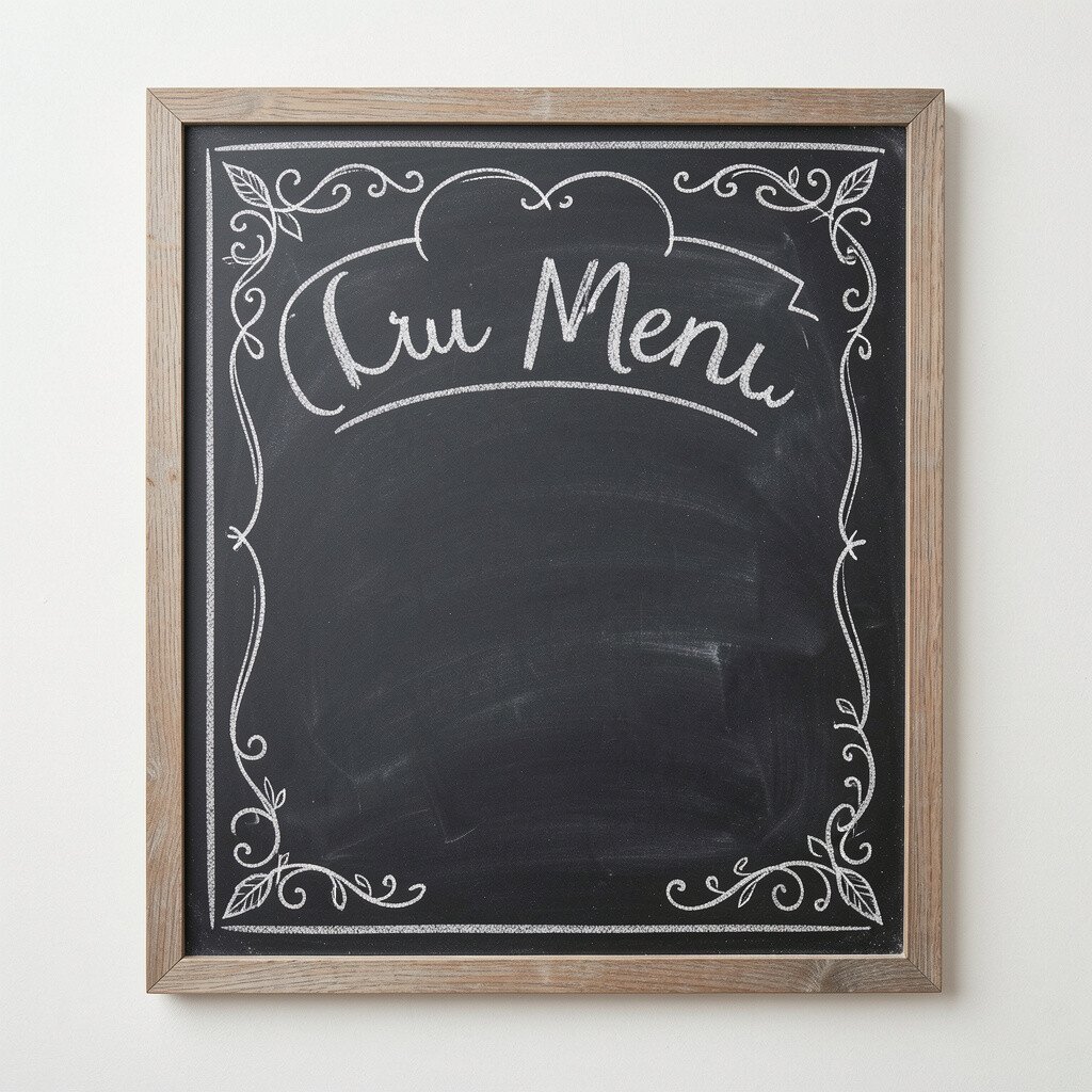
Picture a chalkboard where the center menu is neat, but the edges are covered in gentle border doodles like tiny leaves, stars, or waves. The border adds charm while keeping the main information easy to read.
Use border art to define sections, like swirling corners for desserts and clean lines for drinks. This boosts uniqueness because most chalkboards rely on plain framing. Personalize by matching doodles to your theme, such as seashells for a beachy shop or pine sprigs for winter.
Practical tips include using light chalk first so you can erase and adjust. If you want crisp borders, use a ruler for straight sections and freehand for the playful parts. Costs stay low since all you need is chalk, and the visual impact comes from your design choices.
12. Menu Wall with Layered Chalkboard Frames
Menu Wall with Layered Chalkboard Frames
Imagine a wall display where multiple chalkboard frames overlap like art prints. It turns your menu into a focal point that feels creative and welcoming.
Keep each board focused on a theme, like one for breakfast, one for lunch, and one for desserts. Layering creates depth and helps guests notice the menu even when they walk past quickly. For personalization, vary the frame finishes, such as matte black and natural wood, so the wall feels curated.
For practical tips, keep spacing consistent so writing doesn’t collide from board to board. Choose frames that hold boards securely so they don’t sag with time. Cost considerations are flexible since you can start with two frames and add more as you grow.
13. Chalkboard Menu with a Price-First Layout
Chalkboard Menu with a Price-First Layout
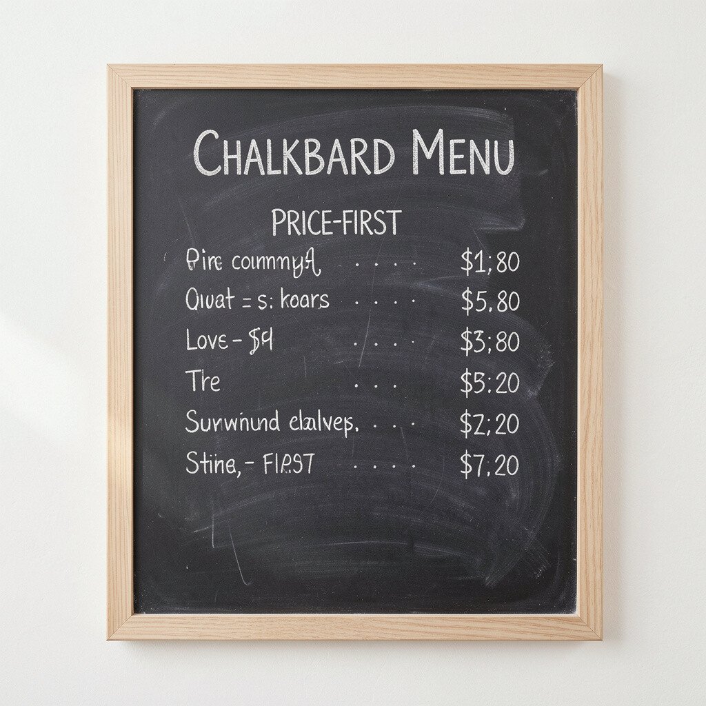
Picture a chalkboard where prices sit in bright, clear alignment across the board, and item names sit just next to them. This kind of layout feels practical and helps guests decide quickly.
Write prices in a larger font and keep item names short so the board feels easy to scan. This benefit is huge when your space is busy or noisy because people can read fast without slowing down. Personalize by adding a small symbol next to items that are most popular.
For practical tips, use chalk line marks lightly to keep everything straight and even. Cost is minimal since you’re using the same chalkboard but refining the layout. A current trend in many casual dining spots is clarity-first design, and this approach matches that style.
If you offer combos, place them in a bold row so guests see value without hunting.
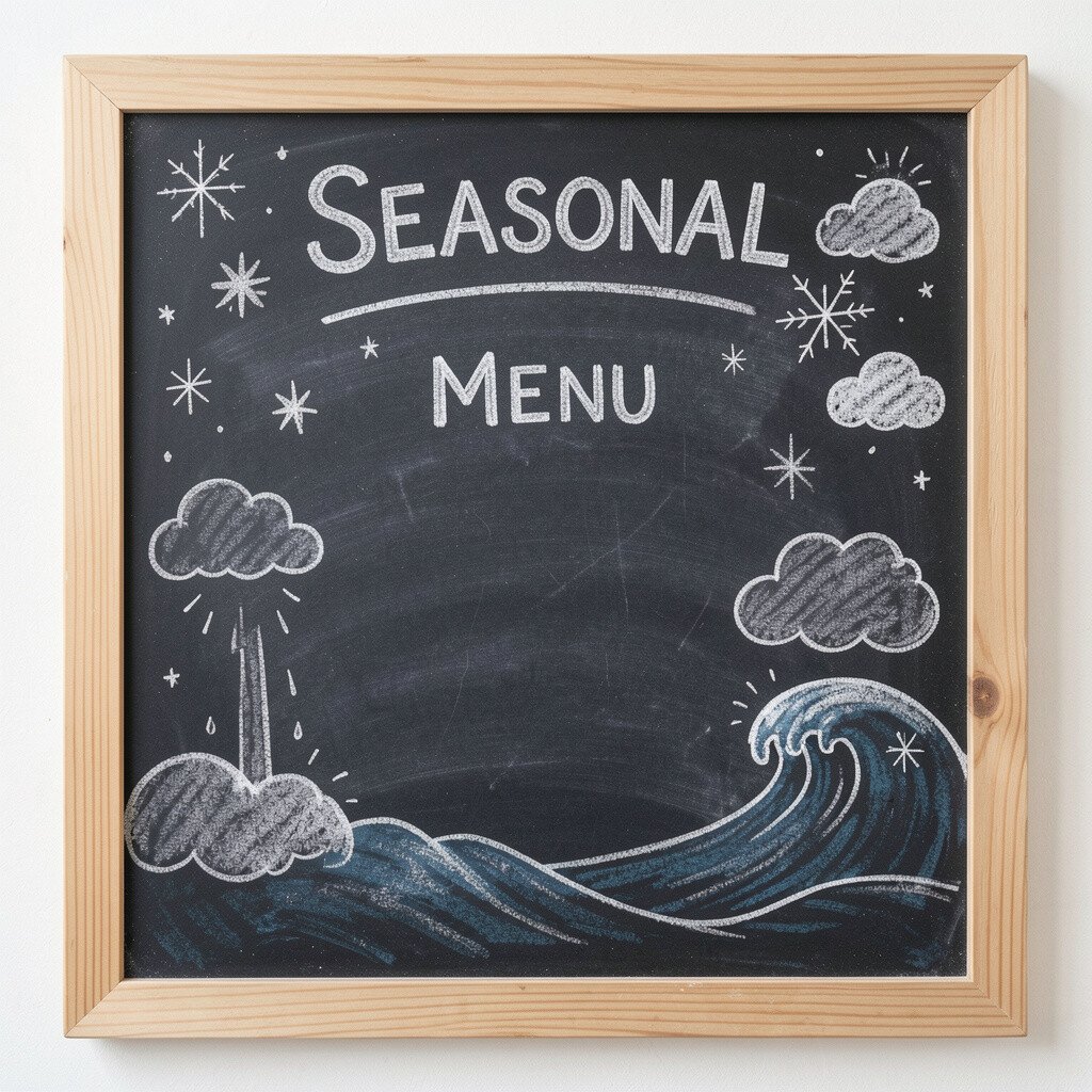
14. Seasonal Chalkboard Menu with Weather Theme
Seasonal Chalkboard Menu with Weather Theme
Imagine a chalkboard menu styled around the weather, like a sunny layout with bright words or a rainy layout with gentle watery doodles. It makes your menu feel like it belongs to that exact day.
Write the menu in standard rows, then add seasonal touches like “Cozy,” “Chilled,” or “Spicy” to guide mood. Personalize the theme by using your local climate or common seasonal cravings in your area. This uniqueness also helps regulars feel noticed because the sign doesn’t stay the same every time.
For practical tips, update only a small section of the board each week so the rest stays consistent. Costs are low because you can reuse your existing board and only change the chalk writing. A trend that keeps showing up is storytelling in small ways, and weather themes are an easy win.
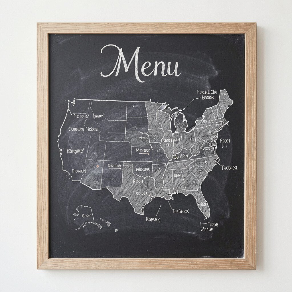
15. Chalkboard Menu with Chalk-Drawn Menu Map
Chalkboard Menu with Chalk-Drawn Menu Map
Picture a chalkboard with a simple map-like layout, showing where items come from or how to build your order. It’s like a visual guide that feels fun and interactive.
For example, draw a path that starts with base items and ends with add-ons, then list what each step offers. This benefits guests who like structure, especially if you have custom orders. Personalize it by using your own shop story, like “Step into the bowl” or “Build your cup,” but keep the writing short and readable.
Practical tips include using clear arrows and limiting the number of steps so the map stays understandable. Cost considerations stay low because the design relies on chalk skills, not expensive parts. This idea feels unique because it turns a static menu into a mini activity.
Keep the map at eye level, and add one bold line that explains the simplest way to order.
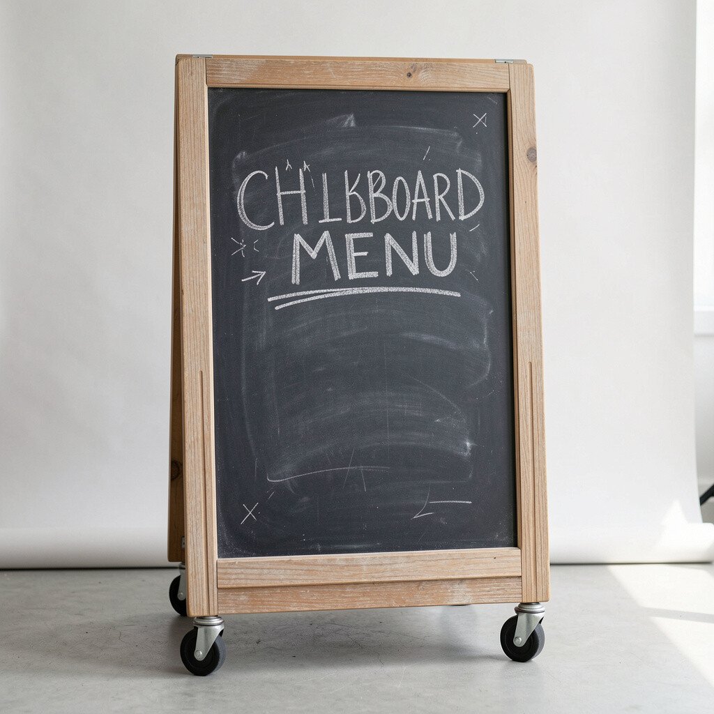
16. Chalkboard Menu on a Rolling Cart Backdrop
Chalkboard Menu on a Rolling Cart Backdrop
Imagine your chalkboard mounted on a rolling cart, ready to move wherever your crowd needs it most. It looks flexible and gives you a professional setup even at pop-up events.
Use the cart for a menu board plus matching items like napkins, utensils, or sample cards so the area feels organized. This is a big practical benefit because you can reposition your sign for sightlines. Personalize the cart by adding small decals or a cloth runner that matches your decor.
For practical tips, lock the wheels in place so the board stays steady and writing stays neat. Costs can be managed since carts are easy to find secondhand, and a chalkboard panel can be swapped later. A current trend is mobility in small businesses, where setups can adapt quickly without losing style.
When the menu changes, you can roll the cart to a better spot and update the board without resetting the whole display.